Minard meets ggplot2
Michael Friendly
February 10, 2022
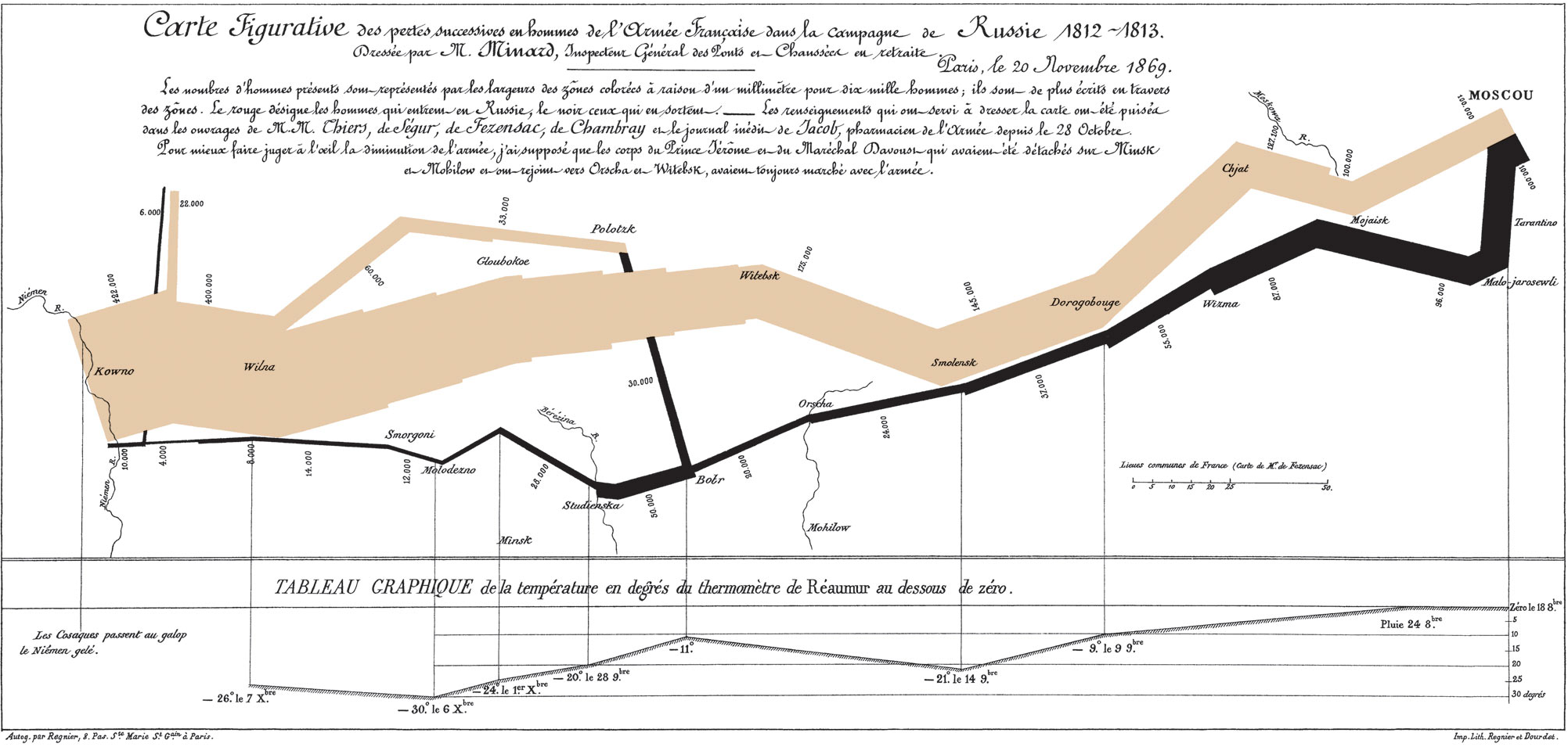
Goal
What would C. J. Minard have done if he had access to R
and ggplot2? The goal of this excercise is to reproduce, to
some reasonable approximation, Minard’s famous graphic of Napoleon’s
March on Moscow. Along the way, we’ll learn some techniques for
developing plots using ggplot2. But, you might also want to
read Paul Kahn’s Napoleon,
Trump, and the Best Statistical Graphic Ever Drawn.

(The original source of this exercise was the documentation example
for the Minard data, example("Minard", package="HistData"),
with the steps explained here. Other ideas were taken from Andrew Heiss,
Exploring Minard’s
1812 plot with ggplot2.)
(In this tutorial, you are encouraged to work it through in your own R session, using this file as a guide. Each code chunk has an icon to copy the code to the clipboard. When a code chunk is hidden, click the Show button to un-hide it.)
This graph looks very complicated. How should we get started?
Data
The first step is to understand the available data.
Because there are several sources of information here, the data are contained in three data.frames in the HistData package. Let’s load each one and examine its structure.
Troops: Minard.troops
The main data on Napoleon’s troop strength at points
(lat, long) along the campaign path, giving
the number of survivors, stratified by
direction, a factor with levels A (“Advance”)
and R (“Retreat”), and group (Napoleon had
three generals commanding portions of his troops).
data(Minard.troops, package="HistData")
str(Minard.troops)
## 'data.frame': 51 obs. of 5 variables:
## $ long : num 24 24.5 25.5 26 27 28 28.5 29 30 30.3 ...
## $ lat : num 54.9 55 54.5 54.7 54.8 54.9 55 55.1 55.2 55.3 ...
## $ survivors: int 340000 340000 340000 320000 300000 280000 240000 210000 180000 175000 ...
## $ direction: Factor w/ 2 levels "A","R": 1 1 1 1 1 1 1 1 1 1 ...
## $ group : int 1 1 1 1 1 1 1 1 1 1 ...Cities: Minard.cities
The (lat, long) locations of various places
along the path of Napoleon’s army, with the name of the
city.
data(Minard.cities, package="HistData")
str(Minard.cities)
## 'data.frame': 20 obs. of 3 variables:
## $ long: num 24 25.3 26.4 26.8 27.7 27.6 28.5 28.7 29.2 30.2 ...
## $ lat : num 55 54.7 54.4 54.3 55.2 53.9 54.3 55.5 54.4 55.3 ...
## $ city: Factor w/ 20 levels "Bobr","Chjat",..: 5 18 15 9 4 7 16 13 1 19 ...Temperature: Minard.temp
The temperature at various places along the march of retreat from
Moscow, with their date.
data(Minard.temp, package="HistData")
str(Minard.temp)
## 'data.frame': 9 obs. of 4 variables:
## $ long: num 37.6 36 33.2 32 29.2 28.5 27.2 26.7 25.3
## $ temp: int 0 0 -9 -21 -11 -20 -24 -30 -26
## $ days: int 6 6 16 5 10 4 3 5 1
## $ date: Factor w/ 8 levels "Dec01","Dec06",..: 7 8 4 5 NA 6 1 2 3Analyzing the graph: layers
The first step is to try to decompose the graph in terms of the components to be plotted.
First, the graph really consists of two separate plots, stacked vertically:
- The graph of troop strength, with (x, y) coordinates
(
lat,long) - The graph of temperature, with coordinates (
temp,long)
- The graph of troop strength, with (x, y) coordinates
(
The graph of troop strength has two layers:
- A path connecting the (x, y) coordinates, of width
proportional to
survivors - Text labels on the map corresponding to the cities
in
Minard.cities
- A path connecting the (x, y) coordinates, of width
proportional to
At this point, it is useful to make a table of the aesthetics that are used in these plots:
| Plot | Information | Aesthetic |
|---|---|---|
| 1,2 | Longitude of army (long) |
x-axis |
| 1 | Latitude of army (lat) |
y-axis |
| 1 | Size of army (survivors) |
Width of path |
| 1 | direction of army’s movement |
Color of path |
| 2 | date of points along retreat path |
Text label |
| 2 | Temperature (temp) during retreat |
y-axis |
Plotting the troops data
First, load the packages we will need. In addition to
ggplot2 we will use the scales package to
provide convenient formatting of the scale for survivors
and the gridExtra package to combine the two separate
plots.
library(ggplot2)
library(scales)        # additional formatting for scales
library(grid)          # combining plots
library(gridExtra)     # combining plots
library(dplyr)         # tidy data manipulations
The basic plot uses lat and long as the
ggplot (x, y) coordinates. The line below just sets up an empty plot
frame for lat and long.
ggplot(Minard.troops, aes(long, lat)) The flow-map path of the surviving troops is a geom_path
layer. The important aesthetic attribute is to map the size
(width) of the path to survivors. Here is a first try:
 ggplot(Minard.troops, aes(long, lat)) +
        geom_path(aes(size = survivors))
That is pretty hideous, but it is at least a first approxmiation. What’s wrong here:
the path of Advance and Retreat are not distinguished in the graph.
the aspect ratio of the plot doesn’t reflect the equal scaling of degrees of latitude and longitude on a map, or Minard’s scaling in the graphic.
Try again
For the first problem, we need to map the color of the path to
direction. In Minard’s map, there are also some side paths
of parts of the army diverted to separate battles. These are
distinguished by the group variable.
The scaling of the horizontal and vertical axes is easily fixed by
coord_fixed() which makes equal units appear equal on the
two axes.
 ggplot(Minard.troops, aes(long, lat)) +
        geom_path(aes(size = survivors, colour = direction, group = group)) +
    coord_fixed()
Your turn
Before going further, here are some things to try:
What if Minard simply made a line graph of the path, without using
survivorsas the size of the path? What would he have gotten with justgeom_path()– nosize,colororgroupaesthetics?What if Minard had added points (
+ geom_point(aes(size=survivors)) to reflect the remaining size of the Grand Army?What if he also tried to distinguish the points by color, based on
direction(+ geom_point(aes(size=survivors, color=direction))) ?In Minard’s version, the two upward diversions of troops on the Retreat are drawn “behind” the path of the Advance, whereas in our version they appear in front. How can we change this? (Hint: consider sorting the
Minard.troopsdata or using transparent versions of the two colors.)
Back to Minard
The graph above is correct geographically, but the vertical size is
too small to accommodate other graphical elements. In the plots below,
we omit coord_fixed(), and use knitr options
fig.height=3.5, fig.width=10 to scale the plot in
proportion to Minard’s original.
As well, the individual segments of the path don’t fit together very
well and leave big gaps. We can fix that by adding a rounded line ending
to each segment (lineend="round").
Fixing the scales
ggplot automatically makes discrete categories for the
survivors variable and the values are printed in an
unpleasant “e” (exponential) notation. We can override the default using
scale_size() providing our own breaks, and
using scales::comma() to format the values.
While we’re at it, we can also override the colors for the
direction variable. I used the Eyedropper tool in Firefox
Tools -> Web Developer to get the HEX values from
the original graph.
breaks <- c(1, 2, 3) * 10^5
ggplot(Minard.troops, aes(long, lat)) +
        geom_path(aes(size = survivors, colour = direction, group = group),
                  lineend="round") +
    scale_size("Survivors", range = c(1,10), #c(0.5, 15),
               breaks=breaks, labels=scales::comma(breaks)) +
    scale_color_manual("Direction",
                       values = c("#E8CBAB", "#1F1A1B"),
labels=c("Advance", "Retreat")) 
plot_troops <- last_plot()I’m also using a ggplot trick here: I liked the result
of this plot, so I can assign it to a variable, plot_troops
that I’ll use later, rather than reproducing all the code each time.
last_plot() always returns the last ggplot created or
modified.
When we assemble this into the complete graphic, we might want to
suppress the legends for surviviors and
direction, and perhaps also the axis labels
(lat and long). This is easy to do with
ggplot, even though we saved this plot in a
ggplot object.
Your turn
Before going further, here are some things to try:
Open a copy of Minard’s graphic, http://euclid.psych.yorku.ca/www/psy6135/images/Minard-march.png, in a web browser or other application. Find the color-picking tool that lets you hover the mouse on the graphic and get the color values to use for the Advance and Retreat paths.
When Minard combines this plot with others, he will want to make some adjustments. Try some of the following:
Minard will not need the default labels and scales for the horizontal and vertical axes. Try running:
plot_troops + labs(x = NULL, y = NULL)Minard would not like the default ggplot theme, with a gray background and white grid lines. Try running:
plot_troops + theme_bw(). There is a large collection of other themes, such astheme_minimal()andtheme_void().He will also want to delete the legends for
survivorsanddirection. Inggplot2, these are handled byguides(), and we can set them to"none"to suppress them. Try:plot_troops + guides(color = "none", size = "none")
Cities
The locations of the cities in Minard’s graphic provide the
geographical context for this graphic story of Napoleon’s terrible
defeat. The cities he chose for the labels in the graph reflect
important battles or other locations from historical accounts of the
1812 campaign. In ggplot terms, it is just another layer on
the graph of the troops, added with +.
Using the Minard.cities data, we can use
geom_point() to plot city locations, and/or
geom_text() to plot their names. If we use both, we have to
figure out how to deal with overlap of points & text.
plot_troops + geom_text(data = Minard.cities, aes(label = city), size = 3)
Here is another version using both points and text labels for the
cities. geom_text() has several other arguments
(hjust, vjust) to move the text away from the
points, angle to print them at an angle, and
family to change the font family (e.g.,
family = "Times New Roman")
plot_troops +
    geom_point(data = Minard.cities) +
geom_text(data = Minard.cities, aes(label = city), vjust = 1.5) 
Plotting both points and text labels is a common problem in graphics.
You often have to tweak the positions of the labels so they don’t
overlap the points. A separate ggplot-compatible package,
ggrepel
provides a function, geom_text_repel() to automatically
move the labels away from points and to ensure none of the labels
overlap.
if (!require(ggrepel)) {install.packages("ggrepel"); require(ggrepel)}
library(ggrepel)
plot_troops +
    geom_point(data = Minard.cities) +
    geom_text_repel(data = Minard.cities, aes(label = city))
plot_troops_cities <- last_plot()We like this version best, so we save it as
plot_troops_cities.
Plot of Temperature
The second plot in Minard’s graphic is the plot of temperature against longitude on the path of the retreat. Minard first takes a quick look at the data.
Minard.temp## long temp days date
## 1 37.6 0 6 Oct18
## 2 36.0 0 6 Oct24
## 3 33.2 -9 16 Nov09
## 4 32.0 -21 5 Nov14
## 5 29.2 -11 10 <NA>
## 6 28.5 -20 4 Nov28
## 7 27.2 -24 3 Dec01
## 8 26.7 -30 5 Dec06
## 9 25.3 -26 1 Dec07He then decides that this is just another geom_path()
His first version just adds the points.
In making this plot, I again measured the size of this part of the
graph in Minard’s original, and used
fig.height=1.2, fig.width=10 as the knitr
options in this chunk to make this plot have approximately the right
size and shape.
ggplot(Minard.temp, aes(long, temp)) +
    geom_path(color="grey", size=1.5) +
geom_point(size=2) 
If you look carefully at Minard’s graph, he labeled each point using
the temperature and the date, in the form \(-26^o \textrm{le } 7 X^{bre}\) for the
left-most point for December 7. We construct a nicer label
combining temperature and date as follows:
Minard.temp <- Minard.temp %>%
    mutate(label = paste0(temp, "° ", date))
head(Minard.temp$label)
## [1] "0° Oct18" "0° Oct24" "-9° Nov09" "-21° Nov14" "-11° NA" "-20° Nov28"(There is one temperature in the data without a date. What R function could you use to change “NA” to ” ” in the code above?)
His next version of the plot of temperature used this
label variable as follows:
ggplot(Minard.temp, aes(long, temp)) +
    geom_path(color="grey", size=1.5) +
    geom_point(size=1) +
  geom_text(aes(label=label), size=2, vjust=-1)
However, putting all the labels above the points gives the result
that those for the right-most two points are clipped, because they are
outside the plot frame. He tries this again, using
geom_text_repel():
ggplot(Minard.temp, aes(long, temp)) +
    geom_path(color="grey", size=1.5) +
    geom_point(size=1) +
  geom_text_repel(aes(label=label), size=2.5)
This is not too bad. He can always come back and tweak this later, assuming he saves his R code!
plot_temp <- last_plot()Assembling the graphic
OK, the pieces are done, and it is time to try to paste them together
into a single graphic. The tool for this is grid.arrange()
from the gridExtra
package. If I was re-doing this today, I’d use the patchwork
package.
Here is the first attempt, just placing one plot on top of the other, as is.
grid.arrange(plot_troops_cities, plot_temp)
In the knitr options, I specified the final dimensions
of the combined plot, fig.height=4.7, fig.width=10. By
defaut, grid.arrange() stacks them, and gives each the same
vertical height. We can fix this later.
First, let’s fix the separate plots. In the plot of troops and cities, we need to:
- Set the X axis limits to a range that will coincide with those for the plot of temperature;
- Get rid of the X and Y axis labels scales;
- Remove the legends for
survivorsanddirection; - Get rid of all
ggplot2theme elements.
plot_troops_cities +
  coord_cartesian(xlim = c(24, 38)) +
  labs(x = NULL, y = NULL) +
  guides(color = "none", size = "none") +
  theme_void()
plot_troops_cities_fixed <- last_plot() In the plot of temperature, we use similar techniques, however it
takes a bit more work to suppress the horizontal axis tick marks and
labels. The theme() function allows all aspects of a graph
to be controlled.
plot_temp +
  coord_cartesian(xlim = c(24, 38)) +
  labs(x = NULL, y="Temperature") +
  theme_bw() +
  theme(panel.grid.major.x = element_blank(),
        panel.grid.minor.x = element_blank(),
        panel.grid.minor.y = element_blank(),
        axis.text.x = element_blank(), axis.ticks = element_blank(),
        panel.border = element_blank())
plot_temp_fixed <- last_plot()These plots are now both on the same horizontal scale. To combine
them in a single plot, we can again use grid.arrange(). It
would be nice to add a border around the entire graphic. The function
grid.rect() in the grid package does this for
us.
grid.arrange(plot_troops_cities_fixed, plot_temp_fixed, nrow=2, heights=c(3.5, 1.2))
grid.rect(width = .99, height = .99, gp = gpar(lwd = 2, col = "gray", fill = NA))
Going further
This is as far as we will take the reconstruction of Minard’s graphic in this tutorial. But, here are some suggestions for going further.
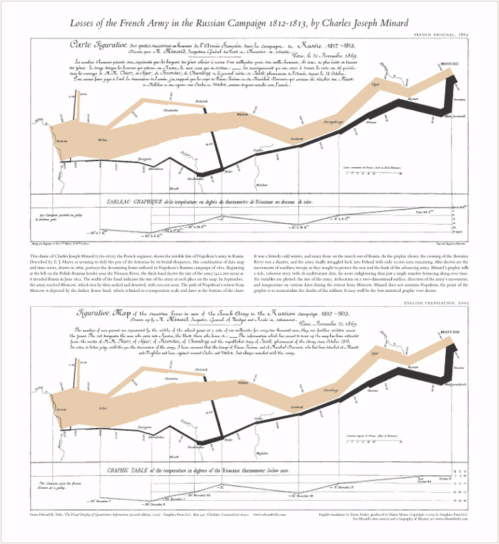
Resizing and adding a title or descriptive text: My calculation of the height of the graphic (3.5” for the plot of troops, 4.7” overall) did not take into account the top portion (about 0.64”) that Minard devotes to the title and descriptive text.
- Re-do the map, making allowance for this.
- Construct another graphic containing a title and some descriptive
text. An English translation of Minard’s text is contained in the image
below. You can use the
ggplot2functionannotate()for this, but that is quite tedious for lots of text. Alternatively, find a way to read in this graphic and combine it with the image.

- Fancy fonts: Minard’s original and the English
translation (originally
from Tufte) use a fancy script font. To reproduce this aspect, the
first task is to try to find a similar font. Adobe has an online font tool; or, more
conveniently,you can search Google
Fonts, which fonts can be used with the
showtextpackage. I found something close in Tangerine bold

Here’s a stub to get you started:
library(showtext)
font_add_google(name="Tangerine", family="tangerine")
showtext_auto()

title <- "Map of the losses over time of the French army during the Russian campaign, 1812-1813.\n
Constructed by Charles Joseph Minard, Inspector General of Public Works (retired).
Paris, 20 November 1869."
Add a map background: Minard drew some map elements, largely rivers, on his graphic to provide more geographic context. The package ggmap works nicely with
ggplot2and provides tools for getting map data from various web sources. Andrew Heiss, Exploring Minard’s 1812 plot with ggplot2 shows how to do this.Re-visions of Minard: My web page Re-Visions of Minard contains a collection of graphs that others have produced to either recreate Minard’s graphic in other software or to attempt to display the data in some other way. Study this page and try one or more of the ideas illustrated there.