
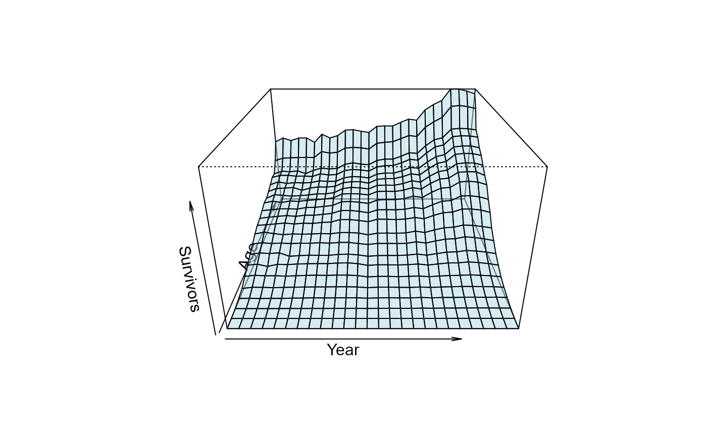
Data underlying Luigi Perozzo's (1880, 1881) "stereogram" – an early three-dimensional population pyramid – showing the number of survivors, by age, of Swedish birth cohorts followed forward through successive census years, 1750-1875. Friendly & Wainer (2021, Sec. 8.4) consider this the first true 3D statistical graphic, using an axionometric projection of a 3D surface.
Usage
data("Perozzo")Format
A data frame with 546 observations on the following 3 variables, forming a 26 (Year) x 21 (Age) grid.
Yearnumeric, census year, 1750-1875 in steps of 5
Agenumeric, age in years, 0-100 in steps of 5
Survivorsnumeric, number of survivors at that age in that census year
Source
Traced to the original printed table in Perozzo's own 1880 paper, Annali di Statistica
ser. 2, v. 11-12 (1880), scanned by HathiTrust:
https://babel.hathitrust.org/cgi/pt?id=mdp.39015033949978&seq=226. RJ Andrews OCR'd and
corrected that table, then transformed it into this Year x Age grid (see Details).
His result was posted, byte-identical to this package's copy, as porozzo-tidy.csv in
his old-charts GitHub repo:
https://github.com/infowetrust/old-charts/tree/main/src/components/PerozzoSweden/data
(see also https://charts.infowetrust.com/). The original stereogram – Perozzo's
graphic built from this same table – is held by Wikimedia Commons:
https://commons.wikimedia.org/wiki/File:Stereogram_(three-dimensional_population_pyramid)_modeled_on_actual_data_(Swedish_census,_1750-1875).jpg
_modeled_on_actual_data_(Swedish_census,_1750-1875).jpg)
Details
Perozzo's stereogram plotted Survivors as a surface over the Year x Age grid,
letting a viewer read off both cross-sections (the age distribution in a given census
year) and diagonal cohort lines (survivorship of a single birth cohort as it ages) from
one figure – widely cited as one of the earliest true 3D statistical graphics.
The original numbers were published as a printed table in Perozzo's own 1880 paper (see
@source), not read off the stereogram image itself. That table is organized by
birth-year cohort (Anni di nascita, in 5-year bands) crossed with age at observation –
not by census year x age directly. The Year column here (census year) comes from a
birth_year + Age transform applied after digitizing the table, not from the original
table's own layout.
The full chain is now documented: RJ Andrews OCR'd the printed table from a HathiTrust
scan, hand-corrected several OCR misreads, transformed the birth-cohort table into this
Year x Age grid, and tidied it to long format (confirmed directly with him,
2026-08-31). That result was posted, byte-identical to the copy shipped here, as
porozzo-tidy.csv in his old-charts GitHub repo – the route this package's copy was
traced through as of 2026-08-07, before the fuller upstream story was confirmed with him
directly. See issues/vignettes/verifying-perozzo.md
(on GitHub – issues/ is dev-only and not included in the installed package) for the
full trace.
Perozzo's 3D graphic was remarkable in its' time and still is today, for attention to detail in his
hand-drawn graphic. The simple image from graphics::persp show here is a very coarse approximation.
It remains a HistData challenge to do this (a) closer to Perozzo's graphic or (b) better in someway.
For example: Perozzo showed the trace lines for age receding into the image, with major lines for
year shown in red at 25 year intervals. The trace lines for year at fixed age were also highlighted
at 25 year intervals.
More importantly, for demography, he realized that diagonal lines for combinations of age and year
reflected a cohort and these could be used to compare the life survivorship of people born in
various years.
References
Friendly, M., & Wainer, H. (2021). A History of Data Visualization and Graphic Communication. Harvard University Press. doi:10.4159/9780674259034
Perozzo, L. (1880). Della Rappresentazione Graphica di una Collettivita di Individuinella Successione del Tempo. Annali di Statistica, 12, 1-16.
Perozzo, L. (1881). Stereogrammi Demografici – Seconda memoria dell'Ingegnere Luigi Perozzo. Annali di Statistica, 22, 1-20.
Examples
data(Perozzo)
str(Perozzo)
#> 'data.frame': 546 obs. of 3 variables:
#> $ Year : num 1750 1755 1760 1765 1770 ...
#> $ Age : num 0 0 0 0 0 0 0 0 0 0 ...
#> $ Survivors: num 163000 173012 166233 172982 173367 ...
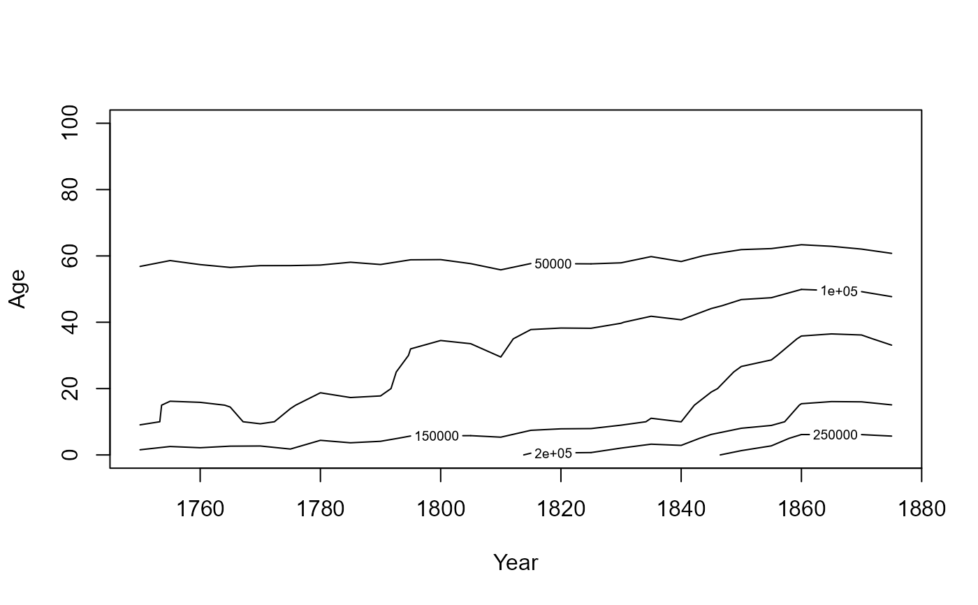
# reshape to a Year x Age matrix for a surface / contour plot
Pmat <- xtabs(Survivors ~ Year + Age, data = Perozzo)
years <- as.numeric(rownames(Pmat))
ages <- as.numeric(colnames(Pmat))
# perspective plot: Year horizontal (1750 -> 1875, left to right), Age receding
# in depth (100 in front -> 0 at the back), as in Perozzo's original stereogram.
# persp() requires ascending x/y, so the front-to-back flip is done by negating
# and reversing Age (and matching the matrix columns to it), not by relabeling.
ages_rev <- -rev(ages)
Pmat_rev <- Pmat[, rev(seq_along(ages))]
persp(years, ages_rev, Pmat_rev,
xlab = "Year", ylab = "Age", zlab = "Survivors",
theta = 0, phi = 25, expand = 0.6,
col = adjustcolor("lightblue", alpha.f = 0.5), shade = 0.5)
 # contour plot of the same surface
contour(years, ages, Pmat, xlab = "Year", ylab = "Age")
# contour plot of the same surface
contour(years, ages, Pmat, xlab = "Year", ylab = "Age")
 # extract the contour lines themselves, e.g. for further analysis or custom plotting
cl <- contourLines(years, ages, Pmat, levels = seq(20000, 280000, by = 20000))
length(cl)
#> [1] 16
str(cl[[1]])
#> List of 3
#> $ level: num 20000
#> $ x : num [1:32] 1750 1755 1760 1765 1770 ...
#> $ y : num [1:32] 73.5 75 73.6 74.4 73.9 ...
# extract the contour lines themselves, e.g. for further analysis or custom plotting
cl <- contourLines(years, ages, Pmat, levels = seq(20000, 280000, by = 20000))
length(cl)
#> [1] 16
str(cl[[1]])
#> List of 3
#> $ level: num 20000
#> $ x : num [1:32] 1750 1755 1760 1765 1770 ...
#> $ y : num [1:32] 73.5 75 73.6 74.4 73.9 ...