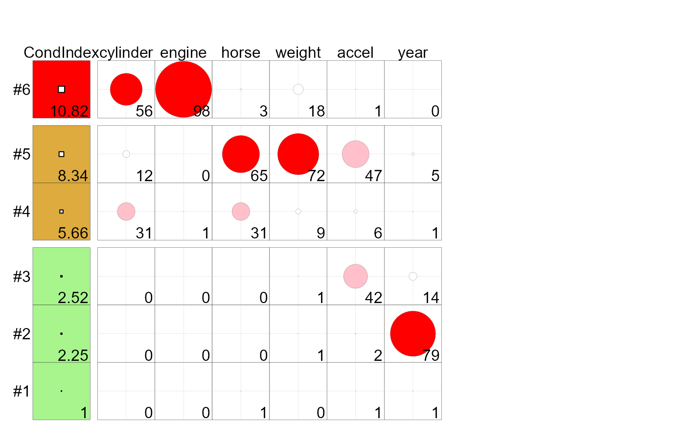
These methods produce a tableplot of collinearity diagnostics, showing the condition indices and variance
proportions for predictors in a linear or generalized linear regression model. This encodes the
condition indices using squares whose background color is red for condition indices > 10,
green for values > 5 and green otherwise, reflecting danger, warning and OK respectively.
The value of the condition index is encoded within this using a white square proportional to the value
(up to some maximum value, cond.max),
Variance decomposition proportions are shown by filled circles whose radius is proportional to those values and are filled (by default) with shades ranging from white through pink to red. Rounded values of those diagnostics are printed in the cells.
Usage
# S3 method for class 'colldiag'
tableplot(
  values,
  prop.col = c("white", "pink", "red"),
  cond.col = c("#A8F48D", "#DDAB3E", "red"),
  cond.max = 100,
  prop.breaks = c(0, 20, 50, 100),
  cond.breaks = c(0, 5, 10, 1000),
  show.rows = nvar:1,
  title = "",
  patterns,
  ...
)

# S3 method for class 'lm'
tableplot(values, ...)

# S3 method for class 'glm'
tableplot(values, ...)
Arguments
- values
A
"colldiag","lm"or"glm"object- prop.col
A vector of colors used for the variance proportions. The default is
c("white", "pink", "red").- cond.col
A vector of colors used for the condition indices
- cond.max
Maximum value to scale the white squares for the condition indices
- prop.breaks
Scale breaks for the variance proportions, a vector of length one more than the number of
prop.col, whose values are between 0 and 100.- cond.breaks
Scale breaks for the condition indices a vector of length one more than the number of
cond.col- show.rows
Rows of the eigenvalue decompositon of the model matrix to show in the display. The default
nvar:1puts the smallest dimensions at the top of the display.- title
title used for the resulting graphic
- patterns
pattern matrix used for table plot.
- ...
other arguments, for consistency with generic
References
Friendly, M., & Kwan, E. (2009). "Where’s Waldo: Visualizing Collinearity Diagnostics." The American Statistician, 63, 56–65. Online: https://www.datavis.ca/papers/viscollin-tast.pdf.

