Discriminant analysis can be more easily understood from plots of the data variables showing how observations are classified.
plot_discrim() uses the ideas behind effect plots (Fox, 1987): Visualize predicted classes of the observations for two focal variables over a
grid of their values, with other variables in a model held fixed. This differs from the usual effect plots in that the predicted
values to be visualized are discrete categories rather than quantitative.
In the case of discriminant analysis, the predicted values are class membership,
so this can be visualized by mapping the categorical predicted class to discrete colors used as the background for the plot, or
plotting the contours of predicted class membership as lines (for [MASS::lda()]) or qauadratic curves (for [MASS::qda()]) in the plot.
The predicted class of any observation in the space of the variables displayed can also be rendered as colored tiles or points
in the background of the plot.
Usage
plot_discrim(
  model,
  vars,
  data = insight::get_data(model),
  resolution = 100,
  point.size = 3,
  showgrid = c("tile", "point", "none"),
  contour = TRUE,
  contour.color = "black",
  tile.alpha = 0.2,
  ellipse = FALSE,
  ellipse.args = list(level = 0.68, linewidth = 1.2),
  labels = FALSE,
  labels.args = list(geom = "text", size = 5),
  rev.axes = c(FALSE, FALSE),
  xlim = NULL,
  ylim = NULL,
  ...,
  other.levels
)
Arguments
- model
a discriminant analysis model object from
MASS::lda()orMASS::qda()- vars
either a character vector of length 2 of the names of the
xandyvariables, or a formula of formy ~ xspecifying the axes in the plot. Can include discriminant dimensions likeLD1,LD2, etc.- data
data to use for visualization. Should contain all the data needed to use the
modelfor prediction. The default is to use the data used to fit themodel.- resolution
number of points in x, y variables to use for visualizing the predicted class boundaries and regions.
- point.size
size of the plot symbols use to show the data observations
- showgrid
a character string; how to display predicted class regions:
"tile"forggplot2::geom_tile(),"point"forggplot2::geom_point(), or"none"for no grid display.- contour
logical (default:
TRUE); should the plot display the boundaries of the classes by contours?- contour.color
color of the lines for the contour boundaries (default:
"black")- tile.alpha
transparency value for the background tiles of predicted class.
- ellipse
logical; if
TRUE, 68 percent data ellipses for the groups are added to the plot.- ellipse.args
a named list of arguments passed to
ggplot2::stat_ellipse(). Common arguments includelevel(confidence level, default: 0.68),linewidth(line thickness, default: 1.2),geom(either"path"for unfilled ellipses or"polygon"for filled ellipses), andalpha(transparency for filled ellipses). Any valid argument tostat_ellipse()can be used.- labels
logical; if
TRUE, class labels are added to the plot at the group means (default:FALSE).- labels.args
a named list of arguments passed to
ggplot2::geom_text()orggplot2::geom_label(). Common arguments includegeom(either"text"or"label", default:"text"),size(text size, default: 5),fontface(e.g.,"bold"or"italic"),nudge_xandnudge_y(position offsets), andalpha(transparency for label backgrounds). Any valid argument togeom_text()orgeom_label()can be used.- rev.axes
a logical vector of length 2 controlling axis reversal for discriminant dimensions.
rev.axes[1] = TRUEreverses the horizontal (x) axis;rev.axes[2] = TRUEreverses the vertical (y) axis. Only applies when plotting discriminant dimensions (e.g.,LD2 ~ LD1). Default:c(FALSE, FALSE).- xlim, ylim
numeric vectors of length 2 giving the axis limits. If
NULL(default), uses the range of the variable in the data.- ...
further parameters passed to
predict()- other.levels
a named list specifying the fixed values to use for variables in the model that are not included in
vars(the non-focal variables). These values are held constant across the prediction grid. If not specified, the function uses sensible defaults: means for quantitative variables, and the first level for factors or character variables.
Details
Since plot_discrim() returns a "ggplot" object, you can easily customize colors and shapes by adding scale layers after
the function call. You can also add other graphic layers, such as annotations, and control the overall appearance of
plots using ggplot2::theme() components.
Customizing colors and shapes
Use
scale_color_manual()andscale_fill_manual()to control the colors used when usingshowgrid = "tile", because that maps both bothcolorandfillto the group variable.Use
scale_shape_manual()to control the symbols used forgeom_points()
Customizing ellipses
The ellipse.args parameter provides fine control over the appearance of data ellipses. Common arguments include:
level: the confidence level for the ellipse (default: 0.68)linewidth: thickness of the ellipse line (default: 1.2)geom: either"path"for unfilled ellipses (default) or"polygon"for filled ellipsesalpha: transparency when usinggeom = "polygon"
See ggplot2::stat_ellipse() for additional parameters.
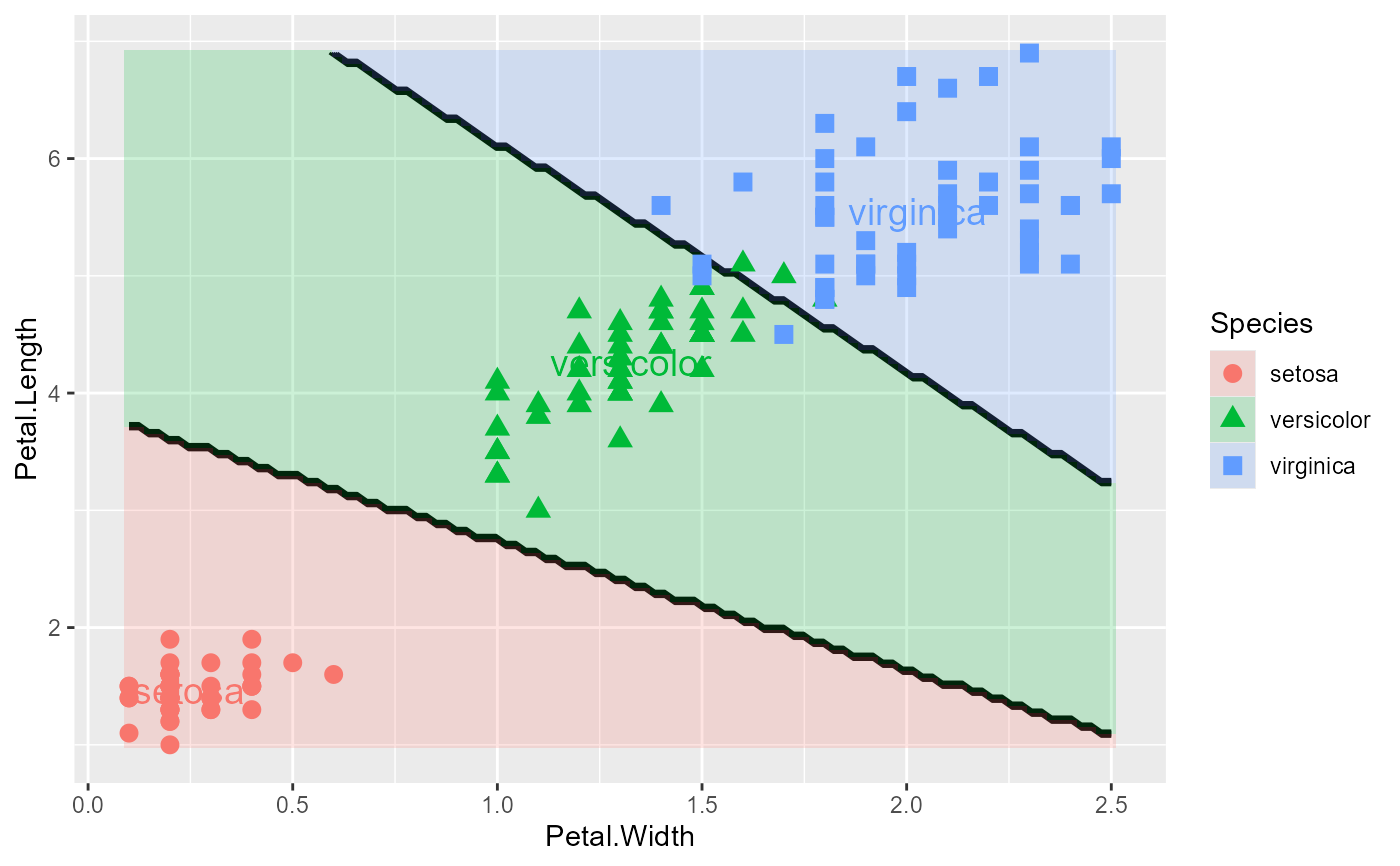
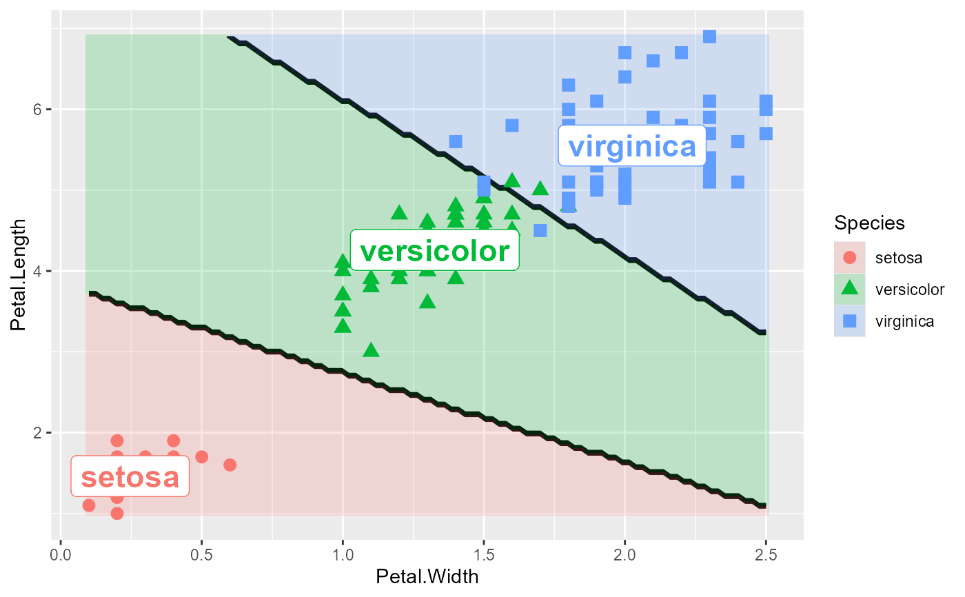
Adding class labels
The labels and labels.args parameters allow you to add text labels for each class, positioned at the
group means. Common arguments for labels.args include:
geom: either"text"(default) for simple text or"label"for text with a background boxsize: text size (default: 5)fontface: font style such as"bold"or"italic"nudge_x,nudge_y: offsets for label positioningalpha: transparency for label backgrounds when usinggeom = "label"
See ggplot2::geom_text() and ggplot2::geom_label() for additional parameters.
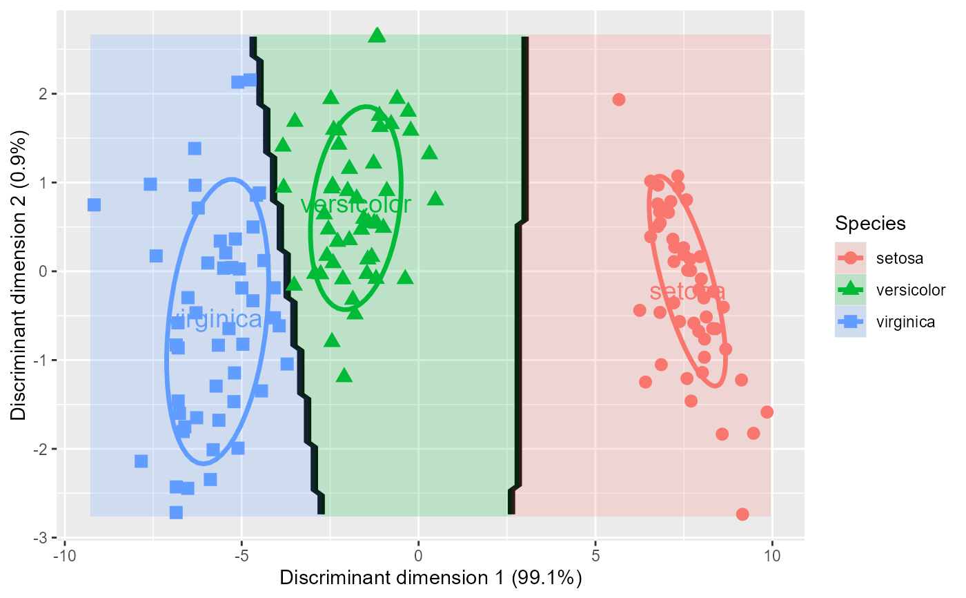
Plotting in discriminant space
When vars specifies discriminant dimensions (e.g., LD2 ~ LD1), the function automatically:
Calculates discriminant scores using
predict_discrim()Creates a new LDA model in the discriminant space
Plots the observations and decision boundaries in this transformed space
This is particularly useful for visualizing how well the discriminant dimensions separate the groups, since by construction the groups are maximally separated in discriminant space.
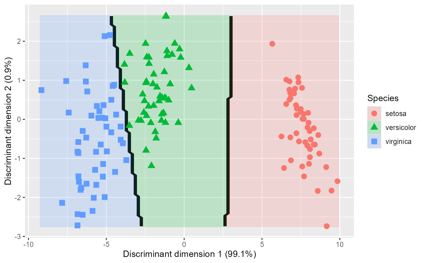
Reversing discriminant axes
The orientation of discriminant axes (LD1, LD2, etc.) is arbitrary in the sense that multiplying
any discriminant dimension by -1 does not change the discriminant solution or model fit. The rev.axes
parameter allows you to reverse the direction of one or both axes when plotting in discriminant space.
This can be useful for:
Aligning the discriminant plot with conventional interpretations (e.g., having "positive" on the right)
Making the orientation consistent across different analyses or visualizations
Improving the interpretability of the axes in relation to the original variables
The rev.axes parameter only affects plots of discriminant dimensions (e.g., LD2 ~ LD1) and has no
effect when plotting original observed variables. To reverse the horizontal axis (x-axis), set
rev.axes[1] = TRUE; to reverse the vertical axis (y-axis), set rev.axes[2] = TRUE. Both axes
can be reversed simultaneously with rev.axes = c(TRUE, TRUE).
References
Fox, J. (1987). Effect Displays for Generalized Linear Models. In C. C. Clogg (Ed.), Sociological Methodology, 1987 (pp. 347–361). Jossey-Bass
See also
klaR::partimat() for pairwise discriminant plots, but with little control of plot details
Author
Original code by Oliver on SO https://stackoverflow.com/questions/63782598/quadratic-discriminant-analysis-qda-plot-in-r.
Generalized by Michael Friendly
Examples
library(MASS)
library(ggplot2)
library(dplyr)
iris.lda <- lda(Species ~ ., iris)
# formula call: y ~ x
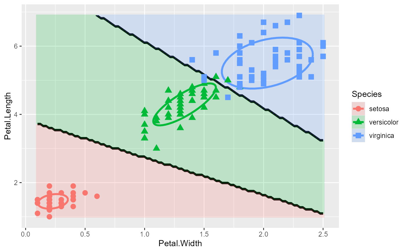
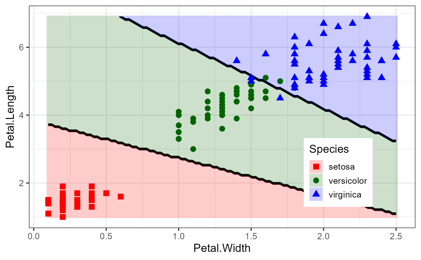
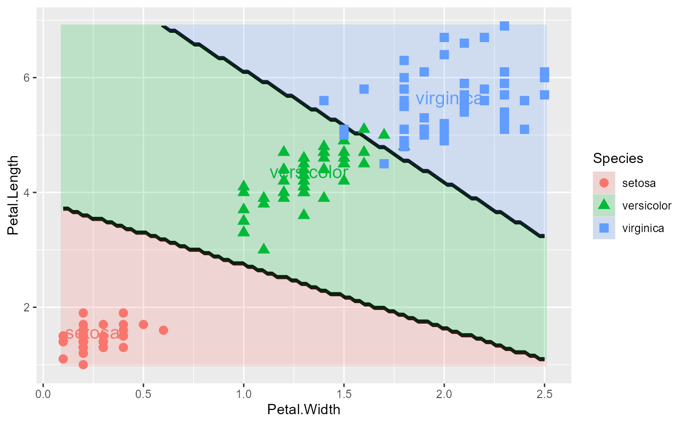
plot_discrim(iris.lda, Petal.Length ~ Petal.Width)
 # add data ellipses
plot_discrim(iris.lda, Petal.Length ~ Petal.Width,
ellipse = TRUE)
# add data ellipses
plot_discrim(iris.lda, Petal.Length ~ Petal.Width,
ellipse = TRUE)
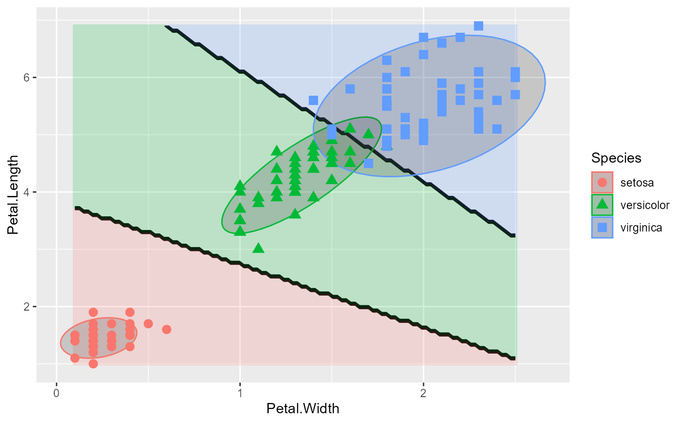
 # add filled ellipses with transparency
plot_discrim(iris.lda, Petal.Length ~ Petal.Width,
ellipse = TRUE,
ellipse.args = list(geom = "polygon", alpha = 0.2))
# add filled ellipses with transparency
plot_discrim(iris.lda, Petal.Length ~ Petal.Width,
ellipse = TRUE,
ellipse.args = list(geom = "polygon", alpha = 0.2))
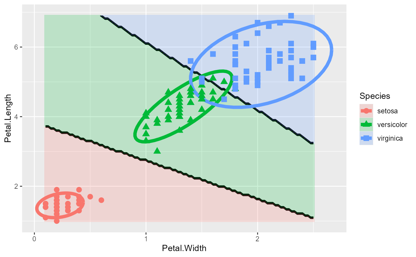
 # customize ellipse level and line thickness
plot_discrim(iris.lda, Petal.Length ~ Petal.Width,
ellipse = TRUE,
ellipse.args = list(level = 0.95, linewidth = 2))
# customize ellipse level and line thickness
plot_discrim(iris.lda, Petal.Length ~ Petal.Width,
ellipse = TRUE,
ellipse.args = list(level = 0.95, linewidth = 2))
 # without contours
# data ellipses
plot_discrim(iris.lda, Petal.Length ~ Petal.Width,
contour = FALSE)
# without contours
# data ellipses
plot_discrim(iris.lda, Petal.Length ~ Petal.Width,
contour = FALSE)
 # specifying `vars` as character names for x, y
plot_discrim(iris.lda, c("Petal.Width", "Petal.Length"))
# specifying `vars` as character names for x, y
plot_discrim(iris.lda, c("Petal.Width", "Petal.Length"))
 # Define custom colors and shapes, modify theme() and legend.position
iris.colors <- c("red", "darkgreen", "blue")
iris.pch <- 15:17
plot_discrim(iris.lda, Petal.Length ~ Petal.Width) +
scale_color_manual(values = iris.colors) +
scale_fill_manual(values = iris.colors) +
scale_shape_manual(values = iris.pch) +
theme_bw(base_size = 14) +
theme(legend.position = "inside",
legend.position.inside = c(.8, .25))
# Define custom colors and shapes, modify theme() and legend.position
iris.colors <- c("red", "darkgreen", "blue")
iris.pch <- 15:17
plot_discrim(iris.lda, Petal.Length ~ Petal.Width) +
scale_color_manual(values = iris.colors) +
scale_fill_manual(values = iris.colors) +
scale_shape_manual(values = iris.pch) +
theme_bw(base_size = 14) +
theme(legend.position = "inside",
legend.position.inside = c(.8, .25))
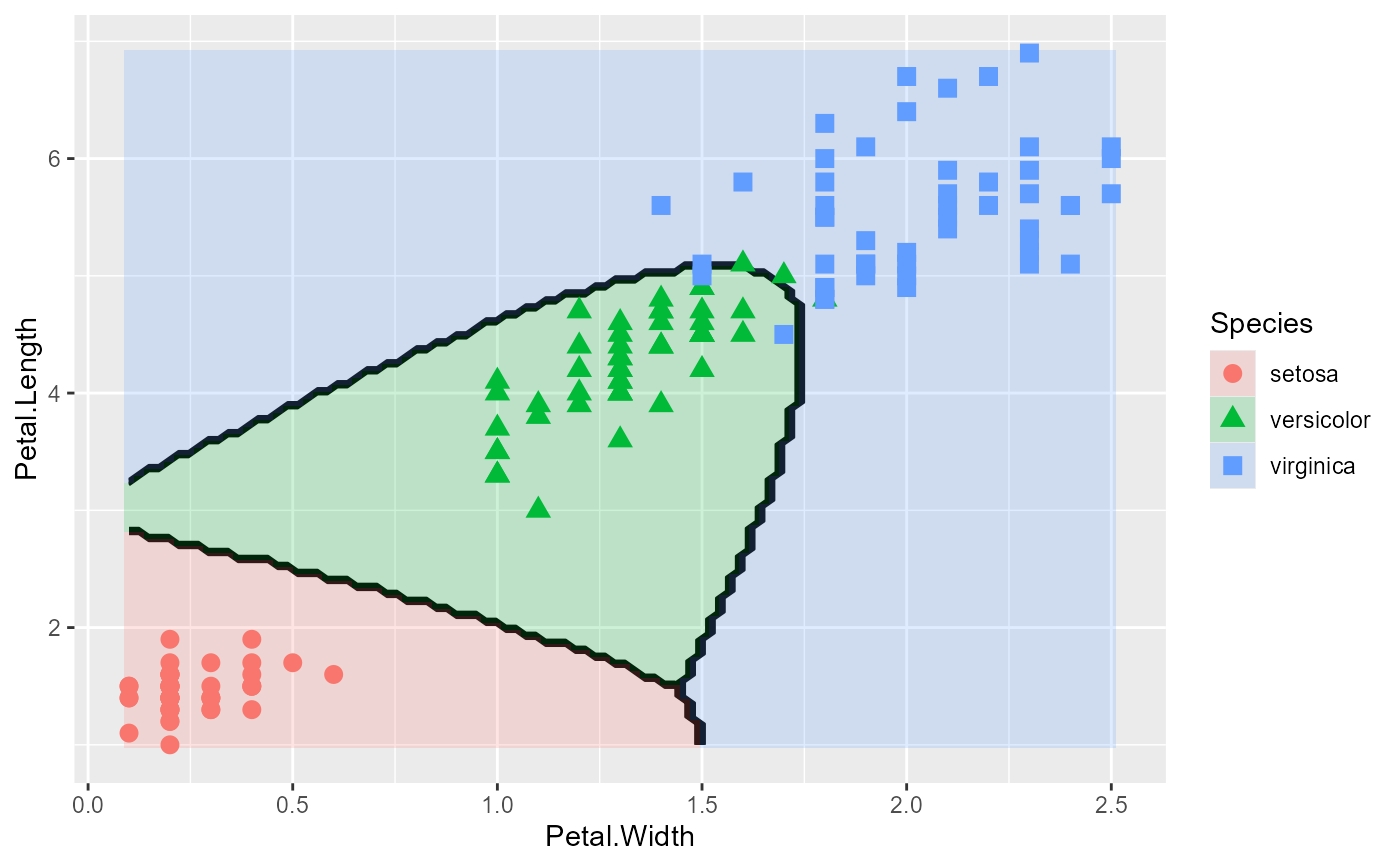
 # Quadratic discriminant analysis gives quite a different result
iris.qda <- qda(Species ~ ., iris)
plot_discrim(iris.qda, Petal.Length ~ Petal.Width)
# Quadratic discriminant analysis gives quite a different result
iris.qda <- qda(Species ~ ., iris)
plot_discrim(iris.qda, Petal.Length ~ Petal.Width)
 # Add class labels, with custom styling
plot_discrim(iris.lda, Petal.Length ~ Petal.Width,
labels = TRUE,
labels.args = list(geom = "label", size = 6, fontface = "bold"))
# Add class labels, with custom styling
plot_discrim(iris.lda, Petal.Length ~ Petal.Width,
labels = TRUE,
labels.args = list(geom = "label", size = 6, fontface = "bold"))
 # Add labels with position adjustments
plot_discrim(iris.lda, Petal.Length ~ Petal.Width,
labels = TRUE,
labels.args = list(nudge_y = 0.1, size = 5))
# Add labels with position adjustments
plot_discrim(iris.lda, Petal.Length ~ Petal.Width,
labels = TRUE,
labels.args = list(nudge_y = 0.1, size = 5))
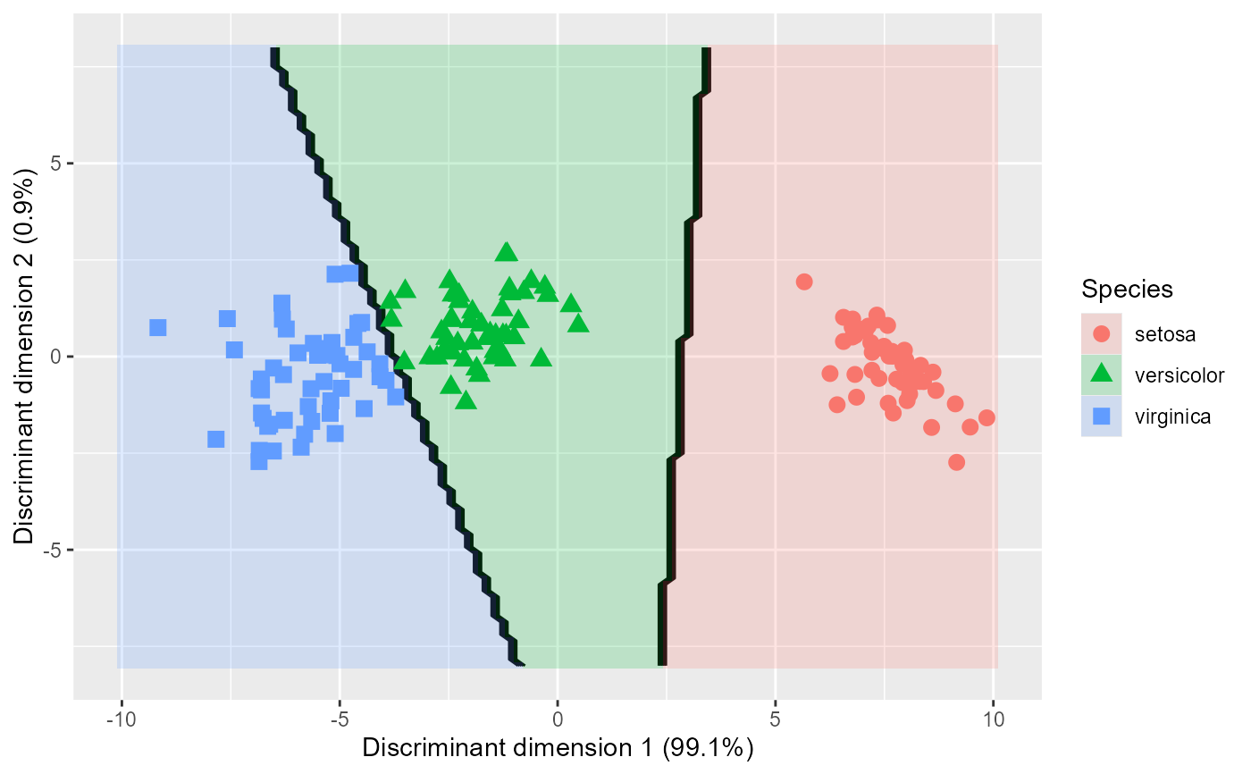
 # Plot in discriminant space
plot_discrim(iris.lda, LD2 ~ LD1)
# Plot in discriminant space
plot_discrim(iris.lda, LD2 ~ LD1)
 # Reverse the horizontal axis in discriminant space
plot_discrim(iris.lda, LD2 ~ LD1, rev.axes = c(TRUE, FALSE))
# Reverse the horizontal axis in discriminant space
plot_discrim(iris.lda, LD2 ~ LD1, rev.axes = c(TRUE, FALSE))
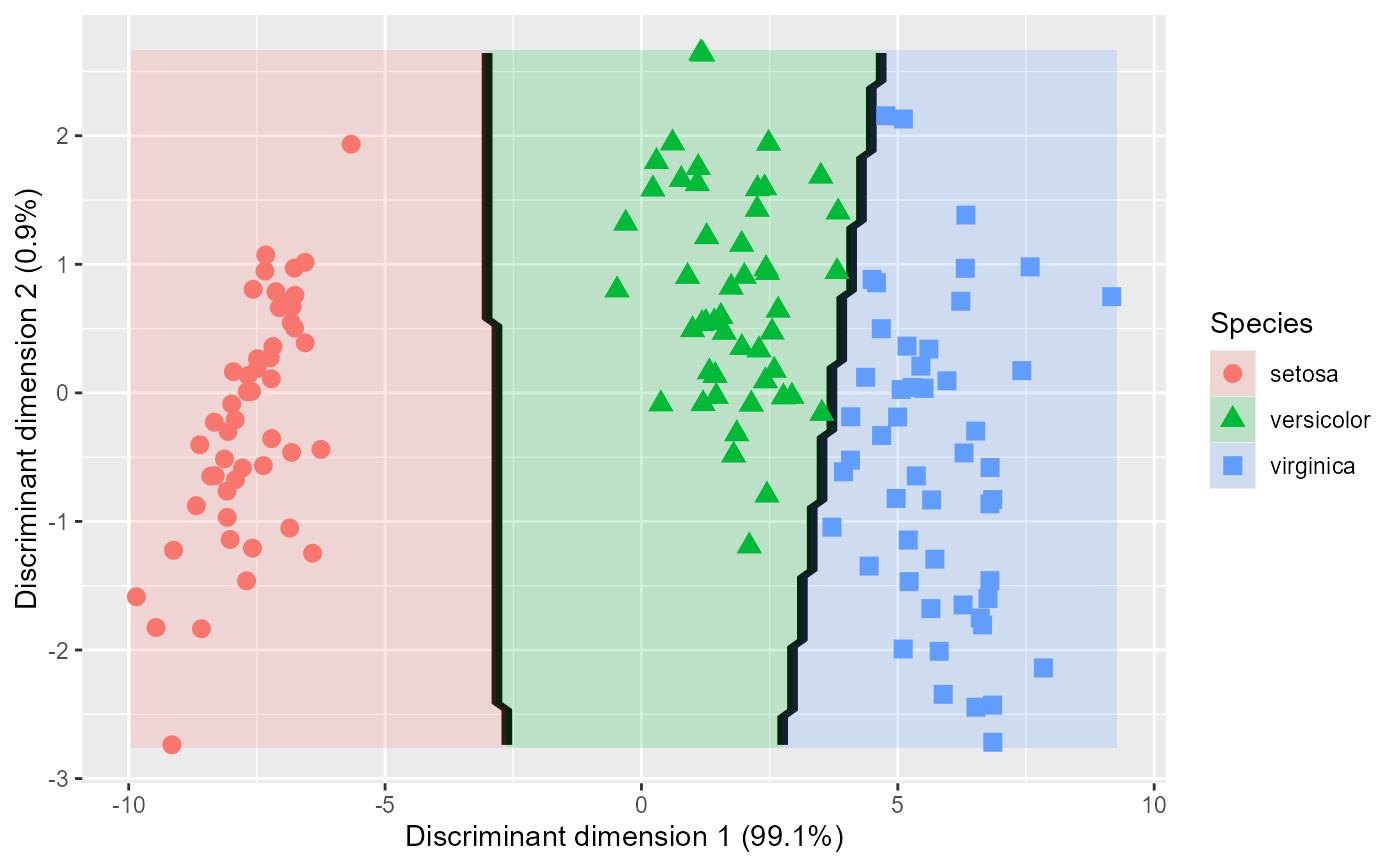 # Control axis limits
plot_discrim(iris.lda, LD2 ~ LD1,
xlim = c(-10, 10), ylim = c(-8, 8))
# Control axis limits
plot_discrim(iris.lda, LD2 ~ LD1,
xlim = c(-10, 10), ylim = c(-8, 8))