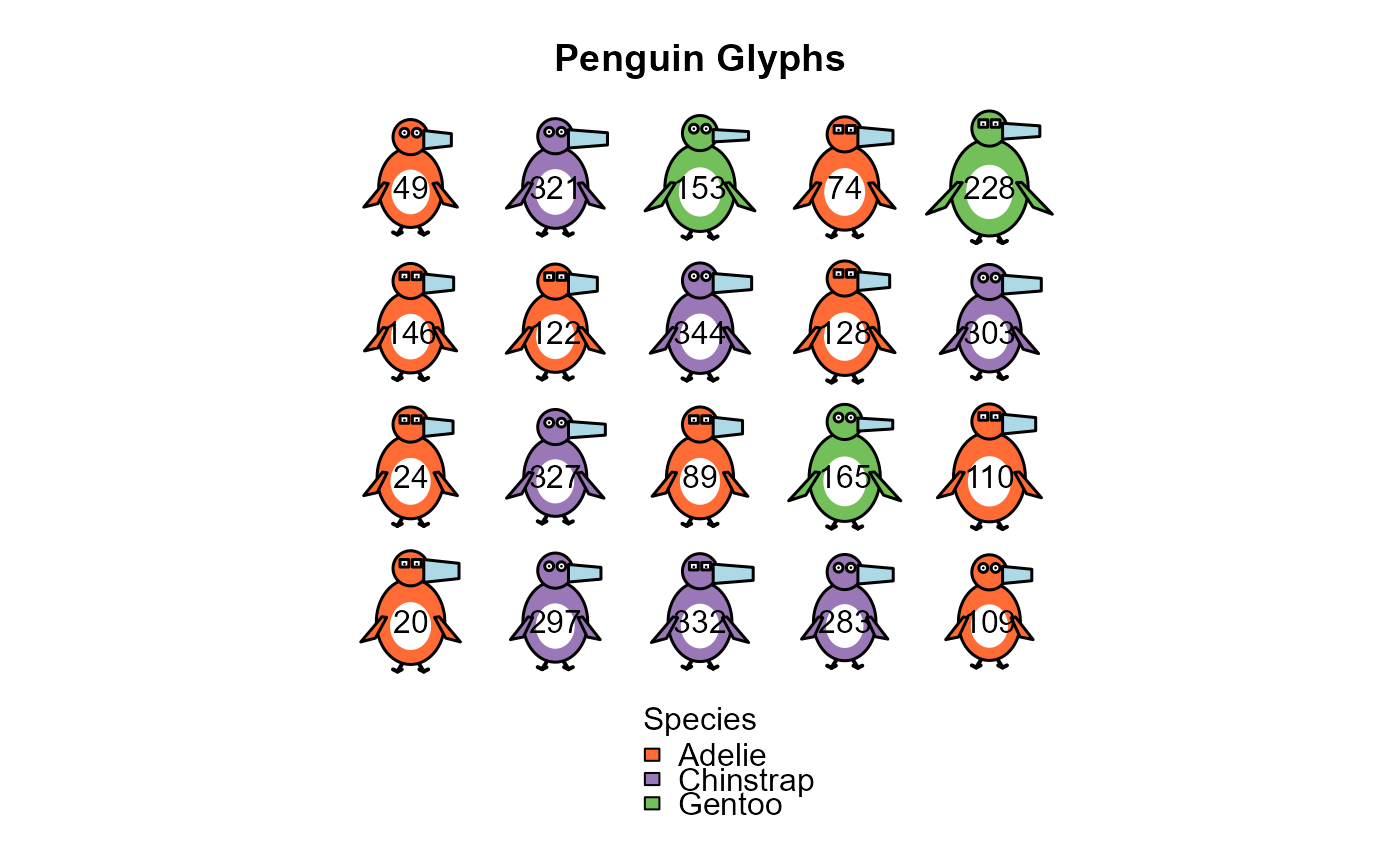
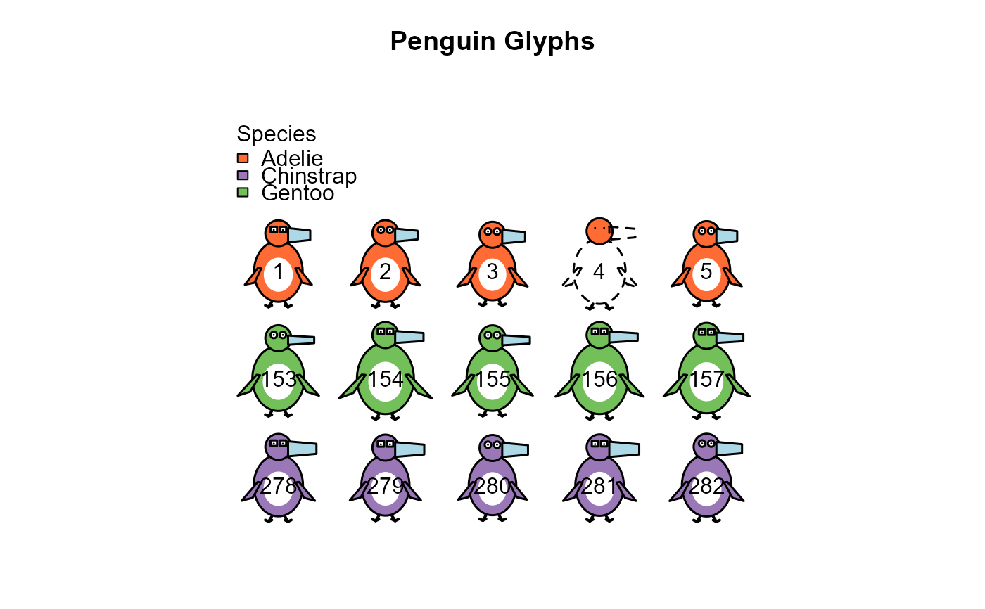
Visualizes multiple penguins as a grid of glyphs, automatically normalizing measurements to appropriate visual ranges. This function creates a complete plot with legend showing the mapping between data and visual features.
Usage
penguin_glyphs(
  data,
  bill_len = "bill_len",
  bill_dep = "bill_dep",
  flipper_len = "flipper_len",
  body_mass = "body_mass",
  species = "species",
  sex = "sex",
  ncol = 5,
  main = "Penguin Glyphs",
  legend = list(loc = "topleft", horiz = FALSE),
  ref = NULL,
  col = penguin_colors(),
  cex.lab = 1
)
Arguments
- data
Data frame with penguin measurements (typically datasets::penguins)
- bill_len
Column name for bill length (default "bill_len")
- bill_dep
Column name for bill depth (default "bill_dep")
- flipper_len
Column name for flipper length (default "flipper_len")
- body_mass
Column name for body mass (default "body_mass")
- species
Column name for species (default "species")
- sex
Column name for sex (default "sex")
- ncol
Number of columns in grid (default 5)
- main
Plot title (default "Penguin Glyphs")
- legend
List with legend parameters:
locfor location, one of the keywords "topleft", "top", "topright", "left", "right", "bottomleft", "bottom" or "bottomright", andhorizfor horizontal layout (TRUE/FALSE). Default islist(loc = "topleft", horiz = FALSE)- ref
Reference data frame, whose ranges of the measurement variables determine how they are scaled. With the default,
NULL, the ranges are those of the full datasets::penguins data, so that a given penguin is drawn the same way in any subset. A variable not found there is scaled by its range indata. Useref = datato scale all variables relative to the rows being plotted.- col
Named vector of body colors, with species as names. See
penguin_colors().- cex.lab
Character expansion for the ID labels in the glyphs (default 1)
Details
Each continuous variable is normalized to a scale of 0.7 to 1.3, relative
to its range in ref, to ensure visual differences are apparent but not extreme.
Row names from the data frame are displayed as IDs within each penguin glyph.
Missing values are shown as described in draw_penguin().
The legend is placed outside the grid of glyphs, on the side given by legend$loc.
The grid cells are square, so there is usually spare room either beside the grid or
above and below it. For a corner position such as "topleft", the legend goes beside
or above the grid, whichever leaves more room for the glyphs.
See also
penguin_points() to use the glyphs as point symbols in another plot
Examples
# Load the penguins dataset
data(penguins, package = "datasets")
# Visualize first 5 penguins in each species
which <- outer(1:5, c(0, 152, 277), FUN ="+") |> c()
penguin_glyphs(penguins[which,])
 # Sample random penguins
set.seed(42)
sampled_rows <- sample(1:nrow(penguins), size = 20)
penguin_glyphs(penguins[sampled_rows, ], main = "Random Penguin Glyphs")
# Sample random penguins
set.seed(42)
sampled_rows <- sample(1:nrow(penguins), size = 20)
penguin_glyphs(penguins[sampled_rows, ], main = "Random Penguin Glyphs")
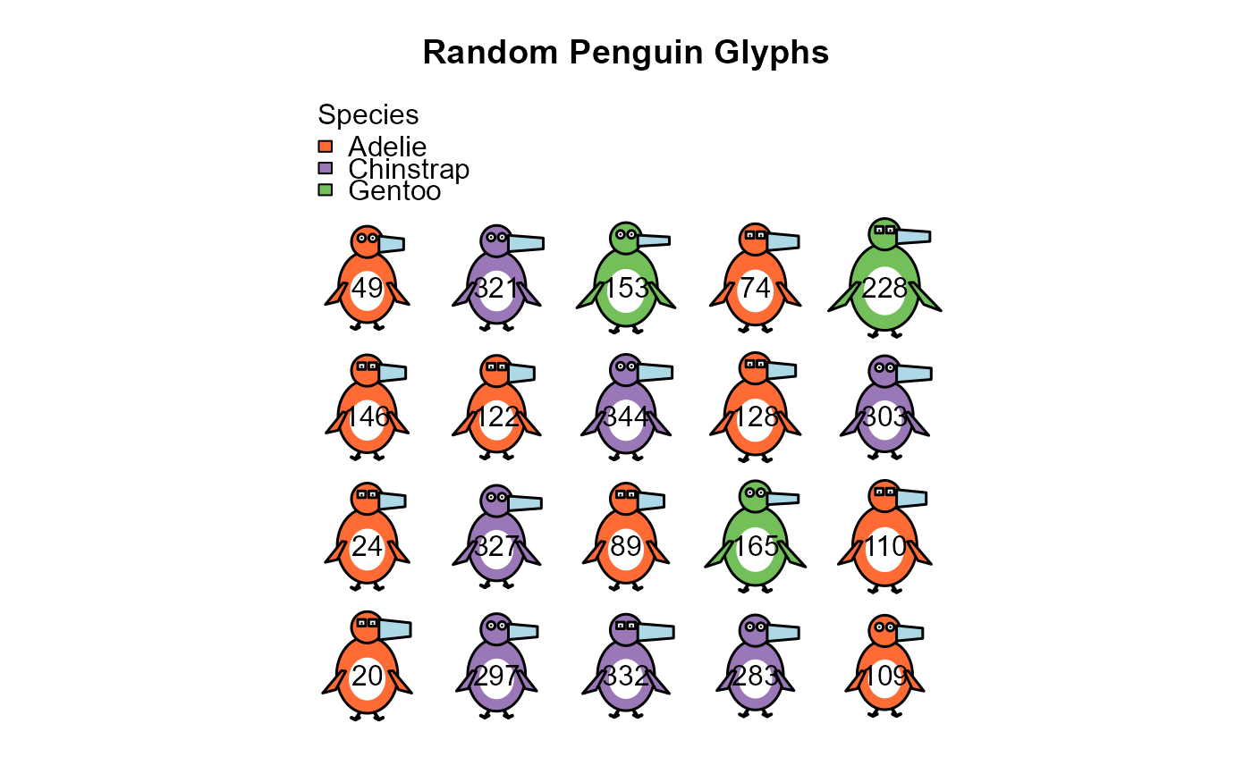 # Look at specific outliers, among the penguins with complete data.
# Renumbering the rows gives the same case numbers as in heplots::peng
peng <- na.omit(penguins)
rownames(peng) <- NULL
outliers <- c(10, 35, 283)
penguin_glyphs(peng[outliers,], main = "Notable Penguins")
# Look at specific outliers, among the penguins with complete data.
# Renumbering the rows gives the same case numbers as in heplots::peng
peng <- na.omit(penguins)
rownames(peng) <- NULL
outliers <- c(10, 35, 283)
penguin_glyphs(peng[outliers,], main = "Notable Penguins")
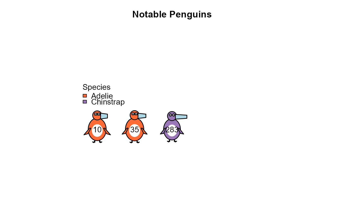 # Custom legend position
penguin_glyphs(penguins[sampled_rows, ],
legend = list(loc = "bottom", horiz = FALSE))
# Custom legend position
penguin_glyphs(penguins[sampled_rows, ],
legend = list(loc = "bottom", horiz = FALSE))