Resources
This page lists various resources for the course in general, as well as additional links or topics related to individual lectures beyond what is listed on the main course page. If you find a link that doesn’t work, or could be replaced by something better or more recent, please let me know by filing an issue.
General, tutorials
Royal Statistical Society Best Practices for Data Visualisation: Insights, advice, and examples (with code) to make data outputs more readable, accessible, and impactful. (The Quarto source text & examples for this are on Github.)
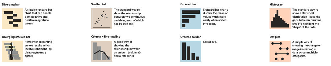
Financial Times Visual Vocabulary. A large cheatsheet poster for fining types of graphs to use for different purposes.
Checklist For Good Graphical Practice. From From: Gordon & Finch (2015), a useful set of questions and suggestions to apply to graphs designed for presentation purposes.
Twenty rules for good graphics. This post by Rob Hyndman, describes some best practices for producing graphs for journal publication.
British Ecological Society’s Guide to Reproducible Science. The guide proposes a simple reproducible project workflow, and a guide to organizing projects for reproducibility. The Programming section provides concrete tips and traps to avoid (example: use relative, not absolute pathnames), and the Reproducible Reports section provides a step-by-step guide for generating reports with R Markdown.
Books
Main texts
|
Colin Ware,
Information Visualization, 3rd Ed.
. What perceptual science has to say about data visualization, from a bottom-up perspective.
Course notes at http://ccom.unh.edu/vislab/VisCourse/index.html |
|
Alberto Cairo,
The Truthful Art
. Information graphics from a communication perspective.
Blog: http://www.thefunctionalart.com/ |
|
Claus Wilke, Fundamentals of Data Visualization . Well thought out, a wide range of topics, good practical advice, lots of examples. It was written entirely using R Studio and the `bookdown` package, and now online. |
More books I recommend
|
Michael Friendly & Howard Wainer, A History of Data Visualization and Graphic Communicantion . Everything you've ever wanted to know about the history of data visualization: Who did what, when and why.. |
|
Jen Christiansen, Building Science Graphics . An illustrated guide to communicating science through diagrams and visualizations. Beautifully illustrated itself, it outlines a process for creating graphics using evidence-based design strategies. |
|
Tamara Munzner,
Visualization Analysis & Design
. An attractive recent book combining computer science and design perspectives.
Web page at http://www.cs.ubc.ca/~tmm/vadbook/ with lots of illustrations and lectures |
|
Koponen & Hilden,
Handbook of Data Visualization
. A practical guide for creating compelling graphics to explain and explore data, primarily aimed at designers, journalists, researchers, analysts, and other professionals who want to learn the basics of visualization. Lovely illustrations!
Some content on Google books |
|
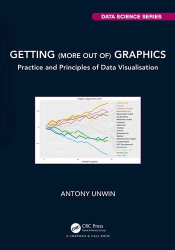
Antony Unwin,
Getting (More out of) Graphics
. A lovely collection of 25 case studies using ggplot2, followed by discussion of factors affecting understanding graphics.
The {GmooG} package contains datasets, and code for all figures available on GitHub |
|
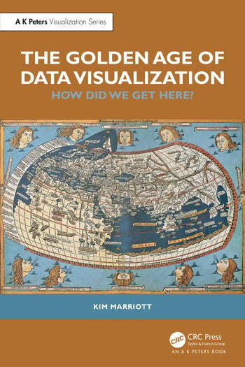
Kim Marriot, The Golden Age of Data Visualization . Traces the deep roots of data visualization from the earliest times to the present. A tour-de-force, meticulously researched. |
|
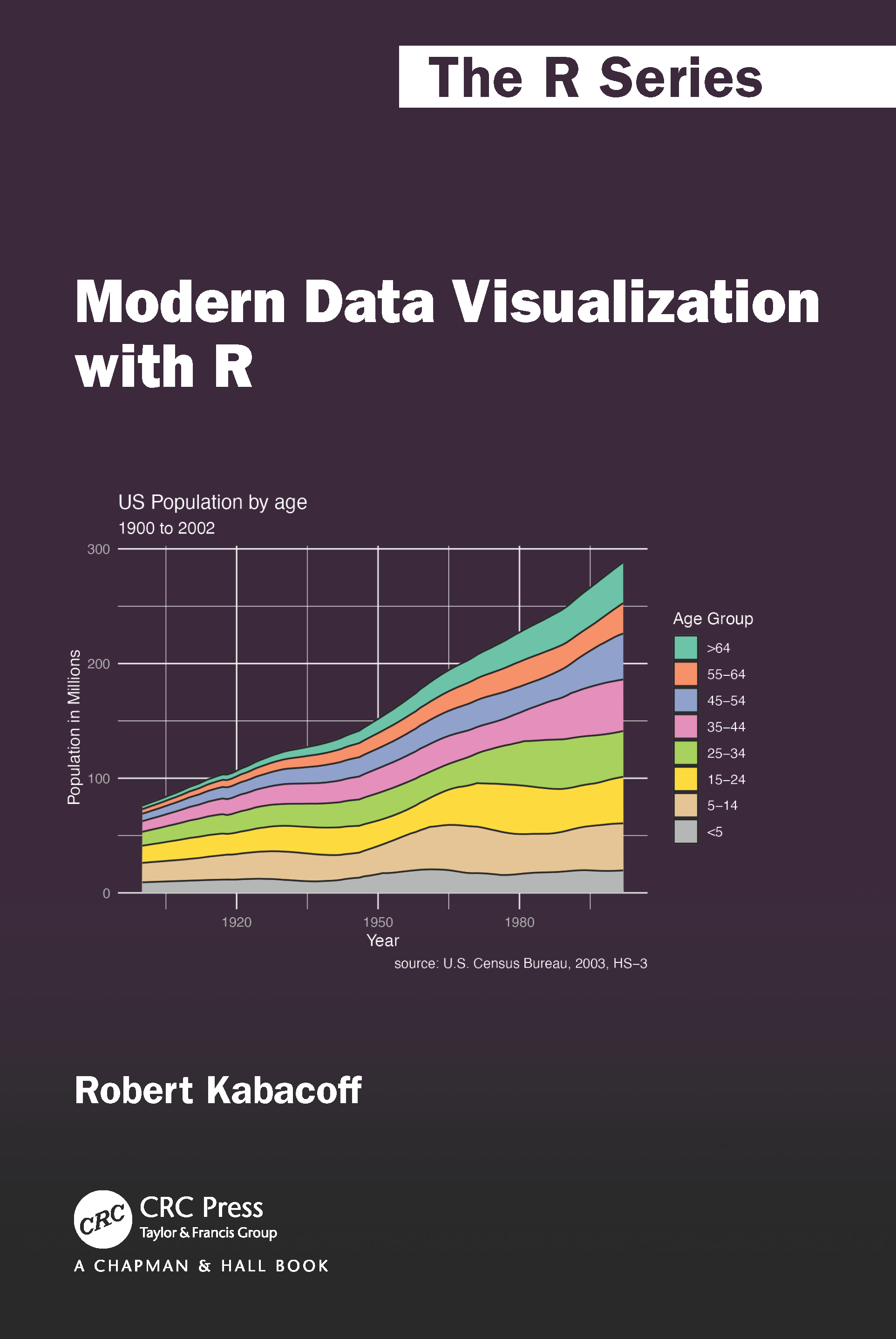
Robert Kabakoff, Modern Data Visualization with R . A comprehensive guide to creating data visualizations using R, mainly ggplot2, but also base R, and other tools. All R code and (non-package) data sets are available on GitHub |
Tufte Stufte
Four books by Edward Tufte largely defined the landscape for data visualization and information design.
|
|
|
|
Blogs & Web Resources
The following blogs are a rich source of information on visual design, data graphics and the history of data visualization.
|
My web site, http://datavis.ca . Contains the Milestone Project on the history of data vis, the Data Visualization gallery links to books, papers, courses, and software. |

|
Nathan Yau, http://flowingdata.com/ A large number of blog posts illustrating data visualization methods with tutorials on how do do these with R and other software. |

|
Kaiser Fung, http://junkcharts.typepad.com/ Fung discusses a variety of data displays and how they can be improved. |

|
A podcast on data visualization with Enrico Bertini and Moritz Stefaner, http://datastori.es/ . Interviews with over 100 graphic designers & developers. |

|
Kantar Information is Beautiful Awards https://www.informationisbeautifulawards.com Celebrates excellence and beauty in data visualizations,infographics, interactives & information art. |
|
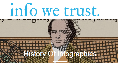
Raymond Andrews, http://infowetrust.com/ A visual storyteller delights with graphic stories from the history of data visualization. |
|
|
Andy Kirk, https://www.visualisingdata.com/blog/ Among other things, Kirk provides a monthly digest of his picks for the Best in Data Visualization. |

|
Data Visualization Teaching and Learning Materials, https://visualization.info/ A large collection of online texts, lecture notes, tutorials on data visualization. |
Additional session resources
These are additional resources related to weekly topics, many of which were originally suggested by former student Borzu Talaie (Thx!). Feel free to suggest other topics that can be added to these lists.
Session 1: Overview
Data Visualization Society Information is Beautiful Awards, 2023. A showcase of winners from the annual competitions.
Foundations of Data Visualization Cédric Scherer, Session 1 of a workshop, Designing Data Visualizations to Successfully Tell a Story
Graphical Gaffes by Ben Jones. A collection of What Not to Do in Graphics.
Scientific Amercan’s Best Science Graphics of 2023
Take a look at some of the visualizations selected by Andy Kirk as his picks for the Best visualizations in August 2021
How People Actually Lie With Charts. What makes a visualization misleading? Some awfully nice examples dealing with COVID-19 data.
Friends Don’t Let Friends. Friends don’t let friends make certain types of data visualization - What are they and why are they bad.
You can’t unsee it – the impact of a good visual for scientific data. A collection of high-impact infographics dealing with climate change.
Advanced Techniques in Lying Using Data Visualizations. Discover the power of chart design to manipulate an audience towards any narrative.
Why you sometimes need to break the rules in data viz. Best practices help us to avoid common pitfalls in data visualisation — but we shouldn’t follow them blindly.
Dishonest charts are coming from all directions, and they’re only going to hit harder. Nathan Yau provides an interactive self-defence guide: Defense Against Dishonest Charts
Session 2: Varieties Data Visualization
Financial Times Visual Vocabulary poster, showing examples of different chart types depending on what you want to show.
From Data to Viz. A decision tree of many chart types that tries to lead you to the most appropriate graph for your data. It links to the code to build it and lists common caveats you should avoid.
30 Day Chart Challenge This collection, currated by Cédric Scherer, contains examples of graphs and charts designed to show visualizations classified by type and topic. But, more generally, follow #30DayChartChallenge on Twitter.
Out of Sight, Out of Mind A great example in storytelling with data: history of drone strikes in Pakistan.
Five ways to effectively use animation in data visualization. A nice collection of examples of animation to enhance engagement, reveal trends, and help viewers track patterns across time and space.
COVIC A large collection of Covid-19 pandemic visualizations intended for teaching and research purposes.
Five ways to effectively use animation in data visualization
Session 3: History of Data Visualization
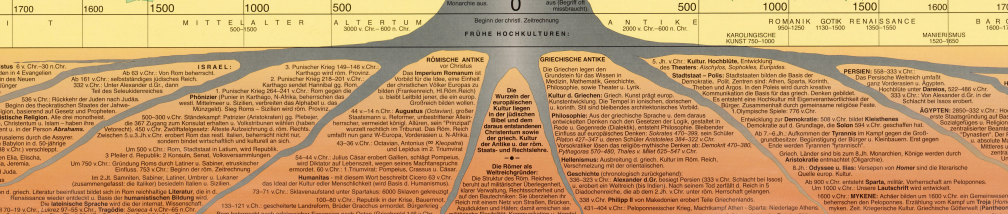
Album de Statistique Graphique A blog post by Richard Brath picks out some features in this remarkable series of statistical albums
Salomé Esteves The people DataViz’s history ignores: a step forward to an intersectional history of Data Visualization. An attempt to broaden the history of dataviz, recognizing women and people of color.
- Katharine Harmon The Map as Art. She also has another good book on maps called: You Are Here
Session 4: Graphical perception
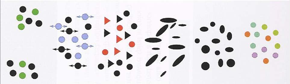
The Illusions Index is a fully searchable, curated collection of illusions. Warning: Some may blow your mind!
Captain Disillusion video CD Color. “The most important thing to know about color is that it doesn’t exist.”
Emil Hvitfeldt has compiled a Comprehensive list of color palettes available in R with examples of each.
McNutt, Stone & Heer, Color Buddy App. A GUI for choosing color palettes to meet various design considerations. Based on the paper Mixing Linters with GUIs: A Color Palette Design Probe
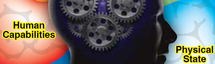
Session 5: Human Factors
Ben Schneiderman’s The Eight Golden Rules of Interface Design distills the vast corpus of user interface design into a few key principles.
How do we read pie charts? You might think you read pie charts by angle, but you don’t. Robert Kosera lays out some evidence in this Youtube video The Science of Pie Charts.
The New York Times You Draw It: How Family Income Predicts Children’s College Chances is an interactive app that asks you to draw what you think is the relationship between family income and percent of children who go to college. Robinson et al. Eye Fitting Straight Lines in the Modern Era use this to study how people fit lines to data points by eye.
Alan Lundgard & Arvind Satyanarayan Accessible Visualization via Natural Language Descriptions: A Four-Level Model of Semantic Content. Considers how to write figure captions or alt-text to better communicate and contextualize graph insights, and to improve their accessibility for readers with disabilities.
Nancy Organ An Incomplete Guide to Accessible Data Visualization
Dataviz Accessibility Resources lists a wealth of papers, blogs, software tools, etc. on data visualization accessibility
Accessible Visualization: Design Space, Opportunities, and Challenges. This paper gives a comprehensive survey of papers published for the last 20 years on visualization accessibility.
What to consider when choosing colors for race, ethnicity, and world regions. Some ideas for thinking about use of color in a social/emotional context.
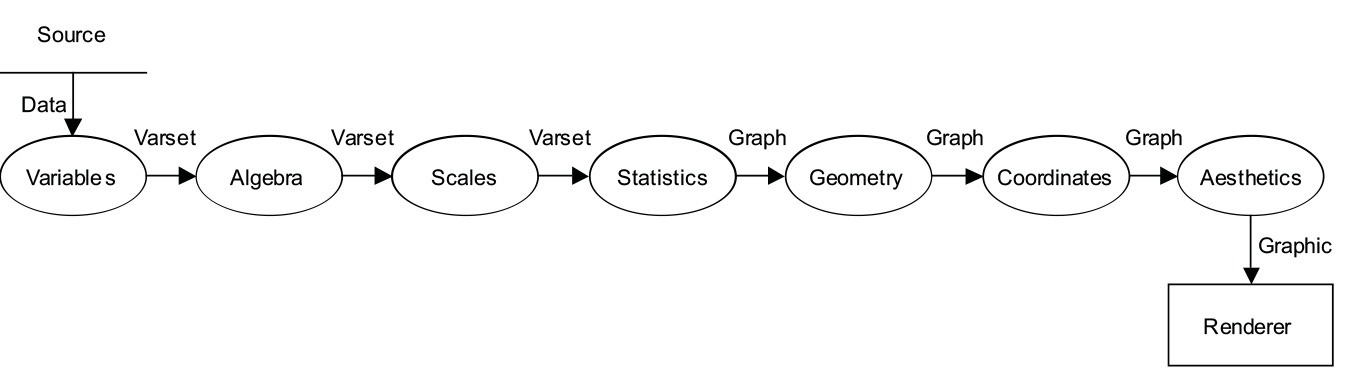
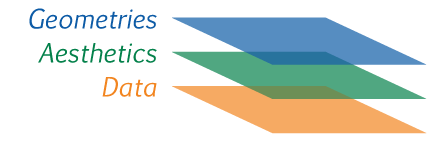
Session 6: The Language of Graphs
Claus Wilke, SDS 375/395 Data Visualization in R This is a comprehensive course in R graphics (mainly ggplot2 & friends), based on Wilke’s Fundamentals of Data Visualization.
Jer Thorp. National Geographic video: Numbers that paint the picture. Look for his OOH/AAH metaphors at the 8:20 marker.
Cole Nussbaumer: Storytelling with Data. For those interested in the narrative side of Dataviz
Raw graphics. A very good online resource to easily poke at your datasets.
The Johnny Cash Project. A very interesting project that used crowdsourcing like Amazon Mechanical Turk for its creative content.
Visualization of geographical data.. Chapter 1 has an overview of visual variables, as applied to mapping.
Session 7: ggplot2 basics
Grolemund, G. (2014). Hands-On Programming with R: Write Your Own Functions and Simulations. Online book that provides a good introduction to programming in R.
Andrew Heiss Data Visualization with R. A complete course on data visualization using
ggplot2and related packages. Contains lecture slides, examples, videos, and a whole lot more.Deepali Kank’s Tidy Tuesday 2023 collection of R scripts using
ggplot2andtidyverseprinciples to produce some lovely graphics. See the Tidy Tuesday Github site for details of the topics.Data Visualization and D3 A very good online resource (although a bit pricy) if you are interested in learning D3. Here is the course syllabus.
ggplot2 extensions - gallery. There are now > 130 additional packages that extend ggplot2 with new geoms, themes, data types, …
Sharon Machlis, 12 ggplot extensions for snazzier R graphics. For everything from styling text and customizing color palettes to creating your own geoms, these ggplot2 add-ons deserve a place in your R data visualization toolkit
Session 8: Going further in the tidyverse
Cédric Scherer Engaging and Beautiful Data Visualizations with ggplot2. A one-day workshop for those who already know a bit of ggplot2, but want to take their graphs to the next level.
Frank Harrell’s R Workflow, intended to foster best practices in reproducible data documentation and manipulation, statistical analysis, graphics, and reporting. Very complete, but relies heavily on Harrell’s Hmisc package.
Session 9: Visualizing Uncertainty
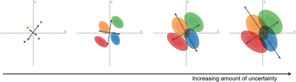
David Weiskopf Uncertainty Visualization: Concepts, Methods, and Applications in Biological Data Visualization
Cartography and Visualization: The Visualization of Uncertainty
Nathan Yau Visualizing the Uncertainty in Data
Matthew Kay Frequentist uncertainty visualization. Vignette from the ggdist package.
A great collection of uncertainty examples by Matthew Kay using the ggdist package.
Uncertainty Visualization Collective. A currated collection of different typoes of uncertainty visualizations.
Session 10: Data Journalism
Data Journalism Toolkit. A collection of tools to help journalists acquire, analyze, visualize, map, and otherwise make use of data in reporting.
Awesome data journalism. A curated list of publicly available, free/open source and open access resources for learning and doing data journalism.
Journalism in the Age of Data A very interesting video report on data as a storytelling medium – a bit outdated, but still holds some interesting content. (There is an annotated version, which requires Flashplayer)
Nate Silver is the guy behind the FiveThirtyEight website. Trained as a statistician, he predicted Obama’s win in 2008! See his book: The Signal and the Noise: Why So Many Predictions Fail – but Some Don’t
Swing-O-Matic: How Demographics Will Shape The 2016 Election
Krisztina Szucs – a quick analysis on two of her projects by Angela Nobel Borzu: I really like her work on the frequency of the spread of diseases
How Music Taste Evolved (by the Pudding). Borzu: In my opinion, this project is one of the most engaging dataviz projects in terms of storytelling. Enjoy!
Data Journalism With R and the Tidyverse. An online book covering data capture, cleaning, analysis and reporting from the perspective of data journalism.
Hans Rosling: 200 years in 4 minutes – another example/approach in storytelling with data
Mark Corcoran: Satellite Journalism – The Big Picture
Software for graphics in R
|
At http://visiphilia.org/ statisticians Di Cook and Heike Hofmann from Iowa State University blog about data visualization topics, using R |

|
https://www.r-bloggers.com/ A large collection of posts on R news and tutorials by over 750 R bloggers. |
|
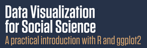
Kieran Healy, http://socviz.co/ Data Visualization for Social Science: A practical introduction with R and ggplot2. |
|
DataVis Catalog, https://datavizcatalogue.com/blog/ Extended discussions of variations of a given chart type. |
R
My install-packages.R R script, to install the most useful packages for this course.
R Studio cheatsheets. A handy collection of cheat sheets for R, R Studio and a number of the most useful R packages.
R for Social Scientists. A short course introduction to R, covering also data wrangling with
dplyrandtidyr, graphics withggplot2, using Rmarkdown for documents, …Happy git and github for the useR provides a good overview of how to use Git and GitHub in conjunction with an R-based workflow.
A primer on web scraping with R by Simon Munzert. Includes slides from a workshop and lots of links to resources.
Flipbook introduction to ggplot2 by Gina Reynolds. An introduction to
ggplot2showing the effect of each bit of code for a plot.
Presentation/project ideas
Here are a few ideas (in no particular order) for the course presentation or project:
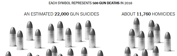
Winners of the ASA Police Data Challenge student visualization contest. The American Statistical Association teamed up with the Police Data Initiative, which provides open data from local law enforcement agencies in the US, to create a competition for high school and college students to analyze crime data from Baltimore, Seattle and Cincinnati. Explore some data and create your own visualization.
Somewhat related, OpenIntro maintains a large set of datasets, one of which details Fatal police shootings by on-duty officers since Jan. 2015. Collected by the Washington Post. This includes 6400 incidents, with many variables on the nature of the incident and the age, race, sex of the victim.
The 50 Most Influential Living Psychologists. This page gives brief biographies of a collection of 50 living psychologists called the most influential in the world. How can this collection be visualized in terms of their attributes (area of psychology, age, gender, …)? You’ll need to scrape the data from the web page. Here is a start on that:
library(rvest)
library(stringr)
url <- "https://thebestschools.org/features/most-influential-psychologists-world/"
page <- read_html(url)
items <- page %>% html_nodes("h3") %>% html_text()
items <- items[grep("More", items, invert=TRUE)]
items <- sub("^\\d+\\. ", "", items, perl=TRUE)
Graphical inference for Info Vis. Wickham et al. (2010) describe a graphical “lineup” technique for doing statistical inference with graphs and human judges. Do a literature review of this topic and design a possible experimental use of this technique. There is an R package, nullabor with this vignette for contstructing such graphical displays.
Best practices for research presentations using data graphics: How to best communicate your results in a conference presentation or in a poster?
Redesigning maps for usability: One of the best early examples is Harry Beck’s London Tube Map, which has become iconic. But there have been many other additions to the literature on this topic. Some local examples of maps that could use a design-overhaul are:
- The Toronto PATH map, showing the 30 km of walkways underneath a large part of the dpowntown core.
- The York Campus Map, showing all buildings on the Keele Campus.
Language of Graphs: Characteristics of different computer languages for graphics, including aspects of syntax, semantics and expressive power. See me for some pointers and references.
- Nicolas Kruchten Metrics for Reasoning About the Usability of Visualization Notations
Online experiments: More and more psychologists are using computer-controlled methods of data collection, either with specific software for personal computers or with web-based or cloud-based application. Some of these use graphics, either for stimulus presentation or for displaying results.
Measures of graph literacy: In many studies of graph perception, it is useful to measure a construct of ability to understand graphic information (“graph literacy”). What is the state of the art on this topic?
Michael Correll The Mythos of Visualization Literacy
Lee et al. VLAT : Development of a Visualization Literacy Assessment Test
Mirta Galesic Graph Literacy: A Cross-Cultural Comparison
Vividness of Visual Imagery Questionnaire. A 16-item scale that tests the vividness with which you can see people, objects, or settings in your mind’s eye. You can take this online.
Related: Aphantasia - inability to “see” mental images, and some scales for measuring the same.
Accessibility: Making graphics accessible to the visually impaired. A simple example is ALT text, now increasingly used. Are there standards or tools available? See the links under Human factors above.
- Somewhat related: Data sonification & haptics– using sound and other modalities, e.g., Loud Numbers; the Data Sonification Archive; Google’s TwoTone, a free open-source web app to turn data into music
- Erie: A Declarative Grammar for Data Sonification. Describes how a sonification maps data variables to sound variables like time, pitch, and volume. E.g., an auditory histogram can map bins to time and the count to pitch.
Social / Equity Do No Harm: Applying Equity Awarenes in Data Visualization
Other dataviz & graphic software:
- Observable, a dynamic, extensible graphics system built on D3, a free, open-source JavaScript library for visualizing data
- Figma, a graphic design system, often used to “gussy-up” plots done with R.
- Python graphics libraries: plotnine, an
implementation of a grammar of graphics in Python based on
ggplot2. There are many other Python libraries for data visualization: matplotlib, plotly, …
Data physicalization: representation of data by physical objects
- Opportunities and Challenges for Data Physicalization
- Data physicalization wiki. A collection of links and resources on the topic.
- Making with Data: Physical Design and Craft in a Data-Driven World. an edited book on the topic.
Copyright © 2018 Michael Friendly. All rights reserved. || lastModified :
friendly AT yorku DOT ca
 orcid.org/0000-0002-3237-0941