Vignette built using heplots, version 1.8.1
and candisc, version 1.1.0.
Multivariate Multiple Regression Designs
The ideas behind HE plots extend naturally to multivariate multiple regression (MMRA) and multivariate analysis of covariance (MANCOVA). In MMRA designs, the \(\mathbf{X}\) matrix contains only quantitative predictors, while in MANCOVA designs, it contains a mixture of factors and quantitative predictors (covariates), but typically there is just one “group” factor.
In the MANCOVA case, there is often a subtle difference in emphasis: true MANCOVA analyses focus on the differences among groups defined by the factors, adjusting for (or controlling for) the quantitative covariates. Analyses concerned with homogeneity of regression focus on quantitative predictors and attempt to test whether the regression relations are the same for all groups defined by the factors.
1 Rohwer data: Aptitude and achievement
To illustrate the homogeneity of regression flavor, we use data from a study by Rohwer (given in Timm (1975), Ex. 4.3, 4.7, and 4.23) on kindergarten children, designed to determine how well a set of paired-associate (PA) tasks predicted performance on measures of achievement:
- the Peabody Picture Vocabulary test (
PPVT), - a student achievement test (
SAT), and - the Raven Progressive matrices test (
Raven).
The PA tasks were considered measures of learning aptitude and
varied in how the stimuli were presented, and are called named (n), still (s), named still (ns),
named action (na), and sentence still (ss).
Two groups were tested: a group of \(n=37\) children from a low socioeconomic
status (SES) school, and a group of \(n=32\) high SES children from an
upper-class, white residential school. The data are in the data frame
Rohwer in the heplots package:
data(Rohwer)
Rohwer |> dplyr::sample_n(6)
#>    group SES SAT PPVT Raven n  s ns na ss
#> 31     1  Lo   9   63    11 2 12  5 25 14
#> 7      1  Lo   6   71    21 0  1 20 23 18
#> 18     1  Lo  45   54    10 0  6  6 14 16
#> 17     1  Lo  19   66    13 7 12 21 35 27
#> 50     2  Hi   4   87    14 1  4 14 25 19
#> 59     2  Hi  36   89    15 1  6 15 23 28
1.1 Preliminary plots
Before fitting models, it is usually useful to do some data exploration and graphing. With multivariate multiple regression data, among the most helpful plots are scatterplots of each response variable, Y, against each predictor, X, and we can get a better sense of the relationships by adding linear regression lines, loess smooths or other enhancements.
A scatterplot matrix, using graphics::pairs() or GGally::ggpairs() is easy to do.
However, with 3 response variables, 4 predictors and a group factor (SES), this can
be overwhelming. An alternative is to compose a rectangular matrix of plots for
only the Y variables against the Xs.
This turned out to be not as easy as it might seem, because none of the pairs() methods
allow for this possibility. The trick is to reshape the data from wide to long format
and use facets in ggplot2 to compose the pairwise scatterplots into the desired
rectangular matrix format.
library(tidyr)
library(dplyr)
library(ggplot2)

yvars <- c("SAT", "PPVT", "Raven" )      # outcome variables
xvars <- c("n", "s", "ns", "na", "ss")   # predictors
xvars <- c("n", "s", "ns")               # make a smaller example

Rohwer_long <- Rohwer %>%
  dplyr::select(-group, -na, -ss) |>
  tidyr::pivot_longer(cols = all_of(xvars),
                      names_to = "xvar", values_to = "x") |>
  tidyr::pivot_longer(cols = all_of(yvars),
                      names_to = "yvar", values_to = "y") |>
  dplyr::mutate(xvar = factor(xvar, levels = xvars),
                yvar = factor(yvar, levels = yvars))
Rohwer_long
#> # A tibble: 621 × 5
#>    SES   xvar      x yvar      y
#>    <fct> <fct> <int> <fct> <int>
#>  1 Lo    n         1 SAT      49
#>  2 Lo    n         1 PPVT     48
#>  3 Lo    n         1 Raven     8
#>  4 Lo    s         2 SAT      49
#>  5 Lo    s         2 PPVT     48
#>  6 Lo    s         2 Raven     8
#>  7 Lo    ns        6 SAT      49
#>  8 Lo    ns        6 PPVT     48
#>  9 Lo    ns        6 Raven     8
#> 10 Lo    n         5 SAT      47
#> # ℹ 611 more rows
Then, we can use ggplot2 to make produce the pairwise plots for each combination of x and y variables. Using color=SES in the aesthetic results in a separate regression line for
the two SES groups produced by geom_smooth().
ggplot(Rohwer_long, aes(x, y, color = SES, shape = SES)) +
  geom_jitter(size=1.5) +
  geom_smooth(method = "lm",
              se = FALSE,
              formula = y ~ x,
              size=1.5) +
  facet_grid(yvar ~ xvar,            # plot matrix of Y by X
             scales = "free") +
  theme_bw(base_size = 16) +
  theme(legend.position = "bottom")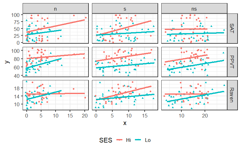
Figure 1.1: Plot matrix of the response variables (SAT, PPVT and Raven) against each of three predictors (n, s, ns). The lines show separate linear regressions for each SES group.
Such plots form a framework for understanding model fits and statistical tests we turn to now.
1.2 Separate models
As one approach, we might be tempted to fit separate regression models for each of the High and Low SES groups. This approach is not generally recommended because it lacks power (smaller sample sizes in each group than a combined analysis) and does not allow hypotheses about equality of slopes and intercepts to be tested directly.
rohwer.ses1 <- lm(cbind(SAT, PPVT, Raven) ~ n + s + ns + na + ss, data=Rohwer,
                  subset=SES=="Hi")
Anova(rohwer.ses1)
#>
#> Type II MANOVA Tests: Pillai test statistic
#>    Df test stat approx F num Df den Df Pr(>F)
#> n   1     0.202     2.02      3     24 0.1376
#> s   1     0.310     3.59      3     24 0.0284 *
#> ns  1     0.358     4.46      3     24 0.0126 *
#> na  1     0.465     6.96      3     24 0.0016 **
#> ss  1     0.089     0.78      3     24 0.5173
#> ---
#> Signif. codes:  0 '***' 0.001 '**' 0.01 '*' 0.05 '.' 0.1 ' ' 1

rohwer.ses2 <- lm(cbind(SAT, PPVT, Raven) ~ n + s + ns + na + ss, data=Rohwer,
                  subset=SES=="Lo")
Anova(rohwer.ses2)
#>
#> Type II MANOVA Tests: Pillai test statistic
#>    Df test stat approx F num Df den Df Pr(>F)
#> n   1    0.0384     0.39      3     29  0.764
#> s   1    0.1118     1.22      3     29  0.321
#> ns  1    0.2252     2.81      3     29  0.057 .
#> na  1    0.2675     3.53      3     29  0.027 *
#> ss  1    0.1390     1.56      3     29  0.220
#> ---
#> Signif. codes:  0 '***' 0.001 '**' 0.01 '*' 0.05 '.' 0.1 ' ' 1
This fits separate slopes and intercepts for each of the two groups, but it is difficult to compare the coefficients numerically.
coef(rohwer.ses1)
#>                  SAT     PPVT    Raven
#> (Intercept) -28.4675 39.69709 13.24384
#> n             3.2571  0.06728  0.05935
#> s             2.9966  0.36998  0.49244
#> ns           -5.8591 -0.37438 -0.16402
#> na            5.6662  1.52301  0.11898
#> ss           -0.6227  0.41016 -0.12116
coef(rohwer.ses2)
#>                  SAT     PPVT    Raven
#> (Intercept)  4.15106 33.00577 11.17338
#> n           -0.60887 -0.08057  0.21100
#> s           -0.05016 -0.72105  0.06457
#> ns          -1.73240 -0.29830  0.21358
#> na           0.49456  1.47042 -0.03732
#> ss           2.24772  0.32396 -0.05214
The function heplots::coefplot() makes this a bit easier, by plotting bivariate confidence ellipses for the
coefficients in a multivariate linear model. In this problem, with three response variables,
the 95% confidence regions are 3D ellipsoids, but we only plot them in 2D.
The 3D versions have the property that a given predictor is significant by a multivariate test if
the ellipsoid excludes the point (0, 0, 0).
coefplot(rohwer.ses1, fill=TRUE, cex.label=1.5, cex.lab=1.5)
text(-10, 3, "High SES group", pos=4, cex=1.4)

coefplot(rohwer.ses2, fill=TRUE, cex.label=1.5, cex.lab=1.5)
text(-4.7, 2.5, "Low SES group", pos=4, cex=1.4)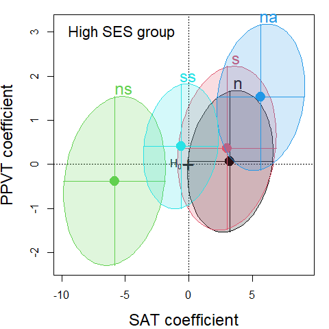
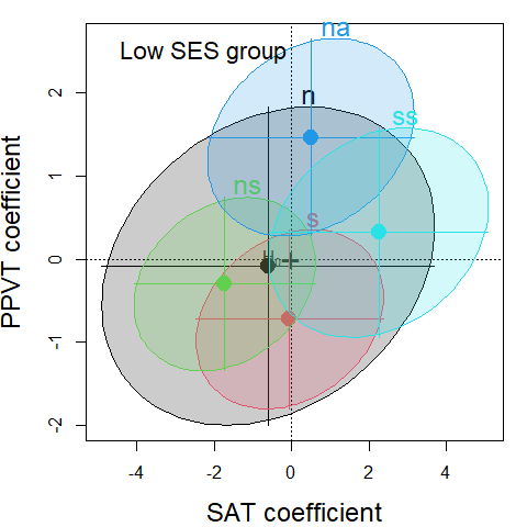
Figure 1.2: Coefficient plots for the separate models for the High and Low SES groups in the Rohwer data. The ellipses are 95% confidence regions for the pairs of regression coefficients of (SAT, PPVT) for each predictor in the model.
Alternatively, we can visualize the results of the multivariate tests for the predictors
with HE plots. Here we make use of the fact
that several HE plots can be overlaid using the option add=TRUE
as shown in Figure 1.3.
heplot(rohwer.ses1,
       ylim=c(40,110),                        # allow more room for 2nd plot
       col=c("red", "black"),
       fill = TRUE, fill.alpha = 0.1,
       lwd=2, cex=1.2)
heplot(rohwer.ses2,
       add=TRUE,
       col=c("brown", "black"),
       grand.mean=TRUE, error.ellipse=TRUE,   # not shown by default when add=TRUE
       fill = TRUE, fill.alpha = 0.1,
       lwd=2, cex=1.2)
# label the groups at their centroid
means <- aggregate(cbind(SAT,PPVT)~SES, data=Rohwer,  mean)
text(means[,2], means[,3], labels=means[,1], pos=3, cex=2, col="black")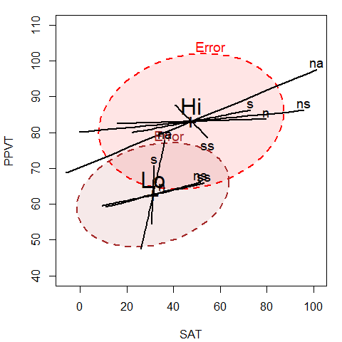
Figure 1.3: HE plot for SAT and PPVT, showing the effects for the PA predictors for the High and Low SES groups separately
We can readily see the difference in means for the two SES groups (Hi has greater scores on both variables)
and it also appears that the slopes of the predictor ellipses are shallower for the High
than the Low group, indicating greater relation with the SAT score.
1.3 MANCOVA model
Alternatively (and optimistically), we can fit a MANCOVA model that allows different means for the two SES groups on the responses, but constrains the slopes for the PA covariates to be equal.
# MANCOVA, assuming equal slopes
Rohwer.mod <- lm(cbind(SAT, PPVT, Raven) ~ SES + n + s + ns + na + ss,
                 data=Rohwer)
Anova(Rohwer.mod)
#>
#> Type II MANOVA Tests: Pillai test statistic
#>     Df test stat approx F num Df den Df  Pr(>F)
#> SES  1     0.379    12.18      3     60 2.5e-06 ***
#> n    1     0.040     0.84      3     60  0.4773
#> s    1     0.093     2.04      3     60  0.1173
#> ns   1     0.193     4.78      3     60  0.0047 **
#> na   1     0.231     6.02      3     60  0.0012 **
#> ss   1     0.050     1.05      3     60  0.3770
#> ---
#> Signif. codes:  0 '***' 0.001 '**' 0.01 '*' 0.05 '.' 0.1 ' ' 1
Note that, although the
multivariate tests for two of the covariates (ns and na)
are highly significant, univariate multiple regression tests for the
separate responses [from summary(Rohwer.mod)] are relatively weak.
We can also test the global 5 df hypothesis, \(\mathbf{B}=\mathbf{0}\),
that all covariates have null effects
for all responses as a linear hypothesis.
First, extract the names
of the PA tests predictors from the model.
car::linearHypothesis() takes a vector of the names coefficients to be tested simultaneously.
covariates  <- c("n", "s", "ns", "na", "ss")
# or: covariates <- rownames(coef(Rohwer.mod))[-(1:2)]
Regr <- linearHypothesis(Rohwer.mod, covariates)
print(Regr, digits=4, SSP=FALSE)
#>
#> Multivariate Tests:
#>                  Df test stat approx F num Df den Df   Pr(>F)
#> Pillai            5    0.6658    3.537     15    186 2.31e-05 ***
#> Wilks             5    0.4418    3.812     15    166 8.28e-06 ***
#> Hotelling-Lawley  5    1.0309    4.032     15    176 2.79e-06 ***
#> Roy               5    0.7574    9.392      5     62 1.06e-06 ***
#> ---
#> Signif. codes:  0 '***' 0.001 '**' 0.01 '*' 0.05 '.' 0.1 ' ' 1
Then 2D views of the
additive MANCOVA model Rohwer.mod and the overall test for all covariates
are produced as follows, giving the plots in Figure 1.4.
colors <- c("red", "blue", rep("black",5), "#969696")
heplot(Rohwer.mod,
       col=colors, variables=c(1,2),
       hypotheses=list("Regr" = covariates),
       fill = TRUE, fill.alpha = 0.1,
       cex=1.5, lwd=c(2, rep(3,5), 4),
       main="(SAT, PPVT) in Rohwer MANCOVA model")

heplot(Rohwer.mod,
       col=colors,  variables=c(1,3),
       hypotheses=list("Regr" = covariates),
       fill = TRUE, fill.alpha = 0.1,
       cex=1.5, lwd=c(2, rep(3,5), 4),
       main="(SAT, Raven) in Rohwer MANCOVA model")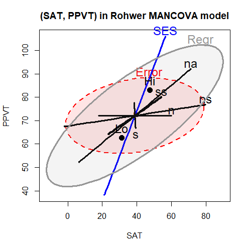
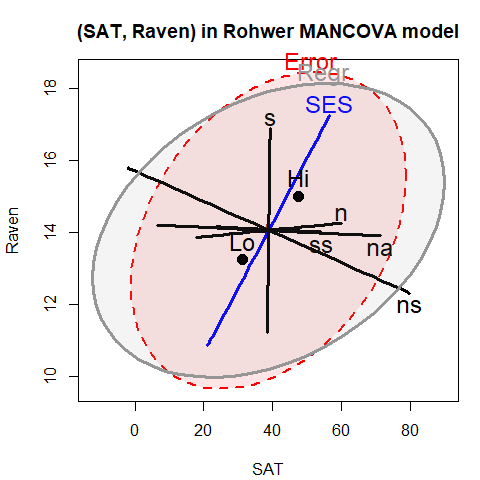
Figure 1.4: HE plot for SAT and PPVT (left) and for SAT and Raven (right) using the MANCOVA model. The ellipses labeled ‘Regr’ show the test of the overall model, including all predictors.
The positive orientation of the Regr ellipses shows that the predicted
values for all three responses are positively correlated (more so for
SAT and PPVT). As well, the High SES group
is higher on all responses than the Low SES group.
Alternatively, all pairwise plots among these responses could be drawn using
the pairs.mlm() function,
pairs(Rohwer.mod, col=colors,
      hypotheses=list("Regr" = c("n", "s", "ns", "na", "ss")),
      cex=1.3, lwd=c(2, rep(3,5), 4))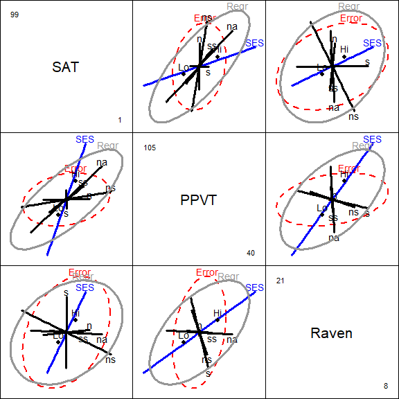
or as a 3D plot, using heplot3d() as shown in Figure 1.5.
colors <- c("pink", "blue", rep("black",5), "#969696")
heplot3d(Rohwer.mod, col=colors,
    hypotheses=list("Regr" = c("n", "s", "ns", "na", "ss")))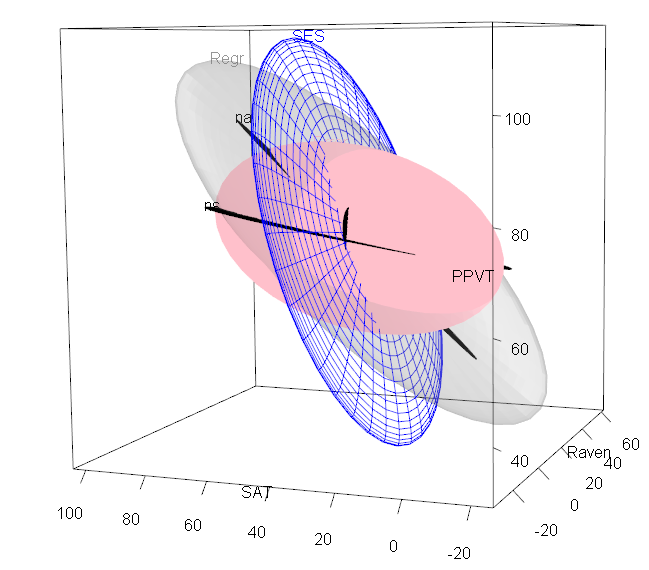
Figure 1.5: 3D HE plot for the MANCOVA model fit to the Rohwer data.
1.4 Testing homogeneity of regression
The MANCOVA model, Rohwer.mod, has relatively simple interpretations
(large effect of SES, with ns and na as the major predictors)
but the test of the SES effect relies on the assumption of homogeneity of slopes for the predictors.
We can test this assumption as follows, by adding interactions of SES
with each of the covariates:
Rohwer.mod2 <- lm(cbind(SAT, PPVT, Raven) ~ SES * (n + s + ns + na + ss),
                  data=Rohwer)
Anova(Rohwer.mod2)
#>
#> Type II MANOVA Tests: Pillai test statistic
#>        Df test stat approx F num Df den Df  Pr(>F)
#> SES     1     0.391    11.78      3     55 4.5e-06 ***
#> n       1     0.079     1.57      3     55 0.20638
#> s       1     0.125     2.62      3     55 0.05952 .
#> ns      1     0.254     6.25      3     55 0.00100 ***
#> na      1     0.307     8.11      3     55 0.00015 ***
#> ss      1     0.060     1.17      3     55 0.32813
#> SES:n   1     0.072     1.43      3     55 0.24417
#> SES:s   1     0.099     2.02      3     55 0.12117
#> SES:ns  1     0.118     2.44      3     55 0.07383 .
#> SES:na  1     0.148     3.18      3     55 0.03081 *
#> SES:ss  1     0.057     1.12      3     55 0.35094
#> ---
#> Signif. codes:  0 '***' 0.001 '**' 0.01 '*' 0.05 '.' 0.1 ' ' 1
It appears from the above that there is only weak evidence of unequal slopes
from the separate SES: terms. The evidence for heterogeneity is
stronger, however, when these terms are tested collectively using the
linearHypothesis() function:
# test interaction terms jointly
coefs <- rownames(coef(Rohwer.mod2))
interactions <- coefs[grep(":", coefs)] |> print()
#> [1] "SESLo:n"  "SESLo:s"  "SESLo:ns" "SESLo:na" "SESLo:ss"

print(linearHypothesis(Rohwer.mod2, interactions), SSP=FALSE)
#>
#> Multivariate Tests:
#>                  Df test stat approx F num Df den Df  Pr(>F)
#> Pillai            5    0.4179    1.845     15  171.0 0.03209 *
#> Wilks             5    0.6236    1.894     15  152.2 0.02769 *
#> Hotelling-Lawley  5    0.5387    1.927     15  161.0 0.02396 *
#> Roy               5    0.3846    4.385      5   57.0 0.00191 **
#> ---
#> Signif. codes:  0 '***' 0.001 '**' 0.01 '*' 0.05 '.' 0.1 ' ' 1
This model (Rohwer.mod2) is similar in spirit to the two models
(rohwer.ses1 and rohwer.ses2)
fit for the two SES groups separately and show in Figure 1.3,
except that model Rohwer.mod2 assumes a common within-groups error covariance matrix
and allows overall tests.
To illustrate model Rohwer.mod2, we construct an HE plot for
SAT and PPVT shown in Figure 1.6.
To simplify this display, we show the hypothesis ellipses
for the overall effects of the PA tests in the baseline high-SES group, and
a single combined ellipse for all the SESLo: interaction terms that
we tested previously, representing differences in slopes between the low and
high-SES groups.
Because SES is “treatment-coded” in this model, the ellipse for each
covariate represents the hypothesis that the slopes for that covariate are
zero in the high-SES baseline category. With this parameterization, the ellipse for
Slopes represents the joint hypothesis that slopes for the covariates do not differ
in the low-SES group.
colors <- c("red", "blue", rep("black",5), "#969696")
heplot(Rohwer.mod2, col=c(colors, "brown"),
      terms=c("SES", "n", "s", "ns", "na", "ss"),
      hypotheses=list("Regr" = c("n", "s", "ns", "na", "ss"),
                      "Slopes" = coefs[grep(":", coefs)]))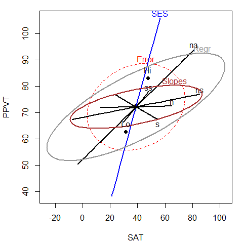
Figure 1.6: HE plot for SAT and PPVT, fitting the model Rohwer.mod2 that allows unequal slopes for the covariates.
Comparing Figure 1.6 for the heterogeneous slopes model
with Figure 1.4 (left) for the homogeneous slopes model,
it can be seen that most of the covariates have ellipses of similar
size and orientation, reflecting similar evidence against the respective
null hypotheses, as does the effect of SES, showing the
greater performance of the high-SES group on all response measures.
Somewhat more subtle, the error ellipse is noticeably smaller in
Figure 1.6, reflecting the additional variation accounted
for by differences in slopes.
2 Recovery from hernia repair
This example uses the Hernior data (from Mosteller & Tukey (1977), Data Exhibit 8, p. 567-568),
comprising
data on measures of post-operative recovery of 32 patients undergoing an
elective herniorrhaphy operation, in relation to pre-operative measures.
The outcome measures are:
-
leave, the patient’s condition upon leaving the recovery room (a 1-4 scale, 1=best), -
nurse, level of nursing required one week after operation (a 1-5 scale, 1=worst) and -
los, length of stay in hospital after operation (in days)
The predictor variables are:
- patient
age,sex, - `pstat, physical status ( a 1-5 scale, with 1=perfect health, …, 5=very poor health),
-
build, body build (a 1-5 scale, with 1=emaciated, …, 5=obese), and - preoperative complications with (
cardiac) heart and respiration (resp), 1-4 scales, 1=none, …, 4=severe.
data(Hernior)
str(Hernior)
#> 'data.frame':    32 obs. of  9 variables:
#>  $ age    : int  78 60 68 62 76 76 64 74 68 79 ...
#>  $ sex    : Factor w/ 2 levels "f","m": 2 2 2 2 2 2 2 1 2 1 ...
#>  $ pstat  : int  2 2 2 3 3 1 1 2 3 2 ...
#>  $ build  : int  3 3 3 5 4 3 2 3 4 2 ...
#>  $ cardiac: int  1 2 1 3 3 1 1 2 2 1 ...
#>  $ resp   : int  1 2 1 1 2 1 2 2 1 1 ...
#>  $ leave  : int  2 2 1 1 2 1 1 1 1 2 ...
#>  $ los    : int  9 4 7 35 9 7 5 16 7 11 ...
#>  $ nurse  : num  3 5 4 3 4 5 5 3 5 3 ...
2.1 All predictors model
We begin with a model fitting all predictors. Note that the ordinal predictors,
pstat, build, cardiac and resp could arguably be treated as
factors, rather than linear, regression terms. Doing so would give tests for
nonlinear effects of their relations with the responses.
We ignore this possibility in this example.
Hern.mod <- lm(cbind(leave, nurse, los) ~ age + sex +  pstat +  build + cardiac + resp,
               data=Hernior)
Anova(Hern.mod)
#>
#> Type II MANOVA Tests: Pillai test statistic
#>         Df test stat approx F num Df den Df Pr(>F)
#> age      1     0.143     1.27      3     23  0.307
#> sex      1     0.026     0.21      3     23  0.892
#> pstat    1     0.333     3.84      3     23  0.023 *
#> build    1     0.257     2.65      3     23  0.073 .
#> cardiac  1     0.228     2.26      3     23  0.108
#> resp     1     0.248     2.53      3     23  0.082 .
#> ---
#> Signif. codes:  0 '***' 0.001 '**' 0.01 '*' 0.05 '.' 0.1 ' ' 1
The results of the multivariate tests above are somewhat disappointing. Only the physical status
predictor (pstat) appears to be significant at conventional levels.
The univariate models for each response are implicit in the MLM Hern.mod.
These can be printed using summary(), or we can use summary() to extract
certain statistics for each univariate response model, as we do here.
Hern.summary <- summary(Hern.mod)
unlist(lapply(Hern.summary, function(x) x$r.squared))
#> Response leave Response nurse   Response los
#>         0.5918         0.2474         0.3653
More conveniently, the function heplots::glance.mlm() extends broom::glance.lm()
to give a one-line summary of statistics for each response variable in a MLM.
The \(R^2\) and \(F\) statistics are those for each overall model assessing the impact
of all predictors.
glance.mlm(Hern.mod)
#> # A tibble: 3 × 8
#>   response r.squared sigma fstatistic numdf dendf  p.value  nobs
#>   <chr>        <dbl> <dbl>      <dbl> <dbl> <dbl>    <dbl> <int>
#> 1 leave        0.592 0.388       6.04     6    25 0.000519    32
#> 2 nurse        0.247 0.841       1.37     6    25 0.265       32
#> 3 los          0.365 5.62        2.40     6    25 0.0573      32
Univariate tests for predictors in each of these models (not shown here)
are hard to interpret, and largely show only significant effects for
the leave variable. Yet, the \(R^2\) values for the other responses
are slightly promising. We proceed to a multivariate overall test of \(\mathbf{B} = 0\)
for all predictors, whose term names can be easily extracted from the
rownames of the coefficients.
# test overall regression
(predictors <- rownames(coef(Hern.mod))[-1])
#> [1] "age"     "sexm"    "pstat"   "build"   "cardiac" "resp"
Regr <- linearHypothesis(Hern.mod, predictors)
print(Regr, digits=5, SSP=FALSE)
#>
#> Multivariate Tests:
#>                  Df test stat approx F num Df den Df    Pr(>F)
#> Pillai            6   1.10198   2.4192     18 75.000 0.0041356 **
#> Wilks             6   0.21734   2.6046     18 65.539 0.0025239 **
#> Hotelling-Lawley  6   2.26797   2.7300     18 65.000 0.0016285 **
#> Roy               6   1.55434   6.4764      6 25.000 0.0003232 ***
#> ---
#> Signif. codes:  0 '***' 0.001 '**' 0.01 '*' 0.05 '.' 0.1 ' ' 1
clr <- c("red", "darkgray", "blue", "darkgreen", "magenta", "brown", "black")
vlab <- c("LeaveCondition\n(leave)",
          "NursingCare\n(nurse)",
          "LengthOfStay\n(los)")

hyp <- list("Regr" = predictors)
pairs(Hern.mod,
      hypotheses=hyp,
      col=clr, var.labels=vlab,
      fill=c(TRUE,FALSE), fill.alpha = 0.1,
      cex=1.25)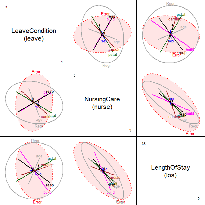
Figure 2.1: HE pairs plot for Hernior data
A pairs() plot for the MLM gives the set of plots shown in Figure 2.1
helps to interpret the relations among the predictors which lead to the highly significant
overall test.
Among the predictors, age and sex have small and insignificant effects on the outcome measures
jointly. The other predictors all contribute to the overall test of \(\mathbf{B} = 0\),
though in different ways for the various responses.
For example, in the panel for (leave, los) in Figure 2.1,
it can be seen that while only pstat individually is outside the
\(\mathbf{E}\) ellipse, build and resp contribute to the overall test in
an opposite direction.
2.2 Canonical analysis
In this multivariate regression example, all of the terms in the model Hern.mod
have 1 df, and so plot as lines in HE plots. An alternative view of these effects
can be seen in canonical discriminant space, which, for each predictor shows the
scores on the linear combination of the responses that contributes most to
the multivariate test of that effect, together with the weights for the responses.
We use candiscList() to calculate the canonical analyses for all predictor terms in
Hern.mod.
Hern.canL <- candiscList(Hern.mod)1D canonical discriminant plots for all terms can be obtained interactively
with a menu, simply by plotting the Hern.canL object.
plot(Hern.canL)Plots for separate terms are produced by the lines below, and shown in Figure 2.2 and Figure 2.3.
For pstat and build:
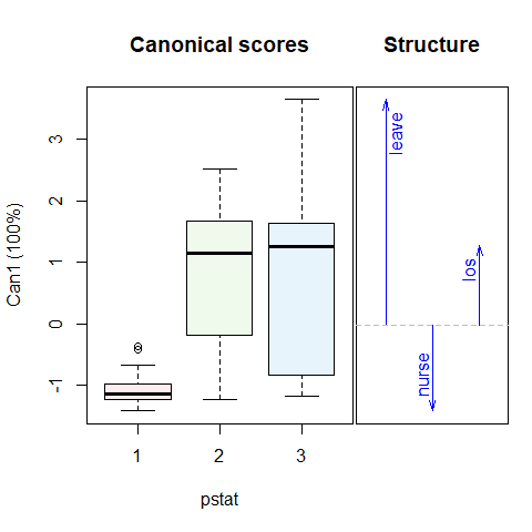
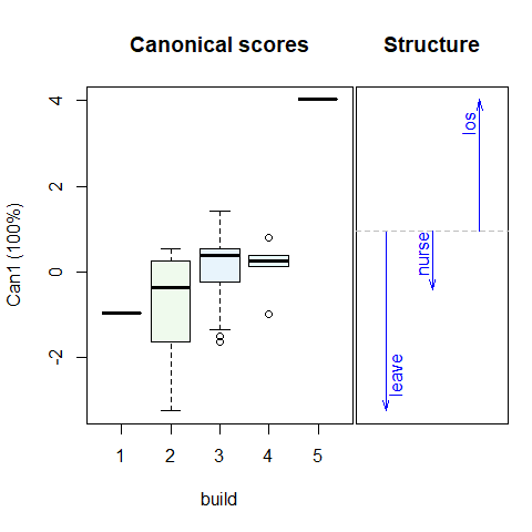
Figure 2.2: 1D Canonical discriminant plots for physical status (pstat) and build. The canonical scores are such that better outcomes are associated with smaller scores. Arrows show the correlations of the responses with the 1D canonical scores.
For age and cardiac:
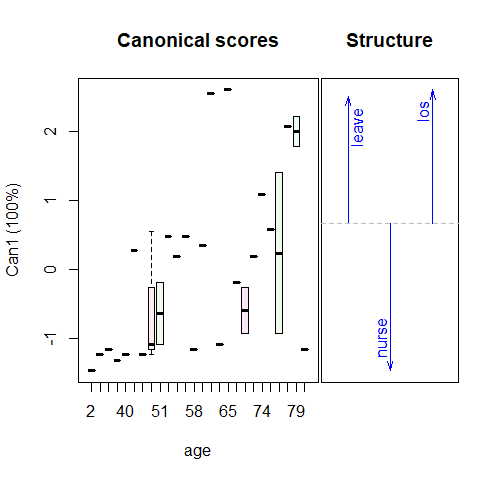
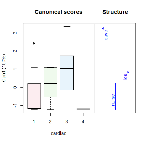
Figure 2.3: 1D Canonical discriminant plots for age and cardiac. The canonical scores are such that better outcomes are associated with smaller scores.
In these plots, the canonical scores panel shows the linear combinations of the response variables which have the largest possible \(R^2\). Better outcomes correspond to numerically smaller canonical scores. The arrows in the structure panel are proportional to the canonical weights.
These plots provide simple interpretations of the results for the canonical combinations of the responses. Better physical status, smaller body build, lower age and absence of cardiac complications are all positively related to better outcomes.
3 Grades in a Sociology Course
The data set SocGrades contains four outcome measures on student performance
in an introductory sociology course together with six potential predictors.
These data were used by Marascuilo & Levin (1983) for an example of
canonical correlation analysis, but are also suitable as examples of
multivariate multiple regression, MANOVA, MANCOVA
and step-down analysis in multivariate linear models.
The outcome measures used here are three test scores during the course,
midterm1, midterm2, final,
and a course evaluation (eval).1
Predictor variables are:
-
class, the student’s social class (an ordered factor with levels1>2>3) -
sex, -
gpa, grade point average, -
boards, College Board test scores, -
hssoc, previous high school unit in sociology? (with valuesno,yes), and -
pretest, score on a course pretest.
str(SocGrades)
#> 'data.frame':    40 obs. of  10 variables:
#>  $ class   : Ord.factor w/ 3 levels "3"<"2"<"1": 2 2 2 1 2 1 3 2 1 2 ...
#>  $ sex     : Factor w/ 2 levels "F","M": 2 2 2 2 2 2 1 2 2 1 ...
#>  $ gpa     : num  3.55 2.7 3.5 2.91 3.1 3.49 3.17 3.57 3.76 3.81 ...
#>  $ boards  : int  410 390 510 430 600 610 610 560 700 460 ...
#>  $ hssoc   : Factor w/ 2 levels "no","yes": 1 1 1 1 1 1 1 1 2 2 ...
#>  $ pretest : int  17 20 22 13 16 28 14 10 28 30 ...
#>  $ midterm1: int  43 50 47 24 47 57 42 42 69 48 ...
#>  $ midterm2: int  61 47 79 40 60 59 61 79 83 67 ...
#>  $ final   : int  129 60 119 100 79 99 92 107 156 110 ...
#>  $ eval    : int  3 1 1 1 2 1 3 2 1 1 ...
3.1 Models
The basic MLM is fit below as grades.mod with all predictor variables.
data(SocGrades)
grades.mod <- lm(cbind(midterm1, midterm2, final, eval) ~
                         class + sex + gpa + boards + hssoc + pretest,
                 data=SocGrades)
Anova(grades.mod, test="Roy")
#>
#> Type II MANOVA Tests: Roy test statistic
#>         Df test stat approx F num Df den Df  Pr(>F)
#> class    2     1.567    11.75      4     30 7.3e-06 ***
#> sex      1     0.553     4.01      4     29  0.0104 *
#> gpa      1     1.208     8.76      4     29 9.2e-05 ***
#> boards   1     0.731     5.30      4     29  0.0025 **
#> hssoc    1     0.035     0.25      4     29  0.9052
#> pretest  1     0.313     2.27      4     29  0.0859 .
#> ---
#> Signif. codes:  0 '***' 0.001 '**' 0.01 '*' 0.05 '.' 0.1 ' ' 1
3.1.1 Screening for interactions
In both univariate and multivariate
response models, it is often useful to screen for higher-order
terms (interactions, non-linear predictors). This can most easily be
done using update(), as we do below. First, try the extended
model with all pairwise interactions of the predictors.
In the model formula, ~.^2, the . represents all terms in the model,
and the ^2 generates all products of terms, such as class:sex, class:gpa, and so forth.
grades.mod2 <- update(grades.mod, . ~ .^2)
Anova(grades.mod2, test="Roy")
#>
#> Type II MANOVA Tests: Roy test statistic
#>                Df test stat approx F num Df den Df Pr(>F)
#> class           2     2.817     7.04      4     10 0.0058 **
#> sex             1     0.487     1.09      4      9 0.4152
#> gpa             1     1.998     4.49      4      9 0.0286 *
#> boards          1     2.338     5.26      4      9 0.0183 *
#> hssoc           1     0.281     0.63      4      9 0.6522
#> pretest         1     0.510     1.15      4      9 0.3946
#> class:sex       2     2.039     5.10      4     10 0.0168 *
#> class:gpa       2     0.982     2.45      4     10 0.1137
#> class:boards    2     0.522     1.31      4     10 0.3321
#> class:hssoc     2     0.356     0.89      4     10 0.5041
#> class:pretest   2     1.005     2.51      4     10 0.1082
#> sex:gpa         1     0.269     0.60      4      9 0.6694
#> sex:boards      1     0.184     0.41      4      9 0.7944
#> sex:hssoc       1     0.909     2.04      4      9 0.1714
#> sex:pretest     1     0.885     1.99      4      9 0.1795
#> gpa:boards      1     0.447     1.00      4      9 0.4537
#> gpa:hssoc       1     0.596     1.34      4      9 0.3269
#> gpa:pretest     1     0.472     1.06      4      9 0.4291
#> boards:hssoc    1     0.353     0.80      4      9 0.5573
#> boards:pretest  1     0.705     1.59      4      9 0.2593
#> hssoc:pretest   1     1.464     3.29      4      9 0.0635 .
#> ---
#> Signif. codes:  0 '***' 0.001 '**' 0.01 '*' 0.05 '.' 0.1 ' ' 1
In the results above, only the interaction of class:sex is significant,
and the main effects of hssoc and pretest remain insignificant.
A revised model to explore is grades.mod3,
grades.mod3 <- update(grades.mod, . ~ . + class:sex - hssoc - pretest)
Anova(grades.mod3, test="Roy")
#>
#> Type II MANOVA Tests: Roy test statistic
#>           Df test stat approx F num Df den Df  Pr(>F)
#> class      2     1.588    11.91      4     30 6.5e-06 ***
#> sex        1     0.575     4.17      4     29 0.00864 **
#> gpa        1     1.434    10.40      4     29 2.4e-05 ***
#> boards     1     0.895     6.49      4     29 0.00074 ***
#> class:sex  2     0.450     3.38      4     30 0.02143 *
#> ---
#> Signif. codes:  0 '***' 0.001 '**' 0.01 '*' 0.05 '.' 0.1 ' ' 1
A pairwise HE plot for all responses (Figure 3.1 shows that nearly all
effects are in the expected directions: higher gpa, boards, class
leads to better performance on most outcomes. The interaction of
class:sex seems to be confined largely to midterm1.
pairs(grades.mod3)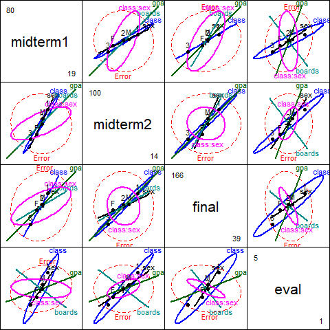
Figure 3.1: HE pairs plot for SocGrade, model grades.mod3.
These effects are easier to appreciate for the three exam grades jointly in a 3D HE plot when you can rotate it interactively. A snapshot is shown in Figure 3.2.
heplot3d(grades.mod3, wire=FALSE)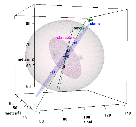
Figure 3.2: 3D HE plot for SocGrades, model grades.mod3
Interactive
rotation of this plot shows that the effect of class is only two dimensional,
and of these, one dimension is very small. The major axis of the class ellipsoid
is aligned with increasing performance on all three grades, with the expected
ordering of the three social classes.
3.2 Canonical analysis
The representation of these effects in canonical space is particularly useful here.
Again, use candiscList() to compute the canonical decompositions for all terms
in the model, and extract the canonical \(R^2\) from the terms in the result.
# calculate canonical results for all terms
grades.can <- candiscList(grades.mod3)
# extract canonical R^2s
unlist(lapply(grades.can, function(x) x$canrsq))
#>     class1     class2        sex        gpa     boards class:sex1 class:sex2
#>    0.61362    0.02419    0.36527    0.58915    0.47227    0.31046    0.13293
We use heplot() on the "candiscList" object to show
the effects of class in canonical space, giving Figure 3.3.
# plot class effect in canonical space
 heplot(grades.can, term="class",
        scale=4, fill=TRUE, var.col="black", var.lwd=2)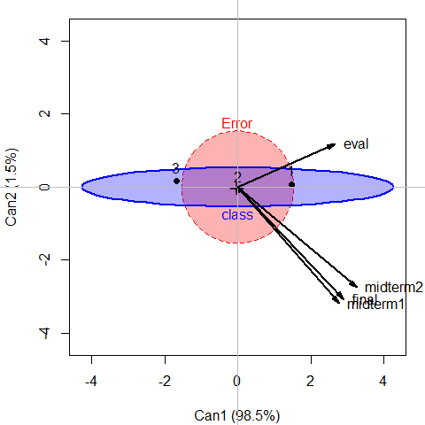
Figure 3.3: Canonical HE plot for class effect in grades.mod3
It can be seen in Figure 3.3 that nearly all variation in exam performance due to class is aligned with the first canonical dimension. The three tests and course evaluation all have similar weights on this dimension, but the course evaluation differs from the rest along a second, very small dimension.
1D plots of the canonical scores for other effects in the model are also of interest, and provide simple interpretations of these effects on the response variables. The statements below produce the plots shown in Figure 3.4.
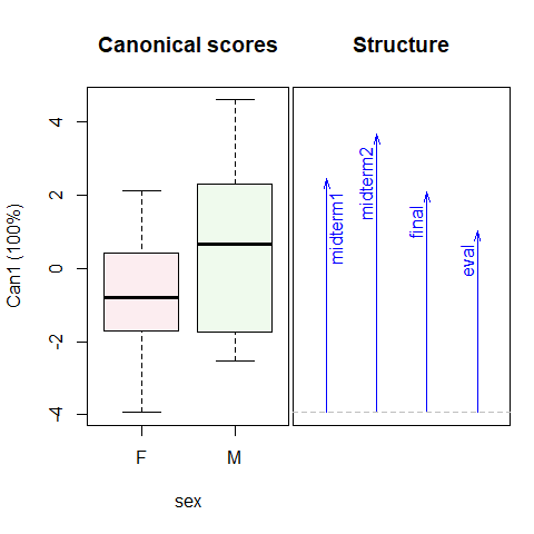
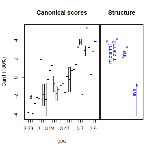
Figure 3.4: 1D Canonical discriminant plots for sex and gpa. Higher canonical scores reflect better course performance.
It is readily seen that males perform better overall, but the effect of
sex is strongest for the midterm2.
As well, increasing course performance on tests is strongly associated with
gpa.
