As described earlier (Section 10.4), Linear Discriminant Analysis (LDA) is similar to a one-way MANOVA, but with its emphasis on the problem of classifying observations into groups rather than testing whether there are significant differences of the means for the response variables. You would use LDA rather than MANOVA when your goal is to predict group membership and identify which variables best distinguish between pre-defined groups, rather than just testing for group differences.
Thus, LDA can be seen as a flipped MANOVA, where the role of dependent and independent variables are reversed. You can see this difference in the model formulas used in lm() compared with MASS::lda(), which fits a linear discriminant analysis (LDA) model: The outcomes on the right-hand side are cbind(y1, y2, y3) for the MANOVA but is simply group for a discriminant analysis.
One consequence of this flipped emphasis is that predicted values from predict() for an LDA is the predicted group membership for an observation with values \(y_1, y_2, y_3\) rather than the predicted response values \(\hat{y}_1, \hat{y}_2, \hat{y}_3\) in MANOVA. This is useful for classifying new observations from an LDA model, such as determining whether new Swiss banknotes are real or fake (Example 10.1) or classifying a new penguin.
As we have seen, the multivariate linear model fit by lm() applies equally well when there are two or more grouping factors and or quantitative predictors, whereas discriminant analysis is mostly restricted to the case of a single group factor.1
15.1 Main ideas of LDA
The essential ideas are illustrated in Figure 15.1 for two groups, “A” and “B” measured on two variables, \(\mathbf{y}_1\) and \(\mathbf{y}_2\). The two groups differ in their bivariate means \(\boldsymbol{\mu}_A = (3,4); \boldsymbol{\mu}_B = (6,2)\), and were sampled with \(n=100\) points each, having the same within-group variances of 2 for both variables and correlation \(\rho = 0.5\).
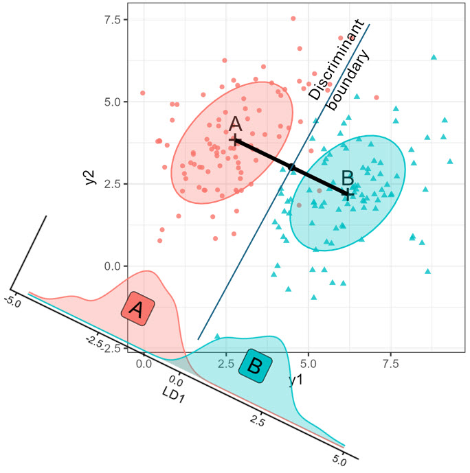
The geometric and statistical ideas shown here are:
- LDA calculates a weighted sum of the variables, \(\text{LD}_1 = v_1 \mathbf{y}_1 + v_2 \mathbf{y}_2\), such that the groups are most widely separated, relative to the variability within each group.
- The oblique figure at the bottom left shows the distributions of the \(\text{LD}_1\) scores. These are just the orthogonal projections of the \((y_1, y_2)\) points on this axis.
- For classification, LDA provides a line in this space which is the boundary between points that would be classified as belonging to groups “A” or “B”.
- In the case shown here with \(g=2\) groups, and equal sample sizes, \(n_1 = n_2\), the decision boundary is perpendicular to the line joining the means \(\boldsymbol{\mu}_A, \boldsymbol{\mu}_B\) and half-way between them.
- With only \(g=2\) groups, the discriminant space (LD1) is always one-dimensional, no matter how many \(\mathbf{y}\) variables there are in data space.
15.2 Theory
The mathematics of MANOVA and LDA are essentially the same. In both cases, the analysis and significance tests are based on the familiar breakdown (Equation 11.3) of total variability, \(\mathbf{T} \equiv \mathbf{SSP}_{T}\), of the observations around the grand means into portions attributable to differences between the group means \(\mathbf{H} \equiv \mathbf{SSP}_{H}\) and the portions attributable to differences within the groups around their means, \(\mathbf{E} \equiv \mathbf{SSP}_{E}\) as described in Section 11.2.1,
\[ \mathbf{T} = \mathbf{H} + \mathbf{E} \; . \] As we saw earlier (Section 11.2.2), for \(p\) variables and \(g\) groups, having \(\text{df}_h = g-1\) degrees of freedom, significance tests are based on the \(s = \min{(p, \text{df}_h)}\) non-zero eigenvalues \(\lambda_i\) of the matrix product \(\mathbf{H}\mathbf{E}^{-1}\), reflecting a ratio of between-group to within-group variation. These are combined into a single test statistic such as Wilks’ \(\Lambda = \Pi_i^s (1+\lambda_i)^{-1}\) or Hotelling-Lawley trace, \(\Sigma_i^s \lambda_i\).
The corresponding eigenvectors, \(\mathbf{V}\) of \(\mathbf{H}\mathbf{E}^{-1}\) are the weights for the linear combinations of the quantitative variables on which the groups are most widely separated. The transformation of the \(\mathbf{Y}\) variables in data space to the space of these linear combinations is given by \(\mathbf{Z}_{n \times s} = \mathbf{Y} \; \mathbf{E}^{-1/2} \; \mathbf{V}\) as we saw earlier (Section 12.7, Equation 12.4).
But here is where MANOVA and discriminant analysis diverge again. In discriminant analysis, you can replace the observed \(\mathbf{Y}\) variables with the uncorrelated \(s\) discriminant variates defined by \(\mathbf{V}\) and obtain exactly the same classifications of the observations. The first, \(\mathbf{v}_1\), associated with the largest eigenvalue \(\lambda_1\), accounts for the greatest proportion of between-group separation; the second, \(\mathbf{v}_2\) is next in discriminating power, and so forth. But if there are more than \(s=2\) dimensions, maybe we can classify nearly as well with a small subset of \(k < s\) discriminants without great loss.
Hence, just as in PCA, discriminant analysis can be thought of as a dimension reduction technique, squeezing the most discriminant juice out of the data in a few dimensions. These methods differ in that in PCA, the “juice” is the total variance of the cloud of points in \(p\)-dimensional data space, whose contributions are the \(p\) eigenvalues of \(\mathbf{T}\). However, in discriminant analysis, the “juice” is ratio of between-class variation (\(\mathbf{H}\)) of the group means to the within-class (\(\mathbf{E}\)) variation in the cloud, reflected in the \(s\) non-zero eigenvalues of \(\mathbf{H} \mathbf{E}^{-1}\).
The discussion here is limited to what this altered focus adds to visualizing differences among groups on a collection of response variables. See Klecka (1980), Lachenbruch (1975) for a basic, but more general introduction to discriminant analysis methods. There is a useful discussion in this Cross Validated question How is MANOVA related to LDA?
Linear vs. quadratic discriminant analysis
As in MANOVA, linear discriminant analysis assumes equal variance covariance matrices across the groups. In this case, the boundaries separating predicted group memberships are hyper-planes in the data space of the quantitative variables. In 2D plots, these appear as lines, and a goal of this section is to show how you can plot these. When the variance covariance matrices differ substantially, the boundaries become curved, and the method is called quadratic discriminant analysis, implemented in MASS::qda().2 This method is illustrated in Section 15.10.
Prior probabilities
Another way that LDA differs from MANOVA is that for classification purposes, the relative proportions of the groups in your sample or in the population has a role in determining the classification rules. These are called prior probabilities, which adjust the boundaries used to classify new observations.
A higher prior probability, \(\pi_k\) for group \(k\) increases its assigned likelihood, effectively “pulling” the classification boundary in its favor.3,4 This is expressed in the formula for the discriminant function \(\delta(\mathbf{x})\) for a new data point \(\mathbf{x}\),
\[ \delta_k(\mathbf{x})=x^\top \, \boldsymbol{\Sigma}^{-1} \, \bar{\mathbf{x}}_k - \frac{1}{2} \bar{\mathbf{x}}_k^\top \, \boldsymbol{\Sigma}^{-1} \,\bar{\mathbf{x}}_k+\log \left(\pi_k\right) \; , \tag{15.1}\]
where \(\bar{\mathbf{x}}_k\) is the estimated mean vector for class \(k\), and \(\boldsymbol{\Sigma}^{-1} = \mathbf{S}_p^{-1}\) is the inverse of the pooled covariance matrix.
You can see this from Figure 15.1. If the prior probability of group “A” was greater than that of group “B”, the line for the discriminant boundary would be shifted away from group “A”, resulting in more observations being classified in that group.
The idea of classification based on multiple measurements has a long history in medicine (nosology: classifying diseases, based on symptoms and bodily humours) and biology, taxonomy (classifying organisms to species or varieties, based on morphological measurements). It arose in statistics at a time when statisticians like Karl Pearson and Prasanta Mahalanobis first began to think of multivariate problems like principal components (Pearson, 1901) and multivariate distance (Mahalanobis, 1936) in geometric terms, with matrix algebra as a muse to express these ideas and handmaid to find solutions.
Ronald Fisher’s landmark paper (Fisher, 1936b) introduced the idea of a “discriminant function”, a weighted sum of observed measurements as a means to classifying observations into predefined groups. His perfect test case was the now famous data collected by Edgar Anderson (Anderson, 1935) on iris flowers of the Gaspé Peninsula. His elegant approach essentially involved the eigenvectors of what I call here \(\mathbf{H} \mathbf{E}^{-1}\), representing between-group relative to within-group variation, as the weights to apply to the observed variables to best discriminate among the iris species. The method quickly found application in crainometry (Fisher, 1936a), sex classification of Egyptian mandible bones (Martin, 1936) …
C. R. Rao (1948) extended Fisher’s framework, introducing what would become known as quadratic discriminant analysis (QDA). He relaxed Fisher’s assumption of equal covariance structure, allowing each group to have its own covariance matrix. This generalization led to quadratic, rather than linear, decision boundaries, providing greater flexibility in modeling how groups differ.
These methods evolved considerably in subsequent decades. McLachlan’s (2004) comprehensive work unified and extended classical discriminant analysis, incorporating robust methods. Bayesian approaches (e.g., Enis & Geisser, 1974) have brought new perspectives to discriminant analysis, treating group membership probabilities and model parameters as uncertain quantities to be estimated from data. These methods naturally incorporate prior information and provide full posterior distributions rather than point estimates, offering richer uncertainty quantification (Hastie et al., 2009).
Example 15.1 Penguins on Island Z
For an example, to illustrate how discriminant analysis works and how to use it to classify observations, imagine you are a researcher on an expedition to Antarctica to survey the penguin population. You stop at a small, as yet unnamed island “Z”, and find five penguins you want to study. You call them Abe, Betsy, Chloe, Dave and Emma. How can you determine their species based on what you know of the penguins studied before?
peng_new <- data.frame(
  species = rep(NA, 5),
  island = rep("Z", 5),
  bill_length = c(35, 52, 52, 50, 40),
  bill_depth= c(18, 20, 15, 16, 15),
  flipper_length = c(220, 190, 210, 190, 195),
  body_mass = c(5000, 3900, 4000, 3500, 5500),
  sex = c("m", "f", "f", "m", "f"),
  row.names = c("Abe", "Betsy", "Chloe", "Dave", "Emma")
  ) |>
  print()
#       species island bill_length bill_depth flipper_length
# Abe        NA      Z          35         18            220
# Betsy      NA      Z          52         20            190
# Chloe      NA      Z          52         15            210
# Dave       NA      Z          50         16            190
# Emma       NA      Z          40         15            195
#       body_mass sex
# Abe        5000   m
# Betsy      3900   f
# Chloe      4000   f
# Dave       3500   m
# Emma       5500   f
So, you can run a discriminant analysis using the existing data and then use that to classify the new penguins on island Z. By default, MASS::lda() uses the proportions of the three species as the prior probabilities, which are given in the printed output.
data(peng, package = "heplots")
peng.lda <- lda(species ~ bill_length + bill_depth + flipper_length + body_mass,
                data = peng)
print(peng.lda, digits = 3)
# Call:
# lda(species ~ bill_length + bill_depth + flipper_length + body_mass,
#     data = peng)
#
# Prior probabilities of groups:
#    Adelie Chinstrap    Gentoo
#     0.438     0.204     0.357
#
# Group means:
#           bill_length bill_depth flipper_length body_mass
# Adelie           38.8       18.3            190      3706
# Chinstrap        48.8       18.4            196      3733
# Gentoo           47.6       15.0            217      5092
#
# Coefficients of linear discriminants:
#                     LD1      LD2
# bill_length    -0.08593 -0.41660
# bill_depth      1.04165 -0.01042
# flipper_length -0.08455  0.01425
# body_mass      -0.00135  0.00169
#
# Proportion of trace:
#   LD1   LD2
# 0.866 0.135
With \(g = 3\) groups, having \(\text{df}_h = 2\) degrees of freedom and \(p = 4\) variables, there are only \(s = 2\) discriminant dimensions. The first, LD1 accounts for 86.6% of the total between/within variance and the second for the remaining 13.5%. LDA doesn’t provide significance tests, but these are available as described below (Section 15.9).
Example 15.2 Iris flowers
It is historically relevant to illustrate some of these methods using Anderson’s data on iris flowers, which was the inspiration for Fisher (1936b) to construct the LDA method. The structure is similar to that of the penguin data, with three Species: setosa, versicolor, and virginica. There are also four quantitative variables to be used to classify the flowers. …
Fitting the LDA model to the iris dataset is quite simple, because the variables for petal and sepal lengths and widths can be specified as . in the model formula, Species ~ .
data(iris)
iris.lda <- lda(Species ~ ., data = iris)
And, the results are simpler also. From the singular values, extracted as iris.lda$svd, we see that the first dimension, LD1 accounts for 99.1% of the differences among the species means on these four variables.
15.3 Classification accuracy
How well did LDA succeed in classifying the penguins in the existing peng dataset? You can answer this by making a table of the frequencies of the species in the data against their predicted class, obtained from the MASS::predict.lda() method for an "lda" object:
class_table <- table(
  actual    = peng$species,
  predicted = predict(peng.lda)$class) |>
  print()
#            predicted
# actual      Adelie Chinstrap Gentoo
#   Adelie       145         1      0
#   Chinstrap      3        65      0
#   Gentoo         0         0    119

# overall rates
acc <- sum(diag(class_table))/sum(class_table) * 100
err <- 100 - acc
c(accuracy = acc, error = err)
# accuracy    error
#     98.8      1.2
That’s pretty good! Only 4 penguins are misclassified, giving an error rate of 1.2%. You can identify the errors by joining the data with the predicted class and filtering those that don’t match. The only confusions are between Adélie and Chinstraps. We’ll see why this is the case in plots developed below.
data.frame(id = row.names(peng),
           peng[, c(1, 3:6)],
           predicted = predict(peng.lda)$class) |>
  filter(species != predicted) |>
  relocate(predicted, .after = species)
#    id   species predicted bill_length bill_depth flipper_length
# 1  68    Adelie Chinstrap        45.8       18.9            197
# 2 286 Chinstrap    Adelie        42.4       17.3            181
# 3 296 Chinstrap    Adelie        40.9       16.6            187
# 4 320 Chinstrap    Adelie        42.5       17.3            187
#   body_mass
# 1      4150
# 2      3600
# 3      3200
# 4      3350
A more sensitive assessment of accuracy is leave-one-out cross validation, obtained using CV = TRUE in MASS::lda(). With this computer-intensive method, the function systematically holds out one observation, fits the model on the remaining \(n\) cases and predicts the class of the excluded observation. The overall error rate can be calculated as:
error_rate <- mean(peng.lda$class != peng$species)15.4 Classifying new penguins
The fitted model, peng.lda, can also be used to classify our new penguins by supplying the call to predict.lda() with newdata = peng_new. Only those cases are classified. The printed result isn’t pretty, because the function simply returns a list, with elements:
-
class: The predicted class for each observation -
posterior: The posterior probabilities for the observations being assigned to eachclass. The predicted class is that of the maximum probability. -
x: The scores of the test cases on the discriminant variables.
peng_pred <- predict(peng.lda, newdata = peng_new) |>
  print(digits = 4)
# $class
# [1] Adelie    Chinstrap Gentoo    Chinstrap Gentoo
# Levels: Adelie Chinstrap Gentoo
#
# $posterior
#          Adelie Chinstrap    Gentoo
# Abe   9.693e-01 6.150e-10 3.069e-02
# Betsy 2.205e-05 1.000e+00 3.244e-20
# Chloe 2.263e-11 1.277e-03 9.987e-01
# Dave  5.484e-07 1.000e+00 2.766e-09
# Emma  1.518e-07 8.504e-13 1.000e+00
#
# $x
#           LD1    LD2
# Abe   -1.0351  5.345
# Betsy  3.6062 -4.039
# Chloe -3.4278 -3.534
# Dave   0.1504 -3.839
# Emma  -3.1495  3.780
A little manipulation of the result from predict() makes what has happened here more apparent. I extract the predicted class of the observations and join this with the posterior probabilities and their maximum maxp across the levels of species.
class <- peng_pred$class
posterior <- peng_pred$posterior
maxp <- apply(posterior, 1, max)
data.frame(class, round(posterior, 4), maxp)
#           class Adelie Chinstrap Gentoo  maxp
# Abe      Adelie  0.969    0.0000 0.0307 0.969
# Betsy Chinstrap  0.000    1.0000 0.0000 1.000
# Chloe    Gentoo  0.000    0.0013 0.9987 0.999
# Dave  Chinstrap  0.000    1.0000 0.0000 1.000
# Emma     Gentoo  0.000    0.0000 1.0000 1.000
This says that Abe has the highest probability in the Adélie class, Betty and Dave are almost certainly of the Chinstrap species, while Chloe and Emma are almost certainly Gentoos.
15.4.1 Working with "lda" objects
The implementation of discriminant analysis in MASS is untidy and awkward to work with. The candisc package now provides a collection of convenience functions which simplify analysis, display and plotting for this class of models.
-
predict_discrim(): a wrapper toMASS::predict.lda()returning a data.frame -
cor_lda()calculates structure correlations between variables and discriminant scores -
scores.lda()ascores()method to extract discriminant scores
15.5 Visualizing classification in data space
A simple way to understand what happens in discriminant analysis is to plot the original data in data space and add labeled points for the new observations. You can use candisc::predict_discrim(), which joins the measures in the test dataset with the predicted class for each new observation. In the result, species is the predicted class.
pred <- predict_discrim(peng.lda,
                        newdata = peng_new[, 3:6]) |>
  print()
#         species bill_length bill_depth flipper_length body_mass
# Abe      Adelie          35         18            220      5000
# Betsy Chinstrap          52         20            190      3900
# Chloe    Gentoo          52         15            210      4000
# Dave  Chinstrap          50         16            190      3500
# Emma     Gentoo          40         15            195      5500
Using this result you can simply plot the original Penguin data for two variables and use geom_text() or geom_label() to identify the observations of the new penguins in this space. In Figure 15.2, I do this in two separate plots, one for the bill length and depth variables, and another for flipper_length vs. body_mass. The key thing is that the call to geom_label() uses the predicted species and coordinates for the new penguins from the pred dataset obtained from predict_discrim().
p1 <- ggplot(peng,
       aes(x = bill_length, y = bill_depth,
           color = species, shape = species, fill=species)) +
  geom_point(size=2) +
  stat_ellipse(geom = "polygon", level = 0.95, alpha = 0.4) +
  geom_label(data = pred, label=row.names(pred),
             fill="white", size = 5, fontface="bold") +
  theme_penguins("dark") +
  theme(legend.position = "none")

p2 <- ggplot(peng,
       aes(x = flipper_length, y = body_mass,
           color = species, shape = species, fill=species)) +
  geom_point(size=2) +
  stat_ellipse(geom = "polygon", level = 0.95, alpha = 0.4) +
  geom_label(data = pred, label=row.names(pred),
             fill="white", size = 5, fontface="bold") +
  theme_penguins("dark") +
  legend_inside(c(0.87, 0.15))

p1 + p2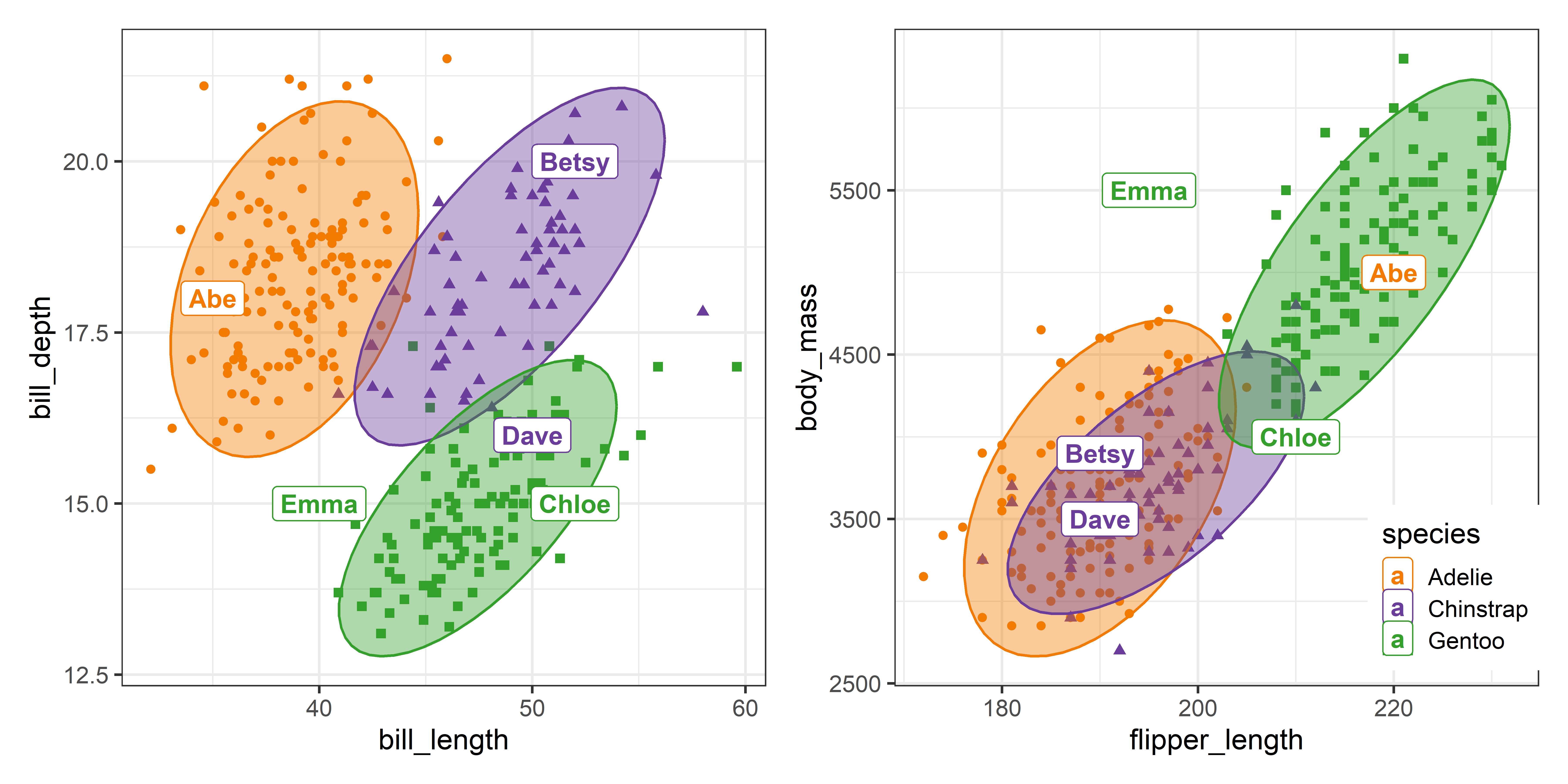
In Figure 15.2, Betsy is well within the data ellipses for her species in both plots. Abe looks very much like an Adélie in the panel for the bill variables, but more like a Gentoo in terms of flipper length and body mass. Chloe, classed as a Gentoo is at the margin of the 95% ellipses. Dave, classified as a Chinstrap, looks more like a Gentoo in terms of bill length and depth, but is in the region occupied by Adélie and Chinstraps in the right panel. Emma is outside the data ellipses for all three species in both plots.
These plots are just two of the \((4 \times 3) / 2 = 6\) possible pairwise plots that would appear in a scatterplot matrix.
15.6 Visualizing classification in discriminant space
The main virtue of discriminant analysis is that it allows us to see the data in the reduced-rank space that shows the greatest differences among the groups. The 4D data space of the observed \(\mathbf{y}\) variables is replaced by 2D discriminant space of the \(\mathbf{z}\)s, which contains the same information for classification.
If you add points for the newly classified observations, you can see better why they are classified as they were in a single plot. The MASS package has a plot.lda() method, but the usual result is far too ugly to be useful. Here’s what you get with the default settings:
plot(peng.lda)
But, you can turn this sow’s ear into a silk purse with a little graph-craft! My goal here is to illustrate plotting in discriminant space and show how the basic plot from plot.lda() can be made more informative. First, predict_discrim() can also return the discriminant scores (LD1, LD2) for the new observations via the argument scores = TRUE. I’ll use this dataset to add labels to the plot.
pred <- predict_discrim(peng.lda,
                        newdata = peng_new[, 3:6],
                        scores = TRUE)
print(pred[, -(2:5)])
#         species   LD1   LD2
# Abe      Adelie -1.04  5.35
# Betsy Chinstrap  3.61 -4.04
# Chloe    Gentoo -3.43 -3.53
# Dave  Chinstrap  0.15 -3.84
# Emma     Gentoo -3.15  3.78
Then, I want to use more informative axis labels, showing the percent of between-group variance associated with each dimension. These come from the svd component of the peng.lda object whose squares \(\lambda_i^2\) give the amount of between-to-within variance accounted for by each dimension.
Fortunately, plot.lda() allows a panel = argument, to control how the observations are represented. You can override the default (observation class labels) by creating a panel function that simply plots the points.
panel.pts <- function(x, y, ...) points(x, y, ...)Finally, call plot.lda() with this panel function, set the color and shape of the point symbols to match our Penguin theme and use the axis labels set above in labs. You can then add points and labels for the newly classified penguins.
col <- peng.colors()
plot(peng.lda,
     panel = panel.pts,
     col = col[peng$species],
     pch = (15:17)[peng$species],
     xlab = labs[1],
     ylab = labs[2],
     ylim = c(-6, 6),
     cex.lab = 1.3
)

# plot new observations & label them with their row.names in the predicted data
with(pred,{
     points(LD1, LD2, pch = 16, col = "black", cex = 2)
     text(LD1, LD2, label=row.names(pred),
          col = col[species], cex = 1.3, font = 2,
          pos = c(3, 1, 1, 1, 3),
          xpd = TRUE)
  })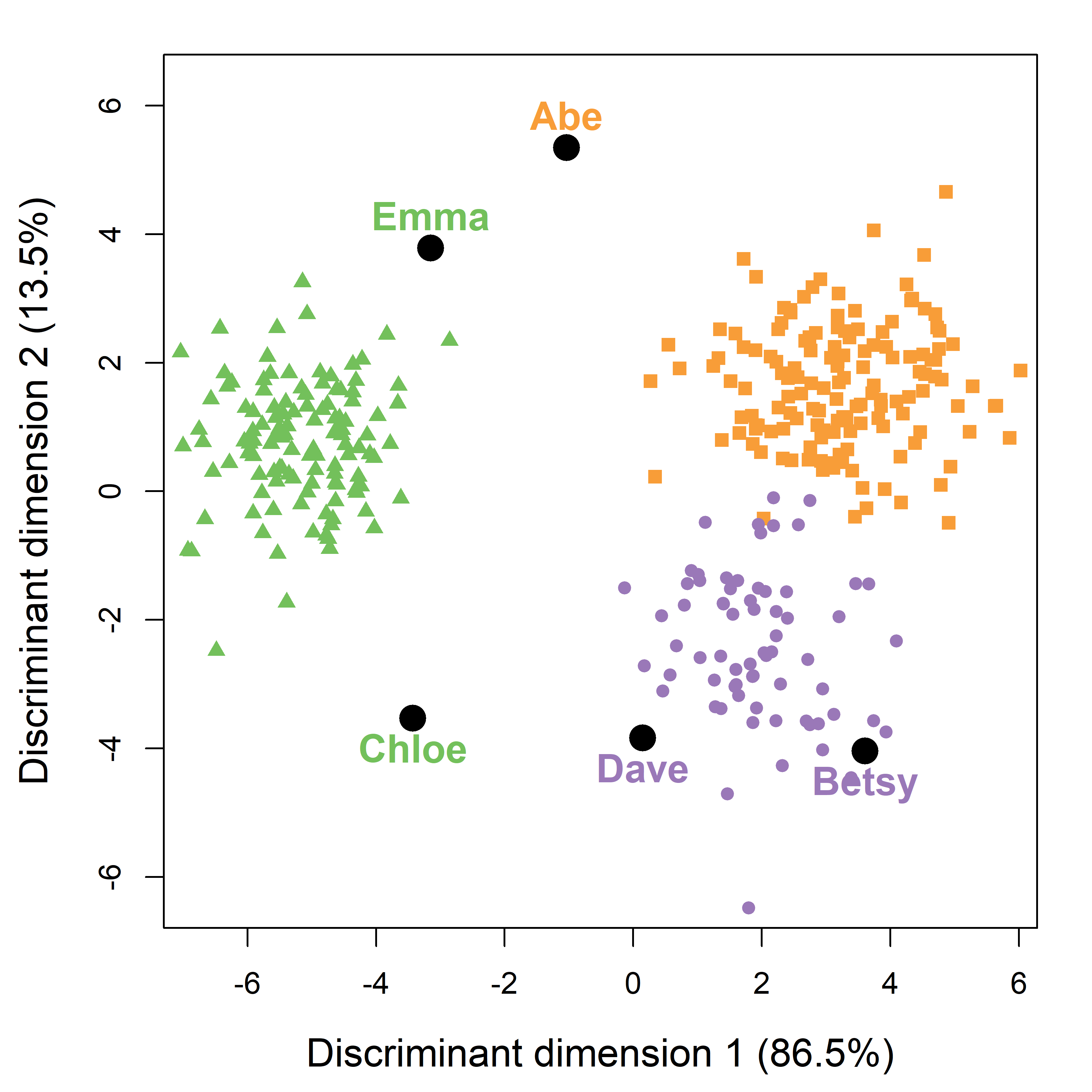
Compared with the separate 2D views in data space (Figure 15.2), this single view accounts for 100% of the variance due to separation of the species groups. You can see that Betsy and Dave are rather close to the other Chinstraps. Abe, Chloe and Emma are rather far from the centers of the species they are classified as, yet they are closer to their groups than to any of the two others.
15.6.1 Going further
While Figure 15.4 is a substantial improvement over Figure 15.3, it is harder to go much further, because plot.lda() method conceals what it does to make the plot using the "lda" object. You have to dive into that object to get the information needed to add additional graphical information.
For example, if you also wanted to show data ellipses or other bivariate summaries in this plot, it would be necessary to get the predicted classes for all observations in peng dataset, together with the discriminant scores, LD1 and LD2, obtained using scores=TRUE in the call to predict_discrim(). Data ellipses could then be added using car::dataEllipse() as follows (this plot is not shown).
pred_all <- predict_discrim(peng.lda, scores=TRUE)

# add data ellipses
dataEllipse(LD2 ~ LD1 | species, data = pred_all,
            levels = 0.68, fill=TRUE, fill.alpha = 0.1,
            group.labels = NULL,
            add = TRUE, plot.points = FALSE,
            col = col)
15.7 Visualizing prediction regions
An even better way to understand and interpret discriminant analysis results is to visualize the boundaries that separate the prediction into one group rather than another. Our penguins live in a 4-dimensional data space, and the boundaries of the predicted classification regions are of one less dimension—3D hyperplanes here.
Any point in this data space can be classified into one of the group using a predict() method. Therefore, to visualize the prediction regions, you can calculate the prediction over a grid of values of the \(y\) variables, and then plot those using colored tiles. The steps are:
-
Construct a \(k \times k\) grid of values of the two focal variables \(y_1, y_2\) to be plotted:
- For each focal \(y\) variable, divide it’s range into \(k\) intervals, as in
seq(min(y)), max(y), k) - Set each non-focal variable to its’s mean.
- Use a
predict()method to get the predicted classification group for each point.
- For each focal \(y\) variable, divide it’s range into \(k\) intervals, as in
For base R graphs, you can use
image(x, y, z, ...)to plot this grid of the(x, y), wherezis a \(k \times k\)-length vector of the predicted class of an observation at this point. Inggplot2this is easier, usinggeom_tile().Boundaries of the regions are the contours of the maximum of the posterior probabilities. You can plot these using
contour(x, y, z, ...)in base R orgeom_contour()inggplot2.On top of this, you can plot the data observations, data ellipses for the groups or anything else.
This idea is essentially the same as used in effect plots (Section 7.4)—you calculate predicted values over a range of the variables shown, while controlling those not shown at a typical value. These plots for discriminant analysis are also called “territorial maps” or “partition plots”.
15.7.1 Partition plots with partimat()
The function klar::partimat() produces such partition plots for lda(), qda() as well as a number of other classification methods, including recursive partioning trees (rpart::rpart()), naive Bayes (e1071::naiveBayes()) and other methods. The graphs produced are generally UGLY; but they are easy to produce and convey a sense of the method. Once we have the idea in mind, we can try to make prettier, more useful versions.
partimat() takes a model formula for the classification, here species ~ . for the penguin data. It produces a classification plot for every combination of two \(y\) variables in the data, and can show them either in a scatterplot matrix format (plot.matrix = TRUE), or a rectangular display of only the unique pairs. The latter takes less space, and so allows higher resolution in the individual plots. The method argument in the call uses lda() to determine the result shown in Figure 15.5.
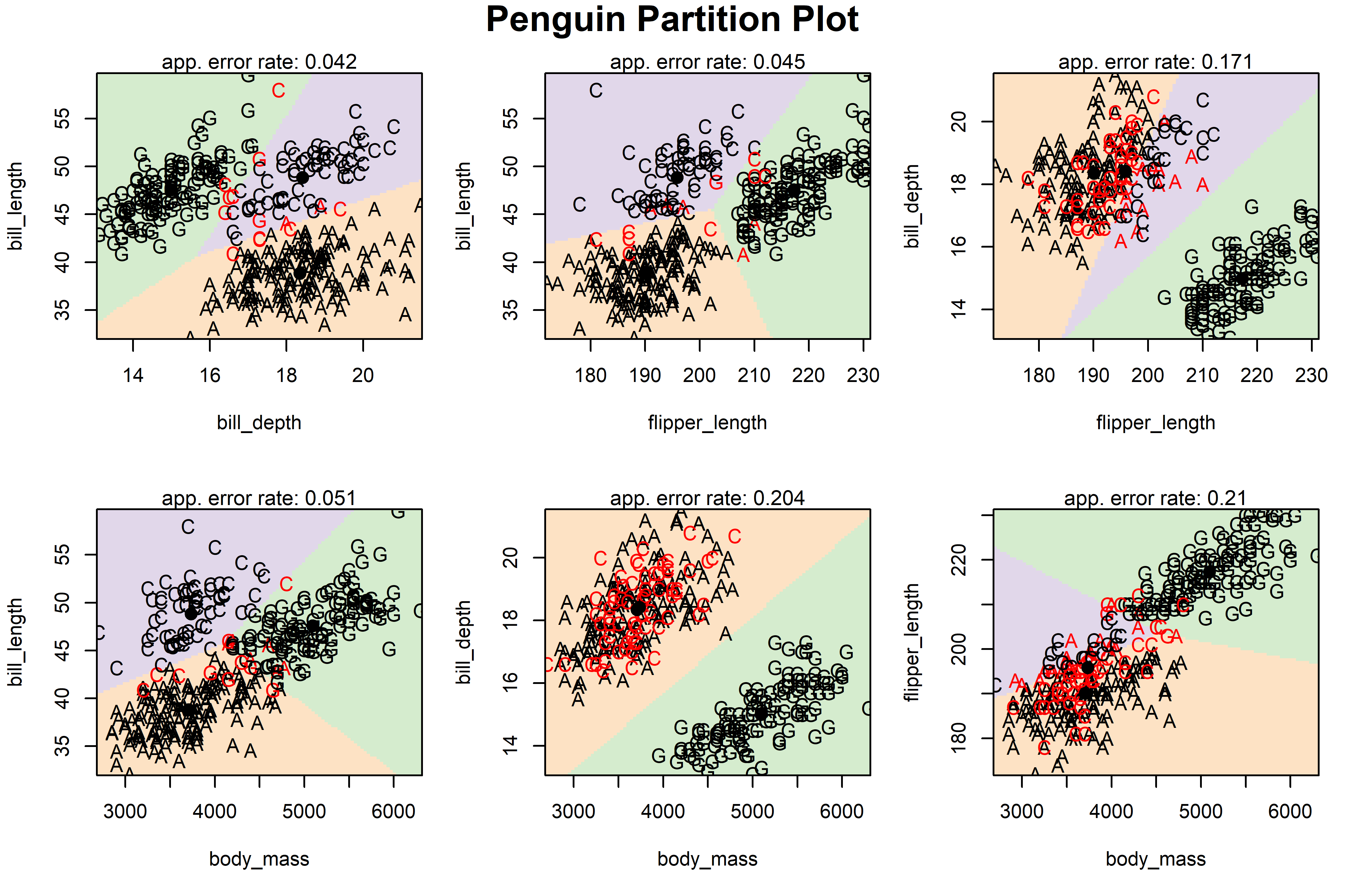
In each pairwise plot of the penguin variables shown in Figure 15.5, the background is colored according to the species that any observation there (holding others constant) would be classified as. This fails in software design because there is little flexibility in what else is shown to represent the observations. The penguin data values are shown using the first letter of their species, colored black if that bird is classified correctly, red otherwise.5
15.7.2 Using ggplot()
To construct similar (but better) plots using ggplot2, I follow the steps outlined above to get predicted classes over a grid, in this case for the penguin bill variables. The function marginaleffects::datagrid() makes this easy, automatically marginalizing the other variables. You can supply a function, here seq.range(), to specify a sequence of a variable over its range.
# make a grid of values for prediction
range80 = \(x) seq(min(x), max(x), length.out = 80)
seq.range = \(n) \(x) seq(min(x), max(x), length.out = n)
grid <- datagrid(bill_length = seq.range(80),
                 bill_depth = seq.range(80), newdata = peng)
# get predicted species for the grid points
pred_grid <- predict_discrim(peng.lda, newdata = grid)
head(pred_grid)
#   species rowid island flipper_length body_mass sex year
# 1  Gentoo     1 Biscoe            201      4207   m 2008
# 2  Gentoo     2 Biscoe            201      4207   m 2008
# 3  Gentoo     3 Biscoe            201      4207   m 2008
# 4  Gentoo     4 Biscoe            201      4207   m 2008
# 5  Gentoo     5 Biscoe            201      4207   m 2008
# 6  Gentoo     6 Biscoe            201      4207   m 2008
#   bill_length bill_depth
# 1        32.1       13.1
# 2        32.1       13.2
# 3        32.1       13.3
# 4        32.1       13.4
# 5        32.1       13.5
# 6        32.1       13.6
Then, in the plotting steps, geom_tile() is used to display the predictions in the pred_grid dataset, using the penguin colors for the species. Points and other layers use the full peng dataset. I also calculate the means for each species and use these as direct labels for the groups, to avoid a legend.
means <- peng |>
group_by(species) |>
summarise(across(c(bill_length, bill_depth),
\(x) mean(x, na.rm = TRUE) ))
p1 <- ggplot(data = peng, aes(x = bill_length, y = bill_depth)) +
# Plot decision regions
geom_tile(data = pred_grid, aes(fill = species), alpha = 0.2) +
stat_ellipse(aes(color=species), level = 0.68, linewidth = 1.2) +
# Plot original data points
geom_point(aes(color = species, shape=species),
size =2) +
geom_label(data=means, aes(label = species, color = species),
size =5) +
theme_penguins("dark") +
theme_minimal(base_size = 16) +
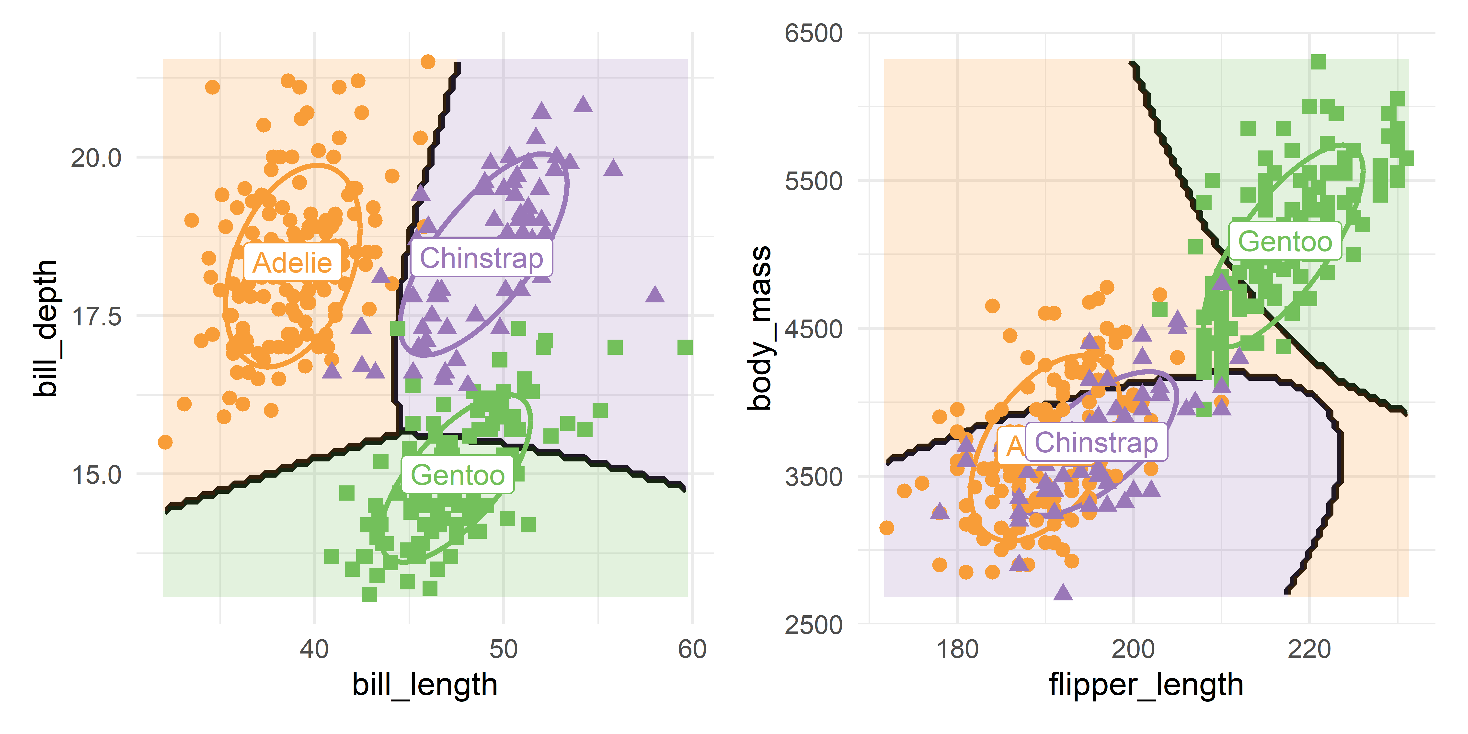
theme(legend.position = "none")Doing the same steps for flipper_length and body_mass, and then showing the two plots together (as in Figure 15.2) gives Figure 15.6.
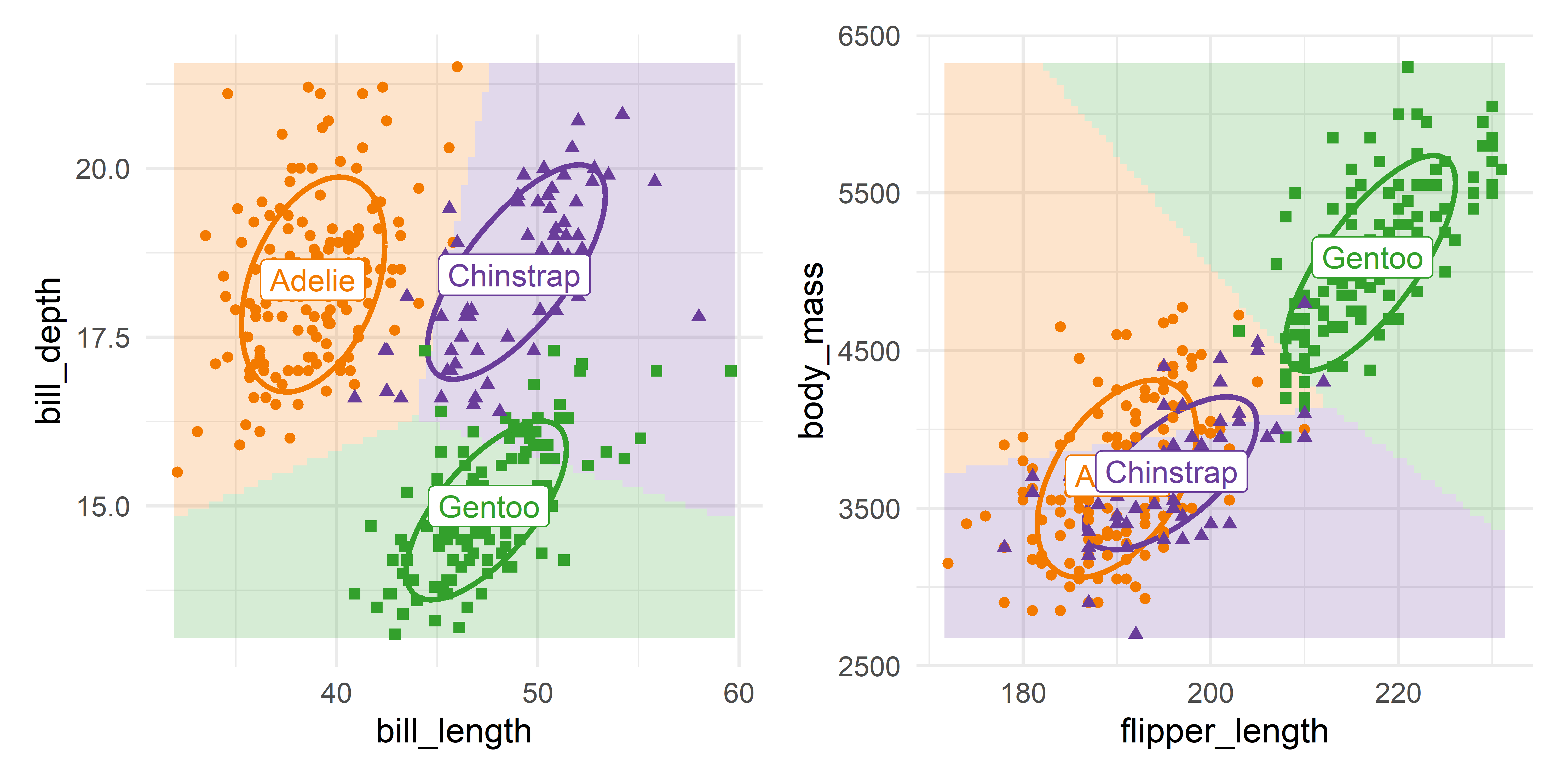
bill_length vs. bill_depth; right: flipper_length vs. body mass.
The groups are nicely separated in the left panel for the bill variables. For the other two variables in the right panel, Adélie and Chinstrap overlap considerably, but are well distinguished from the Gentoos. The predictions for these two groups favor Adélie for penguins of greater body mass.
These plots are essentially the same as those in the (1, 1) and (2, 3) panels in Figure 15.5, but with axes reversed. You should understand that such plots in data space hold all other variables fixed at their means, so they show more observations that appear to be misclassified, as in the plot for flipper length and body mass.
15.7.3 Using plot_discrim()
Plots showing decision regions such as Figure 15.6 are made even easier using candisc::plot_discrim(). This takes an "lda" (or "qda") model, finds the predicted class over a grid of values, and plots the points together with the boundaries of classification and/or the classification regions colored by group.
It produces a "ggplot" object which can be customized with theme() and scale_*() components. Data ellipses can be added through the ellipse argument, and you can add labels for the groups similar to what was done in Figure 15.6.
You can use this as shown in the code below for a plot of body_mass ~ bill_length, which gives Figure 15.7. Here I simply added text labels for the species at their centroids.
means <- peng |>
  group_by(species) |>
  summarise(across(c(bill_length, body_mass), mean))

plot_discrim(peng.lda, body_mass ~ bill_length,
             ellipse = TRUE,
             pt.size = 2) +
  geom_label(data=means, aes(label = species, color = species),
             size =5) +
  theme_penguins() +
  theme_minimal(base_size = 16) +
  theme(legend.position = "none")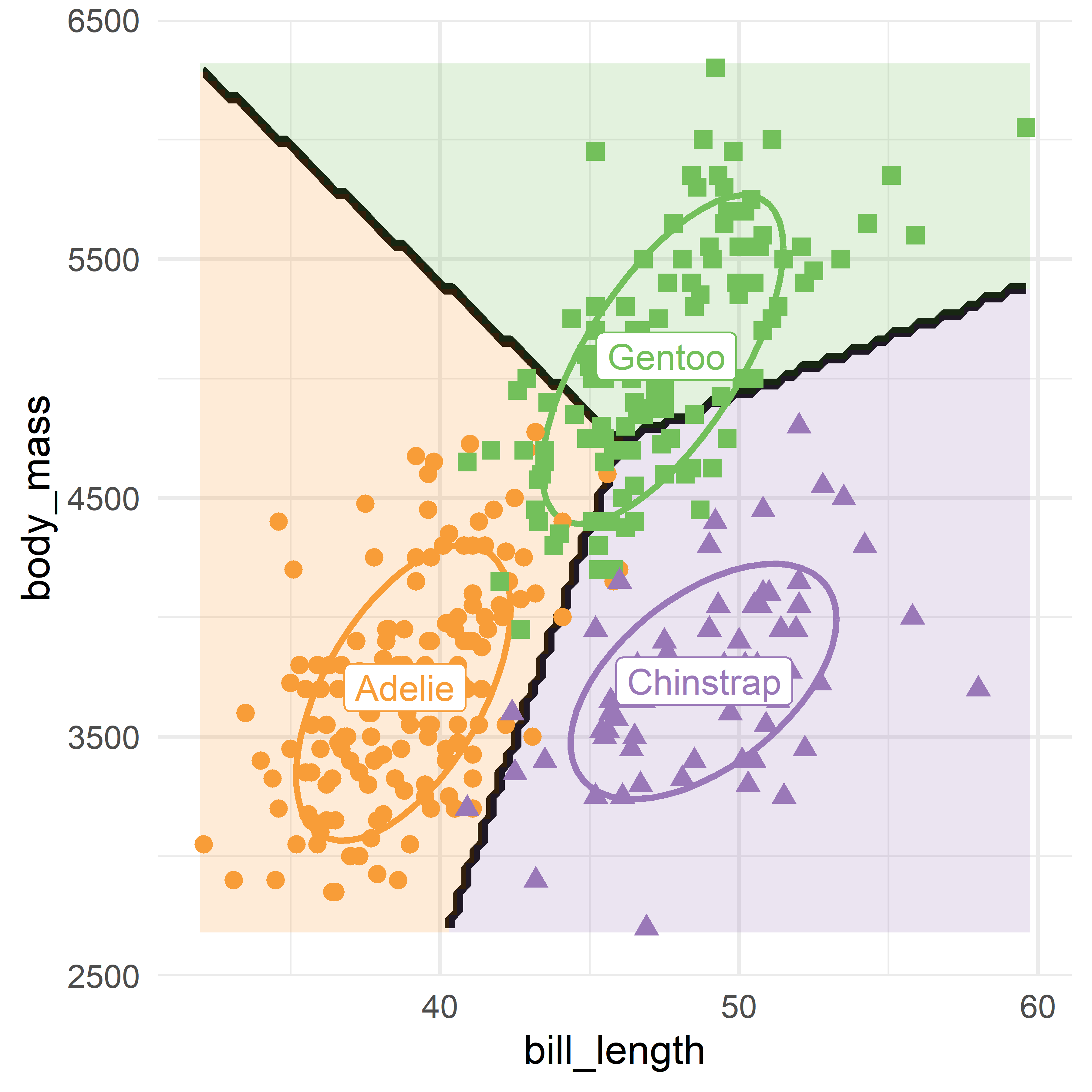
plot_discrim() plot of bill_depth ~ bill_length for the Penguin data showing the linear discriminant prediction regions for the three species.
15.8 Prediction regions in discriminant space
The 2D plot of the data in discriminant space (Figure 15.4) is much simpler to understand because it captures all the information regarding penguin classification in a single plot, rather than the six shown in Figure 15.5. Can we make a similar plot, showing the prediction regions in discriminant space?
If you recall that dimension reduction interpretation of discriminant analysis allows you to replace the observed \(\mathbf{y}\)s with their discriminant scores \(\mathbf{z}\) with the same accuracy when there are only \(s=2\) possible dimensions, you can do this first finding the discriminant scores, LD1 and LD2 and using those as predictors in a new call to lda():
peng_scored <- predict_discrim(peng.lda,
                               scores=TRUE)

peng.lda2 <- lda(species ~ LD1 + LD2, data=peng_scored)

# coefficients
coef(peng.lda2)
#          LD1      LD2
# LD1 -1.00129 -0.00155
# LD2 -0.00739  1.00569

# proportions of variance
var <- peng.lda2$svd^2 / sum(peng.lda2$svd^2)
setNames(var, nm =c("LD1", "LD2"))
#   LD1   LD2
# 0.864 0.136
As you can see from the results, the proportions of between-class variance accounted for are nearly the same as in the original peng.lda. Note that the coefficients for the old vs. new discriminants are nearly the identity matrix, except that the sign of the coefficients for LD1 have been flipped.
Then you can follow the earlier examples in data space: Set up a grid of values for LD1 and LD2 over the discriminant space of peng_scored and obtain the predicted classifications for each point.
grid <- datagrid(LD1 = range80,
                 LD2 = range80,
                 newdata = peng_scored)
pred_grid <- predict_discrim(peng.lda2, newdata = grid, posterior = FALSE)
Finally, the plotting steps are identical to that used in Figure 15.6. The resulting plot in Figure 15.8 gives a single, complete picture of the results of discriminant analysis for this dataset.
Show the code
means <- peng_scored |>
  group_by(species) |>
  summarise(across(LD1:LD2, \(x) mean(x, na.rm = TRUE) ))
means
# # A tibble: 3 × 3
#   species     LD1    LD2
#   <fct>     <dbl>  <dbl>
# 1 Adelie     3.26  1.12
# 2 Chinstrap  1.94 -2.97
# 3 Gentoo    -5.13  0.257

ggplot(data = peng_scored, aes(x = LD1, y = LD2)) +
  # Plot decision regions
  geom_tile(data = pred_grid, aes(fill = species), alpha = 0.2) +
  stat_ellipse(aes(color=species), level = 0.68, linewidth = 1.2) +
  # Plot original data points
  geom_point(aes(color = species, shape=species),
             size =2) +
  geom_label(data=means, aes(label = species, color = species),
             size =5) +
  labs(x = labs[1], y = labs[2]) +
  theme_penguins() +
  theme_minimal(base_size = 16) +
  theme(legend.position = "none")

p <- last_plot() # save for later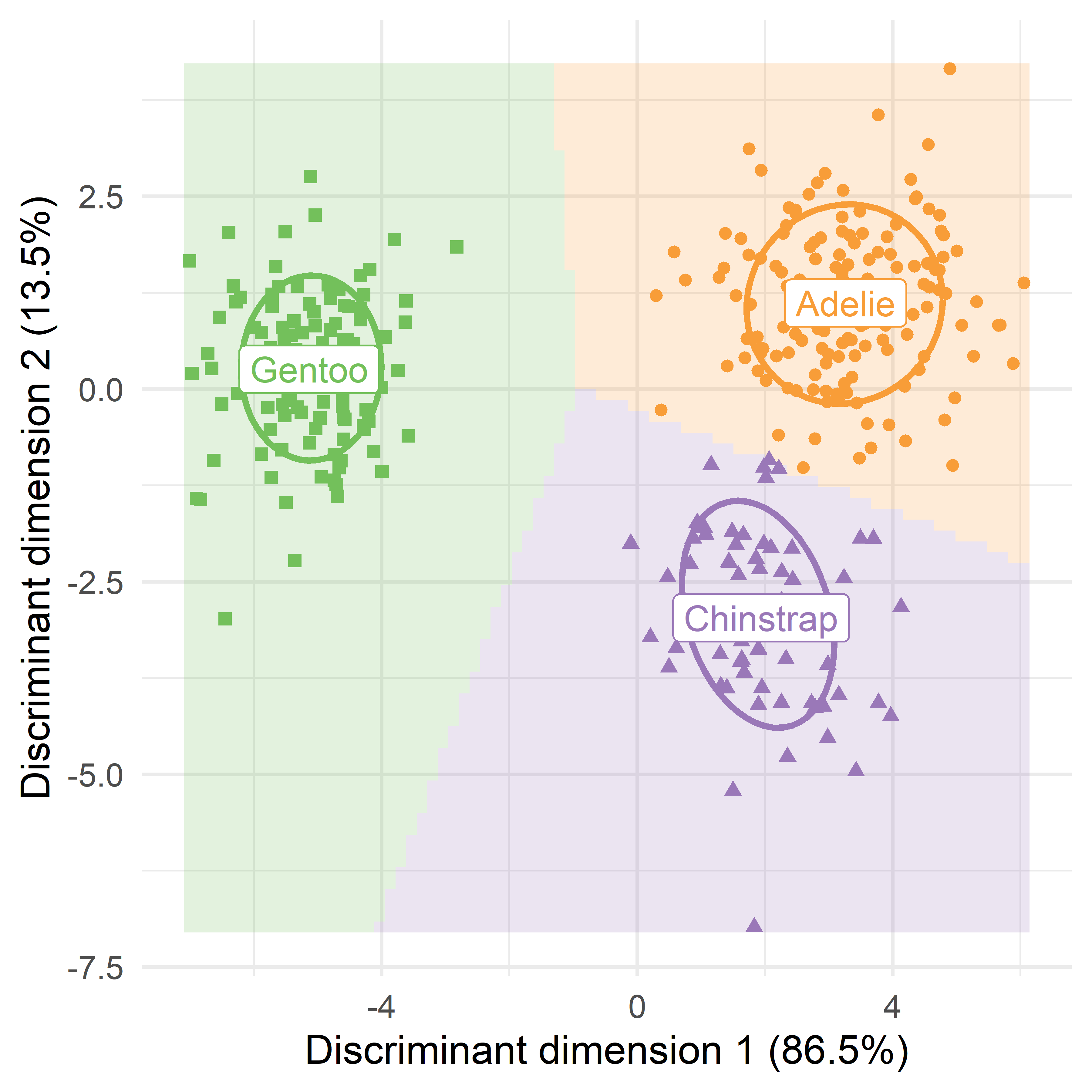
15.8.1 Adding variable vectors: LDA biplot
Figure 15.8 is like a PCA plot of observation scores on the first two dimensions, but with the addition of the prediction regions for LDA. As we saw earlier (Section 5.3), interpretation of such dimension reduction plots is considerably enhanced by drawing vectors, whose orientation (angles) with respect to the axes reflect the relations of the observed variables \(\mathbf{y}_1, \mathbf{y}_2, \dots\) to what is shown in the plot. The relative lengths of these vectors reflect their contributions.
In the result of lda() the weights for the observed variable are given in the scaling component, which is a matrix. For use with ggplot(), this must be converted to a data.frame, and the row names of the observed variables must be made into an explicit variable. To take less space in the plot, the underline (_) is replaced by a newline (\n).
vecs <- peng.lda$scaling |>
  as.data.frame() |>
  tibble::rownames_to_column(var = "label") |>
  mutate(label = stringr::str_replace(label, "_", "\n")) |>
  print()
#             label      LD1      LD2
# 1    bill\nlength -0.08593 -0.41660
# 2     bill\ndepth  1.04165 -0.01042
# 3 flipper\nlength -0.08455  0.01425
# 4      body\nmass -0.00135  0.00169
Then, I use gggda::geom_vector() to draw the variable vectors. Only the relative lengths of these matter, so you are free to multiply them by any constant to make them fill the plotting space. Because the interpretation of angles is important, it is necessary to assure that the aspect ratio of the plot is 1, so that one unit on the x-axis is the same length as one unit on the y-axis, which is done using coord_equal().
p + gggda::geom_vector(
  data = vecs,
  aes(x = 5*LD1, y = 5*LD2, label = label),
  lineheight = 0.8, linewidth = 1.25, size = 5
  ) +
  coord_equal()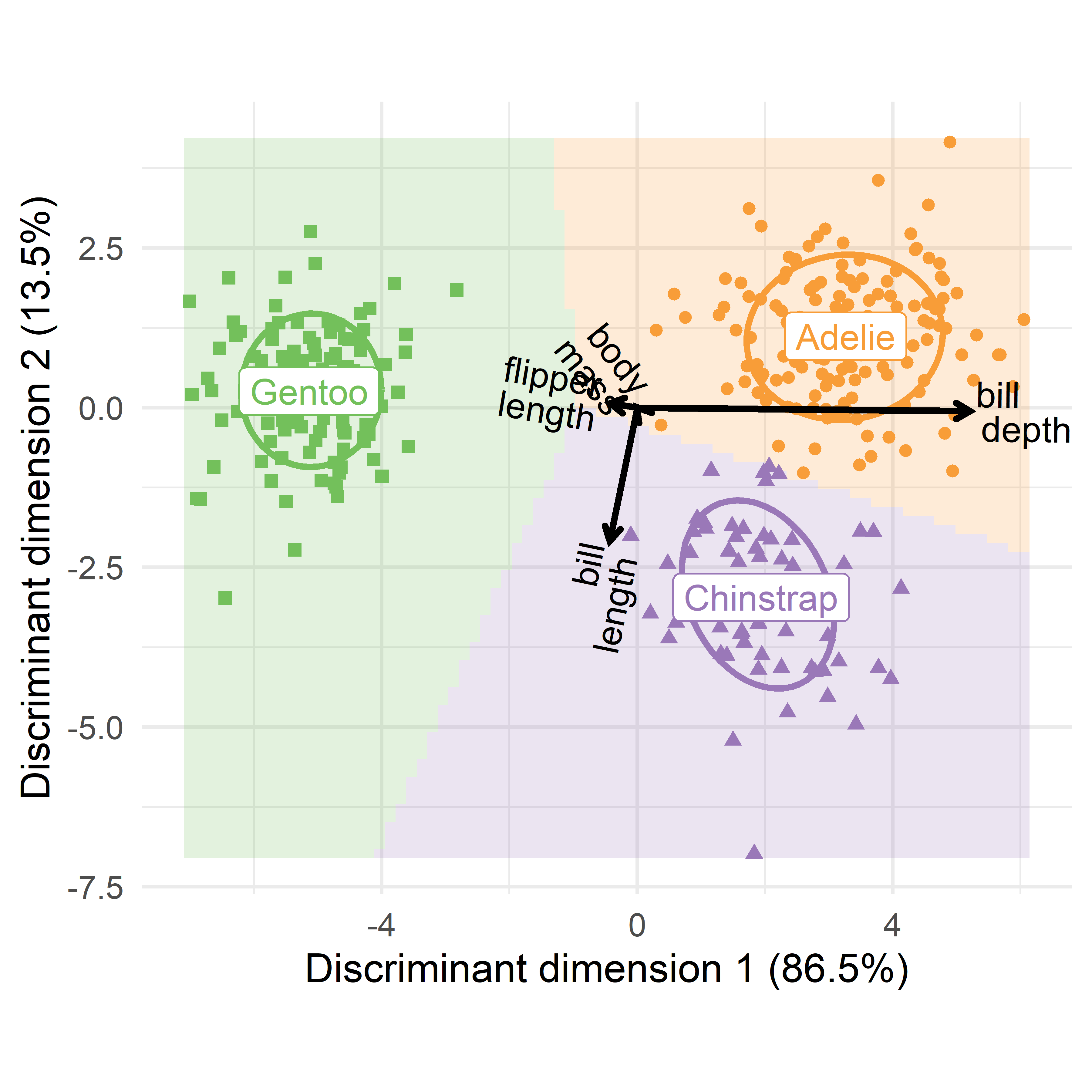
15.9 Relation to MANOVA and CDA
As I noted at the outset, LDA is in some sense a twin of MANOVA, but with its emphasis flipped from significance tests to classification. This connection can be made more apparent by using the canonical representation of the MANOVA (Section 12.7) implemented in the candisc package.
You can simply send the "mlm" object computed with lm() to candisc() and get significance tests for the model in terms of the dimensions that discriminate best among the species.
peng.mlm <- lm(cbind(bill_length, bill_depth, flipper_length, body_mass) ~ species ,
                data = peng)

peng.can <- candisc(peng.mlm, data=peng) |>
  print()
#
# Canonical Discriminant Analysis for species:
#
#   CanRsq Eigenvalue Difference Percent Cumulative
# 1  0.938      15.03       12.7    86.5       86.5
# 2  0.700       2.34       12.7    13.5      100.0
#
# Test of H0: The canonical correlations in the
# current row and all that follow are zero
#
#   LR test stat approx F numDF denDF Pr(> F)
# 1       0.0187      516     8   654  <2e-16 ***
# 2       0.2997      255     3   328  <2e-16 ***
# ---
# Signif. codes:  0 '***' 0.001 '**' 0.01 '*' 0.05 '.' 0.1 ' ' 1
In the printed table, the eigenvalues are the \(\lambda_i\) of \(\mathbf{H}\mathbf{E}^{-1}\) and their percent contributions are the same as what we saw from the discriminant analysis given by lda(). The significance tests printed are a variety called step-down tests (Roy, 1957), which test the contributions of the current row and all that follow in each line.
15.9.1 Canonical discriminant plot
The plot() method for a "candisc" object gives something similar to what we saw in Figure 15.9, but with more sensible scaling of the variable vectors. In the code, ellipse = TRUE adds 68% data ellipses for the discriminant scores for each species, and rev.axes is used to reflect the directon of the horizontal axis to make it similar to Figure 15.9. The result is shown in Figure 15.10.
Code
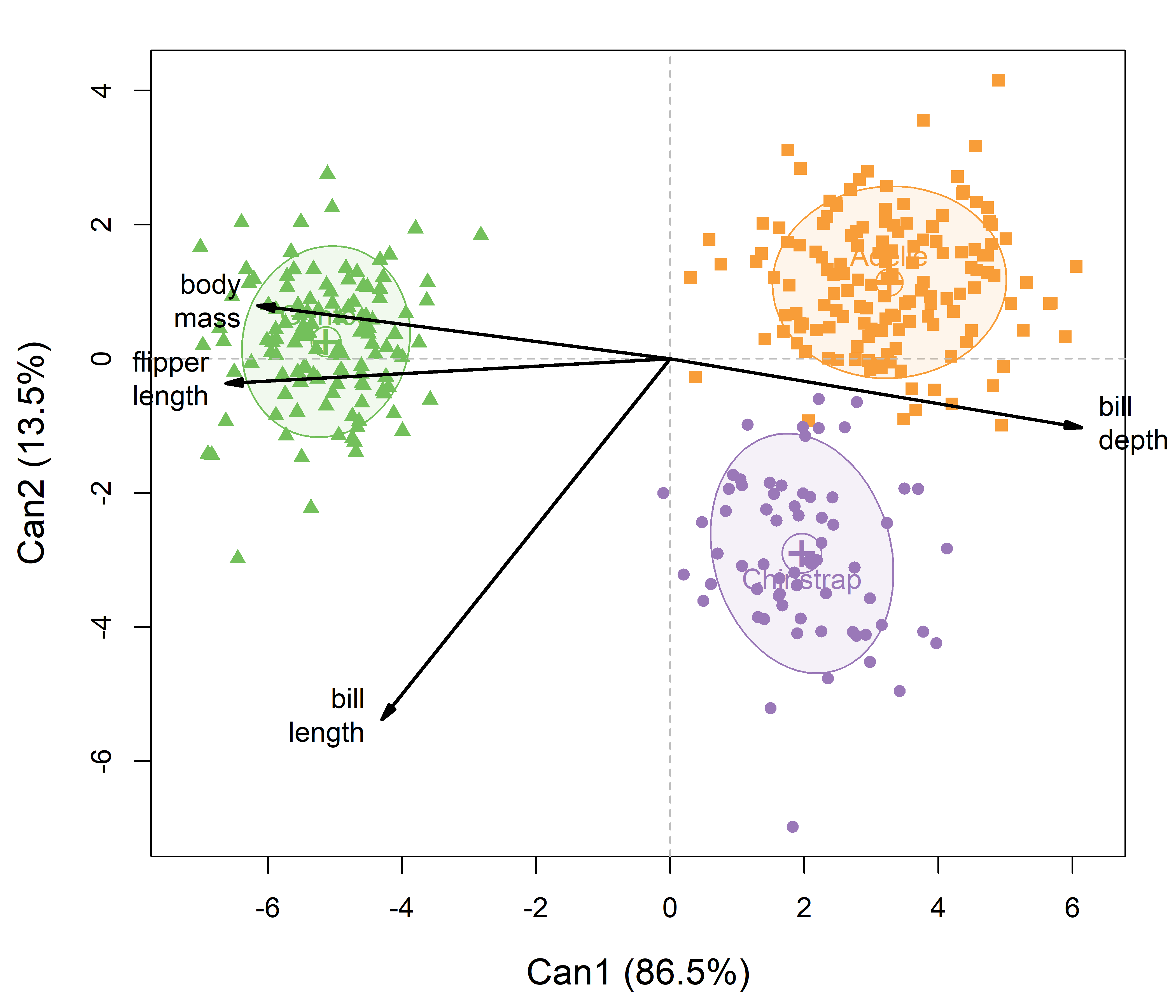
peng.mlm. Data ellipses summarize the within-group variation of the canonical scores. Variable vectors to show the correlations of the observed variables with the discriminant dimensions.
To interpret such plots, first consider the separation among the groups on a given dimension, and then how the variable vectors point on this dimension. In Figure 15.10, the first canonical dimension largely separates the Gentoos on the left from Adélie and Chinstrap on the right. This dimension is positively aligned with bill_depth, so these two groups have straighter bills than the Gentoo. But, the Gentoos tend to have larger body mass and longer flippers. The second dimension distinguishes mostly between the Adélie and Chinstraps, where the Chinstraps tend to have longer bills.
An important difference between this plot (Figure 15.10) and that shown for the discriminant analysis (Figure 15.9) is that the relative lengths and angles of the variable vectors differ in the two plots. This is because the variable coefficients in peng.lda$scaling calculated by lda() are unstandardized by default, whereas the plot from candisc() uses standardized, structure coefficients (correlations). These can be compared directly among variables to assess their relative importance. In the penguin data, body_mass is measured in grams, while the other variables are in millimeters. You would get more similar results from lda() if the variables were standardized first.
15.9.2 Canonical HE plot
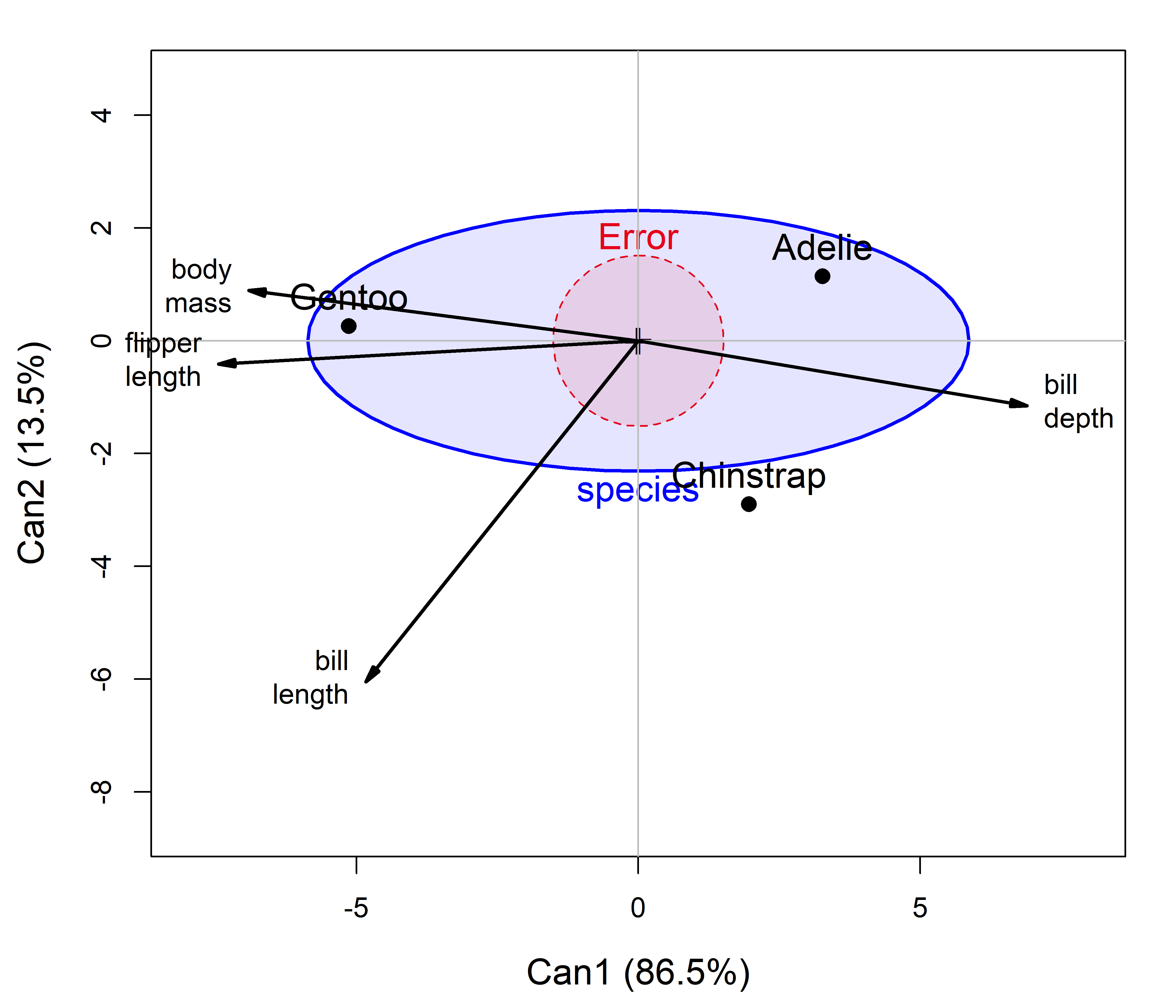
Finally, if the focus is on MANOVA, to simply determine whether and how the penguin species differ on these variables, you can summarize that with the canonical version of an HE plot, as shown in Figure 15.11, which effectively substitutes the canonical \(\mathbf{H}\) and \(\mathbf{E}\) ellipses for the canonical scores displayed in Figure 15.10.
This is shown using effect scaling (Section 12.4) because the differences among the groups (\(\mathbf{H}\)) are so large relative to within group variation (\(\mathbf{E}\)). The \(\mathbf{E}\) ellipse plots as a circle because the canonical scores are uncorrelated with variances of 1.
Code
peng.mlm.
15.10 Quadratic discriminant analysis
Linear discriminant analysis breaks down when the covariance matrices for the groups differ substantially. In the context of MANOVA, this issue was addressed in Chapter 13 through statistical tests and graphical methods for understanding how the group covariance matrices differ.
When the covariance matrices \(\mathbf{S}_k\) differ across the groups, the discriminant function Equation 15.1 becomes (Rao, 1948)
\[ \delta_k(x) = -\frac{1}{2}\ln|\mathbf{S}_k| - \frac{1}{2}(x-\bar{\mathbf{x}}_k)^\top\mathbf{S}_k^{-1}(x-\bar{\mathbf{x}}_k) + \ln(\pi_k) \; , \tag{15.2}\]
and again the observation \(\mathbf{x}\) is assigned to the class \(k\) that has the largest discriminant score. QDA gets its name because the resulting decision boundaries are quadratic (curved) rather than straight lines.
Happily, with these developments, all the methods for analysis and visualization work just the same, if you substitute MASS::qda() for MASS::lda() in the material above.
Example 15.3 Quadratic penguins
In Chapter 13, we saw that the Penguin groups had unequal covariance matrices when tested by Box’s \(\mathcal{M}\) test, but these did not differ dramatically in visual displays (e.g., Figure 13.4).
peng.qda <- qda(species ~ bill_length + bill_depth + flipper_length + body_mass,
                data = peng)
Plotting the quadratic prediction regions in data space in the same manner as in Figure 15.6, gives Figure 15.12.
bill_length vs. bill_depth; right: flipper_length vs. body mass.
You can see in Figure 15.12 that the decision boundaries for bill length and bill depth are only slightly curved. The penguin species are widely separated in this view and the extra complexity of the quadratic model doesn’t make much difference in this view.
In the right panel for flipper length and body mass, QDA uses its’ additional covariance parameters to construct more highly curved regions to try to isolate the smaller differences between the Adélie and Chinstraps. The difference between these two species appears more clearly in the low-rank canonical discriminant space of Figure 15.10.
Was the QDA analysis worth the extra complexity? A simple way to find out is to re-run the LDA and QDA analyses using cross validation (CV = TRUE) to assess the classification accuracy of each
peng.lda <- lda(species ~ bill_length + bill_depth + flipper_length + body_mass,
                data = peng, CV = TRUE)
peng.qda <- qda(species ~ bill_length + bill_depth + flipper_length + body_mass,
                data = peng, CV = TRUE)

# Calculate LOO CV accuracy
lda_accuracy <- mean(peng.lda$class == peng$species)
qda_accuracy <- mean(peng.qda$class == peng$species)
accuracy <- c(LDA = lda_accuracy,
              QDA = qda_accuracy,
              diff = qda_accuracy - lda_accuracy) |> print()
#   LDA   QDA  diff
# 0.985 0.988 0.003
So, for our penguin friends, we only gain an additional 0.3% accuracy by using the quadratic method. That’s good, because LDA is easier for them to explain to new penguins, like Betsy and Dave, who come to an island and request membership in a particular species group. The Penguin Refugee Board could then measure them and assign them to the most appropriate LDA group.
15.11 What have we learned?
Linear discriminant analysis is MANOVA with its emphasis flipped: rather than testing whether groups differ on a set of response variables, you ask how to classify an observation into the most likely group. Both methods share the same mathematical engine—eigenvalues of \(\mathbf{H}\mathbf{E}^{-1}\)—but lead to different visualizations and different questions.
LDA reverses the MANOVA formula: In MANOVA, the group factor predicts the \(\mathbf{y}\) variables; in LDA, the \(\mathbf{y}\) variables predict group membership. The same decomposition into between-group (\(\mathbf{H}\)) and within-group (\(\mathbf{E}\)) matrices underlies both, but the goal shifts from significance testing to classification.
Discriminant dimensions reduce a \(p\)-dimensional classification problem to a small number of scores: With \(g\) groups, there are at most \(s = \min(p, g-1)\) discriminant dimensions. The first, \(\text{LD}_1\), captures the greatest between-group separation relative to within-group variation; the second captures the next most, and so on. For the penguin data, two dimensions account for the entire 4D classification problem, and a single 2D plot tells the full story.
Prior probabilities shift the decision boundary: When groups differ in prevalence or when misclassification errors carry unequal costs, prior probabilities adjust where the boundary falls. A higher prior for one group pulls the boundary toward its competitors, increasing the fraction of observations assigned to it.
Classification accuracy is read from the confusion table: Comparing actual to predicted class memberships reveals where the classifier succeeds and where it confuses groups. For the penguin data, only Adélie and Chinstrap were confused—four birds out of 333—a pattern that becomes visually clear in the discriminant plots.
Visualization in data space shows the geometry of individual decisions: Plotting new observations alongside the original data, with 95% data ellipses, lets you see at a glance why a penguin on island Z was classified as Gentoo. The limitation is that with \(p\) variables there are \(\binom{p}{2}\) pairwise plots to examine; none tells the whole story by itself.
Visualization in discriminant space gives a comprehensive picture low-D space: Because the discriminant scores capture all the classification-relevant variation, a single plot of \(\text{LD}_1\) vs. \(\text{LD}_2\) shows how all groups separate. Adding prediction regions—colored tiles showing which group would be assigned at any point in this space—makes the decision boundaries explicit. Overlaying variable vectors (an LDA biplot, analogous to a PCA biplot) shows which measured variables drive each dimension.
candisc()bridges LDA and MANOVA: Runningcandisc()on the same"mlm"object used for MANOVA provides significance tests for each discriminant dimension, a canonical discriminant plot with properly scaled structure-coefficient vectors, and a canonical HE plot that shows the between-group hypothesis ellipse against the within-group error ellipse in the discriminant space. This makes explicit the connection between visual hypothesis testing and classification.Quadratic discriminant analysis handles unequal covariance matrices: When the within-group covariance matrices \(\mathbf{S}_k\) differ substantially across groups, the linear decision boundaries of LDA are no longer appropriate and QDA replaces them with curved boundaries. Swapping
qda()forlda()in the visualization routines shown here—plot_discrim(), the grid-prediction approach—produces the quadratic versions with no further changes to the plotting code.
The function
candisc::candisc()carries out a generalized discriminant analysis, for one term in a multivariate linear model.candisc::candiscList()does this for all terms in a model.↩︎There are a number of other methods of discriminant analysis. For example, in mixture discriminant analysis (MDA), each class is assumed to be a mixture of several Gaussian distributions, rather than a single one. flexible discriminant analysis (FDA) is an extension of LDA that uses non-linear combinations of predictors such as splines. FDA is useful to model multivariate non-normality or non-linear relationships among variables within each group, allowing for a more accurate classification. These are implemented in the package mda as
mda()andfda(), which have the same syntax and similar methods tolda().↩︎You can choose prior probabilities for discriminant analysis by (a) using equal probabilities for the groups, (b) calculating them based on the observed sample sizes in your dataset, or (c) manually specifying known prior probabilities if you have external information about the population. The choice depends on whether you want the model to be influenced by group sizes or if you have pre-existing knowledge about the likelihood of group membership.↩︎
The choice of prior probabilities can also be influenced by the cost of misclassification. For example in a two-group case of medical diagnosis, the cost of misclassifying a sample as “normal” rather than “disease” might be much higher than the reverse error.↩︎
In fairness,
klaR::partimat()was designed to emphasize the classification accuracy shown in each pairwise plot, also printed as an error rate for each plot. You can see, for example that the plot ofbody_massagainstbill_depthin row 2, column 2 of Figure 15.5 shows only two distinct regions, for Adélie and Gentoo. All the Chinstraps appear mixed in with the Adélies, giving an error rate of 0.204 in this plot. Two other panels also show high error rates.↩︎