
Plotting nestedLogit models with ggplot2
Michael Friendly and John Fox
2026-03-07
Source:vignettes/plotting-ggplot.Rmd
plotting-ggplot.RmdLoad the packages we’ll use here:
library(nestedLogit)    # Nested Dichotomy Logistic Regression Models
library(knitr)          # A General-Purpose Package for Dynamic Report Generation in R
library(dplyr)          # A Grammar of Data Manipulation
library(tidyr)          # Tidy Messy Data
library(ggplot2)        # Create Elegant Data Visualisations Using the Grammar of Graphics
library(geomtextpath)   # Curved Text in 'ggplot2'
The main vignette illustrated the basic plot method,
plot.nestedLogit() in the package. However, for better
control of the details and possibly more pleasing graphs, it is useful
to describe how graphs can be constructed using ggplot2
(Wickham et al., 2026). We’ll use the same
example of women’s labor force participation, using the original
dichotomies:
data(Womenlf, package = "carData")
comparisons <- logits(work=dichotomy("not.work", c("parttime", "fulltime")),
                      full=dichotomy("parttime", "fulltime"))

wlf.nested <- nestedLogit(partic ~ hincome + children,
                          dichotomies = comparisons,
                          data=Womenlf)
The advantages of this approach are that
- you can handle more complicated designs with more predictors by faceting,
- it allows you to plot either the fitted probabilities or their transformed logits,
- you can also obtain plots for log odds corresponding to each of the dichotomies which comprise the nested logit model.
As we will illustrate, this provides a nice visual interpretation of
the alternative specification of dichotomies for the
Womenlf data discussed in the section “Alternative models
for the Womenlf data” of the main vignette.
Fitted probabilities
To draw a plot, it is sufficient to calculate predicted probabilities
over a grid of values of the predictor variables. Here, we select a
range of 0 - 45 in steps of 5, combined with the two values of
children.
new <- expand.grid(hincome=seq(0, 45, by = 5),
                   children=c("absent", "present"))

pred.nested <- predict(wlf.nested, newdata = new)
names(pred.nested)
#> [1] "p"        "logit"    "se.p"     "se.logit" ".data"
As explained in help(predict.nestedLogit), the predict
method returns a complicated structure – a list of four data frames
corresponding to the predicted probabilities for the response
categories, the corresponding logits, and each of their standard
errors.
head(pred.nested[["p"]])
#>   not.work parttime fulltime
#> 1   0.2082  0.02372   0.7681
#> 2   0.2452  0.03785   0.7169
#> 3   0.2864  0.05907   0.6545
#> 4   0.3315  0.08936   0.5791
#> 5   0.3800  0.12944   0.4906
#> 6   0.4309  0.17691   0.3922
However, ggplot wants the data in long format. This is
easily done using the as.data.frame() method, which also
includes the values of the predictors in the newdata data
set:
plotdata <- as.data.frame(pred.nested, newdata=new)
head(plotdata)
#>   hincome children response       p    se.p   logit se.logit
#> 1       0   absent not.work 0.20820 0.06326 -1.3358   0.3838
#> 2       0   absent parttime 0.02372 0.01775 -3.7176   0.7666
#> 3       0   absent fulltime 0.76809 0.06386  1.1975   0.3585
#> 4       5   absent not.work 0.24522 0.05799 -1.1243   0.3133
#> 5       5   absent parttime 0.03785 0.02222 -3.2356   0.6101
#> 6       5   absent fulltime 0.71694 0.05933  0.9293   0.2923
Plotting with ggplot2
Then we can plot probability against one predictor, use
color to distinguish the levels of the response
(partic) and facet the plot by children. The
point-wise standard errors are drawn in a 68% confidence envelope using
geom_ribbon(). We’ve also plotted the predicted values as
points to show where the predictions are obtained.
theme_set(theme_bw(base_size = 14))

gg1 <- ggplot(plotdata,
       aes(x=hincome, y=p, color=response)) +
  geom_line(linewidth = 2) +
  geom_point(size = 1.5, shape = 16, color = "black") +
  labs(x="Husband's Income", y= "Probability") +
  facet_wrap(~ children, labeller = label_both) +
  geom_ribbon(aes(ymin=p - se.p,
                  ymax=p + se.p,
                  fill = response), alpha = 0.3)

gg1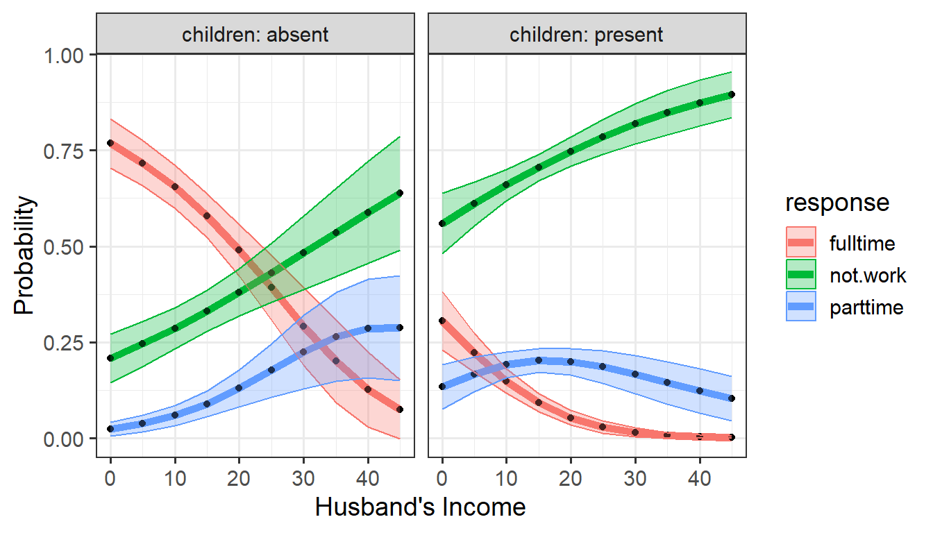
ggplot: Predicted probabilities of working at all or
working part time or full time versus husband’s income, by
children
It is noteworthy that the confidence envelopes are wider for not-working women at higher levels of husband’s income, where there are fewer observations.
Direct labels
Plot legends are somewhat hard to read and take up unnecessary space
in the plot, so it is often better to label the curves directly. The
geomtextpath package (R-geomtextpath?) produces a
nicer plot.
gg1 + geom_textline(aes(label = response),
                    hjust = -0.01, vjust=-0.5, size=5) +
  theme(legend.position = "none")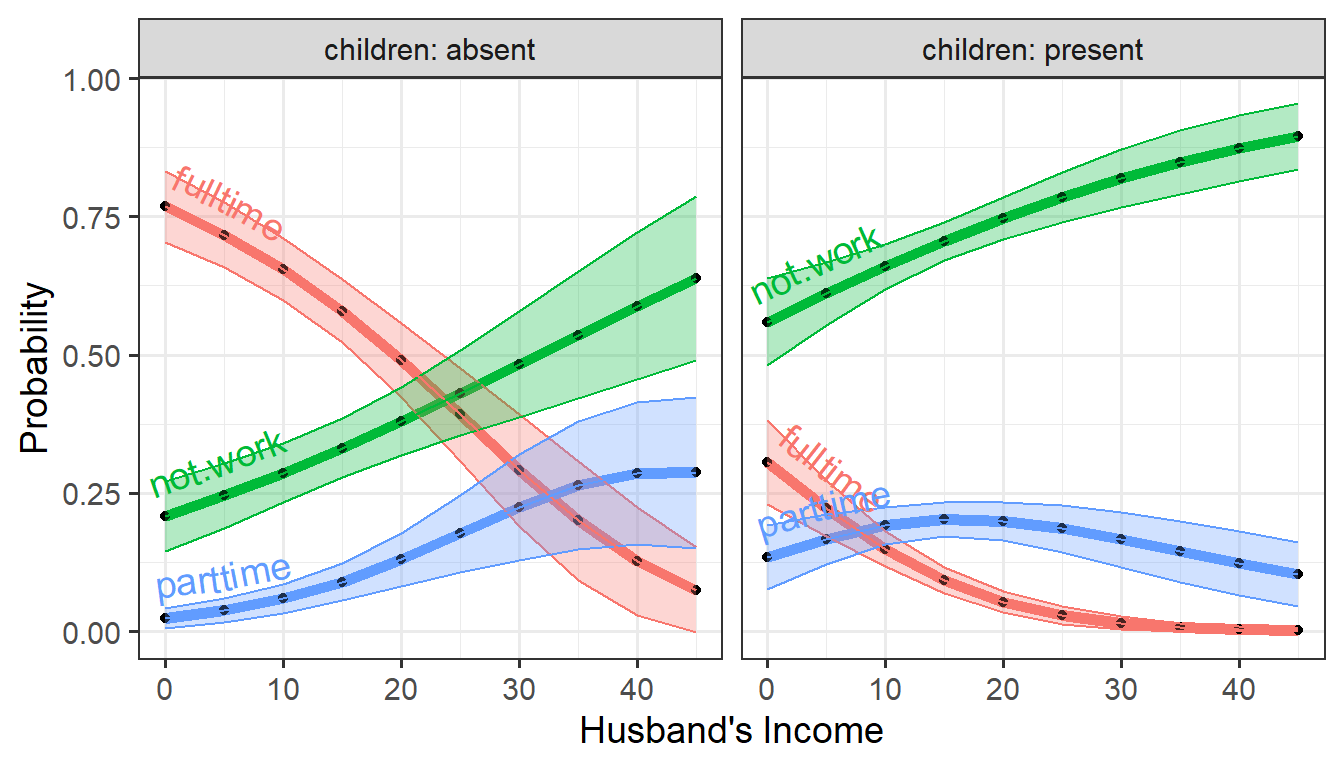
The same plot using direct labels on the curves rather than a legend.
Plotting log-odds
The advantage of the data structure returned by
as.data.frame() is that you can just as easily plot the
predicted probabilities on the scale of log-odds
(),
using the logit and logit.se components.
ggplot(plotdata,
       aes(x=hincome, y=logit, color=response)) +
  geom_line(linewidth = 2) +
  geom_point(size = 1.5, shape = 16, color = "black") +
  labs(x="Husband's Income", y= "Log Odds") +
  facet_wrap(~ children, labeller = label_both) +
  geom_ribbon(aes(ymin=logit - se.logit,
                  ymax=logit + se.logit,
                  fill = response), alpha = 0.3) +
  geom_textline(aes(label = response),
                hjust = -0.01, vjust=-0.5, size=5) +
  theme(legend.position = "none")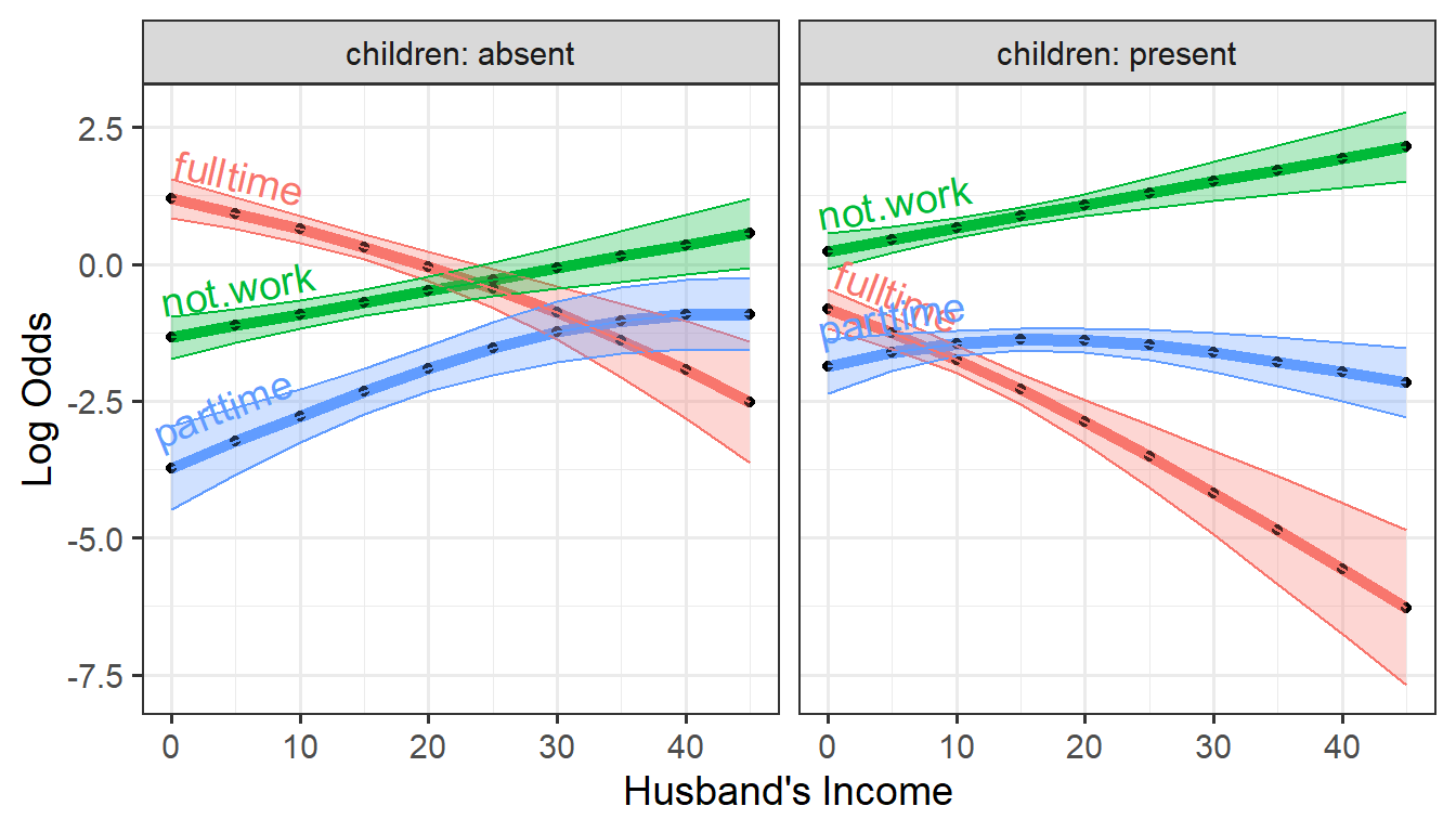
Predicted log odds of working at all or working part time or full time
versus husband’s income, by children
Predicted logit values for the dichotomies
The nested logit model wlf.nested comprises the two
binary logistic regression models for the work and
full dichotomies. We can plot these as follows.
The predict() method can also generate predicted values
and their standard errors for the logits of these dichotomies, using the
model = "dichotomies" argument:
pred.dichot <- predict(wlf.nested, newdata = new,
                       model = "dichotomies")
str(pred.dichot)
#> List of 3
#>  $ work :'data.frame':   20 obs. of  3 variables:
#>   ..$ fit           : num [1:20] 1.336 1.124 0.913 0.701 0.49 ...
#>   ..$ se.fit        : num [1:20] 0.384 0.313 0.262 0.242 0.261 ...
#>   ..$ residual.scale: num [1:20] 1 1 1 1 1 1 1 1 1 1 ...
#>  $ full :'data.frame':   20 obs. of  3 variables:
#>   ..$ fit           : num [1:20] 3.48 2.94 2.41 1.87 1.33 ...
#>   ..$ se.fit        : num [1:20] 0.767 0.613 0.489 0.423 0.443 ...
#>   ..$ residual.scale: num [1:20] 1 1 1 1 1 1 1 1 1 1 ...
#>  $ .data:'data.frame':   20 obs. of  2 variables:
#>   ..$ hincome : num [1:20] 0 5 10 15 20 25 30 35 40 45 ...
#>   ..$ children: Factor w/ 2 levels "absent","present": 1 1 1 1 1 1 1 1 1 1 ...
#>   ..- attr(*, "out.attrs")=List of 2
#>   .. ..$ dim     : Named int [1:2] 10 2
#>   .. .. ..- attr(*, "names")= chr [1:2] "hincome" "children"
#>   .. ..$ dimnames:List of 2
#>   .. .. ..$ hincome : chr [1:10] "hincome= 0" "hincome= 5" "hincome=10" "hincome=15" ...
#>   .. .. ..$ children: chr [1:2] "children=absent" "children=present"
#>  - attr(*, "model")= chr "wlf.nested"
#>  - attr(*, "dichotomies")= chr [1:2] "work" "full"
#>  - attr(*, "class")= chr "predictDichotomies"
Transforming this to a data frame, we get an analogous result for plotting:
plotlogit <- as.data.frame(pred.dichot, newdata = new)
head(plotlogit)
#>   hincome children response  logit se.logit
#> 1       0   absent     work 1.3358   0.3838
#> 2       5   absent     work 1.1243   0.3133
#> 3      10   absent     work 0.9127   0.2620
#> 4      15   absent     work 0.7012   0.2422
#> 5      20   absent     work 0.4897   0.2613
#> 6      25   absent     work 0.2781   0.3121
Then, plot the logit vs. husband’s income, with separate
curves for the two sub-models:
ggplot(plotlogit,
       aes(x=hincome, y=logit, color=response)) +
  geom_line(linewidth = 2) +
  geom_point(size = 1.5, shape = 16, color = "black") +
  labs(x="Husband's Income", y= "Log Odds") +
  facet_wrap(~ children, labeller = label_both) +
  geom_ribbon(aes(ymin=logit - se.logit,
                  ymax=logit + se.logit,
                  fill = response), alpha = 0.3) +
  geom_textline(aes(label = response),
                hjust = -0.01, vjust=-0.5, size=5) +
  theme(legend.position = "none")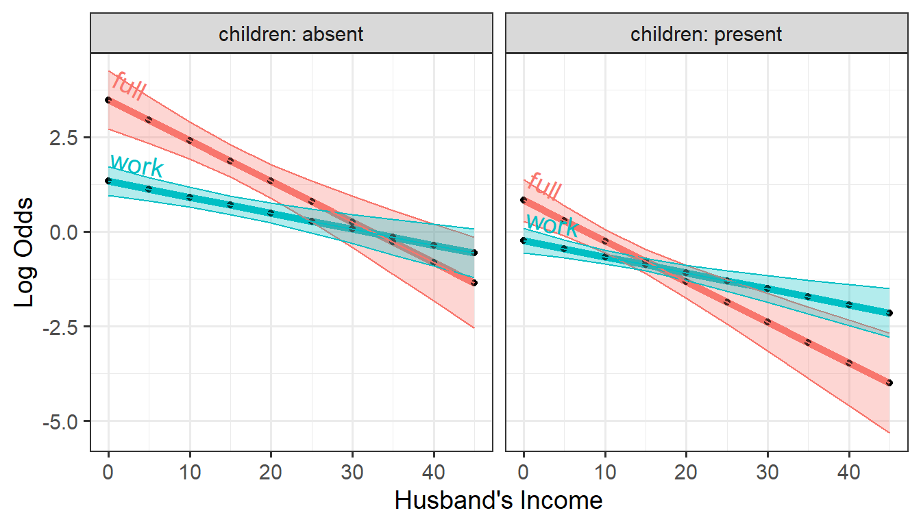
Predicted logits for the two dichotomies, work and
full versus hincome, by children
Or, interchanging the roles of children and
response, we can plot these the other way, faceting by
response.
ggplot(plotlogit,
       aes(x=hincome, y=logit, color=children)) +
  geom_line(linewidth = 2) +
  geom_point(size = 1.5, shape = 16, color = "black") +
  labs(x="Husband's Income", y= "Log Odds") +
  facet_wrap(~ response, labeller = label_both) +
  geom_ribbon(aes(ymin=logit - se.logit,
                  ymax=logit + se.logit,
                  fill = children), alpha = 0.3) +
  geom_textline(aes(label = children),
                hjust = -0.01, vjust=-0.5, size=5) +
  theme(legend.position = "none")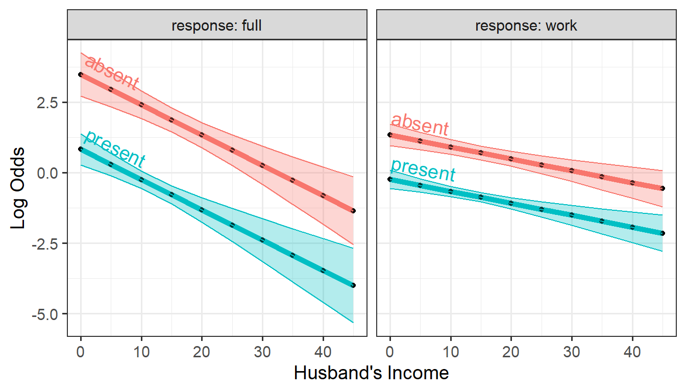
Predicted logits for the two dichotomies, work and
full versus hincome, by response
This nicely illustrates the nature of the fitted logit models: The
lines in each panel have the same slopes for the two levels of
children, differing only in their intercepts. The
full distinction between working full-time vs. part-time
decreases faster with husband’s income than for the work
dichotomy between not working at all and working either part-time or
full-time.
Alternative model
In the main vignette we mentioned that an alternative set of nested dichotomies first contrasts full-time work with the other categories, {full-time} vs. {not working, part-time}, and then {not working} vs. {part-time}.
wlf.nested.alt <- nestedLogit(partic ~ hincome + children,
                              logits(full=dichotomy(nonfulltime=c("not.work", "parttime"), "fulltime"),
                                     part=dichotomy("not.work", "parttime")),
                              data=Womenlf)
Proceeding in the same way as above, we get predicted logits and standard errors for each of the dichotomies.
pred.dichot.alt <- predict(wlf.nested.alt, newdata = new,
                       model = "dichotomies")
plotlogit.alt <- as.data.frame(pred.dichot.alt, newdata = new)
head(plotlogit.alt)
#>   hincome children response   logit se.logit
#> 1       0   absent     full  1.7696   0.4690
#> 2       5   absent     full  1.2762   0.3577
#> 3      10   absent     full  0.7827   0.2723
#> 4      15   absent     full  0.2893   0.2421
#> 5      20   absent     full -0.2042   0.2852
#> 6      25   absent     full -0.6976   0.3772
Plotting these as before:
ggplot(plotlogit.alt,
       aes(x=hincome, y=logit, color=children)) +
  geom_line(linewidth = 2) +
  geom_point(size = 1.5, shape = 16, color = "black") +
  labs(x="Husband's Income", y= "Log Odds") +
  facet_wrap(~ response, labeller = label_both) +
  geom_ribbon(aes(ymin=logit - se.logit,
                  ymax=logit + se.logit,
                  fill = children), alpha = 0.3) +
  geom_textline(aes(label = children),
                hjust = -0.01, vjust=-0.5, size=5) +
  theme(legend.position = "none")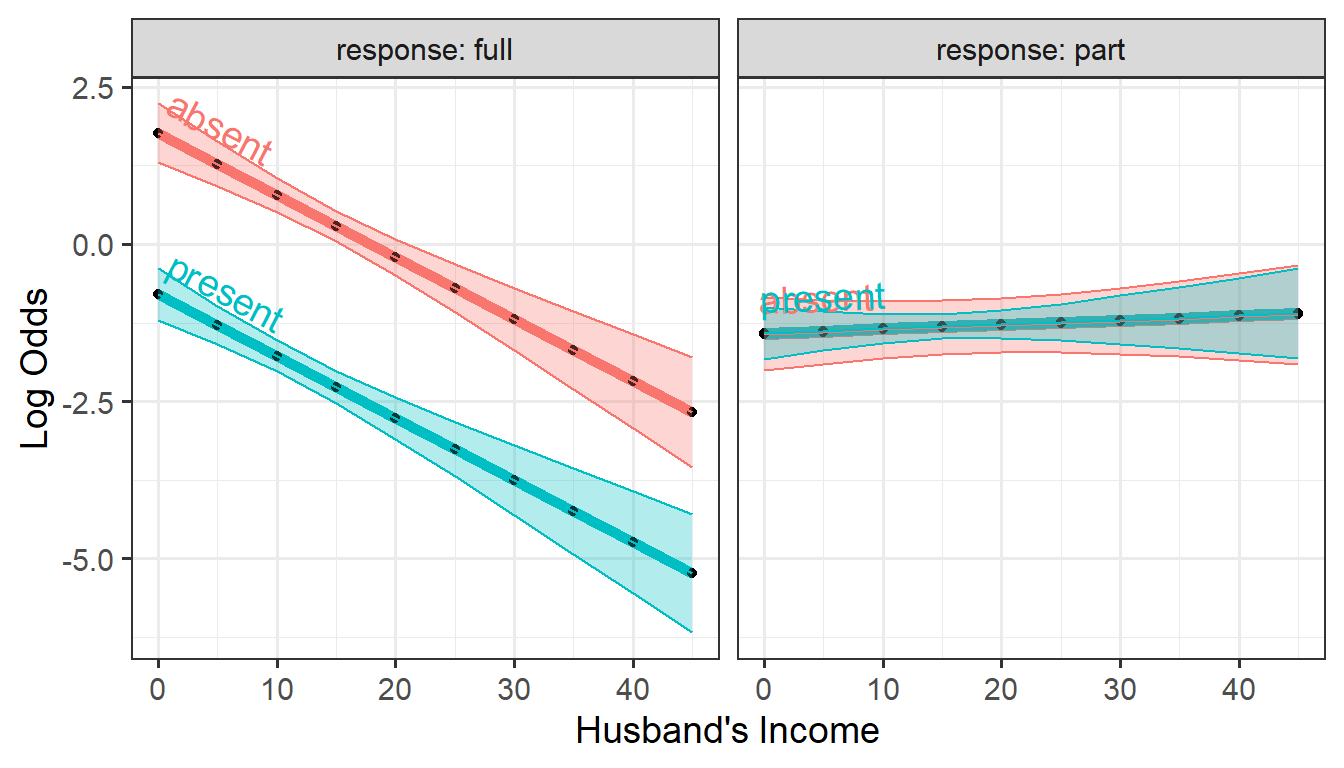
Predicted logits for the two dichotomies, work and
full versus hincome, by response
It’s apparent that the alternative model produces a simpler description of the data: The predictors husband’s income and presence of children affect the decision to work full-time, but not the decision to work part-time among those who aren’t engaged in full-time work. In particular it is clear that neither husband’s income nor having young children has any effect on the decision to work part-time.