Vignette built using heplots, version 1.8.1
and candisc, version 1.1.0.
Multivariate Analysis of Variance Designs
This vignette provides some worked examples of the analysis of multivariate linear models (MLMs) for MANOVA designs where all predictors are factors, and the goal is to determine how the group means differ on several response variables in relation to the factors and possible interactions.
Graphical methods for visualizing results using the heplots and the candisc packages
are illustrated.
The emphasis here is on using these methods in R, and understanding how they help reveal
aspects of these models that might not be apparent from other graphical displays.
No attempt is made here to describe the theory of MLMs or the statistical details behind HE plots and their reduced-rank canonical cousins. For that, see Fox, Friendly, & Monette (2009); Friendly (2007); Friendly (2006).
1 Adolescent Mental Health Data
This is a simple example of a one-way MANOVA design with a quantitative factor.
The dataset, AddHealth, contains a large cross-sectional sample of participants from grades 7–12
from the National Longitudinal Study of Adolescent Health, described by Warne (2014).
It contains responses to two Likert-scale (1–5) items, anxiety and depression.
grade is an ordered factor, which means that the default contrasts are taken as
orthogonal polynomials with linear (grade.L), quadratic (grade.Q), up to 5th degree (grade^5)
trends, which decompose the total effect of grade.
data(AddHealth, package="heplots")
str(AddHealth)
#> 'data.frame':    4344 obs. of  3 variables:
#>  $ grade     : Ord.factor w/ 6 levels "7"<"8"<"9"<"10"<..: 5 4 6 1 2 2 2 3 3 3 ...
#>  $ depression: int  0 0 0 0 0 0 0 0 1 2 ...
#>  $ anxiety   : int  0 0 0 1 1 0 0 1 1 0 ...
The research questions are:
- How do the means for anxiety and depression vary separately with grade? Is there evidence for linear and nonlinear trends?
- How do anxiety and depression vary jointly with grade?
- How does the association of anxiety and depression vary with age?
The first question can be answered by fitting separate linear models for each response
(e.g., lm(anxiety ~ grade))). However the second question is more interesting because it
considers the two responses together and takes their correlation into account. This would
be fit as the MLM:
\[ \mathbf{y} = \boldsymbol{\beta}_0 + \boldsymbol{\beta}_1 x + \boldsymbol{\beta}_2 x^2 + \cdots \boldsymbol{\beta}_5 x^5 \tag{1.1} \] or, \[ \begin{eqnarray*} \begin{bmatrix} y_{\text{anx}} \\y_{\text{dep}} \end{bmatrix} & = & \begin{bmatrix} \beta_{0,\text{anx}} \\ \beta_{0,\text{dep}} \end{bmatrix} + \begin{bmatrix} \beta_{1,\text{anx}} \\ \beta_{1,\text{dep}} \end{bmatrix} \text{grade} + \begin{bmatrix} \beta_{2,\text{anx}} \\ \beta_{2,\text{dep}} \end{bmatrix} \text{grade}^2 + \cdots \begin{bmatrix} \beta_{5,\text{anx}} \\ \beta_{5,\text{dep}} \end{bmatrix} \text{grade}^5 \end{eqnarray*} \]
Using lm() we get the coefficients for each of the polynomial terms in grade:
lm(cbind(anxiety, depression) ~ grade, data=AddHealth)
#>
#> Call:
#> lm(formula = cbind(anxiety, depression) ~ grade, data = AddHealth)
#>
#> Coefficients:
#>              anxiety   depression
#> (Intercept)   0.94286   1.18437
#> grade.L       0.32072   0.38917
#> grade.Q      -0.02662  -0.12256
#> grade.C      -0.03979  -0.00952
#> grade^4      -0.02458  -0.04024
#> grade^5      -0.06263  -0.00239
Exploratory plots
Some exploratory analysis is useful before fitting and visualizing models. As a first step, find the means, standard deviations, and standard errors of the means:
library(ggplot2)
library(dplyr)
library(patchwork)

means <- AddHealth |>
  group_by(grade) |>
  summarise(
    n = n(),
    dep_sd = sd(depression, na.rm = TRUE),
    anx_sd = sd(anxiety, na.rm = TRUE),
    dep_se = dep_sd / sqrt(n),
    anx_se = anx_sd / sqrt(n),
    depression = mean(depression),
    anxiety = mean(anxiety) ) |>
  relocate(depression, anxiety, .after = grade) |>
  print()
#> # A tibble: 6 × 8
#>   grade depression anxiety     n dep_sd anx_sd dep_se anx_se
#>   <ord>      <dbl>   <dbl> <int>  <dbl>  <dbl>  <dbl>  <dbl>
#> 1 7          0.881   0.751   622   1.11   1.05 0.0447 0.0420
#> 2 8          1.08    0.804   664   1.19   1.06 0.0461 0.0411
#> 3 9          1.17    0.934   778   1.19   1.08 0.0426 0.0387
#> 4 10         1.27    0.956   817   1.23   1.11 0.0431 0.0388
#> 5 11         1.37    1.12    790   1.20   1.16 0.0428 0.0411
#> 6 12         1.34    1.10    673   1.14   1.11 0.0439 0.0426
Now, plot the means with \(\pm 1\) error bars. It appears that average level of both depression and anxiety increase steadily with grade, except for grades 11 and 12 which don’t differ much.
p1 <-ggplot(data = means, aes(x = grade, y = anxiety)) +
  geom_point(size = 4) +
  geom_line(aes(group = 1), linewidth = 1.2) +
  geom_errorbar(aes(ymin = anxiety - anx_se,
                   ymax = anxiety + anx_se),
                width = .2) +
  theme_bw(base_size = 15)

p2 <-ggplot(data = means, aes(x = grade, y = depression)) +
  geom_point(size = 4) +
  geom_line(aes(group = 1), linewidth = 1.2) +
  geom_errorbar(aes(ymin = depression - dep_se,
                    ymax = depression + dep_se),
                width = .2) +
  theme_bw(base_size = 15)

p1 + p2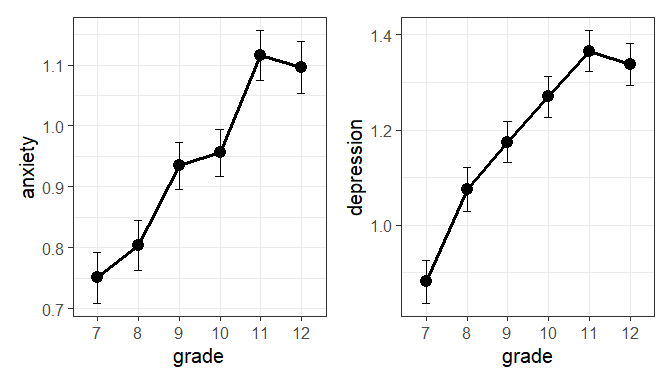
Figure 1.1: Means of anxiety and depression by grade, with \(\pm 1\) standard error bars.
Treating anxiety and depression as multivariate outcomes, we can also plot their bivariate means.
ggplot(data = means, aes(x = anxiety, y = depression,
                         color = grade)) +
  geom_point(size = 3) +
  geom_errorbarh(aes(xmin = anxiety - anx_se,
                    xmax = anxiety + anx_se)) +
  geom_errorbar(aes(ymin = depression - dep_se,
                    ymax = depression + dep_se)) +
  geom_line(aes(group = 1), linewidth = 1.5) +
  geom_label(aes(label = grade),
             nudge_x = -0.015, nudge_y = 0.02) +
  scale_color_discrete(guide = "none") +
  theme_bw(base_size = 15)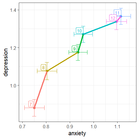
Figure 1.2: Joint plot of means of anxiety and depression by grade, with \(\pm 1\) standard error bars.
You can examine the within-group correlations using covEllipses(). Because the variability of the
scores is so large compared to the range of the means, I show the data ellipses with coverage of
only 10%.
covEllipses(AddHealth[, 3:2], group = AddHealth$grade,
            pooled = FALSE, level = 0.1,
            center.cex = 2.5, cex = 1.5, cex.lab = 1.5,
            fill = TRUE, fill.alpha = 0.05)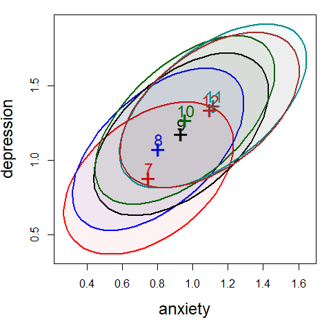
Figure 1.3: Within-group covariance ellipses for the grade groups.
Fit the MLM
Now, let’s fit the MLM for both responses jointly in relation to grade. The null hypothesis is that the means for anxiety and depression are the same at all six grades,
\[
H_0 : \mathbf{\mu}_7 = \mathbf{\mu}_8 = \cdots = \mathbf{\mu}_{12} \; ,
\]
or equivalently, that all coefficients except the intercept in the model (1.1) are zero,
\[
H_0 : \boldsymbol{\beta}_1 = \boldsymbol{\beta}_2 = \cdots = \boldsymbol{\beta}_5 = \boldsymbol{0} \; .
\]
The overall test, with 5 degrees of freedom is diffuse, in that it can be rejected if any pair of means differ.
car::Anova() gives a simple display of the multivariate test, using the Pillai trace criterion.
AH.mlm <- lm(cbind(anxiety, depression) ~ grade, data = AddHealth)

# overall test of `grade`
Anova(AH.mlm)
#>
#> Type II MANOVA Tests: Pillai test statistic
#>       Df test stat approx F num Df den Df Pr(>F)
#> grade  5    0.0224     9.83     10   8676 <2e-16 ***
#> ---
#> Signif. codes:  0 '***' 0.001 '**' 0.01 '*' 0.05 '.' 0.1 ' ' 1
The summary() method for this gives all four test statistics.
## show separate multivariate tests
summary(Anova(AH.mlm)) |> print(SSP = FALSE)
#>
#> Type II MANOVA Tests:
#>
#> ------------------------------------------
#>
#> Term: grade
#>
#> Multivariate Tests: grade
#>                  Df test stat approx F num Df den Df    Pr(>F)
#> Pillai            5   0.02242   9.8340     10   8676 < 2.2e-16 ***
#> Wilks             5   0.97762   9.8726     10   8674 < 2.2e-16 ***
#> Hotelling-Lawley  5   0.02286   9.9112     10   8672 < 2.2e-16 ***
#> Roy               5   0.02119  18.3878      5   4338 < 2.2e-16 ***
#> ---
#> Signif. codes:  0 '***' 0.001 '**' 0.01 '*' 0.05 '.' 0.1 ' ' 1
Testing linear hypotheses
Given that grade is an ordered factor, it makes sense to examine narrower hypotheses
of linear and nonlinear trends. car::linearHypothesis() provides a general way to
do this, giving multivariate tests for one or more linear combinations of coefficients.
The joint test of the linear coefficients for anxiety and depression, \(H_0 : \boldsymbol{\beta}_1 = \boldsymbol{0}\) is highly significant,
## linear effect
linearHypothesis(AH.mlm, "grade.L") |> print(SSP = FALSE)
#>
#> Multivariate Tests:
#>                  Df test stat approx F num Df den Df    Pr(>F)
#> Pillai            1   0.01921   42.479      2   4337 < 2.2e-16 ***
#> Wilks             1   0.98079   42.479      2   4337 < 2.2e-16 ***
#> Hotelling-Lawley  1   0.01959   42.479      2   4337 < 2.2e-16 ***
#> Roy               1   0.01959   42.479      2   4337 < 2.2e-16 ***
#> ---
#> Signif. codes:  0 '***' 0.001 '**' 0.01 '*' 0.05 '.' 0.1 ' ' 1
The test of the quadratic coefficients \(H_0 : \boldsymbol{\beta}_2 = \boldsymbol{0}\) indicates significant curvature in trends across grade, as we saw in the plots of their means, Figures 1.1 and 1.2.
## quadratic effect
linearHypothesis(AH.mlm, "grade.Q") |> print(SSP = FALSE)
#>
#> Multivariate Tests:
#>                  Df test stat approx F num Df den Df  Pr(>F)
#> Pillai            1   0.00195   4.2421      2   4337 0.01444 *
#> Wilks             1   0.99805   4.2421      2   4337 0.01444 *
#> Hotelling-Lawley  1   0.00196   4.2421      2   4337 0.01444 *
#> Roy               1   0.00196   4.2421      2   4337 0.01444 *
#> ---
#> Signif. codes:  0 '***' 0.001 '**' 0.01 '*' 0.05 '.' 0.1 ' ' 1
We can also test the hypothesis that all higher order terms beyond the quadratic are zero, \(H_0 : \boldsymbol{\beta}_3 = \boldsymbol{\beta}_4 = \boldsymbol{\beta}_5 = \boldsymbol{0}\):
## joint test of all higher terms
linearHypothesis(AH.mlm, rownames(coef(AH.mlm))[3:5]) |> print(SSP = FALSE)
#>
#> Multivariate Tests:
#>                  Df test stat approx F num Df den Df  Pr(>F)
#> Pillai            3   0.00235   1.7021      6   8676 0.11612
#> Wilks             3   0.99765   1.7023      6   8674 0.11608
#> Hotelling-Lawley  3   0.00236   1.7025      6   8672 0.11604
#> Roy               3   0.00206   2.9797      3   4338 0.03022 *
#> ---
#> Signif. codes:  0 '***' 0.001 '**' 0.01 '*' 0.05 '.' 0.1 ' ' 1
HE plot
Figure 1.4 shows the HE plot for this problem.
The H ellipse for the grade effect reflects the increasing pattern in the means across grades:
depression increases along with anxiety. The error E ellipse reflects the pooled with-group
covariance, the weighted average of those shown in @ref{fig-addhealth-covellipse}.
You can include any linear hypotheses or contrasts using the hypotheses argument.
The H ellipses for the 1 df linear and quadratic terms plot as lines.
The linear effect corresponds to the major axis of the H ellipse for the grade effect.
Again, to preserve resolution in the plot, I show the H and E ellipses with only 10% coverage, but it is only the relative size of an H ellipse relative to E that matters: With the default significance scaling, any effect is significant iff the corresponding H ellipse projects anywhere outside the E ellipse.
heplot(AH.mlm,
       hypotheses = c("grade.L", "grade.Q"),
       hyp.labels = c("linear", "quad"),
       label.pos = c(4, 3, 1, 1),
       fill=c(TRUE, FALSE),
       level = 0.1,
       cex.lab = 1.5)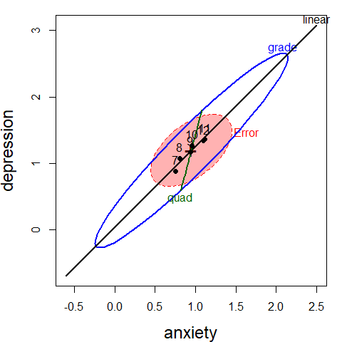
Figure 1.4: HE plot for the multivariate model AH.mlm, showing the overall effect of grade as well as tests for the linear and quadratic terms in this model.
2 Plastic film data
An experiment was conducted to determine the optimum conditions for extruding plastic film.
Three responses, tear resistance, film gloss and film opacity
were measured in relation to two factors, rate of extrusion and amount of an additive,
both of these being set to two values, High and Low. The data set comes from
Johnson & Wichern (1992).
data(Plastic, package="heplots")
str(Plastic)
#> 'data.frame':    20 obs. of  5 variables:
#>  $ tear    : num  6.5 6.2 5.8 6.5 6.5 6.9 7.2 6.9 6.1 6.3 ...
#>  $ gloss   : num  9.5 9.9 9.6 9.6 9.2 9.1 10 9.9 9.5 9.4 ...
#>  $ opacity : num  4.4 6.4 3 4.1 0.8 5.7 2 3.9 1.9 5.7 ...
#>  $ rate    : Factor w/ 2 levels "Low","High": 1 1 1 1 1 1 1 1 1 1 ...
#>  $ additive: Factor w/ 2 levels "Low","High": 1 1 1 1 1 2 2 2 2 2 ...
The design is thus a \(2\times 2\) MANOVA, with \(n=5\) per cell and 3 numeric response variables. Because the effects of the factors on the responses are likely correlated, it is useful to consider a multivariate analysis, rather than 3 separate univariate ones.
This example illustrates:
- 2D and 3D HE plots,
- the difference between “effect” scaling and “evidence” (significance) scaling, and
- visualizing composite linear hypotheses.
Multivariate tests
We begin with an overall MANOVA for the two-way MANOVA model. In all these analyses, we use
car::Anova() for significance tests rather than stats::anova(), which only provides
so-called “Type I” (sequential) tests for terms in linear models.
In this example, because each effect has 1 df, all of the multivariate statistics
(Roy’s maximum root test, Pillai and Hotelling trace criteria, Wilks’ Lambda)
are equivalent, in that they give the same \(F\) statistics and \(p\)-values.
We specify test.statistic="Roy" to emphasize that Roy’s test has
a natural visual interpretation in HE plots.
plastic.mod <- lm(cbind(tear, gloss, opacity) ~ rate*additive, data=Plastic)
Anova(plastic.mod, test.statistic="Roy")
#>
#> Type II MANOVA Tests: Roy test statistic
#>               Df test stat approx F num Df den Df Pr(>F)
#> rate           1     1.619     7.55      3     14  0.003 **
#> additive       1     0.912     4.26      3     14  0.025 *
#> rate:additive  1     0.287     1.34      3     14  0.302
#> ---
#> Signif. codes:  0 '***' 0.001 '**' 0.01 '*' 0.05 '.' 0.1 ' ' 1
For the three responses jointly, the main effects of rate and additive
are significant, while their interaction is not.
In some approaches to testing effects in multivariate linear models (MLMs),
significant multivariate tests are often followed by univariate tests on each
of the responses separately to determine which responses contribute to each
significant effect.
In R, univariate analyses are conveniently performed
using the update() method for the mlm object plastic.mod, which re-fits the model with
only a single outcome variable.
Anova(update(plastic.mod, tear ~ .))
#> Anova Table (Type II tests)
#>
#> Response: tear
#>               Sum Sq Df F value Pr(>F)
#> rate            1.74  1    15.8 0.0011 **
#> additive        0.76  1     6.9 0.0183 *
#> rate:additive   0.00  1     0.0 0.9471
#> Residuals       1.76 16
#> ---
#> Signif. codes:  0 '***' 0.001 '**' 0.01 '*' 0.05 '.' 0.1 ' ' 1

Anova(update(plastic.mod, gloss ~ .))
#> Anova Table (Type II tests)
#>
#> Response: gloss
#>               Sum Sq Df F value Pr(>F)
#> rate           1.301  1    7.92  0.012 *
#> additive       0.612  1    3.73  0.071 .
#> rate:additive  0.544  1    3.32  0.087 .
#> Residuals      2.628 16
#> ---
#> Signif. codes:  0 '***' 0.001 '**' 0.01 '*' 0.05 '.' 0.1 ' ' 1

Anova(update(plastic.mod, opacity ~ .))
#> Anova Table (Type II tests)
#>
#> Response: opacity
#>               Sum Sq Df F value Pr(>F)
#> rate             0.4  1    0.10   0.75
#> additive         4.9  1    1.21   0.29
#> rate:additive    4.0  1    0.98   0.34
#> Residuals       64.9 16
The results above show significant main effects for tear,
a significant main effect of rate for gloss,
and no significant effects for opacity, but they don’t shed light on the
nature of these effects.
Traditional univariate plots of the means for each variable separately
are useful, but they don’t allow visualization of the
relations among the response variables.
HE plots
We can visualize these effects for pairs of variables in an HE plot, showing the “size” and orientation of hypothesis variation (\(\mathbf{H}\)) in relation to error variation (\(\mathbf{E}\)) as ellipsoids. When, as here, the model terms have 1 degree of freedom, the \(\mathbf{H}\) ellipsoids degenerate to a line.
In HE plots, the \(\mathbf{H}\) ellipses can be scaled relative to the
\(\mathbf{E}\) to show significance of effects (size="evidence"),
or effect size (size="effect"). In the former case, a model term
is significant (using Roy’s maximum root test) iff the
\(\mathbf{H}\) projects anywhere outside the \(\mathbf{E}\) ellipse.
This plot overlays those for both scaling, using thicker lines for the effect scaling.
## Compare evidence and effect scaling
colors = c("red", "darkblue", "darkgreen", "brown")
heplot(plastic.mod, size="evidence",
       col=colors, cex=1.25,
       fill=TRUE, fill.alpha=0.1)
heplot(plastic.mod, size="effect",
       add=TRUE, lwd=5, term.labels=FALSE, col=colors)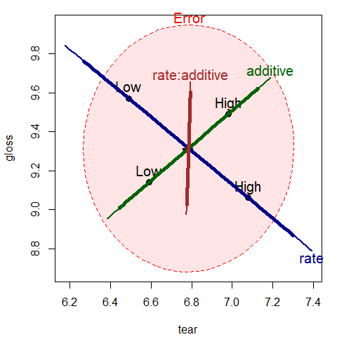
Figure 2.1: HE plot for effects on tear and gloss according to the factors rate, additive and their interaction, rate:additive. The thicker lines show effect size scaling; the thinner lines show significance scaling.
The interpretation can be easily read from the plot, at least for the two response variables
(tear and gloss) that are shown in this bivariate view. The effect of rate of extrusion is
highly significant: high rate shows greater tear compared to low rate. The effect of amount of
additive is not significant in this view, but high level of additive has greater tear and gloss.
With effect scaling, both the \(\mathbf{H}\) and \(\mathbf{E}\) sums of squares and products
matrices are both divided by the error df, giving multivariate analogs of univariate
measures of effect size, e.g., \((\bar{y}_1-\bar{y}_2) / s\).
With significance scaling, the \(\mathbf{H}\) ellipse is further divided by
\(\lambda_\alpha\), the critical value of Roy’s largest root statistic.
This scaling has the property that an \(\mathbf{H}\) ellipse will protrude somewhere
outside the \(\mathbf{E}\) ellipse iff the
multivariate test is significant at level \(\alpha\).
Figure 2.2 shows both scalings, using a thinner line for significance scaling.
Note that the (degenerate) ellipse for additive is significant, but
does not protrude outside the \(\mathbf{E}\) ellipse in this view.
All that is guaranteed is that it will protrude somewhere in the 3D space of
the responses.
By design, means for the levels of interaction terms are not shown in the HE plot,
because doing so in general can lead to messy displays.
We can add them here for the term rate:additive as follows:
# Compare evidence and effect scaling
colors = c("red", "darkblue", "darkgreen", "brown")
heplot(plastic.mod, size="evidence",
       col=colors, cex=1.25,
       fill=TRUE, fill.alpha=0.05)
heplot(plastic.mod, size="effect",
       add=TRUE, lwd=5, term.labels=FALSE, col=colors)

## add interaction means
intMeans <- termMeans(plastic.mod, 'rate:additive', abbrev.levels=2)
points(intMeans[,1], intMeans[,2], pch=18, cex=1.2, col="brown")
text(intMeans[,1], intMeans[,2], rownames(intMeans),
     adj=c(0.5, 1), col="brown")
lines(intMeans[c(1,3),1], intMeans[c(1,3),2], col="brown")
lines(intMeans[c(2,4),1], intMeans[c(2,4),2], col="brown")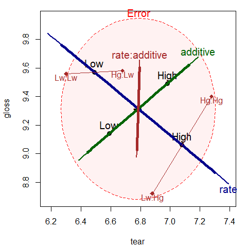
Figure 2.2: HE plot for effects on tear and gloss according to the factors rate, additive and their interaction, rate:additive. Annotations have added means for the combinations of rate and additive.
The factor means in this plot (Figure 2.2 have a simple interpretation:
The high rate level yields greater tear resistance but lower gloss
than the low level.
The high additive amount produces greater tear resistance and greater gloss.
The rate:additive interaction is not significant overall, though it
approaches significance for gloss.
The cell means for the combinations
of rate and additive shown in this figure suggest an explanation,
for tutorial purposes:
with the low level of rate, there is little difference in gloss
for the levels of additive. At the high level of rate, there is
a larger difference in gloss. The \(\mathbf{H}\) ellipse for the interaction
of rate:additive therefore “points” in the direction of gloss
indicating that this variable contributes to the interaction in the
multivariate tests.
In some MANOVA models, it is of interest to test sub-hypotheses of a given main effect or interaction, or conversely to test composite hypotheses that pool together certain effects to test them jointly. All of these tests (and, indeed, the tests of terms in a given model) are carried out as tests of general linear hypotheses in the MLM.
In this example, it might be useful to test two composite hypotheses: one corresponding to both main effects jointly, and another corresponding to no difference among the means of the four groups (equivalent to a joint test for the overall model). These tests are specified in terms of subsets or linear combinations of the model parameters.
plastic.mod
#>
#> Call:
#> lm(formula = cbind(tear, gloss, opacity) ~ rate * additive, data = Plastic)
#>
#> Coefficients:
#>                        tear   gloss  opacity
#> (Intercept)             6.30   9.56   3.74
#> rateHigh                0.58  -0.84  -0.60
#> additiveHigh            0.38   0.02   0.10
#> rateHigh:additiveHigh   0.02   0.66   1.78
Thus, for example, the joint test of both main effects tests the parameters
rateHigh and additiveHigh.
linearHypothesis(plastic.mod, c("rateHigh", "additiveHigh"),
                 title="Main effects") |>
  print(SSP=FALSE)
#>
#> Multivariate Tests: Main effects
#>                  Df test stat approx F num Df den Df   Pr(>F)
#> Pillai            2   0.71161   2.7616      6     30 0.029394 *
#> Wilks             2   0.37410   2.9632      6     28 0.022839 *
#> Hotelling-Lawley  2   1.44400   3.1287      6     26 0.019176 *
#> Roy               2   1.26253   6.3127      3     15 0.005542 **
#> ---
#> Signif. codes:  0 '***' 0.001 '**' 0.01 '*' 0.05 '.' 0.1 ' ' 1

linearHypothesis(plastic.mod, c("rateHigh", "additiveHigh", "rateHigh:additiveHigh"),
                 title="Groups") |>
  print(SSP=FALSE)
#>
#> Multivariate Tests: Groups
#>                  Df test stat approx F num Df den Df   Pr(>F)
#> Pillai            3   1.14560   3.2948      9 48.000 0.003350 **
#> Wilks             3   0.17802   3.9252      9 34.223 0.001663 **
#> Hotelling-Lawley  3   2.81752   3.9654      9 38.000 0.001245 **
#> Roy               3   1.86960   9.9712      3 16.000 0.000603 ***
#> ---
#> Signif. codes:  0 '***' 0.001 '**' 0.01 '*' 0.05 '.' 0.1 ' ' 1
Correspondingly, we can display these tests in the HE plot by specifying these tests in the
hypothesis argument to heplot(), as shown in Figure 2.3.
heplot(plastic.mod,
       hypotheses=list("Group" =  c("rateHigh", "additiveHigh", "rateHigh:additiveHigh ")),
       col=c(colors, "purple"),
       fill = TRUE, fill.alpha = 0.1,
       lwd=c(2, 3, 3, 3, 2), cex=1.25)
heplot(plastic.mod,
       hypotheses=list("Main effects" = c("rateHigh", "additiveHigh")),
       add=TRUE,
       col=c(colors, "darkgreen"), cex=1.25)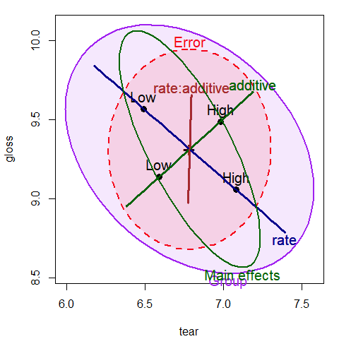
Figure 2.3: HE plot for tear and gloss, supplemented with ellipses representing
the joint tests of main effects and all group differences
Finally, a 3D HE plot can be produced with heplot3d(), giving Figure 2.4.
This plot was rotated interactively to a view that shows both main effects
protruding outside the error ellipsoid.
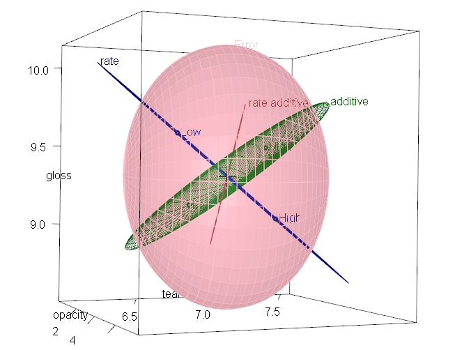
Figure 2.4: 3D HE plot for the plastic MLM
3 Effects of physical attractiveness on mock jury decisions
In a social psychology
study of influences on jury decisions
by Plaster (1989),
male participants (prison inmates)
were shown a picture of one of three young women.
Pilot work
had indicated that one woman was beautiful, another of average physical
attractiveness, and the third unattractive. Participants rated the woman they
saw on each of twelve attributes on scales of 1–9. These measures were used to check on the
manipulation of “attractiveness” by the photo.
Then the participants were told that the person in the photo had committed a
Crime, and asked to rate the seriousness of the crime and recommend a
prison sentence, in Years. The data are contained in the data frame MockJury.1
data(MockJury, package = "heplots")
str(MockJury)
#> 'data.frame':    114 obs. of  17 variables:
#>  $ Attr         : Factor w/ 3 levels "Beautiful","Average",..: 1 1 1 1 1 1 1 1 1 1 ...
#>  $ Crime        : Factor w/ 2 levels "Burglary","Swindle": 1 1 1 1 1 1 1 1 1 1 ...
#>  $ Years        : int  10 3 5 1 7 7 3 7 2 3 ...
#>  $ Serious      : int  8 8 5 3 9 9 4 4 5 2 ...
#>  $ exciting     : int  6 9 3 3 1 1 5 4 4 6 ...
#>  $ calm         : int  9 5 4 6 1 5 6 9 8 8 ...
#>  $ independent  : int  9 9 6 9 5 7 7 2 8 7 ...
#>  $ sincere      : int  8 3 3 8 1 5 6 9 7 5 ...
#>  $ warm         : int  5 5 6 8 8 8 7 6 1 7 ...
#>  $ phyattr      : int  9 9 7 9 8 8 8 5 9 8 ...
#>  $ sociable     : int  9 9 4 9 9 9 7 2 1 9 ...
#>  $ kind         : int  9 4 2 9 4 5 5 9 5 7 ...
#>  $ intelligent  : int  6 9 4 9 7 8 7 9 9 9 ...
#>  $ strong       : int  9 5 5 9 9 9 5 2 7 5 ...
#>  $ sophisticated: int  9 5 4 9 9 9 6 2 7 6 ...
#>  $ happy        : int  5 5 5 9 8 9 5 2 6 8 ...
#>  $ ownPA        : int  9 7 5 9 7 9 6 5 3 6 ...
Sample sizes were roughly balanced for the independent variables
in the three conditions of the attractiveness of the photo,
and the combinations of this with Crime:
table(MockJury$Attr)
#>
#>    Beautiful      Average Unattractive
#>           39           38           37
table(MockJury$Attr, MockJury$Crime)
#>
#>                Burglary Swindle
#>   Beautiful          21      18
#>   Average            18      20
#>   Unattractive       20      17
The main questions of interest were:
- Does attractiveness of the “defendant” influence the sentence or perceived seriousness of the crime?
- Does attractiveness interact with the nature of the crime?
Manipulation check
But first, as a check on the manipulation of attractiveness,
we try to assess the ratings of the photos in relation to the
presumed categories of the independent variable Attr. The questions here
are:
- do the ratings of the photos on physical attractiveness
(
phyattr) confirm the original classification? - how do other ratings differentiate the photos?
To keep things simple, we consider only a few of the other ratings in a one-way MANOVA.
(jury.mod1 <- lm( cbind(phyattr, happy, independent, sophisticated) ~ Attr, data=MockJury))
#>
#> Call:
#> lm(formula = cbind(phyattr, happy, independent, sophisticated) ~
#>     Attr, data = MockJury)
#>
#> Coefficients:
#>                   phyattr  happy   independent  sophisticated
#> (Intercept)        8.282    5.359   6.410        6.077
#> AttrAverage       -4.808    0.430   0.537       -1.340
#> AttrUnattractive  -5.390   -1.359  -1.410       -1.753
Anova(jury.mod1, test="Roy")
#>
#> Type II MANOVA Tests: Roy test statistic
#>      Df test stat approx F num Df den Df Pr(>F)
#> Attr  2      1.77     48.2      4    109 <2e-16 ***
#> ---
#> Signif. codes:  0 '***' 0.001 '**' 0.01 '*' 0.05 '.' 0.1 ' ' 1
Note that Beautiful is the baseline category of Attr, so the
intercept term gives the means for this level.
We see that the means are significantly different on all four variables
collectively, by a joint multivariate test. A traditional analysis might
follow up with univariate ANOVAs for each measure separately.
As an aid to interpretation of the MANOVA results
We can examine the test of Attr in this model with an HE plot for
pairs of variables, e.g., for phyattr and happy (Figure 3.1).
The means in this plot show that Beautiful is rated higher on
physical attractiveness than the other two photos, while Unattractive
is rated less happy than the other two. Comparing the sizes of the
ellipses, differences among group means on physical attractiveness
contributes more to significance than do ratings on happy.
heplot(jury.mod1, main="HE plot for manipulation check",
       fill = TRUE, fill.alpha = 0.1)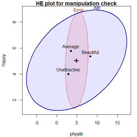
Figure 3.1: HE plot for ratings of phyattr and happy according to the classification of photos on Attr
The function pairs.mlm() produces all pairwise HE plots.
This plot (Figure 3.2) shows that the means for happy
and independent are highly correlated, as are the means for phyattr
and sophisticated. In most of these pairwise plots, the means form a
triangle rather than a line, suggesting that these attributes are indeed
measuring different aspects of the photos.
pairs(jury.mod1)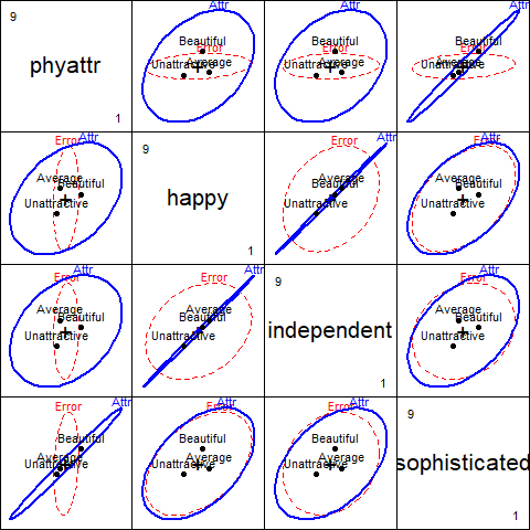
Figure 3.2: HE plots for all pairs of ratings according to the classification of photos on Attr
With 3 groups and 4 variables, the \(\mathbf{H}\) ellipsoid has only \(s=\min(df_h, p)=2\)
dimensions. candisc() carries out a canonical discriminant analysis
for the MLM and returns an object that can be used to show an HE plot in the
space of the canonical dimensions. This is plotted in Figure 3.3.
jury.can <- candisc(jury.mod1)
jury.can
#>
#> Canonical Discriminant Analysis for Attr:
#>
#>   CanRsq Eigenvalue Difference Percent Cumulative
#> 1  0.639      1.767        1.6   91.33       91.3
#> 2  0.144      0.168        1.6    8.67      100.0
#>
#> Test of H0: The canonical correlations in the
#> current row and all that follow are zero
#>
#>   LR test stat approx F numDF denDF Pr(> F)
#> 1        0.309    21.53     8   216 < 2e-16 ***
#> 2        0.856     6.09     3   109 0.00072 ***
#> ---
#> Signif. codes:  0 '***' 0.001 '**' 0.01 '*' 0.05 '.' 0.1 ' ' 1
heplot.candisc() is the HE plot method for candisc objects
heplot(jury.can,
       rev.axes = TRUE,
       fill = c(TRUE,FALSE),
       prefix="Canonical dimension",
       main="Canonical HE plot")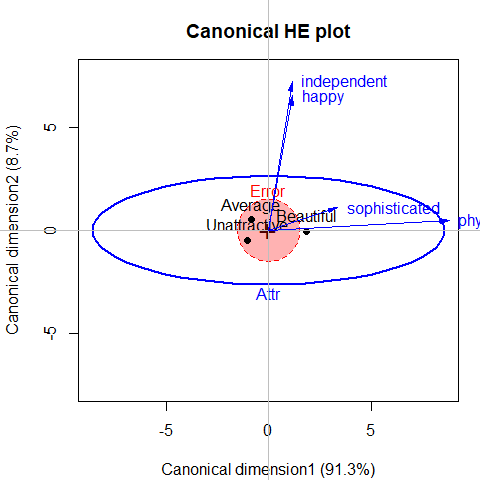
Figure 3.3: Canonical discriminant HE plot for the MockJury data. Variable vectors show the correlations of the predictors with the canonical dimensions.
#> Vector scale factor set to 8.8177In this plot,
the variable vectors are determined by the canonical structure coefficients and represent the correlations of the predictor variables with the canonical variables. Thus, an angle near zero with an axis represents a correlation close to 1.0; an angle near 90\(^o\) represent a correlation close to 0.0. (The axes must be scaled to have equal unit lengths for angles to be interpretable.)
The lengths of arrows are scaled to roughly fill the plot, but relative length represents the overall strength of the relation of the variable with the canonical dimensions.
Points represent the means of the canonical scores on the two dimensions for the three groups of photos.
From this we can see that 91% of the variation among group means
is accounted for by the first dimension, and this is nearly completely
aligned with phyattr.
The second dimension, accounting for the remaining 9%
is determined nearly entirely by ratings on happy and independent.
This display gives a relatively simple account of the results of the MANOVA
and the relations of each of the ratings to discrimination among the photos.
Main analysis
Proceeding to the main questions of interest, we carry out a two-way MANOVA of the responses
Years and Serious in relation to the independent variables
Attr and Crime.
# influence of Attr of photo and nature of crime on Serious and Years
jury.mod2 <- lm( cbind(Serious, Years) ~ Attr * Crime, data=MockJury)
Anova(jury.mod2, test="Roy")
#>
#> Type II MANOVA Tests: Roy test statistic
#>            Df test stat approx F num Df den Df Pr(>F)
#> Attr        2    0.0756     4.08      2    108  0.020 *
#> Crime       1    0.0047     0.25      2    107  0.778
#> Attr:Crime  2    0.0501     2.71      2    108  0.071 .
#> ---
#> Signif. codes:  0 '***' 0.001 '**' 0.01 '*' 0.05 '.' 0.1 ' ' 1
We see that there is a nearly significant interaction between Attr and Crime
and a strong effect of Attr.
heplot(jury.mod2)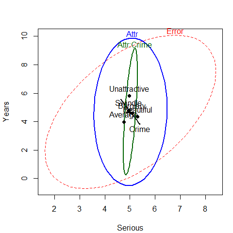
Figure 3.4: HE plot for the two-way MANOVA for Years and Serious
The HE plot shows that the nearly significant
interaction of Attr:Crime is mainly in terms of
differences among the groups on the response of Years of sentence,
with very little contribution of Serious. We explore this interaction in a bit more detail
below. The main effect of Attr is also dominated by differences among groups
on Years.
If we assume that Years of sentence is the main outcome of interest,
it also makes sense to carry out a step-down test of this variable by itself,
controlling for the rating of seriousness (Serious) of the crime.
The model jury.mod3 below is equivalent to an ANCOVA for Years.
# stepdown test (ANCOVA), controlling for Serious
jury.mod3 <- lm( Years ~ Serious + Attr * Crime, data=MockJury)
t(coef(jury.mod3))
#>      (Intercept) Serious AttrAverage AttrUnattractive CrimeSwindle
#> [1,]    0.011612 0.83711     0.39586          0.60285     -0.26302
#>      AttrAverage:CrimeSwindle AttrUnattractive:CrimeSwindle
#> [1,]                 -0.53701                        2.5123
Anova(jury.mod3)
#> Anova Table (Type II tests)
#>
#> Response: Years
#>            Sum Sq  Df F value  Pr(>F)
#> Serious       379   1   41.14 3.9e-09 ***
#> Attr           74   2    4.02   0.021 *
#> Crime           4   1    0.43   0.516
#> Attr:Crime     49   2    2.67   0.074 .
#> Residuals     987 107
#> ---
#> Signif. codes:  0 '***' 0.001 '**' 0.01 '*' 0.05 '.' 0.1 ' ' 1
Thus, even when adjusting for Serious rating, there is still a
significant main effect of Attr of the photo, but also a hint of
an interaction of Attr with Crime. The coefficient for
Serious indicates that participants awarded 0.84 additional
years of sentence for each 1 unit step on the scale of seriousness of crime.
A particularly useful
method for visualizing the fitted effects in such univariate response
models is provided by the effects. By default allEffects()
calculates the predicted values for all high-order terms in a given
model, and the plot method produces plots of these values for
each term. The statements below produce Figure 3.5.
library(effects)
jury.eff <- allEffects(jury.mod3)
plot(jury.eff, ask=FALSE)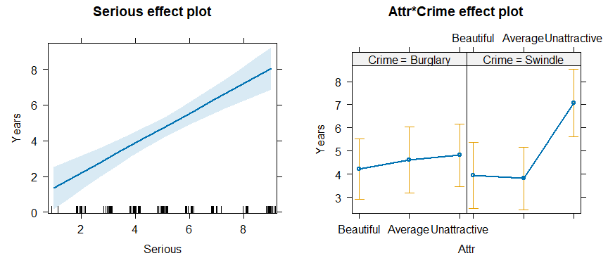
Figure 3.5: Effect plots for Serious and the Attr * Crime interaction in the ANCOVA model jury.mod3.
The effect plot for Serious shows the expected linear relation
between that variable and Years. Of greater interest here is the nature
of the possible interaction of Attr and Crime on Years
of sentence, controlling for Serious.
The effect plot shows that for the crime of Swindle, there is a much
greater Years of sentence awarded to Unattractive defendants.
4 Egyptian skulls from five epochs
This example examines physical measurements of size and shape made on
150 Egyptian skulls from five epochs ranging from
4000 BC to 150 AD.
The measures are: maximal breadth (mb), basibregmatic height (bh),
basialiveolar length (bl), and nasal height (nh) of each skull.
See Figure 4.1 for a diagram.
The question of interest is whether and how these measurements change over time.
Systematic changes over time is of interest because this
would indicate interbreeding with immigrant populations.
Figure 4.1: Diagram of the skull measurements. Maximal breadth and basibregmatic height are the basic measures of “size” of a skull. Basialveolar length and nasal height are important anthropometric measures of “shape”.
data(Skulls)
str(Skulls)
#> 'data.frame':    150 obs. of  5 variables:
#>  $ epoch: Ord.factor w/ 5 levels "c4000BC"<"c3300BC"<..: 1 1 1 1 1 1 1 1 1 1 ...
#>  $ mb   : num  131 125 131 119 136 138 139 125 131 134 ...
#>  $ bh   : num  138 131 132 132 143 137 130 136 134 134 ...
#>  $ bl   : num  89 92 99 96 100 89 108 93 102 99 ...
#>  $ nh   : num  49 48 50 44 54 56 48 48 51 51 ...
table(Skulls$epoch)
#>
#> c4000BC c3300BC c1850BC  c200BC  cAD150
#>      30      30      30      30      30
Note that epoch is an ordered factor, so the default contrasts
will be orthogonal polynomials. This assumes that epoch
values are equally spaced, which they are not. However, examining
the linear and quadratic trends is useful to a first approximation.
For ease of labeling various outputs, it is useful to trim the
epoch values and assign more meaningful variable labels.
# make shorter labels for epochs
Skulls$epoch <- factor(Skulls$epoch, labels=sub("c","",levels(Skulls$epoch)))
# assign better variable labels
vlab <- c("maxBreadth", "basibHeight", "basialLength", "nasalHeight")
We start with some simple displays of the means by epoch. From the numbers,
the means don’t seem to vary much.
A pairs plot, Figure 4.2, joining points
by epoch is somewhat more revealing for the bivariate relations among means.
means <- aggregate(cbind(mb, bh, bl, nh) ~ epoch, data=Skulls, FUN=mean)[,-1]
rownames(means) <- levels(Skulls$epoch)
means
#>            mb     bh     bl     nh
#> 4000BC 131.37 133.60 99.167 50.533
#> 3300BC 132.37 132.70 99.067 50.233
#> 1850BC 134.47 133.80 96.033 50.567
#> 200BC  135.50 132.30 94.533 51.967
#> AD150  136.17 130.33 93.500 51.367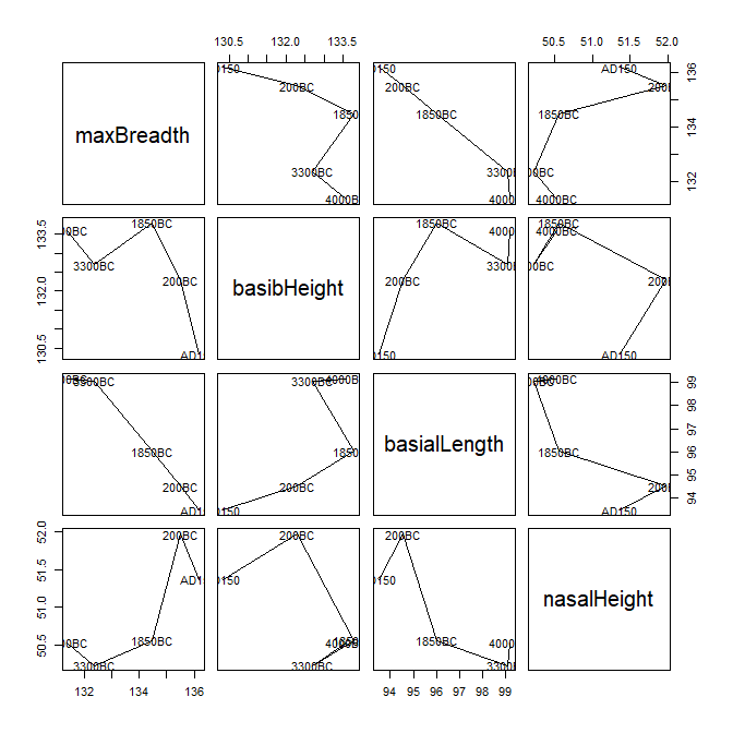
Figure 4.2: Pairs plot of means of Skulls data, by epoch.
Perhaps better for visualizing the trends over time is a set of boxplots,
joining means over epoch. Using bwplot() from the lattice
package requires reshaping the data from wide to long format. The following
code produces Figure 4.3.
library(lattice)
library(reshape2)
sklong <- melt(Skulls, id="epoch")

bwplot(value ~ epoch | variable, data=sklong, scales="free",
    ylab="Variable value", xlab="Epoch",
    strip=strip.custom(factor.levels=paste(vlab,
                                           " (", levels(sklong$variable), ")",
                                           sep="")),
    panel = function(x,y, ...) {
        panel.bwplot(x, y, ...)
        panel.linejoin(x,y, col="red", ...)
}) 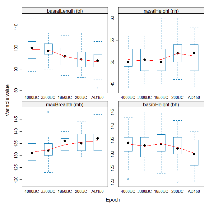
Figure 4.3: Boxplots of Skulls data, by epoch, for each variable.
The trend lines aren’t linear, but neither are they random, so something systematic has been going on!
Now, fit the MANOVA model, and test the effect of epoch with car::Anova().
We see that the multivariate means differ substantially.
# fit manova model
sk.mod <- lm(cbind(mb, bh, bl, nh) ~ epoch, data=Skulls)
Anova(sk.mod)
#>
#> Type II MANOVA Tests: Pillai test statistic
#>       Df test stat approx F num Df den Df  Pr(>F)
#> epoch  4     0.353     3.51     16    580 4.7e-06 ***
#> ---
#> Signif. codes:  0 '***' 0.001 '**' 0.01 '*' 0.05 '.' 0.1 ' ' 1
Perhaps of greater interest are the more focused tests of trends over time.
These are based on tests of the coefficients in the model sk.mod
being jointly equal to zero, for subsets of the
(polynomial) contrasts in epoch.
coef(sk.mod)
#>                    mb        bh        bl       nh
#> (Intercept) 133.97333 132.54667 96.460000 50.93333
#> epoch.L       4.02663  -2.19251 -5.017481  1.07517
#> epoch.Q      -0.46325  -1.26504 -0.089087  0.12472
#> epoch.C      -0.46380  -0.78003  1.075174 -0.83273
#> epoch^4       0.34263   0.80479 -0.661360 -0.41833
We use linearHypothesis() for a multivariate test of the
epoch.L linear effect.
The linear trend is highly significant. It is not obvious from
Figure 4.2 that maximal breadth and nasal are increasing
over time, while the other two measurements have negative slopes.
coef(sk.mod)["epoch.L",]
#>      mb      bh      bl      nh
#>  4.0266 -2.1925 -5.0175  1.0752
print(linearHypothesis(sk.mod, "epoch.L"), SSP=FALSE) # linear component
#>
#> Multivariate Tests:
#>                  Df test stat approx F num Df den Df    Pr(>F)
#> Pillai            1   0.29138   14.597      4    142 5.195e-10 ***
#> Wilks             1   0.70862   14.597      4    142 5.195e-10 ***
#> Hotelling-Lawley  1   0.41119   14.597      4    142 5.195e-10 ***
#> Roy               1   0.41119   14.597      4    142 5.195e-10 ***
#> ---
#> Signif. codes:  0 '***' 0.001 '**' 0.01 '*' 0.05 '.' 0.1 ' ' 1
linearHypothesis() can also be used to test composite hypotheses.
Here we test all non-linear coefficients jointly. The result indicates
that, collectively, all non-linear terms are not significantly different
from zero.
print(linearHypothesis(sk.mod, c("epoch.Q", "epoch.C", "epoch^4")), SSP=FALSE)
#>
#> Multivariate Tests:
#>                  Df test stat approx F num Df den Df Pr(>F)
#> Pillai            3   0.06819  0.83726     12 432.00 0.6119
#> Wilks             3   0.93296  0.83263     12 375.99 0.6167
#> Hotelling-Lawley  3   0.07063  0.82791     12 422.00 0.6216
#> Roy               3   0.04519  1.62676      4 144.00 0.1707
Again, HE plots can show the patterns of these tests of multivariate hypotheses.
With four response variables, it is easiest to look at all pairwise
HE plots with the pairs.mlm() function.
The statement below produces Figure 4.4.
In this plot, we show the hypothesis ellipsoids for the overall
effect of epoch, as well as those for the tests just shown
for the linear trend component epoch.L
as well as the joint test of all non-linear terms.
pairs(sk.mod, variables=c(1,4,2,3),
    hypotheses=list(Lin="epoch.L",
                    NonLin=c("epoch.Q", "epoch.C", "epoch^4")),
    var.labels=vlab[c(1,4,2,3)])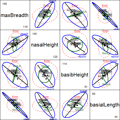
Figure 4.4: Pairs HE plot of Skulls data, showing multivariate tests of epoch, as well as tests of linear and nonlinear trends.
These plots have an interesting geometric interpretation:
the \(\mathbf{H}\) ellipses for the overall effect of epoch
are representations of the additive decomposition of this effect into
\(\mathbf{H}\) ellipses for the linear and nonlinear linear
hypothesis tests according to
\[\mathbf{H}_{\textrm{epoch}} = \mathbf{H}_{\textrm{linear}} + \mathbf{H}_{\textrm{nonlinear}}\]
where the linear term has rank 1 (and so plots as a line), while the nonlinear term has rank 3. In each panel, it can be seen that the large direction of the \(\mathbf{H}_{\textrm{epoch}}\) leading to significance of this effect corresponds essentially to the linear contrast. \(\mathbf{H}_{\textrm{nonlinear}}\) is the orthogonal complement of \(\mathbf{H}_{\textrm{linear}}\) in the space of \(\mathbf{H}_{\textrm{epoch}}\), but nowhere does it protrude beyond the boundary of the \(\mathbf{E}\) ellipsoid.
