OK, now we’re ready to do some analyses. This vignette focuses on relatively simple non-parametric tests and measures of association.
CrossTable
For tabular displays, the CrossTable() function in the
gmodels package produces cross-tabulations modeled after
PROC FREQ in SAS or CROSSTABS in SPSS. It has
a wealth of options for the quantities that can be shown in each
cell.
Recall the GSS data used earlier.
# Agresti (2002), table 3.11, p. 106
GSS <- data.frame(
  expand.grid(sex = c("female", "male"),
              party = c("dem", "indep", "rep")),
  count = c(279,165,73,47,225,191))

(GSStab <- xtabs(count ~ sex + party, data=GSS))
##         party
## sex      dem indep rep
##   female 279    73 225
##   male   165    47 191
Generate a cross-table showing cell frequency and the cell contribution to \(\chi^2\).
# 2-Way Cross Tabulation
library(gmodels)
CrossTable(GSStab, prop.t=FALSE, prop.r=FALSE, prop.c=FALSE)
##
##
##    Cell Contents
## |-------------------------|
## |                       N |
## | Chi-square contribution |
## |-------------------------|
##
##
## Total Observations in Table:  980
##
##
##              | party
##          sex |       dem |     indep |       rep | Row Total |
## -------------|-----------|-----------|-----------|-----------|
##       female |       279 |        73 |       225 |       577 |
##              |     1.183 |     0.078 |     1.622 |           |
## -------------|-----------|-----------|-----------|-----------|
##         male |       165 |        47 |       191 |       403 |
##              |     1.693 |     0.112 |     2.322 |           |
## -------------|-----------|-----------|-----------|-----------|
## Column Total |       444 |       120 |       416 |       980 |
## -------------|-----------|-----------|-----------|-----------|
##
##
There are options to report percentages (row, column, cell), specify
decimal places, produce Chi-square, Fisher, and McNemar tests of
independence, report expected and residual values (pearson,
standardized, adjusted standardized), include missing values as valid,
annotate with row and column titles, and format as SAS or SPSS style
output! See help(CrossTable) for details.
Chi-square test
For 2-way tables you can use chisq.test() to test
independence of the row and column variable. By default, the \(p\)-value is calculated from the asymptotic
chi-squared distribution of the test statistic. Optionally, the \(p\)-value can be derived via Monte Carlo
simulation.
(HairEye <- margin.table(HairEyeColor, c(1, 2)))
##        Eye
## Hair    Brown Blue Hazel Green
##   Black    68   20    15     5
##   Brown   119   84    54    29
##   Red      26   17    14    14
##   Blond     7   94    10    16

chisq.test(HairEye)
##
##  Pearson's Chi-squared test
##
## data:  HairEye
## X-squared = 138.29, df = 9, p-value < 2.2e-16

chisq.test(HairEye, simulate.p.value = TRUE)
##
##  Pearson's Chi-squared test with simulated p-value (based on 2000
##  replicates)
##
## data:  HairEye
## X-squared = 138.29, df = NA, p-value = 0.0004998
Fisher Exact Test
fisher.test(X) provides an exact test
of independence. X must be a two-way contingency table in
table form. Another form, fisher.test(X, Y) takes two
categorical vectors of the same length.
For tables larger than \(2 \times 2\)
the method can be computationally intensive (or can fail) if the
frequencies are not small.
fisher.test(GSStab)
##
##  Fisher's Exact Test for Count Data
##
## data:  GSStab
## p-value = 0.03115
## alternative hypothesis: two.sided
Fisher’s test is meant for tables with small total sample size. It
generates an error for the HairEye data with \(n\)=592 total frequency.
fisher.test(HairEye)
## Error in fisher.test(HairEye): FEXACT error 6 (f5xact).  LDKEY=618 is too small for this problem: kval=238045028.
## Try increasing the size of the workspace.
Mantel-Haenszel test and conditional association
Use the mantelhaen.test(X) function to perform a
Cochran-Mantel-Haenszel \(\chi^2\) chi
test of the null hypothesis that two nominal variables are
conditionally independent, \(A \perp
B \; | \; C\), in each stratum, assuming that there is no
three-way interaction. X is a 3 dimensional contingency
table, where the last dimension refers to the strata.
The UCBAdmissions serves as an example of a \(2 \times 2 \times 6\) table, with
Dept as the stratifying variable.
# UC Berkeley Student Admissions
mantelhaen.test(UCBAdmissions)
##
##  Mantel-Haenszel chi-squared test with continuity correction
##
## data:  UCBAdmissions
## Mantel-Haenszel X-squared = 1.4269, df = 1, p-value = 0.2323
## alternative hypothesis: true common odds ratio is not equal to 1
## 95 percent confidence interval:
##  0.7719074 1.0603298
## sample estimates:
## common odds ratio
##         0.9046968
The results show no evidence for association between admission and
gender when adjusted for department. However, we can easily see that the
assumption of equal association across the strata (no 3-way association)
is probably violated. For \(2 \times 2 \times
k\) tables, this can be examined from the odds ratios for each
\(2 \times 2\) table
(oddsratio()), and tested by using
woolf_test() in vcd.
oddsratio(UCBAdmissions, log=FALSE)
##  odds ratios for Admit and Gender by Dept
##
##         A         B         C         D         E         F
## 0.3492120 0.8025007 1.1330596 0.9212838 1.2216312 0.8278727

lor <- oddsratio(UCBAdmissions)  # capture log odds ratios
summary(lor)
##
## z test of coefficients:
##
##    Estimate Std. Error z value  Pr(>|z|)
## A -1.052076   0.262708 -4.0047 6.209e-05 ***
## B -0.220023   0.437593 -0.5028    0.6151
## C  0.124922   0.143942  0.8679    0.3855
## D -0.081987   0.150208 -0.5458    0.5852
## E  0.200187   0.200243  0.9997    0.3174
## F -0.188896   0.305164 -0.6190    0.5359
## ---
## Signif. codes:  0 '***' 0.001 '**' 0.01 '*' 0.05 '.' 0.1 ' ' 1

woolf_test(UCBAdmissions)
##
##  Woolf-test on Homogeneity of Odds Ratios (no 3-Way assoc.)
##
## data:  UCBAdmissions
## X-squared = 17.902, df = 5, p-value = 0.003072
Some plot methods
Fourfold displays
We can visualize the odds ratios of Admission for each department
with fourfold displays using fourfold(). The cell
frequencies \(n_{ij}\) of each \(2 \times 2\) table are shown as a quarter
circle whose radius is proportional to \(\sqrt{n_{ij}}\), so that its area is
proportional to the cell frequency.
UCB <- aperm(UCBAdmissions, c(2, 1, 3))
dimnames(UCB)[[2]] <- c("Yes", "No")
names(dimnames(UCB)) <- c("Sex", "Admit?", "Department")
Confidence rings for the odds ratio allow a visual test of the null of no association; the rings for adjacent quadrants overlap iff the observed counts are consistent with the null hypothesis. In the extended version (the default), brighter colors are used where the odds ratio is significantly different from 1. The following lines produce .
col <- c("#99CCFF", "#6699CC", "#F9AFAF", "#6666A0", "#FF0000", "#000080")
fourfold(UCB, mfrow=c(2,3), color=col)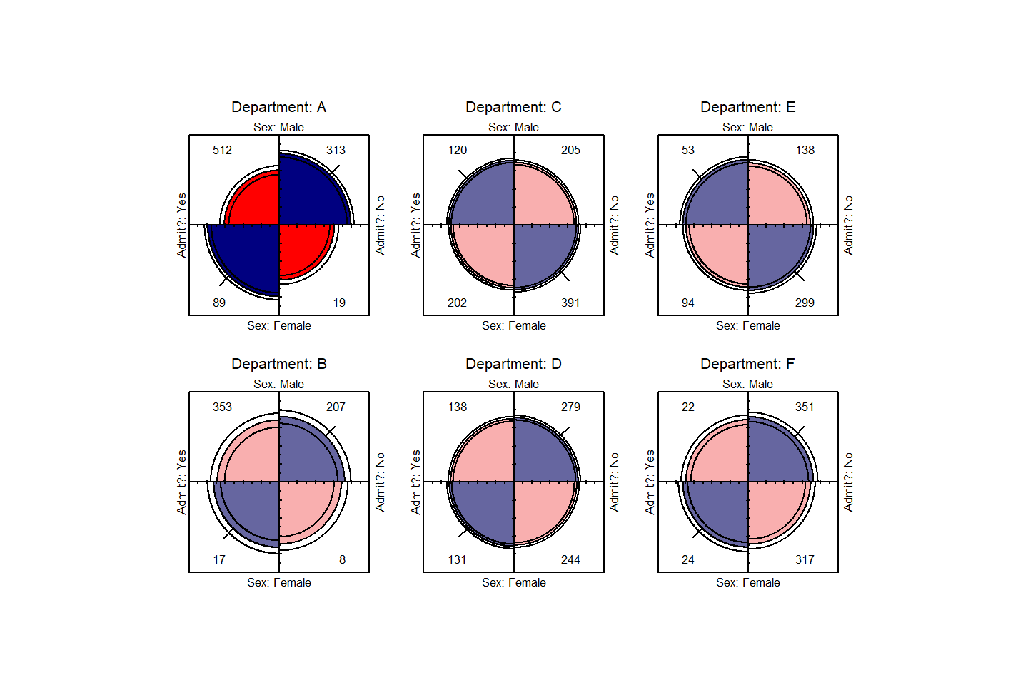
Fourfold display for the UCBAdmissions data. Where the odds
ratio differs significantly from 1.0, the confidence bands do not
overlap, and the circle quadrants are shaded more intensely.
Another vcd function, cotabplot(), provides
a more general approach to visualizing conditional associations in
contingency tables, similar to trellis-like plots produced by
coplot() and lattice graphics. The panel
argument supplies a function used to render each conditional subtable.
The following gives a display (not shown) similar to .
cotabplot(UCB, panel = cotab_fourfold)Doubledecker plots
When we want to view the conditional probabilities of a response
variable (e.g., Admit) in relation to several factors, an
alternative visualization is a doubledecker() plot. This
plot is a specialized version of a mosaic plot, which highlights the
levels of a response variable (plotted vertically) in relation to the
factors (shown horizontally). The following call produces , where we use
indexing on the first factor (Admit) to make
Admitted the highlighted level.
In this plot, the association between Admit and
Gender is shown where the heights of the highlighted
conditional probabilities do not align. The excess of females admitted
in Dept A stands out here.
doubledecker(Admit ~ Dept + Gender, data=UCBAdmissions[2:1,,])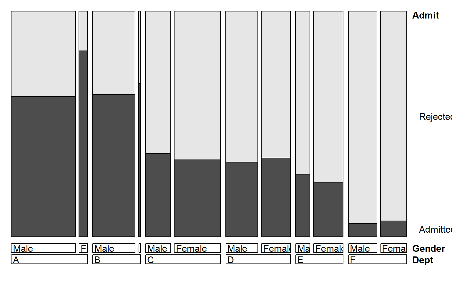
Doubledecker display for the UCBAdmissions data. The
heights of the highlighted bars show the conditional probabilities of
Admit, given Dept and Gender.
Odds ratio plots
Finally, the there is a plot() method for
oddsratio objects. By default, it shows the 95% confidence
interval for the log odds ratio. is produced by:
plot(lor,
     xlab="Department",
     ylab="Log Odds Ratio (Admit | Gender)")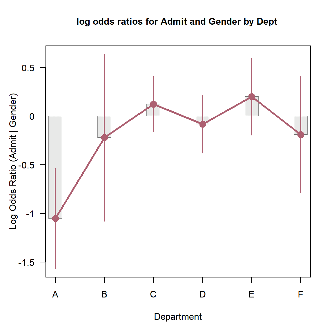
Log odds ratio plot for the UCBAdmissions data.
{#fig:oddsratio}
Cochran-Mantel-Haenszel tests for ordinal factors
The standard \(\chi^2\) tests for association in a two-way table treat both table factors as nominal (unordered) categories. When one or both factors of a two-way table are quantitative or ordinal, more powerful tests of association may be obtained by taking ordinality into account, using row and or column scores to test for linear trends or differences in row or column means.
More general versions of the CMH tests (Landis etal., 1978) (Landis, Heyman, and Koch 1978) are provided by
assigning numeric scores to the row and/or column variables. For
example, with two ordinal factors (assumed to be equally spaced),
assigning integer scores, 1:R and 1:C tests
the linear \(\times\) linear component
of association. This is statistically equivalent to the Pearson
correlation between the integer-scored table variables, with \(\chi^2 = (n-1) r^2\), with only 1 \(df\) rather than \((R-1)\times(C-1)\) for the test of general
association.
When only one table variable is ordinal, these general CMH tests are analogous to an ANOVA, testing whether the row mean scores or column mean scores are equal, again consuming fewer \(df\) than the test of general association.
The CMHtest() function in vcdExtra
calculates these various CMH tests for two possibly ordered factors,
optionally stratified other factor(s).
Example:
Recall the \(4 \times 4\) table,
JobSat introduced in @(sec:creating),
JobSat
##         satisfaction
## income   VeryD LittleD ModerateS VeryS
##   < 15k      1       3        10     6
##   15-25k     2       3        10     7
##   25-40k     1       6        14    12
##   > 40k      0       1         9    11
Treating the satisfaction levels as equally spaced, but
using midpoints of the income categories as row scores
gives the following results:
CMHtest(JobSat, rscores=c(7.5,20,32.5,60))
## Cochran-Mantel-Haenszel Statistics for income by satisfaction
##
##                  AltHypothesis  Chisq Df     Prob
## cor        Nonzero correlation 3.8075  1 0.051025
## rmeans  Row mean scores differ 4.4774  3 0.214318
## cmeans  Col mean scores differ 3.8404  3 0.279218
## general    General association 5.9034  9 0.749549
Note that with the relatively small cell frequencies, the test for
general give no evidence for association. However, the the
cor test for linear x linear association on 1 df is nearly
significant. The coin package contains the functions
cmh_test() and lbl_test() for CMH tests of
general association and linear x linear association respectively.
Measures of Association
There are a variety of statistical measures of strength of
association for contingency tables— similar in spirit to \(r\) or \(r^2\) for continuous variables. With a
large sample size, even a small degree of association can show a
significant \(\chi^2\), as in the
example below for the GSS data.
The assocstats() function in vcd calculates
the \(\phi\) contingency coefficient,
and Cramer’s V for an \(r \times c\)
table. The input must be in table form, a two-way \(r \times c\) table. It won’t work with
GSS in frequency form, but by now you should know how to
convert.
assocstats(GSStab)
##                     X^2 df P(> X^2)
## Likelihood Ratio 7.0026  2 0.030158
## Pearson          7.0095  2 0.030054
##
## Phi-Coefficient   : NA
## Contingency Coeff.: 0.084
## Cramer's V        : 0.085
For tables with ordinal variables, like JobSat, some
people prefer the Goodman-Kruskal \(\gamma\) statistic (Agresti 2002, 2.4.3) based on a comparison of
concordant and discordant pairs of observations in the case-form
equivalent of a two-way table.
GKgamma(JobSat)
## gamma        : 0.221
## std. error   : 0.117
## CI           : -0.009 0.451
A web article by Richard Darlington, [http://node101.psych.cornell.edu/Darlington/crosstab/TABLE0.HTM] gives further description of these and other measures of association.
Measures of Agreement
The Kappa() function in the vcd package
calculates Cohen’s \(\kappa\) and
weighted \(\kappa\) for a square
two-way table with the same row and column categories (Cohen 1960). Normal-theory \(z\)-tests are obtained by dividing \(\kappa\) by its asymptotic standard error
(ASE). A confint() method for Kappa objects
provides confidence intervals.
data(SexualFun, package = "vcd")
(K <- Kappa(SexualFun))
##             value     ASE     z Pr(>|z|)
## Unweighted 0.1293 0.06860 1.885 0.059387
## Weighted   0.2374 0.07832 3.031 0.002437
confint(K)
##
## Kappa                 lwr       upr
##   Unweighted -0.005120399 0.2637809
##   Weighted    0.083883432 0.3908778
A visualization of agreement (Bangdiwala
1987), both unweighted and weighted for degree of departure from
exact agreement is provided by the agreementplot()
function. shows the agreementplot for the SexualFun data,
produced as shown below.
The Bangdiwala measures (returned by the function) represent the proportion of the shaded areas of the diagonal rectangles, using weights \(w_1\) for exact agreement, and \(w_2\) for partial agreement one step from the main diagonal.
agree <- agreementplot(SexualFun, main="Is sex fun?")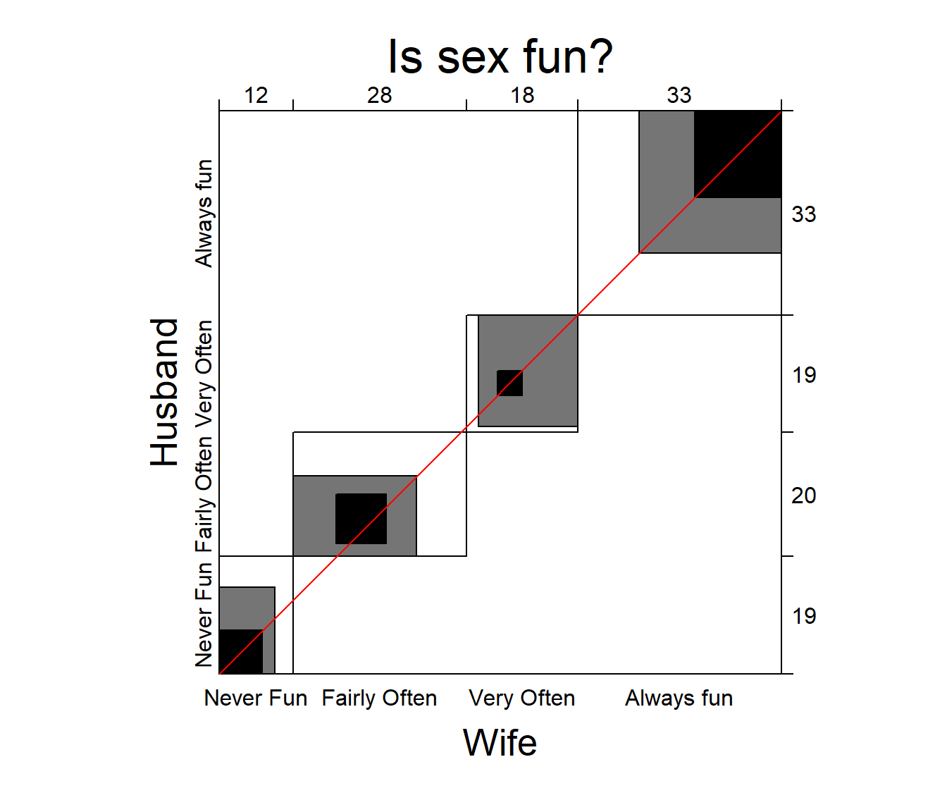
Agreement plot for the SexualFun data.
unlist(agree)
##          Bangdiwala Bangdiwala_Weighted            weights1            weights2
##           0.1464624           0.4981723           1.0000000           0.8888889
In other examples, the agreement plot can help to show sources of disagreement. For example, when the shaded boxes are above or below the diagonal (red) line, a lack of exact agreement can be attributed in part to different frequency of use of categories by the two raters– lack of marginal homogeneity.
Correspondence analysis
Correspondence analysis is a technique for visually exploring
relationships between rows and columns in contingency tables. The
ca package gives one implementation. For an \(r \times c\) table, the method provides a
breakdown of the Pearson \(\chi^2\) for
association in up to \(M = \min(r-1,
c-1)\) dimensions, and finds scores for the row (\(x_{im}\)) and column (\(y_{jm}\)) categories such that the
observations have the maximum possible correlations.% 1
Here, we carry out a simple correspondence analysis of the
HairEye data. The printed results show that nearly 99% of
the association between hair color and eye color can be accounted for in
2 dimensions, of which the first dimension accounts for 90%.
library(ca)
ca(HairEye)
##
##  Principal inertias (eigenvalues):
##            1        2        3
## Value      0.208773 0.022227 0.002598
## Percentage 89.37%   9.52%    1.11%
##
##
##  Rows:
##             Black     Brown       Red    Blond
## Mass     0.182432  0.483108  0.119932 0.214527
## ChiDist  0.551192  0.159461  0.354770 0.838397
## Inertia  0.055425  0.012284  0.015095 0.150793
## Dim. 1  -1.104277 -0.324463 -0.283473 1.828229
## Dim. 2   1.440917 -0.219111 -2.144015 0.466706
##
##
##  Columns:
##             Brown     Blue     Hazel     Green
## Mass     0.371622 0.363176  0.157095  0.108108
## ChiDist  0.500487 0.553684  0.288654  0.385727
## Inertia  0.093086 0.111337  0.013089  0.016085
## Dim. 1  -1.077128 1.198061 -0.465286  0.354011
## Dim. 2   0.592420 0.556419 -1.122783 -2.274122
The resulting ca object can be plotted just by running
the plot() method on the ca object, giving the
result in . plot.ca() does not allow labels for dimensions;
these can be added with title(). It can be seen that most
of the association is accounted for by the ordering of both hair color
and eye color along Dimension 1, a dark to light dimension.
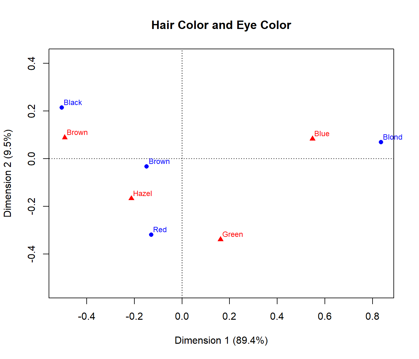
Correspondence analysis plot for the HairEye data