Just as the one- and two- sample univariate \(t\)-test is the gateway drug for understanding analysis of variance, so too Hotelling’s \(T^2\) test provides an entry point to multivariate analysis of variance. This simple case provides an entry point to understanding the collection of methods I call the HE plot framework for visualizing effects in multivariate linear models, which are a main focus of this book.
The essential idea is that Hotelling’s \(T^2\) provides a test of the difference in means between two groups on a collection of variables, \(\mathbf{x} = x_1, x_2, \dots x_p\) simultaneously, rather than one by one. This has the advantages that it:
- does not require \(p\)-value corrections for multiple tests (e.g., Bonferroni);
- combines the evidence from the multiple response variables, and pools strength, accumulating support across measures;
- clarifies how the multiple response are jointly related to the group effect along a single dimension, the discriminant axis;
- in so doing, it reduces the problem of testing differences for two (and potentially more) response variables to testing the difference on a single variable that best captures the multivariable relations.
After describing it’s features, I use an example of a two-group \(T^2\) test to illustrate the basic ideas behind multivariate tests and hypothesis error plots.
Packages
In this chapter we use the following packages. Load them now.
9.1 \(T^2\) as a generalized \(t\)-test
Hotelling’s \(T^2\) (Hotelling, 1931) is an analog the square of a univariate \(t\) statistic, extended to the Consider the basic one-sample \(t\)-test, where we wish to test the hypothesis that the mean \(\bar{x}\) of a set of \(N\) measures on a test of basic math, with standard deviation \(s\) does not differ from an assumed mean \(\mu_0 = 150\) for a population. The \(t\) statistic for testing \(H_0 : \mu = \mu_0\) against the two-sided alternative, \(H_0 : \mu \ne \mu_0\) is \[ t = \frac{(\bar{x} - \mu_0)}{s / \sqrt{N}} = \frac{(\bar{x} - \mu_0)\sqrt{N}}{s} \]
Squaring this gives
\[ t^2 = \frac{N (\bar{x} - \mu_0)^2}{s} = N (\bar{x} - \mu_0)(s^2)^{-1} (\bar{x} - \mu_0) \]
Now consider we also have measures on a test of solving word problems for the same sample. Then, a hypothesis test for the means on basic math (BM) and word problems (WP) is the test of the means of these two variables jointly equal their separate values, say, \((150, 100)\).
\[ H_0 : \mathbf{\mu} = \mathbf{\mu_0} = \begin{pmatrix} \mu_{0,BM} \\ \mu_{0,WP} \end{pmatrix} = \begin{pmatrix} 150 \\ 100 \end{pmatrix} \]
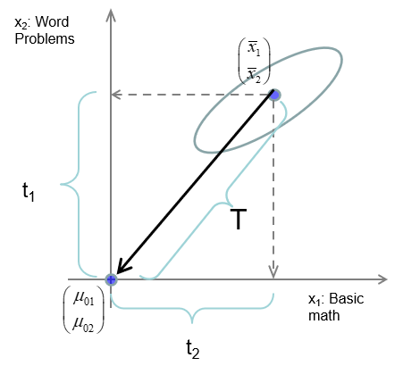
Hotelling’s \(T^2\) is then the analog of \(t^2\), with the variance-covariance matrix \(\mathbf{S}\) of the scores on (BM, WP) replacing the variance of a single score. This is nothing more than the squared Mahalanobis distance between the sample mean vector \((\bar{x}_{BM}, \bar{x}_{WP})^\textsf{T}\) and the hypothesized means \(\mathbf{\mu}_0\), in the metric of \(\mathbf{S}\), as shown in Figure 9.1.
\[\begin{align*} T^2 &= N (\bar{\mathbf{x}} - \mathbf{\mu}_0)^\textsf{T} \; \mathbf{S}^{-1} \; (\bar{\mathbf{x}} - \mathbf{\mu}_0) \\ &= N D^2_M (\bar{\mathbf{x}}, \mathbf{\mu}_0) \end{align*}\]
9.2 \(T^2\) properties
Aside from it’s elegant geometric interpretation Hotelling’s \(T^2\) has simple properties that aid in understanding the extension to more complex multivariate tests.
Maximum \(t^2\) : Consider constructing a new variable \(w\) as a linear combination of the scores in a matrix \(\mathbf{X} = [ \mathbf{x_1}, \mathbf{x_2}, \dots, \mathbf{x_p}]\) with weights \(\mathbf{a}\), \[ w = a_1 \mathbf{x_1} + a_2 \mathbf{x_2} + \dots + a_p \mathbf{x_p} = \mathbf{X} \mathbf{a} \] Hotelling’s \(T^2\) is then the maximum value of a univariate \(t^2 (\mathbf{a})\) over all possible choices of the weights in \(\mathbf{a}\). In this way, Hotellings test reduces a multivariate problem to a univariate one.
Eigenvalue : Hotelling showed that \(T^2\) is the one non-zero eigenvalue (latent root) \(\lambda\) of the matrix \(\mathbf{Q}_H = N (\bar{\mathbf{x}} - \mathbf{\mu}_0)^\textsf{T} (\bar{\mathbf{x}} - \mathbf{\mu}_0)\) relative to \(\mathbf{Q}_E = \mathbf{S}\) that solves the equation \[ (\mathbf{Q}_H - \lambda \mathbf{Q}_E) \mathbf{a} = 0 \tag{9.1}\] In more complex MANOVA problems, there are more than one non-zero latent roots, \(\lambda_1, \lambda_2, \dots \lambda_s\), and test statistics (Wilks’ \(\Lambda\), Pillai and Hotelling-Lawley trace criteria, Roy’s maximum root test) are functions of these.
Eigenvector : The corresponding eigenvector is \(\mathbf{a} = \mathbf{S}^{-1} (\bar{\mathbf{x}} - \mathbf{\mu}_0)\). These are the (raw) discriminant coefficients, giving the relative contribution of each variable to \(T^2\).
Critical values : For a single response, the square of a \(t\) statistic with \(N-1\) degrees of freedom is an \(F (1, N-1)\) statistic. But we chose \(\mathbf{a}\) to give the maximum \(t^2 (\mathbf{a})\); this can be taken into account with a transformation of \(T^2\) to give an exact \(F\) test with the correct sampling distribution: \[ F^* = \frac{N - p}{p (N-1)} T^2 \; \sim \; F (p, N - p) \tag{9.2}\]
Invariance under linear transformation : Just as a univariate \(t\)-test is unchanged if we apply a linear transformation to the variable, \(x \rightarrow a x + b\), \(T^2\) is invariant under all linear (affine) transformations, \[ \mathbf{x}_{p \times 1} \rightarrow \mathbf{C}_{p \times p} \mathbf{x} + \mathbf{b} \] So, you get the same results if you convert penguins flipper lengths from millimeters to centimeters or inches. The same is true for all MANOVA tests.
Two-sample tests : With minor variations in notation, everything above applies to the more usual test of equality of multivariate means in a two sample test of \(H_0 : \mathbf{\mu}_1 = \mathbf{\mu}_2\). \[ T^2 = N (\bar{\mathbf{x}}_1 - \bar{\mathbf{x}}_2)^\textsf{T} \; \mathbf{S}_p^{-1} \; (\bar{\mathbf{x}}_1 - \bar{\mathbf{x}}_2) \] where \(\mathbf{S}_p\) is the pooled within-sample variance covariance matrix.
Example
The data set heplots::mathscore gives (fictitious) scores on a test of basic math skills (BM) and solving word problems (WP) for two groups of \(N=6\) students in an algebra course, each taught by different instructors.
You can carry out the test that the means for both variables are jointly equal using either Hotelling::hotelling.test() (Curran & Hersh, 2021) or car::Anova(),
hotelling.test(cbind(BM, WP) ~ group, data=mathscore) |> print()
#> Test stat:  64.174
#> Numerator df:  2
#> Denominator df:  9
#> P-value:  0.0001213

math.mod <- lm(cbind(BM, WP) ~ group, data=mathscore)
Anova(math.mod)
#>
#> Type II MANOVA Tests: Pillai test statistic
#>       Df test stat approx F num Df den Df  Pr(>F)
#> group  1     0.865     28.9      2      9 0.00012 ***
#> ---
#> Signif. codes:  0 '***' 0.001 '**' 0.01 '*' 0.05 '.' 0.1 ' ' 1
What’s wrong with just doing the two \(t\)-tests (or equivalent \(F\)-test with lm())?
Anova(mod1 <- lm(BM ~ group, data=mathscore))
#> Anova Table (Type II tests)
#>
#> Response: BM
#>           Sum Sq Df F value Pr(>F)
#> group       1302  1    4.24  0.066 .
#> Residuals   3071 10
#> ---
#> Signif. codes:  0 '***' 0.001 '**' 0.01 '*' 0.05 '.' 0.1 ' ' 1
Anova(mod2 <- lm(WP ~ group, data=mathscore))
#> Anova Table (Type II tests)
#>
#> Response: WP
#>           Sum Sq Df F value Pr(>F)
#> group       4408  1    10.4  0.009 **
#> Residuals   4217 10
#> ---
#> Signif. codes:  0 '***' 0.001 '**' 0.01 '*' 0.05 '.' 0.1 ' ' 1
From this, we might conclude that the two groups do not differ significantly on Basic Math but strongly differ on Word problems. But the two univariate tests do not take the correlation among the mean differences into account.
To see the differences between the groups on both variables together, we draw their data (68%) ellipses, using heplots::covEllpses()
colors <- c("darkgreen", "blue")
covEllipses(mathscore[,c("BM", "WP")], mathscore$group,
            pooled=FALSE,
            col = colors,
            fill = TRUE,
            fill.alpha = 0.05,
            cex = 2, cex.lab = 1.5,
            asp = 1,
            xlab="Basic math", ylab="Word problems")
# plot points
pch <- ifelse(mathscore$group==1, 15, 16)
col <- ifelse(mathscore$group==1, colors[1], colors[2])
points(mathscore[,2:3], pch=pch, col=col, cex=1.25)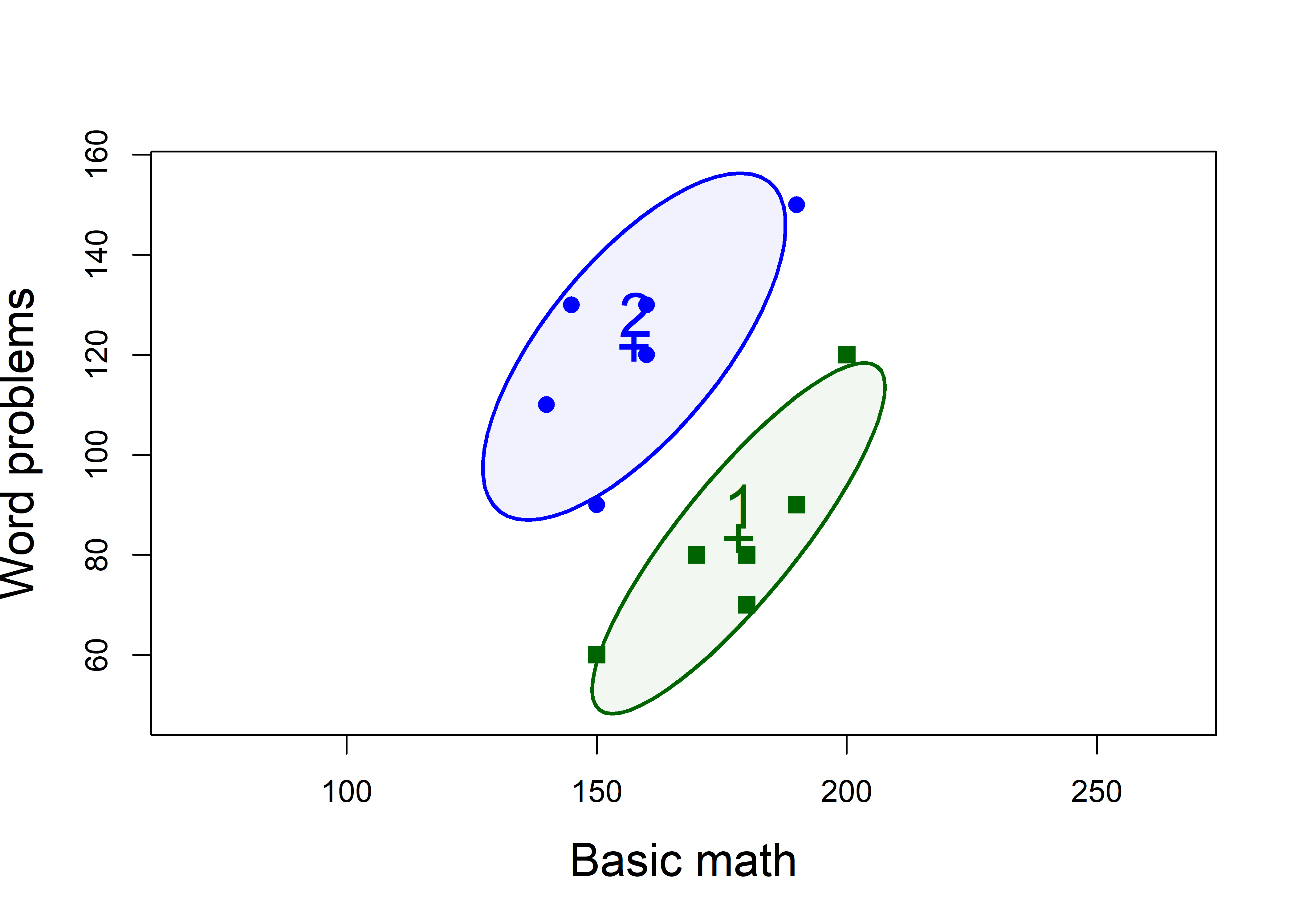
mathscore data, enclosing approximately 68% of the observations in each group
We can see that:
- Group 1 > Group 2 on Basic Math, but worse on Word Problems
- Group 2 > Group 1 on Word Problems, but worse on Basic Math
- Within each group, those who do better on Basic Math also do better on Word Problems
We can also see why the univariate test, at least for Basic math is non-significant: the scores for the two groups overlap considerably on the horizontal axis. They are slightly better separated along the vertical axis for word problems. The plot also reveals why Hotelling’s \(T^2\) reveals such a strongly significant result: the two groups are very widely separated along an approximately 45\(^o\) line between them.
A relatively simple interpretation is that the groups don’t really differ in overall math ability, but perhaps the instructor in Group 1 put more focus on basic math skills, while the instructor for Group 2 placed greater emphasis on solving word problems.
In Hotelling’s \(T^2\), the “size” of the difference between the means (labeled “1” and “2”) is assessed relative to the pooled within-group covariance matrix \(\mathbf{S}_p\), which is just a size-weighted average of the two within-sample matrices, \(\mathbf{S}_1\) and \(\mathbf{S}_2\),
\[ \mathbf{S}_p = [ (n_1 - 1) \mathbf{S}_1 + (n_2 - 1) \mathbf{S}_2 ] / (n_1 + n_2 - 2) \]
Visually, imagine sliding the the separate data ellipses to the grand mean, \((\bar{x}_{\text{BM}}, \bar{x}_{\text{WP}})\) and finding their combined data ellipse. This is just the data ellipse of the sample of deviations of the scores from their group means, or that of the residuals from the model lm(cbind(BM, WP) ~ group, data=mathscore)
To see this, we plot \(\mathbf{S}_1\), \(\mathbf{S}_2\) and \(\mathbf{S}_p\) together,
covEllipses(mathscore[,c("BM", "WP")], mathscore$group,
            col = c(colors, "red"),
            fill = c(FALSE, FALSE, TRUE),
            fill.alpha = 0.3,
            cex = 2, cex.lab = 1.5,
            asp = 1,
            xlab="Basic math", ylab="Word problems")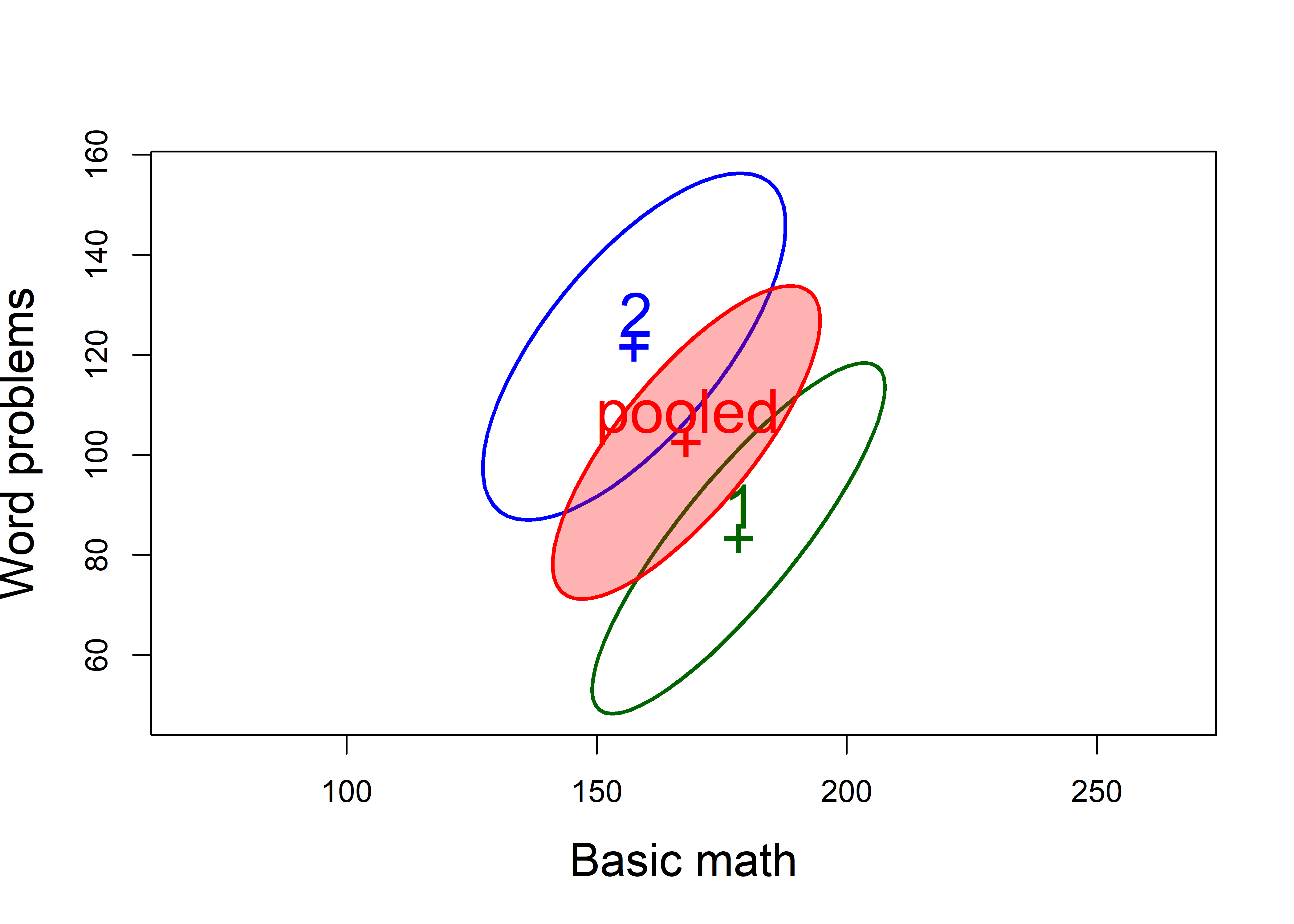
mathscore data.
One of the assumptions of the \(T^2\) test (and of MANOVA) is that the within-group variance covariance matrices, \(\mathbf{S}_1\) and \(\mathbf{S}_2\), are the same. In Figure 9.3, you can see how the shapes of \(\mathbf{S}_1\) and \(\mathbf{S}_2\) are very similar, differing in that the variance of word Problems is slightly greater for group 2. In Chapter XX we take of the topic of visualizing tests of this assumption, based on Box’s \(M\)-test.
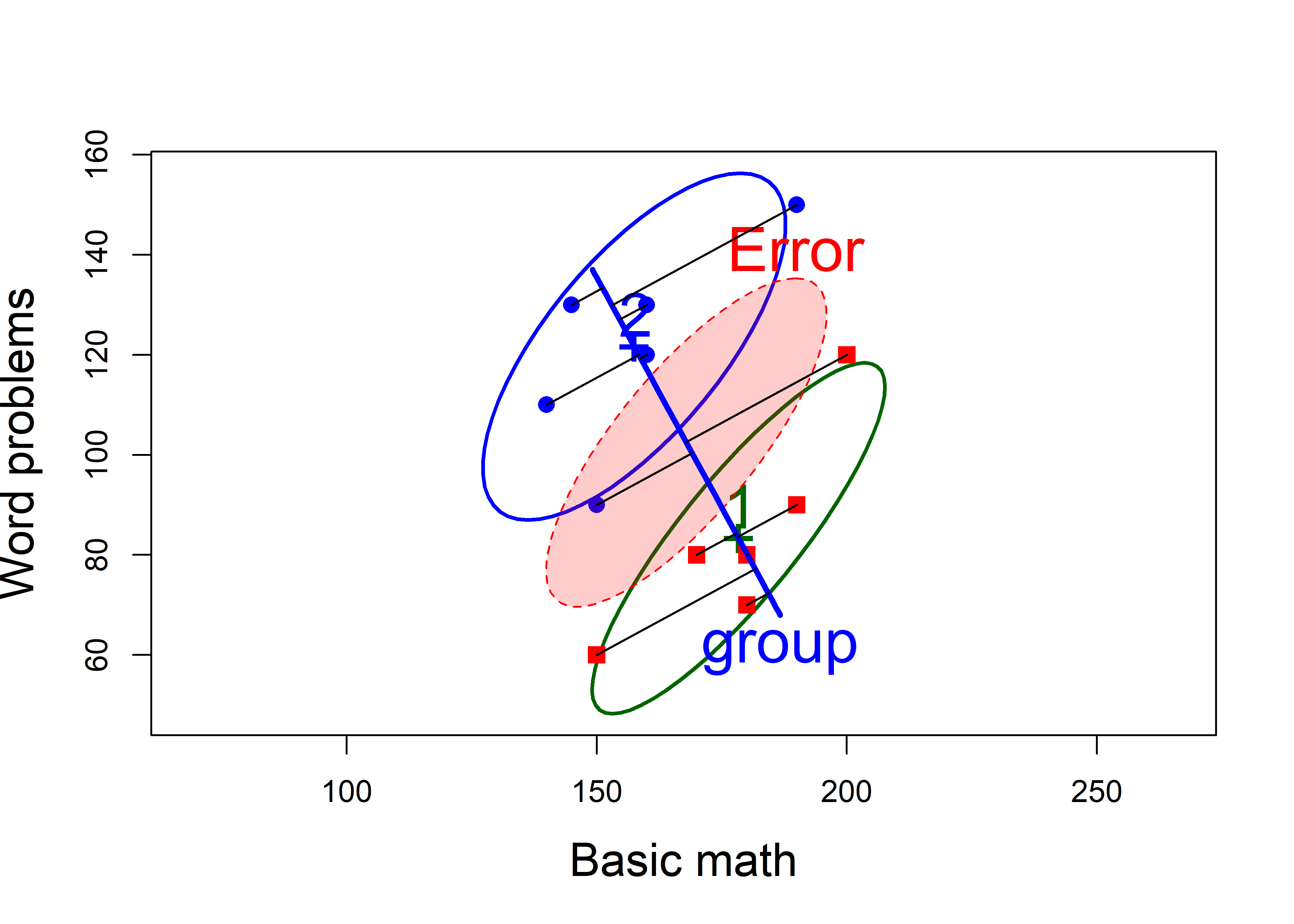
9.3 HE plot and discriminant axis
As we describe in detail in Chapter XX, all the information relevant to the \(T^2\) test and MANOVA can be captured in the remarkably simple Hypothesis Error plot, which shows the relative size of two data ellipses,
- \(\mathbf{H}\): the data ellipse of the fitted values, which are just the group means on the two variables, \(\bar{\mathbf{x}}\), corresponding to \(\mathbf{Q}_H\) in Equation 9.1. In case of \(T^2\), the \(\mathbf{H}\) matrix is of rank 1, so the “ellipse” plots as a line.
# calculate H directly
fit <- fitted(math.mod)
xbar <- colMeans(mathscore[,2:3])
N <- nrow(mathscore)
crossprod(fit) - N * outer(xbar, xbar)
#>       BM    WP
#> BM  1302 -2396
#> WP -2396  4408

# same as: SSP for group effect from Anova
math.aov <- Anova(math.mod)
(H <- math.aov$SSP)
#> $group
#>       BM    WP
#> BM  1302 -2396
#> WP -2396 4408- \(\mathbf{E}\): the data ellipse of the residuals, the deviations of the scores from the group means, \(\mathbf{x} - \bar{\mathbf{x}}\), corresponding to \(\mathbf{Q}_E\).
9.3.1 heplot()
heplots::heplot() takes the model object, extracts the \(\mathbf{H}\) and \(\mathbf{E}\) matrices (from summary(Anova(math.mod))) and plots them. There are many options to control the details.
heplot(math.mod,
       fill=TRUE, lwd = 3,
       asp = 1,
       cex=2, cex.lab=1.8,
       xlab="Basic math", ylab="Word problems")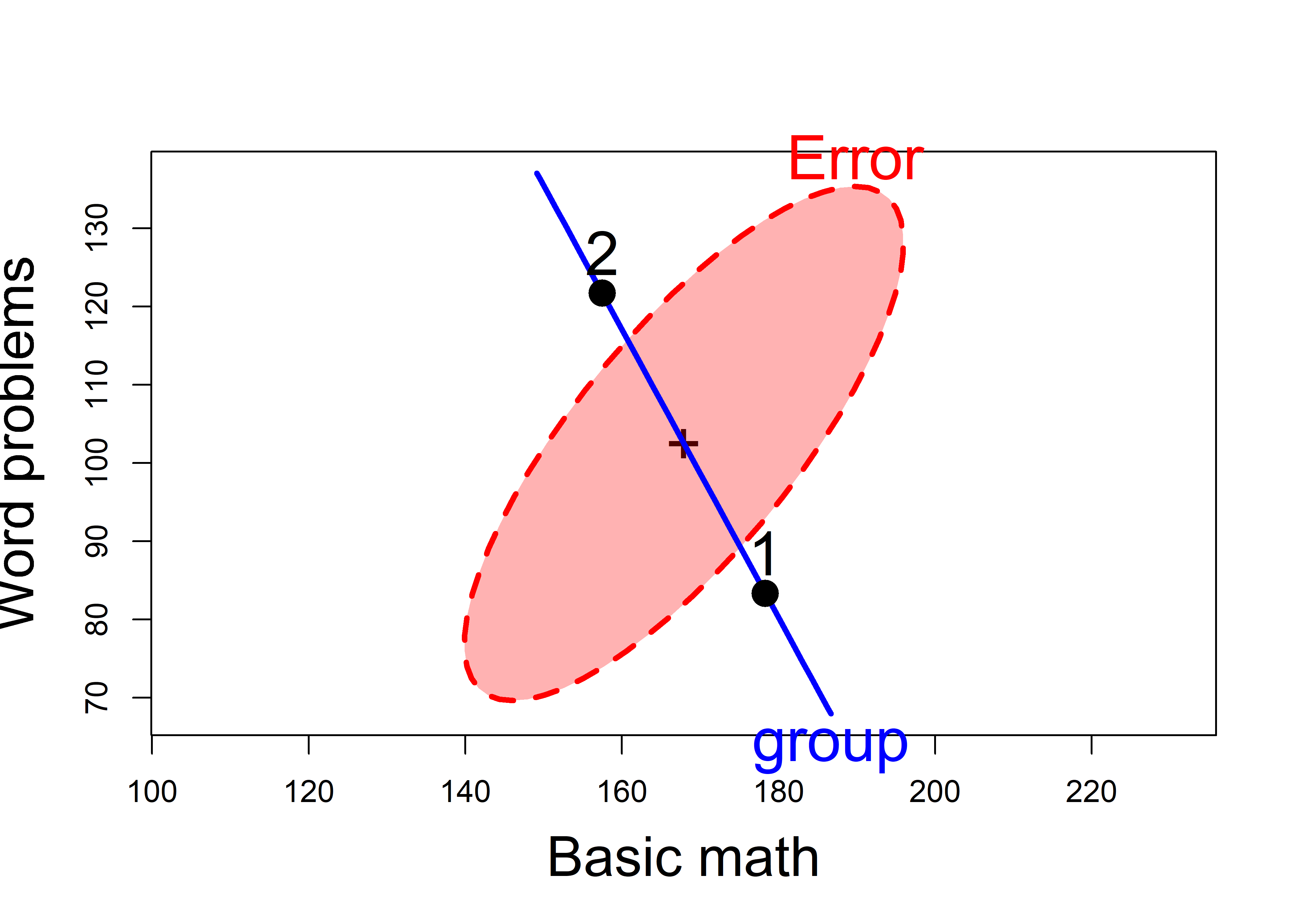
mathscore data. The line through the group means is the H ellipse, which plots as a line here. The red ellipse labeled ‘Error’ represents the pooled within-group covariance matrix.
But the HE plot offers more:
A visual test of significance: the \(\mathbf{H}\) ellipse is scaled so that it projects anywhere outside the \(\mathbf{E}\) ellipse, if and only if the test is significant at a given \(\alpha\) level (\(\alpha = 0.05\) by default)
The \(\mathbf{H}\) ellipse, which appears as a line, goes through the means of the two groups. This is also the discriminant axis, the direction in the space of the variables which maximally discriminates between the groups. That is, if we project the data points onto this line, we get the linear combination \(w\) which has the maximum possible univariate \(t^2\).
You can see how the HE plot relates to the plots of the separate data ellipses by overlaying them in a single figure. We also plot the scores on the discriminant axis, by using this small function to find the orthogonal projection of a point \(\mathbf{a}\) on the line joining two points, \(\mathbf{p}_1\) and \(\mathbf{p}_2\), which in math is \(\mathbf{p}_1 + \frac{\mathbf{d}^\textsf{T} (\mathbf{a} - \mathbf{p}_1)} {\mathbf{d}^\textsf{T} \mathbf{d}}\), letting \(\mathbf{d} = \mathbf{p}_1 - \mathbf{p}_2\).
dot <- function(x, y) sum(x*y)
project_on <- function(a, p1, p2) {
    a <- as.numeric(a)
    p1 <- as.numeric(p1)
    p2 <- as.numeric(p2)
    dot <- function(x,y) sum( x * y)
    t <- dot(p2-p1, a-p1) / dot(p2-p1, p2-p1)
    C <- p1 + t*(p2-p1)
    C
}
Then, we run the same code as before to plot the data ellipses, and follow this with a call to heplot() using the option add=TRUE which adds to an existing plot. Following this, we find the group means and draw lines projecting the points on the line between them.
covEllipses(mathscore[,c("BM", "WP")], mathscore$group,
            pooled=FALSE,
            col = colors,
            cex=2, cex.lab=1.5,
            asp=1,
            xlab="Basic math", ylab="Word problems"
            )
pch <- ifelse(mathscore$group==1, 15, 16)
col <- ifelse(mathscore$group==1, "red", "blue")
points(mathscore[,2:3], pch=pch, col=col, cex=1.25)

# overlay with HEplot (add = TRUE)
heplot(math.mod,
       fill=TRUE,
       cex=2, cex.lab=1.8,
       fill.alpha=0.2, lwd=c(1,3),
       add = TRUE,
       error.ellipse=TRUE)

# find group means
means <- mathscore |>
  group_by(group) |>
  summarize(BM = mean(BM), WP = mean(WP))

for(i in 1:nrow(mathscore)) {
    gp <- mathscore$group[i]
    pt <- project_on( mathscore[i, 2:3], means[1, 2:3], means[2, 2:3])
    segments(mathscore[i, "BM"], mathscore[i, "WP"], pt[1], pt[2], lwd = 1.2)
}
9.4 Discriminant analysis
Discriminant analysis for two-group designs or for one-way MANOVA essentially turns the problem around: Instead of asking whether the mean vectors for two or more groups are equal, discriminant analysis tries to find the linear combination \(w\) of the response variables that has the greatest separation among the groups, allowing cases to be best classified. It was developed by Fisher (1936) as a solution to the biological taxonomy problem of developing a rule to classify instances of flowers—in his famous case, Iris flowers—into known species (I. setosa, I. versicolor, I. virginica) on the basis of multiple measurements (length and width of their sepals and petals).
(math.lda <- MASS::lda(group ~ ., data=mathscore))
#> Call:
#> lda(group ~ ., data = mathscore)
#>
#> Prior probabilities of groups:
#>   1   2
#> 0.5 0.5
#>
#> Group means:
#>    BM    WP
#> 1 178  83.3
#> 2 158 121.7
#>
#> Coefficients of linear discriminants:
#>        LD1
#> BM -0.0835
#> WP  0.0753
The coefficients give \(w = -0.84 \text{BM} + 0.75 \text{WP}\). This is exactly the direction given by the line for the \(\mathbf{H}\) ellipse in Figure 9.5.
To round this out, we can calculate the discriminant scores by multiplying the matrix \(\mathbf{X}\) by the vector \(\mathbf{a} = \mathbf{S}^{-1} (\bar{\mathbf{x}}_1 - \bar{\mathbf{x}}_2)\) of the discriminant weights.
math.lda$scaling
#>        LD1
#> BM -0.0835
#> WP  0.0753

scores <- cbind(group = mathscore$group,
                as.matrix(mathscore[, 2:3]) %*% math.lda$scaling) |>
  as.data.frame()
scores |>
  group_by(group) |>
  slice(1:3)
#> # A tibble: 6 × 2
#> # Groups:   group [2]
#>   group   LD1
#>   <dbl> <dbl>
#> 1     1 -9.09
#> 2     1 -8.17
#> 3     1 -9.01
#> 4     2 -4.33
#> 5     2 -4.58
#> 6     2 -5.75
Then a \(t\)-test on these scores gives Hotelling’s \(T\), accessed via the statistic component of t.test()
Finally, it is instructive to compare violin plots for the three measures, BM, WP and LD1. To do this with ggplot2 requires reshaping the data from wide to long format so the plots can be faceted.
scores <- mathscore |>
  bind_cols(LD1 = scores[, "LD1"])

scores |>
  tidyr::gather(key = "measure", value ="Score", BM:LD1) |>
  mutate(measure = factor(measure, levels = c("BM", "WP", "LD1"))) |>
  ggplot(aes(x = group, y = Score, color = group, fill = group)) +
    geom_violin(alpha = 0.2) +
    geom_jitter(width = .2, size = 2) +
    facet_wrap( ~ measure, scales = "free", labeller = label_both) +
    scale_fill_manual(values = c("darkgreen", "blue")) +
    scale_color_manual(values = c("darkgreen", "blue")) +
    theme_bw(base_size = 14) +
    theme(legend.position = "none")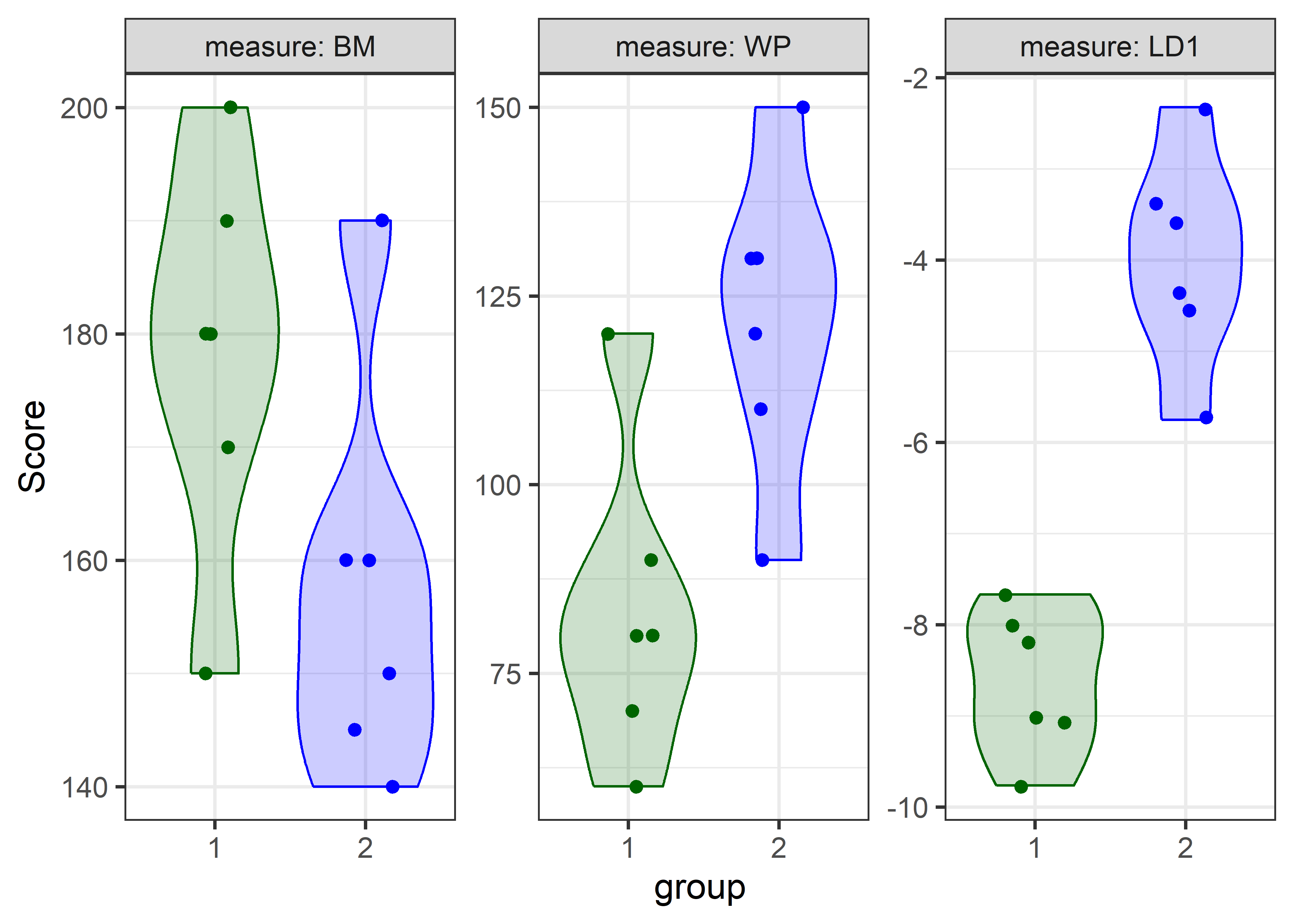
You can readily see how well the groups are separated on the discriminant axes, relative to the two individual variables.
9.5 More variables
The mathscore data gave a simple example with two outcomes to explain the essential ideas behind Hotelling’s \(T^2\) and multivariate tests. Multivariate methods become increasingly useful as the number of response variables increases because it is harder to show them all together and see how they relate to differences between groups.
A classic example is the dataset mbclust::banknote, containing six size measures made on 100 genuine and 100 counterfeit old-Swiss 1000-franc bank notes (Flury & Riedwyl, 1988). The goal is to see how well the real and fake banknotes can be distinguished. The measures are the Length and Diagonal lengths of a banknote and the Left, Right, Top and Bottom edge margins in mm.
Before considering hypothesis tests, let’s look at some exploratory graphics. Figure 9.7 shows univariate violin and boxplots of each of the measures. To make this plot, faceted by measure, I first reshape the data from wide to long and make measure a factor with levels in the order of the variables in the data set.
data(banknote, package= "mclust")
banknote |>
  tidyr::gather(key = "measure",
                value = "Size",
                Length:Diagonal) |>
  mutate(measure = factor(measure,
                          levels = c(names(banknote)[-1]))) |>

  ggplot(aes(x = Status, y = Size, color = Status)) +
  geom_violin(aes(fill = Status), alpha = 0.2) +           # (1)
  geom_jitter(width = .2, size = 1.2) +                    # (2)
  geom_boxplot(width = 0.25,                               # (3)
               linewidth = 1.1,
               color = "black",
               alpha = 0.5) +
  labs(y = "Size (mm)") +
  facet_wrap( ~ measure, scales = "free", labeller = label_both) +
  theme_bw(base_size = 14) +
  theme(legend.position = "top")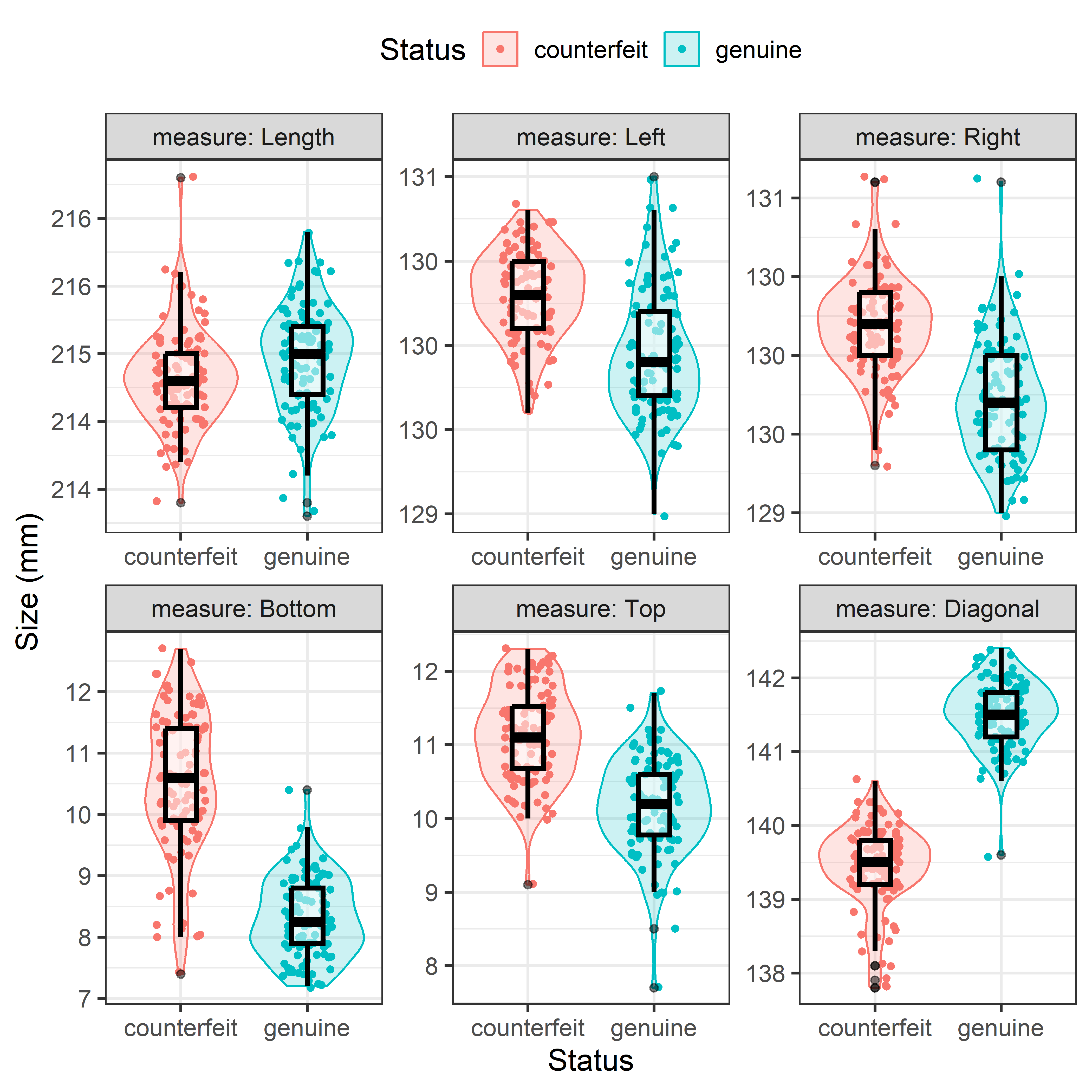
A quick glance at Figure 9.7 shows that the counterfeit and genuine bills differ in their means on most of the measures, with the counterfeit ones slightly larger on Left, Right, Bottom and Top margins. But univariate plots don’t give an overall sense of how these variables are related to one another.
Figure 9.7 is somewhat complex, so it is useful to understand the steps needed to make this figure show what I wanted. The plot in each panel contains three layers:
- the violin plot based on a density estimate, showing the shape of each distribution;
- the data points, but they are jittered horizontally using
geom_jiter()because otherwise they would all overlap on the X axis; - the boxplot, showing the center (median) and spread (IQR) of each distribution.
In composing graphs with layers, order matters, and also does the alpha transparency, because each layer adds data ink on top of earlier ones. I plotted these in the order shown because I wanted the violin plot to provide the background, and the boxplot to show a simple univariate summary, not obscured by the other layers. The alpha values allow the data ink to be blended for each layer, and in this case, alpha = 0.5 for the boxplot let the earlier layers show through.
9.5.1 Biplots
Multivariate relations among these six variables could be explored in data space using scatterplots or other methods, but I turn to my trusty multivariate juicer, a biplot, to give a 2D summary. Two dimensions account for 70% of the total variance of all the banknotes, while three would give 85%.
banknote.pca <- prcomp(banknote[, -1], scale = TRUE)
summary(banknote.pca)
#> Importance of components:
#>                          PC1   PC2   PC3   PC4    PC5    PC6
#> Standard deviation     1.716 1.131 0.932 0.671 0.5183 0.4346
#> Proportion of Variance 0.491 0.213 0.145 0.075 0.0448 0.0315
#> Cumulative Proportion  0.491 0.704 0.849 0.924 0.9685 1.0000
The biplot in Figure 9.8 gives a nicely coherent overview, at least in two dimensions. The first component shows the positive correlations among the measures of the margins, where the counterfeit bills are larger than the real ones and a negative correlation of the Diagonal with the other measures. The length of bills only distinguishes the types of banknotes on the second dimension.
banknote.pca <- reflect(banknote.pca)
ggbiplot(banknote.pca,
   obs.scale = 1, var.scale = 1,
   groups = banknote$Status,
   ellipse = TRUE,
   ellipse.level = 0.5,
   ellipse.alpha = 0.1,
   ellipse.linewidth = 0,
   varname.size = 4,
   varname.color = "black") +
  labs(fill = "Status",
       color = "Status") +
  theme_minimal(base_size = 14) +
  theme(legend.position = 'top')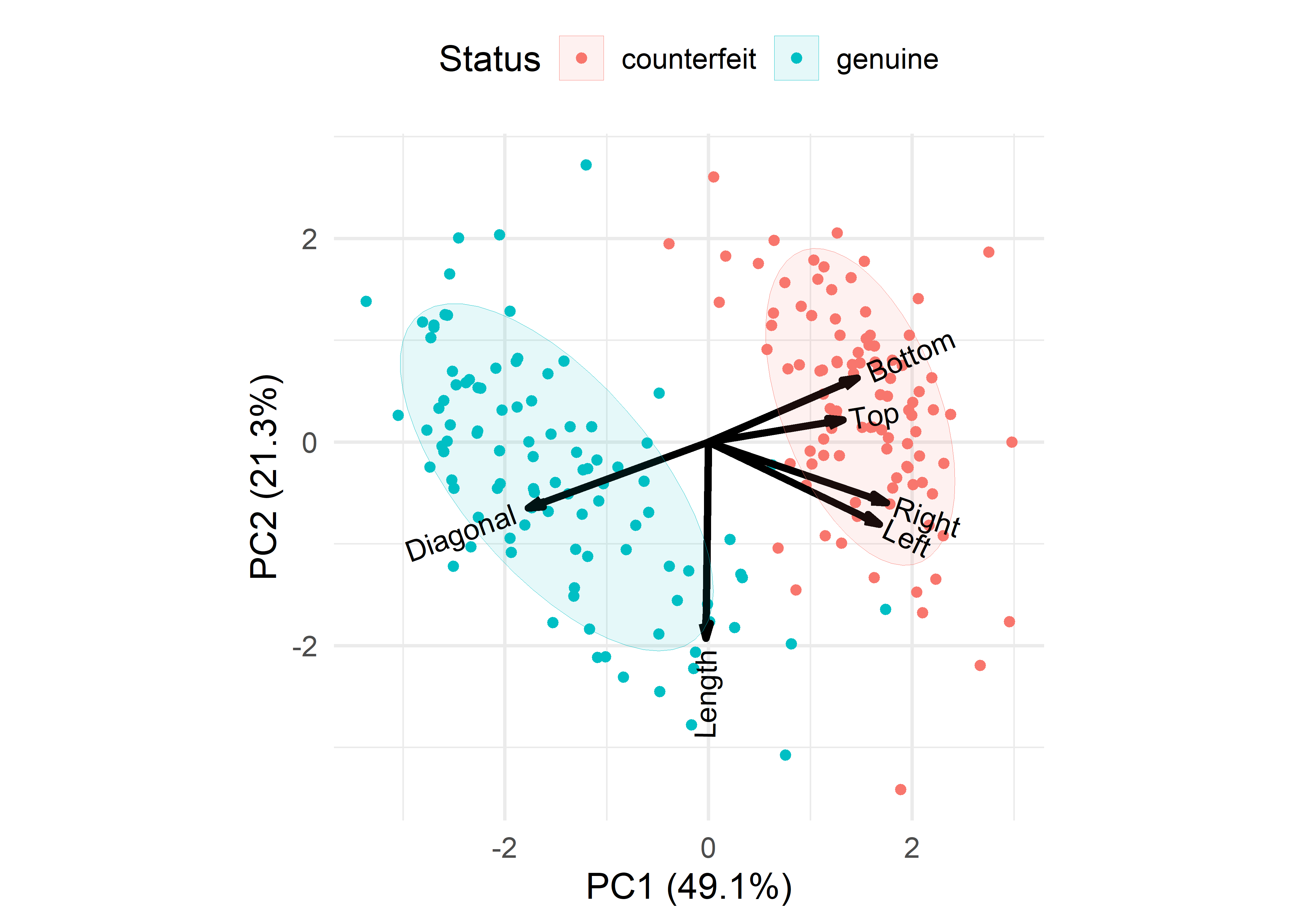
9.5.2 Testing mean differences
As noted above, Hotelling’s \(T^2\) is equivalent to a one-way MANOVA, fitting the size measures to the Status of the banknotes. Anova() reports only the \(F\)-statistic based on Pillai’s trace criterion.
banknote.mlm <- lm(cbind(Length, Left, Right, Bottom, Top, Diagonal) ~ Status,
                    data = banknote)
Anova(banknote.mlm)
#>
#> Type II MANOVA Tests: Pillai test statistic
#>        Df test stat approx F num Df den Df Pr(>F)
#> Status  1     0.924      392      6    193 <2e-16 ***
#> ---
#> Signif. codes:  0 '***' 0.001 '**' 0.01 '*' 0.05 '.' 0.1 ' ' 1
You can see all the multivariate test statistics with the summary() method for "Anova.mlm" objects. With two groups, and hence a 1 df test, these all translate into identical \(F\)-statistics.
summary(Anova(banknote.mlm)) |> print(SSP = FALSE)
#>
#> Type II MANOVA Tests:
#>
#> ------------------------------------------
#>
#> Term: Status
#>
#> Multivariate Tests: Status
#>                  Df test stat approx F num Df den Df Pr(>F)
#> Pillai            1      0.92      392      6    193 <2e-16 ***
#> Wilks             1      0.08      392      6    193 <2e-16 ***
#> Hotelling-Lawley  1     12.18      392      6    193 <2e-16 ***
#> Roy               1     12.18      392      6    193 <2e-16 ***
#> ---
#> Signif. codes:  0 '***' 0.001 '**' 0.01 '*' 0.05 '.' 0.1 ' ' 1
If you wish, you can extract the univariate \(t\)-tests or equivalent \(F = t^2\) statistics from the "mlm" object using broom::tidy.mlm(). What is given as the estimate is the difference in the mean for the genuine banknotes relative to the counterfeit ones.
broom::tidy(banknote.mlm) |>
  filter(term != "(Intercept)") |>
  dplyr::select(-term) |>
  rename(t = statistic) |>
  mutate(F = t^2) |>
  relocate(F, .after = t)
#> # A tibble: 6 × 6
#>   response estimate std.error      t      F  p.value
#>   <chr>       <dbl>     <dbl>  <dbl>  <dbl>    <dbl>
#> 1 Length      0.146    0.0524   2.79   7.77 5.82e- 3
#> 2 Left       -0.357    0.0445  -8.03  64.5  8.50e-14
#> 3 Right      -0.473    0.0464 -10.2  104.   6.84e-20
#> 4 Bottom     -2.22     0.130  -17.1  292.   7.78e-41
#> 5 Top        -0.965    0.0909 -10.6  113.   3.85e-21
#> 6 Diagonal    2.07     0.0715  28.9  836.   5.35e-73
The individual \(F_{(1, 198)}\) statistics can be compared to the \(F_{(6, 193)} = 392\) value for the overall multivariate test. While all of the individual tests are highly significant, the average of the univariate \(F\)s is only 236. The multivariate test gains power by taking the correlations of the size measures into account.
9.6 Variance accounted for: Eta square (\(\eta^2\))
In a univariate multiple regression model, the coefficient of determination \(R^2 = \text{SS}_H / \text{SS}_\text{Total}\) gives the proportion of variance accounted for by hypothesized terms in \(H\) relative to the total variance. An analog for ANOVA-type models with categorical, group factors as predictors is \(\eta^2\) (Pearson, 1903), defined as \[ \eta^2 = \frac{\text{SS}_\text{Between groups}}{\text{SS}_\text{Total}} \] For multivariate response models, the generalization of \(\eta^2\) uses multivariate analogs of these sums of squares, \(\mathbf{Q}_H\) and \(\mathbf{Q}_T = \mathbf{Q}_H + \mathbf{Q}_E\), and there are different different calculations for a single measure corresponding to the various test statistics (Wilks’ \(\Lambda\), etc.), as described in Chapter XX.
Let’s calculate the \(\eta^2\) for the multivariate model banknote.mlm with Status as the only predictor, giving \(\eta^2 = 0.92\), or 92% of the total variance.
heplots::etasq(banknote.mlm)
#>        eta^2
#> Status 0.924
This can be compared (unfavorably) to the principal components analysis and the biplot in Figure 9.8, where two components accounted for 70% of total variance and it took four PCA dimensions to account for over 90%. The goals of PCA and MANOVA are different, of course, but they are both concerned with accounting for variance of multivariate data. We will meet another multivariate juicer, canonical discriminant analysis in Chapter XX.
9.7 Exercises
- The value of Hotelling’s \(T^2\) found by
hotelling.test()is 64.17. The value of the equivalent \(F\) statistic found byAnova()is 28.9. Verify that Equation 9.2 gives this result.
Packages
#> 11 packages used here:
#> broom, car, carData, corpcor, dplyr, ggbiplot, ggplot2,
heplots, Hotelling, knitr, tidyr