For a univariate linear model fit using lm(), glm() and similar functions, the standard plot() method gives basic versions of diagnostic plots of residuals and other calculated quantities for assessing possible violations of the model assumptions. Some of these can be considerably enhanced using other packages.
Beyond this,
tables of model coefficients, standard errors and test statistics can often be usefully supplemented or even replaced by suitable coeficient plots providing essentially the same information.
when there are two or more predictors, standard plots of \(y\) vs. each \(x\) can be misleading because they ignore the other predictors in the model. Added-variable plots (also called partial regression plots) allow you to visualize partial relations between the response and a predictor by adjusting (controlling for) all other predictors. Component + residual plots help to diagnose nonlinearity.
in this same situation, you can more easily understand their separate impact on the response by plotting the marginal predicted effects of one or more focal variables, averaging over other variables not shown in a given plot.
when there are highly correlated predictors, some specialized plots are useful to understand the nature of colinearity. The problems of collinearity and visual solutions are discussed in sec-collin.
The classic reference on regression diagnostics is Belsley et al. (1980). My favorite modern texts are the brief Fox (2020) and the more complete Fox & Weisberg (2018a), both of which are supported by the car package (Fox & Weisberg, 2019). Some of the examples in this chapter are inspired by Fox & Weisberg (2018a).
Packages
In this chapter I use the following packages. Load them now:
6.1 The “regression quartet”
For a fitted model, plotting the model object with plot(model) provides for any of six basic plots. Four of these are produced by default, giving rise to the term regression quartet for this collection. These are:
Residuals vs. Fitted: For well-behaved data, the points should hover around a horizontal line at residual = 0, with no obvious pattern or trend.
Normal Q-Q plot: A plot of sorted standardized residuals \(e_i\) (obtained from
rstudent(model)) against the theoretical values those values would have in a standard normal \(\mathcal{N}(0, 1)\) distribution. Well-behaved residuals should appear as a line with slope=1 (when the aspect ratio is 1) in such plots. Departures from normality usually appear as systematic curvature above or below the line in the tails of the distribution.Scale-Location: Plots the square-root of the absolute values of the standardized residuals \(\sqrt{| e_i |}\) as a measure of “scale” against the fitted values \(\hat{y}_i\) as a measure of “location”. This provides an assessment of homogeneity of variance. Violations appear as a tendency for scale (variability) to vary with location.
Residuals vs. Leverage: Plots standardized residuals against leverage to help identify possibly influential observations. Leverage, or “hat” values (given by
hat(model)) are proportional to the squared Mahalanobis distances of the predictor values \(\mathbf{x}_i\) from the means, and measure the potential of an observation to change the fitted coefficients if that observation was deleted. Actual influence is measured by Cooks’s distance (cooks.distance(model)) and is proportional to the product of residual times leverage. Contours of constant Cook’s \(D\) are added to the plot.
One key feature of these plots is providing reference lines or smoothed curves for ease of judging the extent to which a plot conforms to the expected pattern; another is the labeling of observations which deviate from an assumption.
The base-R plot(model) plots are done much better in a variety of packages. I illustrate some versions from the car (Fox & Weisberg, 2019) and performance (Lüdecke et al., 2021) packages, part of the easystats (Lüdecke et al., 2022) suite of packages.
6.1.1 Example: Duncan’s occupational prestige
In a classic study in sociology, Duncan (1961) used data from the U.S. Census in 1950 to study how one could predict the prestige of occupational categories — which is hard to measure — from available information in the census for those occupations. His data is available in carData:Duncan, and contains
-
type: the category of occupation, one ofprof(professional),wc(white collar) orbc(blue collar); -
income: the percentage of occupational incumbents with a reported income > 3500 (about 40,000 in current dollars); -
education: the percentage of occupational incumbents who were high school graduates; -
prestige: the percentage of respondents in a social survey who rated the occupation as “good” or better in prestige.
These variables are a bit quirky in they are measured in percents, 0-100, rather dollars for income and years for education, but this common scale permitted Duncan to ask an interesting sociological question: Assuming that both income and education predict prestige, are they equally important, as might be assessed by testing the hypothesis \(\mathcal{H}_0: \beta_{\text{income}} = \beta_{\text{education}}\). If so, this would provide a very simple theory for occupational prestige.
A quick look at the data shows the variables and a selection of the occupational categories, which are the row.names() of the dataset.
data(Duncan, package = "carData")
set.seed(42)
car::some(Duncan)
#                  type income education prestige
# accountant       prof     62        86       82
# professor        prof     64        93       93
# engineer         prof     72        86       88
# factory.owner    prof     60        56       81
# store.clerk        wc     29        50       16
# carpenter          bc     21        23       33
# machine.operator   bc     21        20       24
# barber             bc     16        26       20
# soda.clerk         bc     12        30        6
# janitor            bc      7        20        8
Let’s start by fitting a simple model using just income and education as predictors. The results look very good! Both income and education are highly significant and the \(R^2 = 0.828\) for the model indicates that prestige is very well predicted by just these variables.
duncan.mod <- lm(prestige ~ income + education, data=Duncan)
summary(duncan.mod)
#
# Call:
# lm(formula = prestige ~ income + education, data = Duncan)
#
# Residuals:
#    Min     1Q Median     3Q    Max
# -29.54  -6.42   0.65   6.61  34.64
#
# Coefficients:
#             Estimate Std. Error t value Pr(>|t|)
# (Intercept)  -6.0647     4.2719   -1.42     0.16
# income        0.5987     0.1197    5.00  1.1e-05 ***
# education     0.5458     0.0983    5.56  1.7e-06 ***
# ---
# Signif. codes:  0 '***' 0.001 '**' 0.01 '*' 0.05 '.' 0.1 ' ' 1
#
# Residual standard error: 13.4 on 42 degrees of freedom
# Multiple R-squared:  0.828, Adjusted R-squared:  0.82
# F-statistic:  101 on 2 and 42 DF,  p-value: <2e-16
Beyond this, Duncan was interested in the coefficients and whether income and education could be said to have equal impacts on predicting occupational prestige. A nice display of model coefficients with confidence intervals is provided by parameters::model_parameters().
parameters::model_parameters(duncan.mod)
# Parameter   | Coefficient |   SE |         95% CI | t(42) |      p
# ------------------------------------------------------------------
# (Intercept) |       -6.06 | 4.27 | [-14.69, 2.56] | -1.42 | 0.163
# income      |        0.60 | 0.12 | [  0.36, 0.84] |  5.00 | < .001
# education   |        0.55 | 0.10 | [  0.35, 0.74] |  5.56 | < .001
We can also test Duncan’s hypothesis that income and education have equal effects on prestige with car::linearHypothesis(). This is constructed as a test of a restricted model in which the two coefficients are forced to be equal against the unrestricted model. Duncan was very happy with this result.
car::linearHypothesis(duncan.mod, "income = education")
#
# Linear hypothesis test:
# income - education = 0
#
# Model 1: restricted model
# Model 2: prestige ~ income + education
#
#   Res.Df  RSS Df Sum of Sq    F Pr(>F)
# 1     43 7519
# 2     42 7507  1      12.2 0.07    0.8
Equivalently, the linear hypothesis that \(\beta_{\text{Inc}} = \beta_{\text{Educ}}\) can be tested with a Wald test1 for difference between these coefficients, expressed as \(\mathcal{H}_0 : \mathbf{C} \boldsymbol{\beta} = 0\), using \(\mathbf{C} = (0, -1, 1)\). The estimated value, -0.053 has a confidence interval [-0.462, 0.356], consistent with Duncan’s hypothesis.
We can visualize this test and confidence intervals using a joint confidence ellipse for the coefficients for income and education in the model duncan.mod. In Figure fig-duncan-beta-diff the size of the ellipse is set to \(\sqrt{F^{0.95}_{1,\nu}} = t^{0.95}_{\nu}\), so that its shadows on the horizontal and vertical axes correspond to 1D 95% confidence intervals. In this plot, the line through the origin with slope \(= 1\) corresponds to equal coefficients for income and education and the line with slope \(= -1\) corresponds to their difference, \(\beta_{\text{Educ}} - \beta_{\text{Inc}}\). The orthogonal projection of the coefficient vector \((\widehat{\beta}_{\text{Inc}}, \widehat{\beta}_{\text{Educ}})\) (the center of the ellipse) is the point estimate of \(\widehat{\beta}_{\text{Educ}} - \widehat{\beta}_{\text{Inc}}\) and the shadow of the ellipse along this axis is the 95% confidence interval for the difference in slopes.
See the code
confidenceEllipse(duncan.mod, col = "blue",
  levels = 0.95, dfn = 1,
  fill = TRUE, fill.alpha = 0.2,
  xlim = c(-.4, 1),
  ylim = c(-.4, 1), asp = 1,
  cex.lab = 1.3,
  grid = FALSE,
  xlab = expression(paste("Income coefficient, ", beta[Inc])),
  ylab = expression(paste("Education coefficient, ", beta[Educ])))

abline(h=0, v=0, lwd = 2)

# confidence intervals for each coefficient
beta <- coef( duncan.mod )[-1]
CI <- confint(duncan.mod)       # confidence intervals
lines( y = c(0,0), x = CI["income",] , lwd = 5, col = 'blue')
lines( x = c(0,0), y = CI["education",] , lwd = 5, col = 'blue')
points(rbind(beta), col = 'black', pch = 16, cex=1.5)
points(diag(beta) , col = 'black', pch = 16, cex=1.4)
arrows(beta[1], beta[2], beta[1], 0, angle=8, len=0.2)
arrows(beta[1], beta[2], 0, beta[2], angle=8, len=0.2)

# add line for equal slopes
abline(a=0, b = 1, lwd = 2, col = "darkgreen")
text(0.8, 0.8, expression(beta[Educ] == beta[Inc]),
     srt=45, pos=3, cex = 1.5, col = "darkgreen")

# add line for difference in slopes
col <- "darkred"
x <- c(-1.5, .5)
lines(x=x, y=-x)
text(-.15, -.15, expression(~beta["Educ"] - ~beta["Inc"]),
     col=col, cex=1.5, srt=-45)

# confidence interval for b1 - b2
wtest <- spida2::wald(duncan.mod, c(0, -1, 1))[[1]]
lower <- wtest$estimate$Lower /2
upper <- wtest$estimate$Upper / 2
lines(-c(lower, upper), c(lower,upper), lwd=6, col=col)

# projection of (b1, b2) on b1-b2 axis
beta <- coef( duncan.mod )[-1]
bdiff <- beta %*% c(1, -1)/2
points(bdiff, -bdiff, pch=16, cex=1.3)
arrows(beta[1], beta[2], bdiff, -bdiff,
       angle=8, len=0.2, col=col, lwd = 2)

# calibrate the diff axis
ticks <- seq(-0.3, 0.3, by=0.2)
ticklen <- 0.02
segments(ticks, -ticks, ticks-sqrt(2)*ticklen, -ticks-sqrt(2)*ticklen)
text(ticks-2.4*ticklen, -ticks-2.4*ticklen, ticks, srt=-45)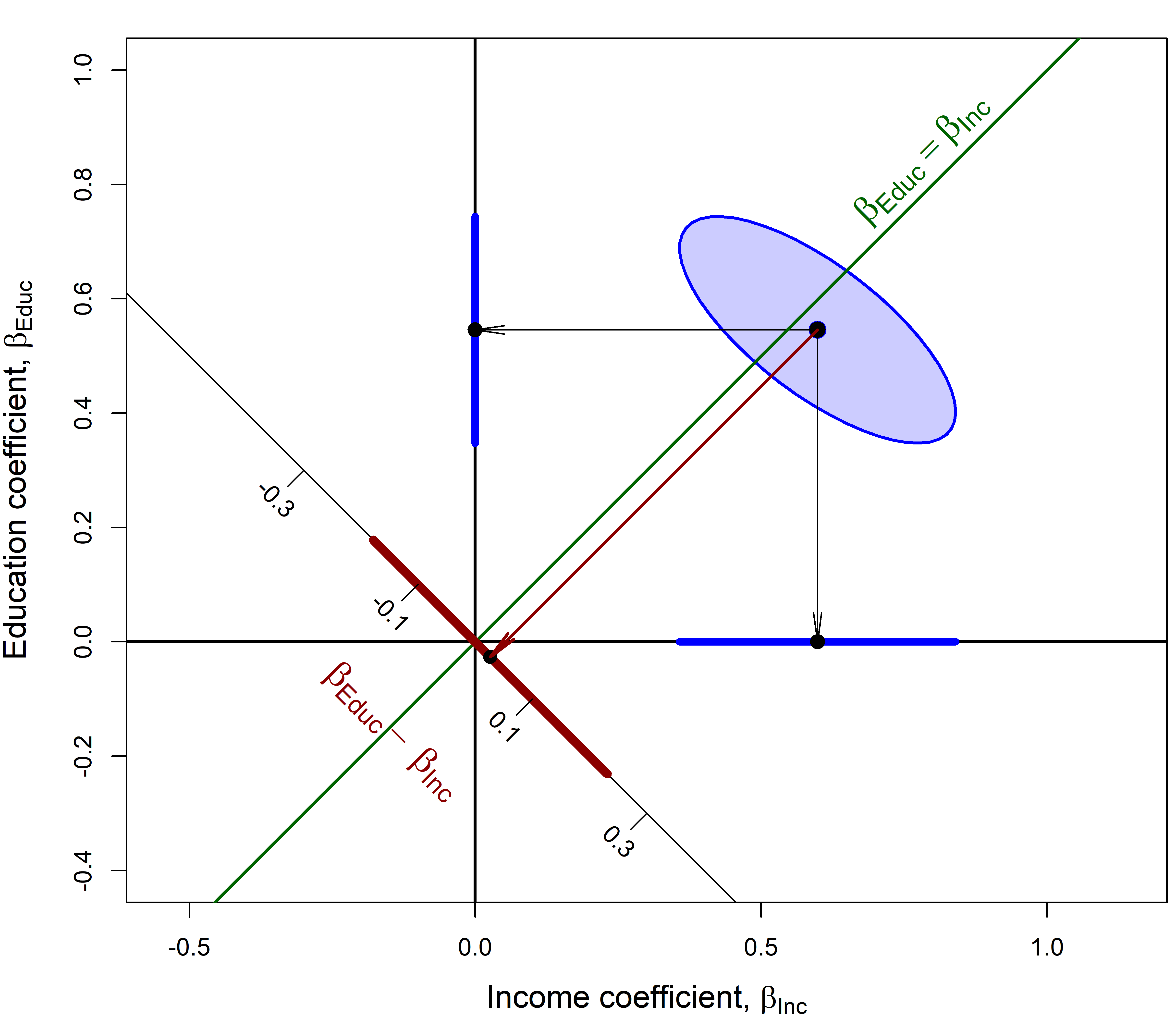
6.1.2 Diagnostic plots
But, should Duncan be so happy? It is unlikely that he ran any model diagnostics or plotted his model; we do so now. Here is the regression quartet (Figure fig-duncan-plot-model) for this model. Each plot shows some trend lines, and importantly, labels some observations that stand out and might deserve attention.
plot(duncan.mod, lwd=2, pch=16,
     cex.lab = 1.2, cex = 1.1, cex.id = 1.2)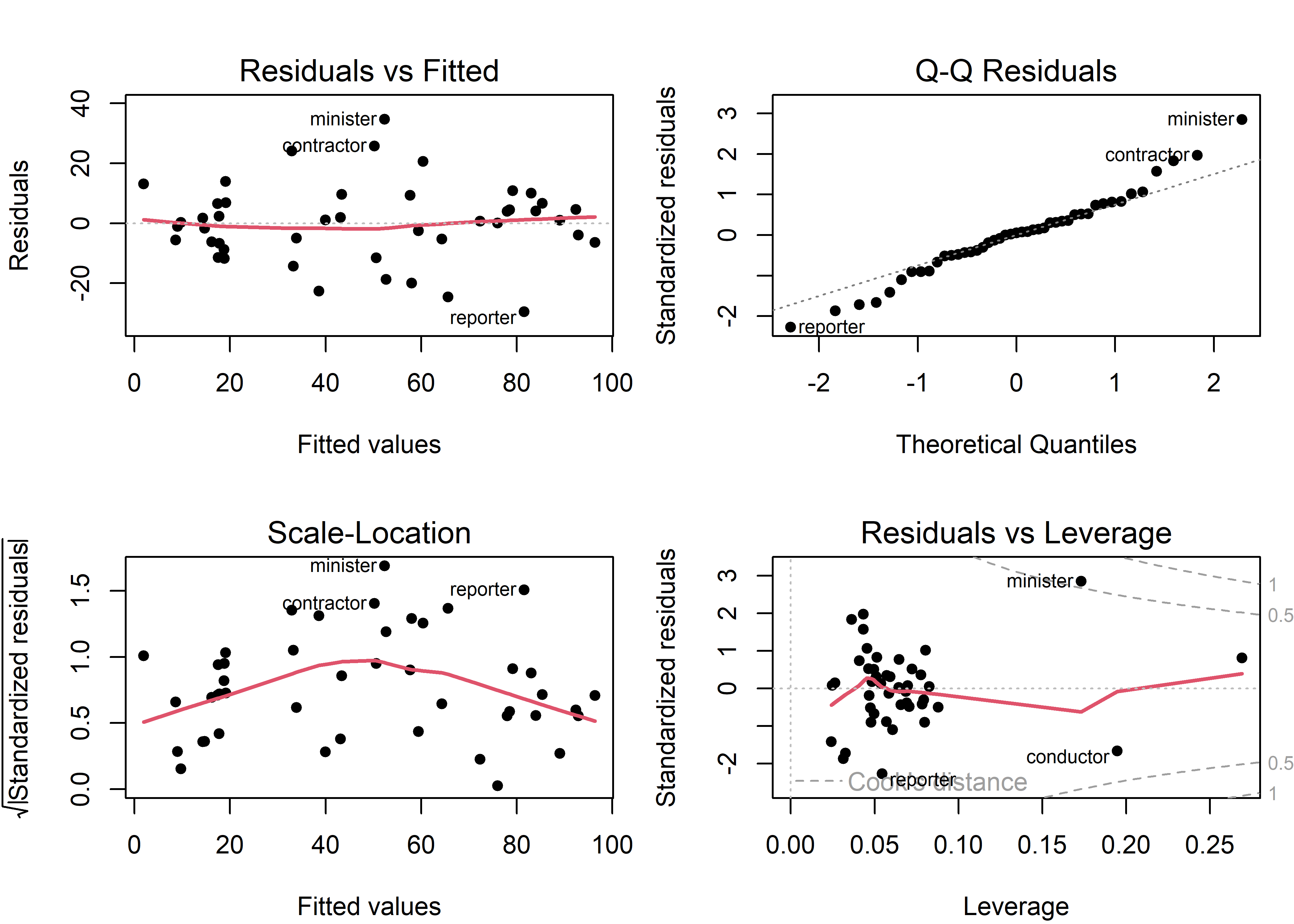
Duncan data. Several possibly unusual observations are labeled.
Some points to note:
- A few observations (minister, reporter, conductor, contractor) are flagged in multiple panels. It turns out (sec-duncan-influence) that the observations for minister and reporter noted in the residuals vs. leverage plot are highly influential and largely responsible for Duncan’s finding that the slopes for income and education could be considered equal.
- The red trend line in the scale-location plot indicates that residual variance is not constant, but rather increases from both ends. This is a consequence of the fact that
prestigeis measured as a percentage, bounded at [0, 100], and the standard deviation of a percentage \(p\) is proportional to \(\sqrt{p \times (1-p)}\) which is maximal at \(p = 0.5\).
Similar, but nicer-looking diagnostic plots are provided by performance::check_model() which uses ggplot2 for graphics. These include helpful captions indicating what should be observed for each for a good-fitting model. However, they don’t have as good facilities for labeling unusual observations as the base R plot.lm() method or functions in the car package.
check_model(duncan.mod,
            check=c("linearity", "qq",
                    "homogeneity", "outliers"))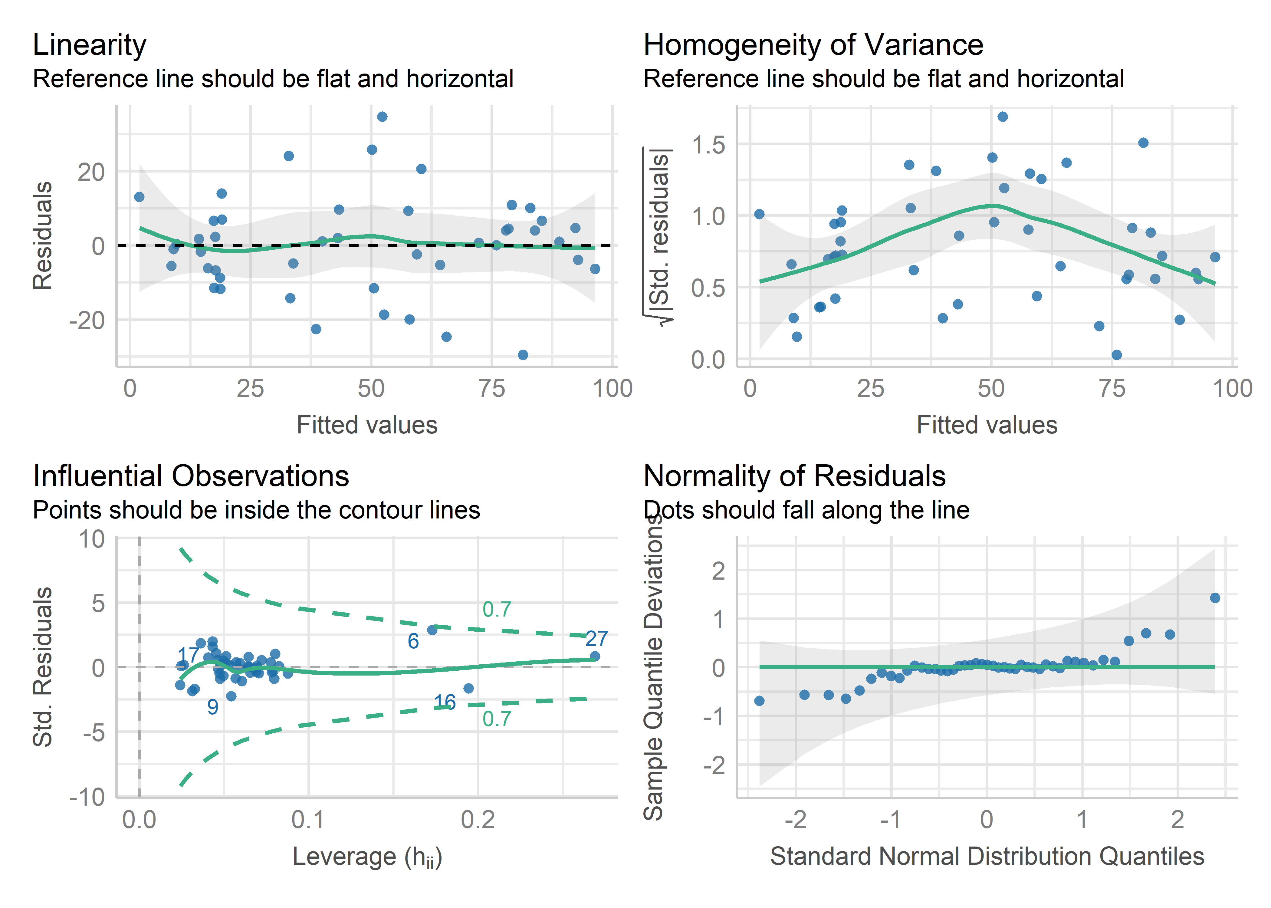
Duncan data, using performance::check_model().
6.1.3 Example: Canadian occupational prestige
Following Duncan (1961), occupational prestige was studied in a Canadian context by Bernard Blishen and others at York University, giving the dataset Prestige which we looked at in Example exm-prestige. It differs from the Duncan dataset primarily in that the main variables—prestige, income and education were revamped to better reflect the underlying constructs in more meaningful units.
prestige: Rather than a simple percentage of “good+” ratings, this uses a wider and more reliable scale from Pineo & Porter (1967) on a scale from 10–90.incomeis measured as the average income of incumbents in each occupation, in 1971 dollars, rather than percent exceeding a given threshold ($3500)educationis measured as the average education of occupational incumbents, years.
The dataset again includes type of occupation with the same levels "bc" (blue collar), "wc" (white collar) and "prof" (professional)2, but in addition includes the percent of women in these occupational categories.
Our interest again is in understanding how prestige is related to census measures of the average education, income, percent women of incumbents in those occupations, but with attention to the scales of measurement and possibly more complex relationships.
data(Prestige, package="carData")
# Reorder levels of type
Prestige$type <- factor(Prestige$type,
                        levels=c("bc", "wc", "prof"))
str(Prestige)
# 'data.frame': 102 obs. of  6 variables:
#  $ education: num  13.1 12.3 12.8 11.4 14.6 ...
#  $ income   : int  12351 25879 9271 8865 8403 11030 8258 14163 11377 11023 ...
#  $ women    : num  11.16 4.02 15.7 9.11 11.68 ...
#  $ prestige : num  68.8 69.1 63.4 56.8 73.5 77.6 72.6 78.1 73.1 68.8 ...
#  $ census   : int  1113 1130 1171 1175 2111 2113 2133 2141 2143 2153 ...
#  $ type     : Factor w/ 3 levels "bc","wc","prof": 3 3 3 3 3 3 3 3 3 3 ...
We fit a main-effects model using all predictors (ignoring census):
prestige.mod <- lm(prestige ~ education + income + women + type,
                   data=Prestige)
plot(model) produces four separate plots by default, prompting you to see the next plot. For a quick look, I like to arrange them in a single 2 x 2 figure, using par(mfrow = c(2,2))
6.2 Coefficient displays
The results of linear models are most often reported in tables and typically with “significance stars” (*, **, ***) to indicate the outcome of hypothesis tests. These are useful for looking up precise values and you can use this format to compare a small number of competing models side-by-side. However, as illustrated by Kastellec & Leoni (2007), plots of coefficients can increase the clarity of presentation and make it easier to draw correct conclusions. Yet, when you need to present tables, there is a variety of tools in R that can help make them attractive in publications.
For illustration, I’ll consider three models for the Prestige data of increasing complexity:
-
mod1fits the main effects of the three quantitative predictors; -
mod2adds the categorical variabletypeof occupation; -
mod3allows an interaction ofincomewithtype.
From our earlier analyses (Example exm-prestige) we saw that the marginal relationship between income and prestige was nonlinear Figure fig-Prestige-scatterplot-income1), and was better represented in a linear model using log(income) (sec-log-scale) shown in Figure fig-Prestige-scatterplot2. However, this possibly non-linear relationship could also be explained by stratifying (sec-stratifying) the data by type of occupation (Figure fig-Prestige-scatterplot3).
6.2.1 Displaying coefficients
summary() gives the complete precis of a fitted model, with information about the estimated coefficients, residuals and goodness-of fit statistics like \(R^2\). But if you only want to see the coefficients, standard errors, etc. lmtest::coeftest() gives these results in the familiar format for console output. broom::tidy() places these in a tidy format common to many modeling functions which is useful for futher processing (e.g., comparing models).
lmtest::coeftest(mod1)
#
# t test of coefficients:
#
#              Estimate Std. Error t value Pr(>|t|)
# (Intercept) -6.794334   3.239089   -2.10    0.039 *
# education    4.186637   0.388701   10.77  < 2e-16 ***
# income       0.001314   0.000278    4.73  7.6e-06 ***
# women       -0.008905   0.030407   -0.29    0.770
# ---
# Signif. codes:  0 '***' 0.001 '**' 0.01 '*' 0.05 '.' 0.1 ' ' 1

broom::tidy(mod1)
# # A tibble: 4 × 5
#   term        estimate std.error statistic  p.value
#   <chr>          <dbl>     <dbl>     <dbl>    <dbl>
# 1 (Intercept) -6.79     3.24        -2.10  3.85e- 2
# 2 education    4.19     0.389       10.8   2.59e-18
# 3 income       0.00131  0.000278     4.73  7.58e- 6
# 4 women       -0.00891  0.0304      -0.293 7.70e- 1
The modelsummary package (Arel-Bundock, 2022) is an easy to use, very general package to summarize data and statistical models in R. The main function modelsummary() can produce highly customizable tables of coefficients in a wide variety of output formats, including HTML, PDF, LaTeX, Markdown, and MS Word. You can select the statistics displayed for any model term with the estimate and statistic arguments.
modelsummary(list("Model1" = mod1),
  coef_omit = "Intercept",
  shape = term ~ statistic,
  estimate = "{estimate} [{conf.low}, {conf.high}]",
  statistic = c("std.error", "p.value"),
  fmt = fmt_statistic("estimate" = 3, "conf.low" = 3, "conf.high" = 3),
gof_omit = ".")| Model1 | |||
|---|---|---|---|
| Est. | S.E. | p | |
| education | 4.187 [3.415, 4.958] | 0.389 | 0.000 |
| income | 0.001 [0.001, 0.002] | 0.000 | 0.000 |
| women | -0.009 [-0.069, 0.051] | 0.030 | 0.770 |
gof_omit allows you to omit or select the goodness-of-fit statistics and other model information available from those listed by get_gof():
get_gof(mod1)
#   aic bic r.squared adj.r.squared rmse nobs   F logLik
# 1 716 729     0.798         0.792 7.69  102 129   -353
6.2.2 Visualizing coefficients
modelplot() is the companion function. It allows you to plot model estimates and confidence intervals. It makes it easy to subset, rename, reorder, and customize plots using same mechanics as in modelsummary().
theme_set(theme_minimal(base_size = 14))

modelplot(mod1, coef_omit="Intercept",
          color="red", size=1, linewidth=2) +
  labs(title="Raw coefficients for mod1")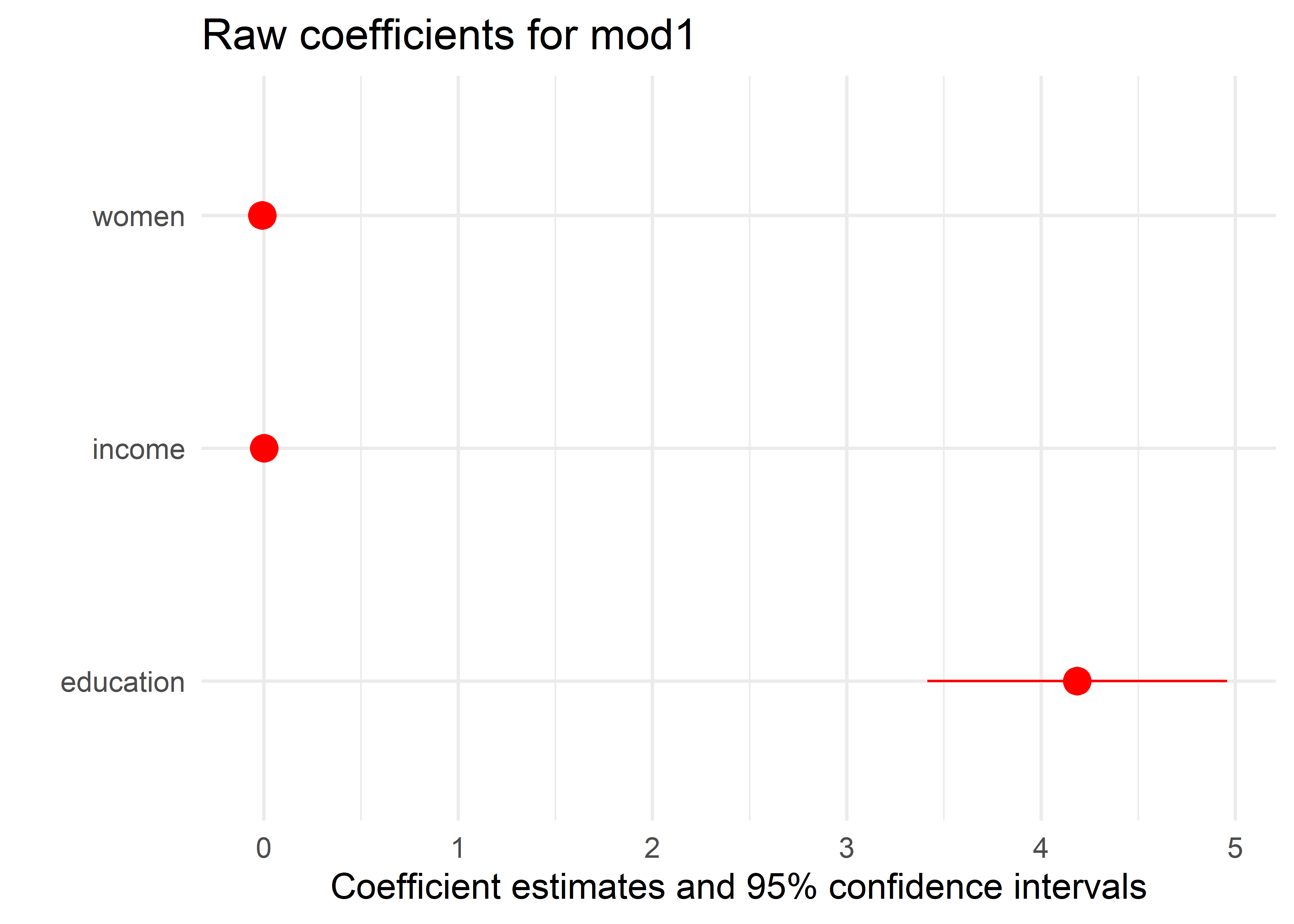
But this plot is disappointing and misleading because it shows the raw coefficients, which are on different scales. From the plot, it looks like only education has a non-zero effect, but the effect of income is also highly significant. The problem is that the magnitude of the coefficient \(\hat{b}_{\text{education}}\) is more than 40,000 times that of the other coefficients, because education is measured years, while income is measured in dollars. The 95% confidence interval for \(\hat{b}_{\text{income}} = [0.0008, 0.0019]\), but this is invisible in the plot.
Before figuring out how to fix this issue, I show the comparable displays from modelsummary() and modelplot() for all three models. When you give modelsummary() a list of models, it displays their coefficients side-by-side as shown in Table tbl-modelsummary2.
models <- list("Model1" = mod1, "Model2" = mod2, "Model3" = mod3)
modelsummary(models,
     coef_omit = "Intercept",
     fmt = 2,
     stars = TRUE,
     shape = term ~ statistic,
     statistic = c("std.error", "p.value"),
     gof_map = c("rmse", "r.squared")
)| Model1 | Model2 | Model3 | |||||||
|---|---|---|---|---|---|---|---|---|---|
| Est. | S.E. | p | Est. | S.E. | p | Est. | S.E. | p | |
| + p < 0.1, * p < 0.05, ** p < 0.01, *** p < 0.001 | |||||||||
| education | 4.19*** | 0.39 | <0.01 | 3.66*** | 0.65 | <0.01 | 2.80*** | 0.59 | <0.01 |
| income | 0.00*** | 0.00 | <0.01 | 0.00*** | 0.00 | <0.01 | 0.00*** | 0.00 | <0.01 |
| women | -0.01 | 0.03 | 0.77 | 0.01 | 0.03 | 0.83 | 0.08* | 0.03 | 0.02 |
| typewc | -2.92 | 2.67 | 0.28 | 3.43 | 5.37 | 0.52 | |||
| typeprof | 5.91 | 3.94 | 0.14 | 27.55*** | 5.41 | <0.01 | |||
| income × typewc | -0.00 | 0.00 | 0.21 | ||||||
| income × typeprof | -0.00*** | 0.00 | <0.01 | ||||||
| RMSE | 7.69 | 6.91 | 6.02 | ||||||
| R2 | 0.798 | 0.835 | 0.875 | ||||||
Note that a factor predictor (like type here) with \(d\) levels is represented by \(d-1\) coefficients in main effects and in interactions with quantitative variables. These levels are coded with treatment contrasts by default. Also by default, the first level is set as the reference level in alphabetical order. Here the reference level is blue collar (bc), so the coefficient typeprof = 5.91 indicates that professional occupations on average are rated 5.91 greater on the Prestige scale than blue collar workers.
Note also that unlike the table, the coefficients in Figure fig-modelplot1 are ordered from bottom to top, because the Y axis starts at the lower left corner. In Figure fig-modelplot2 I use scale_y_discrete() to reverse the order. It is also useful to add a vertical reference line at \(\beta = 0\).
modelplot(models,
          coef_omit="Intercept",
          size=1.3, linewidth=2) +
  ggtitle("Raw coefficients") +
  geom_vline(xintercept = 0, linewidth=1.5) +
  scale_y_discrete(limits=rev) +
  theme(legend.position = "inside",
        legend.position.inside = c(0.85, 0.2))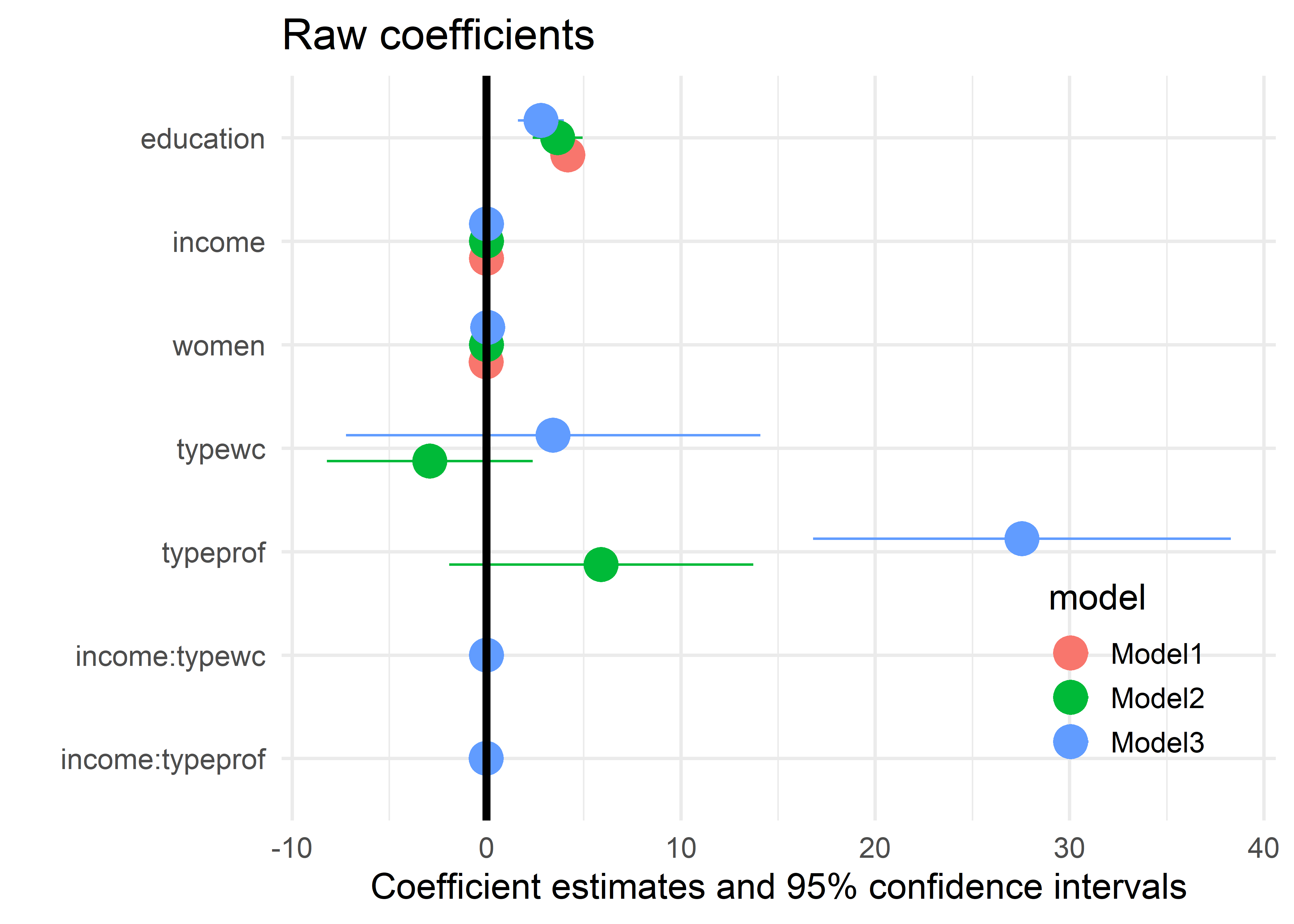
6.2.3 More useful coefficient plots
The problem with plots of raw coefficients shown in Figure fig-modelplot1 and Figure fig-modelplot2 is that the coefficients for different predictors are not directly comparable because they are measured in different units.
One alternative is to plot the standardized coefficients. Another way is to re-scale the predictors into more comparable and meaningful units. I illustrate these ideas below.
Standardized coefficients
The simplest way to do this is to transform all variables to standardized (\(z\)) scores. The coefficients are then interpreted as the standardized change in prestige for a one standard deviation change in the predictors. The syntax below uses scale to transform all the numeric variables. Then, we re-fit the models using the standardized data.
Prestige_std <- Prestige |>
  as_tibble() |>
  mutate(across(where(is.numeric), scale))

mod1_std <- lm(prestige ~ education + income + women,
               data=Prestige_std)
mod2_std <- lm(prestige ~ education + women + income + type,
               data=Prestige_std)
mod3_std <- lm(prestige ~ education + women + income * type,
               data=Prestige_std)
The plot in Figure fig-modelplot3 now shows the significant effect of income in all three models. As well, it offers a more sensitive comparison of the coefficients of other terms across models; for example women is not significant in models 1 and 2, but becomes significant in Model 3 when the interaction of income * type is included.
models <- list("Model1" = mod1_std, "Model2" = mod2_std, "Model3" = mod3_std)
modelplot(models,
          coef_omit="Intercept", size=1.3) +
  ggtitle("Standardized coefficients") +
  geom_vline(xintercept = 0, linewidth = 1.5) +
  scale_y_discrete(limits=rev) +
  theme(legend.position = "inside",
        legend.position.inside = c(0.85, 0.2))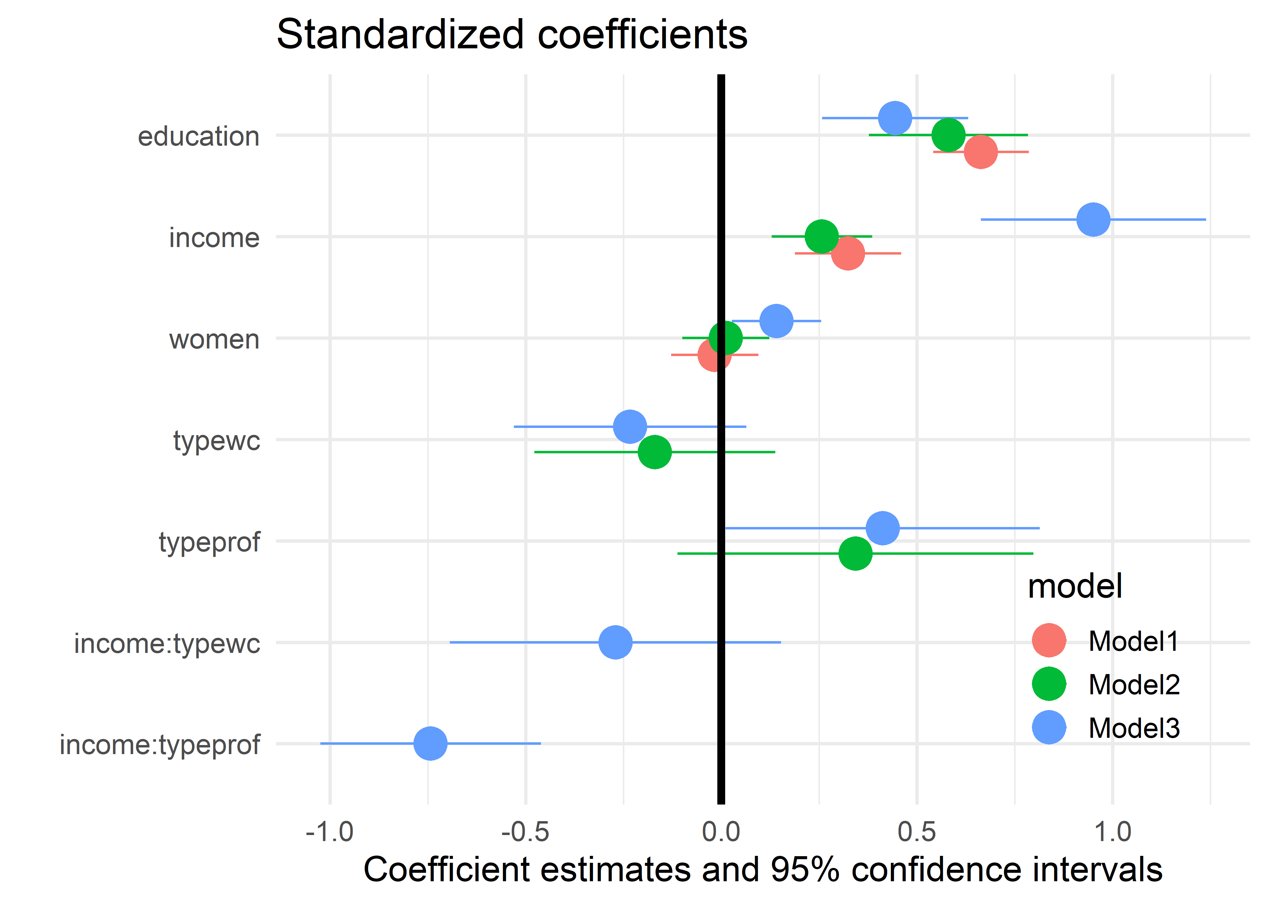
It turns out there is an easier way to get plots of standardized coefficients. modelsummary() extracts coefficients from model objects using the parameters package, and that package offers several options for standardization: See model parameters documentation. We can pass the standardize="refit" (or other) argument directly to modelsummary() or modelplot(), and that argument will be forwarded to parameters. The plot produced by the code below is identical to Figure fig-modelplot3 and is not shown.
modelplot(list("mod1" = mod1, "mod2" = mod2, "mod3" = mod3),
          standardize = "refit",
          coef_omit="Intercept", size=1.3) +
  ggtitle("Standardized coefficients") +
  geom_vline(xintercept = 0, linewidth=1.5) +
  scale_y_discrete(limits=rev) +
  theme(legend.position = "inside",
        legend.position.inside = c(0.85, 0.2))
The ggstats package (Larmarange, 2025) provides even nicer versions of coefficient plots that handle factors in a more reasonable way, as levels within the factor. ggcoef_model() plots a single model and ggcoef_compare() plots a list of models using sensible defaults. A small but nice feature is that it explicitly shows the 0 value for the reference level of a factor (type = "bc" here) and uses better labels for factors and their interactions.
models <- list(
  "Base model"      = mod1_std,
  "Add type"        = mod2_std,
  "Add interaction" = mod3_std)

ggcoef_compare(models) +
  labs(x = "Standarized Coefficient")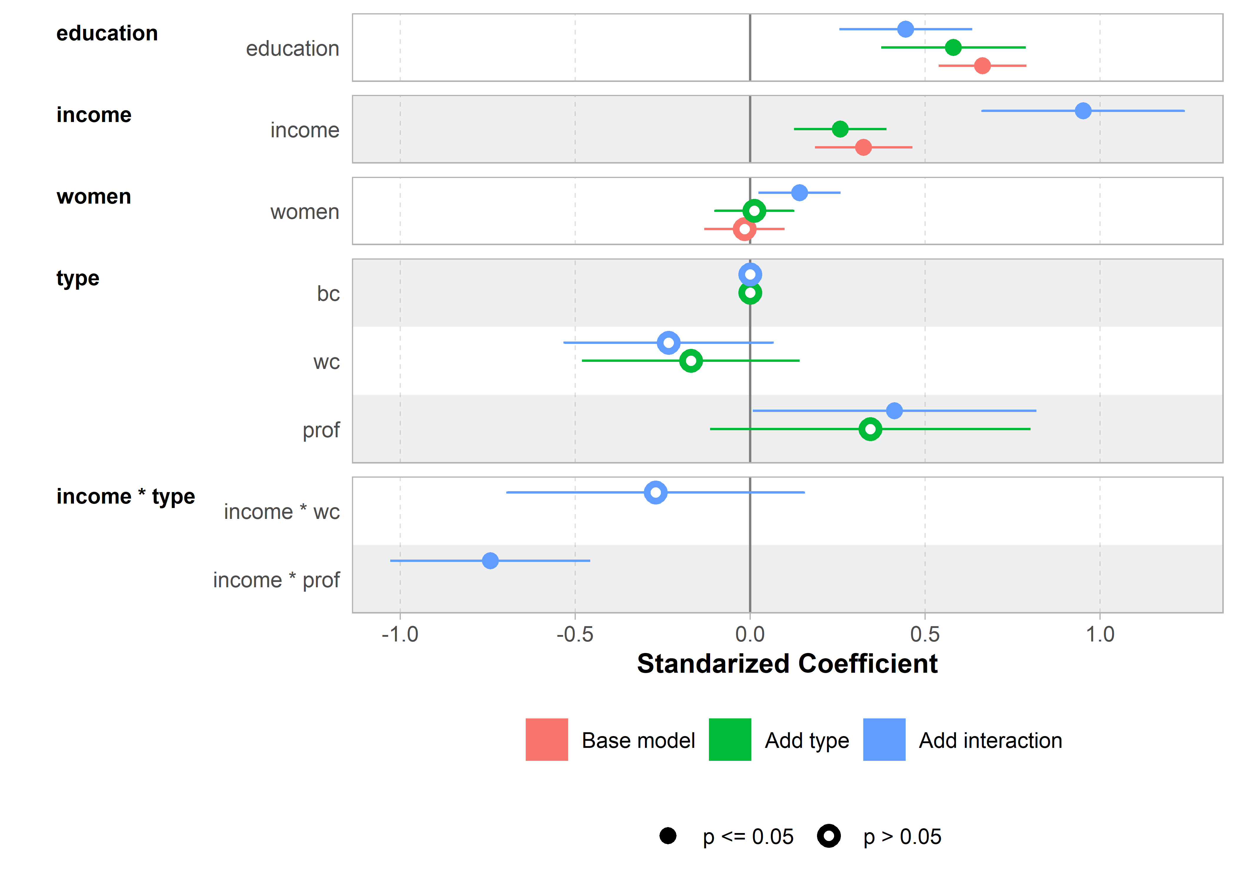
ggcoef_compare()
More meaningful units
Standardizing the variables makes the coefficients directly comparable, but it may be harder to understand what they mean in terms of the variables. For example, the coefficient of income in mod2_std is 0.25. A literal interpretation is that occupational prestige is expected to increase 0.25 standard deviations for each standard deviation increase in income, but it may be difficult to appreciate what this means.
A better substantive comparison of the coefficients could use understandable scales for the predictors, e.g., months of education, $100,000 of income or 10% of women’s participation. Note that the effect of this is just to multiply the coefficients and their standard errors by a factor. The statistical conclusions of significance are unchanged.
For simplicity, I do this just for Model 1.
When we plot this with ggcoef_model(), there are many options to control how variables are labeled and other details.
ggcoef_model(mod1_scaled,
  signif_stars = FALSE,
  variable_labels = c(education = "education\n(months)",
                      income = "income\n(/$100K)",
                      women = "women\n(/10%)")) +
  xlab("Coefficients for prestige with scaled predictors")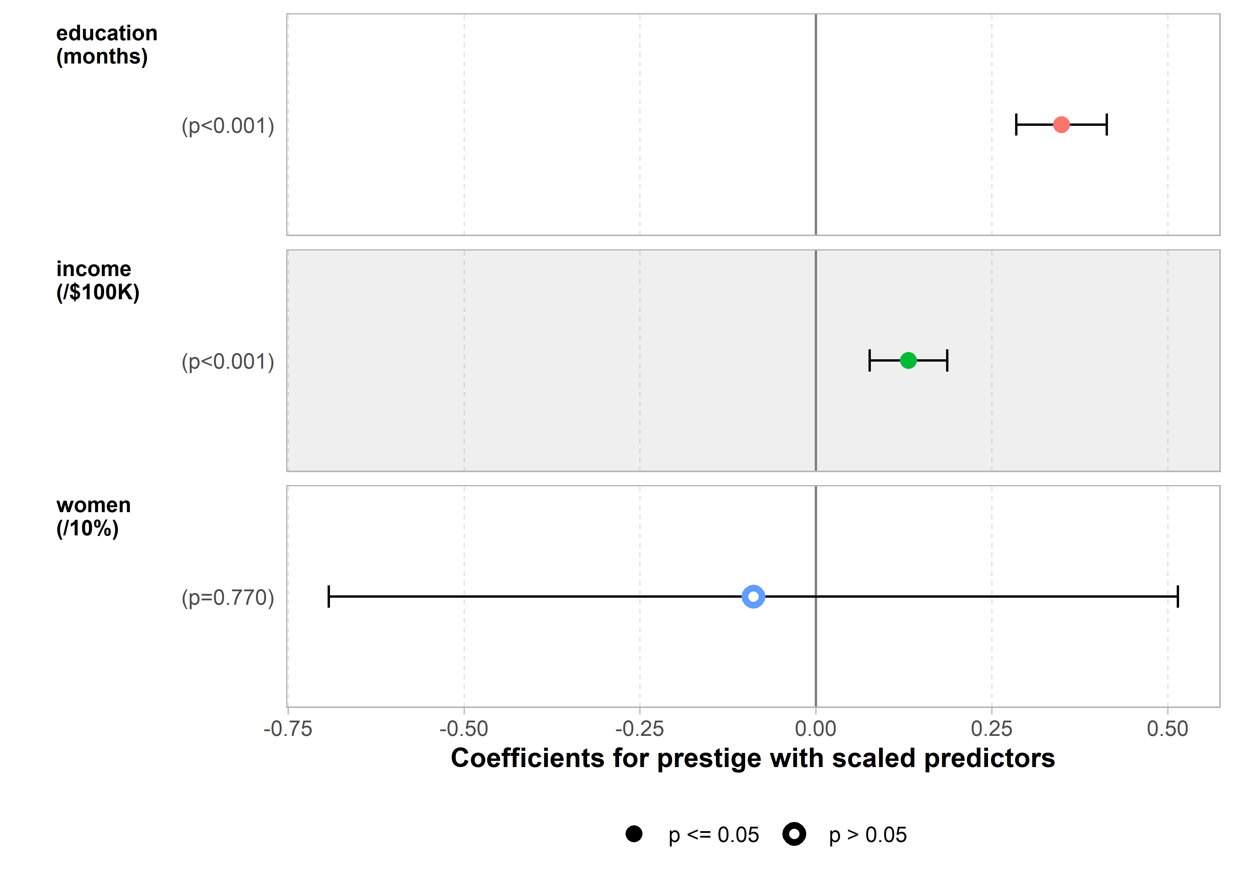
So, on average, each additional month of education increases the prestige rating by 0.34 units, while an additional $100,000 of income increases it by 0.13 units. While these are significant effects, they are not large in relation to the scale of prestige which ranges 14.8—87.2.
6.3 Added-variable and related plots
In multiple regression problems, it is most often useful to construct a scatterplot matrix and examine the plot of the response vs. each of the predictors as well as those of the predictors against each other. However, these simple, marginal scatterplots of a response \(y\) against each of several predictors \(x_1, x_2, \dots\) can be misleading because each one ignores the other predictors.
To see this, consider the dataset matlib::coffee, giving measures of Heart (\(y\)), an index of cardiac damage, Coffee (\(x_1\)), a measure of daily coffee consumption, and Stress (\(x_2\)), a measure of occupational stress, in a contrived sample of \(n=20\) university people.3 For the sake of the example we assume that the main goal is to determine whether or not coffee is good or bad for your heart, and stress represents one potential confounding variable among others (age, smoking, etc.) that might be useful to control statistically.
data(coffee, package="matlib")

scatterplotMatrix(~ Heart + Coffee + Stress,
  data=coffee,
  smooth = FALSE,
  ellipse = list(levels=0.68, fill.alpha = 0.1),
  pch = 19, cex.labels = 2.5)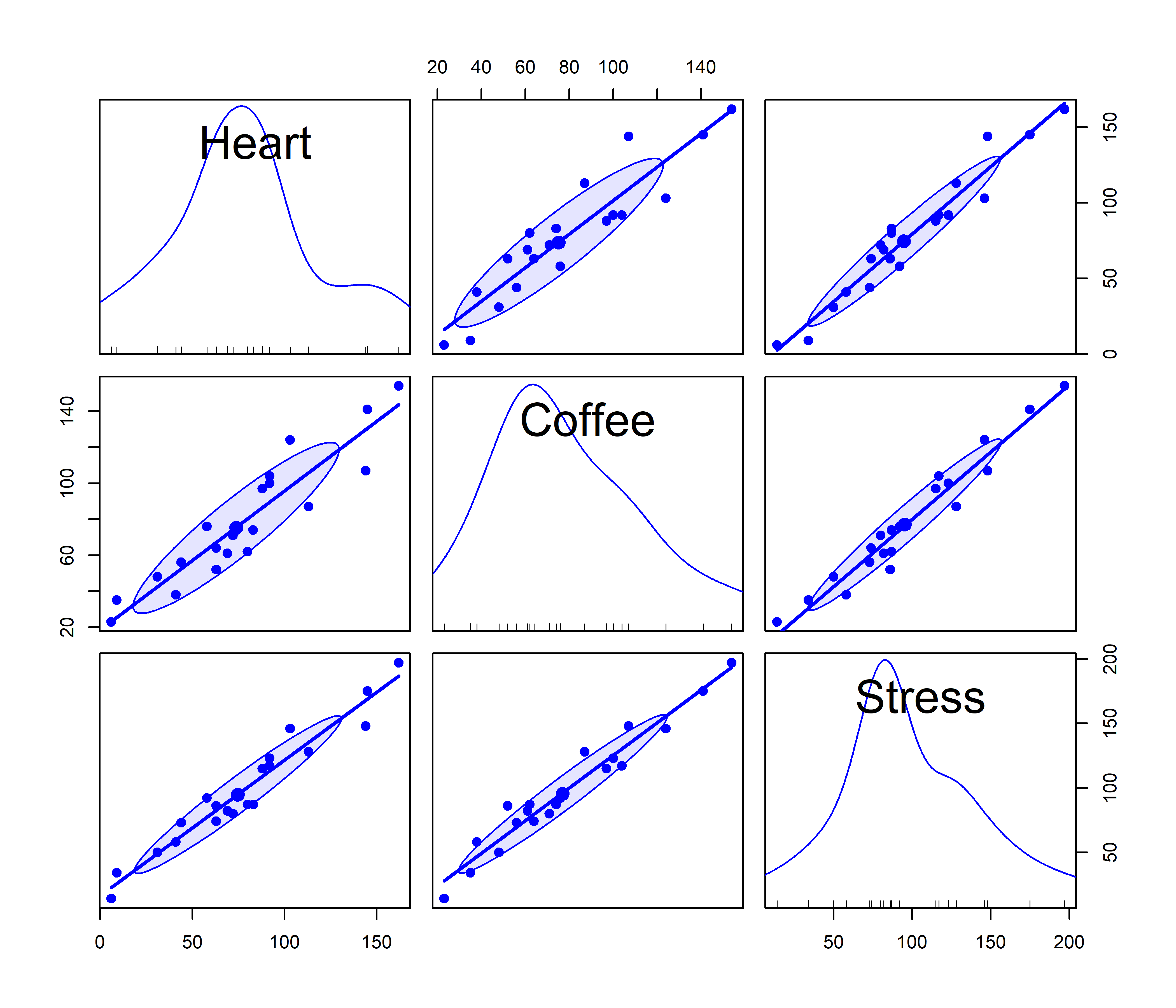
Heart damage (\(y\)), Coffee consumption (\(x_1\)) and Stress (\(x_2\)), with linear regression lines and 68% data ellipses for the bivariate relations
The message from these marginal plots in Figure fig-coffee-spm seems to be that coffee is bad for your heart, stress is bad for your heart, and stress is also strongly related to coffee consumption. Yet, when we fit a model with both variables together, we get the following results:
fit.both   <- lm(Heart ~ Coffee + Stress, data=coffee)
lmtest::coeftest(fit.both)
#
# t test of coefficients:
#
#             Estimate Std. Error t value Pr(>|t|)
# (Intercept)   -7.794      5.793   -1.35     0.20
# Coffee        -0.409      0.292   -1.40     0.18
# Stress         1.199      0.224    5.34  5.4e-05 ***
# ---
# Signif. codes:  0 '***' 0.001 '**' 0.01 '*' 0.05 '.' 0.1 ' ' 1
The coefficients suggest that stress is indeed bad for your heart, but the negative (though non-significant) coefficient for coffee suggests that coffee is good for you. How can this be? Does that mean I should drink more coffee, while avoiding stress?
The reason for this apparent paradox is that the general linear model fit by lm() estimates all effects together and so the coefficients pertain to the partial effect of a given predictor, adjusting for the effects of all others. That is, the coefficient for coffee (\(\beta_{\text{Coffee}} = -0.41\)) estimates the effect of coffee for people with same level of stress. In the marginal scatterplot, the positive slope for coffee (1.10) ignores the correlation of coffee and stress.
This is an example of confounding in regression when an important predictor is omitted. Stress is positively associated with both coffee consumption and heart damage. When stress is omitted, the coefficient for coffee is biased because it “picks up” the relation with the omitted variable.
A solution to this problem is the added-variable plot (“AV plot”, also called partial regression plot, Mosteller & Tukey (1977)). This is a multivariate analog of a simple marginal scatterplot, designed to visualize directly the partial relation between \(y\) and the predictors \(x_1, x_2, \dots\) in a multiple regression model.
You can think of this as a magic window that hides the relations of all other variables with each of the \(y\) and \(x_i\) shown in a given added-variable plot. This gives an unobstructed view of the net relation between \(y\) and \(x_i\) with the effect of all other variables removed.
In effect, this reduces the problem of viewing the complete model in \(p\)-dimensional space to a sequence of \(p\) 2D plots, each of which tells the story of one predictor, unentangled from the others. This is essentially the same idea as the partial variables plot (sec-pvPlot) used to understand partial correlations.
The construction of an AV plot is conceptually very simple. For variable \(x_i\), imagine that we fit two supplementary regressions:
Regress \(\mathbf{y}\) on \(\mathbf{X_{(-i)}}\), the model matrix of all of the regressors except \(x_i\). By definition, the residuals from this regression, \(\mathbf{y}^\star \equiv \mathbf{y} \,\vert\, \text{others} = \mathbf{y} - \widehat{\mathbf{y}} \,\vert\, \mathbf{X_{(-i)}}\), are the part of \(\mathbf{y}\) that cannot be explained by all the other regression terms. These residuals are necessarily uncorrelated with the other predictors.
Regress \(x_i\) on the other predictors, \(\mathbf{X_{(-i)}}\) and again obtain the residuals. These residuals, \(\mathbf{x}_i^\star \equiv \mathbf{x}_i \,\vert\, \text{others} = \mathbf{x}_i - \widehat{\mathbf{x}}_i \,\vert\, \mathbf{X_{(-i)}}\) give the part of \(x_i\) that cannot be explained by the others, and so are uncorrelated with them.
The AV plot is then just a simple scatterplot of these residuals, \(\mathbf{y}^\star\) on the vertical axis, and \(\mathbf{x}^\star\) on the horizontal. In practice, it is unnecessary to run the auxilliary regressions this way (Velleman & Welsh, 1981). Both can be calculated using stats::lsfit() roughly as follows:
AVcalc <- function(model, variable)
X <- model.matrix(model)
response <- model.response(model)
x <- X[, -variable]
y <- cbind(X[, variable], response)
fit <- lsfit(x, y, intercept = FALSE)
resids <- residuals(fit)
return(resids)
Note that y in the code here contains both the current predictor, \(\mathbf{x}_i\) and the response \(\mathbf{y}\), so the residuals resids have two columns, one for \(x_i \,\vert\, \text{others}\) and one for \(y \,\vert\, \text{others}\).
The avPlot() function
Added-variable plots are produced using car::avPlot() for one predictor or avPlots() for any number of model terms. The id argument controls which points are identified in the plots; n=2 labels the two points that are furthest from the mean on the horizontal axis and the two with the largest absolute residuals. For instance, in Figure fig-coffee-avPlots, observations 5 and 13 are flagged because their conditional \(\mathbf{x}_i^\star\) values are extreme; observation 17 has a large absolute residual, \(\mathbf{y}^\star = \text{Heart} \,\vert\, \text{others}\).
avPlots(fit.both,
  ellipse = list(levels = 0.68, fill=TRUE, fill.alpha = 0.1),
  pch = 19,
  id = list(n = 2),
  cex.lab = 1.5,
  main = "Added-variable plots for Coffee data")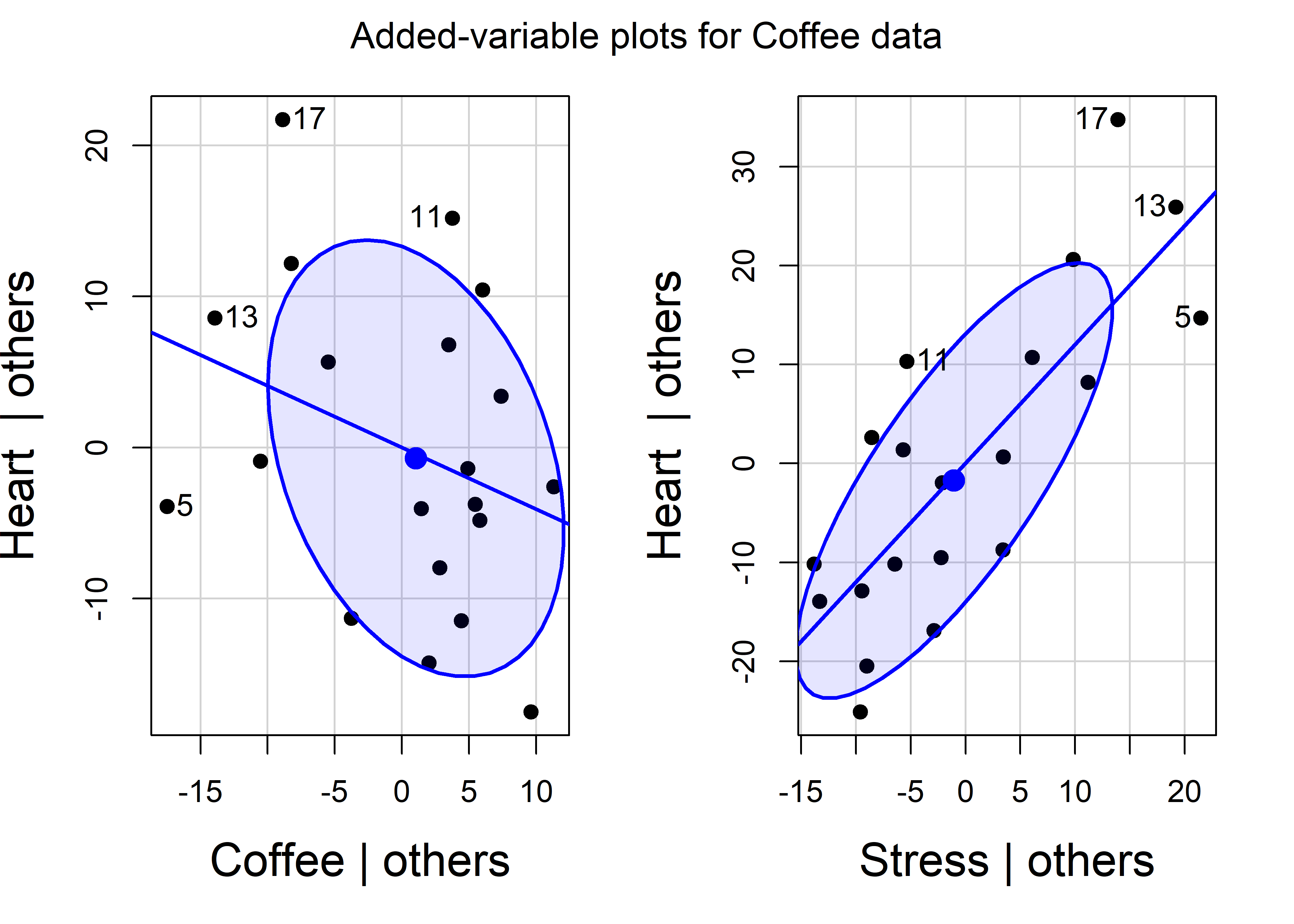
The data ellipses for \(\mathbf{x}_i^\star\) and \(\mathbf{y}^\star\) summarize the conditional (or partial) relations of the response to each predictor controlling for all other predictors in each plot. The essential idea is that the data ellipse for \((\mathbf{x}_i^\star, \mathbf{y}^\star)\) has the identical relation to the estimate \(\hat{b}_i\) in a multiple regression as the data ellipse of \((\mathbf{x}, \mathbf{y})\) has to the slope in a simple regression.
6.3.1 Properties of AV plots
AV plots are particularly interesting and useful for the following noteworthy properties:
The slope of the simple regression in the AV plot for variable \(x_i\) is identical to the slope \(b_i\) for that variable in the full multiple regression model.
The residuals in this plot are the same as the residuals using all predictors. This means you can see the degree of fit for observations directly in relation to the various predictors, which is not the case for marginal scatterplots.
Consequentially, the standard deviation of the (vertical) residuals in the AV plot is the same as \(s = \sqrt(MSE)\) in the full model and the standard error of a coefficient is \(\text{SE}(b_i) = s / \sqrt{\Sigma (\mathbf{x}_i^\star)^2}\). This is shown by the size of the shadow of the data ellipses on the vertical axis in Figure fig-coffee-avPlots.
The horizontal positions, \(\mathbf{x}_i^\star\), of points adjust for all other predictors, and so we can see points at the extreme left and right as unusual in relation to the others. If these points are also badly fitted (large residuals), we can see their influence on the fitted relation in the full model. AV plots thus provide visual displays of (partial) leverage and influence on each of the regression coefficients.
The correlation of \(\mathbf{x}_i^\star\) and \(\mathbf{y}^\star\) shown by the shape of the data ellipses is the partial correlation between \(\mathbf{x}_i\) and \(\mathbf{y}_i\) with other predictors partialled out.
6.3.2 Marginal - conditional plots
The relation of the conditional data ellipses in AV plots to those in marginal plots of the same variables provides further insight into what it means to “control for” other variables.
Figure fig-coffee-mcplot shows the same added-variable plots for Heart disease on Stress and Coffee as in Figure fig-coffee-avPlots (with a zoomed-out scaling). But here I also overlay the marginal data ellipses for \((\mathbf{x}_i, \mathbf{y})\) (centered at the means), and marginal regression lines for Stress and Coffee separately. Drawing arrows connecting the original data points to their positions in the AV plot shows exactly what happens when we condition on or partial out the other variable.
These marginal - conditional plots are produced by car::mcPlot() (for one regressor) and car::mcPlots() (for several). The plots for the marginal and conditional relations can be compared separately using the same scales for both, or overlaid as shown here. The points labeled here are only those with large absolute residuals \(\mathbf{y}^\star\) in the vertical direction.
mcPlots(fit.both,
  ellipse = list(levels=0.68, fill=TRUE, fill.alpha=0.2),
  id = list(n=2),
  pch = c(16, 16),
  col.marginal = "red", col.conditional = "blue",
  col.arrows = "black",
  cex.lab = 1.5)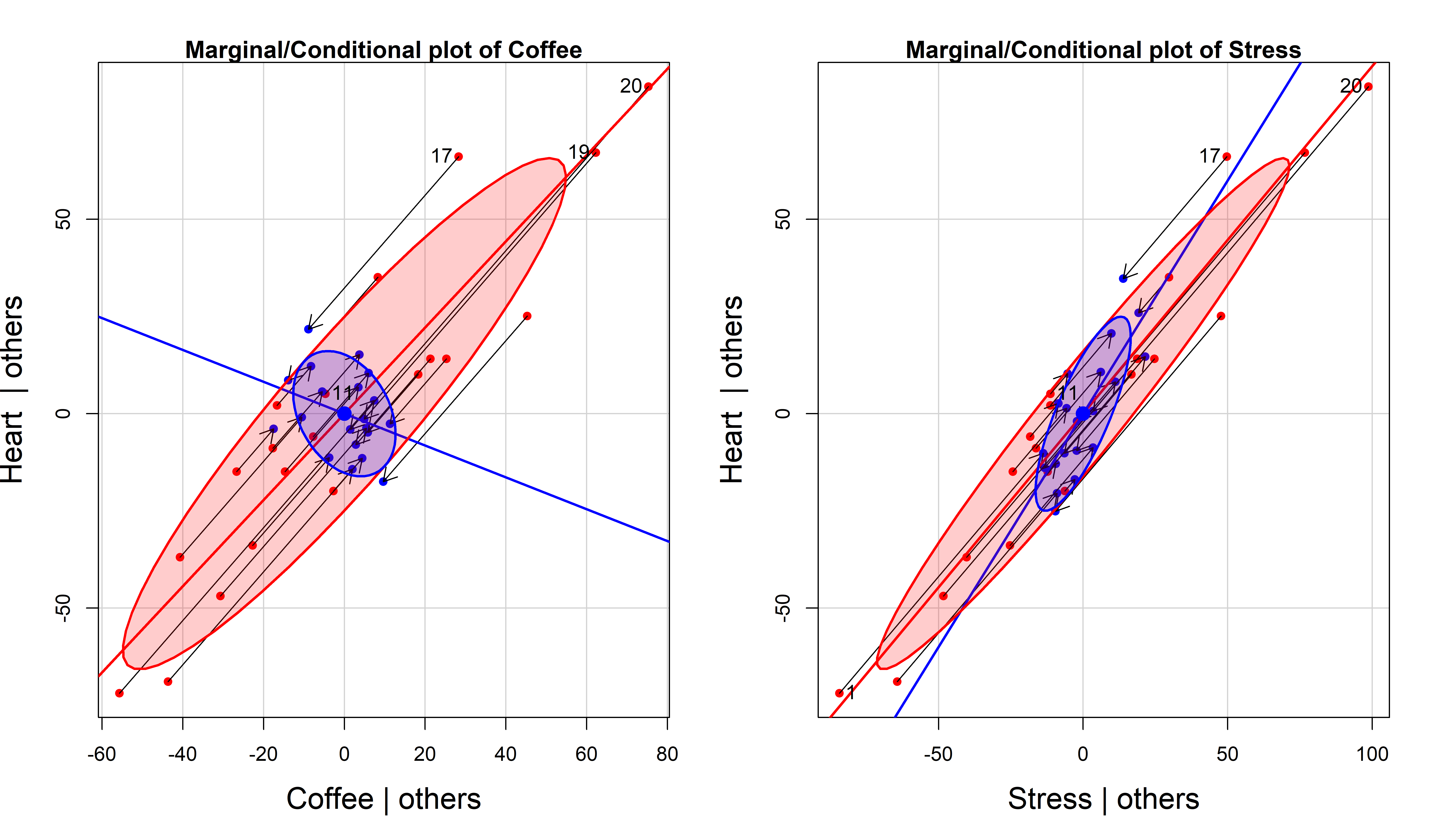
The most obvious feature of Figure fig-coffee-mcplot is that Coffee has a negative slope in the conditional AV plot but a positive slope in the marginal plot. This is an example of Simpson’s paradox in a regression context: marginal and conditional relations can have opposite signs.
Less obvious is the relation between the marginal and AVP ellipses. In 3D, the marginal data ellipse is the shadow (projection) of the ellipsoid for \((\mathbf{y}, \mathbf{x}_1, \mathbf{x}_2)\) on one of the coordinate planes, whereas the AV plot is a slice through the ellipsoid where either \(\mathbf{x}_1\) or \(\mathbf{x}_2\) is held constant. Thus, the AVP ellipse must be contained in the marginal ellipse, as we can see in Figure fig-coffee-mcplot. If there are only two \(x\)s, then the AVP ellipse must touch the marginal ellipse at two points.
Finally, Figure fig-coffee-mcplot also shows how conditioning on other predictors works for individual observations, where each point of \((\mathbf{x}_i^\star, \mathbf{y}^\star)\) is the image of \((\mathbf{x}_i, \mathbf{y})\) along the path of the marginal regression. The variability in the response and in the focal predictor are both reduced, leaving only the uncontaminated relation of \(\mathbf{y}\) with \(\mathbf{x}_i\).
These plots are similar in spirit to the ARES plot (“Adding REgressors Smoothly”) proposed by Cook & Weisberg (1994), but their idea was an interactive animation, displaying a smooth transition between the fit of a marginal model and the fit of a larger model. They used linear interpolation, \[ (\mathbf{x}_i, \mathbf{y}_i)_{\text{interp}} = (\mathbf{x}_i, \mathbf{y}_i) + \lambda [(\mathbf{x}_i^\star, \mathbf{y}_i^\star) - (\mathbf{x}_i, \mathbf{y}_i)] \:\: , \] controlled by a slider whose value, \(\lambda \in [0, 1]\), was the weight given to the smaller marginal model. See an animated graphic (https://bit.ly/49XDHn0) for an example using the Duncan data.
6.3.3 Prestige data
For a substantive example, let’s return to the model for income, education and women in the Prestige data. The plot in Figure fig-prestige-avplot shows the strong positive relations of income and education to prestige in the full model, and the negligible relation of percent women. But, in the plot for income, two occupations (physicians and general managers) with high income strongly pull the regression line down from what can be seen in the orientation of the conditional data ellipse.
prestige.mod1 <- lm(prestige ~ education + income + women,
           data=Prestige)

avPlots(prestige.mod1,
  ellipse = list(levels = 0.68),
  id = list(n = 2, cex = 1.2),
  pch = 19,
  cex.lab = 1.5,
  main = "Added-variable plots for prestige")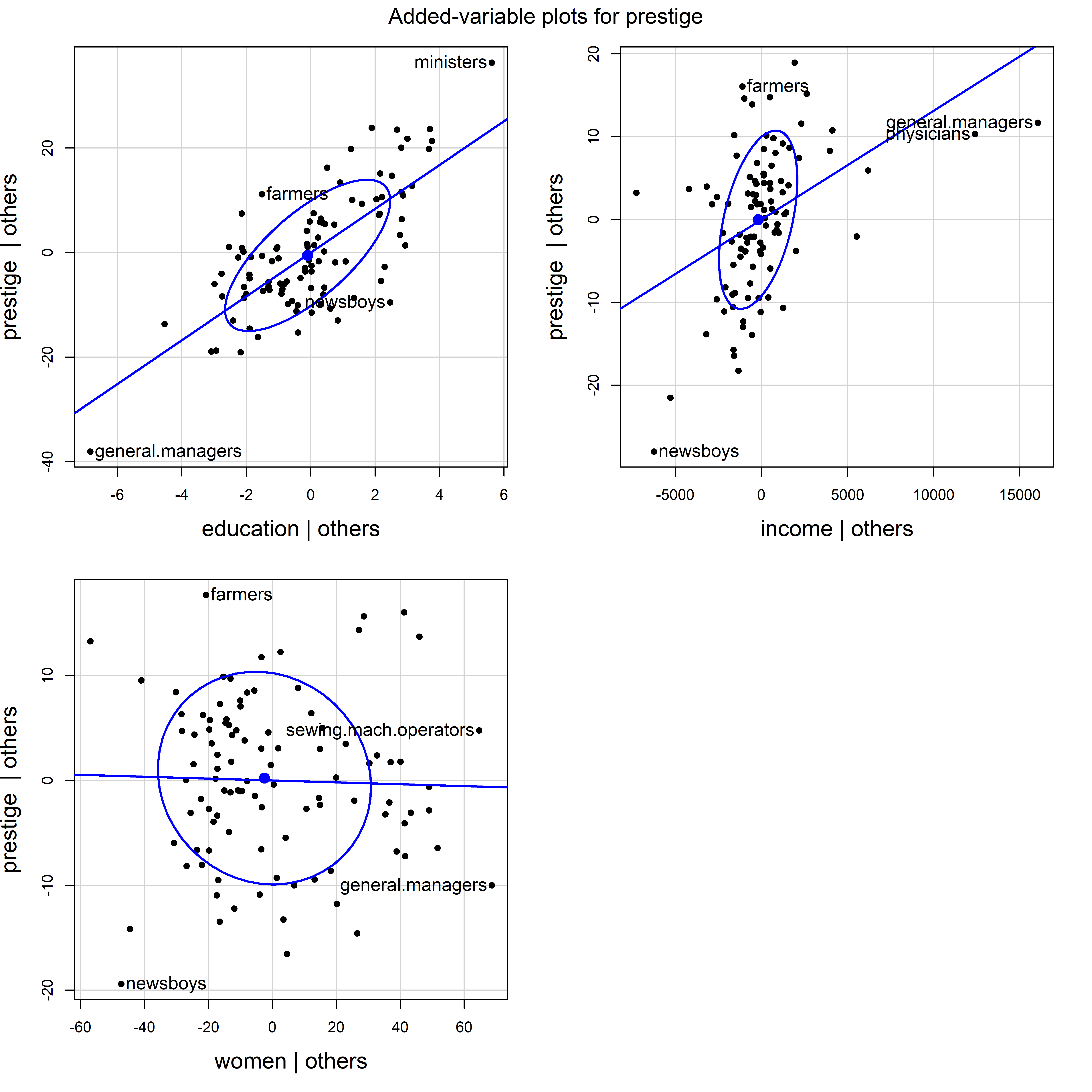
Prestige data.
The influential points for physicians and general managers could just be unusual, or suggest that the relation of income to prestige is nonlinear. A rough test of this is to fit a smoothed curve through the points in the AV plot as shown in Figure fig-prestige-av-income.
res <- avPlot(prestige.mod1, "income",
              ellipse = list(levels = 0.68),
              pch = 19,
              cex.lab = 1.5)
smooth <- loess.smooth(res[,1], res[,2])
lines(smooth, col = "red", lwd = 2.5)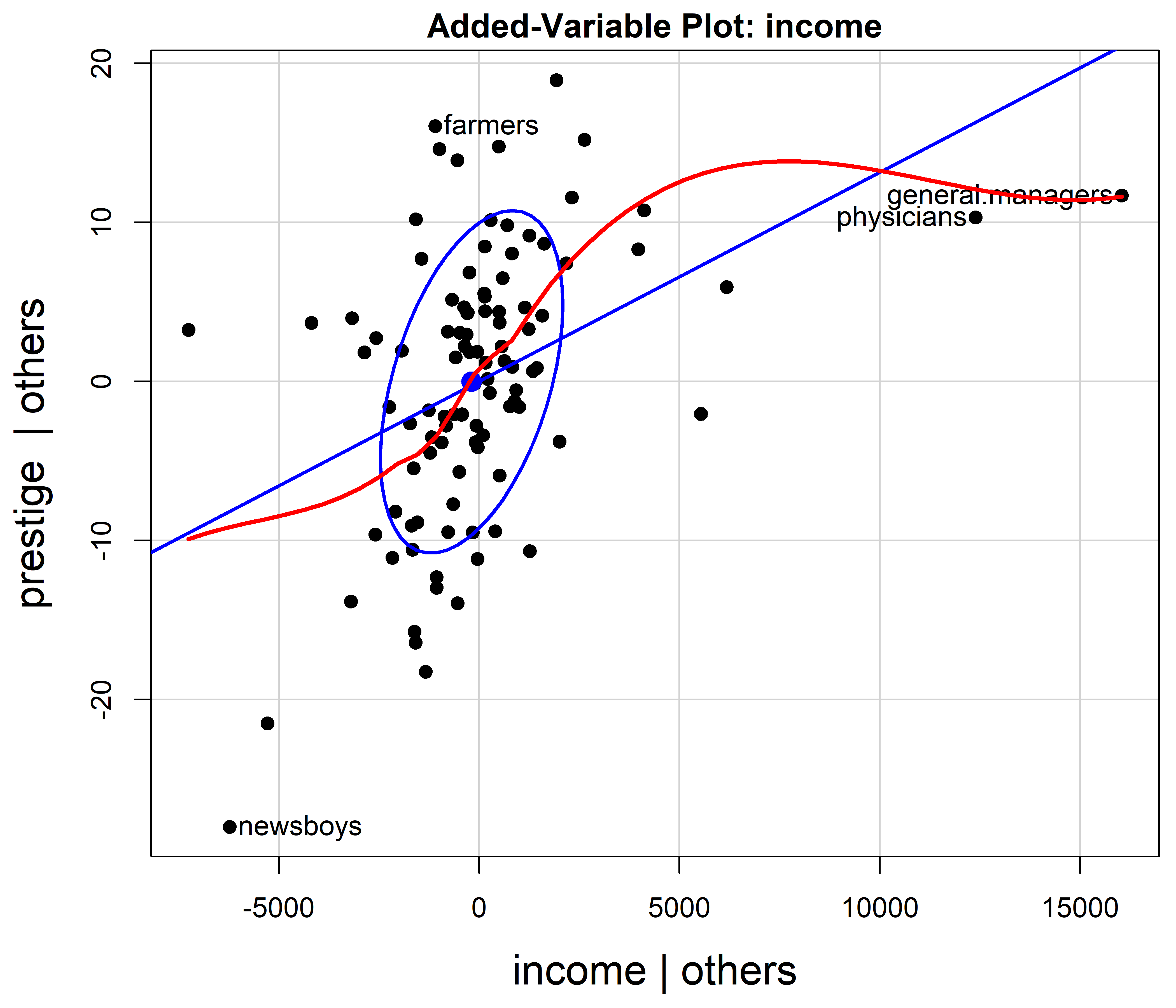
However, this use of AV plots to diagnose nonlinearity or suggest transformations can be misleading (Cook, 1996). Curvature in these plots is an indication of some model deficiency, but unless the predictors are uncorrelated, they cannot determine the form of a possible transformation of the predictors.
6.3.4 Component + Residual plots
A related method, the component + residual plot (“C+R plot”, also called partial residual plot, Larsen & McCleary (1972); Cook (1993)) gives a plot more suited to detecting the need to transform a predictor \(\mathbf{x}_i\) to a form \(f(\mathbf{x}_i)\) to make it’s relationship with the response \(\mathbf{y}\) more nearly linear. This plot displays the partial residual \(\mathbf{e} + \hat{b}_i \mathbf{x}_i\) on the vertical axis against \(\mathbf{x}_i\) on the horizontal, where \(\mathbf{e}\) are the residuals from the full model. A smoothed curve through the points will often suggest the form of the transformation \(f()\). The fact that the horizontal axis is \(\mathbf{x}_i\) itself rather than \(\mathbf{x}^\star_i\) makes it easier to see the functional form.
The C+R plot has the same desirable properties as the AV plot: The slope \(\hat{b}_i\) and residuals \(\mathbf{e}\) in this plot are the same as those in the full model.
C+R plots are produced by car::crPlots() and car::crPlot(). Figure fig-prestige-crplot shows this just for income in the model prestige.mod1. (These plots for education and women show no strong evidence of curvilinearity.) The dashed blue line is the linear partial fit, \(\hat{b}_i \mathbf{x}_i\), whose slope \(\hat{b}_2 = 0.0013\) is the same as that for income in prestige.mod1. The solid red curve is the loess smooth through the points. The same points are identified as noteworthy as in AV plot in Figure fig-prestige-av-income.
crPlot(prestige.mod1, "income",
       smooth = TRUE,
       order = 2,
       pch = 19,
       col.lines = c("blue", "red"),
       id = list(n=2, cex = 1.2),
cex.lab = 1.5) 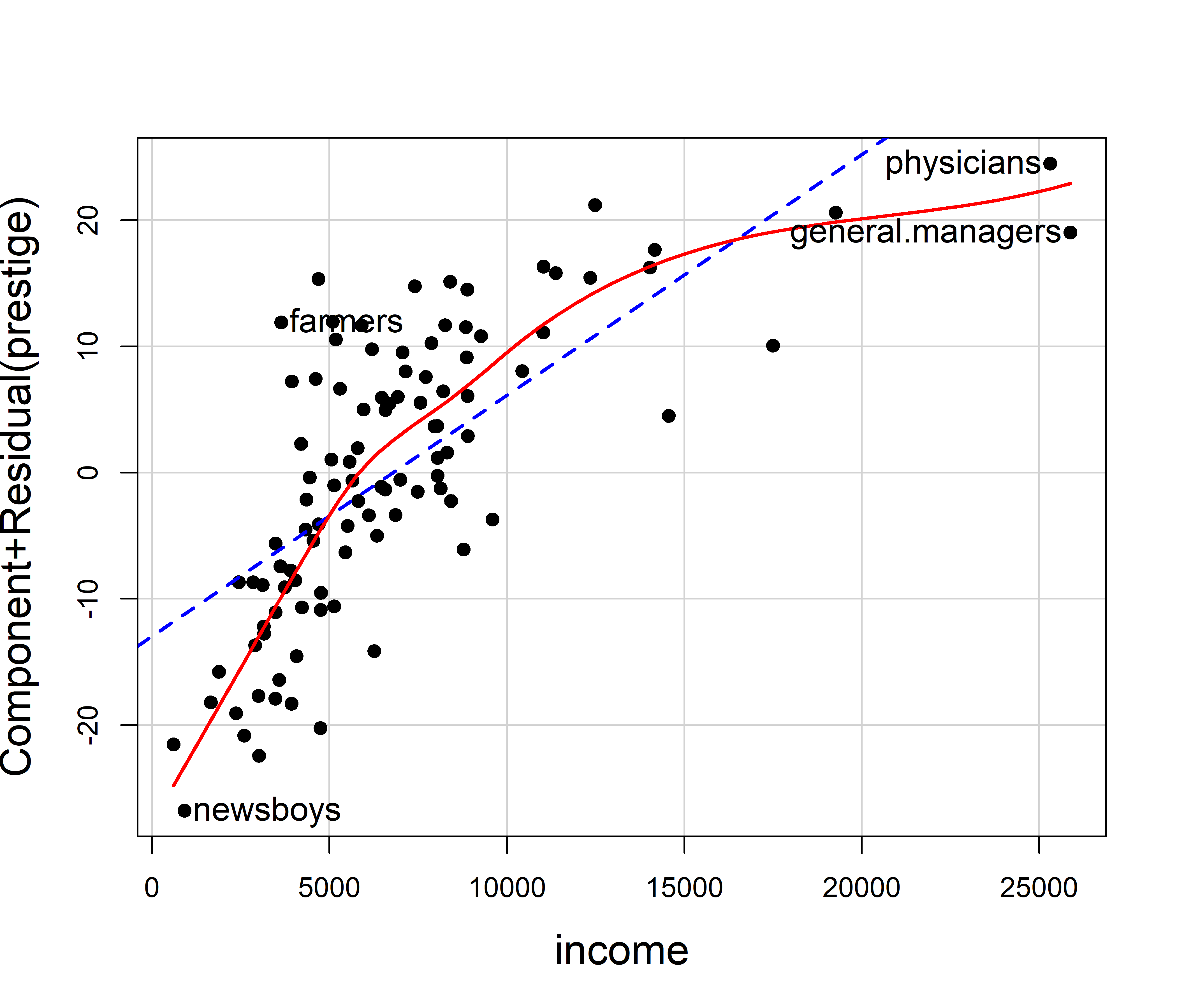
The partial relation between prestige and income is clearly curved, so it would be appropriate to transform income or to include a polynomial (quadratic) term and refit the model. As suggested earlier (Example exm-prestige) it makes sense statistically and substantively to model the effect of income on a log scale, so then the slope for log(income) would measure the increment in prestige for a constant percentage increase in income.
The effect of percent women on prestige seen in Figure fig-prestige-avplot appears very small and essentially linear. However, if we wished to examine this more closely, we could use the C+R plot in Figure fig-prestige-crplot-women.
crPlot(prestige.mod1, "women",
       pch = 19,
       col.lines = c("blue", "red"),
       id = list(n=2, cex = 1.2),
       cex.lab = 1.5)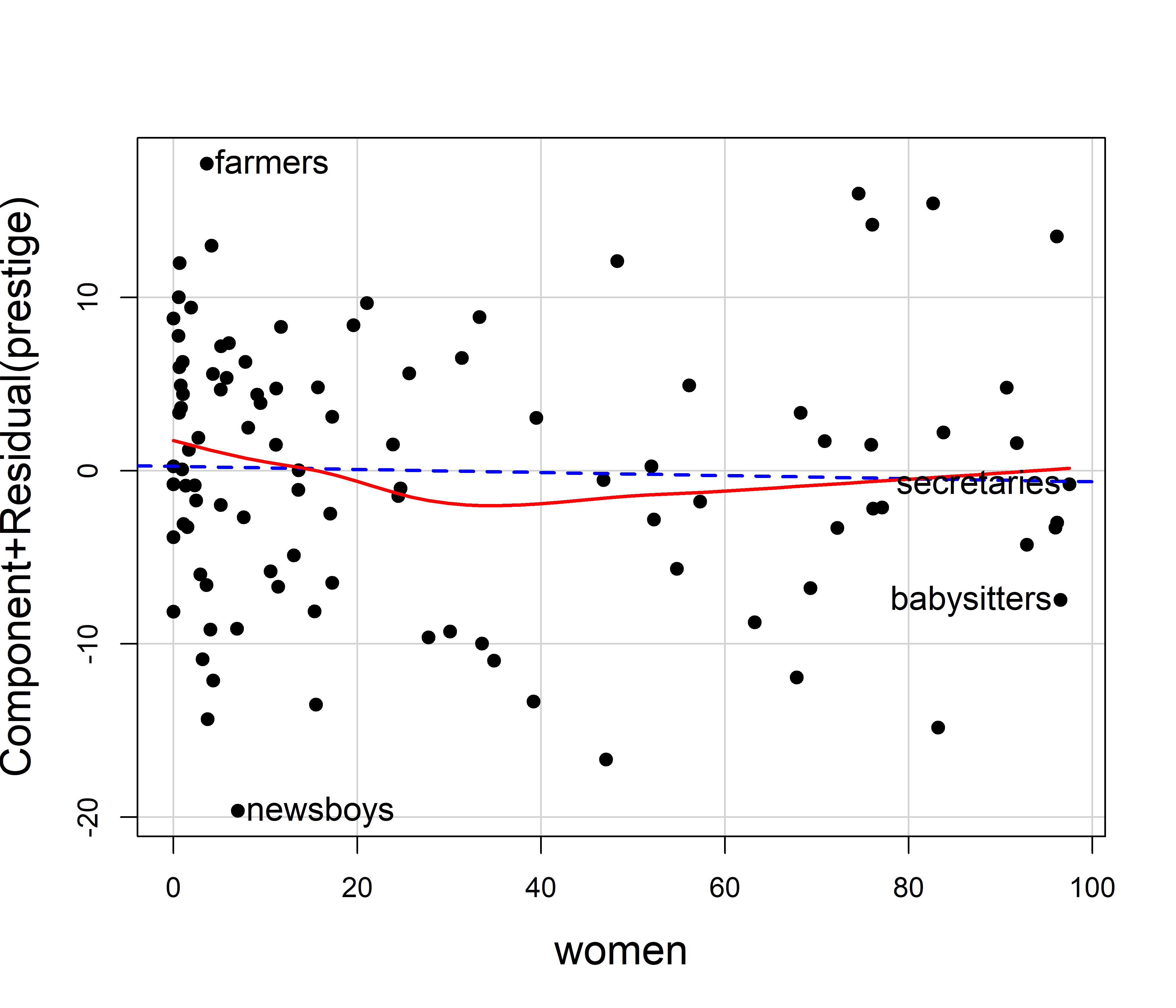
This shows a slight degree of curvature, with modestly larger values in the extremes. If we wished to test this statistically, we could fit a model with a quadratic effect of women, and compare that to the linear-only effect using anova().
prestige.mod2 <- lm(prestige ~ education + income + poly(women,2),
           data=Prestige)

anova(prestige.mod1, prestige.mod2)
# Analysis of Variance Table
#
# Model 1: prestige ~ education + income + women
# Model 2: prestige ~ education + income + poly(women, 2)
#   Res.Df  RSS Df Sum of Sq    F Pr(>F)
# 1     98 6034
# 2     97 5907  1       127 2.08   0.15
This model ignores the type of occupation (“bc”, “wc”, “prof”) as well as any possible interactions of type with other predictors. We examine this next, using effect displays.
6.4 Effect displays
For two predictors it is possible, even if awkward, to display the fitted response surface in a 3D plot or faceted 2D views in what I call a full model plot. For more than two predictors such displays become cumbersome if not impractical, particularly when there are interactions in the model, when some effects are curvilinear, or when the main substantive interest is focused understanding on one or more main effects or interaction terms in the presence of others. The method of effect displays, largely introduced by John Fox (Fox, 1987, 2003; Fox & Weisberg, 2018b) is a generally useful solution to this problem. 4 These plots are nearly always easier to understand than tables of coefficients.
The idea of effect displays is quite simple, but very general and handles models of arbitrary complexity. Imagine that in a model we have a particular subset of predictors (focal predictors) whose effects on the response variable we wish to visualize. The essence of an effect display is that we calculate the predicted values (and standard errors) of the response for the model term(s) involving the focal predictors (and all low-order relatives, e.g, main effects that are marginal to an interaction) as those predictors are allowed to vary over a grid covering their range.
For a given plot, the other, non-focal variables are “controlled” by being fixed at typical values. For example, a quantitative predictor could be fixed at it’s mean, median or some representative value. A factor could be fixed at equal proportions of its levels or its proportions in the data. The result, when plotted, shows the predicted effects of the focal variables, either with multiple lines or in a faceted display, but with all the other variables controlled, adjusted for or averaged over. For interaction effects all low-order relatives are typically included in the fitted values for the term being graphed.
In practical terms, a scoring matrix \(\mathbf{X}^\bullet\) is defined by the focal variables varied over their ranges and the other variables held fixed. The fitted values for a model term are then calculated as \(\widehat{\mathbf{y}}^\bullet = \mathbf{X}^\bullet \; \widehat{\mathbf{b}}\) using the equivalent of:
predict(model, newdata = X, se.fit = TRUE) which also calculates the standard errors as the square roots of \(\mathrm{diag}\, (\mathbf{X}^\bullet \, \widehat{\mathbf{\mathsf{Var}}} (\mathbf{b}) \, \mathbf{X}^{\bullet\mathsf{T}} )\) where \(\widehat{\mathbf{\mathsf{Var}}} (\mathbf{b})\) is the estimated covariance matrix of the coefficients. Consequently, predictor effect values can be obtained for any modelling function that has predict() and vcov() methods. To date, effect displays are available for over 100 different model types in various packages.
To illustrate the mechanics for the effect of education in the prestige.mod1 model, construct a data frame varying education, but fixing income and women at their means:
X <- expand.grid(
      education = seq(8, 16, 2),
      income = mean(Prestige$income),
      women = mean(Prestige$women)) |>
  print(digits = 3)
#   education income women
# 1         8   6798    29
# 2        10   6798    29
# 3        12   6798    29
# 4        14   6798    29
# 5        16   6798    29
predict() then gives the fitted values for a simple effect plot of prestige against education. predict.lm() returns list, so it is necessary to massage this to a data frame for graphing.
As Fox & Weisberg (2018b) note, effect displays can be combined with partial residuals to visualize both fit and potential lack of fit simultaneously, by plotting residuals from a model around 2D slices of the fitted response surface. This adds the benefits of C+R plots, in that we can see the impact of unmodeled curvilinearity and interactions in addition to those of predictor effect displays.
There are several implementations of effect displays in R, whose details, terminology and ease of use vary. Among these, ggeffects (Lüdecke, 2018) calculates adjusted predicted values under several methods for conditioning. marginaleffects (Arel-Bundock et al., 2024) is similar and also provides estimation of marginal slopes, contrasts, odds ratios, etc. Both have plot() methods based on ggplot2. My favorite is the effects (Fox et al., 2025) package, which alone provides partial residuals, and is somewhat easier to use, though it uses lattice graphics. See the vignette Predictor Effects Graphics Gallery for details of the computations for effect displays.
The main functions for computing fitted effects are predictorEffect() (for one predictor) and predictorEffects() (for one or more). For a model mod with formula y ~ x1 + x2 + x3 + x1:x2, the call to predictorEffects(mod, ~ x1) recognizes that an interaction is present and calculates the fitted values for combinations of x1 and x2, holding x3 fixed at its average value. This returns an object of class "eff" which can be graphed using the plot.eff() method.
The effect displays for several predictors can be plotted together, as with avplots() (Figure fig-prestige-avplot) by including them in the plot formula, e.g., predictorEffects(mod, ~ x1 + x3). Another function, allEffects() calculates the effects for each high-order term in the model, so allEffects(mod) |> plot() is handy for getting a visual overview of a fitted model.
6.4.1 Prestige data
To illustrate effect plots, I consider a more complex model, allowing a quadratic effect of women, representing income on a \(\log_{10}\) scale, and allowing this to interact with type of occupation. Anova() provides the Type II tests of each of the model terms.
prestige.mod3 <- lm(prestige ~ education + poly(women,2) +
                       log10(income)*type, data=Prestige)

# test model terms
Anova(prestige.mod3)
# Anova Table (Type II tests)
#
# Response: prestige
#                    Sum Sq Df F value  Pr(>F)
# education             994  1   25.87 2.0e-06 ***
# poly(women, 2)        414  2    5.38 0.00620 **
# log10(income)        1523  1   39.63 1.1e-08 ***
# type                  589  2    7.66 0.00085 ***
# log10(income):type    221  2    2.88 0.06133 .
# Residuals            3420 89
# ---
# Signif. codes:  0 '***' 0.001 '**' 0.01 '*' 0.05 '.' 0.1 ' ' 1
The fitted coefficients, standard errors and \(t\)-tests from coeftest() are shown below. The coefficient for education means that an increase of one year of education, holding other predictors fixed, gives an expected increase of 2.96 in prestige. The other coefficients are more difficult to understand. For example, the effect of women is represented by two coefficients for the linear and quadratic components of poly(women, 2).
The interpretation of coefficients of terms involving type depend on the contrasts used. Here, with the default treatment contrasts, they represent comparisons with type = "bc" as the reference level. It is not obvious how to understand the interaction effects like log10(income):typeprof.
lmtest::coeftest(prestige.mod3)
#
# t test of coefficients:
#
#                        Estimate Std. Error t value Pr(>|t|)
# (Intercept)            -137.500     23.522   -5.85  8.2e-08 ***
# education                 2.959      0.582    5.09  2.0e-06 ***
# poly(women, 2)1          28.339     10.190    2.78   0.0066 **
# poly(women, 2)2          12.566      7.095    1.77   0.0800 .
# log10(income)            40.326      6.714    6.01  4.1e-08 ***
# typewc                    0.969     39.495    0.02   0.9805
# typeprof                 74.276     30.736    2.42   0.0177 *
# log10(income):typewc     -1.073     10.638   -0.10   0.9199
# log10(income):typeprof  -17.725      7.947   -2.23   0.0282 *
# ---
# Signif. codes:  0 '***' 0.001 '**' 0.01 '*' 0.05 '.' 0.1 ' ' 1
It is easiest to produce effect displays for all terms in the model using allEffects(), accepting all defaults. This gives (Figure fig-prestige-allEffects) effect plots for the main effects of education and income and the interaction of income with type, with the non-focal variables held fixed. Each plot shows the fitted regression relation and a default 95% pointwise confidence band using the standard errors. Rug plots at the bottom show the locations of observations for the horizontal focal variable, which is useful when the observations are not otherwise plotted.
allEffects(prestige.mod3) |>
  plot()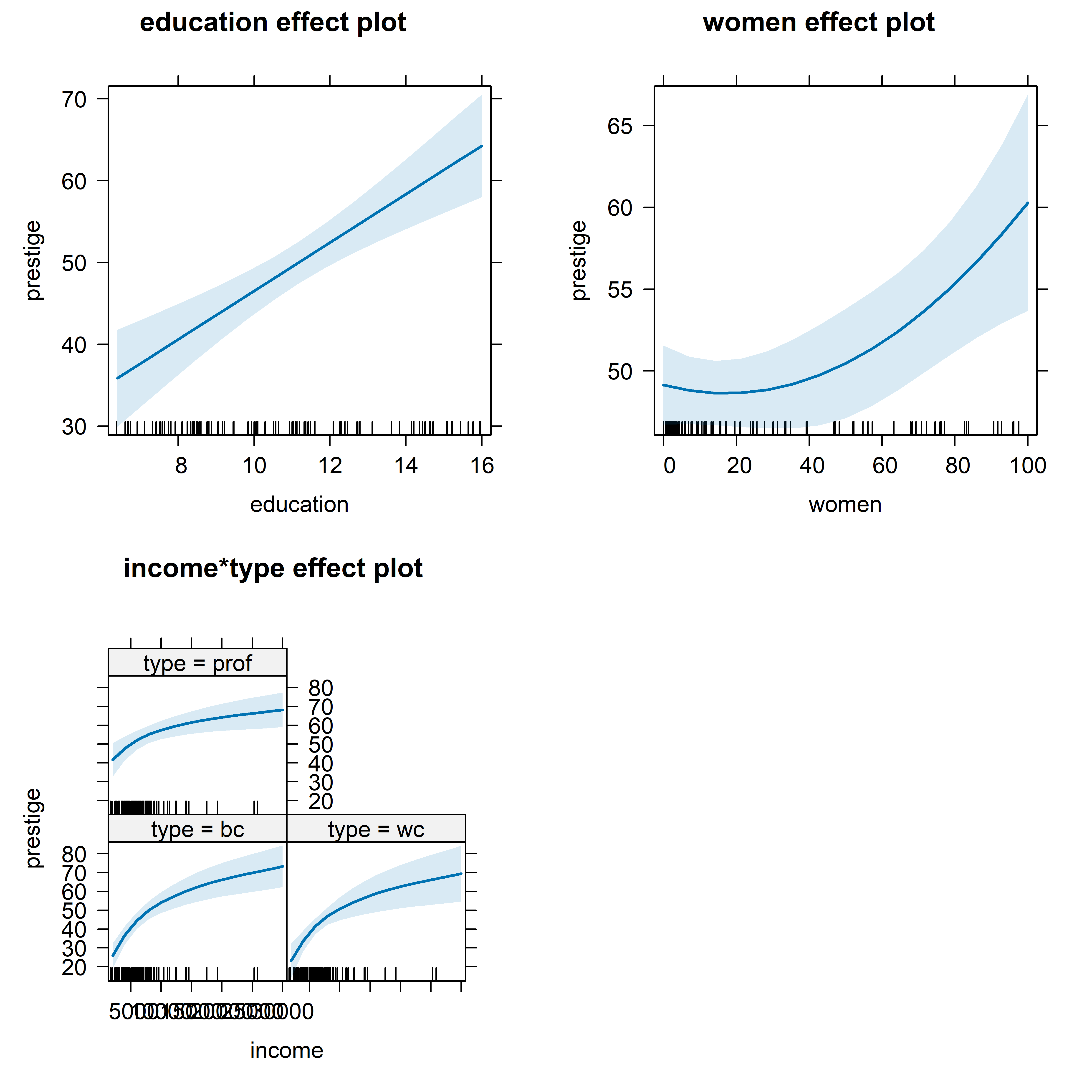
The effect for women, holding education, income and type constant looks to be quite strong and curved upwards. But note that these plots use different vertical scales for prestige in each plot and the range in the plot for women is much smaller than in the others. The interaction is graphed showing separate curves for the three levels of type.
For a more detailed look, it is useful to make separate plots for the predictors in the model, which allows customizing options for calculation and display. Partial residuals for the observations are computed by using residuals = TRUE in the call to predictorEffects(). The slope of the fitted line (in blue) is exactly coefficient for education in the full model. As with C+R plots, a smooth loess curve (in red) gives a visual assessment of linearity for a given predictor. A wide variety of graphing options are available in the call to plot(). Figure fig-prestige-effplot-educ shows the effect display for education with partial residuals and point identification of those points with the largest Mahalanobis distances from the centroid.
lattice::trellis.par.set(par.xlab.text=list(cex=1.5),
                         par.ylab.text=list(cex=1.5))

predictorEffects(prestige.mod3, ~ education,
                 residuals = TRUE) |>
  plot(partial.residuals = list(pch = 16, col="blue"),
id=list(n=4, col="black")) 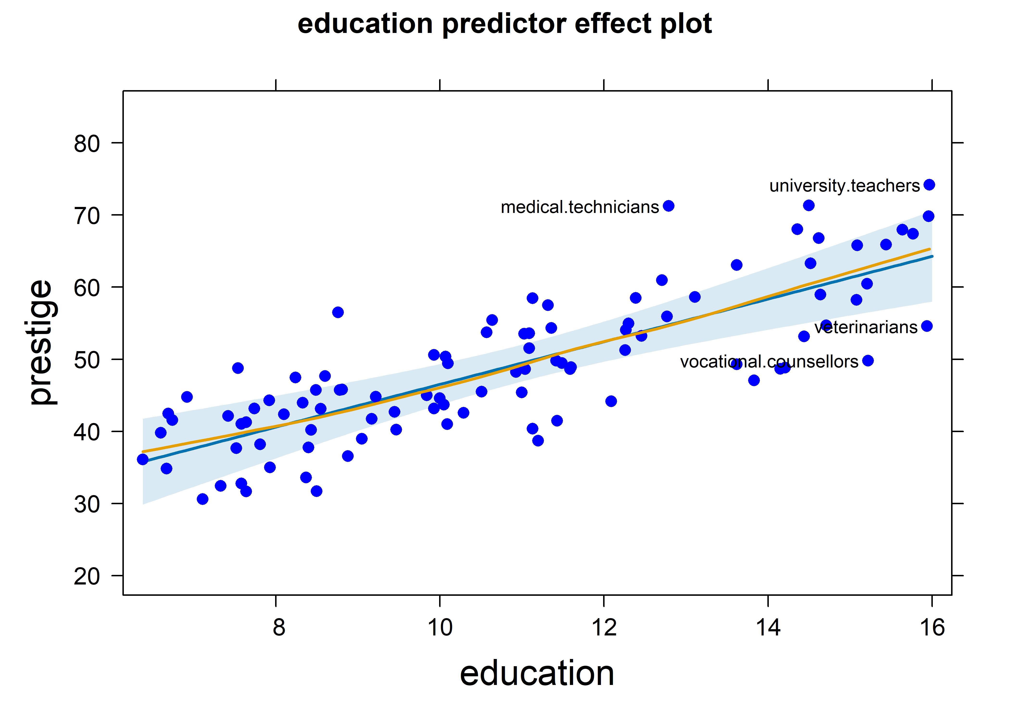
The effect plot for women in this model is shown in Figure fig-prestige-effplot-women. This uses the same vertical scale as in Figure fig-prestige-effplot-educ, showing a more modest effect of percent women.
predictorEffects(prestige.mod3, ~women,
                 residuals = TRUE) |>
  plot(partial.residuals = list(pch = 16, col="blue", cex=0.8),
       id=list(n=4, col="black"))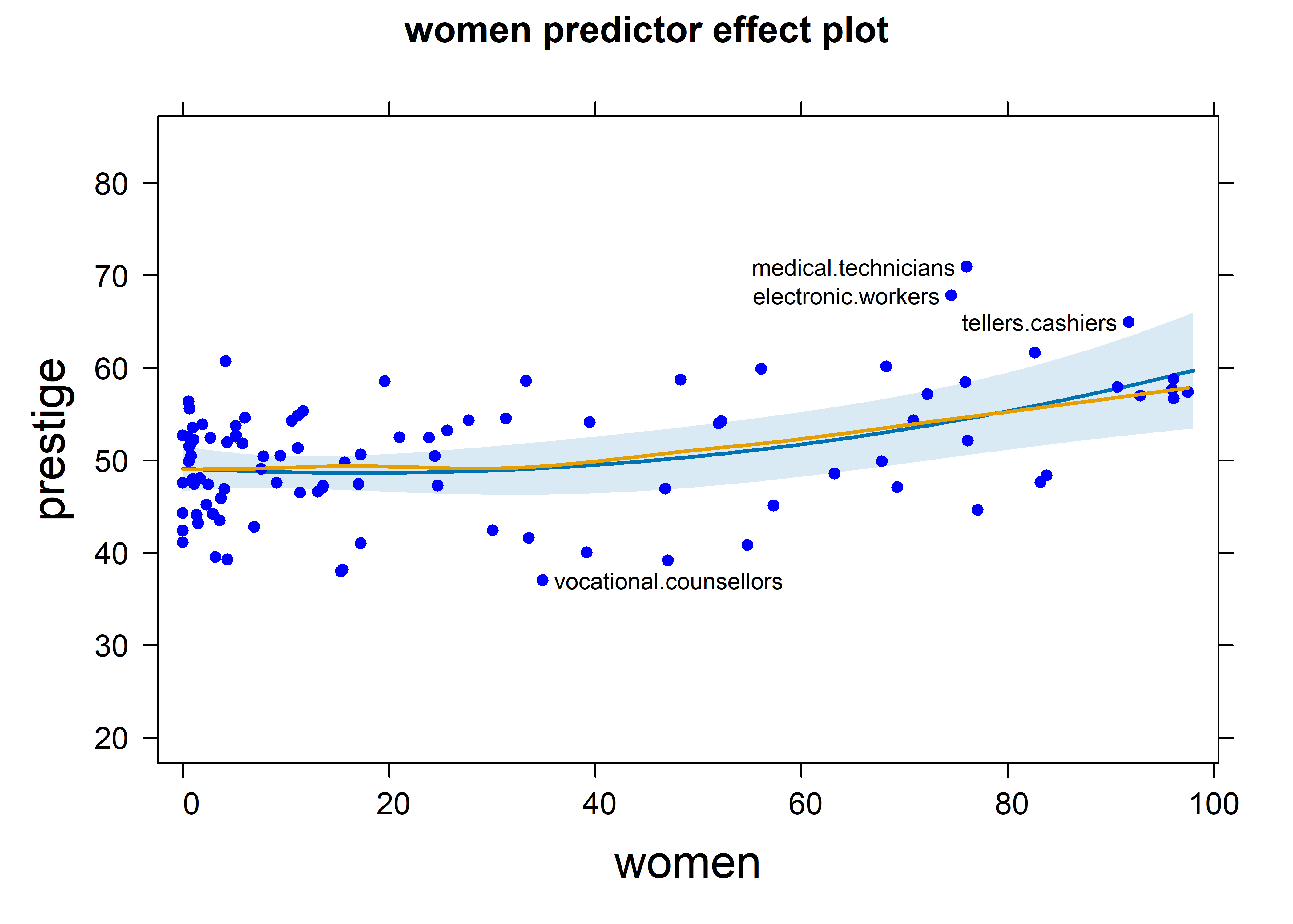
Because of the interaction with type, the fitted effects for income are calculated for the three types of occupation. It is easiest to compare these in the a single plot (using multiline = TRUE), rather than in separate panels as in Figure fig-prestige-allEffects. Income is represented as log10(income) in the model prestige.mod3, and it is also easier to understand the interaction by plotting income on a log scale, using the axes argument to specify a transformation of the \(x\) axis. I use 68% confidence bands here to make the differences among type more apparent.
predictorEffects(prestige.mod3, ~ income,
                 confidence.level = 0.68) |>
  plot(lines=list(multiline=TRUE, lwd=3),
       confint=list(style="bands"),
       axes=list(
          x=list(income=list(transform=list(trans=log, inverse=exp)))),
key.args = list(x=.7, y=.35)) 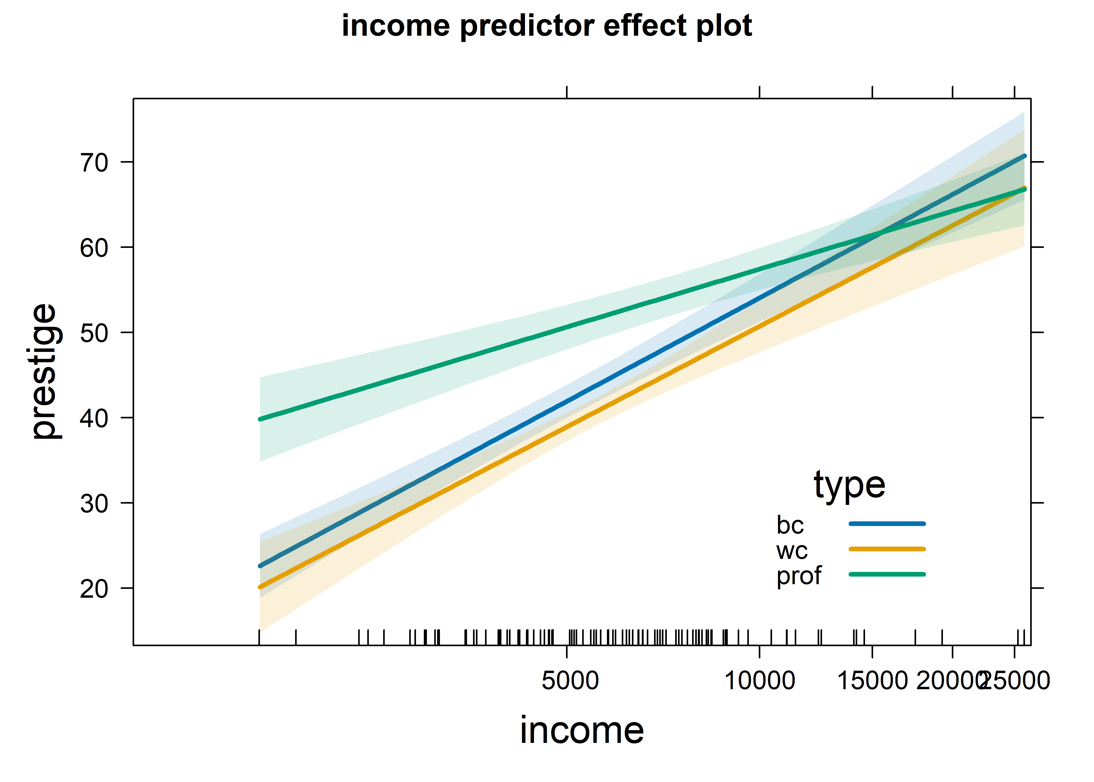
Figure fig-prestige-effplot-inc-log provides a clear interpretation of the interaction, represented by the coefficients shown above for log10(income):typewc and log10(income):typeprof in the model. Averaging over three occupation types, prestige increases linearly with log income with a coefficient of 40.33. This means that increasing income by 10% (say) gives an increase of \(40.33 / 10 = 4.033\) in prestige. The slope for professional workers is less steep: the coefficient for log10(income):typeprof is -17.725. For these workers compared with blue collar jobs, prestige increases 1.77 less with a 10% increase in income. The difference in slopes for blue collar and white collar jobs is negligible.
6.5 Outliers, leverage and influence
In small to moderate samples, “unusual” observations can have dramatic effects on a fitted regression model, as we saw in the analysis of Davis’s data on reported and measured weight (sec-davis) where one erroneous observations hugely altered the fitted line. As well, it turns out that two observations in Duncan’s data are unusual enough that removing them alters his conclusion that income and education have nearly equal effects on occupational prestige.
An observation can be unusual in three archetypal ways, with different consequences:
Unusual in the response \(y\), but typical in the predictor(s), \(\mathbf{x}\) — a badly fitted case with a large absolute residual, but with \(x\) not far from the mean, as in Figure fig-ch02-davis-reg2. This case does not do much harm to the fitted model.
Unusual in the predictor(s) \(\mathbf{x}\), but typical in \(y\) — an otherwise well-fitted point. This case also does litle harm, and in fact can be considered to improve precision, a “good leverage” point.
Unusual in both \(\mathbf{x}\) and \(y\) — This is the case, a “bad leverage” point, revealed in the analysis of Davis’s data, Figure fig-ch02-davis-reg1, where the one erroneous point for women was highly influential, pulling the regression line towards it and affecting the estimated coefficient as well as all the fitted values. In addition, subsets of observations can be jointly influential, in that their effects combine, or can mask each other’s influence.
Influential cases are the ones that matter most. As suggested above, to be influential an observation must be unusual in both \(\mathbf{x}\) and \(y\), and affects the estimated coefficients, thereby also altering the predicted values for all observations. A heuristic formula capturing the relations among leverage, “outlyingness” on \(y\) and influence is
\[ \text{Influence}_{\text{coefficients}} \;=\; X_\text{leverage} \;\times\; Y_\text{residual} \] As described below, leverage is proportional to the squared distance \((x_i - \bar{x})^2\) of an observation \(x_i\) from its mean in simple regression and to the squared Mahalanobis distance in the general case. The \(Y_\text{residual}\) is best measured by a studentized residual, obtained by omitting each case \(i\) in turn and calculating its residual from the coefficients obtained from the remaining cases.
6.5.1 The leverage-influence quartet
These ideas can be illustrated in the “leverage-influence quartet” by considering a standard simple linear regression for a sample and then adding one additional point reflecting the three situations described above. Below, I generate a sample of \(N = 15\) points with \(x\) uniformly distributed between (40, 60) and \(y \sim 10 + 0.75 x + \mathcal{N}(0, 1.25^2)\), duplicated four times.
library(tidyverse)
library(car)
set.seed(42)
N <- 15
case_labels <- paste(1:4, c("OK", "Outlier", "Leverage", "Influence"))
levdemo <- tibble(
  case = rep(case_labels,
             each = N),
  x = rep(round(40 + 20 * runif(N), 1), 4),
  y = rep(round(10 + .75 * x + rnorm(N, 0, 1.25), 4)),
  id = " "
)

mod <- lm(y ~ x, data=levdemo)
coef(mod)
# (Intercept)           x
#      13.332       0.697
The additional points, one for each situation are set to the values below.
-
Outlier: (52, 60) a low leverage point, but an outlier (O) with a large residual -
Leverage: (75, 65) a “good” high leverage point (L) that fits well with the regression line -
Influence: (70, 40) a “bad” high leverage point (OL) with a large residual.
We can plot these four situations with ggplot2 in panels faceted by case as shown below. The standard version of this plot shows the regression line for the original data and that for the ammended data with the additional point. Note that we use the levdemo dataset in geom_smooth() for the regression line with the original data, but specify data = both for that with the additional point.
ggplot(levdemo, aes(x = x, y = y)) +
  geom_point(color = "blue", size = 2) +
  geom_smooth(data = both,
              method = "lm", formula = y ~ x, se = FALSE,
              color = "red", linewidth = 1.3, linetype = 1) +
  geom_smooth(method = "lm", formula = y ~ x, se = FALSE,
              color = "blue", linewidth = 1, linetype = "longdash" ) +
  stat_ellipse(data = both, level = 0.5, color="blue", type="norm", linewidth = 1.4) +
  geom_point(data=extra, color = "red", size = 4) +
  geom_text(data=extra, aes(label = id), nudge_x = -2, size = 5) +
  facet_wrap(~case, labeller = label_both) +
  theme_bw(base_size = 14)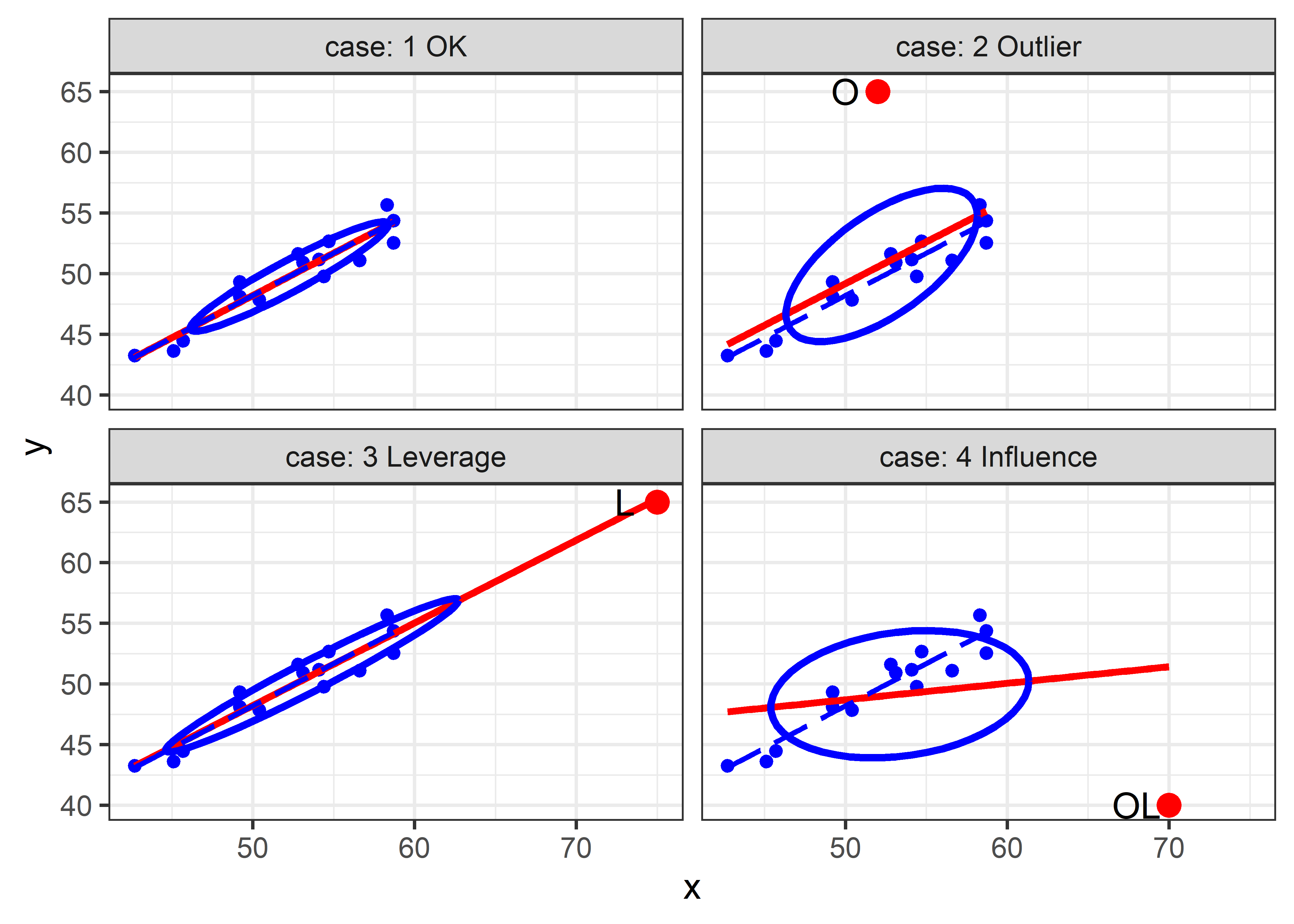
The standard version of this graph shows only the fitted regression lines in each panel. As can be seen, the fitted line doesn’t change very much in panels (2) and (3); only the bad leverage point, “OL” in panel (4) is harmful. Adding data ellipses to each panel immediately makes it clear that there is another part to this story— the effect of the unusual point on precision (standard errors) of our estimates of the coefficients.
Now, we see directly that there is a big difference in impact between the low-leverage outlier [panel (2)] and the high-leverage, small-residual case [panel (3)], even though their effect on coefficient estimates is negligible. In panel (2), the single outlier inflates the estimate of residual variance (the size of the vertical slice of the data ellipse at \(\bar{x}\)), while in panel (3) this is decreased.
To allow direct comparison and make the added value of the data ellipse more apparent, we overlay the data ellipses from Figure fig-levdemo in a single graph, shown in Figure fig-levdemo2. Here, we can also see why the high-leverage point “L” (added in panel (c) of Figure fig-levdemo) is called a “good leverage” point. By increasing the standard deviation of \(x\), it makes the data ellipse somewhat more elongated, giving increased precision of our estimates of \(\mathbf{\beta}\).
Code
colors <- c("black", "blue", "darkgreen", "red")
with(both,
     {dataEllipse(x, y, groups = case,
          levels = 0.68,
          plot.points = FALSE, add = FALSE,
          center.pch = "+",
          col = colors,
          fill = TRUE, fill.alpha = 0.1)
     })

case1 <- both |> filter(case == "1 OK")
points(case1[, c("x", "y")], cex=1)

points(extra[, c("x", "y")],
       col = colors,
       pch = 16, cex = 2)

text(extra[, c("x", "y")],
     labels = extra$id,
     col = colors, pos = 2, offset = 0.5)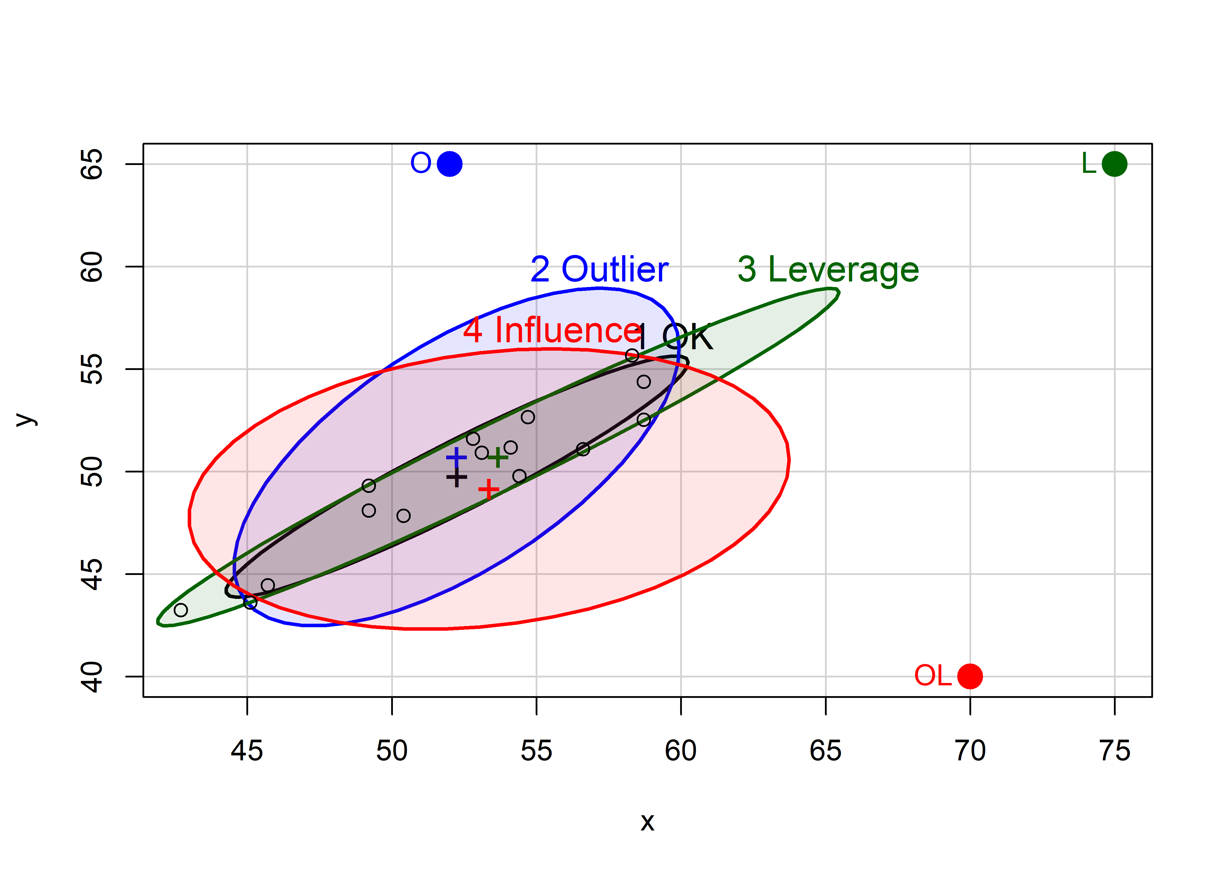
6.5.1.1 Measuring leverage
Leverage is thus an index of the potential impact of an observation on the model due to its’ atypical value in the X space of the predictor(s). It is commonly measured by the “hat” value, \(h_i\), so called because it puts the hat \(\mathbf{\widehat{(\bullet)}}\) on \(\mathbf{y}\), i.e., the vector of fitted values can be expressed as
\[ \begin{aligned} \mathbf{\widehat{y}} &= \underbrace{\mathbf{X}(\mathbf{X}^{\top}\mathbf{X})^{-1}\mathbf{X}^{\top}}_\mathbf{H}\mathbf{y} \\[2ex] &= \mathbf{H\:y} \:\: . \end{aligned} \]
Here, \(h_i \equiv h_{ii}\) are the diagonal elements of the Hat matrix \(\mathbf{H}\). In simple regression, hat values are proportional to the squared distance of the observation \(x_i\) from the mean, \(h_i \propto (x_i - \bar{x})^2\), \[ h_i = \frac{1}{n} + \frac{(x_i - \bar{x})^2}{\Sigma_i (x_i - \bar{x})^2} \; , \tag{6.1}\]
and range from \(1/n\) to 1, with an average value \(\bar{h} = 2/n\). Consequently, observations with \(h_i\) greater than \(2 \bar{h}\) or \(3 \bar{h}\) are commonly considered to be of high leverage.
With \(p \ge 2\) predictors, an analogous relationship holds, but the correlations among the predictors must be taken into account. It is demonstrated below that \(h_i \propto D^2 (\mathbf{x} - \bar{\mathbf{x}})\), the Mahalanobis squared distance of \(\mathbf{x}\) from the centroid \(\bar{\mathbf{x}}\)5.
The generalized version of Equation eq-hat-univar is
\[ h_i = \frac{1}{n} + \frac{1}{n-1} D^2 (\mathbf{x} - \bar{\mathbf{x}}) \; , \tag{6.2}\]
where \(D^2 (\mathbf{x} - \bar{\mathbf{x}}) = (\mathbf{x} - \bar{\mathbf{x}})^\mathsf{T} \mathbf{S}_X^{-1} (\mathbf{x} - \bar{\mathbf{x}})\). From sec-data-ellipse, it follows that contours of constant leverage correspond to data ellipses or ellipsoids of the predictors in \(\mathbf{x}\), whose boundaries, assuming normality, correspond to quantiles of the \(\chi^2_p\) distribution
Example 6.1 Illustrating leverage
To illustrate Equation eq-hat-multivar, I generate \(N = 100\) points from a bivariate normal distribution with means \(\mu = (30, 30)\), variances = 10, and a correlation \(\rho = 0.7\). Then I add two noteworthy points that show an apparently paradoxical result.
The Mahalanobis squared distances of these points can be calculated using heplots::Mahalanobis(), and their corresponding hatvalues found using hatvalues() for any linear model using both x1 and x2.
Plotting x1 and x2 with data ellipses shows the relation of leverage to squared distance from the mean in Figure fig-hatvalues-demo1. The blue point looks to be farther from the mean, but the red point is actually very much further by Mahalanobis squared distance, which takes the correlation into account; it thus has much greater leverage.
dataEllipse(X$x1, X$x2,
            levels = c(0.40, 0.68, 0.95),
            fill = TRUE, fill.alpha = 0.05,
            col = "darkgreen",
            xlab = "X1", ylab = "X2")
points(X[1:nrow(X) > N, 1:2], pch = 16,
       col=c("red", "blue"), cex = 2)
X |> slice_tail(n = 2) |>      # last two rows
  points(pch = 16, col=c("red", "blue"), cex = 2)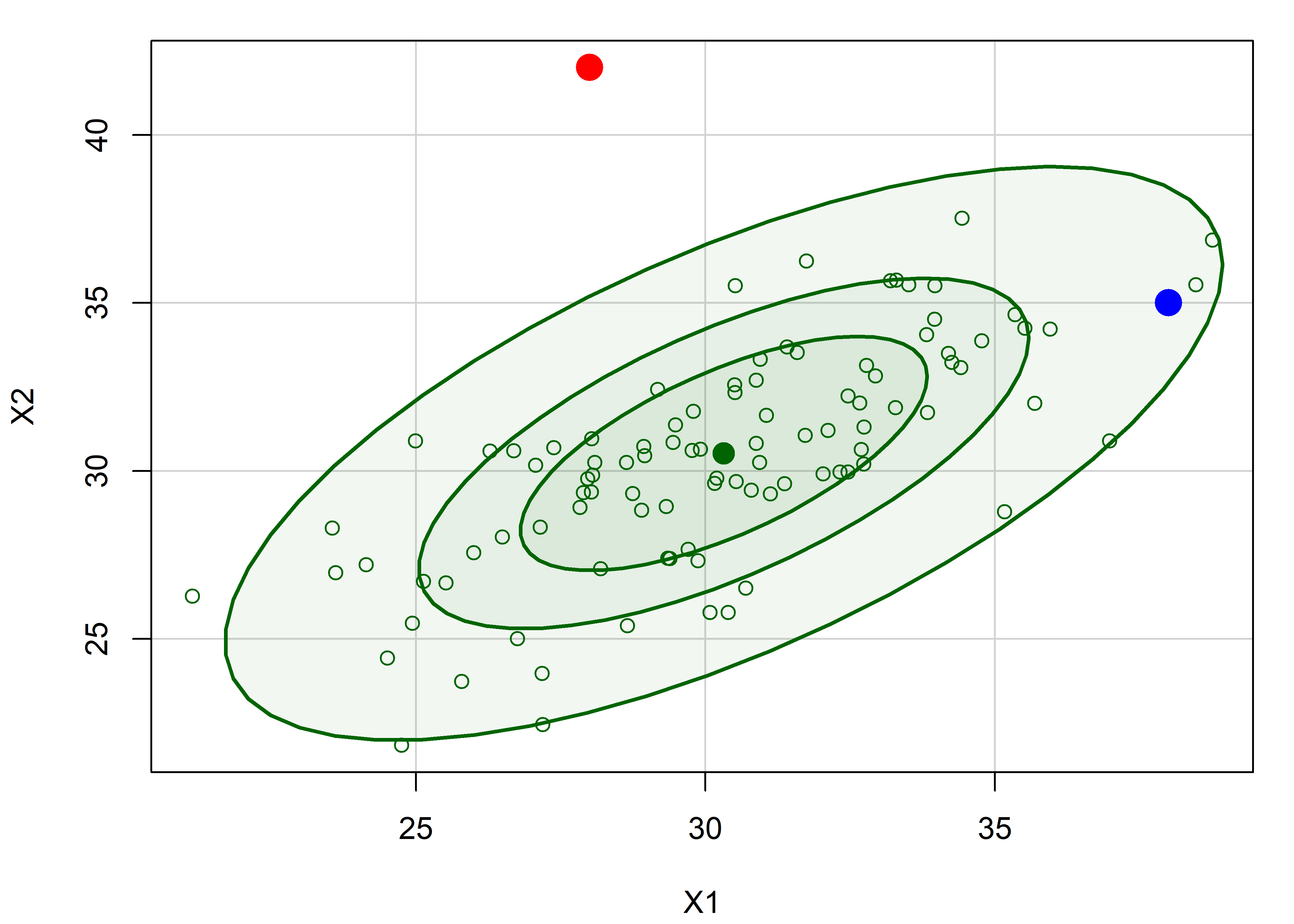
The fact that hatvalues are proportional to leverage can be seen by plotting one against the other. I highlight the two noteworthy points in their colors from Figure fig-hatvalues-demo1 to illustrate how much greater leverage the red point has compared to the blue point.
plot(hat ~ Dsq, data = X,
     cex = c(rep(1, N), rep(3, 3)),
     col = c(rep("black", N), "red", "blue"),
     pch = 16,
     cex.lab = 1.5,
     ylab = "Hatvalue",
     xlab = "Mahalanobis Dsq")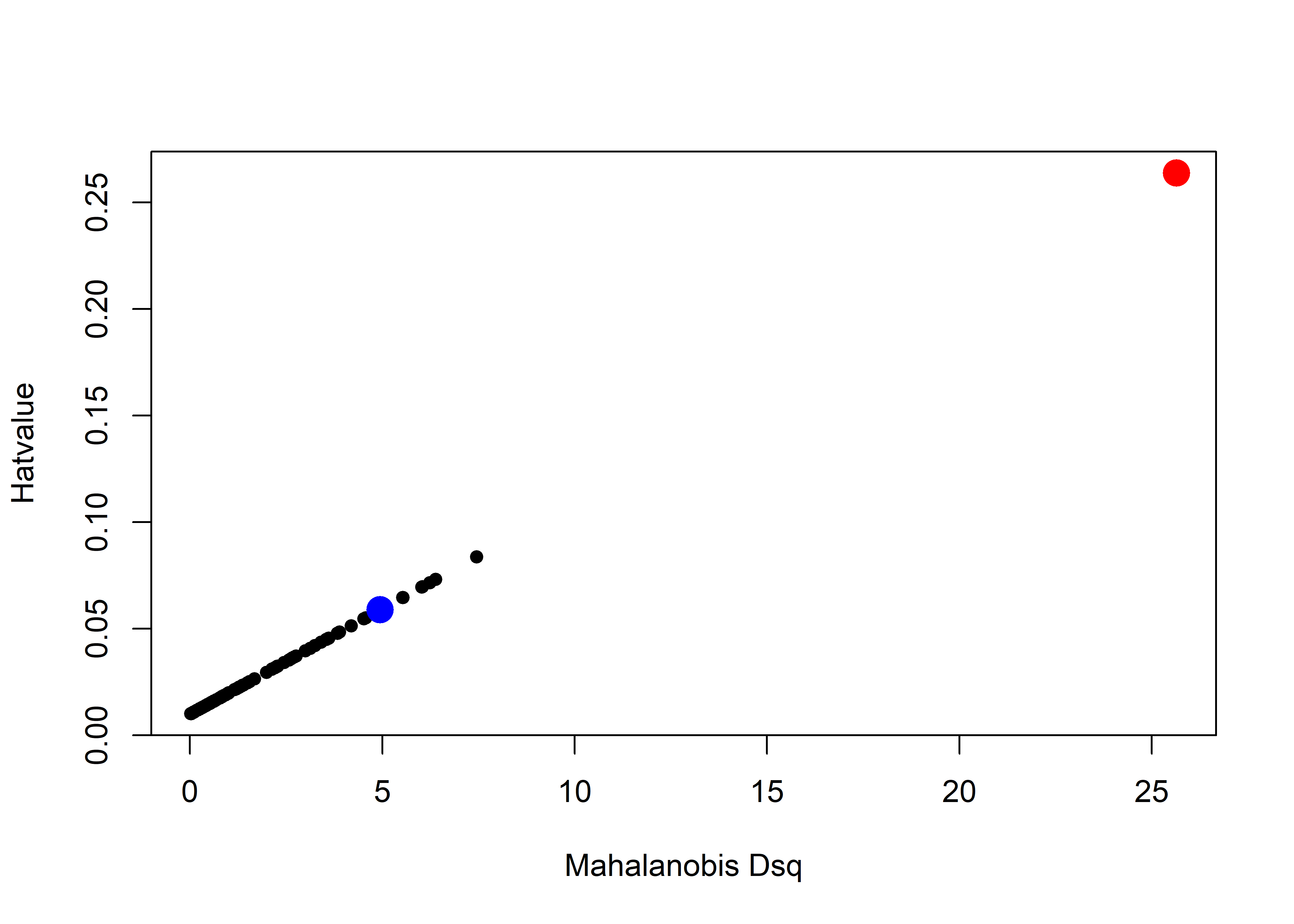
Look back at these two points in Figure fig-hatvalues-demo1. Can you guess how much further the red point is from the mean than the blue point? You might be surprised that its’ \(D^2\) and leverage are about five times as great!
X |> slice_tail(n=2)
#   x1 x2   Dsq   y    hat
# 1 28 42 25.65 179 0.2638
# 2 38 35  4.95 175 0.0588
6.5.1.2 Outliers: Measuring residuals
From the discussion in sec-leverage, outliers for the response \(y\) are those observations for which the residual \(e_i = y_i - \hat{y}_i\) are unusually large in magnitude. However, as demonstrated in Figure fig-levdemo, a high-leverage point will pull the fitted line towards it, reducing its’ residual and thus making them look less unusual.
The standard approach (Cook & Weisberg, 1982; Hoaglin & Welsch, 1978) is to consider a deleted residual \(e_{(-i)}\), conceptually as that obtained by re-fitting the model with observation \(i\) omitted and obtaining the fitted value \(\hat{y}_{(-i)}\) from the remaining \(n-1\) observations, \[ e_{(-i)} = y_i - \hat{y}_{(-i)} \; . \] The (externally) studentized residual is then obtained by dividing \(e_{(-i)}\) by it’s estimated standard error, giving \[ e^\star_{(-i)} = \frac{e_{(-i)}}{\text{sd}(e_{(-i)})} = \frac{e_i}{\sqrt{\text{MSE}_{(-i)}\; (1 - h_i)}} \; . \tag{6.3}\]
This is just the ordinary residual \(e_i\) divided by a factor that increases with the residual variance but decreases with leverage. It can be shown that these studentized residuals follow a \(t\) distribution with \(n - p -2\) degrees of freedom, so a value \(|e^\star_{(-i)}| > 2\) can be considered large enough to pay attention to.
In practice for classical linear models, it is unnecessary to actually re-fit the model \(n\) times. Velleman & Welsh (1981) show that all these leave-one-out quantities can be calculated from the model fitted to the full data set and the hat (projection) matrix \(\mathbf{H} = (\mathbf{X}^\mathsf{T}\mathbf{X})^{-1} \mathbf{X}^\mathsf{T}\) from which \(\widehat{\mathbf{b}} = \mathbf{H} \mathbf{y}\).
6.5.1.3 Measuring influence
As described at the start of this section, the actual influence of a given case depends multiplicatively on its’ leverage and residual. But how can we measure it?
The essential idea introduced above, is to delete the observations one at a time, each time refitting the regression model on the remaining \(n–1\) observations. Then, for observation \(i\) compare the results using all \(n\) observations to those with the \(i^{th}\) observation deleted to see how much influence the observation has on the analysis.
The simplest such measure, called DFFITS, compares the predicted value for case \(i\) with what would be obtained when that observation is excluded.
\[ \begin{aligned} \text{DFFITS}_i & = & \frac{\hat{y}_i - \hat{y}_{(-i)}}{\sqrt{\text{MSE}_{(-i)}\; h_i}} \\ & = & e^\star_{(-i)} \times \sqrt{\frac{h_i}{1-h_i}} \;\; . \end{aligned} \tag{6.4}\]
The first equation gives the signed difference in fitted values in units of the standard deviation of that difference weighted by leverage; the second version (Belsley et al., 1980) represents that as a product of residual and leverage. A rule of thumb is that an observation is deemed to be influential if \(| \text{DFFITS}_i | > 2 \sqrt{(p+1) / n}\).
Influence can also be assessed in terms of the change in the estimated coefficients \(\mathbf{b} = \widehat{\boldsymbol{\beta}}\) versus their values \(\mathbf{b}_{(-i)}\) when case \(i\) is removed. Cook’s distance, \(D_i\), summarizes the size of the difference as a weighted sum of squares of the differences \(\mathbf{d} =\mathbf{b} - \mathbf{b}_{(-i)}\) (Cook, 1977).
\[ D_i = \mathbf{d}^\mathsf{T}\, (\mathbf{X}^\mathsf{T}\mathbf{X}) \,\mathbf{d} / (p+1) \hat{\sigma}^2 \] This can be re-expressed in terms of the components of residual and leverage
\[ D_i = \frac{e^{\star 2}_{(-i)}}{p+1} \times \frac{h_i}{(1- h_i)} \tag{6.5}\]
Cook’s distance is in the metric of an \(F\) distribution with \(p\) and \(n − p\) degrees of freedom, so values \(D_i > 4/n\) are considered large.
6.5.2 Influence plots
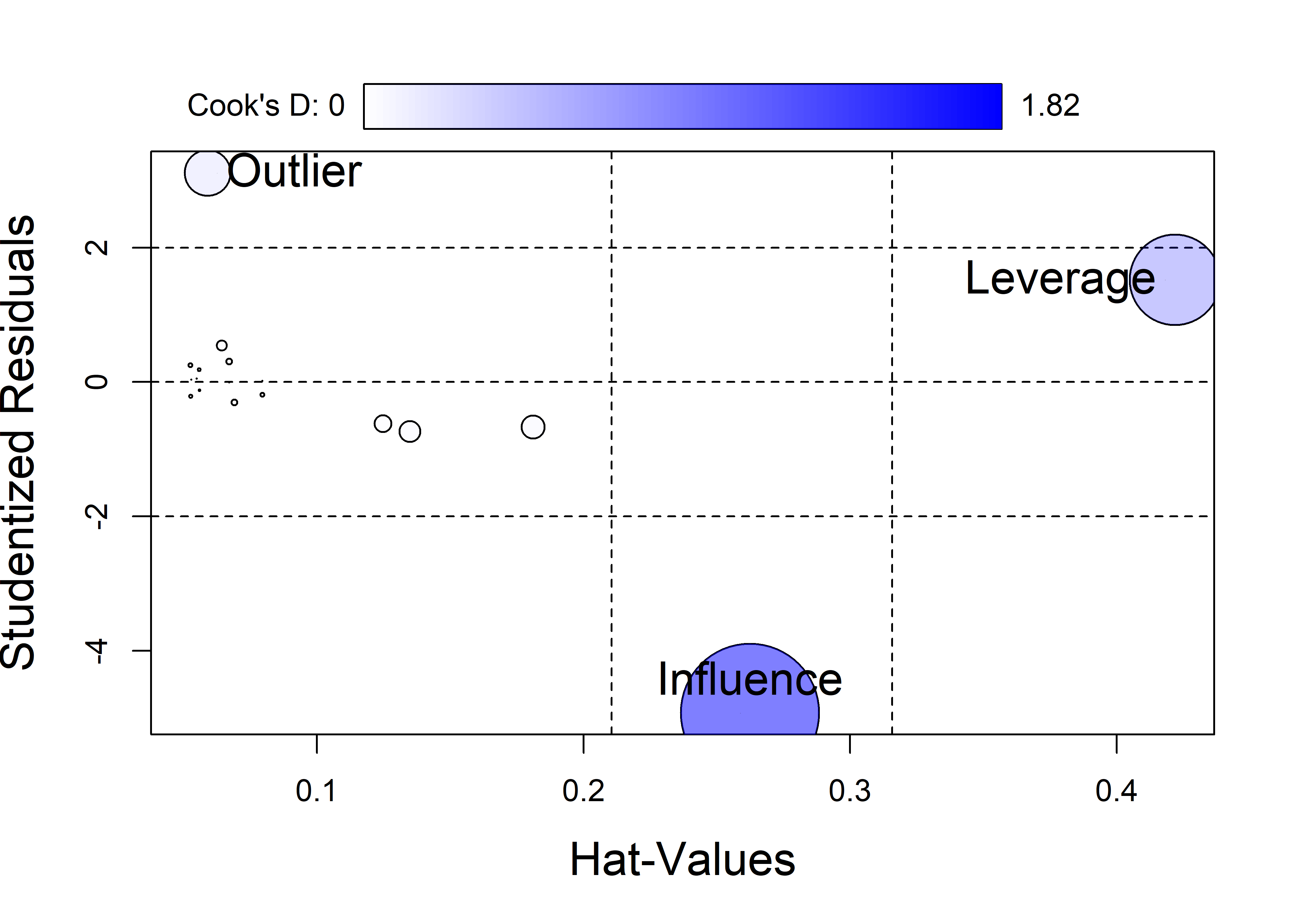
The most common plot to detect influence is a bubble plot of the studentized residuals versus hat values, with the size (area) of the plotting symbol proportional to Cook’s \(D\). These plots are constructed using car::influencePlot() which also fills the bubble symbols with color whose opacity is proportional to Cook’s \(D\).
This is shown in Figure fig-levdemo-infl for the demonstration dataset constructed in sec-lev-inf-quartet. In this plot, notable cutoffs for hatvalues at \(2 \bar{h}\) and \(3 \bar{h}\) are shown by dashed vertical lines and horizontal cutoffs for studentized residuals are shown at values of \(\pm 2\).
The demonstration data of sec-lev-inf-quartet has four copies of the same \((x, y)\) data, three of which have an unusual observation. The influence plot in Figure fig-levdemo-infl subsets the data to give the \(19 = 15 + 4\) unique observations, including the three unusual cases. As can be seen, the high “Leverage” point has has less influence than the point labeled “Influence”, which has moderate leverage but a large absolute residual.
See the code
once <- both[c(1:16, 62, 63, 64),]      # unique observations
once.mod <- lm(y ~ x, data=once)
inf <- influencePlot(once.mod,
                     id = list(cex = 0.01),
                     fill.alpha = 0.5,
                     cex.lab = 1.5)
# custom labels
unusual <- bind_cols(once[17:19,], inf) |>
  print(digits=3)
# # A tibble: 3 × 7
#   case            x     y id    StudRes    Hat CookD
# * <fct>       <dbl> <dbl> <chr>   <dbl>  <dbl> <dbl>
# 1 2 Outlier      52    65 O        3.11 0.0591 0.201
# 2 3 Leverage     75    65 L        1.52 0.422  0.784
# 3 4 Influence    70    40 OL      -4.93 0.262  1.82
with(unusual, {
  casetype <- gsub("\\d ", "", case)
  text(Hat, StudRes, label = casetype,
       pos = c(4, 2, 3), cex=1.5)
})
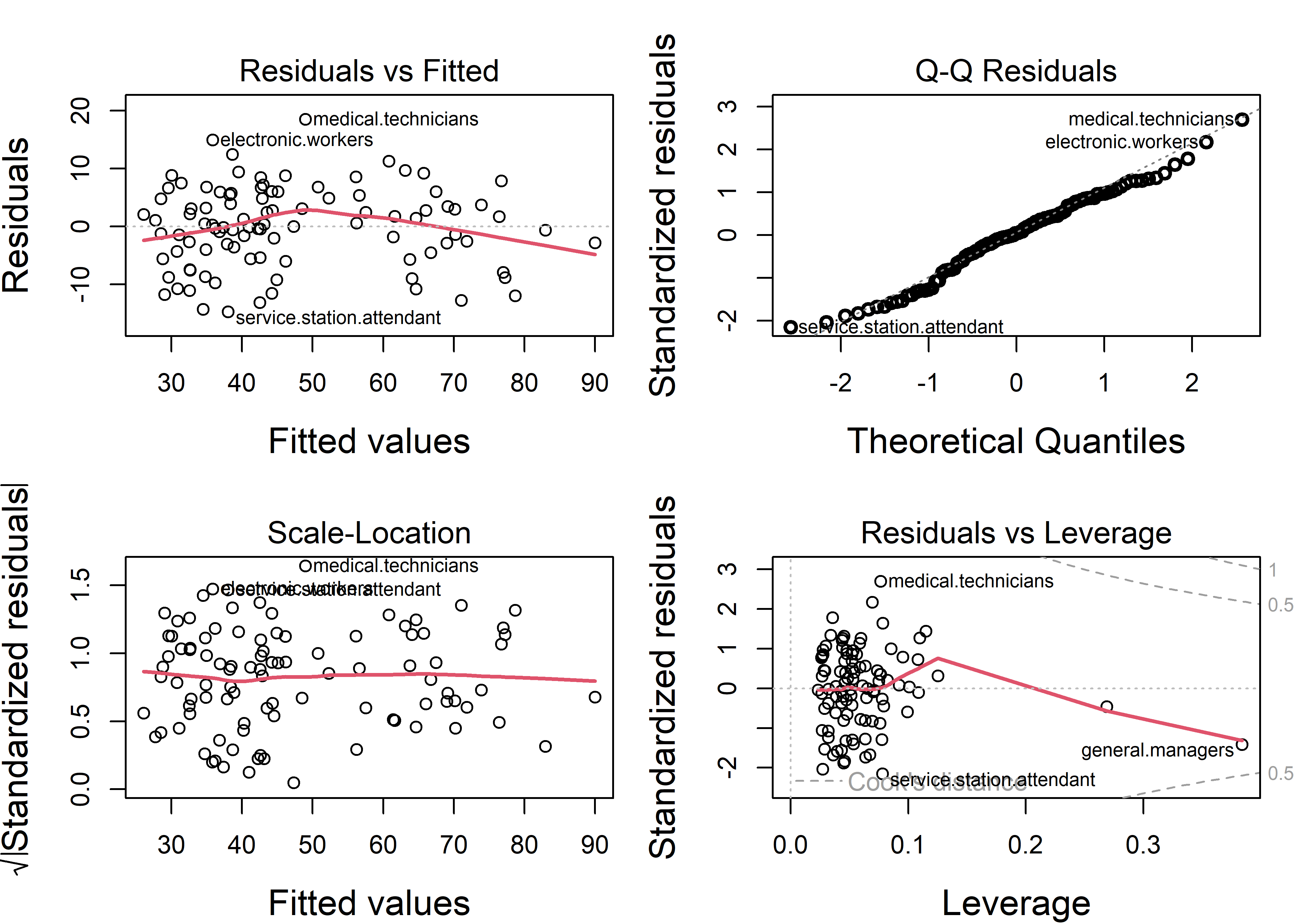
6.5.3 Duncan data
Let’s return to the Duncan data used as an example in sec-example-duncan where a few points stood out as unusual in the basic diagnostic plots (Figure fig-duncan-plot-model). The influence plot in Figure fig-duncan-infl helps to make sense of these noteworthy observations. The default method for identifying points in influencePlot() labels points with any of large studentized residuals, hat-values or Cook’s distances.
inf <- influencePlot(duncan.mod, id = list(n=3),
                     cex.lab = 1.5)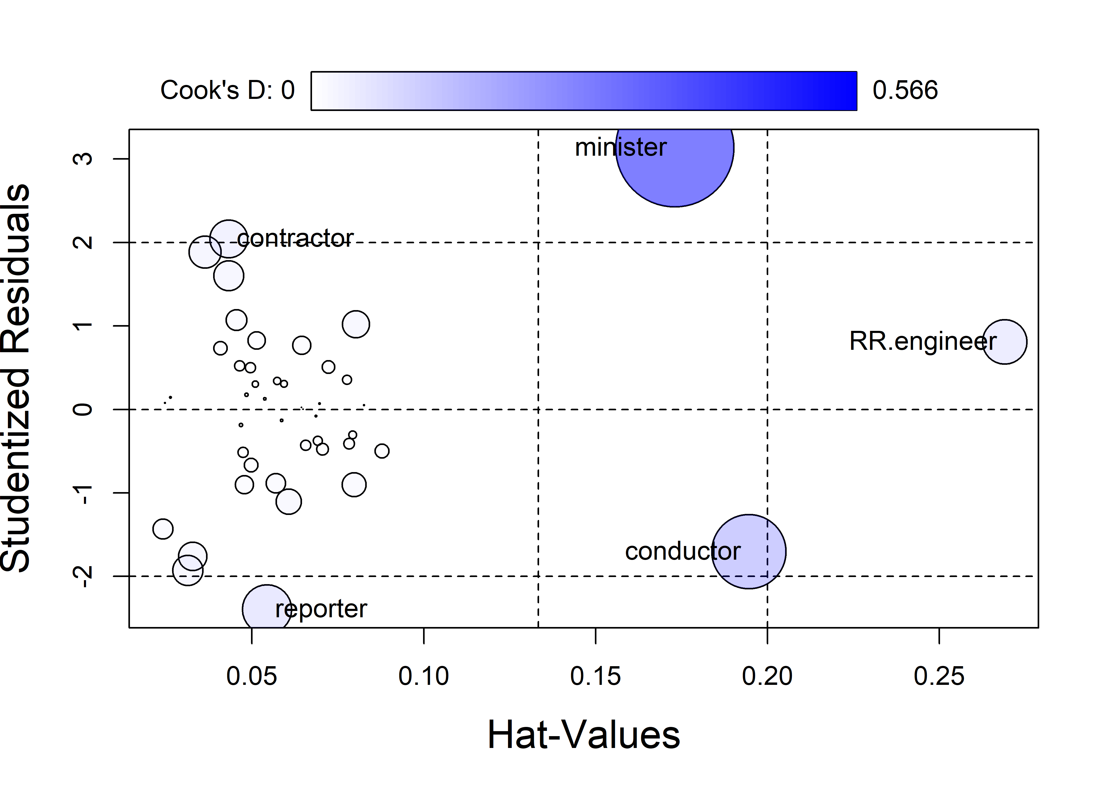
influencePlot() returns (invisibly) the influence diagnostics for the cases identified in the plot. It is often useful to look at data values for these cases to understand why each of these was flagged.
merge(Duncan, inf, by="row.names", all.x = FALSE) |>
  arrange(desc(CookD)) |>
  print(digits=3)
#     Row.names type income education prestige StudRes    Hat  CookD
# 1    minister prof     21        84       87   3.135 0.1731 0.5664
# 2   conductor   wc     76        34       38  -1.704 0.1945 0.2236
# 3    reporter   wc     67        87       52  -2.397 0.0544 0.0990
# 4 RR.engineer   bc     81        28       67   0.809 0.2691 0.0810
# 5  contractor prof     53        45       76   2.044 0.0433 0.0585
minister has by far the largest influence, because it has an extremely positive residual and a large hat value. Looking at the data, we see that ministers have very low income, so their prestige is under-predicted. The large hat value reflects the fact that ministers have low income combined with very high education.
conductor has the next largest Cook’s \(D\). It has a large hat value because its combination of relatively high income and low education is unusual in the data.
Among the others, reporter has a relatively large negative residual—its prestige is far less than the model predicts—but its low leverage make it not highly influential. railroad engineer has an extremely large hat value because its income is very high in relation to education. But this case is well-predicted and has a small residual, so its leverage is not large.
6.5.4 Influence in added-variable plots
The properties of added-variable plots discussed in sec-avplots make them also useful for understanding why cases are influential because they control for other predictors in each plot, and therefore show the partial contributions of each observation to hat values and residuals. As a consequence, we can see directly the how individual cases become individually or jointly influential.
The Duncan data provides a particularly instructive example of this. Figure fig-duncan-av-influence shows the AV plots for both income and education in the model duncan.mod, with some annotations added. I want to focus here on the joint influence of the occupations minister and conductor which were seen to be the most influential in Figure fig-duncan-infl. The green vertical lines show their residuals in each panel and the red lines show the regressions when these two observations are deleted.
The basic AV plots are produced using the call to avPlots() below. To avoid clutter, I use the argument id = list(method = "mahal", n=3) so that only the three points with the greatest Mahalanobis distances from the centroid in each plot are labeled. These are the cases with the largest leverage seen in Figure fig-duncan-infl.
TODO: Fix up the code displayed here, from R/Duncan/Duncan-reg.R
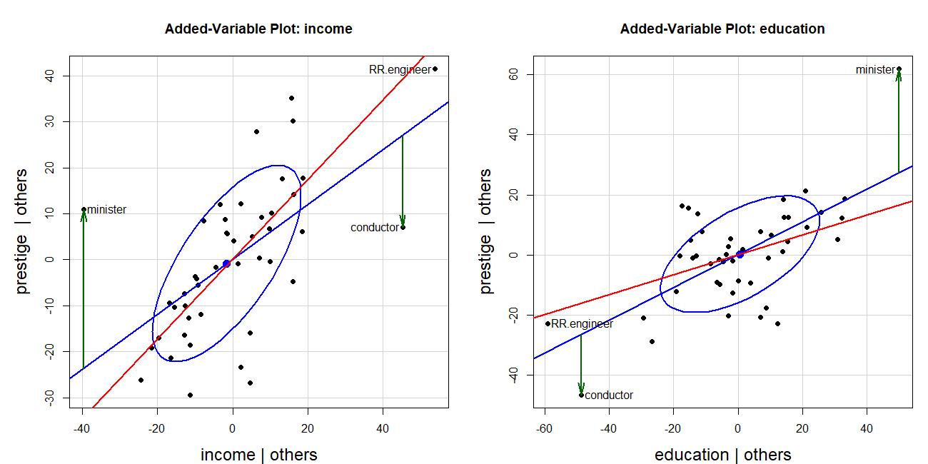
The two cases—minister and conductor—are the most highly influential, but as we can see in Figure fig-duncan-av-influence their influence combines because they are at opposite sides of the horizontal axis and their residuals are of opposite signs. They act together to decrease the slope for income and increase that for education.
Code for income AV plot
res <- avPlot(duncan.mod, "income",
              ellipse = list(levels = 0.68),
              id = list(method = "mahal", n=3),
              pch = 16,
              cex.lab = 1.5) |>
  as.data.frame()
fit <- lm(prestige ~ income, data = res)
info <- cbind(res, fitted = fitted(fit),
             resids = residuals(fit),
             hat = hatvalues(fit),
             cookd = cooks.distance(fit))

# noteworthy points in this plot
big <- which(info$cookd > .20)
with(info, {
  arrows(income[big], fitted[big], income[big], prestige[big],
         angle = 12, length = .18, lwd = 2, col = "darkgreen")
  })

# line w/o the unusual points
duncan.mod2 <- update(duncan.mod, subset = -c(6, 16))
bs <- coef(duncan.mod2)["income"]
abline(a=0, b=bs, col = "red", lwd=2)
Duncan’s hypothesis that the slopes for income and education were equal thus fails when these two observations are deleted. The slope for income then becomes 2.6 times that of education.
6.6 What have we learned?
This chapter unveils the sophisticated visual toolkit that transforms regression models from black boxes into transparent interpretable analyses. Here are the essential insights that will revolutionize how you understand and communicate model results:
The regression quartet reveals model reality beyond the summary statistics: The four diagnostic plots (residuals vs. fitted, Q-Q plot, scale-location, and leverage plots) form a comprehensive health check for your regression models. Like a medical examination, each plot diagnoses different potential problems—linearity violations, non-normality, heteroscedasticity, and influential observations. The enhanced versions in R packages like
carandperformancedon’t just show problems; they label the troublemakers and guide you toward solutions.Coefficient plots make model comparisons effortless and honest: Raw coefficient tables hide the forest for the trees, especially when predictors have wildly different scales (years vs. dollars vs. percentages). Standardized coefficient plots and meaningful rescaling transform incomprehensible tables into intuitive visual comparisons. When Duncan’s income coefficient (0.0013) appears invisible next to education’s coefficient (4.19), the plot reveals they’re actually comparable forces shaping occupational prestige.
Added-variable plots expose the truth behind “controlling for other variables”: These magical plots perform visual surgery, removing the effects of all other predictors to show the pure relationship between response and focal predictor. They reveal Simpson’s paradox in action–—how coffee can appear harmful marginally but beneficial conditionally when stress is controlled. The relationship between marginal and conditional ellipses tells the complete story of confounding and adjustment.
Effect displays translate complex models into understandable stories: When interactions, transformations, and multiple predictors make coefficient interpretation impossible, effect displays come to the rescue. They show exactly how prestige changes with income for different occupation types, or how the effects of education varies across meaningful ranges, controlling for other variables These plots transform “significant at p < 0.05” into “here’s exactly what this means in practice.”
Influence diagnostics separate the signal from the statistical noise: The leverage-influence framework reveals which observations affect your model the most versus which are merely unusual. Through Cook’s distance, hat values, and studentized residuals, we learned that
ministerandconductorin Duncan’s data weren’t just outliers—they were the puppet masters controlling his key findings about the equal effects of income and education. Remove them, and the entire conclusion changes.
The chapter’s profound message is that regression modeling without visualization is like navigating without a compass. In our R-powered world of complex models and large datasets, sophisticated plotting techniques aren’t just helpful—they’re essential for understanding what your models actually say about the world.
A Wald test assesses constraints on the parameters in a model. It is based on the weighted distance between the unrestricted estimate and its hypothesized value under the null hypothesis, where the weight is the precision (inverse variance) of the estimate. ↩︎
Note that the factor
typein the dataset has its levels ordered alphabetically. For analysis and graphing it is useful to reorder the levels in the natural increasing order. An alternative is to maketypean ordered factor, but this would represent it using polynomial contrasts for linear and quadratic trends, which seems useful in this context. ↩︎This example was constructed by Georges Monette.↩︎
Earlier, but less general expression of these ideas go back to the use of adjusted means in analysis of covariance (Fisher, 1925) or least squares means or population marginal means in analysis of variance (Searle et al., 1980)↩︎
See this Stats StackExchange discussion for a proof.↩︎