In the analysis of linear models, the identification and treatment of outliers and influential observations represents one of the most critical, yet challenging, aspects of statistical modeling. As you saw earlier (sec-leverage), even a single “bad” observation can completely alter the results of a linear model fit by ordinary least squares. In the analysis of the dataset heplots::schooldata (sec-multivar-infl), we found a collection of cases that exerted undue influence on the fitted model and its’ interpretation. In this chapter, I extend the earlier discussion of multivariate influence and introduce some methods of robust estimation to deal with unruly observations.
Univariate influence diagnostics have been well-established since the pioneering work of Cook (1977) and others (Belsley et al. (1980); Cook & Weisberg (1982)). Their wide implementation in R packages such as stats and carmakes these readily accessible in statistical practice.1
Thus, if you seek statistical advice regarding a perplexing model, one that defies interpretation or has inconsistencies, your consultant may very well ask you:
Did you make any influence or other diagnostic plots?
However, the extension to multivariate response models introduces additional complexity that goes far beyond simply applying univariate methods to each response variable separately. The multivariate case requires consideration of the joint influence structure across all responses simultaneously, accounting for the correlation patterns among dependent variables and the potential for observations to be influential in some linear combinations of responses while appearing benign when examined multivariate.
This multivariate perspective can reveal influence patterns that would otherwise remain hidden, as an observation might exert substantial leverage on the overall model fit through subtle but systematic effects across multiple responses. Detecting outliers and influential observations has now progressed to the point where the methods described below (sec-multivariate-influence) can usefully be applied to multivariate linear models.
Having found some troublesome cases, the question arises: what should you do about them? We are generally reluctant to simply ignore them, unless there is evidence of a gross data error (as in the Davis data, sec-davis). Instead, a large class of robust methods, which reduce the impact of outliers on the analysis, have been developed. These are described for multivariate models in sec-robust-estimation below. The CRAN Task View on Robust Estimation provides a comprehensive overview of R packages for robust estimation.
Packages
In this chapter I use the following packages. Load them now.
13.1 Multivariate influence
An elegant extension of the ideas behind leverage, studentized residuals and measures of influence to the case of multivariate response data is due to Barrett & Ling (1992), and illustrated in Barrett (2003). These methods have been implemented in the mvinfluence package (Friendly, 2025) which makes available several forms of influence plots to visualize the results.
As in the univariate case, the measures of multivariate influence stem from the case-deletion idea: comparing some statistic calculated from the full sample to that statistic calculated when case \(i\) is deleted. The Barrett-Ling approach generalized this to the case of deleting a set \(I\) of \(m \ge 1\) cases. This can be useful because some cases can “mask” the influence of others in the sense that when one is deleted, others become much more influential. However, in most cases the default of deleting individual observations (\(m=1\)) is sufficient.
13.1.1 Notation
To explain the extension of influence diagnostics to the multivariate case, it is useful to define some notation used to designate terms in the model calculated from the complete dataset versus those calculated with one or more observations excluded. As before, let \(\mathbf{X}\) be the model matrix in the multivariate linear model, \(\mathbf{Y}_{n \times p} = \mathbf{X}_{n \times q} \; \mathbf{B}_{q \times p} + \mathbf{E}_{n \times p}\). As we know, the usual least squares estimate of \(\mathbf{B}\) is given by \(\mathbf{B} = (\mathbf{X}^\top \mathbf{X})^{-1} \mathbf{X}^\top \mathbf{Y}\).
Then let:
- \(\mathbf{X}_I\) be the submatrix of \(\mathbf{X}\) whose \(m\) rows are indexed by \(I\),
- \(\mathbf{X}_{(-I)}\) is the complement, the submatrix of \(\mathbf{X}\) with the \(m\) rows in \(I\) deleted,
Matrices \(\mathbf{Y}_I\), \(\mathbf{Y}_{(-I)}\) are defined similarly, denoting the submatrix of \(m\) rows of \(\mathbf{Y}\) and the submatrix with those rows deleted, respectively.
The calculation of regression coefficients when the cases indexed by \(I\) have been removed has the form \(\mathbf{B}_{(-I)} = (\mathbf{X}_{(-I)}^\top \mathbf{X}_{(-I)})^{-1} \mathbf{X}_{(-I)}^\top \mathbf{Y}_{I}\). The corresponding residuals are expressed as \(\mathbf{E}_{(-I)} = \mathbf{Y}_{(-I)} - \mathbf{X}_{(-I)} \mathbf{B}_{(-I)}\).
13.1.2 Hat values and residuals
The influence measures defined by Barrett & Ling (1992) are functions of two matrices \(\mathbf{H}_I\) and \(\mathbf{Q}_I\) corresponding to hat values and residuals, defined as follows:
- For the full data set, the “hat matrix”, \(\mathbf{H}\), is given by \(\mathbf{H} = \mathbf{X} (\mathbf{X}^\top \mathbf{X})^{-1} \mathbf{X}^\top\),
- \(\mathbf{H}_I\) is the \(m \times m\) the submatrix of \(\mathbf{H}\) corresponding to the index set \(I\), \(\mathbf{H}_I = \mathbf{X} (\mathbf{X}_I^\top \mathbf{X}_I)^{-1} \mathbf{X}^\top\),
- \(\mathbf{Q}\) is the analog of \(\mathbf{H}\) defined for the residual matrix \(\mathbf{E}\), that is, \(\mathbf{Q} = \mathbf{E} (\mathbf{E}^\top \mathbf{E})^{-1} \mathbf{E}^\top\), with corresponding submatrix \(\mathbf{Q}_I = \mathbf{E} \, (\mathbf{E}_I^\top \mathbf{E}_I)^{-1} \, \mathbf{E}^\top\),
Based on these quantitites, Barrett and Ling (1992) defined multivariate analogs of nearly all univariate measures suggested in the literature. I only consider their Cook’s D measure here.
13.1.3 Cook’s distance
Multivariate analogs of all the usual influence diagnostics (Cook’s D, CovRatio, …) can be defined in terms of \(\mathbf{H}\) and \(\mathbf{Q}\). For instance, Cook’s distance is defined for a univariate response by
\[ D_I = (\mathbf{b} - \mathbf{b}_{(-I)})^T (\mathbf{X}^T \mathbf{X}) (\mathbf{b} - \mathbf{b}_{(-I)}) / p s^2 \; , \]
a measure of the squared distance between the coefficients \(\mathbf{b}\) for the full data set and those \(\mathbf{b}_{(-I)}\) obtained when the cases in \(I\) are deleted.
In the multivariate case, Cook’s distance is obtained by replacing the vector of coefficients \(\mathbf{b}\) by \(\mathrm{vec} (\mathbf{B})\), which is the result of stringing out the coefficients for all responses in a single \((n \times p)\)-length vector.
\[ D_I = \frac{1}{p} \; [\mathrm{vec} (\mathbf{B} - \mathbf{B}_{(-I)})]^T \; (S^{-1} \otimes \mathbf{X}^T \mathbf{X}) \; \mathrm{vec} (\mathbf{B} - \mathbf{B}_{(-I)}) \; , \] where \(\otimes\) is the Kronecker (direct) product and \(\mathbf{S} = \mathbf{E}^T \mathbf{E} / (n-p)\) is the covariance matrix of the residuals.
13.1.4 Leverage and residual components
We gain further insight by considering how far we can generalize from the case for a univariate response. For single-case deletions (\(m = 1\)), Cook’s distance can be re-written as a product of leverage and residual components as:
\[ D_i = \left(\frac{n-p}{p} \right) \frac{h_{ii} q_{ii}}{(1 - h_{ii})^2 } \;. \]
This suggests that we can factor that to define a leverage component \(L_i\) and residual component \(R_i\) as the product of two terms,
\[ L_i = \frac{h_{ii}}{1 - h_{ii}} \quad\quad R_i = \frac{q_{ii}}{1 - h_{ii}} \;. \]
\(R_i\) is the studentized residual here. Thus \(D_i \propto L_i \times R_i\). This idea is used to define a new version of influence plot, as illustrated in the following (sec-cookd-multivar).
In the general, multivariate case there are analogous matrix expressions for \(\mathbf{L}\) and \(\mathbf{R}\). When \(m > 1\), the quantities \(\mathbf{H}_I\), \(\mathbf{Q}_I\), \(\mathbf{L}_I\), and \(\mathbf{R}_I\) are \(m \times m\) matrices. Where scalar quantities are needed, the mvinfluence functions apply a function, FUN, either det() or tr() to calculate a measure of “size”. This is done as:
H <- sapply(x$H, FUN)
Q <- sapply(x$Q, FUN)
L <- sapply(x$L, FUN)
R <- sapply(x$R, FUN)
This is the same trick used in the calculation of the various multivariate test statistics like Wilks’ Lambda and Pillai’s trace. In this way, the full range of multivariate influence measures discussed by Barrett (2003) can be calculated.
13.2 The Mysterious Case 9
To illustrate these ideas this toy example, from Barrett (2003), considers the simplest case, of one predictor (x) and two response variables, y1 and y2.
A quick peek (Figure fig-toy-scatmat) at the data indicates that y1 and y2 are nearly perfectly correlated with each other. Both of these are also strongly linear with x and there is one extreme point (case 9). The data is pecuiliar, but looking at these pairwise plots doesn’t suggest that anything is terribly wrong. In the plots of y1 and y2 against x, case 9 simply looks like a good leverage point (sec-leverage).
scatterplotMatrix(~ y1 + y2 + x, data=Toy,
  cex=2,
  col = "blue", pch = 16,
  id = list(n=1, cex=2),
  regLine = list(lwd = 2, col="red"),
  smooth = FALSE)
For this example, we fit the univariate models with y1 and y2 separately and then the multivariate model.
13.2.1 Cook’s D
First, let’s examine the Cook’s D statistics for the models. Note that the function cooks.distance() invokes stats::cooks.distance.lm() for the univariate response models, but invokes mvinfluence::cooks.distance.mlm() for the multivariate model.
df <- Toy
df$D1  <- cooks.distance(Toy.lm1)
df$D2  <- cooks.distance(Toy.lm2)
df$D12 <- cooks.distance(Toy.mlm)

df
# # A tibble: 9 × 7
#    case     x    y1    y2      D1      D2    D12
#   <int> <dbl> <dbl> <dbl>   <dbl>   <dbl>  <dbl>
# 1     1     1  0.1   0.1  0.121   0.118   0.125
# 2     2     1  1.9   1.8  0.124   0.103   0.298
# 3     3     2  1     1    0.0901  0.0886  0.0906
# 4     4     2  2.95  2.93 0.0829  0.0819  0.0831
# 5     5     3  2.1   2    0.0548  0.0673  0.182
# 6     6     3  4     4.1  0.0692  0.0852  0.232
# 7     7     4  2.95  3.05 0.0793  0.0651  0.203
# 8     8     4  4.95  4.93 0.0665  0.0643  0.0690
# 9     9    10 10    10    0.00159 0.00830 3.22
The only thing remarkable here is for case 9: The univariate Cook’s \(D\)s, D1 and D2, are very small, yet the multivariate statistic, D12=3.22 is over 10 times the next largest value.
Let’s see how case 9 stands out in the influence plots (Figure fig-toy-inflplots). It has an extreme hat value. But, because it’s residual is very small, it does not have much influence on the fitted models for either y1 or y2. Neither of these plots suggest that anything is terribly wrong with the univariate models—none of the points are in the “danger” zones of the upper- and lower-right corners.
ip1 <- car::influencePlot(Toy.lm1,
                          id = list(cex=1.5), cex.lab = 1.5)
ip2 <- car::influencePlot(Toy.lm2,
                          id = list(cex=1.5), cex.lab = 1.5)
y1 and y2
TODO: Check how these are defined in mvinfluence
Contrast these results with what we get for the model for y1 and y2 jointly (Figure fig-toy-inflplot-mlm-stres) In the multivariate version, mvinfluence::influencePlot.mlm() plots the squared studentized residual (denoted R in the output) against the hat value; this is referred to as a `type = “stres” plot.2 Case 9 stands in Figure fig-toy-inflplot-mlm-stres out as wildly influential on the joint regression model. But there’s more: The cases in Figure fig-toy-inflplots with large Cook’s D (bubble size) have only tiny influence in the multivariate model.
influencePlot(Toy.mlm, type = "stres",
              id.n=2, id.cex = 1.3,
              cex.lab = 1.5)
#       H     Q CookD     L     R
# 1 0.202 0.177 0.125 0.253 0.222
# 2 0.202 0.422 0.298 0.253 0.529
# 6 0.113 0.587 0.232 0.127 0.662
# 9 0.852 1.082 3.225 5.750 7.301
(y1, y2) ~ x. Dotted vertical lines mark large hat values, \(H > {2, 3} p/n\). The dotted horizontal line marks large values of the squared studentized residual.
Chairman Mao said, “Theory into practice”, but Tukey (1959) said that, “The practical power of a statistical test is the product of its’ statistical power and the probability of use”. The story for multivariate influence here illustrates a nice feature of the connections between statistical theory, graphic development and implemented in software here.
A statistical development proposes a new way of thinking about a problem. Someone with a graphical bent looks at this and think, “How can I visualize this?”. A software developer then solves the remaining problem of how to incorporate that into easy-to-use functions or applications. If only this was easy. But sometimes, all three roles appear within a given person as was the case here.
The general formulation of Barrett (2003) suggests an alternative form of the multivariate influence plot (Figure fig-toy-inflplot-mlm-LR) that uses the leverage (L) and residual (R) components directly, specified as type = "LR".
Because influence is the product of leverage and residual, a plot of \(\log(L)\) versus \(\log(R)\) has the attractive property that contours of constant Cook’s distance fall on diagonal lines with slope = -1. Adjacent reference lines represent constant multiples of influence. Further from the origin implies greater influence, as opposed to other forms, where conventional cutoffs are used to show regions of high influence.
influencePlot(Toy.mlm, type="LR",
              id.n=2, id.cex = 1.3,
              cex.lab = 1.5) -> infl
(y1, y2) ~ x. Dotted lines show contours of constant Cook’s distance.
13.2.2 DFBETAS
The DFBETAS statistics give the estimated change in the regression coefficients when each case is deleted in turn. We can gain some insight as to why case 9 is unremarkable in the univariate regressions by plotting these, shown in Figure fig-toy-dfbetas. The values come from stats::dfbetas() and return the standardized values.
Code
db1 <- as.data.frame(dfbetas(Toy.lm1))
gg1 <- ggplot(data = db1, aes(x=`(Intercept)`, y=x, label=rownames(db1))) +
  geom_point(size=1.5) +
  geom_label(size=6, fill="pink") +
  xlab(expression(paste("Deletion Intercept  ", b[0]))) +
  ylab(expression(paste("Deletion Slope  ", b[1]))) +
  ggtitle("dfbetas for y1") +
  theme_bw(base_size = 16)

db2 <- as.data.frame(dfbetas(Toy.lm2))
gg2 <- ggplot(data = db2, aes(x=`(Intercept)`, y=x, label=rownames(db2))) +
  geom_point(size=1.5) +
  geom_label(size=6, fill="pink") +
  xlab(expression(paste("Deletion Intercept  ", b[0]))) +
  ylab(expression(paste("Deletion Slope  ", b[1]))) +
  ggtitle("dfbetas for y2") +
  theme_bw(base_size = 16)

gg1 + gg2
The values for case 9 are nearly (0, 0) in both plots, indicating that deleting this case has negligible effect in both univariate regressions. Yet, case 9 appeared very influential in the multivariate model. Why did this happen?
In this contrived example, the problem arose from the very high correlation between y1 and y2, \(r = 0.9997\) as can be seen in the (y1, y2) panel in Figure fig-toy-scatmat. Although each of the y1 and y2 values for the high-leverage cases are in-line with the univariate regressions (and thus have small univariate Cook’s Ds), the ill-conditioning magnifies small discrepancies in their positions, making the multivariate Cook’s D larger. And that’s the solution to the Case of the Mysterious Case 9.
13.3 Example: NLSY data
The heplots::NLSY data introduced in sec-NLSY-mmra provides a more realistic example of how the multivariate influence measures and their plots contribute to understanding multivariate data. Some plots were suggested there (Figure fig-NLSY-scat1) to identify “noteworthy” points. The model NLSY.mod1 fits the child’s reading and math scores using parents’ education:
For influence plots, the id.method = "noteworthy" method for point labeling selects observations with large values for any of the standardized residual, hat value or Cook’s D, so 6 points are labeled in Figure fig-NLSY-inflplot1.
influencePlot(NLSY.mod1,
              id.method = "noteworthy",
              id.n = 3, id.cex = 1.25,
              cex.lab = 1.5)
#           H        Q   CookD       L        R
# 12  0.01547 0.090101 0.11149 0.01571 0.091516
# 19  0.14656 0.004801 0.05629 0.17173 0.005625
# 54  0.16602 0.016554 0.21986 0.19907 0.019849
# 142 0.00509 0.208258 0.08478 0.00511 0.209323
# 152 0.00422 0.049821 0.01682 0.00424 0.050032
# 221 0.05707 0.000873 0.00399 0.06053 0.000926
There is an interesting configuration of the points in Figure fig-NLSY-inflplot1. One group of points (152, 12, 142) is apparent at the left side. These have relatively low leverage (hat value), and increasingly large residuals. Another group of points (221, 19, 54) have small residuals but increasingly large hat values. You should take a moment and compare these points with their positions in Figure fig-NLSY-scat1. However, with id.n = 2 only two points are flagged: 54 and 142.
The LR plot is also instructive here.
influencePlot(NLSY.mod1, type = "LR",
              id.method = "noteworthy",
              id.n = 3, id.cex = 1.25,
              cex.lab = 1.5)
#           H        Q   CookD       L        R
# 12  0.01547 0.090101 0.11149 0.01571 0.091516
# 19  0.14656 0.004801 0.05629 0.17173 0.005625
# 54  0.16602 0.016554 0.21986 0.19907 0.019849
# 142 0.00509 0.208258 0.08478 0.00511 0.209323
# 152 0.00422 0.049821 0.01682 0.00424 0.050032
# 221 0.05707 0.000873 0.00399 0.06053 0.000926
In Figure fig-NLSY-inflplot2 the noteworthy points are arrayed within a diagonal band corresponding to contours of equal Cook’s D, and this statistic increases multiplicatively with each step away from the origin. Cases 54 and 142 stand out somewhat here.
13.4 Example: Penguin data
Another example illustrates the appearance of influence plots with factors as predictors. Earlier chapters (sec-multnorm-penguin, sec-dsq-penguin) presented a variety of plots (Figure fig-peng-cqplot, Figure fig-peng-ggplot-out, Figure fig-peng-out-biplot2) for the Penguin data in which a few cases were identified as unusual in exploratory analysis. But, are any of them influential in the context of a multivariate model?
Let’s consider the simple model predicting species from the numeric variables
In the influence plot (Figure fig-peng-inflplot1) the predictor species if of course discrete, so there are only three distinct hat-values and the values for each species appear as columns of points in this plot. For ease of interpretation, I use a little dplyr magic to label the species and their sample sizes.
res <- influencePlot(peng.mlm, id.n=3, type="stres")
res |> arrange(desc(CookD)) |> print(digits = 2)
#          H      Q  CookD      L      R
# 283 0.0147 0.0919 0.1486 0.0149 0.0932
# 286 0.0147 0.0322 0.0520 0.0149 0.0327
# 179 0.0084 0.0512 0.0474 0.0085 0.0517
# 10  0.0068 0.0562 0.0424 0.0069 0.0566
# 268 0.0147 0.0079 0.0129 0.0149 0.0081
# 267 0.0147 0.0037 0.0061 0.0149 0.0038
# 266 0.0147 0.0021 0.0034 0.0149 0.0021

# labels for species, adding sample n
loc <- merge(peng |> add_count(species),
             res,
             by = "row.names") |>
  group_by(species) |>
  slice(1) |>
  ungroup() |>
  select(species, H, n) |>
  mutate(label = glue::glue("{species}\n(n={n})"))
text(loc$H, 0.10, loc$label, xpd=TRUE)
We know that hat-values are proportional to how unusual the observations are from the means of the predictors, but what is this for a factor, like species? The answer is that \(H_j \propto 1 / n_j\), so Chinstrap with the smallest sample size (\(n=68\)) is the most unusual.
The most influential case (283) here is our Chinstrap friend “Cyrano” (see Figure fig-peng-ggplot-out). Among the others, case 10 is the Adélie bird we labeled “Hook Nose”. To better understand why these cases are influential, we can make plots of the data in data space or in PCA space as we did earlier.
13.5 Robust Estimation
Robust methods for multivariate linear models aim to provide reliable parameter estimates and inference procedures that remain stable in the presence of outlying observations. As noted by Rousseeuw et al. (2004), “The main advantage of robust regression is that it provides reliable results even when some of the assumptions of classical regression are violated.” But this advantage comes at the cost of increased computational complexity.3
Robust regression is a compromise between excluding “bad” data points entirely from analysis vs. including all the data and treating them equally in classical OLS regression. The essential idea of robust regression is to weight the observations differently based on how well behaved these observations are. Roughly speaking, it is a form of weighted least squares regression. But because the weights are derived from the data, this must be done iteratively, requiring more computation.
Several general approaches have been developed for robust multivariate regression. These include M-estimators, S-estimators (Rousseeuw & Yohai, 1984), and MM-estimators (Yohai, 1987). Each approach offers different trade-offs between robustness properties, computational efficiency, and statistical efficiency under ideal conditions. See the CRAN Task View: Robust Statistical Methods for an extensive list of robust methods in R and the vignette for the rrcov package for a general overview of multivariate robust methods.
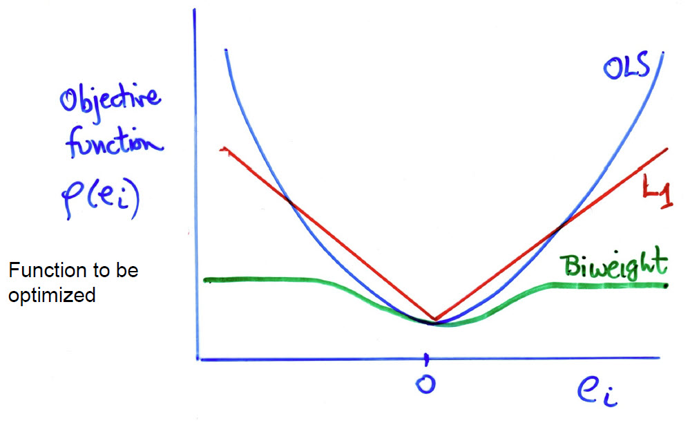
The method implemented in the heplots::robmlm() function belongs to the class of M-estimators. This generalizes OLS estimation by replacing the least squares criterion with a more robust version. The key idea is to relax the least squares criterion of minimizing \(Q(\mathbf{e}) = \Sigma e_i^2 = \Sigma (y_i - \hat{y}_i)^2\) by considering more general functions \(Q(\mathbf{e}, \rho)\), where the function \(\rho (e_i)\) can be chosen to reduce the impact of large outliers. In these terms,
- OLS uses \(\rho(e_i) = e_i^2\)
- \(L_1\) estimation uses \(\rho(e_i) = \vert e_i \vert\), the least absolute values
- A bit more complicated, the biweight function uses a squared measure of error up to some value \(c\) and then levels off thereafter,
\[ \rho(e_i) = \begin{cases} \left[ 1 - \left( \frac{e_i}{c} \right)^2 \right]^2 & |e_i| \leq c, \\ 1 & |e_i| > c. \end{cases} \]
These functions are more easily understood in a graph (Figure fig-weight-fns). The biweight function (ref?) has a property like Windsorizing— the squared error remains constant for residuals \(e_i > c\), with the tuning constant \(c = 4.685\) for MASS::psi.bisquare().
But, there is a problem here, in that weighted least squares is designed for situations where the observation weights are known in advance, for instance, when data points have unequal variances or when some observations are more reliable than others.
The solution, called iteratively reweighted least squares (IRLS), is to substitute computation for theory, and iterate between estimating the coefficients (with given weights) and determining weights for the observations in the next iteration. This is implemented in heplots::robmlm(), which generalizes the methods used in MASS::rlm(). …
13.6 Example: Penguin data
In earlier analyses of the Penguin data, a few points appeared unusual for their species in various plots (Figure fig-peng-bagplot, Figure fig-peng-ggplot-out) and a few were deemed overly influential in sec-peng-mvinfluence for the simple model peng.mlm predicting species. What effect does fitting a robust MANOVA have on the results? We can just substitute robmlm() for lm(). to fit the robust model.
The plot() method for a "robmlm" object give an index plot of the observation weights in the final iteration. I take some care here to color the points by species, label the points with the lowest weights and add my names for a couple of birds.
source(here::here("R", "penguin", "penguin-colors.R"))
col = peng.colors("dark")[peng$species]
plot(peng.rlm,
     segments = TRUE,
     id.weight = 0.6,
     col = col,
     cex.lab = 1.3)
  # label old friends
notables <- tibble(
  id = c(10, 283),
  name = c("HookNose", "Cyrano"),
  wts = peng.rlm$weights[id]
)
text(notables$id, notables$wts,
     label = notables$name, pos = 3,
     xpd = TRUE)
  # label species in axis at the top
ctr <- split(seq(nrow(peng)), peng$species) |> lapply(mean)
axis(side = 3, at=ctr, labels = names(ctr), cex.axis=1.2)
peng.rlm. Observations with weights < 0.5 are labeled with their case number.
The observations that are labeled here are among those which stood out as notable in other plots. In Figure fig-peng-robmlm-plot, the lowest four points are down-weighted considerably. Our friend “Cyrano” (283), the greatest outlier, gets a weight of exactly zero, so is effectively excluded from the model; “Hook Nose” (10) gets a weight of 0.13, and so he can’t do much damage.
Another way to assess the effect of using a robust model is to examine its’ effects on the model coefficients. heplots::rel_diff() calculates the relative difference, \(\vert x - y \vert / x\), expressed here as percent of change. As you can see below, the changes in most of the coefficients is rather small.
The largest differences are for the coefficients for Chinstrap, particularly for bill_depth and body_mass, which reflect the dramatic effect of effectively removing “Cyrano” from the analysis.
If you accept the premise of down-weighting cases with large residuals in robust methods, robmlm() provides a principled way to handle them. Bye-bye Cyrano—it’s been fun—but we can get along nicely without you.
TODO: Add chapter “What have we learned?”
Among other packages providing influence diagnostic plots for univariate response models, olsrr (Hebbali, 2024) provides a wide variety of measures. However, the graphic methods for these are mostly limited to simple index plots of the measure against case number. For hierarchical linear models, where observations are not independent, but are clustered within larger groups, the HLMdiag (Loy & Hofmann, 2014) provides functions like
hlm_influence()andhlm_augment()to generate influence diagnostics and combine them with residuals.↩︎Similar to the univariate version, hat values greater than 2 or 3 times their average, \(\bar{h} = p/n\) here, are considered large in the multivariate case. Values of the squared studentized residual \(R_i\) are calibrated by the Beta distribution, \(\text{Beta}(\alpha=0.95, q/2, (n-p-q)/2)\).↩︎
The tradeoff between simplifying assumptions, which makes computations easier and less restrictive models, achieved by increased computation lies at the heart of modern statistical methods. In Computer Age Statistical Inference, Efron & Hastie (2021) trace this thread in a wide variety ranging from classics in frequentist and Bayesian, through early computer-age topics to the most recent twenty-first century methods.↩︎