In univariate multiple regression models, we usually hope to have high correlations between the outcome \(y\) and each of the predictors, \(\mathbf{X} = [\mathbf{x}_1, \mathbf{x_2}, \dots]\). But high correlations among the predictors can cause problems in estimating and testing their effects. Exactly the same problems can exist in multivariate response models, because they involve only the relations among the predictor variables, so the problems and solutions discussed here apply equally to MLMs.
The problem of high correlations among the predictors in a model is called collinearity (or multicollinearity), referring to the situation when two or more predictors are very nearly linearly related to each other (collinear). This chapter illustrates the nature of collinearity geometrically, using data and confidence ellipsoids (sec-what-is-collin) It describes diagnostic measures to asses these effects (sec-measure-collin) and presents some novel visual tools for these purposes using the VisCollin package. These include tableplots (sec-tableplot) and collinearity biplots (sec-collin-biplots).
One class of solutions for collinearity involves regularization methods such as ridge regression (sec-ridge). Another collection of graphical methods, generalized ridge trace plots, implemented in the genridge package, sheds further light on what is accomplished by this technique. In sec-ridge-low-rank we see that, once again, PCA-related techniques like the biplot can be insightful—here, to understand the nature of collinearity and ridge regression. More generally, the methods of this chapter are further examples of how data and confidence ellipsoids can be used to visualize bias and precision of regression estimates.
Packages
In this chapter I use the following packages. Load them now.
8.1 What is collinearity?
Researchers who have studies standard treatments of linear models (e.g, Graybill (1961); Hocking (2013)) are often less than clear about what collinearity is, how to find its sources and how to take steps to resolve them. There are a number of important diagnostic measures that can help, but these are usually presented in a tabular display like Figure fig-collinearity-diagnostics-SPSS, which prompted this query on an online forum:
Some of my collinearity diagnostics have large values, or small values, or whatever they are not supposed to be.
- What is bad?
- If bad, what can I do about it?
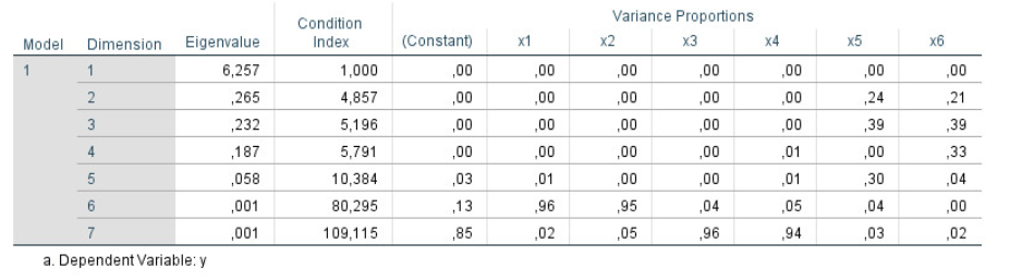
The trouble with displays like Figure fig-collinearity-diagnostics-SPSS is that the important information is hidden in a sea of numbers, some of which are bad when large, others bad when they are small and a large bunch which are irrelevant to interpretation.
In Friendly & Kwan (2009), we liken this problem to that of the reader of Martin Hansford’s successful series of books, Where’s Waldo. These consist of a series of full-page illustrations of hundreds of people and things and a few Waldos— a character wearing a red and white striped shirt and hat, glasses, and carrying a walking stick or other paraphernalia. Waldo was never disguised, yet the complex arrangement of misleading visual cues in the pictures made him very hard to find. Collinearity diagnostics often provide a similar puzzle: where should you look in traditional tabular displays?1

Recall the standard classical linear model for a response variable \(y\) with a collection of predictors in \(\mathbf{X} = (\mathbf{x}_1, \mathbf{x}_2, ..., \mathbf{x}_p)\)
\[ \begin{aligned} \mathbf{y} & = \beta_0 + \beta_1 \mathbf{x}_1 + \beta_2 \mathbf{x}_2 + \cdots + \beta_p \mathbf{x}_p + \boldsymbol{\epsilon} \\ & = \mathbf{X} \boldsymbol{\beta} + \boldsymbol{\epsilon} \; , \end{aligned} \]
for which the ordinary least squares solution is:
\[ \widehat{\mathbf{b}} = (\mathbf{X}^\mathsf{T} \mathbf{X})^{-1} \; \mathbf{X}^\mathsf{T} \mathbf{y} \; . \] The sampling variances and covariances of the estimated coefficients is \(\text{Var} (\widehat{\mathbf{b}}) = \sigma_\epsilon^2 \times (\mathbf{X}^\mathsf{T} \mathbf{X})^{-1}\) and \(\sigma_\epsilon^2\) is the variance of the residuals \(\boldsymbol{\epsilon}\), estimated by the mean squared error (MSE).
In the limiting case, collinearity becomes particularly problematic when one \(x_i\) is perfectly predictable from the other \(x\)s, i.e., \(R^2 (x_i | \text{other }x) = 1\). This is problematic because:
- there is no unique solution for the regression coefficients \(\mathbf{b} = (\mathbf{X}^\mathsf{T} \mathbf{X})^{-1} \mathbf{X} \mathbf{y}\);
- the standard errors \(s (b_i)\) of the estimated coefficients are infinite and t statistics \(t_i = b_i / s (b_i)\) are 0.
This extreme case reflects a situation when one or more predictors are effectively redundant, for example when you include two variables \(x\) and \(y\) and their sum \(z = x + y\) in a model. For instance, a dataset may include variables for income, expenses, and savings. But income is the sum of expenses and savings, so not all three should be used as predictors.
A more subtle case is the use ipsatized, defined as scores that sum to a constant, such as proportions of a total. You might have scores on tests of reading, math, spelling and geography. With ipsatized scores, any one of these is necessarily 1 \(-\) sum of the others, i.e., if reading is 0.5, math and geography are both 0.15, then geography must be 0.2. Once thre of the four scores are known, the last provides no new information.
More generally, collinearity refers to the case when there are very high multiple correlations among the predictors, such as \(R^2 (x_i | \text{other }x) \ge 0.9\). Note that you can’t tell simply by looking at the simple correlations. A large correlation \(r_{ij}\) is sufficient for collinearity, but not necessary—you can have variables \(x_1, x_2, x_3\) for which the pairwise correlation are low, but the multiple correlation is high.
The consequences are:
- The estimated coefficients have large standard errors, \(s(\hat{b}_j)\). They are multiplied by the square root of the variance inflation factor, \(\sqrt{\text{VIF}}\), discussed below.
- The large standard errors deflate the \(t\)-statistics, \(t = \hat{b}_j / s(\hat{b}_j)\), by the same factor, so a coefficient that would significant if the predictors were uncorrelated becomes insignificant when collinearity is present.
- Thus you may find a situation where an overall model is highly significant (large \(F\)-statistic), while no (or few) of the individual predictors are. This is a puzzlement!
- Beyond this, the least squares solution may have poor numerical accuracy (Longley, 1967), because the solution depends inversely on the determinant \(|\,\mathbf{X}^\mathsf{T} \mathbf{X}\,|\), which approaches 0 as multiple correlations increase.
- There is an interpretive problem as well. Recall that the coefficients \(\hat{b}\) are partial coefficients, meaning that they estimate change \(\Delta y\) in \(y\) when \(x\) changes by one unit \(\Delta x\), but holding all other variables constant. Then, the model may be trying to estimate something that does not occur in the data. (For example: predicting strength from the highly correlated height and weight)
8.1.1 Visualizing collinearity
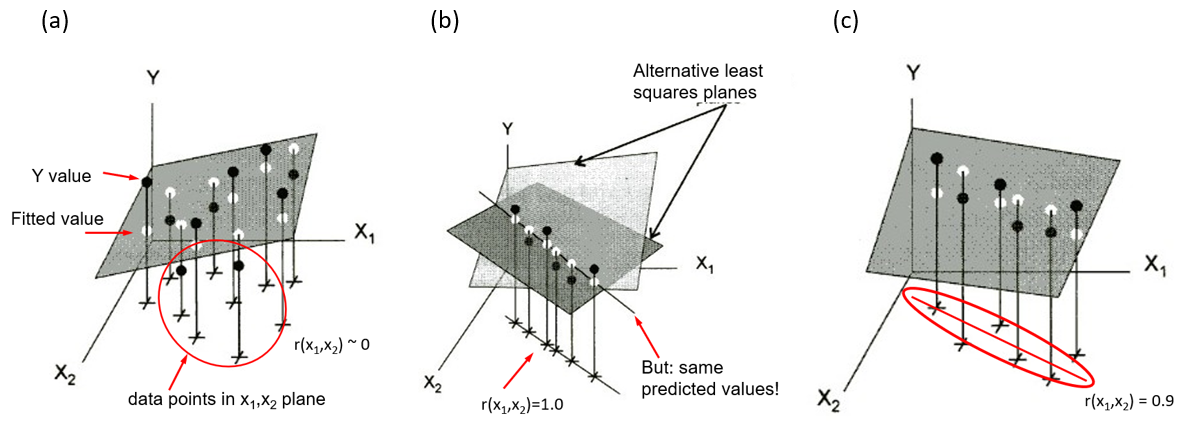
Collinearity can be illustrated in data space for two predictors in terms of the stability of the regression plane for a linear model Y = X1 + X2. Figure fig-collin-demo shows three cases as 3D plots of \((X_1, X_2, Y)\), where the correlation of predictors can be observed in the \((X_1, X_2)\) plane.
shows a case where \(X_1\) and \(X_2\) are uncorrelated as can be seen in their scatter in the horizontal plane (
+symbols). The gray regression plane is well-supported; a small change in Y for one observation won’t make much difference.In panel (b), \(X_1\) and \(X_2\) have a perfect correlation, \(r (x_1, x_2) = 1.0\). The regression plane is not unique; in fact there are an infinite number of planes that fit the data equally well. Note that, if all we care about is prediction (not the coefficients), we could use \(X_1\) or \(X_2\), or both, or any weighted sum of them in a model and get the same predicted values.
Shows a typical case where there is a strong correlation between \(X_1\) and \(X_2\). The regression plane here is unique, but is not well determined. A small change in Y can make quite a difference in the fitted value or coefficients, depending on the values of \(X_1\) and \(X_2\). Where \(X_1\) and \(X_2\) are far from their near linear relation in the botom plane, you can imagine that it is easy to tilt the plane substantially by a small change in \(Y\).
8.1.2 Data space and \(\beta\) space
It is also useful to visualize collinearity by comparing the representation in data space with the analogous view of the confidence ellipses for coefficients in beta space. To do so in this example, I generate data from a known model \(y = 3 x_1 + 3 x_2 + \epsilon\) with \(\epsilon \sim \mathcal{N} (0, 100)\) and various true correlations between \(x_1\) and \(x_2\), \(\rho_{12} = (0, 0.8, 0.97)\) 2.
First, I use MASS:mvrnorm() to construct a list of three data frames XY with the same means and standard deviations, but with different correlations. In each case, the variable \(y\) is generated with true coefficients beta \(=(3, 3)\), and the fitted model for that value of rho is added to a corresponding list of models, mods.
Code
library(MASS)
library(car)

set.seed(421)            # reproducibility
N <- 200                 # sample size
mu <- c(0, 0)            # means
s <- c(1, 1)             # standard deviations
rho <- c(0, 0.8, 0.97)   # correlations
beta <- c(3, 3)          # true coefficients

# Specify a covariance matrix, with standard deviations
#   s[1], s[2] and correlation r
Cov <- function(s, r){
  matrix(c(s[1],        r * s[1]*s[2],
         r * s[1]*s[2], s[2]), nrow = 2, ncol = 2)
}

# Generate a dataframe of X, y for each rho
# Fit the model for each
XY <- vector(mode ="list", length = length(rho))
mods <- vector(mode ="list", length = length(rho))
for (i in seq_along(rho)) {
  r <- rho[i]
  X <- mvrnorm(N, mu, Sigma = Cov(s, r))
  colnames(X) <- c("x1", "x2")
  y <- beta[1] * X[,1] + beta[2] * X[,2] + rnorm(N, 0, 10)

  XY[[i]] <- data.frame(X, y=y)
  mods[[i]] <- lm(y ~ x1 + x2, data=XY[[i]])
}
The estimated coefficients can then be extracted using coef() applied to each model:
Then, I define a function to plot the data ellipse (car::dataEllipse()) for each data frame and confidence ellipse (car::confidenceEllipse()) for the coefficients in the corresponding fitted model. In the plots in Figure fig-collin-data-beta, I specify the x, y limits for each plot so that the relative sizes of these ellipses are comparable, so that variance inflation can be assessed visually.
Code
do_plots <- function(XY, mod, r) {
  X <- as.matrix(XY[, 1:2])
  dataEllipse(X,
    levels= 0.95,
    col = "darkgreen",
    fill = TRUE, fill.alpha = 0.05,
    xlim = c(-3, 3),
    ylim = c(-3, 3), asp = 1)
  text(0, 3, bquote(rho == .(r)), cex = 2, pos = NULL)

  confidenceEllipse(mod,
    col = "red",
    fill = TRUE, fill.alpha = 0.1,
    xlab = expression(paste("x1 coefficient, ", beta[1])),
    ylab = expression(paste("x2 coefficient, ", beta[2])),
    xlim = c(-5, 10),
    ylim = c(-5, 10),
    asp = 1)
  points(beta[1], beta[2], pch = "+", cex=2)
  abline(v=0, h=0, lwd=2)
}

op <- par(mar = c(4,4,1,1)+0.1,
          mfcol = c(2, 3),
          cex.lab = 1.5)
for (i in seq_along(rho)) {
  do_plots(XY[[i]], mods[[i]], rho[i])
}
par(op)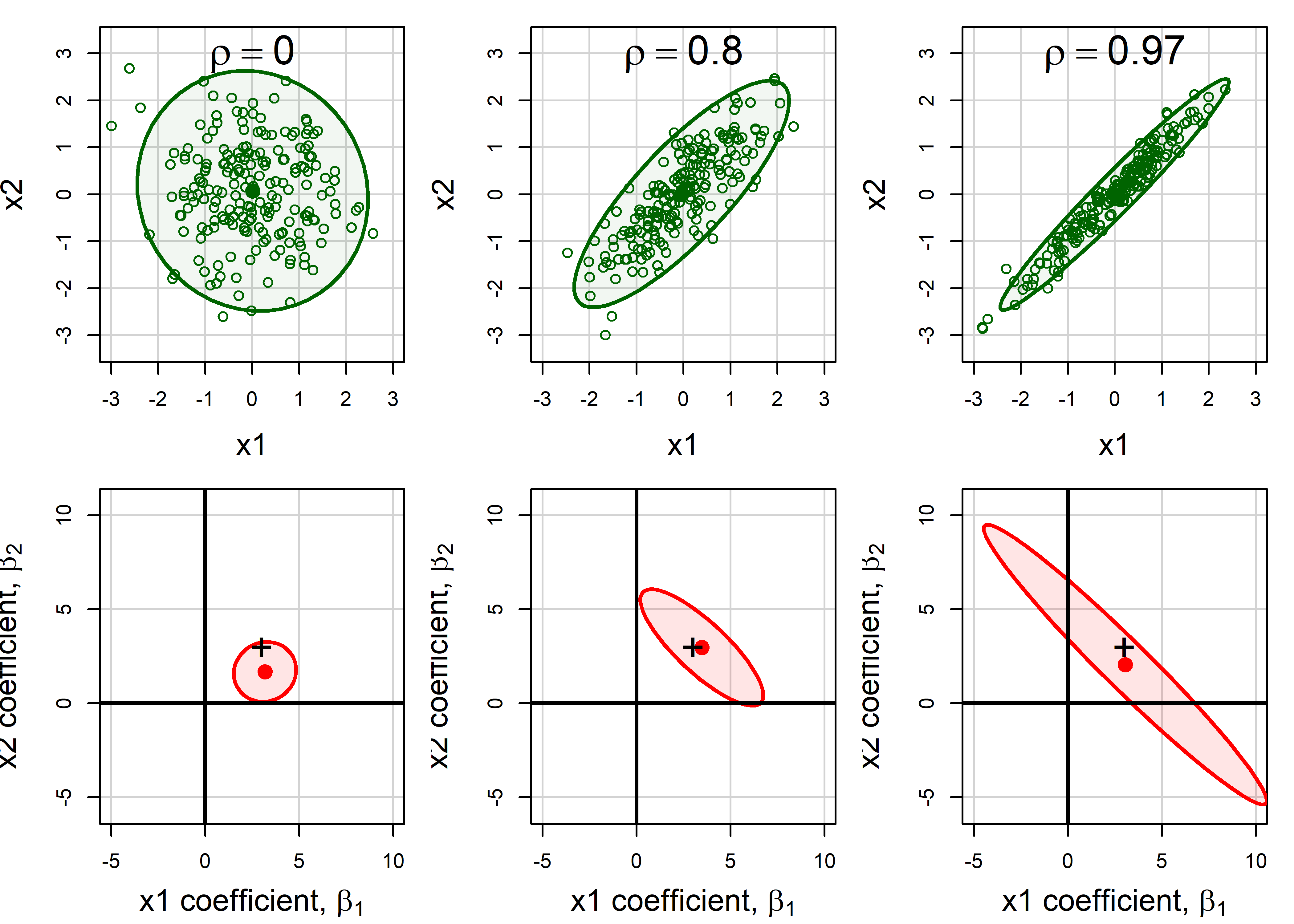
Recall (sec-betaspace) that the confidence ellipse for \((\beta_1, \beta_2)\) is just a 90 degree rotation (and rescaling) of the data ellipse for \((x_1, x_2)\): it is wide (more variance) in any direction where the data ellipse is narrow.
The shadows of the confidence ellipses on the coordinate axes in Figure fig-collin-data-beta represent the standard errors of the coefficients, and get larger with increasing \(\rho\). This is the effect of variance inflation, described in the following section.
8.2 Measuring collinearity
This section first describes the variance inflation factor (VIF) used to measure the effect of possible collinearity on each predictor and a collection of diagnostic measures designed to help interpret these. Then I describe some novel graphical methods to make these effects more readily understandable, to answer the “Where’s Waldo” question posed at the outset.
8.2.1 Variance inflation factors
How can we measure the effect of collinearity? The essential idea is to compare, for each predictor the variance \(s^2 (\widehat{b_j})\) that the coefficient that \(x_j\) would have if it was totally unrelated to the other predictors to the actual variance it has in the given model.
For two predictors such as shown in Figure fig-collin-data-beta the sampling variance of \(x_1\) can be expressed as
\[ s^2 (\widehat{b_1}) = \frac{MSE}{(n-1) \; s^2(x_1)} \; \times \; \left[ \frac{1}{1-r^2_{12}} \right] \] The first term here is the variance of \(b_1\) when the two predictors are uncorrelated. The term in brackets represents the variance inflation factor (Marquardt, 1970), the amount by which the variance of the coefficient is multiplied as a consequence of the correlation \(r_{12}\) of the predictors. As \(r_{12} \rightarrow 1\), the variances approaches infinity.
More generally, with any number of predictors, this relation has a similar form, replacing the simple correlation \(r_{12}\) with the multiple correlation predicting \(x_j\) from all others,
\[ s^2 (\widehat{b_j}) = \frac{MSE}{(n-1) \; s^2(x_j)} \; \times \; \left[ \frac{1}{1-R^2_{j | \text{others}}} \right] \] So, we have that the variance inflation factors are:
\[ \text{VIF}_j = \frac{1}{1-R^2_{j \,|\, \text{others}}} \] In practice, it is often easier to think in terms of the square root, \(\sqrt{\text{VIF}_j}\) as the multiplier of the standard errors. The denominator, \(1-R^2_{j | \text{others}}\) is sometimes called tolerance, a term I don’t find particularly useful, but it is just the proportion of the variance of \(x_j\) that is not explainable from the others.3
For the cases shown in Figure fig-collin-data-beta the VIFs and their square roots are:
Generalized VIF
Note that when there are terms in the model with more than one degree of freedom, such as education with four levels (and hence 3 df) or a polynomial term specified as poly(age, 3), that variable, education or age is represented by three separate \(x\)s in the model matrix, and the standard VIF calculation gives results that vary with how those terms are coded in the model.
To allow for these cases, Fox & Monette (1992) define generalized, GVIFs as the inflation in the squared area of the confidence ellipse for the coefficients of such terms, relative to what would be obtained with uncorrelated data. Visually, this can be seen by comparing the areas of the ellipses in the bottom row of Figure fig-collin-data-beta. Because the magnitude of the GVIF increases with the number of degrees of freedom for the set of parameters, Fox & Monette suggest the analog \(\sqrt{\text{GVIF}^{1/2 \text{df}}}\) as the measure of impact on standard errors. This is what car::vif() calculates for a factor or other term with more than 1 df.
Example 8.1 Cars data
This example uses the cars dataset in the VisCollin package which contains various measures of size and performance on 406 models of automobiles from 1982. Interest is focused on predicting gas mileage, mpg.
data(cars, package = "VisCollin")
str(cars)
# 'data.frame': 406 obs. of  10 variables:
#  $ make    : Factor w/ 30 levels "amc","audi","bmw",..: 6 4 22 1 12 12 6 22 23 1 ...
#  $ model   : chr  "chevelle" "skylark" "satellite" "rebel" ...
#  $ mpg     : num  18 15 18 16 17 15 14 14 14 15 ...
#  $ cylinder: int  8 8 8 8 8 8 8 8 8 8 ...
#  $ engine  : num  307 350 318 304 302 429 454 440 455 390 ...
#  $ horse   : int  130 165 150 150 140 198 220 215 225 190 ...
#  $ weight  : int  3504 3693 3436 3433 3449 4341 4354 4312 4425 3850 ...
#  $ accel   : num  12 11.5 11 12 10.5 10 9 8.5 10 8.5 ...
#  $ year    : int  70 70 70 70 70 70 70 70 70 70 ...
#  $ origin  : Factor w/ 3 levels "Amer","Eur","Japan": 1 1 1 1 1 1 1 1 1 1 ...
We fit a model predicting gas mileage (mpg) from the number of cylinders, engine displacement, horsepower, weight, time to accelerate from 0 – 60 mph and model year (1970–1982). Perhaps surprisingly, only weight and year appear to significantly predict gas mileage. What’s going on here?
cars.mod <- lm (mpg ~ cylinder + engine + horse +
                      weight + accel + year,
                data=cars)
Anova(cars.mod)
# Anova Table (Type II tests)
#
# Response: mpg
#           Sum Sq  Df F value Pr(>F)
# cylinder      12   1    0.99   0.32
# engine        13   1    1.09   0.30
# horse          0   1    0.00   0.98
# weight      1214   1  102.84 <2e-16 ***
# accel          8   1    0.70   0.40
# year        2419   1  204.99 <2e-16 ***
# Residuals   4543 385
# ---
# Signif. codes:  0 '***' 0.001 '**' 0.01 '*' 0.05 '.' 0.1 ' ' 1
We check the variance inflation factors, using car::vif(). We see that most predictors have very high VIFs, indicating moderately severe multicollinearity.
According to \(\sqrt{\text{VIF}}\), the standard error of cylinder has been multiplied by \(\sqrt{10.63} = 3.26\) and it’s \(t\)-value is divided by this number, compared with the case when all predictors are uncorrelated. engine, horse and weight suffer a similar fate.
If we also included the factor origin in the models, we would get the generalized GVIF:
In the linear regression model with standardized predictors, the covariance matrix of the estimated intercept-excluded parameter vector \(\mathbf{b}^\star\) has the simpler form, \[ \mathcal{V} (\mathbf{b}^\star) = \frac{\sigma^2}{n-1} \mathbf{R}^{-1}_{X} \; . \] where \(\mathbf{R}_{X}\) is the correlation matrix among the predictors. It can then be seen that the VIF\(_j\) are just the diagonal entries of \(\mathbf{R}^{-1}_{X}\).
More generally, the matrix \(\mathbf{R}^{-1}_{X} = (r^{ij})\), when standardized to a correlation matrix as \(-r^{ij} / \sqrt{r^{ii} \; r^{jj}}\) gives the matrix of all partial correlations, \(r_{ij} \,|\, \text{others}\).
This inverse connection is analogous to the dual relationship (sec-data-beta-space) between ellipses in data space, based on \(\mathbf{X}^\top \mathbf{X}\) and in \(\beta\)-space, based on \((\mathbf{X}^\top \mathbf{X})^{-1}\).
8.2.2 VIF displays
Beyond the console output from car::vif(), the easystats suite of packages has some useful functions for displaying VIFs in helpful tables and plots. performance::check_collinearity() calculates VIFs and their standard errors and returns a "check_collinearity" data frame. The plot method for this uses a log scale for VIF because it is multiples of variance that matter here. It uses intervals of 1-5, 5-10, 10+ to highlight low, medium and high variance inflation with colored backgrounds.
cars.collin <- check_collinearity(cars.mod)

plot(cars.collin,
     linewidth = 1.1,
     size_point = 5, size_title = 16, base_size = 14)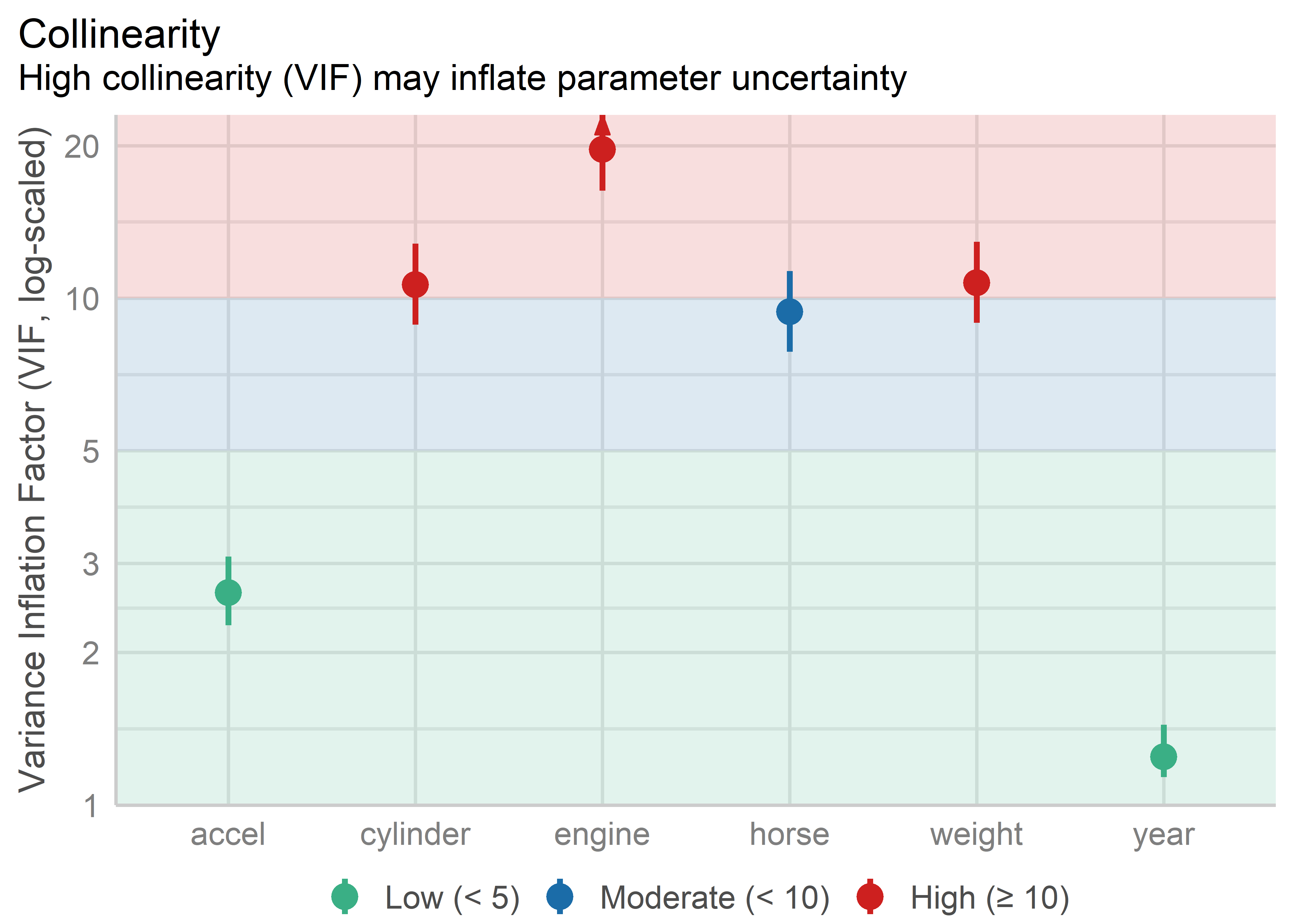
The graphic properties here help to make the problematic variables more apparent than in a table of numbers, though the underlying message is the same. Number of cylinders, engine displacement and weight are the collinearity bad boys.
Knowing this helps to pin Waldo down a bit, but to really find him, we need a few more diagnostics and better graphical methods.
8.2.3 Collinearity diagnostics
OK, we now know that large VIF\(_j\) indicate predictor coefficients whose estimation is degraded due to large \(R^2_{j \,|\, \text{others}}\). But for this to be useful, we need to determine:
- how many dimensions in the space of the predictors are associated with nearly collinear relations?
- which predictors are most strongly implicated in each of these?
Answers to these questions are provided using measures developed by Belsley and colleagues (Belsley et al., 1980; Belsley, 1991). These measures are based on the eigenvalues \(\lambda_1, \lambda_2, \dots \lambda_p\) of the correlation matrix \(R_{X}\) of the predictors (preferably centered and scaled, and not including the constant term for the intercept), and the corresponding eigenvectors in the columns of \(\mathbf{V}_{p \times p}\), given by the the eigen decomposition
\[ \mathbf{R}_{X} = \mathbf{V} \boldsymbol{\Lambda} \mathbf{V}^\mathsf{T} \; . \]
By elementary matrix algebra, the eigen decomposition of \(\mathbf{R}_{XX}^{-1}\) is then
\[ \mathbf{R}_{X}^{-1} = \mathbf{V} \boldsymbol{\Lambda}^{-1} \mathbf{V}^\mathsf{T} \; , \tag{8.1}\]
so, \(\mathbf{R}_{X}\) and \(\mathbf{R}_{XX}^{-1}\) have the same eigenvectors, and the eigenvalues of \(\mathbf{R}_{X}^{-1}\) are just \(\lambda_i^{-1}\). Using Equation eq-rxinv-eigen, the variance inflation factors may be expressed as
\[ \text{VIF}_j = \sum_{k=1}^p \frac{V^2_{jk}}{\lambda_k} \; . \tag{8.2}\]
This shows that (a) only the small eigenvalues contribute to variance inflation, but (b) only for those predictors that have large eigenvector coefficients \(V_{jk}\) on those small components.
These facts lead to the following diagnostic statistics for collinearity:
-
Condition indices (\(\kappa\)): The smallest of the eigenvalues, those for which \(\lambda_j \approx 0\), indicate collinearity and the number of small values indicates the number of near collinear relations. Because the sum of the eigenvalues, \(\Sigma \lambda_i = p\) increases with the number of predictors \(p\), it is useful to scale them all inversely in relation to the largest so that larger numbers are worse. This leads to condition indices, defined as \(\kappa_j = \sqrt{ \lambda_1 / \lambda_j}\). These have the property that the resulting numbers have common interpretations regardless of the number of predictors.
- For completely uncorrelated predictors, all \(\kappa_j = 1\).
- As any \(\lambda_k \rightarrow 0\) the corresponding \(\kappa_j \rightarrow \infty\).
- As a rule of thumb, Belsley (1991) suggests that values \(\kappa_j > 10\) reflect a moderate problem, while \(\kappa_j > 30\) indicates severe collinearity. Even worse values use bounds of 100, 300, … as collinearity becomes more extreme.
Variance decomposition proportions: Large VIFs indicate variables that are involved in some nearly collinear relations, but they don’t indicate which other variable(s) each is involved with. For this purpose, Belsley et al. (1980) and Belsley (1991) proposed calculation of the proportions of variance of each variable associated with each principal component as a decomposition of the coefficient variance for each dimension. These are simply the the terms in Equation eq-VIF-sum divided by their sum.
These measures can be calculated using VisCollin::colldiag(). For the current model, the usual display contains both the condition indices and variance proportions. However, even for a small example, it is often difficult to know what numbers to pay attention to.
(cd <- colldiag(cars.mod, center=TRUE))
# Condition
# Index   -- Variance Decomposition Proportions --
#           cylinder engine horse weight accel year
# 1   1.000 0.005    0.003  0.005 0.004  0.009 0.010
# 2   2.252 0.004    0.002  0.000 0.007  0.022 0.787
# 3   2.515 0.004    0.001  0.002 0.010  0.423 0.142
# 4   5.660 0.309    0.014  0.306 0.087  0.063 0.005
# 5   8.342 0.115    0.000  0.654 0.715  0.469 0.052
# 6  10.818 0.563    0.981  0.032 0.176  0.013 0.004
Belsley (1991) recommends that the sources of collinearity be diagnosed (a) only for those components with large \(\kappa_j\), and (b) for those components for which the variance proportion is large (say, \(\ge 0.5\)) on two or more predictors. The print method for "colldiag" objects has a fuzz argument controlling this. The descending = TRUE argument puts the rows with the largest condition indices at the top.
print(cd, fuzz = 0.5, descending = TRUE)
# Condition
# Index   -- Variance Decomposition Proportions --
#           cylinder engine horse weight accel year
# 6  10.818 0.563    0.981   .     .      .     .
# 5   8.342  .        .     0.654 0.715   .     .
# 4   5.660  .        .      .     .      .     .
# 3   2.515  .        .      .     .      .     .
# 2   2.252  .        .      .     .      .    0.787
# 1   1.000  .        .      .     .      .     .
The Waldo mystery is nearly solved, if you can read that table with these recommendations in mind. There are two nearly collinear relations among the predictors, corresponding to the two smallest dimensions with largest condition indices.
- Dimension 6 reflects the high correlation between number of cylinders and engine displacement.
- Dimension 5 reflects the high correlation between horsepower and weight,
Note that the high variance proportion for year (0.787) on the second component creates no problem and should be ignored because (a) the condition index is low and (b) it shares nothing with other predictors.
8.3 Tableplots
The default tabular display of condition indices and variance proportions from colldiag() is what triggered the comparison to “Where’s Waldo”. It suffers from the fact that the important information — (a) how many Waldos? (b) where are they hiding — is disguised by being embedded in a sea of mostly irrelevant numbers, just as Waldo is hiding in Figure fig-wheres-waldo in a field of stripy things. The simple option of using a principled fuzz factor helps considerably, but not entirely.
The simplified tabular display above can be improved to make the patterns of collinearity more visually apparent and to signify warnings directly to the eyes. A tableplot (Kwan et al., 2009) is a semi-graphic display that presents numerical information in a table using shapes proportional to the value in a cell and other visual attributes (shape type, color fill, and so forth) to encode other information.
For collinearity diagnostics, these show:
the condition indices, using squares whose background color is red for condition indices > 10, brown for values > 5 and green otherwise, reflecting danger, warning and OK respectively. The value of the condition index is encoded within this using a white square whose side is proportional to the value (up to some maximum value,
cond.maxthat fills the cell).Variance decomposition proportions are shown by filled circles whose radius is proportional to those values and are filled (by default) with shades ranging from white through pink to red. Rounded values of those diagnostics are printed in the cells.
The tableplot below (Figure fig-cars-tableplot) encodes all the information from the values of colldiag() printed above. To aid perception, it uses prop.col color breaks such that variance proportions < 0.3 are shaded white. The visual message is that one should attend to collinearities with large condition indices and large variance proportions implicating two or more predictors.
tableplot(cd, title = "Tableplot of cars data",
          cond.max = 30 )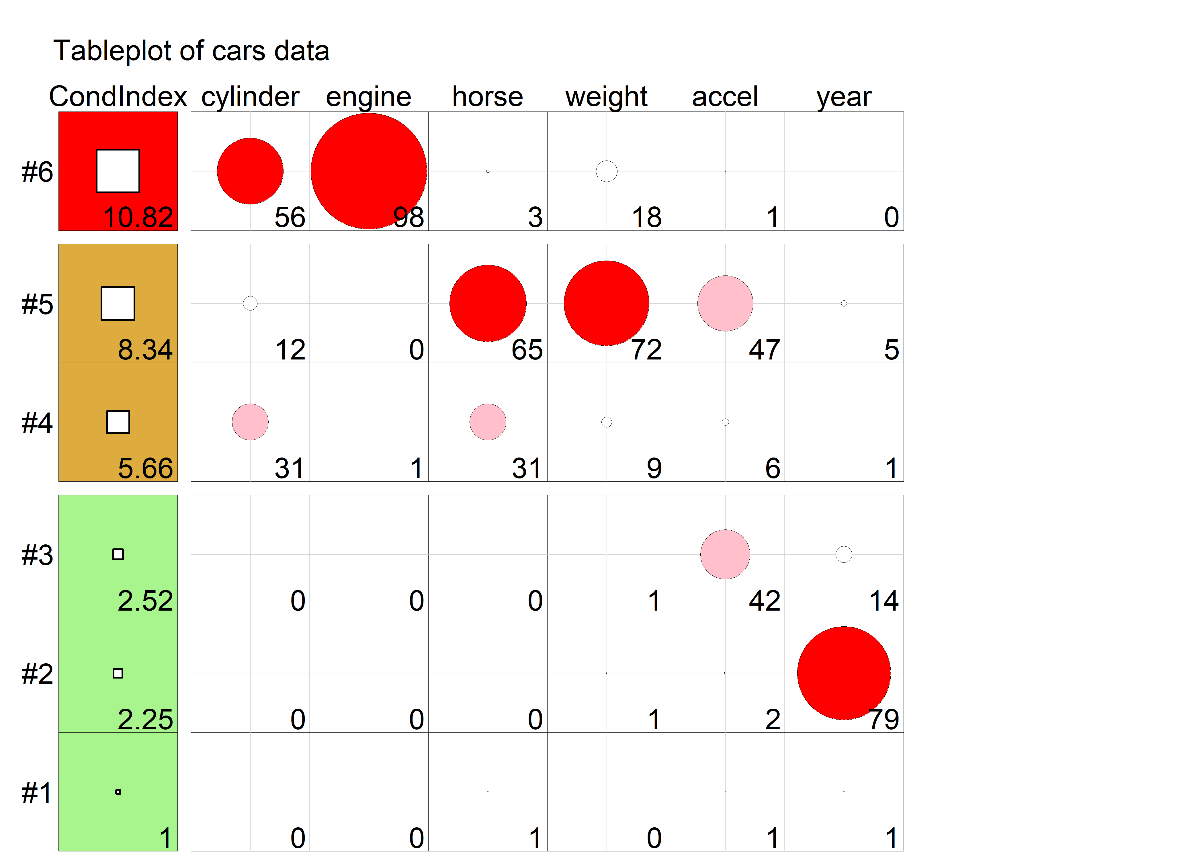
cars data. In column 1, the square symbols are scaled relative to a maximum condition index of 30. In the remaining columns, variance proportions (times 100) are shown as circles scaled relative to a maximum of 100.
The information in Figure fig-cars-tableplot is essentially the same as the fuzzed version of the printed output from colldiag() shown above; however the graphic encoding of the tableplot makes the pattern of the numbers and their
8.4 Collinearity biplots
As we have just seen, the collinearity diagnostics are all functions of the eigenvalues and eigenvectors of the correlation matrix of the predictors in the regression model, or alternatively, the SVD of the \(\mathbf{X}\) matrix in the linear model (excluding the constant). We can use our trusty multivariate juicer the biplot (sec-biplot) to see where the problems lie in a space that relates to observations and variables together.
A standard biplot (Gabriel, 1971; Gower & Hand, 1996) showing the 2 (or 3) largest dimensions in the data is what we usually want to use. By projecting multivariate data into a low-D space, we can see the main variation in the data an how this related to the variables.
However the standard biplot of the largest dimensions is less useful for visualizing the relations among the predictors that lead to nearly collinear relations. Instead, biplots of the smallest dimensions show these relations directly, and can show other features of the data as well, such as outliers and leverage points. I use prcomp(X, scale.=TRUE) to obtain the PCA of the correlation matrix of the predictors in the cars dataset:
cars.X <- cars |>
  select(where(is.numeric)) |>
  select(-mpg) |>
  tidyr::drop_na()
cars.pca <- prcomp(cars.X, scale. = TRUE)
cars.pca
# Standard deviations (1, .., p=6):
# [1] 2.070 0.911 0.809 0.367 0.245 0.189
#
# Rotation (n x k) = (6 x 6):
#             PC1     PC2    PC3    PC4     PC5     PC6
# cylinder -0.454 -0.1869  0.168 -0.659 -0.2711 -0.4725
# engine   -0.467 -0.1628  0.134 -0.193 -0.0109  0.8364
# horse    -0.462 -0.0177 -0.123  0.620 -0.6123 -0.1067
# weight   -0.444 -0.2598  0.278  0.350  0.6860 -0.2539
# accel     0.330 -0.2098  0.865  0.143 -0.2774  0.0337
# year      0.237 -0.9092 -0.335  0.025 -0.0624  0.0142
The standard deviations above are the square roots \(\sqrt{\lambda_j}\) of the eigenvalues of the correlation matrix; these are returned in the sdev component of the "prcomp" object. The eigenvectors are returned in the rotation component. Their orientations are arbitrary and can be reversed for ease of interpretation. Because we are interested in seeing the relative magnitude of variable vectors, we are also free to multiply them all by any constant to make them to zoom in or out, making them more visible in relation to the scores for the cars.
I use factoextra::fviz_pca_biplot() for the biplot in Figure fig-cars-collin-biplot because I want to illustrate identification of noteworthy points with geom_text_repel().
cars.pca$rotation <- -2.5 * cars.pca$rotation    # reflect & scale var vectors

ggp <- fviz_pca_biplot(
  cars.pca,
  axes = 6:5,
  geom = "point",
  col.var = "blue",
  labelsize = 5,
  pointsize = 1.5,
  arrowsize = 1.5,
  addEllipses = TRUE,
  ggtheme = ggplot2::theme_bw(base_size = 14),
  title = "Collinearity biplot for cars data")

# add point labels for outlying points
dsq <- heplots::Mahalanobis(cars.pca$x[, 6:5])
scores <- as.data.frame(cars.pca$x[, 6:5])
scores$name <- rownames(scores)

ggp + geom_text_repel(data = scores[dsq > qchisq(0.95, df = 6),],
                aes(x = PC6,
                    y = PC5,
                    label = name),
                vjust = -0.5,
                size = 5)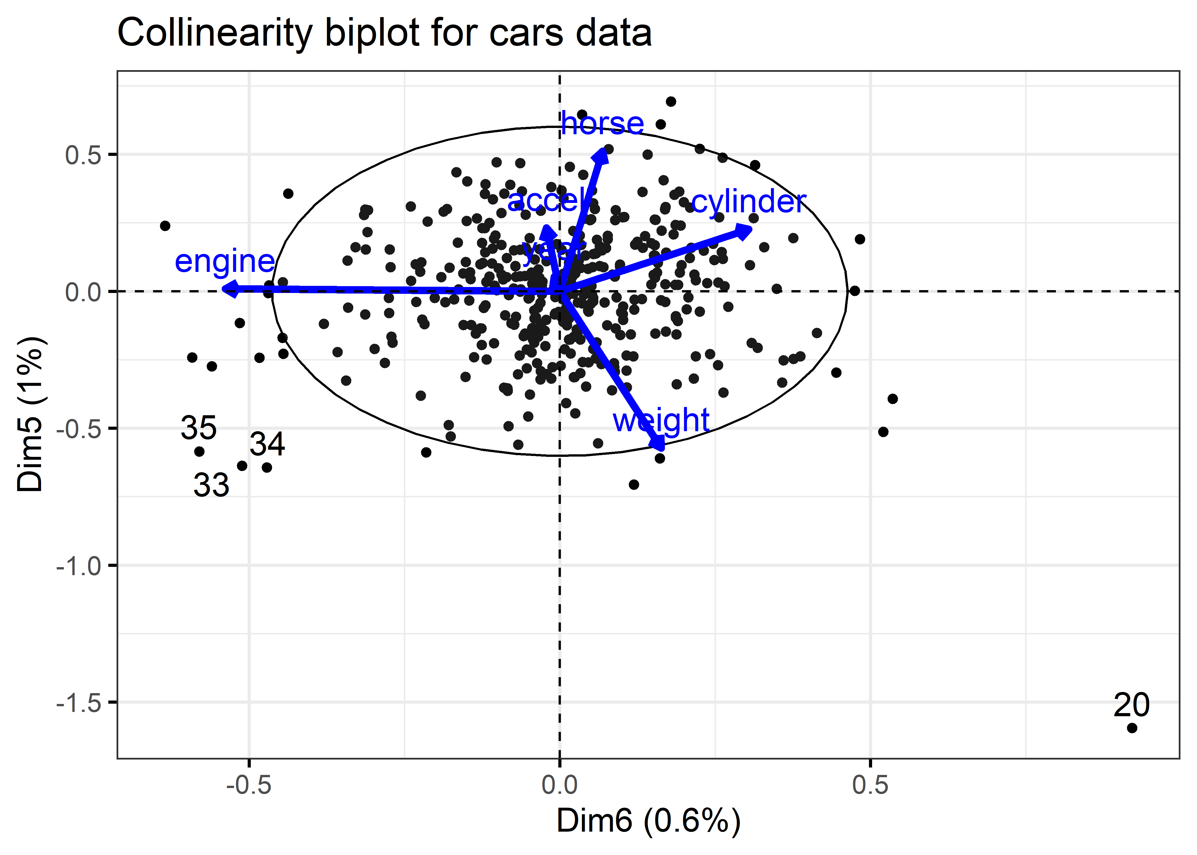
As with the tabular display of variance proportions, Waldo is hiding in the dimensions associated with the smallest eigenvalues (largest condition indices). As well, it turns out that outliers in the predictor space (also high leverage observations) can often be seen as observations far from the centroid in the space of the smallest principal components.
The projections of the variable vectors in Figure fig-cars-collin-biplot on the Dimension 5 and Dimension 6 axes are proportional to their variance proportions shown above. The relative lengths of these variable vectors can be considered to indicate the extent to which each variable contributes to collinearity for these two near-singular dimensions.
Thus, we see again that Dimension 6 is largely determined by engine size, with a substantial (negative) relation to cylinder. Dimension 5 has its strongest relations to weight and horse.
Moreover, there is one observation, #20, that stands out as an outlier in predictor space, far from the centroid. It turns out that this vehicle, a Buick Estate wagon, is an early-year (1970) American behemoth. It had an 8-cylinder, 455 cu. in, 225 horse-power engine, and able to go from 0 to 60 mph in 10 sec. (Its MPG is only slightly under-predicted from the regression model, however.)
With PCA and the biplot, we are used to looking at the dimensions that account for the most variation, but the answer to Where’s Waldo? is that he is hiding in the smallest data dimensions, just as he does in Figure fig-wheres-waldo where the weak signals of his stripped shirt, hat and glasses are embedded in a visual field of noise. As we just saw, outliers hide there also, hoping to escape detection. These small dimensions are also implicated in ridge regression as we will see shortly (sec-ridge).
8.5 Remedies for collinearity: What can I do?
Collinearity is often a data problem, for which there is no magic cure. Nevertheless there are some general guidelines and useful techniques to address this problem.
Pure prediction: If we are only interested in predicting / explaining an outcome, and not the model coefficients or which are “significant”, collinearity can be largely ignored. The fitted values are unaffected by collinearity, even in the case of perfect collinearity as shown in Figure fig-collin-demo (b).
-
Structural collinearity: Sometimes collinearity results from structural relations among the variables that relate to how they have been defined.
For example, polynomial terms, like \(x, x^2, x^3\) or interaction terms like \(x_1, x_2, x_1 * x_2\) are necessarily correlated. A simple cure is to center the predictors at their means, using \(x - \bar{x}, (x - \bar{x})^2, (x - \bar{x})^3\) or \((x_1 - \bar{x}_1), (x_2 - \bar{x}_2), (x_1 - \bar{x}_1) * (x_2 - \bar{x}_2)\). Centering removes the spurious ill-conditioning, thus reducing the VIFs. Note that in polynomial models, using
y ~ poly(x, 3)to specify a cubic model generates orthogonal (uncorrelated) regressors, whereas iny ~ x + I(x^2) + I(x^3)the terms have built-in correlations.When some predictors share a common cause, as in GNP or population in time-series or cross-national data, you can reduce collinearity by re-defining predictors to reflect per capita measures. In a related example with sports data, when you have cumulative totals (e.g., runs, hits, homeruns in baseball) for players over years, expressing these measures as per year will reduce the common effect of longevity on these measures.
-
Model re-specification:
Drop one or more regressors that have a high VIF, if they are not deemed to be essential to understanding the model. Care must be taken here to not omit variables which should be controlled or accounted for in interpretation.
Replace highly correlated regressors with less correlated linear combination(s) of them. For example, two related variables, \(x_1\) and \(x_2\) can be replaced without any loss of information by replacing them with their sum and difference, \(z_1 = x_1 + x_2\) and \(z_2 = x_1 - x_2\). For instance, in a dataset on fitness, we may have correlated predictors of resting pulse rate and pulse rate while running. Transforming these to average pulse rate and their difference gives new variables which are interpretable and less correlated.
-
Statistical remedies:
Transform the predictors \(\mathbf{X}\) to uncorrelated principal component scores \(\mathbf{Z} = \mathbf{X} \mathbf{V}\), and regress \(\mathbf{y}\) on \(\mathbf{Z}\). These will have the identical overall model fit without loss of information. A related technique is incomplete principal components regression, where some of the smallest dimensions (those causing collinearity) are omitted from the model. The trade-off is that it may be more difficult to interpret what the model means, but this can be countered with a biplot, showing the projections of the original variables into the reduced space of the principal components.
Use regularization methods such as ridge regression and lasso, which correct for collinearity by introducing shrinking coefficients towards 0, but inducing a small amount of bias. I illustrate ridge regression below (sec-ridge) using the genridge package for visualization methods.
Use Bayesian regression. If multicollinearity prevents a regression coefficient from being estimated precisely, Bayesian regression (e.g., Pesaran & Smith (2019)) can reduce collinearity by imposing shrinkage priors; these incorporate prior information to regularize the model, making it less sensitive to correlated predictors and reducing its posterior varioance.
Example 8.2 Centering
To illustrate the effect of centering a predictor in a polynomial model, I generate data with a perfect quadratic relationship, \(y = x^2\) and consider the correlations of \(y\) with \(x\) and with \((x - \bar{x})^2\). The correlation of \(y\) with \(x\) is 0.97, while the correlation of \(y\) with \((x - \bar{x})^2\) is zero.
x <- 1:20
y1 <- x^2
y2 <- (x - mean(x))^2
XY <- data.frame(x, y1, y2)

(R <- cor(XY))
#        x    y1    y2
# x  1.000 0.971 0.000
# y1 0.971 1.000 0.238
# y2 0.000 0.238 1.000
The effect of centering here is remove the linear association in what is a purely quadratic relationship. This can be seen in Figure fig-collin-centering by plotting y1 and y2 against x.
r1 <- R[1, 2]
r2 <- R[1, 3]

gg1 <-
ggplot(XY, aes(x = x, y = y1)) +
  geom_point(size = 3) +
  geom_smooth(method = "lm", formula = y~x,
              linewidth = 2, se = FALSE) +
  labs(x = "X", y = "Y") +
  theme_bw(base_size = 16) +
  annotate("text", x = 5, y = 350, size = 6,
           label = paste("X Uncentered\nr =", round(r1, 3)))

gg2 <-
  ggplot(XY, aes(x = x, y = y2)) +
  geom_point(size = 3) +
  geom_smooth(method = "lm", formula = y~x,
              linewidth = 2, se = FALSE) +
  labs(x = "X", y = "Y") +
  theme_bw(base_size = 16) +
  annotate("text", x = 5, y = 80, size = 6,
           label = paste("X Centered\nr =", round(r2, 3)))

gg1 + gg2         # show plots side-by-side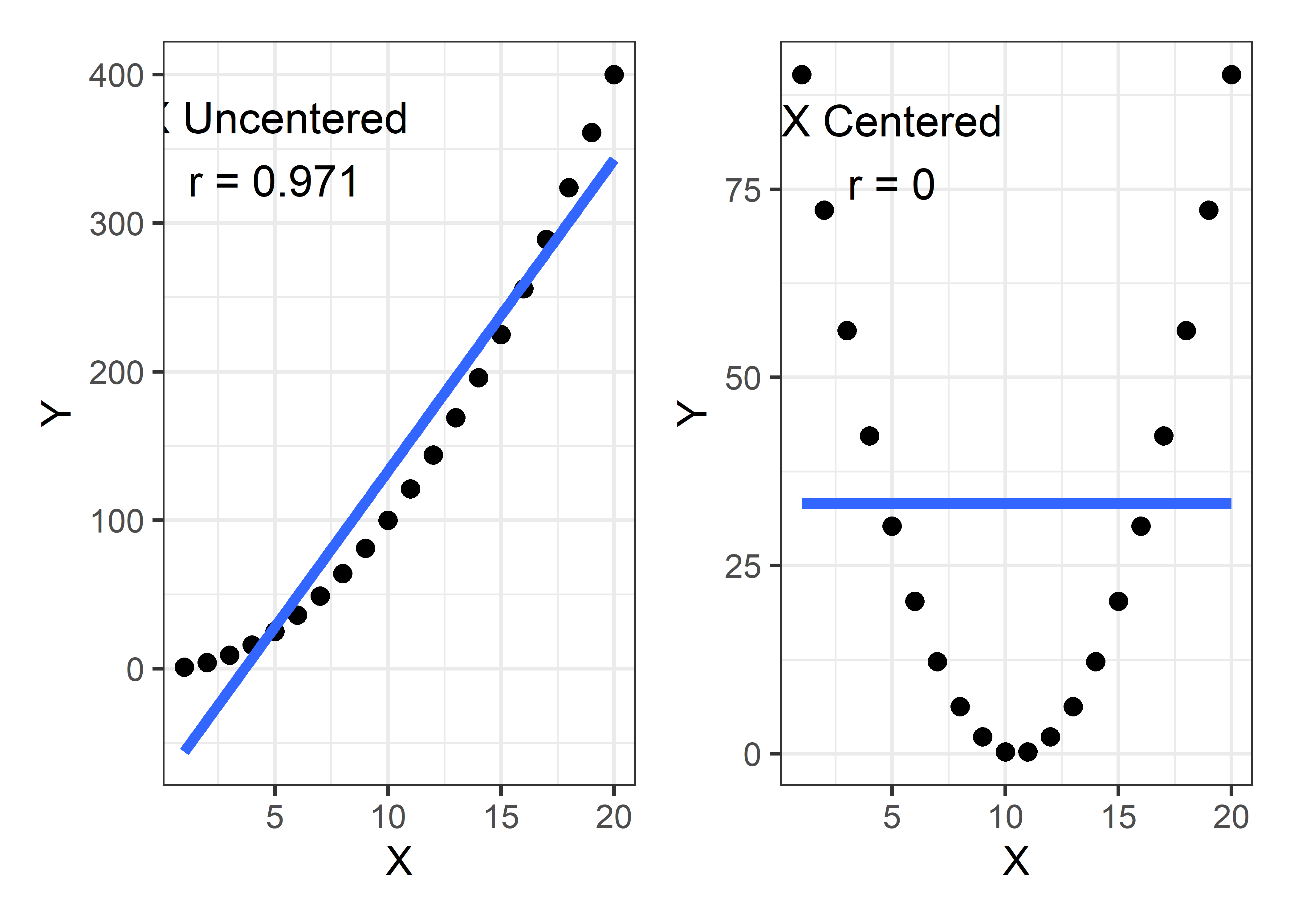
Interpretation
Centering of predictors has an added benefit: the fitted coefficients are easier to interpret*, particularly the intercept in this example. In the left panel of Figure fig-collin-centering, the fitted blue line has an intercept of -77 and slope of 21. But x = 0 is outside the range of the data and it is hard to understand what -77 means.4
Contrast this with the coefficients for the model using the centered x and shown by the blue line in the right panel. The slope of the line is clearly zero and the intercept 33.25 is the average value of y.
This ease of interpretation is more pronounced in polynomial models. For example, in the quadratic model \(y = \beta_0 + \beta_1 x + \beta_2 x^2\) with \(x\) uncentered, the slope coefficient \(\beta_1\) gives the slope of the curve at the value \(x = 0\), which may be well-outside the range of data. With a centered predictor \(x^\star = x - \bar{x}\), the analogous coefficient \(\beta_1^\star\) in the model \(y = \beta_0^\star + \beta_1^\star x^\star + \beta_2^\star (x^\star)^2\) is gives the slope at the mean value of \(x\).
Example 8.3 Interactions and response surface models
Centering of numeric predictors becomes even more important in polynomial models that also include interaction effects, such as response surface models this include all quadratic terms of the predictors and all possible pairwise interactions. The simple notation in an R formula5 is y ~ (x1 + x2 + ...)^2. Spelled out for two predictors with uncentered x1 and x2, this would be:
Here, the product term is necessarily correlated with each of the predictors involved. This gives more opportunities for collinearity and more places for Waldo to hide.
To illustrate, I use the the genridge::Acetylene dataset, which gives results from a manufacturing experiment to study the yield of acetylene in relation to reactor temperature (temp), the ratio of two components and the contact time in the reactor. A naive response surface model might suggest that yield is quadratic in time and there are potential interactions among all pairs of predictors. Without centering time the quadratic effect is fit as a term I(time^2), which simply squares the value of time.6
These results are horrible! How much does centering help? I first center all three predictors and then use update() to re-fit the same model using the centered data.
Acetylene.centered <-
  Acetylene |>
  mutate(temp = temp - mean(temp),
         time = time - mean(time),
         ratio = ratio - mean(ratio))

acetyl.mod1 <- update(acetyl.mod0,
                      data=Acetylene.centered)

(acetyl.vif1 <- vif(acetyl.mod1))
#       temp      ratio       time  I(time^2)  temp:time temp:ratio
#      57.09       1.09      81.57      51.49      44.67      30.69
# ratio:time
#      33.33
This is far better, although still not great in terms of VIF. But, how much have we improved the situation by the simple act of centering the predictors? The square roots of the ratios of VIFs tell us the impact of centering on the standard errors.
sqrt(acetyl.vif0 / acetyl.vif1)
#       temp      ratio       time  I(time^2)  temp:time temp:ratio
#       2.59      98.24      14.89       3.31      14.75      17.77
# ratio:time
#       2.60
Finally, I use poly(time, 2) in the model for the centered data. Because this polynomial term has 2 degree of freedom, car::vif() calculates GVIFs here. The final column gives \(\sqrt{\text{GVIF}^{1/2 \text{df}}}\), the remaining effect of collinearity on the standard errors of terms in this model.
acetyl.mod2 <- lm(yield ~ temp + ratio + poly(time, 2) +
                          temp:time + temp:ratio + time:ratio,
                  data=Acetylene.centered)

vif(acetyl.mod2, type = "term")
#                  GVIF Df GVIF^(1/(2*Df))
# temp            57.09  1            7.56
# ratio            1.09  1            1.05
# poly(time, 2) 1733.56  2            6.45
# temp:time       44.67  1            6.68
# temp:ratio      30.69  1            5.54
# ratio:time      33.33  1            5.77
8.6 Ridge regression
When the goals of your analysis are thwarted by the constraints of the assumptions and goals of a model, some trade-offs may help you stay closer to your goals. Ridge regression is a simple instance of a class of techniques designed to obtain more favorable predictions at the expense of some increase in bias in the coefficients, compared to ordinary least squares (OLS) estimation. These methods began as a way of solving collinearity problems in OLS regression with highly correlated predictors (Hoerl & Kennard, 1970).
More recently, the ideas of ridge regression spawned a larger class of model selection methods, of which the LASSO method of Tibshirani (1996) and LAR method of Efron et al. (2004) are well-known instances. See, for example, the reviews in Vinod (1978) and McDonald (2009) for details and context omitted here.
The case of ridge regression has also been extended to the multivariate case of two or more response variables (Brown & Zidek, 1980; Haitovsky, 1987), but there no implementations of these methods in R.
An essential idea behind these methods is that the OLS estimates are constrained in some way, shrinking them, on average, toward zero, to achieve increased predictive accuracy at the expense of some increase in bias. Another common characteristic is that they involve some tuning parameter (\(k\)) or criterion to quantify the tradeoff between bias and variance. In many cases, analytical or computationally intensive methods have been developed to choose an optimal value of the tuning parameter, for example using generalized cross validation, bootstrap methods.
Visualization
A common means to visualize the effects of shrinkage in these problems is to make what are called univariate ridge trace plots (sec-ridge-univar) showing how the estimated coefficients \(\widehat{\boldsymbol{\beta}}_k\) change as the shrinkage criterion \(k\) increases. (An example is shown in Figure fig-longley-traceplot1 below.) But this only provides a view of bias. It is the wrong graphic form for a multivariate problem where we want to visualize bias in the coefficients \(\widehat{\boldsymbol{\beta}}_k\) vs. their precision, as reflected in their estimated variances, \(\widehat{\textsf{Var}} (\widehat{\boldsymbol{\beta}}_k)\). A more useful graphic plots the confidence ellipses for the coefficients, showing both bias and precision (sec-ridge-bivar). Some of the material below borrows from Friendly (2011) and Friendly (2013).
8.6.1 Properties of ridge regression
To provide some context, I summarize the properties of ridge regression below, comparing the OLS estimates with their ridge counterparts. To avoid unnecessary details related to the intercept, assume the predictors have been centered at their means and the unit vector is omitted from \(\mathbf{X}\). Further, to avoid scaling issues, we standardize the columns of \(\mathbf{X}\) to unit length, so that \(\mathbf{X}^\mathsf{T}\mathbf{X}\) is a also correlation matrix.
The ordinary least squares estimates of coefficients and their estimated variance covariance matrix take the (hopefully now) familiar form
\[ \begin{aligned} \widehat{\boldsymbol{\beta}}^{\mathrm{OLS}} = & (\mathbf{X}^\mathsf{T}\mathbf{X})^{-1} \mathbf{X}^\mathsf{T}\mathbf{y} \:\: ,\\ \widehat{\mathsf{Var}} (\widehat{\boldsymbol{\beta}}^{\mathrm{OLS}}) = & \widehat{\sigma}_{\epsilon}^2 (\mathbf{X}^\mathsf{T}\mathbf{X})^{-1}. \end{aligned} \tag{8.3}\]
As we saw earlier, one signal of the problem of collinearity is that the determinant \(\mathrm{det}(\mathbf{X}^\mathsf{T}\mathbf{X})\) approaches zero as the predictors become more collinear. The inverse \((\mathbf{X}^\mathsf{T}\mathbf{X})^{-1}\) then becomes numerically unstable, or worse—does not exist, if the determinant becomes zero as in the case of exact dependency of one variable on the others. You just can’t divide by zero!
Ridge regression uses a cool matrix trick to avoid this. It simply adds a constant, \(k\) to the diagonal elements, thus replacing \(\mathbf{X}^\mathsf{T}\mathbf{X}\) with \(\mathbf{X}^\mathsf{T}\mathbf{X} + k \mathbf{I}\) in Equation eq-OLS-beta-var. This drives the determinant away from zero as \(k\) increases. The ridge regression estimates then become,
\[ \begin{aligned} \widehat{\boldsymbol{\beta}}^{\mathrm{RR}}_k = & (\mathbf{X}^\mathsf{T}\mathbf{X} + k \mathbf{I})^{-1} \mathbf{X}^\mathsf{T}\mathbf{y} \\ = & \mathbf{G}_k \, \widehat{\boldsymbol{\beta}}^{\mathrm{OLS}} \:\: ,\\ \widehat{\mathsf{Var}} (\widehat{\boldsymbol{\beta}}^{\mathrm{RR}}_k) = & \widehat{\sigma}^2 \mathbf{G}_k (\mathbf{X}^\mathsf{T}\mathbf{X})^{-1} \mathbf{G}_k^\mathsf{T}\:\: , \end{aligned} \tag{8.4}\]
where \(\mathbf{G}_k = \left[\mathbf{I} + k (\mathbf{X}^\mathsf{T}\mathbf{X})^{-1} \right] ^{-1}\) is the \((p \times p)\) shrinkage matrix. Thus, as \(k\) increases, \(\mathbf{G}_k\) decreases, and drives \(\widehat{\boldsymbol{\beta}}^{\mathrm{RR}}_k\) toward \(\mathbf{0}\) (Hoerl & Kennard, 1970).
Another insight, from the shrinkage literature, is that ridge regression can be formulated as least squares regression, minimizing a residual sum of squares, \(\text{RSS}(k)\), which adds a penalty for large coefficients,
\[ \text{RSS}(k) = (\mathbf{y}-\mathbf{X} \boldsymbol{\beta}) ^\mathsf{T}(\mathbf{y}-\mathbf{X} \boldsymbol{\beta}) + k \boldsymbol{\beta}^\mathsf{T}\boldsymbol{\beta} \quad\quad (k \ge 0) \:\: , \tag{8.5}\] where the penalty restrict the coefficients to some squared length \(\boldsymbol{\beta}^\mathsf{T}\boldsymbol{\beta} = \Sigma \beta_i \le t(k)\).
Geometry The geometry of ridge regession is illustrated in Figure fig-ridge-demo for two coefficients \(\boldsymbol{\beta} = (\beta_1, \beta_2)\). The blue circles at the origin, having radii \(\sqrt{t_k}\), show the constraint that the sum of squares of coefficients, \(\boldsymbol{\beta}^\mathsf{T}\boldsymbol{\beta} = \beta_1^2 + \beta_2^2\) be less than \(k\). The red ellipses show contours of the covariance ellipse of \(\widehat{\boldsymbol{\beta}}^{\mathrm{OLS}}\). As the shrinkage constant \(k\) increases, the center of these ellipses travel along the path illustrated toward \(\boldsymbol{\beta} = \mathbf{0}\) This path is called the locus of osculation, the path along which circles or ellipses first kiss as they expand, like the pattern of ripples from rocks dropped into a pond (Friendly et al., 2013).
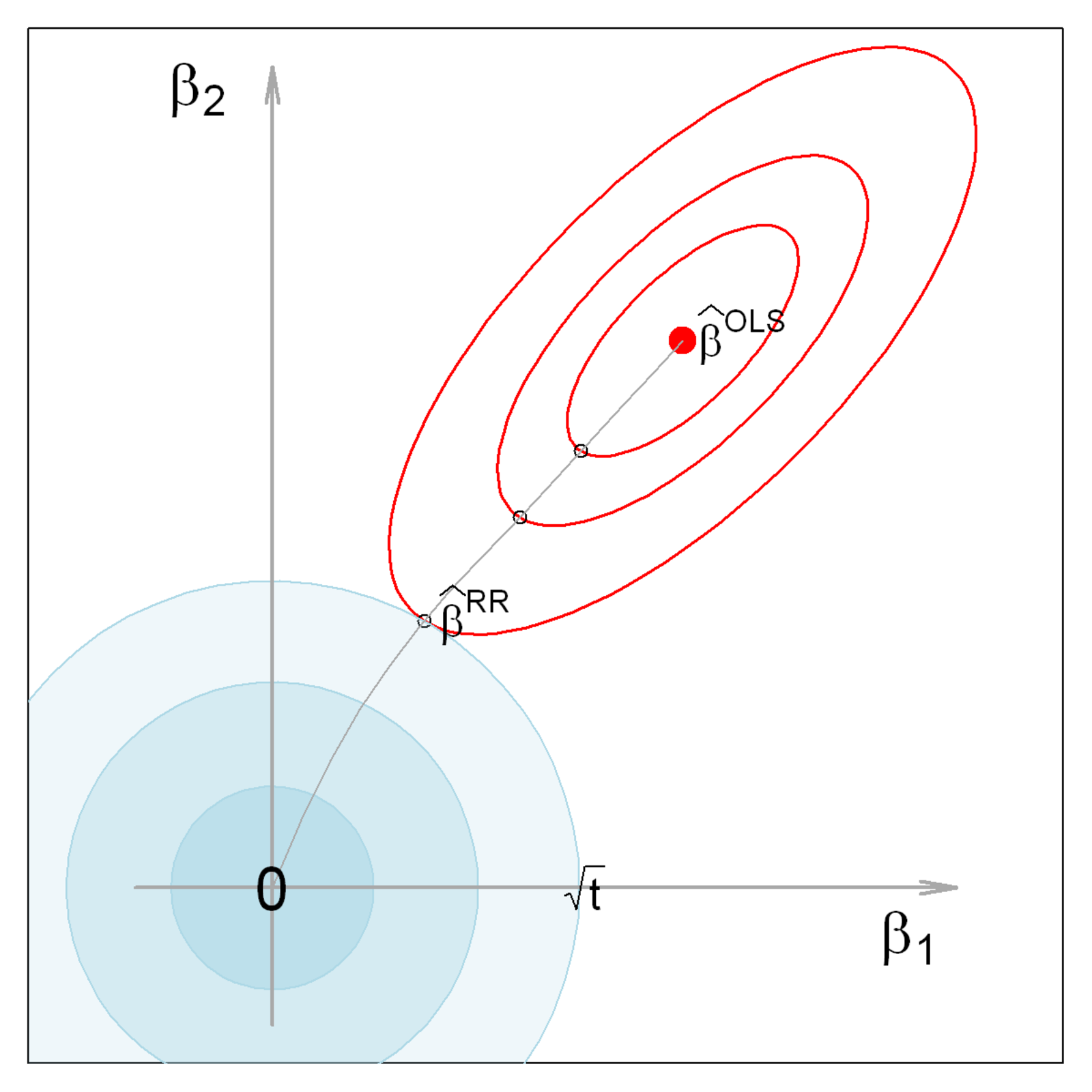
Equation eq-ridge-beta-var is computationally expensive, potentially numerically unstable for small \(k\), and it is conceptually opaque, in that it sheds little light on the underlying geometry of the data in the column space of \(\mathbf{X}\).
Once again, an alternative formulation, highlighting the role of shrinkage here, can be given in terms of the singular value decomposition (SVD) of \(\mathbf{X}\) (sec-biplot-svd),
\[ \mathbf{X} = \mathbf{U} \mathbf{D} \mathbf{V}^\mathsf{T} \]
where \(\mathbf{U}\) and \(\mathbf{V}\) are respectively \(n\times p\) and \(p\times p\) orthonormal matrices, so that \(\mathbf{U}^\mathsf{T}\mathbf{U} = \mathbf{V}^\mathsf{T}\mathbf{V} = \mathbf{I}\), and \(\mathbf{D} = \mathrm{diag}\, (d_1, d_2, \dots d_p)\) is the diagonal matrix of ordered singular values, with entries \(d_1 \ge d_2 \ge \cdots \ge d_p \ge 0\).
Because \(\mathbf{X}^\mathsf{T}\mathbf{X} = \mathbf{V} \mathbf{D}^2 \mathbf{V}^\mathsf{T}\), the eigenvalues of \(\mathbf{X}^\mathsf{T}\mathbf{X}\) are given by \(\mathbf{D}^2\) and therefore the eigenvalues of \(\mathbf{G}_k\) can be shown (Hoerl & Kennard, 1970) to be the diagonal elements of
\[ \mathbf{D}(\mathbf{D}^2 + k \mathbf{I} )^{-1} \mathbf{D} = \mathrm{diag}\, \left(\frac{d_i^2}{d_i^2 + k}\right) \:\: . \]
Noting that the eigenvectors, \(\mathbf{V}\) are the principal component vectors, and that \(\mathbf{X} \mathbf{V} = \mathbf{U} \mathbf{D}\), the ridge estimates can be calculated more simply in terms of \(\mathbf{U}\) and \(\mathbf{D}\) as
\[ \widehat{\boldsymbol{\beta}}^{\mathrm{RR}}_k = (\mathbf{D}^2 + k \mathbf{I})^{-1} \mathbf{D} \mathbf{U}^\mathsf{T}\mathbf{y} = \left( \frac{d_i}{d_i^2 + k}\right) \: \mathbf{u}_i^\mathsf{T}\mathbf{y}, \quad i=1, \dots p \:\: . \]
The terms \(d^2_i / (d_i^2 + k) \le 1\) are thus the factors by which the coordinates of \(\mathbf{u}_i^\mathsf{T}\mathbf{y}\) are shrunk with respect to the orthonormal basis for the column space of \(\mathbf{X}\). The small singular values \(d_i\) correspond to the directions which ridge regression shrinks the most. These are the directions which contribute most to collinearity, discussed earlier.
This analysis also provides an alternative and more intuitive characterization of the ridge tuning constant. By analogy with OLS, where the hat matrix, \(\mathbf{H} = \mathbf{X} (\mathbf{X}^\mathsf{T}\mathbf{X})^{-1} \mathbf{X}^\mathsf{T}\) reflects degrees of freedom \(\text{df} = \mathrm{tr} (\mathbf{H}) = p\) corresponding to the \(p\) parameters, the effective degrees of freedom for ridge regression (Hastie et al., 2009) is
\[ \begin{aligned} \text{df}_k = & \text{tr}[\mathbf{X} (\mathbf{X}^\mathsf{T}\mathbf{X} + k \mathbf{I})^{-1} \mathbf{X}^\mathsf{T}] \\ = & \sum_i^p \text{df}_k(i) = \sum_i^p \left( \frac{d_i^2}{d_i^2 + k} \right) \:\: . \end{aligned} \tag{8.6}\]
\(\text{df}_k\) is a monotone decreasing function of \(k\), and hence any set of ridge constants can be specified in terms of equivalent \(\text{df}_k\). Greater shrinkage corresponds to fewer coefficients being estimated.
There is a close connection with principal components regression mentioned in sec-remedies. Ridge regression shrinks all dimensions in proportion to \(\text{df}_k(i)\), so the low variance dimensions are shrunk more. Principal components regression discards the low variance dimensions and leaves the high variance dimensions unchanged.
8.6.2 The genridge package
Ridge regression and other shrinkage methods are available in several packages including MASS (the lm.ridge() function), glmnet (Friedman et al., 2025), and penalized (Goeman et al., 2022), but none of these provides insightful graphical displays. glmnet::glmnet() also implements a method for multivariate responses with a `family=“mgaussian”.
Here, I focus in the genridge package (Friendly, 2024), where the ridge() function is the workhorse and pca.ridge() transforms these results to PCA/SVD space. vif.ridge() calculates VIFs for class "ridge" objects and precision() calculates precision and shrinkage measures.
A variety of plotting functions is available for univariate, bivariate and 3D plots:
-
traceplot()Traditional univariate ridge trace plots -
plot.ridge()Bivariate 2D ridge trace plots, showing the covariance ellipse of the estimated coefficients -
pairs.ridge()All pairwise bivariate ridge trace plots -
plot3d.ridge()3D ridge trace plots with ellipsoids -
biplot.ridge()ridge trace plots in PCA/SVD space
In addition, the pca() method for "ridge" objects transforms the coefficients and covariance matrices of a ridge object from predictor space to the equivalent, but more interesting space of the PCA of \(\mathbf{X}^\mathsf{T}\mathbf{X}\) or the SVD of \(\mathbf{X}\). biplot.pcaridge() adds variable vectors to the bivariate plots of coefficients in PCA space
8.7 Univariate ridge trace plots
The usual idea to visualize the effects of shrinkage of the coefficients in ridge regression is a simple set of line plots showing how the coefficient of each predictor decreases as the ridge constant increases, as shown below in Figure fig-longley-traceplot1 and Figure fig-longley-traceplot2.
Example 8.4 A classic example for ridge regression is Longley’s (1967) data, consisting of 7 economic variables, observed yearly from 1947 to 1962 (n=16), in the dataset longley. The goal is to predict Employed from GNP, Unemployed, Armed.Forces, Population, Year, and GNP.deflator.
data(longley, package="datasets")
str(longley)
# 'data.frame': 16 obs. of  7 variables:
#  $ GNP.deflator: num  83 88.5 88.2 89.5 96.2 ...
#  $ GNP         : num  234 259 258 285 329 ...
#  $ Unemployed  : num  236 232 368 335 210 ...
#  $ Armed.Forces: num  159 146 162 165 310 ...
#  $ Population  : num  108 109 110 111 112 ...
#  $ Year        : int  1947 1948 1949 1950 1951 1952 1953 1954 1955 1956 ...
#  $ Employed    : num  60.3 61.1 60.2 61.2 63.2 ...
These data were constructed to illustrate numerical problems in least squares software at the time, and they are (purposely) perverse, in that:
- Each variable is a time series so that there is clearly a lack of independence among predictors.
Yearis at least implicitly correlated with most of the others. - Worse, there is also some structural collinearity among the variables
GNP,Year,GNP.deflator, andPopulation; for example,GNP.deflatoris a multiplicative factor to account for inflation.
We fit the regression model, and sure enough, there are some extremely large VIFs. The largest, for GNP represents a multiplier of \(\sqrt{1788.5} = 42.3\) on the standard errors.
Shrinkage values can be specified using \(k\) (where \(k = 0\) corresponds to OLS) or the equivalent degrees of freedom \(\text{df}_k\) (Equation eq-dfk). (The function uses argument lambda, \(\lambda \equiv k\) for the shrinkage constant.) Among other quantities, ridge() returns a matrix containing the coefficients for each predictor for each shrinkage value and other quantities.
lambda <- c(0, 0.002, 0.005, 0.01, 0.02, 0.04, 0.08)
lridge <- ridge(Employed ~ GNP + Unemployed + Armed.Forces +
                           Population + Year + GNP.deflator,
    data=longley, lambda=lambda)
print(lridge, digits = 2)
# Ridge Coefficients:
#        GNP     Unemployed  Armed.Forces  Population  Year
# 0.000  -3.447  -1.828      -0.696        -0.344       8.432
# 0.002  -2.114  -1.644      -0.658        -0.713       7.466
# 0.005  -1.042  -1.491      -0.623        -0.936       6.567
# 0.010  -0.180  -1.361      -0.588        -1.003       5.656
# 0.020   0.499  -1.245      -0.548        -0.868       4.626
# 0.040   0.906  -1.155      -0.504        -0.523       3.577
# 0.080   1.091  -1.086      -0.458        -0.086       2.642
#        GNP.deflator
# 0.000   0.157
# 0.002   0.022
# 0.005  -0.042
# 0.010  -0.026
# 0.020   0.098
# 0.040   0.321
# 0.080   0.570
The standard univariate plot, given by traceplot(), simply plots the estimated coefficients for each predictor against the shrinkage factor \(k\).
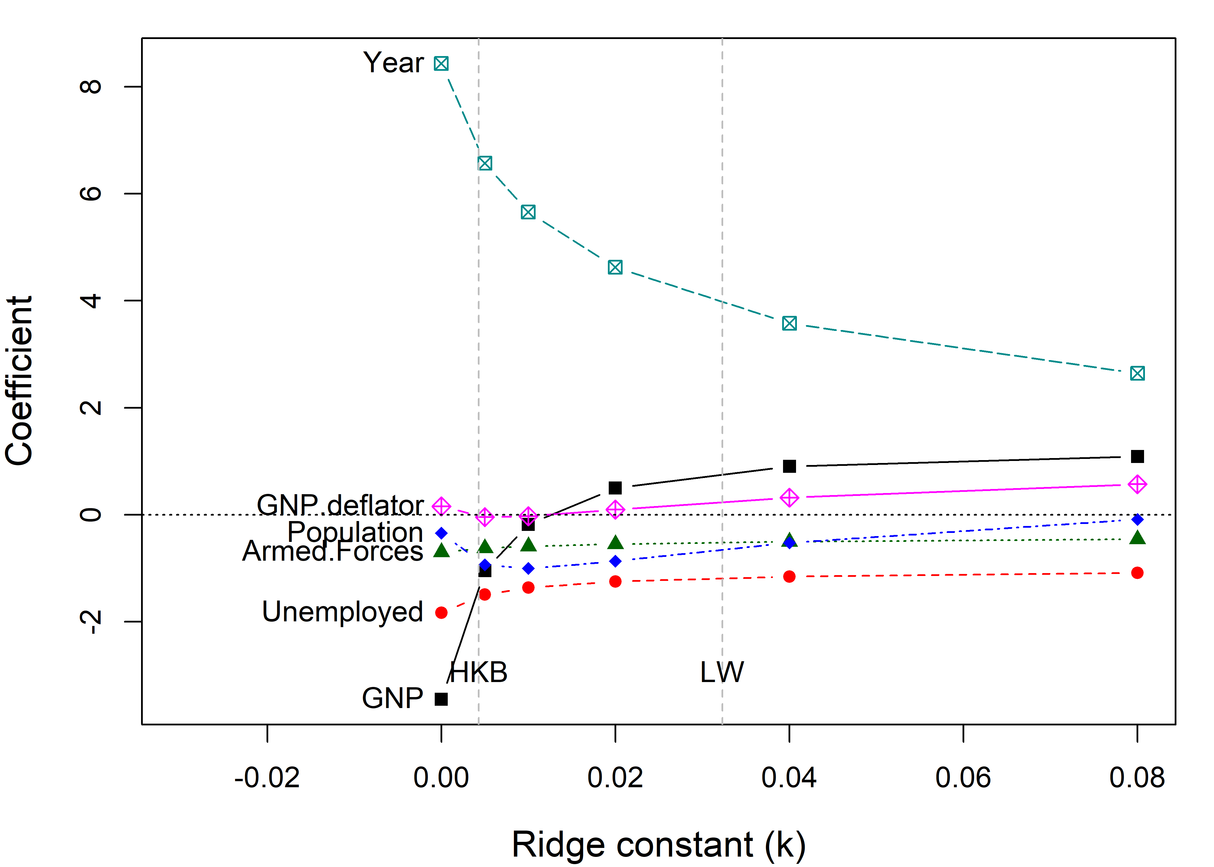
You can see that the coefficients for Year and GNP are shrunk considerably. Differences from the \(\beta\) value at \(k =0\) represent the bias (smaller \(\mid \beta \mid\)) needed to achieve more stable estimates.
The dotted lines in Figure fig-longley-traceplot1 show choices for the ridge constant by two commonly used criteria to balance bias against precision due to Hoerl et al. (1975) (HKB) and Lawless & Wang (1976) (LW). These values (along with a generalized cross-validation value GCV) are also stored in the “ridge” object as a vector criteria.
lridge$criteria
# kHKB kLW kGCV
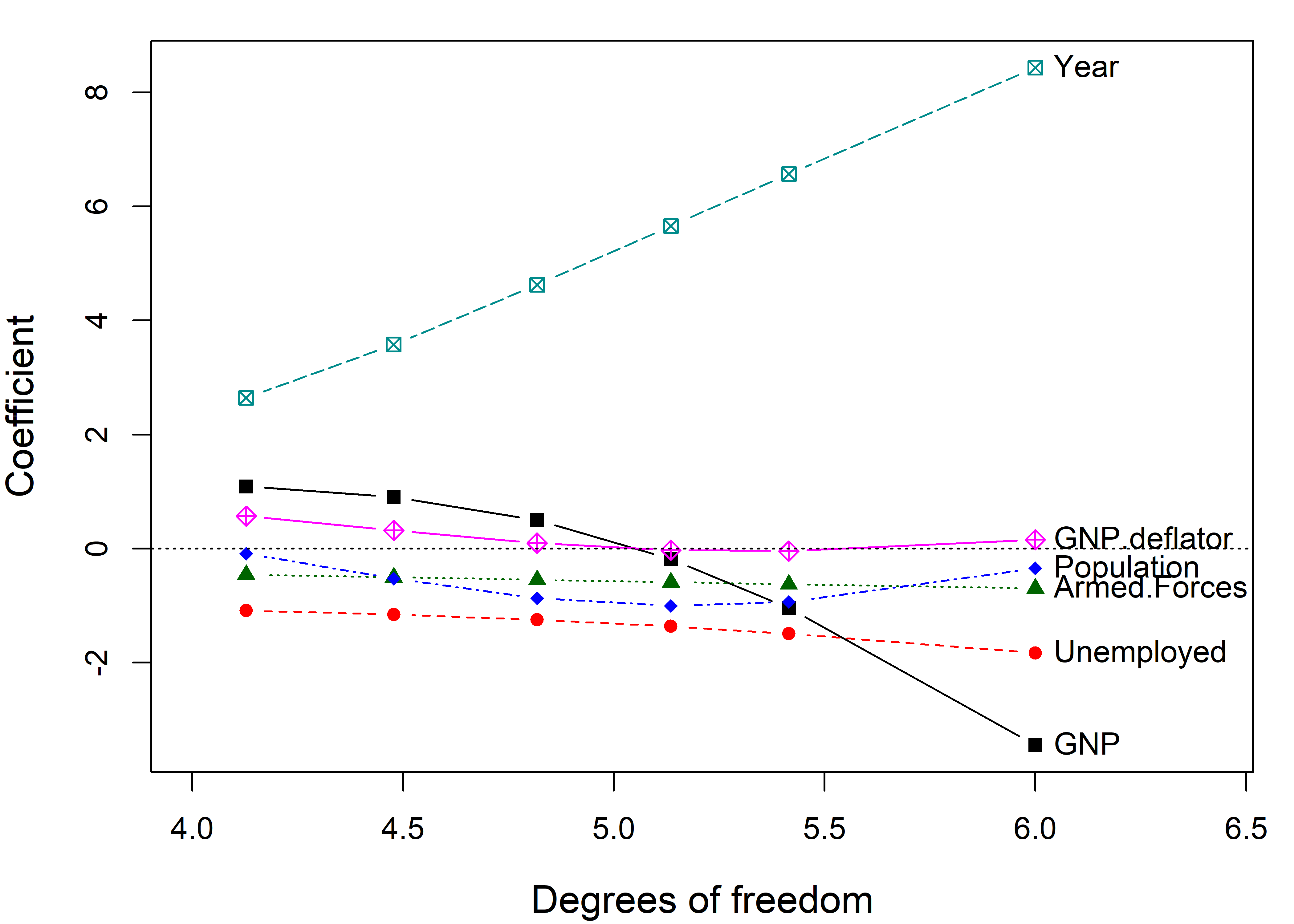
# 0.00428 0.03230 0.00200The shrinkage constant \(k\) doesn’t have much intrinsic meaning, so it is often easier to interpret the plot when coefficients are plotted against the equivalent degrees of freedom, \(\text{df}_k\). OLS corresponds to \(\text{df}_k = 6\) degrees of freedom in the space of six parameters, and the effect of shrinkage is to decrease the degrees of freedom, as if estimating fewer parameters.7 This more natural scale also makes the changes in coefficient with shrinkage more nearly linear.
8.7.1 What’s not to like?
The bigger problem is that these univariate plots are the wrong kind of plot! They show the trends in increased bias (toward smaller \(\mid \beta \mid\)) associated with larger \(k\), but they do not show the accompanying increase in precision (decrease in variance) achieved by allowing a bit of bias.
For that, we need to consider the variances and covariances of the estimated coefficients. The univariate trace plot is simply the wrong graphic form for what is essentially a multivariate problem, where we would like to visualize how both coefficients and their variances change with \(k\).
8.8 Bivariate ridge trace plots
The bivariate analog of the trace plot suggested by Friendly (2013) plots bivariate confidence ellipses for pairs of coefficients. Their centers, \((\widehat{\beta}_i, \widehat{\beta}_j)\) compared to the OLS values show the bias induced for each coefficient, and also how the change in the ridge estimate for one parameter is related to changes for other parameters.
The size and shapes of the covariance ellipses show directly the effect on precision of the estimates as a function of the ridge tuning constant; their size and shape indicate sampling variance and covariance, given by \(\widehat{\text{Var}} (\boldsymbol{\widehat{\beta}}_{ij})\).
Here (Figure fig-longley-plot-ridge), I plot those for GNP against four of the other predictors. The plot() method for "ridge" objects plots these ellipses for a pair of variables.
clr <-  c("black", "red", "brown", "darkgreen","blue", "cyan4", "magenta")
pch <- c(15:18, 7, 9, 12)
lambdaf <- c(expression(~widehat(beta)^OLS), as.character(lambda[-1]))

for (i in 2:5) {
  plot(lridge, variables=c(1,i),
       radius=0.5, cex.lab=1.5, col=clr,
       labels=NULL, fill=TRUE, fill.alpha=0.2)
  text(lridge$coef[1,1], lridge$coef[1,i],
       expression(~widehat(beta)^OLS),
       cex=1.5, pos=4, offset=.1)
  text(lridge$coef[-1,c(1,i)], lambdaf[-1], pos=3, cex=1.3)
}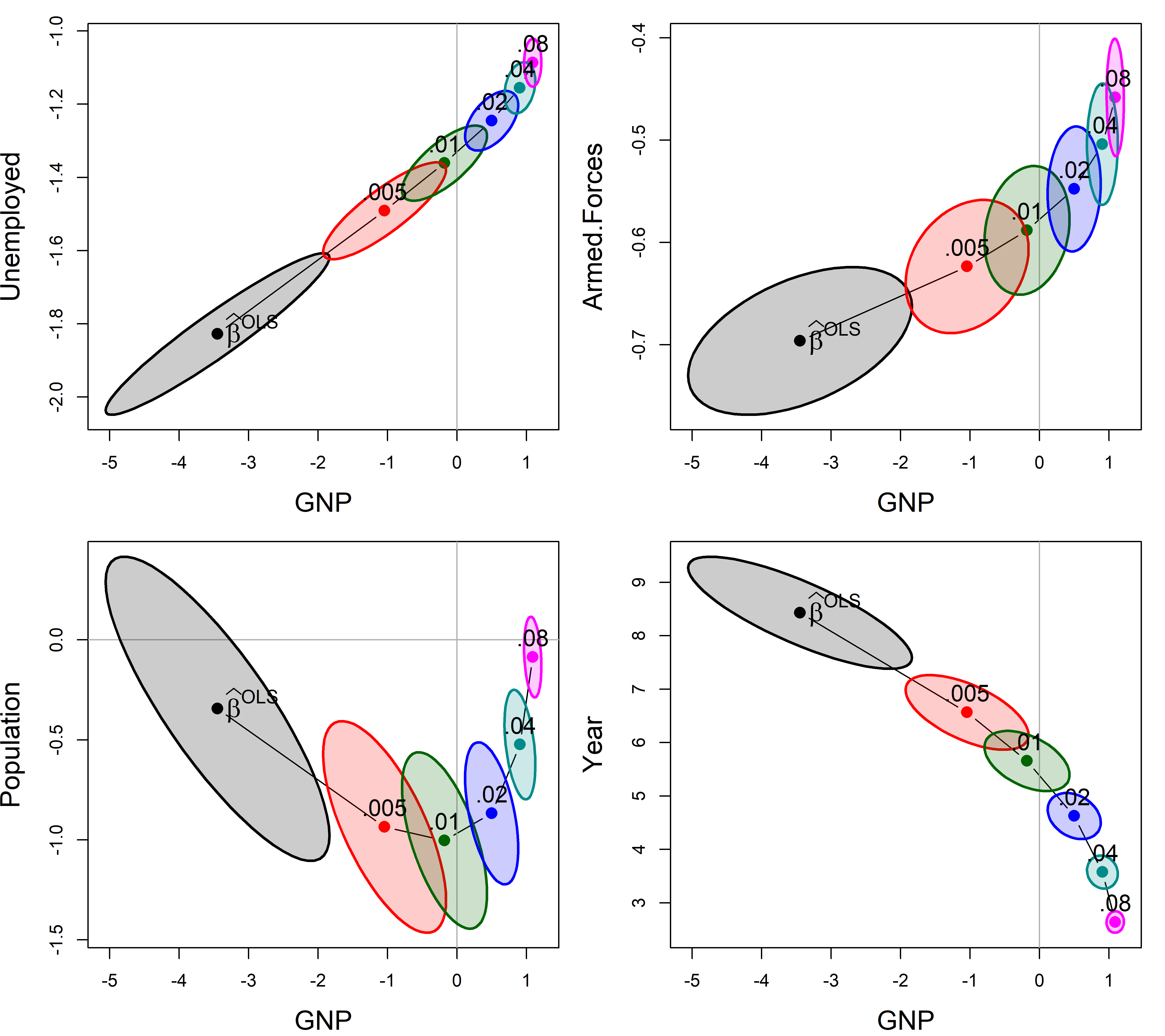
As can be seen, the coefficients for each pair of predictors trace a graceful path generally toward the origin (0,0), and the covariance ellipses get smaller, indicating increased precision. Most often these paths are rather direct, but it takes a peculiar curvilinear route in the case of population and GNP here.
The pairs() method for "ridge" objects shows all pairwise views in scatterplot matrix form. radius sets the base size of the ellipse-generating circle for the covariance ellipses.
pairs(lridge, radius=0.5, diag.cex = 2,
      fill = TRUE, fill.alpha = 0.1)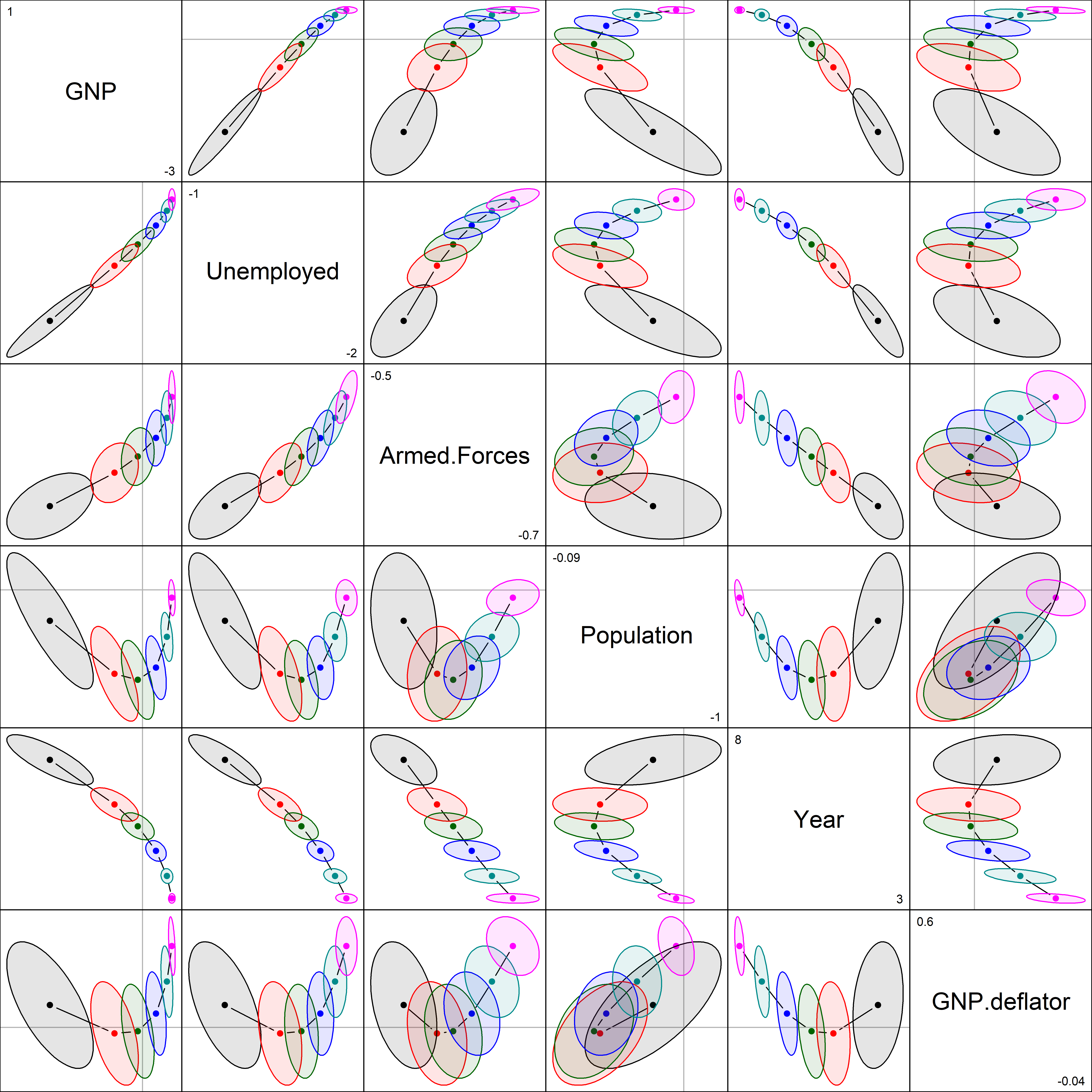
Most of the shrinkage paths in Figure fig-longley-pairs are regular, but those involving population are curvilinear, reflecting more complex behavior in the ridge method.
8.8.1 Visualizing the bias-variance tradeoff
The function precision() calculates a number of measures of the effect of shrinkage of the coefficients in relation to the “size” of the covariance matrix \(\boldsymbol{\mathcal{V}}_k \equiv \widehat{\mathsf{Var}} (\widehat{\boldsymbol{\beta}}^{\mathrm{RR}}_k)\). Larger shrinkage \(k\) should lead to a smaller ellipsoid for \(\boldsymbol{\mathcal{V}}_k\), indicating increased precision.
pdat <- precision(lridge) |> print()
#       lambda   df   det  trace max.eig norm.beta norm.diff
# 0.000  0.000 6.00 -12.9 18.119  15.419     1.000     0.000
# 0.002  0.002 5.70 -13.6 11.179   8.693     0.857     0.695
# 0.005  0.005 5.42 -14.4  6.821   4.606     0.741     1.276
# 0.010  0.010 5.14 -15.4  4.042   2.181     0.637     1.783
# 0.020  0.020 4.82 -16.8  2.218   1.025     0.528     2.262
# 0.040  0.040 4.48 -18.7  1.165   0.581     0.423     2.679
# 0.080  0.080 4.13 -21.1  0.587   0.260     0.337     3.027
Here, the first three terms described below are (inverse) measures of precision; the last two quantify shrinkage:
det\(=\log{| \mathcal{V}_k |}\) is an overall measure of variance of the coefficients. It is the (linearized) volume of the covariance ellipsoid and corresponds conceptually to Wilks’ Lambda criterion.trace\(=\text{trace} (\boldsymbol{\mathcal{V}}_k)\) is the sum of the variances and also the sum of the eigenvalues of \(\boldsymbol{\mathcal{V}}_k\), conceptually similar to Pillai’s trace criterion.max.eigis the largest eigenvalue measure of size, an analog of Roy’s maximum root test.norm.beta\(= \left \Vert \boldsymbol{\beta}\right \Vert / \max{\left \Vert \boldsymbol{\beta}\right \Vert}\) is a summary measure of shrinkage, the normalized root mean square of the estimated coefficients. It starts at 1.0 for \(k=0\) and decreases with the penalty for large coefficients.diff.betais the root mean square of the difference from the OLS estimate \(\lVert \boldsymbol{\beta}_{\text{OLS}} - \boldsymbol{\beta}_k \rVert\). This measure is inversely related tonorm.beta.
Plotting shrinkage against a measure of variance gives a direct view of the tradeoff between bias and precision. In Figure fig-longley-precision-plot I use the plot() method for "precision" objects. By default, this plots norm.beta against det, joins the points with a smooth spline curve and adds labels for the optimum values according to the different criteria. The points are labelled with their equivalent degrees of freedom.
Show the code
pridge <- precision(lridge)
criteria <- lridge$criteria
names(criteria) <- sub("k", "", names(criteria))
plot(pridge, criteria = criteria,
     labels="df", label.prefix="df:",
     cex.lab = 1.5,
     xlab ='shrinkage: ||b|| / max(||b||)',
     ylab='variance: log |Var(b)|'
     )
with(pdat, {
    text(min(norm.beta), max(det),
       labels = "log |Variance| vs. Shrinkage",
       cex=1.5, pos=4)
  })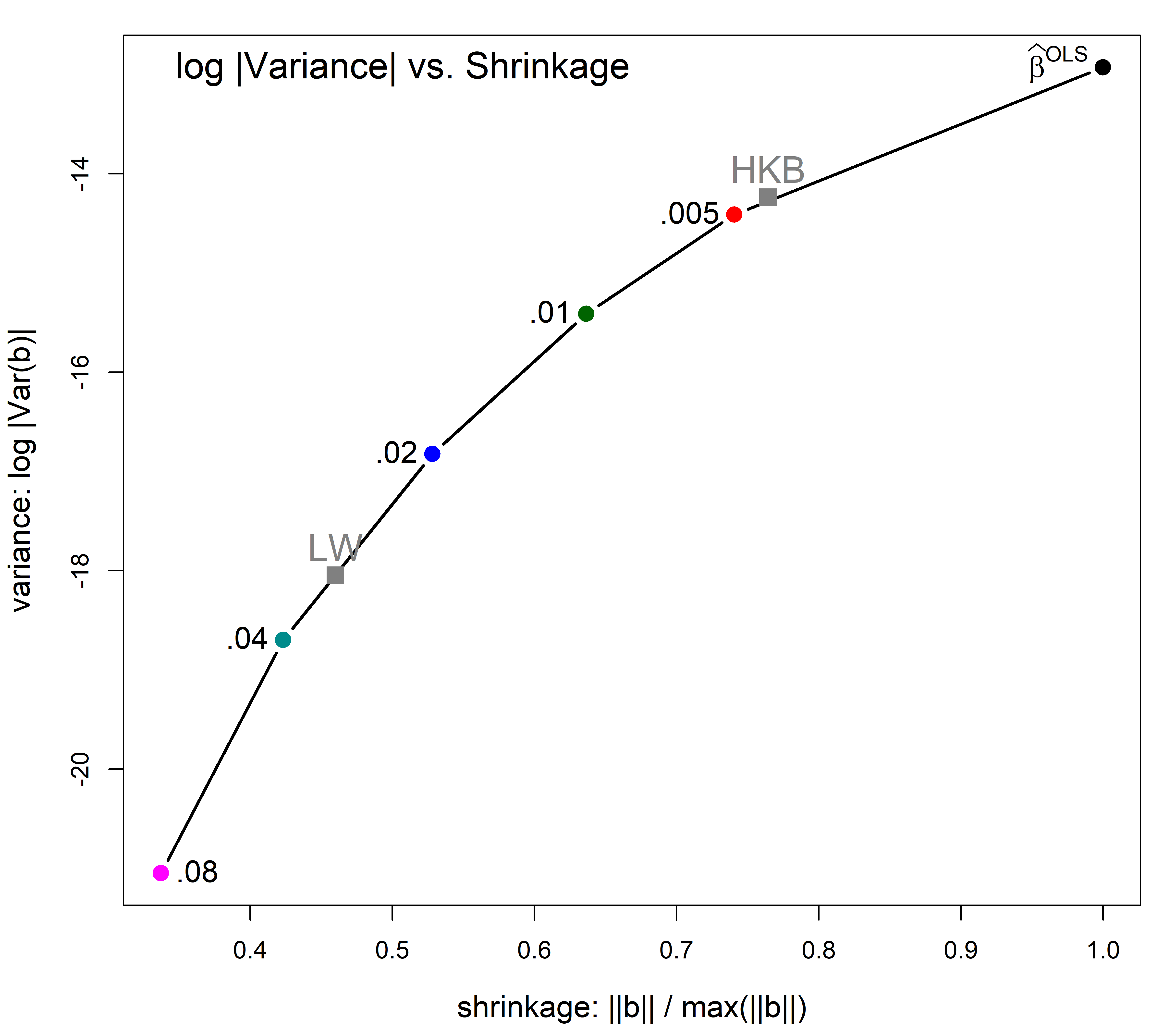
You can see that in this example the HKB and CGV criteria prefer a smaller degree of shrinkage, but achieves only a modest decrease in variance. But variance decreases more sharply thereafter and the LW choice achieves greater precision.
8.9 Low-rank views
Just as principal components analysis gives low-dimensional views of a data set, PCA can be useful to understand ridge regression, just as it did for the problem of collinearity.
The visCollin::pca() method transforms a "ridge" object from parameter space, where the estimated coefficients are \(\beta_k\) with covariance matrices \(\boldsymbol{\mathcal{V}}_k\), to the principal component space defined by the right singular vectors, \(\mathbf{V}\), of the singular value decomposition \(\mathbf{U} \mathbf{D} \mathbf{V}^\mathsf{T}\) of the scaled predictor matrix, \(\mathbf{X}\).
In PCA space the total variance of the predictors remains the same, but it is distributed among the linear combinations that account for successively greatest variance.
plridge <- pca(lridge) |>
  print()
# Ridge Coefficients:
#        dim1     dim2     dim3     dim4     dim5     dim6
# 0.000  1.51541  0.37939  1.80131  0.34595  5.97391  6.74225
# 0.002  1.51537  0.37935  1.80021  0.34308  5.69497  5.06243
# 0.005  1.51531  0.37928  1.79855  0.33886  5.32221  3.68519
# 0.010  1.51521  0.37918  1.79579  0.33205  4.79871  2.53553
# 0.020  1.51500  0.37898  1.79031  0.31922  4.00988  1.56135
# 0.040  1.51459  0.37858  1.77944  0.29633  3.01774  0.88291
# 0.080  1.51377  0.37778  1.75810  0.25915  2.01876  0.47238
Traceplot
Then, a traceplot() of the resulting "pcaridge" object shows how the dimensions are affected by shrinkage, shown on the scale of degrees of freedom in Figure fig-longley-pca-traceplot.
traceplot(plridge, X="df",
          cex.lab = 1.2, lwd=2)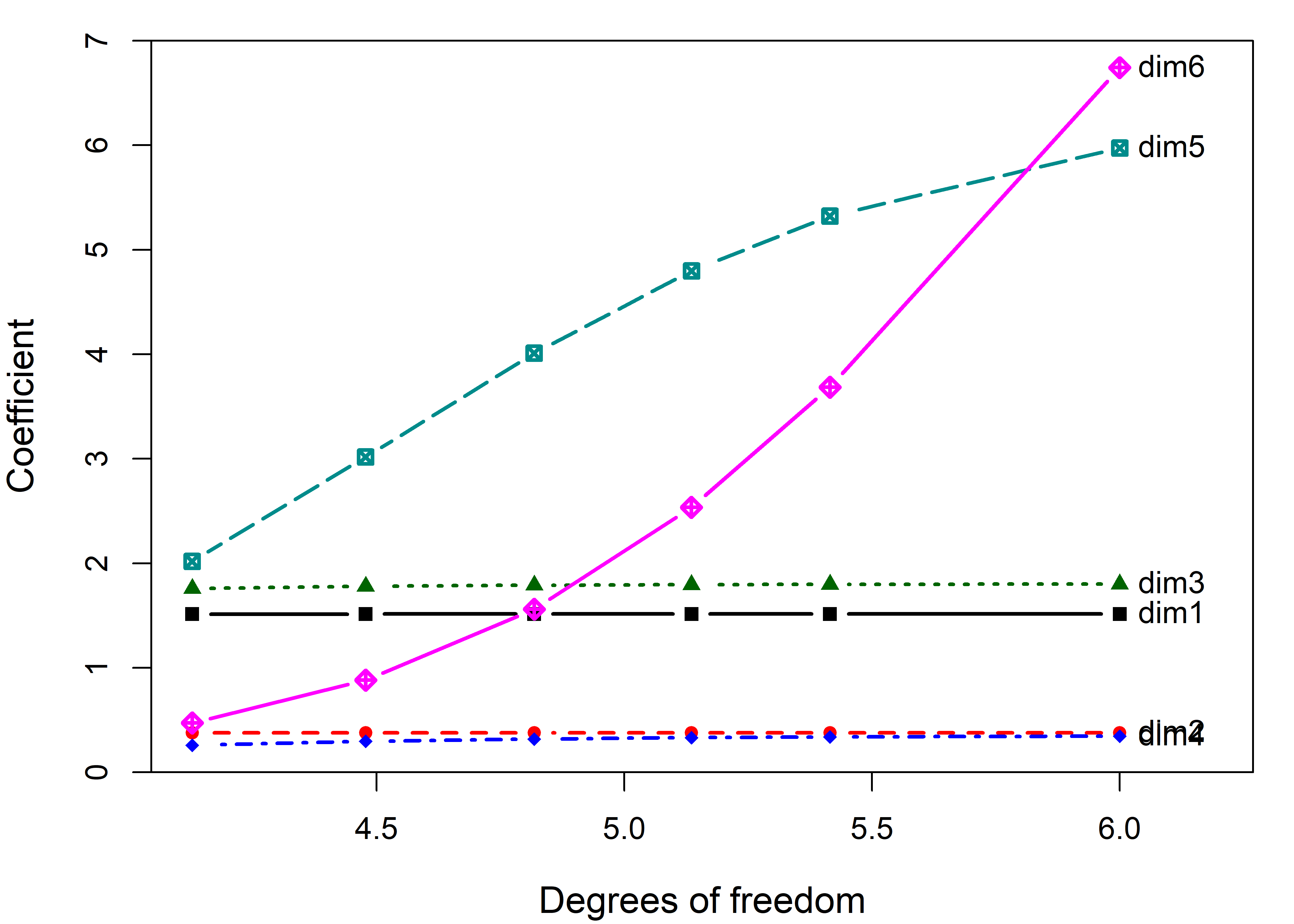
What may be surprising at first is that the coefficients for the first 4 components are not shrunk at all. These large dimensions are immune to ridge tuning. Rather, the effect of shrinkage is seen only on the last two dimensions. But those also are the directions that contribute most to collinearity as we saw earlier.
pairs() plot
A pairs() plot gives a dramatic representation bivariate effects of shrinkage in PCA space: the principal components of X are uncorrelated, so the ellipses are all aligned with the coordinate axes. The ellipses largely coincide for dimensions 1 to 4 where there is little effect of shrinkage. You can see them shrink in one direction in the last two columns and rows, and in both for the combination of (dim5, dim6).
pairs(plridge)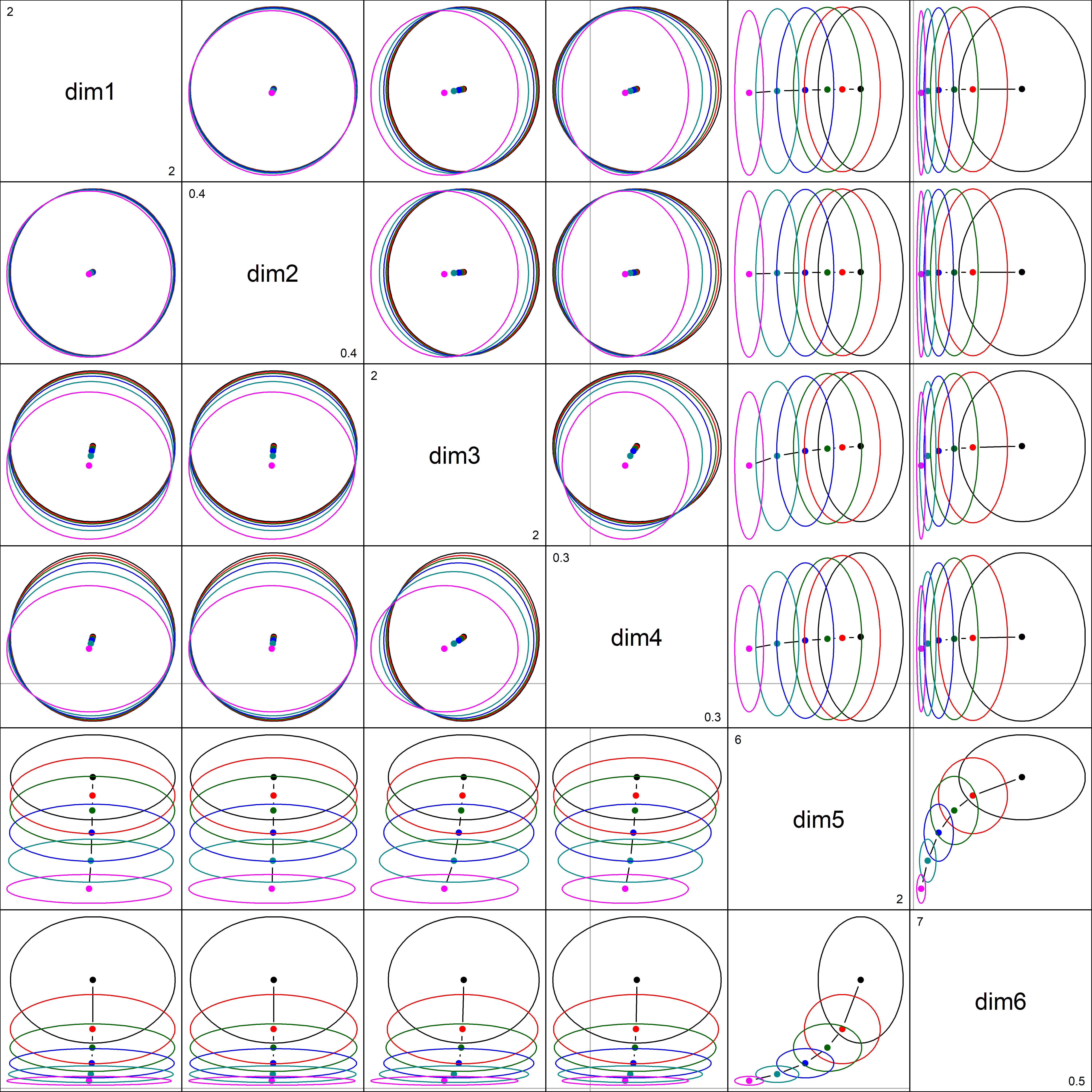
If we focus on the plot of dimensions dim5:dim6, we can see where all the shrinkage action is in this representation. Generally, the predictors that are related to the smallest dimension (6) are shrunk quickly at first.
plot(plridge, variables=5:6,
     fill = TRUE, fill.alpha=0.15, cex.lab = 1.5)
text(plridge$coef[, 5:6],
     label = lambdaf,
     cex=1.5, pos=4, offset=.1)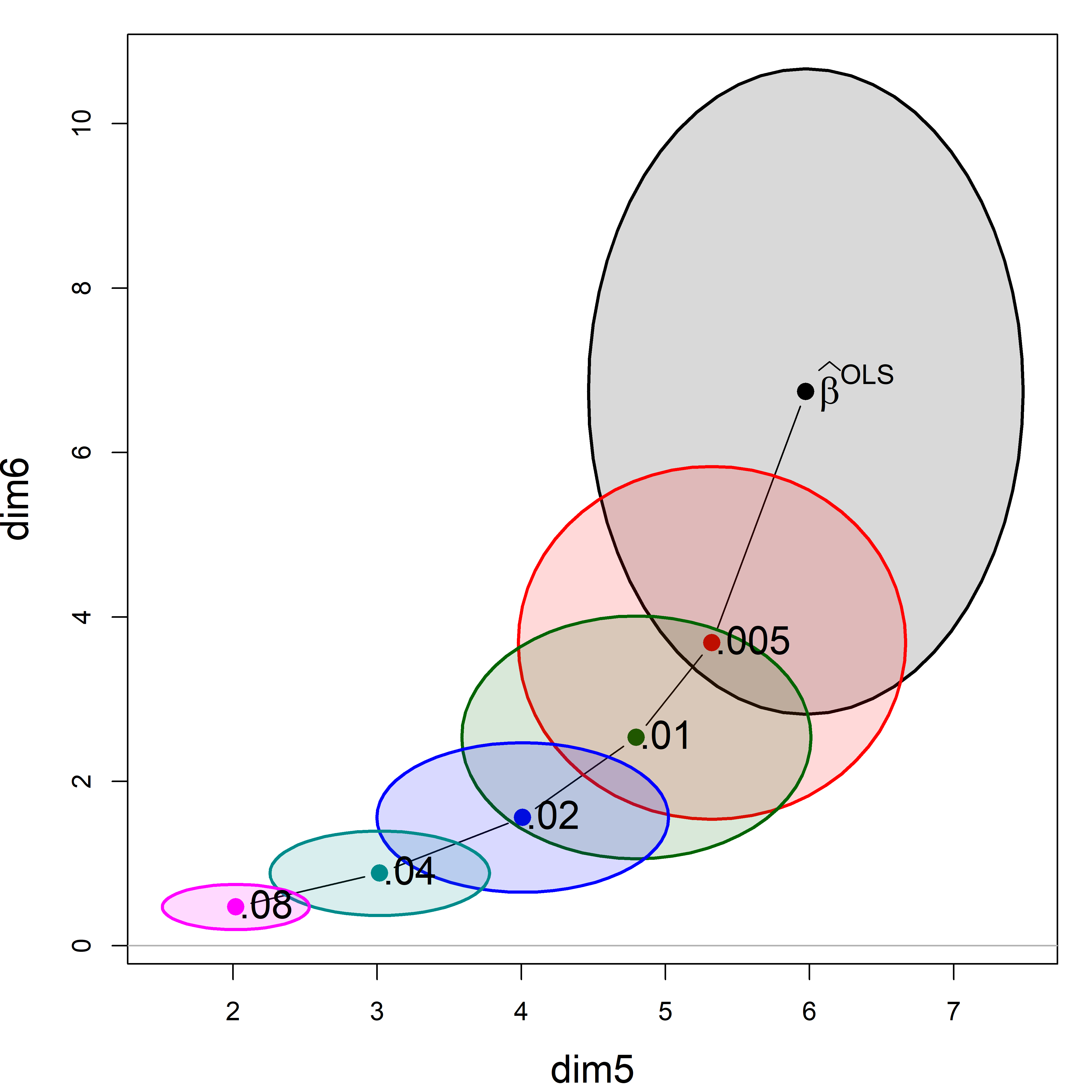
8.9.1 Biplot view
The question arises how to relate this view of shrinkage in PCA space to the original predictors. The biplot is again your friend. In effect, it adds vectors showing the contributions of the predictors to a plot like Figure fig-longley-pca-dim56. You can project variable vectors for the predictor variables into the PCA space of the smallest dimensions, where the shrinkage action mostly occurs to see how the predictor variables relate to these dimensions.
biplot.pcaridge() supplements the standard display of the covariance ellipsoids for a ridge regression problem in PCA/SVD space with labeled arrows showing the contributions of the original variables to the dimensions plotted. Recall from sec-biplot that these reflect the correlations of the variables with the PCA dimensions. The lengths of the arrows reflect the proportion of variance that each predictors shares with the components.
biplot(plridge, radius=0.5,
       ref=FALSE, asp=1,
       var.cex=1.15, cex.lab=1.3, col=clr,
       fill=TRUE, fill.alpha=0.15,
       prefix="Dimension ")
# Vector scale factor set to  5.25
text(plridge$coef[,5:6], lambdaf, pos=2, cex=1.3)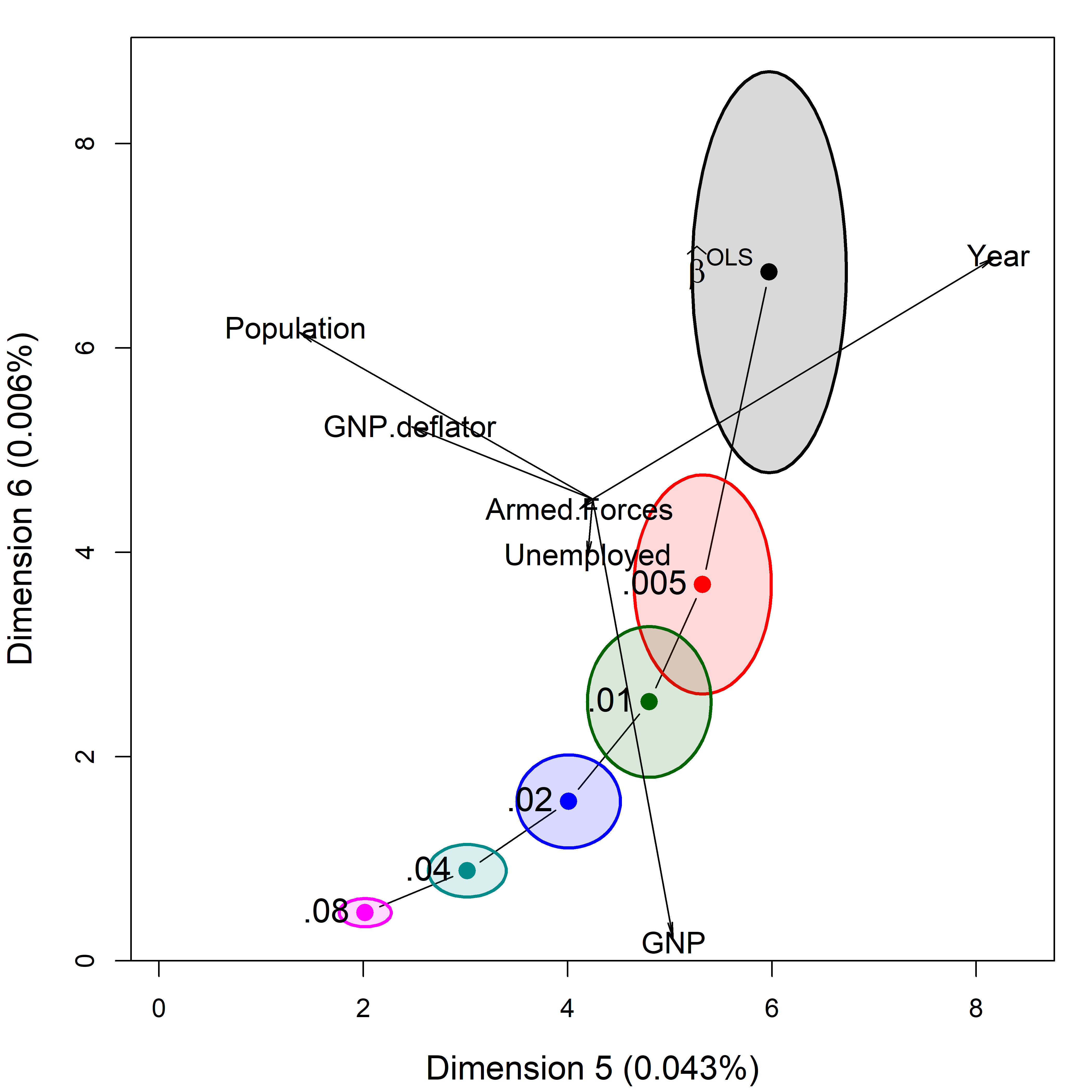
The biplot view in Figure fig-longley-pca-biplot showing the two smallest dimensions is particularly useful for understanding how the predictors contribute to shrinkage in ridge regression. Here, Year and Population largely contribute to dimension 5; a contrast between (Year, Population) and GNP contributes to dimension 6.
8.10 What have we learned?
TODO: Consider replacing this with bullet point take-aways.
This chapter has considered the problems in regression models which stem from high correlations among the predictors. We saw that collinearity results in unstable estimates of coefficients with larger uncertainty, often dramatically more so than would be the case if the predictors were uncorrelated.
Collinearity can be seen as merely a “data problem” which can safely be ignored if we are only interested in prediction. When we want to understand a model, ridge regression can tame the collinearity beast by shrinking the coefficients slightly to gain greater precision in the estimates.
Beyond these statistical considerations, the methods of this chapter highlight the roles of multivariate thinking and visualization in understanding these phenomena and the methods developed for solving them. Data ellipses and confidence ellipses for coefficients again provide tools for visualizing what is concealed in numerical summaries. A perhaps surprising feature of both collinearity and ridge regression is that the important information usually resides in the smallest PCA dimensions and biplots help again to understand these dimensions.
The “Where’s Waldo” problem has attracted attention in machine learning, AI and computational image analysis circles. One approach uses convolutional neural networks. FindWaldo is one example implemented in Python.↩︎
This example is adapted from one by John Fox (2022), Collinearity Diagnostics↩︎
Recall that in an added-variable plot (sec-avplots), the horizontal axis for predictor \(x_j\) is \(x^\star_j = x_j \,|\, \text{others}\) … TODO complete this thought↩︎
Well, -77 is just a bit beyond left-most point on the fitted line in this panel of Figure fig-collin-centering.↩︎
The rsm package provides convenient shortcuts for specifying response surface models. For instance, the
SO()shortcut,y ~ SO(x1, x2)automatically generates all linear, interaction, and quadratic terms for the specified variablesx1andx2.↩︎The
I()here is the identity function. It is needed becausetime^2has a different interpretation in a model formula than in algebra.↩︎A related shrinkage method, LASSO (Least Absolute Shrinkage and Selection Operator) (Tibshirani, 1996) uses a penalty term of the sum of absolute values of the coefficients, \(\Sigma \lvert \beta_i \rvert \le t(k)\) rather than the sum of squares in Equation eq-ridgeRSS. The effect of this change is to shrink some coefficients exactly to zero, effectively eliminating them from the model. This makes LASSO a model selection method, similar in aim to other best subset regression methods. This is widely used in machine learning methods, where interpretation less important than prediction accuracy. ↩︎