The geometric and graphical approach of earlier chapters has already introduced some new ideas for thinking about multivariate data, models for explaining them, and graphical methods for understanding their results. These can be applied to better understand common problems that arise in data analysis.
In sec-betaspace I explore the geometric relationships between ellipses in data space and how these appear in the space of the estimated coefficients of linear models, called \(\beta\) space. It turns out that points in one space correspond to lines in the other, a reflection that each one is in some sense the inverse and dual of the other.
This geometry can also be used to clarify the effect of measurement errors in the predictor variables, as illustrated in sec-meas-error.
Packages
In this chapter I use the following packages. Load them now:
7.1 Ellipsoids in data space and \(\boldsymbol{\beta}\) space
It is most common to look at data and fitted models in our familiar “data space”. Here, axes correspond to variables, points represent observations, and fitted models can be plotted as lines (or planes) in this space. As we’ve suggested, data ellipsoids provide informative summaries of relationships in data space.
For linear models, particularly regression models with quantitative predictors, there is another space—“\(\boldsymbol{\beta}\) space”—that provides deeper views of models and the relationships among them. This discussion extends Friendly et al. (2013), Sec. 4.6.
In \(\boldsymbol{\beta}\) space, the axes pertain to coefficients, for example \((\beta_0, \beta_1)\) in a simple linear regression corresponds to the model \(y = \beta_0 + \beta_1 x\). Points in this space are models (true, hypothesized, fitted) whose coordinates represent values of these parameters. For example,
- In simple regression, one point plotted with the coefficients \(\widehat{\boldsymbol{\beta}}_{\text{OLS}} = (\hat{\beta}_0, \hat{\beta}_1)\) represents the least squares estimate.
- Other points, representing different fitting methods can be shown in the same plot. For instance, \(\widehat{\boldsymbol{\beta}}_{\text{WLS}}\) and \(\widehat{\boldsymbol{\beta}}_{\text{ML}}\) would give weighted least squares and maximum likelihood estimates.
- The line \(\beta_1 = 0\) represents the null hypothesis that the slope is zero and the point \((0, 0)\) corresponds to the joint hypothesis \(\mathcal{H}_0: \beta_0 = 0, \beta_1 = 0\).
7.1.1 Dual and inverse spaces
As illustrated below, the data space of \(\mathbf{X}\) and that of \(\boldsymbol{\beta}\) space are each dual and inverse to the other. To make this explicit for simple linear regression:
- each line, like \(\mathbf{y} = \beta_0 + \beta_1 \mathbf{x}\) with intercept \(\beta_0\) and slope \(\beta_1\) in data space corresponds to a point \((\beta_0,\beta_1)\) in \(\boldsymbol{\beta}\) space, and conversely;
- the set of points on any line \(\beta_1 = x + y \beta_0\) in \(\boldsymbol{\beta}\) space corresponds to a set of lines through a given point \((x, y)\) in data space, and conversely;
- the geometric proposition that “every pair of points defines a line in one space” corresponds to the proposition that “every two lines intersect in a point in the other space”.
Example 7.1 Dual points and lines
This duality of points and lines is illustrated in Figure fig-dual-points-lines. The left panel shows three lines in data space, which can be expressed as linear equations in \(\mathbf{z} = (x, y)\) of the form \(\mathbf{A} \mathbf{z} = \mathbf{d}\). The function matlib::showEqn(A, d) prints these as equations in the data coordinates \(x\) and \(y\).
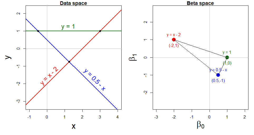
The first equation, \(x - y = 2\) can be expressed as the red line \(y = x - 2\) labeled in the left panel of Figure fig-dual-points-lines. This corresponds to the red point \((\beta_0, \beta_1) = (-2, 1)\) in \(\beta\) space, and similarly for the other two equations shown in blue and green.
The second equation, \(x + y = \frac{1}{2}\), or \(y = 0.5 - x\) intersects the first at the point \((x, y) = (1.25, 0.75)\). This corresponds to the line connecting \((-2, 1)\) and \((0.5, -1)\) in \(\beta\) space. All solutions to this pair of equations lie along this line.
Example 7.2 Inverses
This lovely interchange between points and lines is an example of an important general principle of duality in modern mathematics, which translates concepts and structures from one perspective to another and back again. We get two views of the same thing, whose dual nature provides greater insight from the combination of perspectives.
We have seen (sec-data-ellipse) how ellipsoids in data space summarize variance (lack of precision) and correlation of our data. For the purpose of understanding linear models, ellipsoids in \(\beta\) space do the same thing for the estimates of parameters. These ellipsoids are dual and inversely related to each other, a point first made clear by Dempster (1969, Ch. 6):
In data space, joint confidence intervals for the mean vector or joint prediction regions for the data are given by the ellipsoids \((\bar{x}_1, \bar{x}_2)^\mathsf{T} \oplus c \sqrt{\mathbf{S}_{\mathbf{X}}}\), where the covariance matrix \(\mathbf{S}_{\mathbf{X}}\) depends on \(\mathbf{X}^\mathsf{T}\mathbf{X}\) (\(\oplus\) here shifts the ellipsoid to one centered at \((\bar{x}_1, \bar{x}_2)\) here, as in Equation eq-ellE).
In the dual \(\mathbf{\beta}\) space, joint confidence regions for the coefficients of a response variable \(y\) on \((x_1, x_2)\) are given by ellipsoids of the form \(\widehat{\boldsymbol{\beta}} \oplus c \sqrt{\mathbf{S}_{\mathbf{X}}^{-1}}\), and depend on \(\mathbf{(\mathbf{X}^\mathsf{T}\mathbf{X})}^{-1}\).
It is useful to understand the underlying geometry here connecting the ellipses for a matrix and its inverse. This can be seen in Figure fig-inverse, which shows an ellipse for a covariance matrix \(\mathbf{S}\), whose axes, as we saw in sec-pca-biplot are the eigenvectors \(\mathbf{v}_i\) of \(\mathbf{S}\) and whose radii are the square roots \(\sqrt{\lambda_i}\) of the corresponding eigenvalues. The comparable ellipse for \(2 \mathbf{S}\) has radii multiplied by \(\sqrt{2}\).
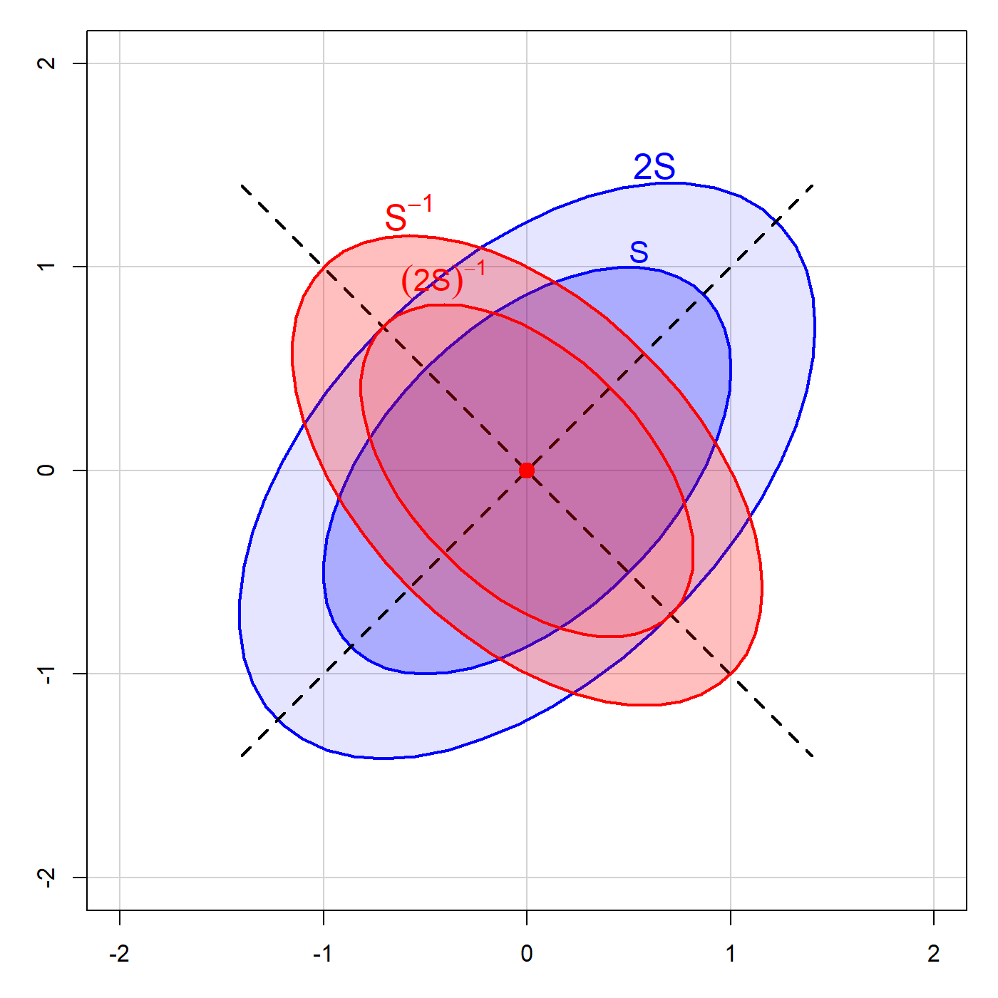
As long as \(\mathbf{S}\) is of full rank, the eigenvectors of \(\mathbf{S}^{-1}\) are identical, while the eigenvalues are \(1 / \lambda_i\), so the radii are the reciprocals \(1 / \sqrt{\lambda_i}\). The analogous ellipse for \((2 \mathbf{S}^{-1})\) is smaller by a factor of \(\sqrt{2}\).
Thus, in two dimensions, the ellipse for \(\mathbf{S}^{-1}\) is a \(90^o\) rotation of that for \(\mathbf{S}\). The ellipse for \(\mathbf{S}^{-1}\) is small in directions where the ellipse for \(\mathbf{S}\) is large, and vice-versa. In our statistical applications, this translates as:
Parameter estimates in \(\beta\) space are more precise (have less variance) in the directions where the data are more widely dispersed, giving more information about the relationship.
I illustrate these ideas in the example below.
7.1.2 Data ellipse and confidence ellipse
In sec-avplots I used the data (heplots::coffee) on coffee consumption, stress and heart disease to illustrate added variable plots. These explained the perplexing result that increased coffee seemed strongly positively related to heart damage when considered alone (see Figure fig-coffee-spm), but had a negative coefficient (\(\beta_{\text{Coffee}} = -0.41\)) in the model (fit.both) that also included the effect of stress on heart damage. The AV plots (Figure fig-coffee-avPlots) clarified this by showing the conditional relations of each predictor, when the other was controlled or adjusted for.
Here, I use this dataset to illustrate the inverse relation between a data ellipse based on the covariance matrix \(\mathbf{S}_X\) and the corresponding confidence ellipse for the coefficients based on \(\mathbf{S}_X^{-1}\). This is shown in Figure fig-coffee-data-beta-both for the data space relation between the predictors coffee and stress, and the \(\beta\) space of the confidence ellipse for their coefficients.
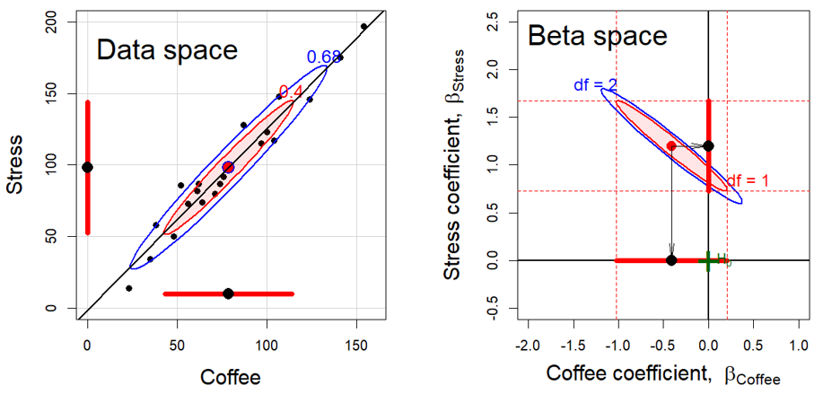
The left panel in Figure fig-coffee-data-beta-both is the same as that in the (3,2) cell of Figure fig-coffee-spm for the relation Stress ~ Coffee but with data ellipses of 40% and 68% coverage. The shadows of the 40% ellipse on any axis give univariate intervals of the mean \(\bar{x} \pm 1 s_x\) (standard deviation) shown by the thick red lines; the shadow of the 68% ellipse corresponds to an interval \(\bar{x} \pm 1.5 s_x\).1
The right panel shows the joint 95% confidence region for the coefficients \((\beta_{\text{Coffee}}, \beta_{\text{Stress}})\) and individual confidence intervals in \(\boldsymbol{\beta}\) space. These are determined as
\[ \widehat{\mathbf{\beta}} \oplus \sqrt{d F^{.95}_{d, \nu}} \times s_e \times \mathbf{S}_X^{-1/2} \:\: . \] where \(d\) is the number of dimensions for which we want coverage, \(\nu\) is the residual degrees of freedom for \(s_e\), and \(\mathbf{S}_X\) is the covariance matrix of the predictors.
Thus, the blue ellipse in Figure fig-coffee-data-beta-both (right) is the ellipse of joint 95% coverage, using the factor \(\sqrt{2 F^{.95}_{2, \nu}}\), which covers the true values of (\(\beta_{\mathrm{Stress}}, \beta_{\mathrm{Coffee}}\)) in 95% of samples. Moreover:
- Any joint hypothesis (e.g., \(\mathcal{H}_0:\beta_{\mathrm{Stress}}=0, \beta_{\mathrm{Coffee}}=0\)) can be tested visually, simply by observing whether the hypothesized point, \((0, 0)\) here, lies inside or outside the joint confidence ellipse. That hypothesis is rejected
- The shadows of this ellipse on the horizontal and vertical axes give Scheff'e joint 95% confidence intervals for the parameters, with protection for simultaneous inference (“fishing”) in a 2-dimensional space.
- Similarly, using the factor \(\sqrt{F^{1-\alpha/d}_{1, \nu}} = t^{1-\alpha/2d}_\nu\) would give an ellipse whose 1D shadows are \(1-\alpha\) Bonferroni confidence intervals for \(d\) posterior hypotheses.
Visual hypothesis tests and \(d=1\) confidence intervals for the parameters separately are obtained from the red ellipse in Figure fig-coffee-data-beta-both, which is scaled by \(\sqrt{F^{.95}_{1, \nu}} = t^{.975}_\nu\). We call this the confidence-interval generating ellipse (or, more compactly, the “confidence-interval ellipse”). The shadows of the confidence-interval ellipse on the axes (thick red lines) give the corresponding individual 95% confidence intervals, which are equivalent to the (partial, Type III) \(t\)-tests for each coefficient given in the standard multiple regression output shown above.
Thus, controlling for Stress, the confidence interval for the slope for Coffee includes 0, so we cannot reject the hypothesis that \(\beta_{\mathrm{Coffee}}=0\) in the multiple regression model, as we saw above in the numerical output. On the other hand, the interval for the slope for Stress excludes the origin, so we reject the null hypothesis that \(\beta_{\mathrm{Stress}}=0\), controlling for Coffee consumption.
Finally, consider the relationship between the data ellipse and the confidence ellipse. These have exactly the same shape, but (with equal coordinate scaling of the axes), the confidence ellipse is exactly a \(90^o\) rotation and rescaling of the data ellipse. In directions in data space where the slice of the data ellipse is wide—where we have more information about the relationship between Coffee and Stress—the projection of the confidence ellipse is narrow, reflecting greater precision of the estimates of coefficients. Conversely, where slice of the the data ellipse is narrow (less information), the projection of the confidence ellipse is wide (less precision).
TODO: Maybe include this code only in the HTML version?
Confidence ellipses are drawn using car::confidenceEllipse(). Click the button to show the code.
Code for confidence ellipses
confidenceEllipse(coffee.mod,
    grid = FALSE,
    xlim = c(-2, 1), ylim = c(-0.5, 2.5),
    xlab = expression(paste("Coffee coefficient,  ", beta["Coffee"])),
    ylab = expression(paste("Stress coefficient,  ", beta["Stress"])),
    cex.lab = 1.5)
confidenceEllipse(coffee.mod, add=TRUE, draw = TRUE,
    col = "red", fill = TRUE, fill.alpha = 0.1,
    dfn = 1)
abline(h = 0, v = 0, lwd = 2)

# confidence intervals
beta <- coef( coffee.mod )[-1]
CI <- confint(coffee.mod)
lines( y = c(0,0), x = CI["Coffee",] , lwd = 6, col = 'red')
lines( x = c(0,0), y = CI["Stress",] , lwd = 6, col = 'red')
points( diag( beta ), col = 'black', pch = 16, cex=1.8)

abline(v = CI["Coffee",], col = "red", lty = 2)
abline(h = CI["Stress",], col = "red", lty = 2)

text(-2.1, 2.35, "Beta space", cex=2, pos = 4)
arrows(beta[1], beta[2], beta[1], 0, angle=8, len=0.2)
arrows(beta[1], beta[2], 0, beta[2], angle=8, len=0.2)

text( -1.5, 1.85, "df = 2", col = 'blue', adj = 0, cex=1.2)
text( 0.2, .85, "df = 1", col = 'red', adj = 0, cex=1.2)

heplots::mark.H0(col = "darkgreen", pch = "+", lty = 0, pos = 4, cex = 3)
7.2 Measurement error
In classical linear models, the predictors are often considered to be fixed variables, statistical constants as in a designed experiment where the \(x\)s are set to given values. If they are random variables, they are to be measured without error and independent of the regression errors in \(y\). Either condition, along with the assumption of linearity, guarantees that the standard OLS estimators are unbiased.
That is, in a simple linear regression, \(y = \beta_0 + \beta_1 x + \epsilon\), the estimated slope \(\hat{\beta}_1\) will have an average, expected value \(\mathcal{E} (\hat{\beta}_1)\) equal to the true population value \(\beta_1\) over repeated samples.
Not only this, but the Gauss-Markov theorem (https://bit.ly/4njKnBo) guarantees that under these conditions the OLS estimator is also the most efficient because it has the least variance (most precise) among all linear and unbiased estimators. The classical OLS estimator is then said to be BLUE: It is the Best (lowest variance), Linear (among linear estimators), Unbiased, Estimator.
But these happy results may go out the window when the predictor variables are subject to measurement errors, for example with rating scales of less than perfect reliability. This section illustrates how error in predictors affects bias and precision using the graphical methods of this book.
7.2.1 Errors in predictors
Errors in the response \(y\) are accounted for in the model and measured by the mean squared error, \(\text{MSE} = \hat{\sigma}_\epsilon^2\). But in practice, of course, predictor variables are often only observed indicators, subject to their own error. Indeed, in the behavioral sciences it is rare that predictors are perfectly reliable and measured exactly. In economics, measures of employment, or cost of your groceries cannot be assumed to be error-free.
This fact that is recognized in errors-in-variables regression models (Fuller, 2006) and in more general structural equation models, but often ignored otherwise. Ellipsoids in data space and \(\beta\) space are well suited to showing the effect of measurement error in predictors on OLS estimates.
The statistical facts are well known, though perhaps counter-intuitive in certain details:
- measurement error in a predictor biases regression coefficients (towards 0), while
- error in the measurement in \(y\) increases the MSE and thus standard errors of the regression coefficients but does not introduce bias in the coefficients.
7.2.2 Example: Measurement Error Quartet
An illuminating example can be constructed by starting with the simple linear regression
\[ y_i = \beta_0 + \beta_1 x_i + \epsilon_i \; , \] where \(x_i\) is the true, fully reliable predictor and \(y\) is the response, with error variance \(\sigma_\epsilon^2\). Now consider that we don’t measure \(x_i\) exactly, but instead observe \(x^\star_i\).
\[ x^\star_i = x_i + \eta_i \; , \] where the measurement error \(\eta_i\) is independent of the true \(x_i\) with variance \(\sigma^2_\eta\). We can extend this example to also consider the effect of adding additional, independent error variance to \(y\), so that instead of \(y_i\) we observe
\[ y^\star_i = y_i + \nu_i \] with variance \(\sigma^2_\nu\).
Let’s simulate an example where the true relation is \(y = 0.2 + 0.3 x\) with error standard deviation \(\sigma = 0.5\). I’ll take \(x\) to be uniformly distributed in [0, 10] and calculate \(y\) as normally distributed around that linear relation.
set.seed(123)
n <- 300

a <- 0.2    # true intercept
b <- 0.3    # true slope
sigma <- 0.5 # baseline error standard deviation

x <- runif(n, 0, 10)
y <- rnorm(n, a + b*x, sigma)
demo <- data.frame(x,y)
Then, generate alternative values \(x^\star\) and \(y^\star\) with additional error standard deviations around \(x\) given by \(\sigma_\eta = 4\) and around \(y\) given by \(\sigma_\nu = 1\).
There are four possible models we could fit and compare, using the combinations of \((x, x^\star)\) and \((y, y^\star)\)
However, to show the differences visually, we can simply plot the data for each pair and show the regression lines (with confidence bands) and the data ellipses. To do this efficiently with ggplot2, it is necessary to transform the demo data to long format with columns x and y, distinguished by name for the four combinations.
# make the demo dataset long, with names for the four conditions
df <- bind_rows(
  data.frame(x=demo$x,      y=demo$y,      name="No measurement error"),
  data.frame(x=demo$x,      y=demo$y_star, name="Measurement error on y"),
  data.frame(x=demo$x_star, y=demo$y,      name="Measurement error on x"),
  data.frame(x=demo$x_star, y=demo$y_star, name="Measurement error on x and y")) |>
  mutate(name = fct_inorder(name))
Then, we can plot the data in df with points, regression lines and a data ellipse, faceting by name to give the measurement error quartet.
ggplot(df, aes(x, y)) +
  geom_point(alpha = 0.2) +
  stat_ellipse(geom = "polygon",
               color = "blue",fill= "blue",
               alpha=0.05, linewidth = 1.1) +
  geom_smooth(method="lm", formula = y~x, fullrange=TRUE, level=0.995,
              color = "red", fill = "red", alpha = 0.2) +
facet_wrap(~name) 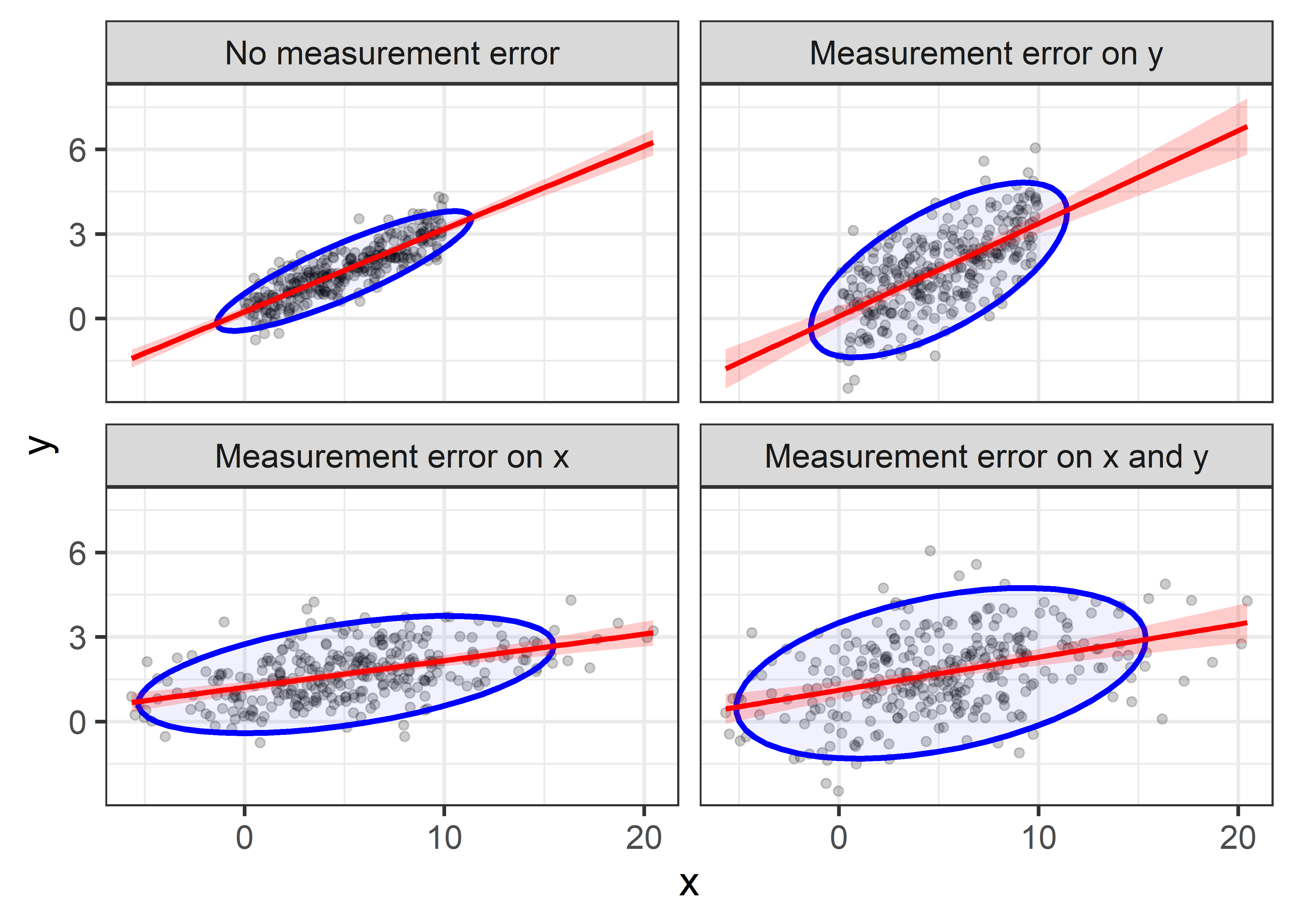
Comparing the plots in the first row, you can see that when additional error is added to \(y\), the regression slope remains essentially unchanged, illustrating that the estimate is unbiased. However, the confidence bounds on the regression line become wider, and the data ellipse becomes fatter in the \(y\) direction, illustrating the loss of precision.
The effect of error in \(x\) is less kind. Comparing the first row of plots with the second row, you can see that the estimated slope decreases when errors are added to \(x\). This is called attenuation bias, and it can be shown that \[ \widehat{\beta}_{x^\star} \longrightarrow \frac{\beta}{1+\sigma^2_\eta /\sigma^2_x} \; , \] where \(\beta\) here refers to the regression slope and \(\longrightarrow\) means “converges to”, as the sample size gets large. Thus, as \(\sigma^2_\eta\) increases, \(\widehat{\beta}_{x^\star}\) becomes less than \(\beta\).
Beyond plots like Figure fig-measerr-demo, we can see the effects of error in \(x\) or \(y\) on the model summary statistics such as the correlation \(r_{xy}\) or MSE by extracting these from the fitted models. This is easily done using dplyr::nest_by(name) and fitting the regression model to each subset, from which we can obtain the model statistics using sigma(), coef() and so forth. A bit of dplyr::mutate() magic is used to construct indicators errX and errY giving whether or not error was added to \(x\) and/or \(y\).
model_stats <- df |>
  dplyr::nest_by(name) |>
  mutate(model = list(lm(y ~ x, data = data)),
         sigma = sigma(model),
         intercept = coef(model)[1],
         slope = coef(model)[2],
         r = sqrt(summary(model)$r.squared)) |>
  mutate(errX = stringr::str_detect(name, " x"),
         errY = stringr::str_detect(name, " y")) |>
  mutate(errX = factor(errX, levels = c("TRUE", "FALSE")),
         errY = factor(errY, levels = c("TRUE", "FALSE"))) |>
  relocate(errX, errY, r, .after = name) |>
  select(-data) |>
  print()
# # A tibble: 4 × 8
# # Rowwise:  name
#   name                errX  errY      r model sigma intercept  slope
#   <fct>               <fct> <fct> <dbl> <lis> <dbl>     <dbl>  <dbl>
# 1 No measurement err… FALSE FALSE 0.858 <lm>  0.495    0.244  0.294
# 2 Measurement error … FALSE TRUE  0.648 <lm>  1.09     0.0838 0.329
# 3 Measurement error … TRUE  FALSE 0.481 <lm>  0.844    1.22   0.0946
# 4 Measurement error … TRUE  TRUE  0.401 <lm>  1.31     1.12   0.117
We plot the model \(R = r_{xy}\) and the estimated residual standard error in Figure fig-measerr-stats below. The lines connecting the points are approximately parallel, indicating that errors of measurement in \(x\) and \(y\) have nearly additive effects on model summaries.
p1 <- ggplot(data=model_stats,
             aes(x = errX, y = r,
                 group = errY, color = errY,
                 shape = errY, linetype = errY)) +
  geom_point(size = 4) +
  geom_line(linewidth = 1.2) +
  labs(x = "Error on X?",
       y = "Model R ",
       color = "Error on Y?",
       shape = "Error on Y?",
       linetype = "Error on Y?") +
  legend_inside(c(0.27, 0.8))

p2 <- ggplot(data=model_stats,
             aes(x = errX, y = sigma,
                 group = errY, color = errY,
                 shape = errY, linetype = errY)) +
  geom_point(size = 4) +
  geom_line(linewidth = 1.2) +
  labs(x = "Error on X?",
       y = "Model residual standard error",
       color = "Error on Y?",
       shape = "Error on Y?",
       linetype = "Error on Y?") +
  theme(legend.position = "none")

p1 + p2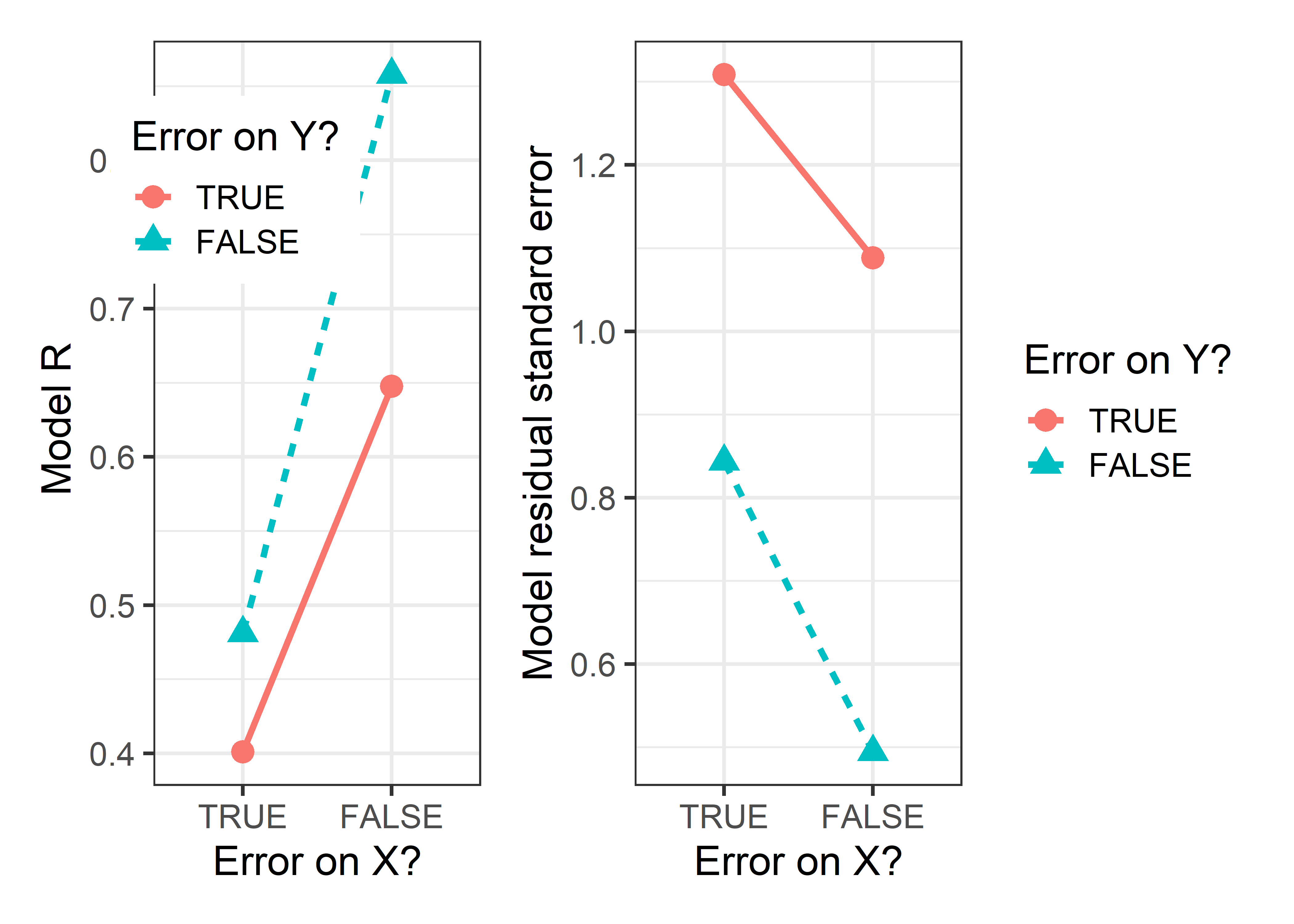
7.2.3 Coffee data: Bias and precision
In multiple regression the effects of measurement error in a predictor become more complex, because error variance in one predictor, \(x_1\), say, can affect the coefficients of other terms in the model.
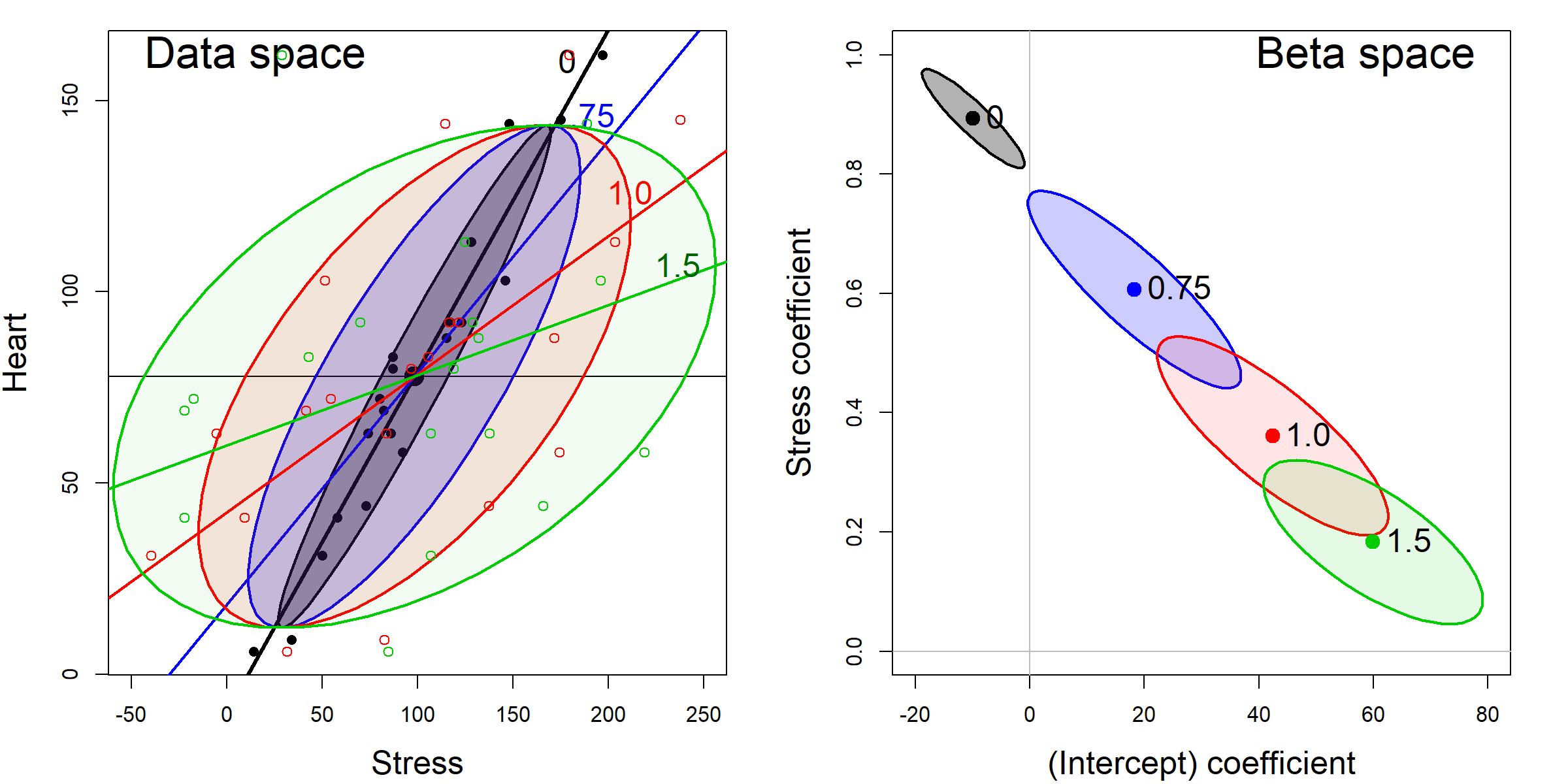
Consider the marginal relation between Heart disease and Stress in the coffee data. Figure fig-coffee-measerr-data-beta shows this with data ellipses in data space and the corresponding confidence ellipses in \(\beta\) space. Each panel starts with the observed data (the darkest ellipse, marked \(0\)), then adds random normal error, \(\mathcal{N}(0, \delta \times \mathrm{SD}_{Stress})\), with \(\delta = \{0.75, 1.0, 1.5\}\), to the value of Stress, while keeping the mean of Stress the same. All of the data ellipses have the same vertical shadows (\(\text{SD}_{\textrm{Heart}}\)), while the horizontal shadows increase with \(\delta\), driving the slope for Stress toward 0.
In \(\beta\) space, it can be seen that the estimated coefficients, \((\beta_0, \beta_{\textrm{Stress}})\) vary along a line and approach \(\beta_{\textrm{Stress}}=0\) as \(\delta\) gets sufficiently large. The shadows of ellipses for \((\beta_0, \beta_{\textrm{Stress}})\) along the \(\beta_{\textrm{Stress}}\) axis also demonstrate the effects of measurement error on the standard error of \(\beta_{\textrm{Stress}}\).
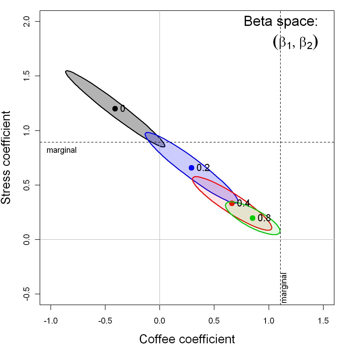
Perhaps less well-known, but both more surprising and interesting, is the effect that measurement error in one variable, \(x_1\), has on the estimate of the coefficient for an other variable, \(x_2\), in a multiple regression model. Figure fig-coffee-measerr shows the confidence ellipses for \((\beta_{\textrm{Coffee}}, \beta_{\textrm{Stress}})\) in the multiple regression predicting Heart disease, adding random normal error \(\mathcal{N}(0, \delta \times \mathrm{SD}_{Stress})\), with \(\delta = \{0, 0.2, 0.4, 0.8\}\), to the value of Stress alone.
As can be plainly seen, while this measurement error in Stress attenuates its coefficient, it also has the effect of biasing the coefficient for Coffee toward that in the marginal regression of Heart disease on Coffee alone.
7.3 What have we learned?
Data space and \(\beta\) space are dualities of each other - While we typically visualize regression models in data space (where points are observations), there’s a parallel \(\beta\) space where points represent models and their coefficients. These spaces mirror each other in elegant ways: lines in one space become points in the other, and confidence ellipses in \(\beta\) space are 90\(^\circ\) rotations of data ellipses. This duality reveals that we gain precision in estimating coefficients precisely where our data spread the most.
Confidence ellipses make hypothesis testing visual and intuitive - Instead of squinting at p-values in regression output, we can literally see whether hypotheses are supported by checking whether null hypothesis points fall inside or outside confidence ellipses. The shadows of these ellipses automatically give us individual confidence intervals, while the full ellipse captures joint uncertainty about multiple coefficients.
Measurement error in predictors is far more dangerous than measurement error in responses - While errors in your response variable (y) simply inflate standard errors without biasing coefficients, errors in predictors create attenuation bias that systematically pulls slope estimates toward zero. This “errors-in-variables” problem means that unreliable measurements of your predictors can make real effects appear weaker than they actually are.
In multiple regression, measurement error in one predictor contaminates estimates of other predictors - Perhaps most surprisingly, when one predictor in your model suffers from measurement error, it doesn’t just bias its own coefficient—it also distorts the coefficients of other variables in unpredictable ways. This distortion will cascade, meaning that measurement quality affects your entire model, not just individual variables.
Ellipses reveal the hidden geometry behind familiar statistical concepts - Data ellipses, confidence ellipses, and their mathematical relationships provide a geometric foundation for understanding correlation, regression coefficients, confidence intervals, and hypothesis tests. This visual approach transforms abstract statistical concepts into concrete geometric relationships that you can literally see and manipulate.
I use 40% and 68% for the data ellipses and 95% for the confidence ellipse only for ease of interpretation and convenience in plotting. What is important is the relative shape and orientation of the ellipses in the two panels of Figure fig-coffee-data-beta-both.↩︎