To make the preliminary test on variances is rather like putting to sea in a rowing boat to find out whether conditions are sufficiently calm for an ocean liner to leave port. — G. E. P. Box (1953)
This chapter concerns the extension of tests of homogeneity of variance from the classical univariate ANOVA setting to the analogous multivariate (MANOVA) setting. Such tests are a routine but important aspect of data analysis, as particular violations can drastically impact model estimates and appropriate conclusions that can be drawn (Lix & Keselman, 1996).
Beyond issues of model assumptions, the question of equality of covariance matrices is often of general interest itself. For instance, variability is often an important issue in studies of strict equivalence in laboratories comparing results across multiple patient measurements and in other applied contexts (see Gastwirth et al., 2009 for other exemplars).
Moreover the outcome of such tests often have important consequences for the details of a main method of analysis. Just as the Welch \(t\)-test (Welch, 1947) is now commonly used and reported for a two-group test of differences in means under unequal variances, a preliminary test of equality of covariance matrices is often used in discriminant analysis to decide whether linear (LDA) or quadratic discriminant analysis (QDA) should be applied in a given problem. In such cases, the data at hand should inform the choice of statistical analysis to utilize.
I provide some answers to the following questions:
Visualization: How can we visualize differences among group variances and covariance matrices, perhaps in a way that is analogous to what is done to visualize differences among group means? As will be illustrated (sec-viz-boxM), differences among covariance matrices are comprised of spread in overall size (“scatter”) and shape (“orientation”). These can be easily seen in data space with data ellipses, particularly if the data is centered by shifting all groups to the grand mean so they can be directly compared.
Low-D views: When there are more than a few response variables, what low-dimensional views can show the most interesting properties related to the equality of covariance matrices? Projecting the data into the space of the principal components serves well again here (sec-eqcov-low-rank-views). Surprisingly, we will see that the small dimensions contain useful information about differences among the group covariance matrices, similar to what we find for outlier detection.
Other statistics: Box’s \(\mathcal{M}\)-test (Box, 1949) is most widely used. Are there other worthwhile test statistics? You will see that graphical methods suggest alternatives in sec-other-measures. Similarly, the univariate Levene’s test has a simple multivariate generalization which can be visualized using HE plots (sec-multivar-levene).
The following sections provide a capsule summary of the issues in this topic following Friendly & Sigal (2018). Most of the discussion is couched in terms of a one-way design for simplicity, but the same ideas can apply to two-way (and higher) designs, where a “group” factor is defined as the product combination (interaction) of two or more factor variables.
When there are also numeric covariates, this topic can also be extended to the multivariate analysis of covariance (MANCOVA) setting. This is accomplished simply by applying these techniques to the residuals from predictions by the covariates alone.
Packages
In this chapter I use the following packages. Load them now.
The main methods described here are implemented in the heplots package.
12.1 Homogeneity of Variance in Univariate ANOVA
In classical (Gaussian) univariate ANOVA models, the main interest is typically on tests of mean differences in a response \(y\) according to one or more factors. The validity of the typical \(F\) test, however, relies on the assumption of homogeneity of variance: all groups have the same (or similar) variance,
\[ \sigma_1^2 = \sigma_2^2 = \cdots = \sigma_g^2 \; . \]
It turns out that the \(F\) test for differences in means is relatively robust to violation of this assumption (Harwell et al., 1992), as long as the group sample sizes are roughly equal.1 This applies to Type I error \(\alpha\) rates, which are not much affected. However, unequal variance makes the ANOVA tests less efficient: you lose power to detect significant differences.
A variety of classical test statistics for homogeneity of variance are available, including Hartley’s \(F_{max}\) (Hartley, 1950), Cochran’s C (Cochran, 1941),and Bartlett’s test (Bartlett, 1937), but these have been found to have terrible statistical properties (Rogan & Keselman, 1977), which prompted Box’s famous quote.
Levene (1960) introduced a different form of test, based on the simple idea that when variances are equal across groups, the average absolute values of differences between the observations and group means will also be equal, i.e., substituting an \(L_1\) norm for the \(L_2\) norm of variance. In a one-way design, this is equivalent to a test of group differences in the means of the auxilliary variable \(z_{ij} = | y_{ij} - \bar{y}_i |\).
More robust versions of this test were proposed by Brown & Forsythe (1974). These tests substitute the group mean by either the group median or a trimmed mean in the ANOVA of the absolute deviations. Some suggest these should be almost always preferred to Levene’s version using the mean deviation. See Conover et al. (1981) for an early review and Gastwirth et al. (2009) for a general discussion of these tests. In what follows, we refer to this class of tests as “Levene-type” tests and suggest a multivariate extension described below (sec-mlevene).
These deviations from a group central can be calculated using heplots::colDevs() and the central value can be a function, like mean, median or an anonymous one like function(x) mean(x, trim = 0.1)) that trims 10% off each side of the distribution. With a response Y Levene-type tests then be performed “by hand” as follows:
The function car::leveneTest() does this, so we could examine whether the variances are equal in the Penguin variables, one at a time, like so:
data(peng, package = "heplots")
leveneTest(bill_length ~ species, data=peng)
# Levene's Test for Homogeneity of Variance (center = median)
#        Df F value Pr(>F)
# group   2    2.29    0.1
#       330

leveneTest(bill_depth ~ species, data=peng)
# Levene's Test for Homogeneity of Variance (center = median)
#        Df F value Pr(>F)
# group   2    1.91   0.15
#       330

# ...

leveneTest(body_mass ~ species, data=peng)
# Levene's Test for Homogeneity of Variance (center = median)
#        Df F value Pr(>F)
# group   2    5.13 0.0064 **
#       330
# ---
# Signif. codes:  0 '***' 0.001 '**' 0.01 '*' 0.05 '.' 0.1 ' ' 1
More conveniently, heplots:leveneTests() with an “s”, does this for each of a set of response variables, specified in a data frame, a model formula or a "mlm" object. It also formats the results in a more pleasing way:
peng.mod <- lm(cbind(bill_length, bill_depth, flipper_length, body_mass) ~ species,
               data = peng)
leveneTests(peng.mod)
# Levene's Tests for Homogeneity of Variance (center = median)
#
#                df1 df2 F value Pr(>F)
# bill_length      2 330    2.29 0.1033
# bill_depth       2 330    1.91 0.1494
# flipper_length   2 330    0.44 0.6426
# body_mass        2 330    5.13 0.0064 **
# ---
# Signif. codes:  0 '***' 0.001 '**' 0.01 '*' 0.05 '.' 0.1 ' ' 1
So, this tells us that the groups do not differ in variances on first three variables, but they do for body_mass.
12.2 Visualizing Levene’s test
To gain some insight into the problem of homogeneity of variance it is helpful so see how the situation looks in terms of data. For the Penguin data, it might be simplest just just to look at boxplots of the variables and try to see whether the widths of the central 50% boxes seem to be the same, as in Figure fig-peng-boxplots. However, it is perceptually difficult to focus on differences with widths of the boxes within each panel when their centers also differ from group to group.
See the code
source("R/penguin/penguin-colors.R")
col <- peng.colors("dark")
clr <- c(col, gray(.20))
peng_long <- peng |>
  pivot_longer(bill_length:body_mass,
               names_to = "variable",
               values_to = "value")

peng_long |>
  group_by(species) |>
  ggplot(aes(value, species, fill = species)) +
  geom_boxplot() +
  facet_wrap(~ variable, scales = 'free_x') +
  theme_penguins() +
  theme_bw(base_size = 14) +
theme(legend.position = 'none') 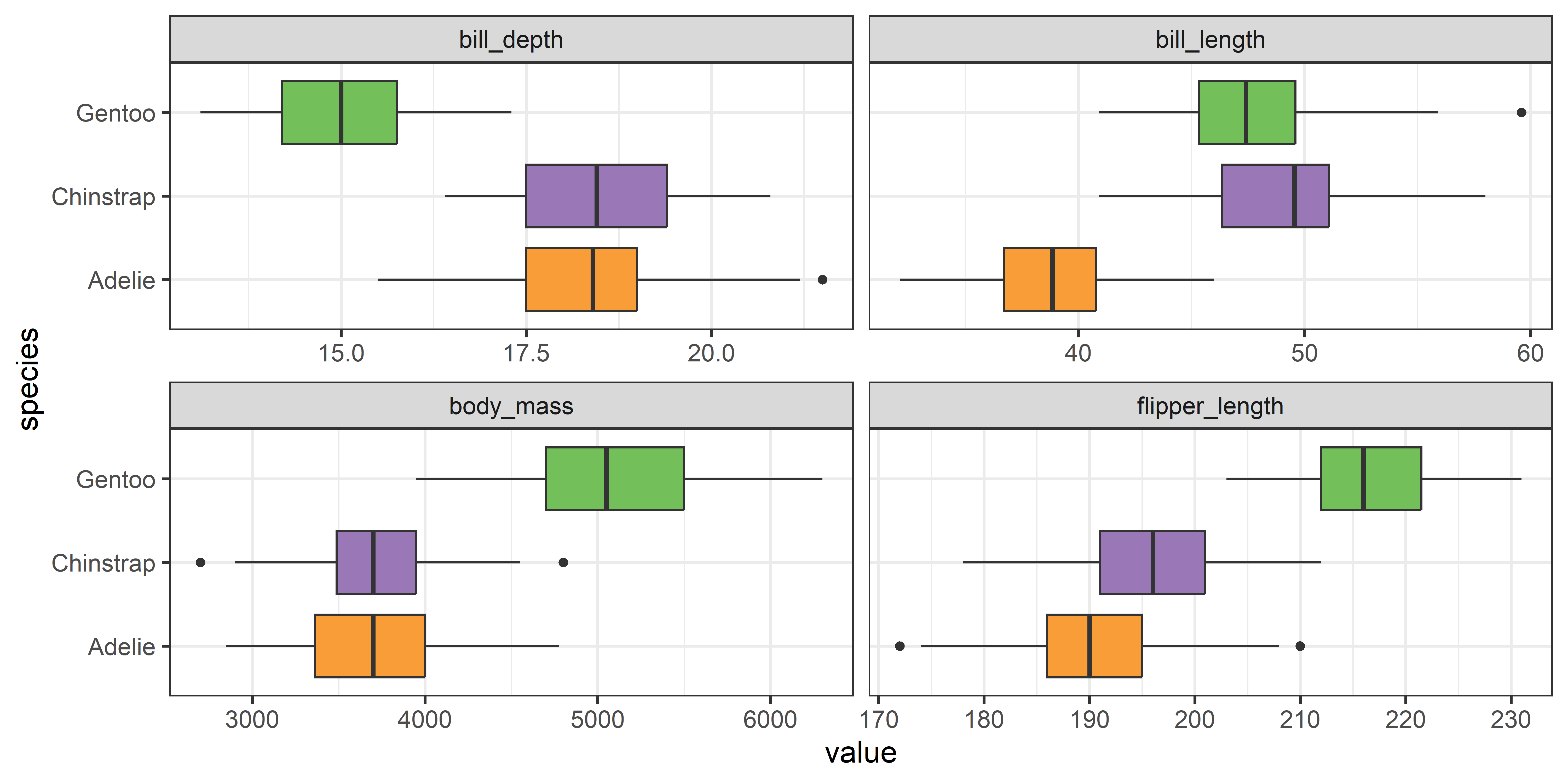
Instead, you can see more directly what is tested by the Levene test by graphing the absolute deviations from the group means or medians. This is another example of the graphic idea that you can make visual comparisons easier by plotting quantities of direct interest. You can calculate the median deviation values as follows:
From a boxplot of the absolute deviations in Figure fig-peng-devplots your eye can now focus on the central value, shown by the median ‘|’ line, because Levene’s method is testing whether these differ across groups.
See the code
# calculate absolute differences from median
dev_long <- data.frame(species = peng$species, pengDevs) |>
  pivot_longer(bill_length:body_mass,
               names_to = "variable",
               values_to = "value")

dev_long |>
  group_by(species) |>
  ggplot(aes(value, species, fill = species)) +
  geom_boxplot() +
  facet_wrap(~ variable, scales = 'free_x') +
  xlab("absolute median deviation") +
  theme_penguins() +
  theme_bw(base_size = 14) +
theme(legend.position = 'none') 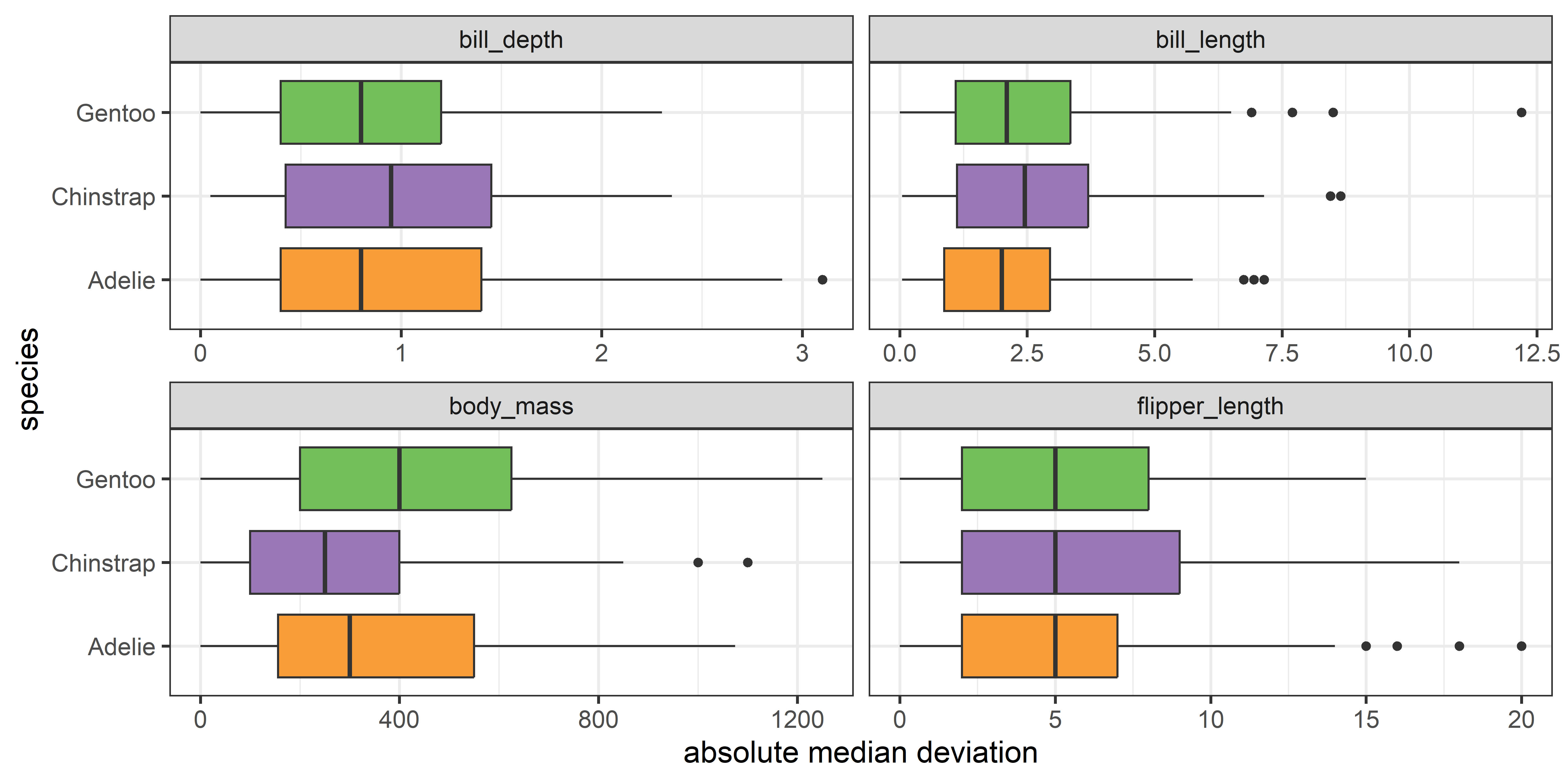
It is now easy to see that the medians largely align for all the variables except for body_mass.
12.3 Homogeneity of variance in MANOVA
In the MANOVA context, the main emphasis, of course, is on differences among mean vectors, testing
\[ \mathcal{H}_0 : \boldsymbol{\mu}_1 = \boldsymbol{\mu}_2 = \cdots = \boldsymbol{\mu}_g \; . \] However, the standard test statistics (Wilks’ Lambda, Hotelling-Lawley trace, Pillai-Bartlett trace, Roy’s maximum root) rely upon the analogous assumption that the within-group covariance matrices \(\boldsymbol{\Sigma}_i\) are equal for all groups,
\[ \boldsymbol{\Sigma}_1 = \boldsymbol{\Sigma}_2 = \cdots = \boldsymbol{\Sigma}_g \; . \] This is much stronger than in the univariate case, because it also requires that all the correlations between pairs of variables are the same for all groups. For example, for two responses, there are three parameters (\(\rho, \sigma_1^2, \sigma_2^2\)) assumed equal across all groups; for \(p\) responses, there are \(p (p+1) / 2\) assumed equal. The variances relate to size differences among data ellipses while the differences in the covariances appear as differences in shape.
Example 12.1 Penguin data: Covariance ellipses
To preview a main example, Figure fig-peng-covEllipse0 shows data ellipses for the main size variables in the Penguins data (peng). heplots::covEllipses() is specialized for viewing the relations among the data ellipsoids representing the sample covariance matrices, \(\mathbf{S}_1 = \mathbf{S}_2 = \cdots = \mathbf{S}_g\). It draws the data ellipse for each group, and also for the pooled within-group \(\mathbf{S}_p\), as shown in Figure fig-peng-covEllipse0 for bill length and bill depth.
You can see that the sizes and shapes of the data ellipses are sort of similar in the left panel. The visual comparison becomes more precise when the data ellipses are all shifted to a common origin at the grand means (using center = TRUE). From this you can see that the Adélie group differs most from the others.
See the code
op <- par(mar = c(4, 4, 1, 1) + .5,
          mfrow = c(c(1,2)))
covEllipses(cbind(bill_length, bill_depth) ~ species, data=peng,
  fill = TRUE,
  fill.alpha = 0.1,
  lwd = 3,
  col = clr)

covEllipses(cbind(bill_length, bill_depth) ~ species, data=peng,
  center = TRUE,
  fill = c(rep(FALSE,3), TRUE),
  fill.alpha = .1,
  lwd = 3,
  col = clr,
  label.pos = c(1:3,0))
par(op)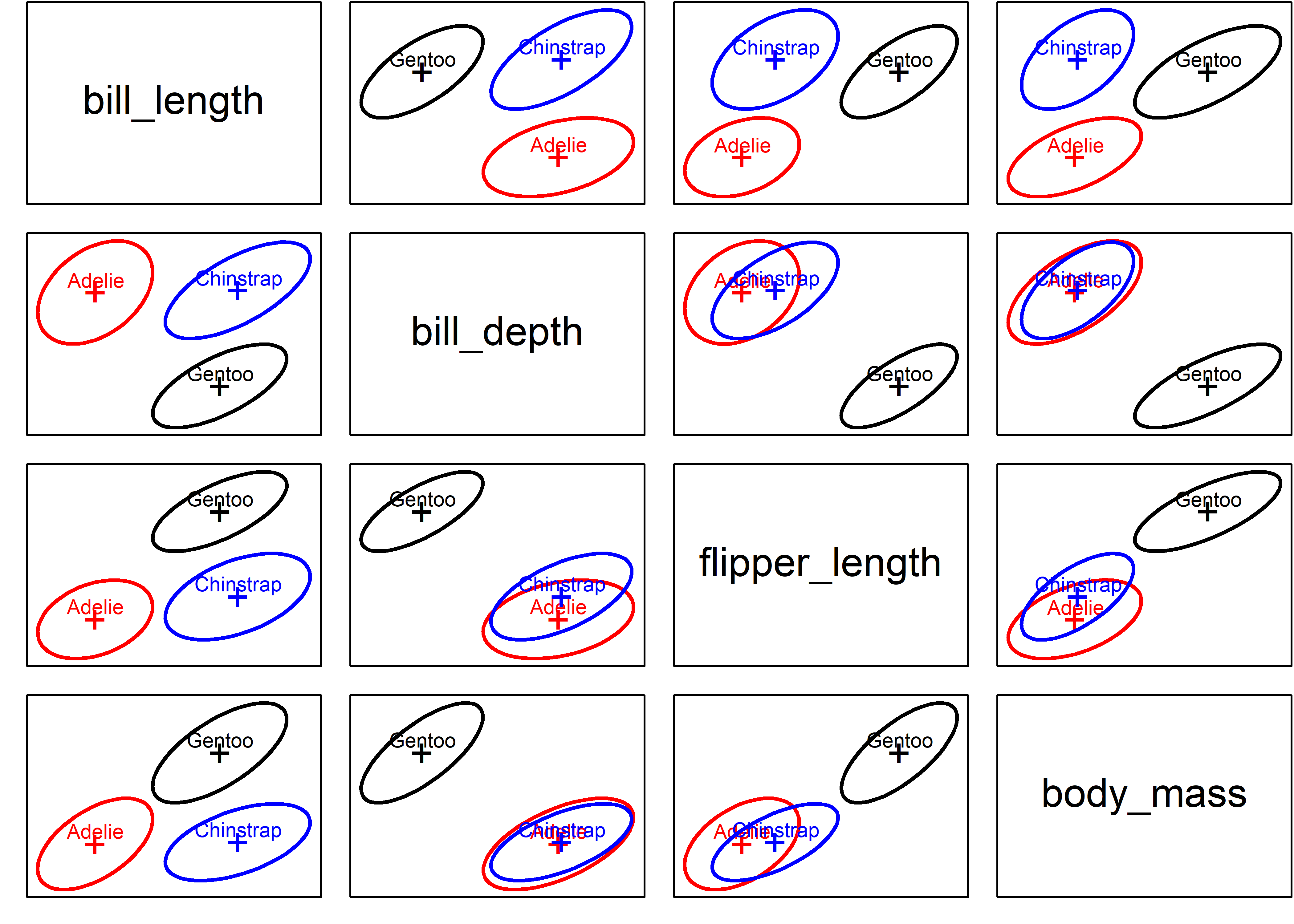
All such pairwise plots in scatterplot matrix format are produced using the variables argument to covEllipses(), giving Figure fig-peng-covEllipse-pairs.
See the code
clr <- c(peng.colors(), "black")
covEllipses(peng[,3:6], peng$species,
  variables=1:4,
  col = clr,
  fill=TRUE,
  fill.alpha=.1)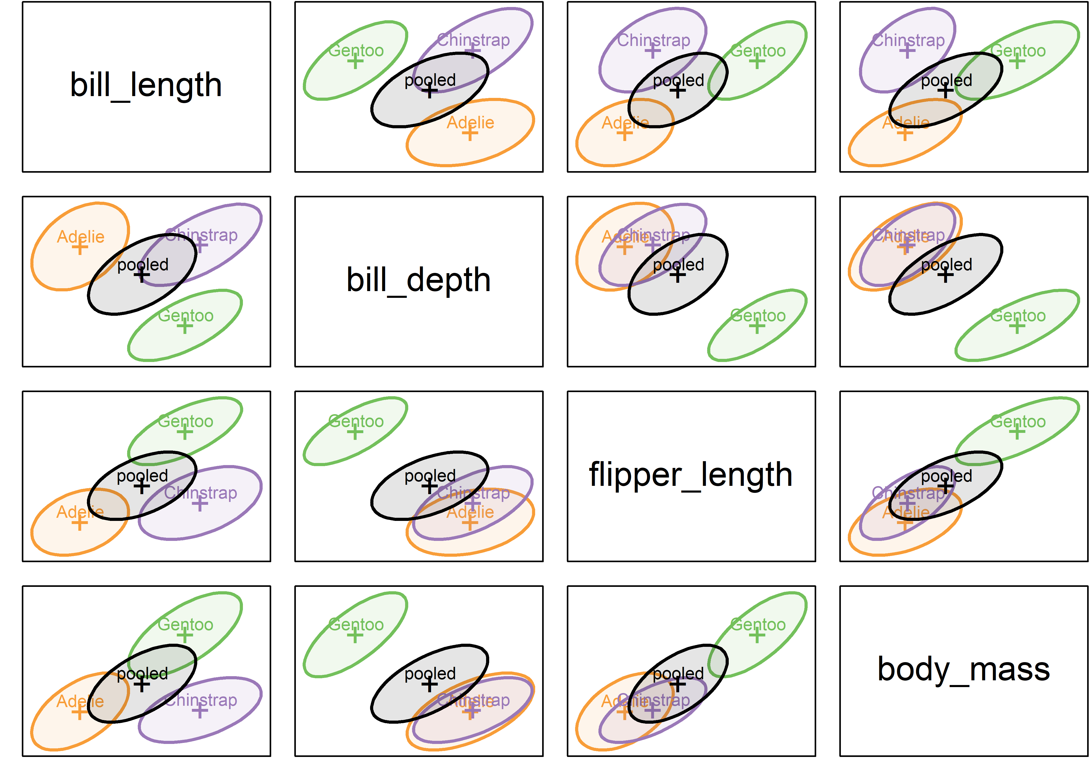
The covariance ellipses in Figure fig-peng-covEllipse-pairs look pretty similar in size, shape and orientation. But what does Box’s \(\mathcal{M}\) test (described below) say?
As you can see, it concludes strongly against the null hypothesis, because the test is highly sensitive to small differences among the covariance matrices.
Example 12.2 Iris data: Covariance ellipses
It will be useful to have another example as we proceed, so Figure fig-iris-covEllipse-pairs shows an analogous plot for the iris data we examined in sec-HEplot-matrices.
Even when these are shown uncentered, the differences in size, shape and orientation are much more apparent. Iris setosa stands out as having smaller variance on some of the variables, while the ellipses for virginica tend to be larger. Their orientation (slopes) also differ quite a bit.
Code
iris.colors <- c("red", "darkgreen", "blue")
covEllipses(iris[,1:4], iris$Species,
  variables=1:4,
  fill = TRUE,
  fill.alpha=.1,
  col = c(iris.colors, "black"),
  label.pos=c(1:3,0))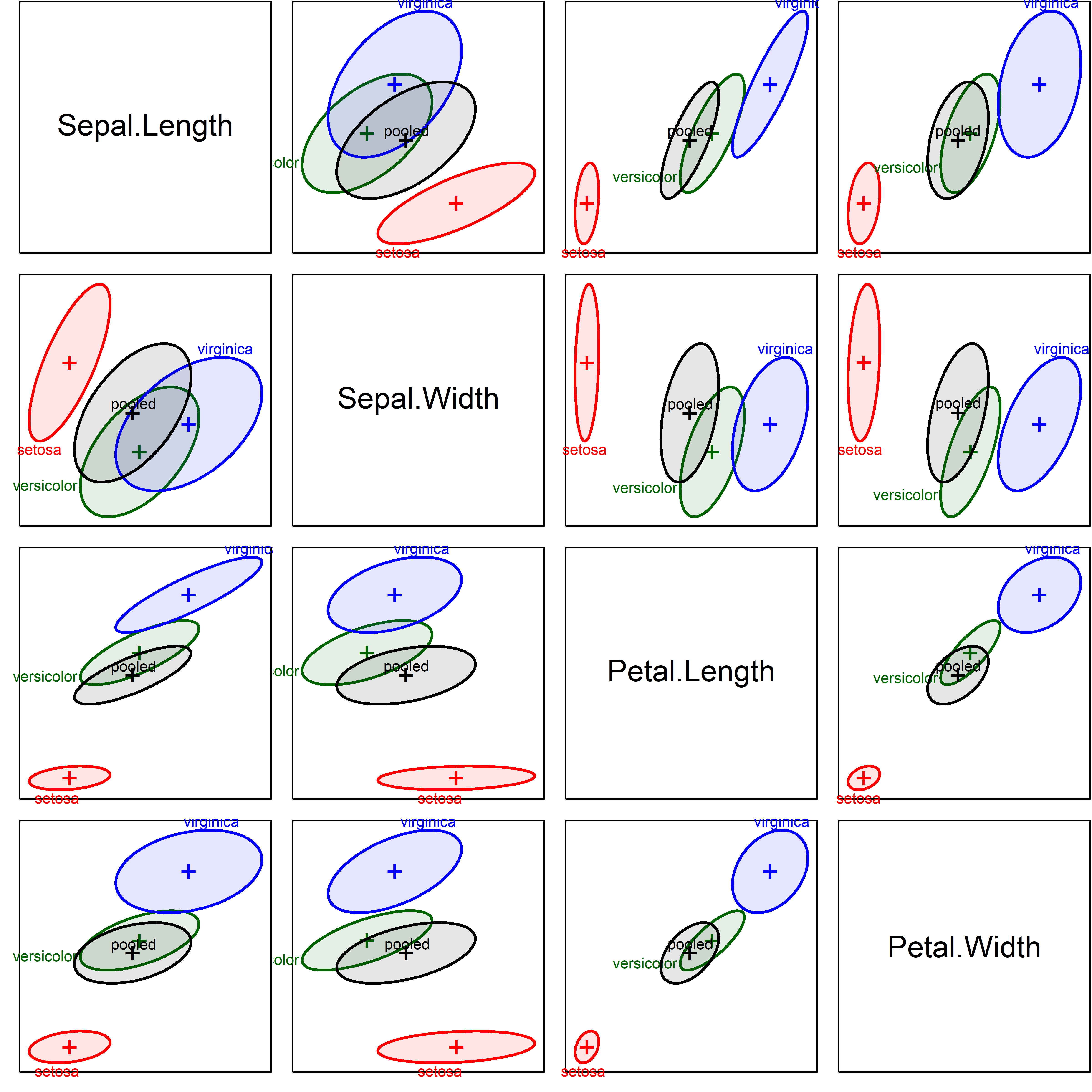
boxM() gives the following results:
Unsurprisingly, Box’s \(\mathcal{M}\) tests gives \(\chi^2_{20} = 140.94\) with a \(p\)-value < 2.2e-16, putting numbers to the visual conclusion from Figure fig-iris-covEllipse-pairs.
12.4 Box’s \(\mathcal{M}\) test
Take a moment and think, “How could we generalize a test of equality of variances, \(s_1^2 = s_2^2 = \cdots = s_g^2\), to the multivariate case, where we have \((p \times p)\) matrices, \(\mathbf{S}_1 = \mathbf{S}_2 = \cdots = \mathbf{S}_g\) for each of \(g\) groups?”.
Multivariate thinking suggests that that we calculate some measure of “size” of each \(\mathbf{S}_i\), in a similar way to what is done in multivariate tests comparing \(\mathbf{H}\) and \(\mathbf{E}\) matrices.
Box (1949) proposed the following likelihood-ratio test (LRT) statistic \(\mathcal{M}\) for testing the hypothesis of equal covariance matrices. It uses the log of the determinant \(\vert \mathbf{S}_i \vert\) as the measure of size.
\[ \mathcal{M} = (N -g) \; \ln \vert \mathbf{S}_p \vert - \sum_{i=1}^g (n_i -1) \; \ln \vert \mathbf{S}_i \vert \; , \tag{12.1}\]
where \(N = \sum n_i\) is the total sample size and
\[ \mathbf{S}_p = (N-g)^{-1} \sum_{i=1}^g (n_i - 1) \mathbf{S}_i \]
is the pooled covariance matrix.
\(\mathcal{M}\) can thus be thought of as a ratio of the determinant of the pooled \(\mathbf{S}_p\) to the geometric mean of the determinants of the separate \(\mathbf{S}_i\).
In practice, there are various transformations of the value of \(M\) to yield a test statistic with an approximately known distribution (Timm, 1975). Roughly speaking, when each \(n_i > 20\), a \(\chi^2\) approximation is often used; otherwise an \(F\) approximation is known to be more accurate.
Asymptotically, \(-2 \ln (\mathcal{M})\) has a \(\chi^2\) distribution. The \(\chi^2\) approximation due to Box (1949, 1950) is that
\[ X^2 = -2 (1-c_1) \; \ln (\mathcal{M}) \quad \sim \quad \chi^2_\text{df} \] with \(\text{df} = (g-1) p (p+1)/2\) degrees of freedom. A bias correction constant \(c_1\) improves accuracy of the approximation:
\[ c_1 = \left( \sum_i \frac{1}{n_i -1} - \frac{1}{N-g} \right) \frac{2p^2 +3p -1}{6 (p+1)(g-1)} \; . \]
In this form, Bartlett’s test for equality of variances in the univariate case is the special case of Box’s \(\mathcal{M}\) when there is only one response variable, so Bartlett’s test is sometimes used as univariate follow-up to determine which response variables show heterogeneity of variance.
Yet, like its univariate counterparts, Box’s test is well-known to be highly sensitive to violation of (multivariate) normality and the presence of outliers2, as Box (1953) suggested in the opening chapter quote. Yet, it provides a nice framework for thinking about this problem more generally and gives rise to interesting graphic methods.
12.5 Visualizing heterogeneity
A larger goal of this chapter is to use this background as another illustration of multivariate thinking, here, for visualizing and testing the heterogeneity of covariance matrices in multivariate designs.
While researchers often rely on a single number to determine if their data have met a particular threshold, such compression will often obscure interesting information, particularly when a test concludes that differences exist, and one is left to wonder ``why?’’. It is within this context where, again, visualizations often reign supreme.
We have already seen one useful method in sec-homogeneity-MANOVA, which uses direct visualization of the information in the \(\mathbf{S}_i\) and \(\mathbf{S}_p\) using data ellipsoids to show size and shape as minimal schematic summaries; In what follows, I propose three additional visualization-based approaches to questions of heterogeneity of covariance in MANOVA designs:
a simple dotplot (sec-viz-boxM) of the components of Box’s \(\mathcal{M}\) test: the log determinants of the \(\mathbf{S}_i\) together with that of the pooled \(\mathbf{S}_p\). Extensions of these simple plots raise the question of whether measures of heterogeneity other than that captured in Box’s test might also be useful; and,
PCA low-rank views (sec-eqcov-low-rank-views) to highlight features more easily seen there than in the full data space.
The analogy with the four types of multivariate test statistics (sec-multivar-tests) suggests other measures that could be used to compare the \(\mathbf{S}_i\) with \(\mathbf{S}_p\) (sec-other-measures).
the connection between Levene-type tests and an ANOVA (of centered absolute differences) suggests a parallel with a multivariate extension of Levene-type tests and a MANOVA (sec-multivar-levene). We explore this with a version of Hypothesis-Error (HE) plots that we found useful for visualizing mean differences in MANOVA designs.
These methods are described and illustrated in Friendly & Sigal (2018).
12.6 Visualizing Box’s \(\mathcal{M}\)
Box’s test is based on a comparison of the log determinants of the \(\mathbf{S}_i\) relative to that of the pooled \(\mathbf{S}_p\), so the simplest thing to do is just plot them!
boxM() produces a "boxm" object, for which there are summary() (details) and plot() methods. The plot() method gives a dot plot of the log determinants \(\ln \vert \mathbf{S}_i \vert\) together with that for the pooled covariance \(\ln \vert \mathbf{S}_p \vert\). Cai et al. (2015) provide the theory for the (asymptotic) confidence intervals shown.
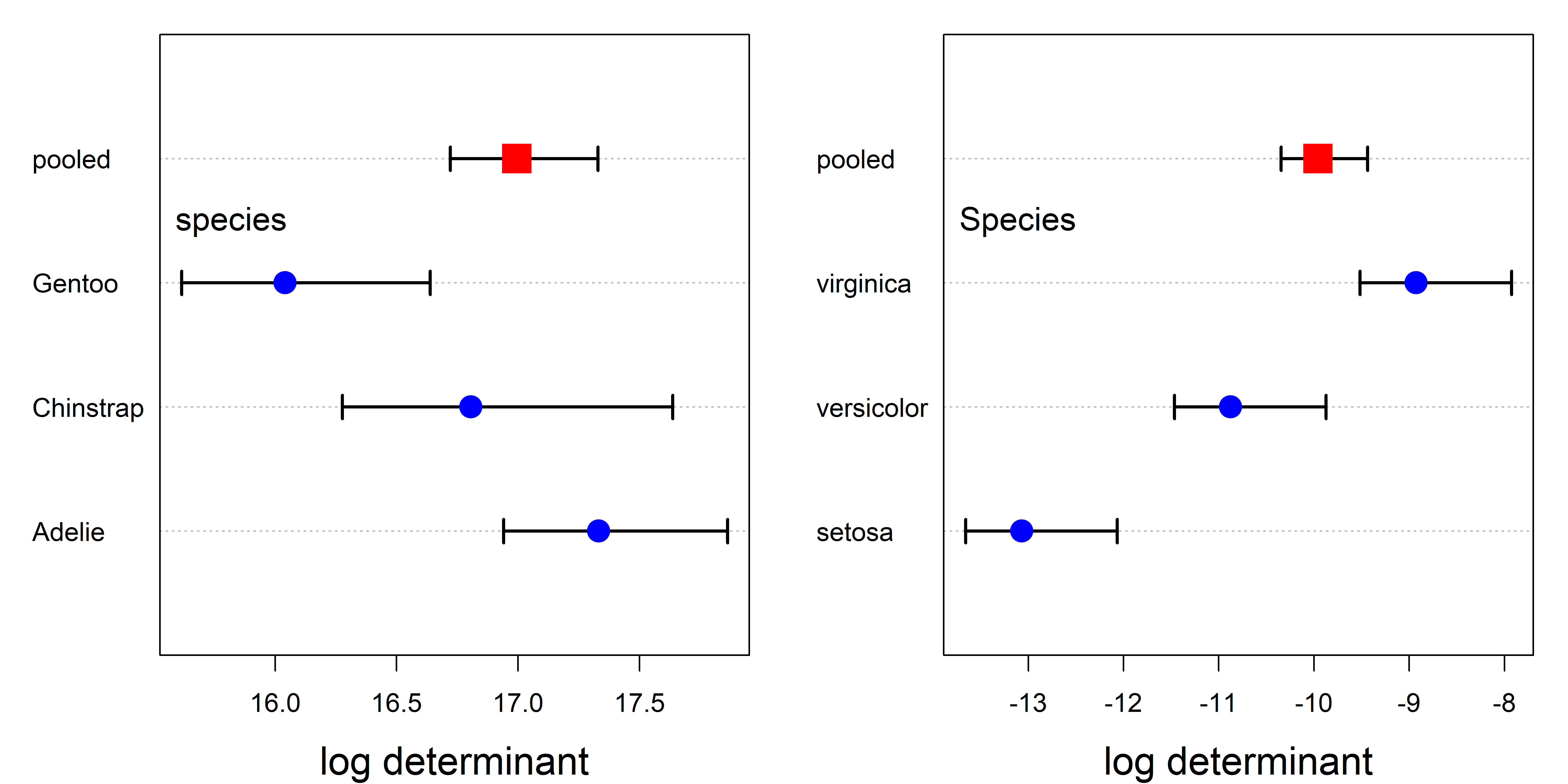
In these plots (Figure fig-peng-iris-boxm-plots), the value for the pooled covariance appears within the range of the groups, because it is a weighted average. If you take a moment to look back at Figure fig-peng-covEllipse-pairs, you’ll see that the data ellipses for Gentoo are slightly smaller in most pairwise views, but it is much easier to see this in a plot that summarizes this, like Figure fig-peng-iris-boxm-plots.
From Figure fig-iris-covEllipse-pairs, it is clear that setosa shows the smallest within-group variability. The numeric scale values on the horizontal axis give a sense that the range across groups is considerably greater for the iris data than for the Penguins. Some generalizations of Box’s test using other measures are illustrated in sec-other-measures.
12.7 Low-rank views
With \(p>3\) response variables, a simple alternative to the pairwise 2D plots in data space (shown in Figure fig-peng-covEllipse-pairs and Figure fig-iris-covEllipse-pairs) is the projection into the principal component space accounting for the greatest amounts of total variance in the data (Friendly & Sigal (2018)). For the Iris data, a simple PCA of the covariance matrix shows that nearly 96% of total variance in the data is accounted for in the first two dimensions.
Figure fig-iris-pca-covellipses shows the plots of the covariance ellipsoids for the first two principal component scores, uncentered (left panel) and centered (right panel). The dominant PC1 (73% of total variance) essentially orders the species by a measure of overall size of their sepals and petals. In the centered view at the right, it can again be seen how Setosa differs in covariance from the other two species, and that while Virginca and Versicolor both have similar shapes to the pooled covariance matrix, Versicolor has somewhat greater variance on PC1.
source(here::here("R/util/text.usr.R"))    # text in user coords

covEllipses(iris.pca$x, iris$Species,
  col = c(iris.colors, "black"),                # uncentered
  fill=TRUE, fill.alpha=.1,
  cex.lab = 1.5,
  label.pos = c(1, 3, 3, 0), asp=1)
text.usr(0.05, 0.95, "(a) Uncentered", pos = 4, cex = 1.5)

covEllipses(iris.pca$x, iris$Species,
  center=TRUE,                                  # centered
  col = c(iris.colors, "black"),
  fill=TRUE, fill.alpha=.1,
  cex.lab = 1.5,
  label.pos = c(1, 3, 3, 0), asp=1)
text.usr(0.95, 0.95, "(b) Centered", pos = 2, cex = 1.5)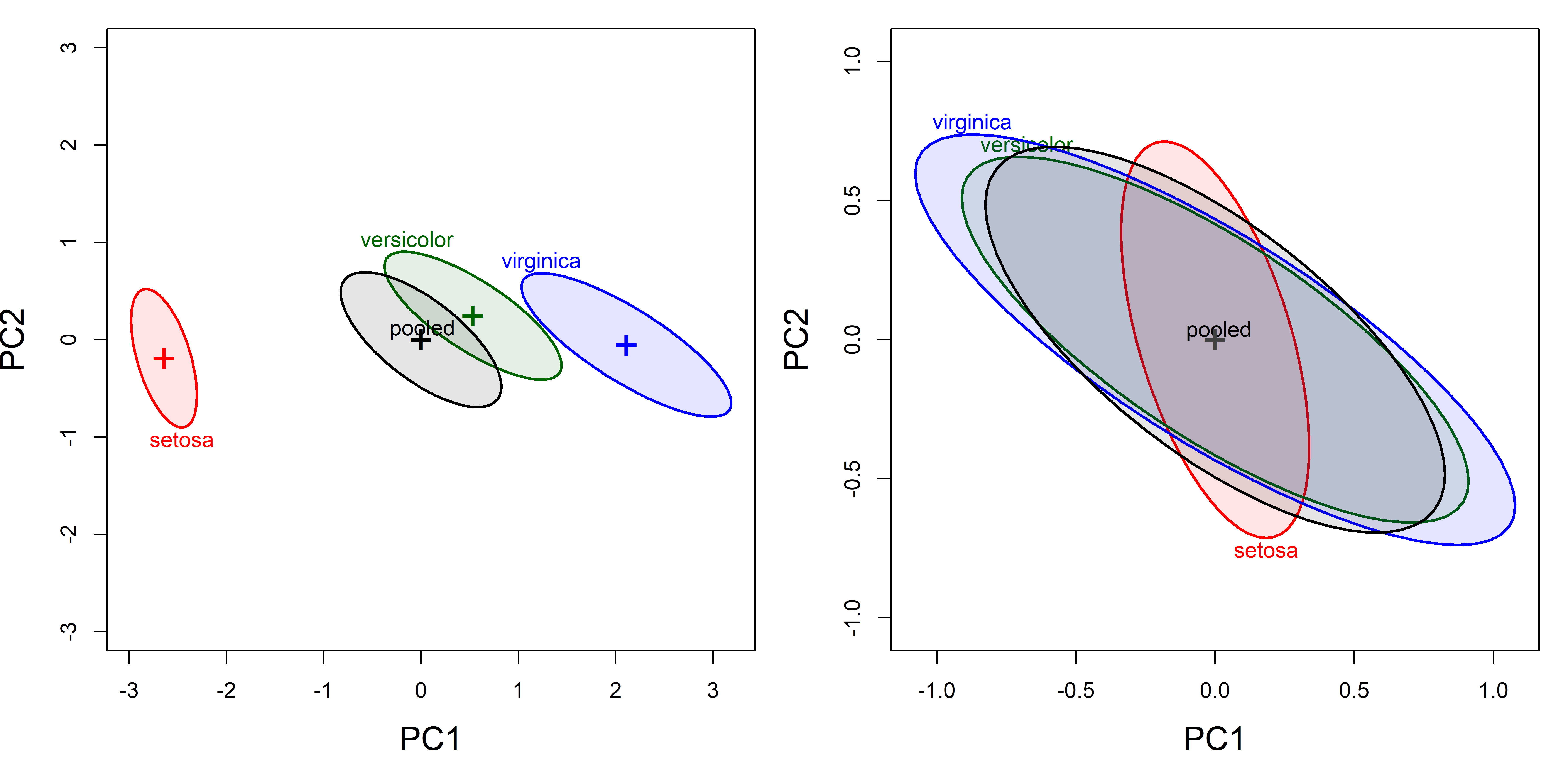
12.7.1 Small dimensions can matter
For the Iris data, the first two principal components account for 96% of total variance, so we might think we are done here. Yet, as we’ve seen in other problems (outliers, collinearity), important information also exists in the space of the smallest principal component dimensions.
This is also true, as we will see for Box’s \(\mathcal{M}\) test, because it is a (linear) function of all the eigenvalues of the between and within group covariance matrices, is therefore also subject to the influence of the smaller dimensions, where differences among \(\mathbf{S}_i\) and of \(\mathbf{S}_p\) can lurk.
covEllipses(iris.pca$x, iris$Species,
  variables = 3:4,
  center=TRUE,
  col = c(iris.colors, "black"),
  fill=TRUE, fill.alpha=.1,
  cex.lab = 1.5,
  label.pos = c(1, 3, 3, 4), asp=1)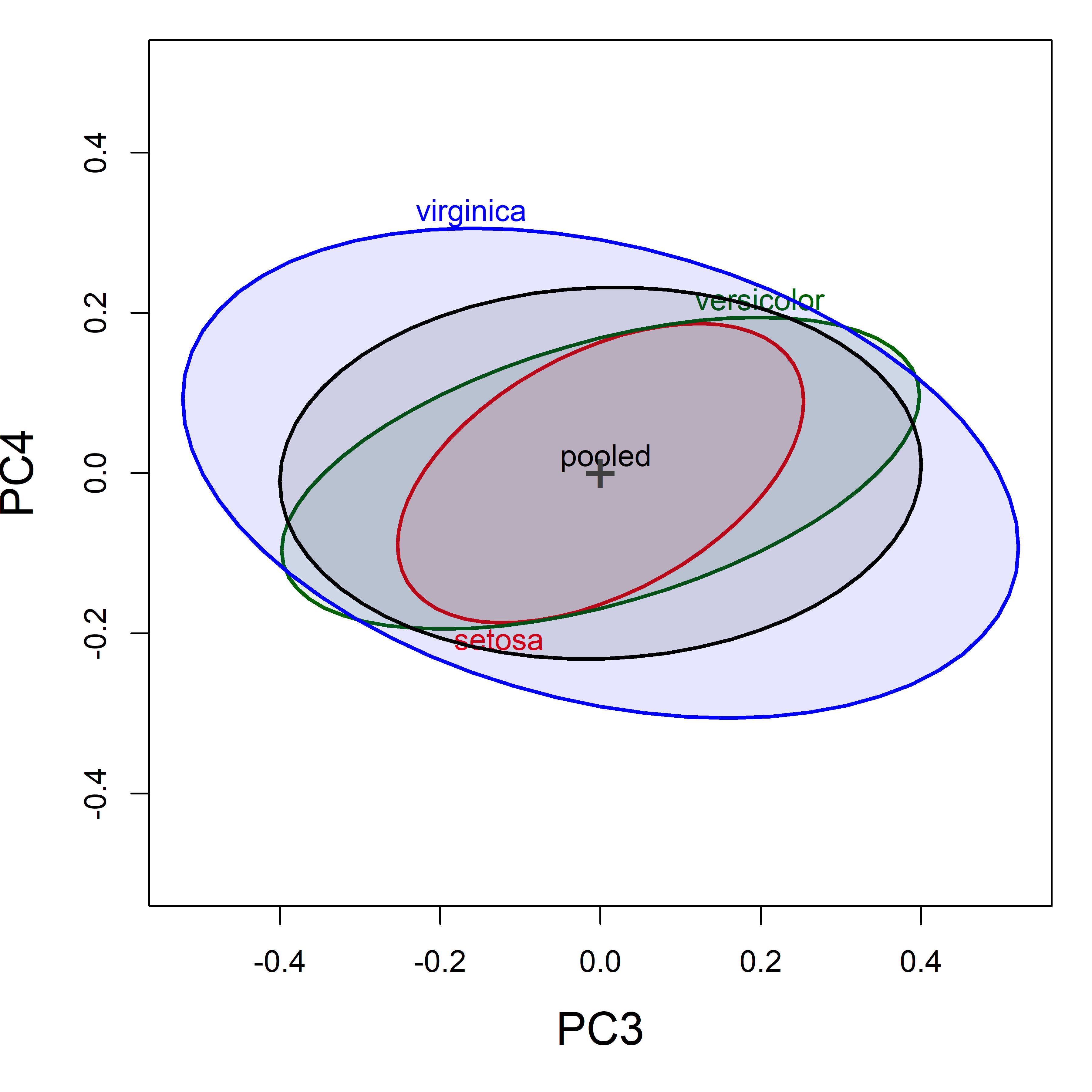
Figure fig-iris-pca-covellipses-dim34 shows the covariance ellipsoids in (PC3, PC4) space. Even though these dimensions contribute little to total variance, there are more pronounced differences in the within-group shapes (correlations) relative to the pooled covariance, and these contribute to a rejection of homogeneity by Box’s \(\mathcal{M}\) test. Here we see that the correlation for Virginca is of opposite sign from the other two groups.
12.8 Other measures of heterogeneity
As we saw above (sec-homogeneity-MANOVA), the question of equality of covariance matrices can be expressed in terms of the similarity in size and shape of the data ellipses for the individual group \(\mathbf{S}_i\) relative to that of \(\mathbf{S}_p\). Box’s \(\mathcal{M}\) test uses just one possible function to describe this size: the logs of their determinants.
When \(\boldsymbol{\Sigma}\) is the covariance matrix of a multivariate vector \(\mathbf{y}\) with eigenvalues \(\lambda_1 \ge \lambda_2 \ge \dots \lambda_p\), the properties shown in Table tbl-eigval-ellipse represent methods of describing the size and shape of the ellipsoid in \(\mathbb{R}^{p}\).3 Just as is the case for tests of the MLM itself where different functions of these give test statistics (Wilks’ \(\Lambda\), Pillai trace, etc.), one could construct other test statistics for homogeneity of covariance matrices as shown in Table tbl-eigval-ellipse.
| Size | Conceptual formula | Geometry | Function |
|---|---|---|---|
| (a) Generalized variance: | \(\det{\boldsymbol{\Sigma}} = \prod_i \lambda_i\) | area, (hyper)volume | geometric mean |
| (b) Average variance: | \(\text{tr}({\boldsymbol{\Sigma}}) = \sum_i \lambda_i\) | linear sum | arithmetic mean |
| (c) Average precision: | \(1/ \text{tr}({\boldsymbol{\Sigma}^{-1}}) = 1/\sum_i (1/\lambda_i)\) | harmonic mean | |
| (d) Maximal variance: | \(\lambda_1\) | maximum dimension | supremum |
Hence, for a sample covariance matrix \(\mathbf{S}\), \(\vert \mathbf{S} \vert\) is a measure of generalized variance and \(\ln \vert \mathbf{S} \vert\) is a measure of average variance across the \(p\) dimensions.
The plot methods in for "boxM" objects in heplots can compute and plot all of the functions of the eigenvalues in Table tbl-eigval-ellipse. The results for the Penguin data are shown in Figure fig-peng-boxm-plots.
plot(peng.boxm, which="product",   gplabel="species")
plot(peng.boxm, which="sum",       gplabel="species")
plot(peng.boxm, which="precision", gplabel="species")
plot(peng.boxm, which="max",       gplabel="species")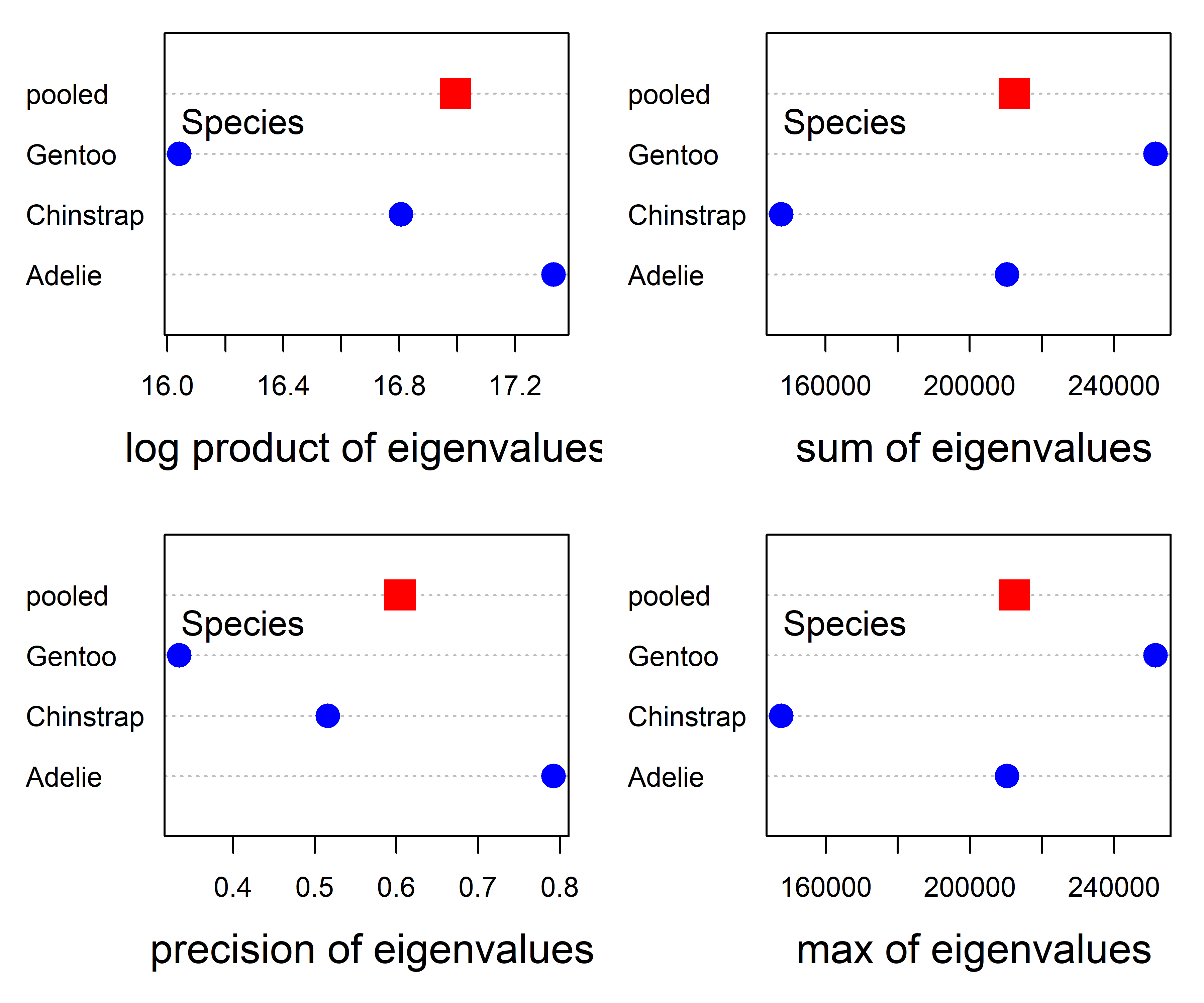
Except for the absence of error bars, the plot for log product in the upper left panel of Figure fig-peng-boxm-plots is the same as that in Figure fig-peng-iris-boxm-plots, but with the sign reversed. In principle, it is possible to add such confidence intervals for all these measures through the use of bootstrapping, but this has not yet been implemented in the heplots package.
For this data set, the pattern of points in the plot for Box’s \(\mathcal{M}\) is also more or less the same as that for the precision measure. The plots for the sum of and maximum eigenvalue are also similar to each other, but differ from those of the two measures in the left column of Figure fig-peng-boxm-plots.
The main point is that these are not all the same, so different functions reflect different patterns of the eigenvalues, and could be used to define new statistical tests, perhaps with greater power or sensitivity to outliers.
12.9 Multivariate analog of Levene’s test
The fact that Levene’s test is just a simple ANOVA of the absolute deviations from the group means or medians suggests an easy multivariate generalization (which has not been well-studied) —Simply do a MANOVA of the absolute differences, \(\vert \mathbf{Y} - \overline{\mathbf{Y}}_j \vert\), centering on the means or medians.4 For the iris data, this gives:
irisdev <- colDevs(iris[,1:4], iris$Species, median,
                   group.var = "Species") |>
  mutate(across(where(is.numeric), abs))

irisdev.mod <- lm(cbind(Sepal.Length, Sepal.Width, Petal.Length, Petal.Width) ~
                    Species, data=irisdev)
Anova(irisdev.mod)
#
# Type II MANOVA Tests: Pillai test statistic
#         Df test stat approx F num Df den Df  Pr(>F)
# Species  2     0.394     8.89      8    290 6.7e-11 ***
# ---
# Signif. codes:  0 '***' 0.001 '**' 0.01 '*' 0.05 '.' 0.1 ' ' 1
The irisdev.mod model is just another MANOVA, so we can visualize it in an HE plot (Figure fig-iris-dev-pairs). But remember that this is showing differences among groups in multivariate dispersion rather than in means.
pairs(irisdev.mod, variables=1:4, fill=TRUE, fill.alpha=.1)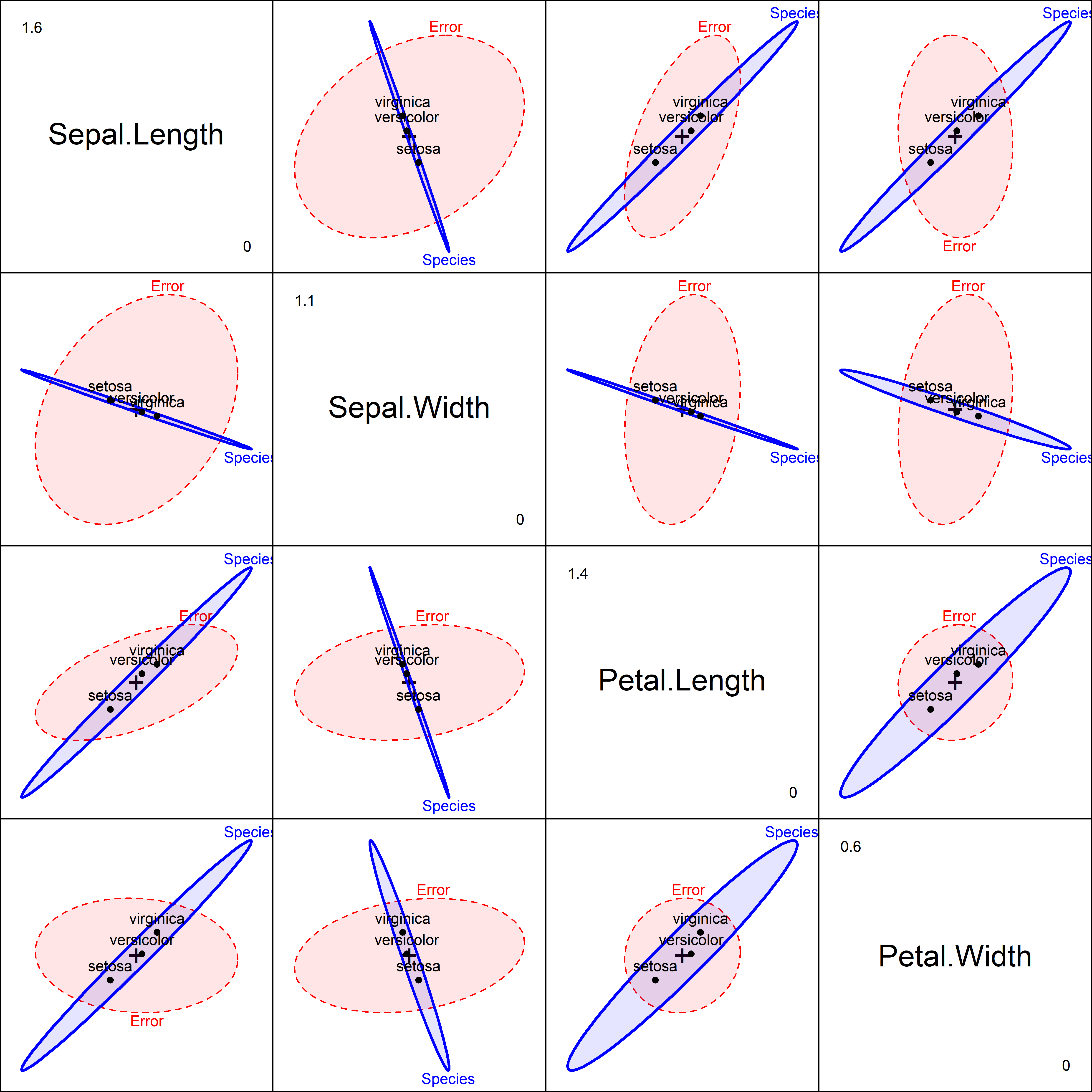
In this plot, the \(\mathbf{H}\) ellipses for the groups show the variation in the overall dispersion—the size of absolute differences from the group medians. These are very highly correlated across groups in most of the subplots, particularly so for those involving sepal width.
12.9.1 Canonical discriminant analysis
But we can go further. Just as canonical discriminant analysis provides a low-dimensional view of differences in means, the same method can be used to visualize heterogeneity of dispersion expressed by the the Levene-type MANOVA in 1D or 2D.
For the model irisdev.mod, this shows that 98% of groups differences shown in the HE plots (Figure fig-iris-dev-pairs) can be found in a single canonical dimension. The 4D information can be reduced to 1D.
library(candisc)
irisdev.can <- candisc(irisdev.mod) |>
  print()
#
# Canonical Discriminant Analysis for Species:
#
#   CanRsq Eigenvalue Difference Percent Cumulative
# 1  0.381     0.6154      0.602    97.9       97.9
# 2  0.013     0.0132      0.602     2.1      100.0
#
# Test of H0: The canonical correlations in the
# current row and all that follow are zero
#
#   LR test stat approx F numDF denDF Pr(> F)
# 1        0.611    10.06     8   288 2.3e-12 ***
# 2        0.987     0.64     3   145    0.59
# ---
# Signif. codes:  0 '***' 0.001 '**' 0.01 '*' 0.05 '.' 0.1 ' ' 1
Plotting the first canonical dimension in Figure fig-iris-dev-can gives a 1D summary, using boxplots for the scores and vectors for the weights of the iris variables.
plot(irisdev.can, which=1,
     fill.alpha = .3,
     col = iris.colors, lwd = 2,
     var.cex = 1.2,
     cex.lab = 1.5, cex.axis = 1.1)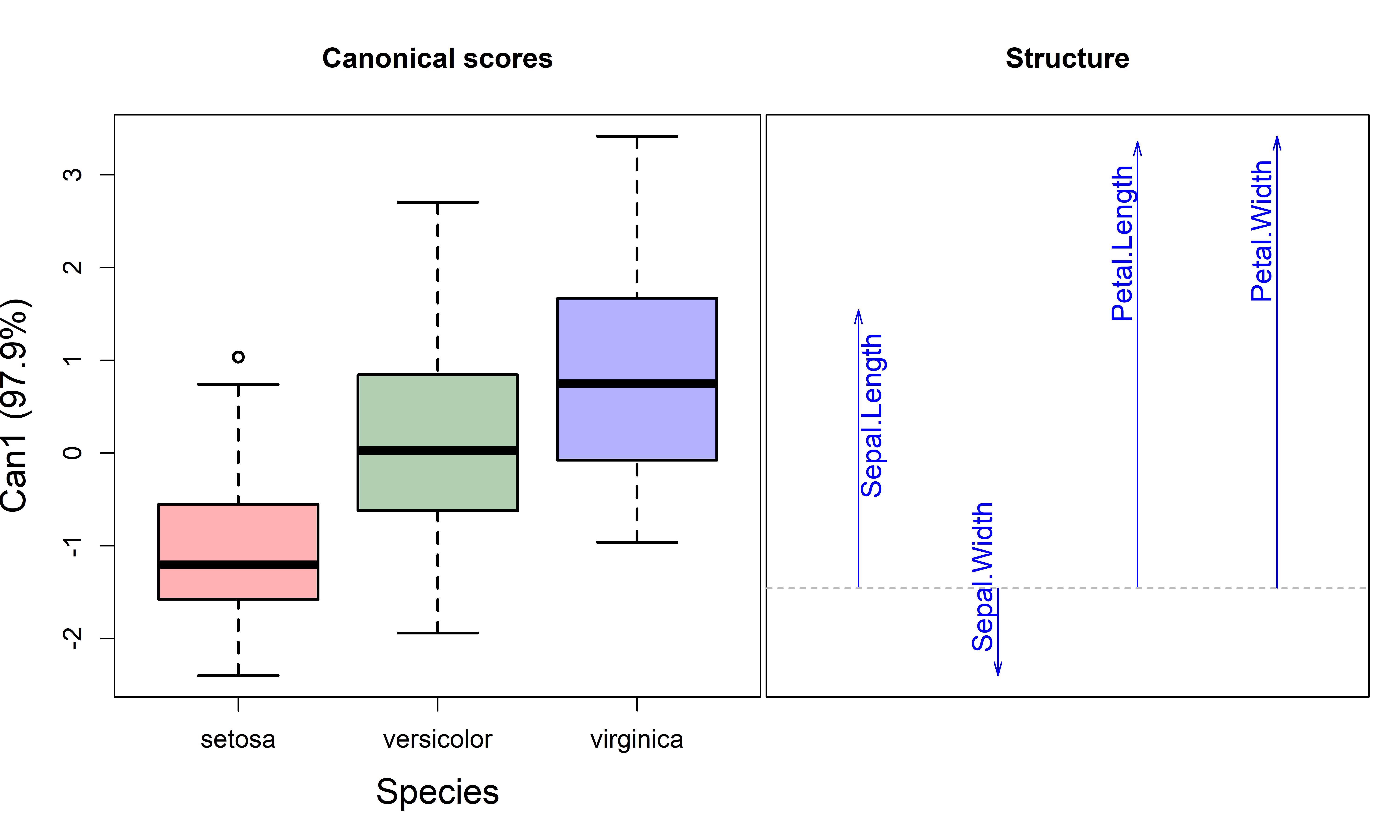
Overall, the covariance matrices are smallest for setosa and largest for virginica. The structure coefficents for the variables reflect the pattern shown in the HE plots (Figure fig-iris-dev-pairs), where the direction of the \(\mathbf{H}\) ellipses is negative for sepal width but positive for the others.
12.10 What Have We Learned?
The quest to understand equality of covariance matrices in multivariate models has taken us on a journey from Box’s famous row boat metaphor to some novel visualization techniques. Here are the essential insights that will transform how you think about and explore heterogeneity in your multivariate data:
Visualization beats test statistics alone - While Box’s \(\mathcal{M}\)-test gives you a single \(p\)-value, covariance ellipses reveal the why behind heterogeneity. You can literally see differences in size (scatter) and shape (orientation) of group covariances, making the abstract concrete and interpretable.
Centering makes differences more apparent - Shifting all group ellipses to a common center (the grand mean) is like removing visual noise to see the signal. This simple transformation makes differences in covariance structure apparent, turning subtle variations into obvious visual patterns.
Small dimensions often hold big secrets - Don’t ignore those “unimportant” principal components! The smallest PC dimensions frequently contain the most discriminating information about covariance differences. It’s often where the action is hiding, away from the obvious patterns in major dimensions.
Multiple measures tell richer stories - Box’s \(\mathcal{M}\)-test uses log determinants, but why stop there? Exploring different eigenvalue functions (sum, precision, maximum) can reveal distinct patterns of heterogeneity, like having multiple lenses to examine the same phenomenon.
Levene meets MANOVA in beautiful harmony - The multivariate extension of Levene’s test (MANOVA on absolute deviations) creates a natural bridge between univariate and multivariate thinking, complete with interpretable HE plots that make variance differences as visual as mean differences.
- Graphics simplify complex concepts - These visualization tools transform an intimidating mathematical concept (equality of \(p \times p\) matrices) into something any researcher can explore, understand, and communicate to others.
The chapter’s strength lies in showing that covariance matrices aren’t just mathematical abstractions—they’re visual stories waiting to be told, patterns waiting to be discovered, and insights illustrating the power of multivariate thinking.
If group sizes are greatly unequal and homogeneity of variance is violated, then the \(F\) statistic is too liberal (actual rejection rate greater than the nominal \(\alpha\)) when large sample variances are associated with small group sizes. Conversely, the \(F\) statistic is too conservative (actual \(< \alpha\)) if large variances are associated with large group sizes.↩︎
For example, Tiku & Balakrishnan (1984) concluded from simulation studies that the normal-theory LRT provides poor control of Type I error under even modest departures from normality. O’Brien (1992) proposed some robust alternatives, and showed that Box’s normal theory approximation suffered both in controlling the null size of the test and in power. Zhang & Boos (1992) also carried out simulation studies with similar conclusions and used bootstrap methods to obtain corrected critical values.↩︎
More general theory and statistical applications of the geometry of ellispoids is given by Friendly et al. (2013).↩︎
Anderson (2006) describes other procedures based on Euclidean distances \(D_{ij} = [\Sigma (y_{ij} - \bar{y}_j)^2]^{1/2}\) of the observations from their group centroids (means or spatial medians). Rather than fit a parametric MANOVA model, he suggests a permutation test method (PERMDIST) which randomly permutes the group assignments and yields non-parametric tests.↩︎