sec-Hotelling introduced the essential ideas of multivariate models in the context of a two-group design using Hotelling’s \(T^2\). Through the magical power of multivariate thinking, I extend this here to a “Holy of Holies”, inner sanctuary of the Tabernacle, the awed general Multivariate Linear Model (MLM).1
This can be understood as a simple extension of the univariate linear model, with the main difference being that there are multiple response variables considered together, instead of just one, analysed alone. (Or, from my perspective, the univariate version is a restricted form of the MLM.) These outcomes might reflect several different ways or scales for measuring an underlying theoretical construct, or they might represent different aspects of some phenomenon that we hope to better understand when they are studied jointly.
For example, in the case of different measures, there are numerous psychological scales used to assess depression or anxiety and it may be important to include more than one measure to ensure that the construct has been measured adequately. It would add considerably to our understanding to know if the different outcome measures all had essentially the same relations to the predictor variables, or if they differ across measures.
In the second case of various aspects, student “aptitude” or “achievement” reflects competency in different various subjects (reading, math, history, science, …) that are better studied together. We get a better understanding of the factors that influence each of aspects by testing them jointly.
Just as in univariate analysis there are variously named techniques (ANOVA, regression) that can be applied to several outcomes, depending on the structure of the predictors at hand. For instance, with one or more continuous predictors and multiple response variables, you could use multivariate multiple regression (MMRA) to obtain estimates useful for prediction.
Instead, if the predictors are categorical factors, multivariate analysis of variance (MANOVA) can be applied to test for differences between groups. Again, this is akin to ANOVA in the univariate context— the same underlying model is utilized, but the tests for terms in the model are multivariate ones for the collection of all response variables, rather than univariate ones for a single response.
The main goal of this chapter is to describe the details of the extension of univariate linear models to the case of multiple outcome measures. But the larger goal is to set the stage for the visualization methods using HE plots and low-D views discussed separately in sec-vis-mlm. Some of the example datasets used here will re-appear there, and also in sec-eqcov which concerns some model-diagnostic graphical methods.
However, before considering the details and examples that apply separately to MANOVA and MMRA, it is useful to consider the general features of the multivariate linear model of which these cases are examples.
Packages
In this chapter I use the following packages. Load them now:
10.1 Structure of the MLM
With \(p\) response variables, the multivariate linear model is most easily appreciated as the collection of \(p\) linear models, one for each response. We have \(p\) outcomes, so why not just consider a separate model for each?
\[ \begin{aligned} \mathbf{y}_1 =& \mathbf{X}\boldsymbol{\beta}_1 + \boldsymbol{\epsilon}_1 \\ \mathbf{y}_2 =& \mathbf{X}\boldsymbol{\beta}_2 + \boldsymbol{\epsilon}_2 \\ \vdots & \\ \mathbf{y}_p =& \mathbf{X}\boldsymbol{\beta}_p + \boldsymbol{\epsilon}_p \\ \end{aligned} \tag{10.1}\]
But the problems with fitting separate univariate models are that:
They don’t give simultaneous tests for all regressions. The situation is similar to that in a one-way ANOVA, where an overall test for group differences is usually applied before testing individual comparisons to avoid problems of multiple testing: \(g\) groups gives \(g \times (g-1)/2\) pairwise tests.
-
More importantly, fitting separate univariate models does not take correlations among the \(\mathbf{y}\)s into account.
- It might be the case that the response variables are all essentially measuring the same thing, but perhaps weakly. If so, the multivariate approach can pool strength across the outcomes to detect their common relations to the predictors, giving greater power.
- On the other hand, perhaps the responses are related in different ways to the predictors. A multivariate approach can help you understand how many different ways there are, and characterize each.
The model matrix \(\mathbf{X}\) in Equation eq-mlm-models is the same for all responses, but each one gets its own vector \(\boldsymbol{\beta}_j\) of coefficients for how the predictors in \(\mathbf{X}\) fit a given response \(\mathbf{y}_j\).
Among the beauties of multivariate thinking is that we can put these separate equations together in single equation by joining the responses \(\mathbf{y}_j\) as columns in a matrix \(\mathbf{Y}\) and similarly arranging the vectors of coefficients \(\boldsymbol{\beta}_j\) as columns in a matrix \(\mathbf{B}\).2
TODO: Revise notation here, to be explicit and consistent about inclusion of \(\boldsymbol{\beta}_0\) and size of \(\mathbf{B}\).
The MLM then becomes:
\[ \mathord{\mathop{\mathbf{Y}}\limits_{n \times p}} = \mathord{\mathop{\mathbf{X}}\limits_{n \times (q+1)}} \, \mathord{\mathop{\mathbf{B}}\limits_{(q+1) \times p}} + \mathord{\mathop{\mathbf{\boldsymbol{\Large\varepsilon}}}\limits_{n \times p}} \:\: , \tag{10.2}\]
where:
- \(\mathbf{Y} = (\mathbf{y}_1 , \mathbf{y}_2, \dots , \mathbf{y}_p )\) is the matrix of \(n\) observations on \(p\) responses, with typical column \(\mathbf{y}_j\);
- \(\mathbf{X}\) is the model matrix with columns \(\mathbf{x}_i\) for \(q\) regressors, which typically includes an initial column \(\mathbf{x}_0\) of 1s for the intercept;
- \(\mathbf{B} = ( \mathbf{b}_1 , \mathbf{b}_2 , \dots, \mathbf{b}_p )\) is a matrix of regression coefficients, one column \(\mathbf{b}_j\) for each response variable;
- \(\boldsymbol{\Large\varepsilon}\) is a matrix of errors in predicting \(\mathbf{Y}\).
Writing Equation eq-mlm in terms of its elements, we have
\[\begin{aligned} \overset{\mathbf{Y}} {\begin{bmatrix} y_{11} & y_{12} & \cdots & y_{1p} \\ y_{21} & y_{22} & \cdots & y_{2p} \\ \vdots & \vdots & \ddots & \vdots \\ y_{n1} & y_{n2} & \cdots & y_{np} \end{bmatrix} } & = \overset{\mathbf{X}} {\begin{bmatrix} 1 & x_{11} & \cdots & x_{1q} \\ 1 & x_{21} & \cdots & x_{2q} \\ \vdots & \vdots & \ddots & \vdots \\ 1 & x_{n1} & \cdots & x_{nq} \end{bmatrix} } \overset{\mathbf{B}} {\begin{bmatrix} \beta_{01} & \beta_{02} & \cdots & \beta_{0p} \\ \beta_{11} & \beta_{12} & \cdots & \beta_{1p} \\ \vdots & \vdots & \ddots & \vdots \\ \beta_{q1} & \beta_{q2} & \cdots & \beta_{qp} \end{bmatrix} } \\ & + \quad\quad \overset{\mathcal{\boldsymbol{\Large\varepsilon}}} {\begin{bmatrix} \epsilon_{11} & \epsilon_{12} & \cdots & \epsilon_{1p} \\ \epsilon_{21} & \epsilon_{22} & \cdots & \epsilon_{2p} \\ \vdots & \vdots & \ddots & \vdots \\ \epsilon_{n1} & \epsilon_{n2} & \cdots & \epsilon_{np} \end{bmatrix} } \end{aligned}\]
The structure of the model matrix \(\mathbf{X}\) is exactly the same as the univariate linear model, and may therefore contain,
-
quantitative predictors, such as
age,income, years ofeducation - transformed predictors like \(\sqrt{\text{age}}\) or \(\log{(\text{income})}\)
-
polynomial terms: \(\text{age}^2\), \(\text{age}^3, \dots\) (using
poly(age, k)in R) -
categorical predictors (“factors”), such as treatment (Control, Drug A, drug B), or sex; internally a factor with
klevels is transformed tok-1dummy (0, 1) variables, representing comparisons with a reference level, typically the first. -
interaction terms, involving either quantitative or categorical predictors, e.g.,
age * sex,treatment * sex.
10.1.1 Assumptions
Just as in univariate models, the assumptions of the multivariate linear model almost entirely concern the behavior of the errors (residuals). Let \(\boldsymbol{\epsilon}_{i}^{\prime}\) represent the \(i\)th row of \(\boldsymbol{\Large\varepsilon}\). Then it is assumed that:
-
Normality: The residuals, \(\boldsymbol{\epsilon}_{i}^{\prime}\) are distributed as multivariate normal, \(\mathcal{N}_{p}(\mathbf{0},\boldsymbol{\Sigma})\), where \(\boldsymbol{\Sigma}\) is a non-singular error-covariance matrix.
Statistical tests of multivariate normality of the residuals include the Shapiro-Wilk (Shapiro & Wilk, 1965) and Mardia (1970, 1974) tests (and others, in the MVN package package).
As in univariate models, the MLM is relatively robust against non-normality. However this is often better assessed visually using a \(\chi^2\) QQ plot of Mahalanobis squared distance against their corresponding \(\chi^2_p\) values for \(p\) degrees of freedom using
heplots::cqplot().
Homoscedasticity: The error-covariance matrix \(\boldsymbol{\Sigma}\) is constant across all observations and grouping factors. Graphical methods to show if this assumption is met are illustrated in sec-eqcov.
Independence: \(\boldsymbol{\epsilon}_{i}^{\prime}\) and \(\boldsymbol{\epsilon}_{j}^{\prime}\) are independent for \(i\neq j\), so knowing the data for case \(i\) gives no information about case \(j\). This assumption would be violated if the observations consisted of pairs of husbands and wives, or clusters of students from different schools and this grouping was ignored in the model.
Error-free \(\mathbf{X}\): The predictors, \(\mathbf{X}\), are fixed and measured without error. The discussion in sec-meas-error illustrates how measurement error biases (toward 0) the estimated effects of predictors. A weaker form, called exogeneity3 merely asserts that the predictors are independent of (uncorrelated with) the errors, \(\boldsymbol{\Large\varepsilon}\). 4
These statements are simply the multivariate analogs of the assumptions of normality, constant variance and independence of the errors in univariate models. Note that it is unnecessary to assume that the predictors (regressors, columns of \(\mathbf{X}\)) are normally distributed.
Implicit in the above is perhaps the most important assumption—that the model has been correctly specified. This means:
Linearity: The form of the relations between each \(\mathbf{y}\) and the \(\mathbf{x}\)s is correct. Typically this means that the relations are linear, but if not, we have specified a correct transformation of \(\mathbf{y}\) and/or \(\mathbf{x}\), such as modeling \(\log(\mathbf{y})\), or using polynomial terms in one or more of the \(\mathbf{x}\)s.
Completeness: No relevant predictors have been omitted from the model. For example in the coffee, stress example (sec-avplots, sec-data-beta), omitting stress from the model biases the effect of coffee on heart disease.
Additive effects: The combined effect of different terms in the model is the sum of their individual effects, so the impact of one predictor on the outcome variable is the same regardless of the values of other predictors in the model. When this is not the case, you can add an interaction term like \(x_1 \times x_2\) to account for this.
10.2 Fitting the model
The least squares (and also maximum likelihood) solution for the coefficients \(\mathbf{B}\) is given by
\[ \widehat{\mathbf{B}} = (\mathbf{X}^\mathsf{T} \mathbf{X})^{-1} \mathbf{X}^\mathsf{T} \mathbf{Y} \:\: . \]
The coefficients are precisely the same as fitting the separate responses \(\mathbf{y}_1 , \mathbf{y}_2 , \dots , \mathbf{y}_p\), and placing the estimated coefficients \(\widehat{\mathbf{b}}_i\) as columns in \(\widehat{\mathbf{B}}\)
\[
\widehat{\mathbf{B}} = [ \widehat{\mathbf{b}}_1, \widehat{\mathbf{b}}_2, \dots , \widehat{\mathbf{b}}_p] \:\: .
\] In R, we fit the multivariate linear model with lm() simply by giving a collection of response variables y1, y2, ... on the left-hand side of the model formula, wrapped in cbind() which combines them to form a matrix response.
In the presence of possible outliers, robust methods are available for univariate linear models (e.g., MASS::rlm()). So too, heplots::robmlm() provides robust estimation in the multivariate case as illustrated in sec-robust-estimation.
10.2.1 Example: Dog food data
As a toy example to make these ideas concrete, consider the dataset dogfood. Here, a dogfood manufacturer wanted to study preference for different dogfood formulas, two of their own (“Old”, “New”) and two from other manufacturers (“Major”, “Alps”).
In a between-dog design, each of \(n=4\) dogs were presented with a bowl of one formula and the time to start eating and amount eaten were recorded. Greater preference would be seen in a shorter delay to start eating and a greater amount, so these responses are expected to be negatively correlated.
For this data, boxplots for the two responses provide an initial look, shown in Figure fig-dogfood-boxplot. Putting these side-by-side makes it easy to see the inverse relation between the medians on the two response variables.
Code
dog_long <- dogfood |>
  pivot_longer(c(start, amount),
               names_to = "variable")
ggplot(data = dog_long,
       aes(x=formula, y = value, fill = formula)) +
  geom_boxplot(alpha = 0.2) +
  geom_point(size = 2.5) +
  facet_wrap(~ variable, scales = "free") +
  theme_bw(base_size = 14) +
  theme(legend.position="none")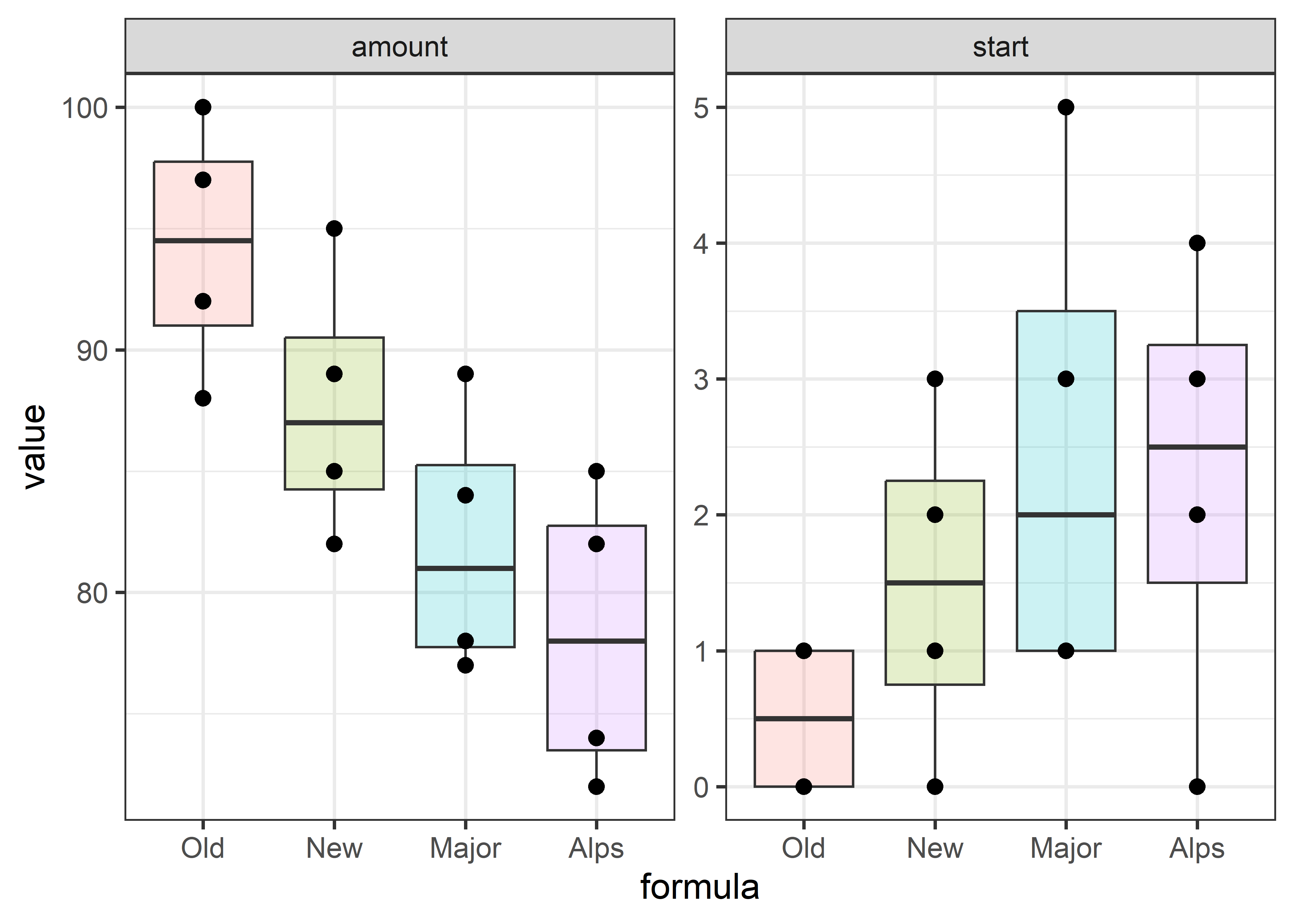
As suggested above, the multivariate model for testing mean differences due to the dogfood formula is fit using lm() on the matrix \(\mathbf{Y}\) constructed with cbind(start, amount).
By default, the factor formula is represented by three columns in the \(\mathbf{X}\) matrix that correspond to treatment contrasts, which are comparisons of the Old formula (a baseline level) with each of the others. The coefficients, for example formulaNEW, are the difference in means from those for Old.
Then, the overall multivariate test that means on both variables do not differ is carried out using car::Anova().
The details of these analysis steps are explained below.
10.2.2 Sums of squares
In univariate response models, statistical tests and model summaries (like \(R^2\)) are based on the familiar decomposition of the total sum of squares \(\text{SS}_T\) into regression or hypothesis (\(\text{SS}_H\)) and error (\(\text{SS}_E\)) sums of squares. For example the \(R^2\) is just \(\text{SS}_H / \text{SS}_T\).
The multivariate linear model has a simple, direct extension: Each of these sum of squares becomes a \(p \times p\) matrix \(SSP\) containing sums of squares for the \(p\) responses on the diagonal and sums of cross products in the off-diagonal. elements. For the MLM this is expressed as:
\[ \begin{aligned} \underset{(p\times p)}{\mathbf{SSP}_{T}} & = \mathbf{Y}^{\top} \mathbf{Y} - n \overline{\mathbf{y}}\,\overline{\mathbf{y}}^{\top} \\ & = \left(\widehat {\mathbf{Y}}^{\top}\widehat{\mathbf{Y}} - n\overline{\mathbf{y}}\,\overline{\mathbf{y}}^{\top} \right) + \widehat{\boldsymbol{\Large\varepsilon}}^{\top}\widehat{\boldsymbol{\Large\varepsilon}} \\ & = \mathbf{SSP}_{H} + \mathbf{SSP}_{E} \\ & \equiv \mathbf{H} + \mathbf{E} \:\: , \end{aligned} \tag{10.3}\]
where,
- \(\overline{\mathbf{y}}\) is the \((p\times 1)\) vector of means for the response variables;
- \(\widehat{\mathbf{Y}} = \mathbf{X}\widehat{\mathbf{B}}\) is the matrix of fitted values; and
- \(\widehat{\boldsymbol{\Large\varepsilon}} = \mathbf{Y} -\widehat{\mathbf{Y}}\) is the matrix of residuals.
We can visualize this decomposition in the simple case of a two-group design (using the mathscore data from sec-t2-properties) as shown in Figure fig-visualizing-SSP. Let \(\mathbf{y}_{ij}\) be the vector of \(p\) responses for subject \(j\) in group \(i, i=1,\dots g\) for \(j = 1, \dots n_i\). Then, using “\(.\)” to represent a subscript averaged over, Equation eq-SSP comes from the identity
\[ \underbrace{(\mathbf{y}_{ij} - \mathbf{y}_{\cdot \cdot})}_T = \underbrace{(\overline{\mathbf{y}}_{i \cdot} - \mathbf{y}_{\cdot \cdot})}_H + \underbrace{(\mathbf{y}_{ij} - \overline{\mathbf{y}}_{i \cdot})}_E \tag{10.4}\]
where each side of Equation eq-THE-dev is squared and summed over observations to give Equation eq-SSP. In Figure fig-visualizing-SSP,
The total variance \(\mathbf{SSP}_T\) reflects the deviations of the observations \(\mathbf{y}_{ij}\) from the grand mean \(\overline{\mathbf{y}}_{. .}\) and has the data ellipse shown in gray.
In the middle \(\mathbf{SSP}_H\) panel, all the observations are represented at their group means, \(\overline{\mathbf{y}}_{i .}\), the fitted values. Their variance and covariance is then reflected by deviations of the group means (weighted for the number of observations per group) around the grand mean.
The right \(\mathbf{SSP}_E\) panel then shows the residual variance, which is the variation of the observations \(\mathbf{y}_{ij}\) around their group means, \(\overline{\mathbf{y}}_{i .}\). Centering the two data ellipses at the centroid \(\overline{\mathbf{y}}_{. .}\) then gives the ellipse for the \(\mathbf{SSP}_E\), also called the pooled within-group covariance matrix.
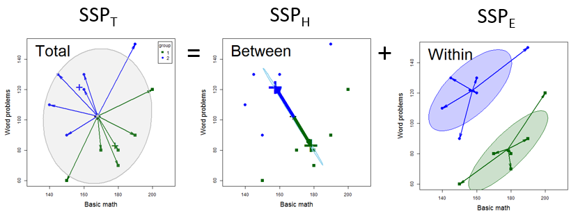
The formulas for these sum of squares and products matrices can be shown explicitly as follows, where the notation \(\mathbf{z} \mathbf{z}^\top\) generates the \(p \times p\) outer product of a vector \(\mathbf{z}\), giving \(z_k \times z_\ell\) for all pairs of elements. \[ \mathbf{SSP}_T = \sum_{i=1}^{g} \sum_{j=1}^{n_{i}}\left(\mathbf{y}_{ij}-\overline{\mathbf{y}}_{\cdot \cdot}\right)\left(\mathbf{y}_{ij}-\overline{\mathbf{y}}_{\cdot \cdot}\right)^{\top} \tag{10.5}\]
\[ \mathbf{SSP}_H = \sum_{i=1}^{g} \mathbf{n}_{i}\left(\overline{\mathbf{y}}_{i \cdot}-\overline{\mathbf{y}}_{\cdot \cdot}\right)\left(\overline{\mathbf{y}}_{i \cdot}-\overline{\mathbf{y}}_{\cdot \cdot}\right)^{\top} \tag{10.6}\]
\[ \mathbf{SSP}_E = \sum_{i=1}^{g} \sum_{j=1}^{n_{i}} \left(\mathbf{y}_{ij}-\overline{\mathbf{y}}_{i \cdot}\right) \left(\mathbf{y}_{ij}-\overline{\mathbf{y}}_{i \cdot}\right)^{\top} \tag{10.7}\]
This is the decomposition that we visualize in HE plots, where the size and direction of \(\mathbf{H}\) and \(\mathbf{E}\) can be represented as ellipsoids.
But first, let’s find these results for the example. The easy way is to get them from the result returned by car::Anova(), where the hypothesis \(\mathbf{SSP}_{H}\) for each term in the model is returned as an element in a named list SSP and the error \(\mathbf{SSP}_{E}\) is returned as the matrix SSPE.
You can calculate these directly as shown below. sweep() is used to subtract the colMeans() from \(\mathbf{Y}\) and \(\widehat{\mathbf{Y}}\) and crossprod() premultiplies a matrix by its’ transpose.
Y <- dogfood[, c("start", "amount")]
Ydev <- sweep(Y, 2, colMeans(Y)) |> as.matrix()
SSP_T <- crossprod(as.matrix(Ydev)) |> print()
#        start amount
# start   35.4  -59.2
# amount -59.2  975.9

fitted <- fitted(dogfood.mod)
Yfit <- sweep(fitted, 2, colMeans(fitted)) |> as.matrix()
SSP_H <- crossprod(Yfit) |> print()
#         start amount
# start    9.69  -70.9
# amount -70.94  585.7

residuals <- residuals(dogfood.mod)
SSP_E <- crossprod(residuals) |> print()
#        start amount
# start   25.8   11.8
# amount  11.8  390.3
The decomposition of the total sum of squares and products in Equation eq-SSP can be shown as:
\[ \overset{\mathbf{SSP}_T} {\begin{pmatrix} 35.4 & -59.2 \\ -59.2 & 975.9 \\ \end{pmatrix}} = \overset{\mathbf{SSP}_H} {\begin{pmatrix} 9.69 & -70.94 \\ -70.94 & 585.69 \\ \end{pmatrix}} + \overset{\mathbf{SSP}_E} {\begin{pmatrix} 25.8 & 11.8 \\ 11.8 & 390.3 \\ \end{pmatrix}} \] These numbers are the variances in the diagonal and covariance between start and amount in the off-diagonal. The sign is important: In \(\text{SSP}_H\) the negative covariance reflects the fact that for these brands larger time to start eating is negatively related to the amount eaten. In \(\text{SSP}_E\) the the covariance is slightly positive. This might reflect a mild hunger factor: for a given brand, dogs who lunge for their bowls sooner also eat more. But, they’re all good boys, right?
10.2.3 How big is \(SS_H\) compared to \(SS_E\)?
In a univariate response model, \(SS_H\) and \(SS_E\) are both scalar numbers and the univariate \(F\) test statistic,
\[F = \frac{\text{SS}_H/\text{df}_h}{\text{SS}_E/\text{df}_e} = \frac{\mathsf{Var}(H)}{\mathsf{Var}(E)} \:\: , \tag{10.8}\]
assesses “how big” \(\text{SS}_H\) is, relative to \(\text{SS}_E\), the variance accounted for by a hypothesized model or model terms relative to error variance. The measure \(R^2 = SS_H / (SS_H + SS_E) = SS_H / SS_T\) gives the proportion of total variance accounted for by the model terms.
In the multivariate analog \(\mathbf{H}\) and \(\mathbf{E}\) are both \(p \times p\) matrices, and \(\mathbf{H}\) “divided by” \(\mathbf{E}\) becomes \(\mathbf{H}\mathbf{E}^{-1}\). The answer, “how big” \(\text{SS}_H\) is compared to \(\text{SS}_E\) is expressed in terms of the \(p\) eigenvalues \(\lambda_i, i = 1, 2, \dots p\) of \(\mathbf{H}\mathbf{E}^{-1}\). These are the \(\lambda_i\) which solve the determinant equation
\[ \text{det}{(\mathbf{H}\mathbf{E}^{-1} - \lambda \mathbf{I}}) = 0 \:\: . \]
The solution gives also the vectors \(\mathbf{v}_i\) as the corresponding eigenvectors, which satisfy
\[ \mathbf{H}\mathbf{E}^{-1} \; \lambda_i = \lambda_i \mathbf{v}_i \:\: . \tag{10.9}\]
This can also be expressed in terms of the size of \(\mathbf{H}\) relative to total variation \((\mathbf{T} =\mathbf{H}+ \mathbf{E})\) as
\[ \mathbf{H}(\mathbf{H}+\mathbf{E})^{-1} \; \rho_i = \rho_i \mathbf{v}_i \:\: , \tag{10.10}\]
which has the same eigenvectors as Equation eq-he-eigen and the eigenvalues are \(\rho_i = \lambda_i / (1 + \lambda_i)\).
However, when the hypothesized model terms have \(\text{df}_h\) degrees of freedom (columns of the \(\mathbf{X}\) matrix for that term), \(\mathbf{H}\) is of rank \(\text{df}_h\), so only \(s=\min(p, \text{df}_h)\) eigenvalues can be non-zero. For example, a test for a hypothesis about a single quantitative predictor \(\mathbf{x}\), has \(\text{df}_h = 1\) degree of freedom and \(\mathrm{rank} (\mathbf{H}) = 1\); for a factor with \(g\) groups, \(\text{df}_h = \mathrm{rank} (\mathbf{H}) = g-1\).
For example, we get the following results for the dogfood data:
The factor formula has four levels and therefore \(\text{df}_h = 3\) degrees of freedom. But there are only \(p = 2\) responses, so there are \(s=\min(p, \text{df}_h) = 2\) non-zero eigenvalues (and corresponding eigenvectors). The eigenvalues tell us that 98.5% of the hypothesis variance due to formula can be accounted for by a single dimension.
The overall multivariate test for the model in Equation eq-mlm is essentially a test of the hypothesis \(\mathcal{H}_0: \mathbf{B} = 0\) (excluding the row for the intercept). Equivalently, this is a test based on the incremental \(\mathbf{SSP}_{H}\) for the hypothesized terms in the model—that is, the difference between the \(\mathbf{SSP}_{H}\) for the full model and the null, intercept-only model. The same idea can be applied to test the difference between any pair of nested models—the added contribution of terms in a larger model relative to a smaller model containing a subset of terms.
The eigenvectors \(\mathbf{v}_i\) in Equation eq-he-eigen are also important. These are the weights for the variables in a linear combination \(v_{i1} \mathbf{y}_1 + v_{i2} \mathbf{y}_2 + \cdots + v_{ip} \mathbf{y}_p\) which produces the largest univariate \(F\) statistic for the \(i\)-th dimension. We exploit this in canonical discriminant analysis and the corresponding canonical HE plots (sec-candisc).
The eigenvectors of \(\mathbf{H}\mathbf{E}^{-1}\) for the dogfood model are shown below:
The first column corresponds to the weighted sum \(0.12 \times\text{start} - 0.99 \times \text{amount}\), which as we saw above accounts for 95.5% of the differences in the group means.
10.3 Multivariate test statistics
In the univariate case, the overall \(F\)-test of \(\mathcal{H}_0: \boldsymbol{\beta} = \mathbf{0}\) is the uniformly most powerful invariant test when the assumptions are met. There is nothing better. This is not the case in the MLM.
The reason is that when there are \(p > 1\) response variables, and we are testing a hypothesis comprising \(\text{df}_h >1\) coefficients or degrees of freedom, there are \(s = \min(p, \text{df}_h) > 1\) possible dimensions in which \(\mathbf{H}\) can be large relative to \(\mathbf{E}\). The size of each dimension is measured by the its eigenvalue \(\lambda_i\). There are several test statistics that combine these into a single measure, shown in Table tbl-mstats.
| Criterion | Formula | Partial \(\eta^2\) | |
|---|---|---|---|
| Wilks’s \(\Lambda\) | \(\Lambda = \prod^s_i \frac{1}{1+\lambda_i}\) | \(\eta^2 = 1-\Lambda^{1/s}\) | |
| Pillai trace | \(V = \sum^s_i \frac{\lambda_i}{1+\lambda_i}\) | \(\eta^2 = \frac{V}{s}\) | |
| Hotelling-Lawley trace | \(H = \sum^s_i \lambda_i\) | \(\eta^2 = \frac{H}{H+s}\) | |
| Roy maximum root | \(R = \lambda_1\) | \(\eta^2 = \frac{\lambda_1}{1+\lambda_1}\) |
These correspond to different kinds of “means” of the \(\lambda_i\): geometric (Wilks), arithmetic (Pillai), harmonic (Hotelling-Lawley) and supremum (Roy). See Friendly et al. (2013) for the geometry behind these measures.
Each of these statistics have different sampling distributions under the null hypothesis. But conveniently they can all be converted to \(F\) statistics. These conversions are exact when the hypothesis has \(s \le 2\) degrees of freedom, and approximations otherwise.
The answer is that it depends on the structure of the size of dimensions of an effect reflected in the eigenvalues \(\lambda_i\) and what possible violation of assumptions you want to protect against.
Schatzoff (1966) compared the power and sensitivity of the four multivariate statistics and showed that Roy’s largest-latent root statistic was most sensitive when population centroids in MANOVA differed in a single dimension, but less sensitive when the group differences were more diffuse.
In addition to power to detect differences, Olson (1974) also examined the robustness of these tests against nonnormality and heterogeneity of covariance matrices. He found that Pillai’s trace was most robust. Under diffuse differences, Pillai’s trace had the greatest power, while Roy’s test was worse. Not surprisingly, when differences were largely one-dimensional, this ordering was reversed.
These differences among the test statistics disappear as your sample size grows large, because these tests become asymptotically equivalent. The default choice in car::Anova() of test.statistic = "Pillai" reflects the view that Pillai’s test is preferred over a wider range of circumstances. The summary() method for "Anova.mlm" objects permits the specification of more than one multivariate test statistic, and the default is to report all four.
As well, each test statistic has an analog of the \(R^2\)-like partial \(\eta^2\) measure, giving the partial association accounted for by each term in the MLM. These reflect the proportion of total variation attributable to a given model term, partialling out (excluding) other factors from the total non-error variation. They can be used as a measure of effect size in a MLM and are calculated using heplots::etasq().
10.3.1 Testing contrasts and linear hypotheses
Even more generally, these multivariate tests apply to every linear hypothesis concerning the coefficients in \(\mathbf{B}\). Suppose we want to test the hypothesis that a subset of rows (predictors) and/or columns (responses) simultaneously have null effects. This can be expressed in the general linear test,
\[ \mathcal{H}_0 : \mathbf{C}_{h \times q} \, \mathbf{B}_{q \times p} = \mathbf{0}_{h \times p} \:\: , \]
where \(\mathbf{C}\) is a full rank \(h \le q\) hypothesis matrix of constants, that selects subsets or linear combinations (contrasts) of the coefficients in \(\mathbf{B}\) to be tested in a \(h\) degree-of-freedom hypothesis.
In this case, the SSP matrix for the hypothesis has the form
\[ \mathbf{H} = (\mathbf{C} \widehat{\mathbf{B}})^\mathsf{T}\, [\mathbf{C} (\mathbf{X}^\mathsf{T}\mathbf{X} )^{-1} \mathbf{C}^\mathsf{T}]^{-1} \, (\mathbf{C} \widehat{\mathbf{B}}) \:\: , \tag{10.11}\]
where there are \(s = \min(h, p)\) non-zero eigenvalues of \(\mathbf{H}\mathbf{E}^{-1}\). In Equation eq-hmat, \(\mathbf{H}\) measures the (Mahalanobis) squared distances (and cross products) among the linear combinations \(\mathbf{C} \widehat{\mathbf{B}}\) from the origin under the null hypothesis.
For example, with three responses \(y_1, y_2, y_3\) and three predictors \(x_1, x_2, x_3\), we can test the hypothesis that neither \(x_1\) nor \(x_2\) contribute at all to predicting the \(y\)s in terms of the hypothesis that the coefficients for the corresponding rows of \(\mathbf{B}\) are zero using a 1-row \(\mathbf{C}\) matrix that simply selects those rows:
\[\begin{aligned} \mathcal{H}_0 : \mathbf{C} \mathbf{B} & = \begin{bmatrix} 0 & 1 & 1 & 0 \end{bmatrix} \begin{pmatrix} \beta_{0,y_1} & \beta_{0,y_2} & \beta_{0,y_3} \\ \beta_{1,y_1} & \beta_{1,y_2} & \beta_{1,y_3} \\ \beta_{2,y_1} & \beta_{2,y_2} & \beta_{2,y_3} \\ \beta_{3,y_1} & \beta_{3,y_2} & \beta_{3,y_3} \end{pmatrix} \\ \\ & = \begin{bmatrix} \beta_{1,y_1} & \beta_{1,y_2} & \beta_{1,y_3} \\ \beta_{2,y_1} & \beta_{2,y_2} & \beta_{2,y_3} \\ \end{bmatrix} = \mathbf{0}_{(2 \times 3)} \end{aligned}\]
In MANOVA designs, it is often desirable to follow up a significant effect for a factor with subsequent tests to determine which groups differ. While you can simply test for all pairwise differences among groups (using Bonferonni or other corrections for multiplicity), a more substantively-driven approach uses planned comparisons or contrasts among the factor levels as described in sec-contrasts.
For a factor with \(g\) groups, a contrast is simply a comparison of the mean of one subset of groups against the mean of another subset. This is specified as a weighted sum, \(L\) of the means with weights \(\mathbf{c}\) that sum to zero,
\[ L = \mathbf{c}^\mathsf{T} \boldsymbol{\mu} = \sum_i c_i \mu_i \quad\text{such that}\quad \Sigma c_i = 0 \] Two contrasts, \(\mathbf{c}_1\) and \(\mathbf{c}_2\) are orthogonal if the sum of products of their weights is zero, i.e., \(\mathbf{c}_1^\mathsf{T} \mathbf{c}_2 = \Sigma c_{1i} \times c_{2i} = 0\). When contrasts are placed as columns of a matrix \(\mathbf{C}\), they are all mutually orthogonal if each pair is orthogonal, which means \(\mathbf{C}^\top \mathbf{C}\) is a diagonal matrix. Orthogonal contrasts correspond to statistically independent tests.
This is nice because orthogonal contrasts reflect separate, non-overlapping research questions. When these questions are posed apriori, in advance of analysis, there is no need to correct for multiple testing, on the grounds that you shouldn’t be penalized for having more ideas!
For example, with the \(g=4\) groups for the dogfood data, the company might want to test the following comparisons among the formulas Old, New, Major and Alps: (a) Ours vs. Theirs: The average of (Old, New) compared to (Major, Alps); (b) Old vs. New; (c) Major vs. Alps. The contrasts that do this are:
\[\begin{aligned} L_1 & = \textstyle{\frac12} (\mu_O + \mu_N) - \textstyle{\frac12} (\mu_M + \mu_A) & \rightarrow\: & \mathbf{c}_1 = \textstyle{\frac12} \begin{pmatrix} 1 & 1 & -1 & -1 \end{pmatrix} \\ L_2 & = \mu_O - \mu_N & \rightarrow\: & \mathbf{c}_2 = \begin{pmatrix} 1 & -1 & 0 & 0 \end{pmatrix} \\ L_3 & = \mu_M - \mu_A & \rightarrow\: & \mathbf{c}_3 = \begin{pmatrix} 0 & 0 & 1 & -1 \end{pmatrix} \end{aligned}\]
Note that these correspond to nested dichotomies among the four groups: first we compare groups (Old and New) against groups (Major and Alps), then subsequently within each of these sets. Nested dichotomy contrasts are always orthogonal, and therefore correspond to statistically independent tests. We are effectively taking a three degree-of-freedom question, “do the means differ?” and breaking it down into three separate 1 df tests that answer specific parts of that overall question.
In R, contrasts for a factor are specified as columns of matrix, each of which sums to zero. For this example, we can set this up by creating each as a vector and joining them as columns using cbind():
c1 <- c(1,  1, -1, -1)/2    # Old,New vs. Major,Alps
c2 <- c(1, -1,  0,  0)      # Old vs. New
c3 <- c(0,  0,  1, -1)      # Major vs. Alps
C <- cbind(c1,c2,c3)
rownames(C) <- levels(dogfood$formula)

C
#         c1 c2 c3
# Old    0.5  1  0
# New    0.5 -1  0
# Major -0.5  0  1
# Alps  -0.5  0 -1

# show they are mutually orthogonal
t(C) %*% C
#    c1 c2 c3
# c1  1  0  0
# c2  0  2  0
# c3  0  0  2
For the dogfood data, with formula as the group factor, you can set up the analyses to use these contrasts by assigning the matrix C to contrasts() for that factor in the dataset itself. The estimated coefficients then become the estimated mean differences for the contrasts. When the contrasts are changed, it is necessary to refit the model.
For example, the contrast “Ours vs. Theirs” estimated by formulac1 takes 1.375 less time to start eating and eats 10.88 more on average.
For multivariate tests, when all contrasts are pairwise orthogonal, the overall test of a factor with \(\text{df}_h = g-1\) degrees of freedom can be broken down into \(g-1\) separate 1 df tests. This gives rise to a set of \(\text{df}_h\) rank 1 \(\mathbf{H}\) matrices that additively decompose the overall hypothesis SSCP matrix,
\[ \mathbf{H} = \mathbf{H}_1 + \mathbf{H}_2 + \cdots + \mathbf{H}_{\text{df}_h} \:\: , \tag{10.12}\]
exactly as the univariate \(\text{SS}_H\) can be decomposed using orthogonal contrasts in an ANOVA (sec-contrasts)
You can test such contrasts or any other hypotheses involving linear combinations of the coefficients using car::linearHypothesis(). Here, "formulac1" refers to the contrast c1 for the difference between Ours and Theirs. Note that because this is a 1 df test, all four test statistics yield the same \(F\) values.
hyp <- rownames(coef(dogfood.mod))[-1] |>
  print()
# [1] "formulac1" "formulac2" "formulac3"
H1 <- linearHypothesis(dogfood.mod, hyp[1],
                       title="Ours vs. Theirs") |>
  print()
#
# Sum of squares and products for the hypothesis:
#         start amount
# start    7.56  -59.8
# amount -59.81  473.1
#
# Sum of squares and products for error:
#        start amount
# start   25.8   11.7
# amount  11.7  390.3
#
# Multivariate Tests: Ours vs. Theirs
#                  Df test stat approx F num Df den Df Pr(>F)
# Pillai            1     0.625     9.18      2     11 0.0045 **
# Wilks             1     0.375     9.18      2     11 0.0045 **
# Hotelling-Lawley  1     1.669     9.18      2     11 0.0045 **
# Roy               1     1.669     9.18      2     11 0.0045 **
# ---
# Signif. codes:  0 '***' 0.001 '**' 0.01 '*' 0.05 '.' 0.1 ' ' 1
Similarly we can test the other two contrasts within these each of these two subsets, but I don’t print the results.
H2 <- linearHypothesis(dogfood.mod, hyp[2],
                       title="Old vs. New")
H3 <- linearHypothesis(dogfood.mod, hyp[3],
                       title="Alps vs. Major")
Then, we can illustrate Equation eq-H-contrasts by extracting the 1 df \(\mathbf{H}\) matrices (SSPH) from the results of linearHypothesis.
\[ \overset{\mathbf{H}} {\begin{pmatrix} 9.7 & -70.9 \\ -70.9 & 585.7 \\ \end{pmatrix}} = \overset{\mathbf{H}_1} {\begin{pmatrix} 7.6 & -59.8 \\ -59.8 & 473.1 \\ \end{pmatrix}} + \overset{\mathbf{H}_2} {\begin{pmatrix} 0.13 & 1.88 \\ 1.88 & 28.12 \\ \end{pmatrix}} + \overset{\mathbf{H}_3} {\begin{pmatrix} 2 & -13 \\ -13 & 84 \\ \end{pmatrix}} \]
10.4 ANOVA \(\rightarrow\) MANOVA
Multivariate analysis of variance (MANOVA) generalizes the familiar ANOVA model to situations where there are two or more response variables. Unlike ANOVA, which focuses on discerning statistical differences in one continuous dependent variable influenced by an independent variable (or grouping variable), MANOVA considers several dependent variables at once. It integrates these variables into a single, composite variable through a weighted linear combination, allowing for a comprehensive analysis of how these dependent variables collectively vary with respect to the levels of the independent variable. Essentially, MANOVA investigates whether the grouping variable explains significant variations in the combined dependent variables.
The situation is illustrated in Figure fig-manova-diagram where there are two response measures, \(Y_1\) and \(Y_2\) with data collected for three groups. For concreteness, \(Y_1\) might be a score on a math test and \(Y_2\) might be a reading score. Let’s also say that group 1 has been studying Shakespeare, while group 2 has concentrated on physics, but group 3 has done nothing beyond the normal curriculum.
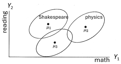
As shown in the figure, the centroids, \((\mu_{1g}, \mu_{2g})\), clearly differ—the data ellipses barely overlap. A multivariate analysis would show a highly difference among groups. From a rough visual inspection, it seems that means differ on the math test \(Y_1\), with the physics group out-performing the other two. On the reading test \(Y_2\) however it might turn out that the three group means don’t differ significantly in an ANOVA, but the Shakespeare and physics groups appear to outperform the normal curriculum group. Doing separate ANOVAs on these variables would miss what is so obvious from Figure fig-manova-diagram: there is wide separation among the groups in the two tests considered jointly.
Figure fig-manova-response-dimensions illustrates a second important advantage of performing a multivariate analysis over separate ANOVAS: that of determining the number of dimensions or aspects along which groups differ. In the panel on the left, the means of the three groups increase nearly linearly on the combination of \(Y_1\) and \(Y_2\), so their differences can be ascribed to a single dimension, which simplifies the interpretation: both memory and attention scores decrease together with increasing degree of schizophrenia.
For example, the groups here might be patients diagnosed as normal, mild schizophrenia and profound schizophrenia, and the measures could be tests of memory and attention. The obvious multivariate interpretation from the figure is that of increasing impairment of cognitive functioning across the groups, comprised by memory and attention. Note also the positive association within each group: those who perform better on the memory task also do better on attention.
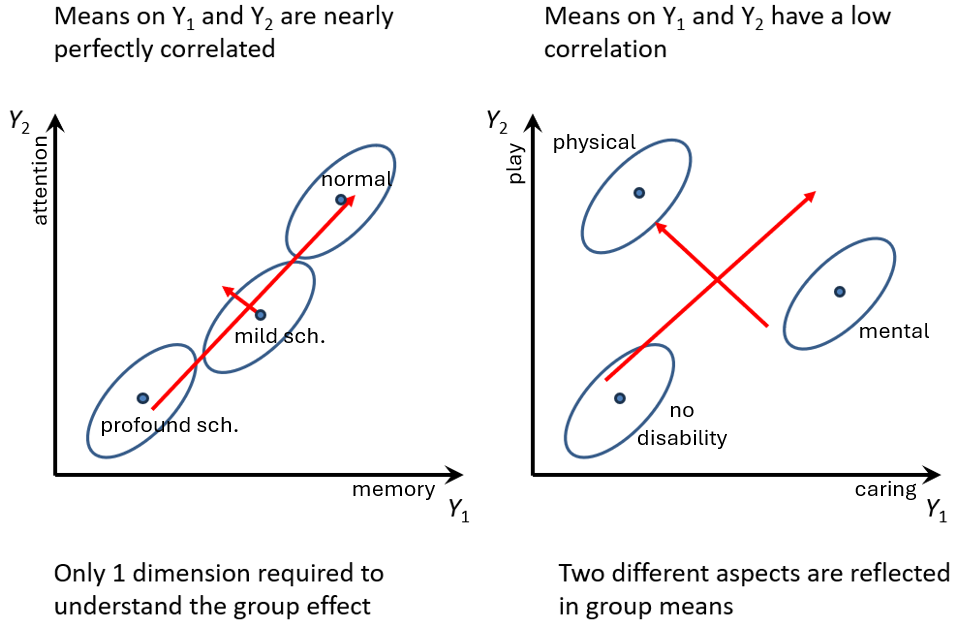
In contrast, the right panel of Figure fig-manova-response-dimensions shows a situation where the group means have a low correlation. Data like this might arise in a study of parental competency, where there are measures of both the degree of caring (\(Y_1\)) and time spent in play (\(Y_2\)) by fathers and groups consisting of fathers of children with no disability, or a physical disability or a mental ability.
As can be seen in Figure fig-manova-response-dimensions fathers of the disabled children differ from those of the not disabled group in two different directions corresponding to being higher on either \(Y_1\) or \(Y_2\). The red arrows suggest that the differences among groups could be interpreted in terms of two uncorrelated dimensions, perhaps labeled overall competency and emphasis on physical activity. (The pattern in Figure fig-manova-response-dimensions (right) is contrived for the sake of illustration; it does not reflect the data analyzed in the example below.)
10.4.1 Example: Father parenting data
I use a simple example of a three-group multivariate design to illustrate the basic ideas of fitting MLMs in R and testing hypotheses. Visualization methods using HE plots are discussed in sec-vis-mlm.
The dataset Parenting come from an exercise (10B) in Meyers et al. (2006) and are probably contrived, but are modeled on a real study in which fathers were assessed on three subscales of a Perceived Parenting Competence Scale,
-
caring, caretaking responsibilities; -
emotion, emotional support provided to the child; and -
play, recreational time spent with the child.
The dataset Parenting comprises 60 fathers selected from three groups of \(n = 20\) each: (a) fathers of a child with no disabilities ("Normal"); (b) fathers with a physically disabled child; (c) fathers with a mentally disabled child. The design is thus a three-group MANOVA, with three response variables.
The main questions concern whether the group means differ on these scales, and the nature of these differences. That is, do the means differ significantly on all three measures? Is there a consistent order of groups across these three aspects of parenting?
More specific questions are: (a) Do the fathers of typical children differ from the other two groups on average? (b) Do the physical and mental groups differ on these measures?
These questions can be tested using contrasts, and are specified by assigning a matrix to contrasts(Parenting$group); each column is a contrast whose values sum to zero. They are given labels "group1" (normal vs. other) and "group2" (physical vs. mental) in some output.
Exploratory plots
Before setting up a model and testing, it is well-advised to examine the data graphically. The simplest plots are side-by-side boxplots (or violin plots) for the three responses. With ggplot2, this is easily done by reshaping the data to long format and using faceting. In Figure fig-parenting-boxpl, I’ve also plotted the group means with white dots.
See the ggplot code
parenting_long <- Parenting |>
  tidyr::pivot_longer(cols=caring:play,
                      names_to = "variable")

ggplot(parenting_long,
       aes(x=group, y=value, fill=group)) +
  geom_boxplot(outlier.size=2.5,
               alpha=.5,
               outlier.alpha = 0.9) +
  stat_summary(fun=mean,
               color="white",
               geom="point",
               size=2) +
  scale_fill_hue(direction = -1) +     # reverse default colors
  labs(y = "Scale value", x = "Group") +
  facet_wrap(~ variable) +
  theme_bw(base_size = 14) +
  theme(legend.position="top") +
  theme(axis.text.x = element_text(angle = 15,
hjust = 1)) 
In this figure, differences among the groups on play are most apparent, with fathers of non-disabled children scoring highest. Differences among the groups on emotion are very small, but one high outlier for the fathers of mentally disabled children is apparent. On caring, fathers of children with a physical disability stand out as highest.
For exploratory purposes, you might also make a scatterplot matrix. Here, because the MLM assumes homogeneity of the variances and covariance matrices \(\mathbf{S}_i\), I show only the data ellipses in scatterplot matrix format, using heplots:covEllipses() (with 50% coverage, for clarity):
colors <- scales::hue_pal()(3) |> rev()  # match color use in ggplot
covEllipses(cbind(caring, play, emotion) ~ group,
  data=Parenting,
  variables = 1:3,
  fill = TRUE, fill.alpha = 0.2,
  pooled = FALSE,
  level = 0.50,
  col = colors)
If the covariance matrices were all the same, the data ellipses would have roughly the same size and orientation, but that is not the case in Figure fig-parenting-covEllipses. The normal group shows greater variability overall and the correlations among the measures differ somewhat from group to group. We’ll assess later whether this makes a difference in the conclusions that can be drawn (sec-eqcov). The group centroids also differ, but the pattern is not particularly clear. We’ll see an easier to understand view in HE plots (sec-he-plots) and their canonical discriminant cousins (sec-candisc).
Testing the model
Let’s proceed to fit the multivariate model predicting all three scales from the group factor. lm() for a multivariate response returns an object of class "mlm", for which there are many methods (use methods(class="mlm") to find them).
parenting.mlm <- lm(cbind(caring, play, emotion) ~ group,
                    data=Parenting) |> print()
#
# Call:
# lm(formula = cbind(caring, play, emotion) ~ group, data = Parenting)
#
# Coefficients:
#              caring   play     emotion
# (Intercept)   5.8833   4.6333   5.9167
# group1       -0.3833   2.4167  -0.0667
# group2        1.7750  -0.2250  -0.6000
The coefficients in this model are the values of the contrasts set up above. group1 is the mean of the typical group minus the average of the other two, which is negative on caring and emotion but positive for play. group2 is the difference in means for the physical vs. mental groups.
Before doing multivariate tests, it is useful to see what would happen if we ran univariate ANOVAs on each of the responses. These can be extracted from an MLM using stats::summary.aov() and they give tests of the model terms for each response variable separately:
summary.aov(parenting.mlm)
#  Response caring :
#             Df Sum Sq Mean Sq F value Pr(>F)
# group        2    130    65.2    18.6  6e-07 ***
# Residuals   57    200     3.5
# ---
# Signif. codes:  0 '***' 0.001 '**' 0.01 '*' 0.05 '.' 0.1 ' ' 1
#
#  Response play :
#             Df Sum Sq Mean Sq F value Pr(>F)
# group        2    177    88.6    27.6  4e-09 ***
# Residuals   57    183     3.2
# ---
# Signif. codes:  0 '***' 0.001 '**' 0.01 '*' 0.05 '.' 0.1 ' ' 1
#
#  Response emotion :
#             Df Sum Sq Mean Sq F value Pr(>F)
# group        2     15    7.27    1.02   0.37
# Residuals   57    408    7.16
For a more condensed summary, you can instead extract the univariate model fit statistics from the "mlm" object using the heplots::glance() method for a multivariate model object. The code below selects just the \(R^2\) and \(F\)-statistic for the overall model for each response, together with the associated \(p\)-value.
From this, one might conclude that there are differences only in caring and play and therefore ignore emotion, but this would be short-sighted. car::Anova(), shown below, gives the overall multivariate test \(\mathcal{H}_0: \mathbf{B} = 0\) of the group effect, that the groups don’t differ on any of the response variables. Note that this has a much smaller \(p\)-value than any of the univariate \(F\) tests.
Anova(parenting.mlm)
#
# Type II MANOVA Tests: Pillai test statistic
#       Df test stat approx F num Df den Df Pr(>F)
# group  2     0.948     16.8      6    112  9e-14 ***
# ---
# Signif. codes:  0 '***' 0.001 '**' 0.01 '*' 0.05 '.' 0.1 ' ' 1
Anova() returns an object of class "Anova.mlm" which has various methods. The summary() method for this gives more details, including all four test statistics. With \(p=3\) responses, these tests have \(s = \min(p, \text{df}_h) = \min(3,2) = 2\) dimensions and the \(F\) approximations are not equivalent here. All four tests are highly significant, with Roy’s test giving the largest \(F\) statistic.
parenting.summary <- Anova(parenting.mlm) |>  summary()
print(parenting.summary, SSP=FALSE)
#
# Type II MANOVA Tests:
#
# ------------------------------------------
#
# Term: group
#
# Multivariate Tests: group
#                  Df test stat approx F num Df den Df  Pr(>F)
# Pillai            2     0.948     16.8      6    112 9.0e-14 ***
# Wilks             2     0.274     16.7      6    110 1.3e-13 ***
# Hotelling-Lawley  2     1.840     16.6      6    108 1.8e-13 ***
# Roy               2     1.108     20.7      3     56 3.8e-09 ***
# ---
# Signif. codes:  0 '***' 0.001 '**' 0.01 '*' 0.05 '.' 0.1 ' ' 1
The summary() method by default prints the SSH = \(\mathbf{H}\) and SSE = \(\mathbf{E}\) matrices, but I suppressed them above. The data structure returned contains nested elements which can be extracted more easily from the object using purrr::pluck():
H <- parenting.summary |>
  purrr::pluck("multivariate.tests", "group", "SSPH") |>
  print()
#         caring    play emotion
# caring   130.4 -43.767 -41.833
# play     -43.8 177.233   0.567
# emotion  -41.8   0.567  14.533
E <- parenting.summary |>
  purrr::pluck("multivariate.tests", "group", "SSPE") |>
  print()
#         caring  play emotion
# caring   199.8 -45.8    35.2
# play     -45.8 182.7    80.6
# emotion   35.2  80.6   408.0
Linear hypotheses & contrasts
With three or more groups or with a more complex MANOVA design, contrasts provide a way of testing questions of substantive interest regarding differences among group means.
The test of the contrast comparing the typical group to the average of the others is the test using the contrast \(c_1 = (1, -\frac12, -\frac12)\) which produces the coefficients labeled "group1". The function car::linearHypothesis() carries out the multivariate test that this difference is zero. This is a 1 df test, so all four test statistics produce the same \(F\) and \(p\)-values.
coef(parenting.mlm)["group1",]
#  caring    play emotion
# -0.3833  2.4167 -0.0667
linearHypothesis(parenting.mlm, "group1") |>
  print(SSP=FALSE)
#
# Multivariate Tests:
#                  Df test stat approx F num Df den Df  Pr(>F)
# Pillai            1     0.521     19.9      3     55 7.1e-09 ***
# Wilks             1     0.479     19.9      3     55 7.1e-09 ***
# Hotelling-Lawley  1     1.088     19.9      3     55 7.1e-09 ***
# Roy               1     1.088     19.9      3     55 7.1e-09 ***
# ---
# Signif. codes:  0 '***' 0.001 '**' 0.01 '*' 0.05 '.' 0.1 ' ' 1
Similarly, the difference between the physical and mental groups uses the contrast \(c_2 = (0, 1, -1)\) and the test that these means are equal is given by linearHypothesis() applied to group2.
coef(parenting.mlm)["group2",]
#  caring    play emotion
#   1.775  -0.225  -0.600
linearHypothesis(parenting.mlm, "group2") |>
  print(SSP=FALSE)
#
# Multivariate Tests:
#                  Df test stat approx F num Df den Df Pr(>F)
# Pillai            1     0.429     13.8      3     55  8e-07 ***
# Wilks             1     0.571     13.8      3     55  8e-07 ***
# Hotelling-Lawley  1     0.752     13.8      3     55  8e-07 ***
# Roy               1     0.752     13.8      3     55  8e-07 ***
# ---
# Signif. codes:  0 '***' 0.001 '**' 0.01 '*' 0.05 '.' 0.1 ' ' 1
linearHypothesis() is very general. The second argument (hypothesis.matrix) corresponds to \(\mathbf{C}\), and can be specified as numeric matrix giving the linear combinations of coefficients by rows to be tested, or a character vector giving the hypothesis in symbolic form; "group1" is equivalent to "group1 = 0".
Because the two contrasts used here are orthogonal, they add together to give the overall test of \(\mathbf{B} = \mathbf{0}\), which implies that the means of the three groups are all equal. The test below gives the same results as Anova(parenting.mlm).
linearHypothesis(parenting.mlm, c("group1", "group2")) |>
  print(SSP=FALSE)
#
# Multivariate Tests:
#                  Df test stat approx F num Df den Df  Pr(>F)
# Pillai            2     0.948     16.8      6    112 9.0e-14 ***
# Wilks             2     0.274     16.7      6    110 1.3e-13 ***
# Hotelling-Lawley  2     1.840     16.6      6    108 1.8e-13 ***
# Roy               2     1.108     20.7      3     56 3.8e-09 ***
# ---
# Signif. codes:  0 '***' 0.001 '**' 0.01 '*' 0.05 '.' 0.1 ' ' 1
10.4.2 Ordered factors
When groups are defined by an ordered factor, such as level of physical fitness (rated 1–5) or grade in school, it is tempting to treat that as a numeric variable and use a multivariate regression model. This would assume that the effect of that factor is linear and if not, we might consider adding polynomial terms.
A different strategy, often preferable, is to make the group variable an ordered factor, for which R assigns polynomial contrasts. This gives separate tests of the linear, quadratic, cubic, … trends of the response, without the need to specify them separately in the model.
10.4.3 Example: Adolescent mental health
The dataset AddHealth contains a large cross-sectional sample of participants from grades 7–12 from the National Longitudinal Study of Adolescent Health, described by Warne (2014). It contains responses to two Likert-scale (1–5) items, anxiety and depression. grade is an ordered factor, which means that the default contrasts are taken as orthogonal polynomials with linear (grade.L), quadratic (grade.Q), up to 5th degree (grade^5) trends, which decompose the total effect of grade.
The research questions are:
- How do the means for anxiety and depression vary separately with grade? Is there evidence for linear and nonlinear trends?
- How do anxiety and depression vary jointly with grade?
- How does the association (correlation, $R^2) of anxiety and depression vary with age?
The first question can be answered by fitting separate linear models for each response (e.g., lm(anxiety ~ grade))). However the second question is more interesting because it considers the two responses together and takes their correlation into account. This would be fit as the MLM:
\[ \mathbf{y} = \boldsymbol{\beta}_0 + \boldsymbol{\beta}_1 x + \boldsymbol{\beta}_2 x^2 + \cdots \boldsymbol{\beta}_5 x^5 \tag{10.13}\]
or, expressed in terms of the variables,
\[\begin{aligned} \begin{bmatrix} y_{\text{anx}} \\y_{\text{dep}} \end{bmatrix} & = \begin{bmatrix} \beta_{0,\text{anx}} \\ \beta_{0,\text{dep}} \end{bmatrix} + \begin{bmatrix} \beta_{1,\text{anx}} \\ \beta_{1,\text{dep}} \end{bmatrix} \text{grade} + \begin{bmatrix} \beta_{2,\text{anx}} \\ \beta_{2,\text{dep}} \end{bmatrix} \text{grade}^2 \\ & + \cdots + \begin{bmatrix} \beta_{5,\text{anx}} \\ \beta_{5,\text{dep}} \end{bmatrix} \text{grade}^5 \end{aligned}\]
With grade represented as an ordered factor, the values of \(x\) in Equation eq-AH-mod are those of the orthogonal polynomials given by poly(grade,5).
Exploratory plots
Some exploratory analysis is useful before fitting and visualizing models. As a first step, we find the means, standard deviations, and standard errors of the means.
means <- AddHealth |>
  group_by(grade) |>
  summarise(
    n = n(),
    dep_sd = sd(depression, na.rm = TRUE),
    anx_sd = sd(anxiety, na.rm = TRUE),
    dep_se = dep_sd / sqrt(n),
    anx_se = anx_sd / sqrt(n),
    depression = mean(depression),
    anxiety = mean(anxiety) ) |>
  relocate(depression, anxiety, .after = grade) |>
  print()
# # A tibble: 6 × 8
#   grade depression anxiety     n dep_sd anx_sd dep_se anx_se
#   <ord>      <dbl>   <dbl> <int>  <dbl>  <dbl>  <dbl>  <dbl>
# 1 7          0.881   0.751   622   1.11   1.05 0.0447 0.0420
# 2 8          1.08    0.804   664   1.19   1.06 0.0461 0.0411
# 3 9          1.17    0.934   778   1.19   1.08 0.0426 0.0387
# 4 10         1.27    0.956   817   1.23   1.11 0.0431 0.0388
# 5 11         1.37    1.12    790   1.20   1.16 0.0428 0.0411
# 6 12         1.34    1.10    673   1.14   1.11 0.0439 0.0426
Now, plot the means with \(\pm 1\) error bars. It appears that average level of both depression and anxiety increase steadily with grade, except for grades 11 and 12 which don’t differ much. Alternatively, we could describe this as relationships that seem largely linear, with a hint of curvature at the upper end.
p1 <-ggplot(data = means, aes(x = grade, y = anxiety)) +
  geom_point(size = 4) +
  geom_line(aes(group = 1), linewidth = 1.2) +
  geom_errorbar(aes(ymin = anxiety - anx_se,
                   ymax = anxiety + anx_se),
                width = .2)

p2 <-ggplot(data = means, aes(x = grade, y = depression)) +
  geom_point(size = 4) +
  geom_line(aes(group = 1), linewidth = 1.2) +
  geom_errorbar(aes(ymin = depression - dep_se,
                    ymax = depression + dep_se),
                width = .2)

p1 + p2
It is also useful to within-group correlations using covEllipses(), as shown in Figure fig-addhealth-covellipse. This also plots the bivariate means showing the form of the association , treating anxiety and depression as multivariate outcomes. (Because the variability of the scores within groups is so large compared to the range of the means, I show the data ellipses with coverage of only 10%.)
covEllipses(AddHealth[, 3:2], group = AddHealth$grade,
            pooled = FALSE, level = 0.1,
            center.cex = 2.5, cex = 1.5, cex.lab = 1.5,
            fill = TRUE, fill.alpha = 0.05)
grade groups.
The bivariate means in Figure fig-addhealth-covellipse increase with grade, but the relationship is curved rather than strictly linear.
Fit the MLM
Now, let’s fit the MLM for both responses jointly in relation to grade. The null hypothesis is that the means for anxiety and depression are the same at all six grades,
\[ \mathcal{H}_0: \boldsymbol{\mu}_7 = \boldsymbol{\mu}_8 = \cdots = \boldsymbol{\mu}_{12} \; , \] or equivalently, that all coefficients except the intercept in the model Equation eq-AH-mod are zero,
\[ \mathcal{H}_0: \boldsymbol{\beta}_1 = \boldsymbol{\beta}_2 = \cdots = \boldsymbol{\beta}_5 = \boldsymbol{0} \; . \]
We fit the MANOVA model, and test the grade effect using car::Anova(). The effect of grade is highly significant, as we could tell from Figure fig-addhealth-means-each.
AH.mlm <- lm(cbind(anxiety, depression) ~ grade, data = AddHealth)

# overall test of `grade`
Anova(AH.mlm)
#
# Type II MANOVA Tests: Pillai test statistic
#       Df test stat approx F num Df den Df Pr(>F)
# grade  5    0.0224     9.83     10   8676 <2e-16 ***
# ---
# Signif. codes:  0 '***' 0.001 '**' 0.01 '*' 0.05 '.' 0.1 ' ' 1
However, the overall test, with 5 degrees of freedom is diffuse, in that it can be rejected if any pair of means differ. Given that grade is an ordered factor, it makes sense to examine narrower hypotheses of linear and nonlinear trends, car::linearHypothesis() on the coefficients of model AH.mlm.
The joint test of the linear coefficients \(\boldsymbol{\beta}_1 = (\beta_{1,\text{anx}}, \beta_{1,\text{dep}})^\mathsf{T}\) for anxiety and depression, \(\mathcal{H}_0 : \boldsymbol{\beta}_1 = \boldsymbol{0}\) is highly significant,
## linear effect
linearHypothesis(AH.mlm, "grade.L") |> print(SSP = FALSE)
#
# Multivariate Tests:
#                  Df test stat approx F num Df den Df Pr(>F)
# Pillai            1     0.019     42.5      2   4337 <2e-16 ***
# Wilks             1     0.981     42.5      2   4337 <2e-16 ***
# Hotelling-Lawley  1     0.020     42.5      2   4337 <2e-16 ***
# Roy               1     0.020     42.5      2   4337 <2e-16 ***
# ---
# Signif. codes:  0 '***' 0.001 '**' 0.01 '*' 0.05 '.' 0.1 ' ' 1
The test of the quadratic coefficients \(\mathcal{H}_0 : \boldsymbol{\beta}_2 = \boldsymbol{0}\) indicates significant curvature in trends across grade, as we saw in the plots of their means in Figure fig-addhealth-means-each. One interpretation might be that depression and anxiety after increasing steadily up to grade eleven could level off thereafter.
## quadratic effect
linearHypothesis(AH.mlm, "grade.Q") |> print(SSP = FALSE)
#
# Multivariate Tests:
#                  Df test stat approx F num Df den Df Pr(>F)
# Pillai            1     0.002     4.24      2   4337  0.014 *
# Wilks             1     0.998     4.24      2   4337  0.014 *
# Hotelling-Lawley  1     0.002     4.24      2   4337  0.014 *
# Roy               1     0.002     4.24      2   4337  0.014 *
# ---
# Signif. codes:  0 '***' 0.001 '**' 0.01 '*' 0.05 '.' 0.1 ' ' 1
An advantage of linear hypotheses is that we can test several terms jointly. Of interest here is the hypothesis that all higher order terms beyond the quadratic are zero, \(\mathcal{H}_0 : \boldsymbol{\beta}_3 = \boldsymbol{\beta}_4 = \boldsymbol{\beta}_5 = \boldsymbol{0}\). Using linearHypothesis you can supply a vector of coefficient names to be tested for their joint effect when dropped from the model.
coefs <- rownames(coef(AH.mlm)) |> print()
# [1] "(Intercept)" "grade.L"     "grade.Q"     "grade.C"
# [5] "grade^4"     "grade^5"
## joint test of all higher terms
linearHypothesis(AH.mlm, coefs[3:5],
                 title = "Higher-order terms") |>
  print(SSP = FALSE)
#
# Multivariate Tests: Higher-order terms
#                  Df test stat approx F num Df den Df Pr(>F)
# Pillai            3     0.002     1.70      6   8676   0.12
# Wilks             3     0.998     1.70      6   8674   0.12
# Hotelling-Lawley  3     0.002     1.70      6   8672   0.12
# Roy               3     0.002     2.98      3   4338   0.03 *
# ---
# Signif. codes:  0 '***' 0.001 '**' 0.01 '*' 0.05 '.' 0.1 ' ' 1
10.5 Factorial MANOVA
When there are two or more categorical factors, the general linear model provides a way to investigate the effects (differences in means) of each simultaneously. More importantly, this allows you to determine if factors interact, so the effect of one factor varies depending on the levels of another factor. For instance, the effect of a weight loss drug treatment may vary with the patient’s ethnicity or age group.
In such situations, when an interaction is significant it is unwise to interpret the overall main effects of treatment and the other factor. Instead, you would look at the “simple effects”– how the treatment works at specific levels of the other factor separately.
Example 10.1 Plastic film data
An industrial experiment was conducted to determine the optimal conditions for extruding plastic film. Of interest were three responses: resistance to tear, film gloss and the opacity of the film. Two factors were manipulated, both at two levels, labeled High and Low: change in rate of extrusion (-10%, +10%) and amount of some additive (1%, 1.5%), with \(n=5\) runs at each combination of the factor levels. The dataset heplots::Plastic comes from Johnson & Wichern (1998), Example 6.12.
data(Plastic, package="heplots")
str(Plastic)
# 'data.frame': 20 obs. of  5 variables:
#  $ tear    : num  6.5 6.2 5.8 6.5 6.5 6.9 7.2 6.9 6.1 6.3 ...
#  $ gloss   : num  9.5 9.9 9.6 9.6 9.2 9.1 10 9.9 9.5 9.4 ...
#  $ opacity : num  4.4 6.4 3 4.1 0.8 5.7 2 3.9 1.9 5.7 ...
#  $ rate    : Factor w/ 2 levels "Low","High": 1 1 1 1 1 1 1 1 1 1 ...
#  $ additive: Factor w/ 2 levels "Low","High": 1 1 1 1 1 2 2 2 2 2 ...
Multivariate tests
The MANOVA model plastic.mod fits the main effects of rate and additive and the interaction rate:additive. The Anova() summary shows a strong effect for rate of extrusions for the three responses jointly, a lesser, but still significant effect of additive and a non-significant interaction.
plastic.mod <- lm(cbind(tear, gloss, opacity) ~ rate*additive,
                  data=Plastic)
Anova(plastic.mod)
#
# Type II MANOVA Tests: Pillai test statistic
#               Df test stat approx F num Df den Df Pr(>F)
# rate           1     0.618     7.55      3     14  0.003 **
# additive       1     0.477     4.26      3     14  0.025 *
# rate:additive  1     0.223     1.34      3     14  0.302
# ---
# Signif. codes:  0 '***' 0.001 '**' 0.01 '*' 0.05 '.' 0.1 ' ' 1
As a reminder, if you want to see the results of univariate tests for the responses separately, heplots::uniStats() (or heplots::glance.mlm()) gives some answers, including \(R^2\) and univariate \(F\) tests.
uniStats(plastic.mod)
# Univariate tests for responses in the multivariate linear model plastic.mod
#
#           R^2    F df1 df2 Pr(>F)
# tear    0.586 7.56   3  16 0.0023 **
# gloss   0.483 4.99   3  16 0.0125 *
# opacity 0.125 0.76   3  16 0.5315
# ---
# Signif. codes:  0 '***' 0.001 '**' 0.01 '*' 0.05 '.' 0.1 ' ' 1
Note that these two summaries are complementary. Anova() collapses over the responses to give overall multivariate tests for each model term. uniStats() shows only the overall statistics for each response variable, combining the effects of all terms, and testing against the null model that none of them contribute to that response.
Plotting main effects and interactions
To understand main effects and interactions in a simple two-way MANOVA design, the simplest thing to do is to plot the cell means and error bars in a traditional line plot with one factor on the horizontal axis and the other as separate lines within the panel and with one panel for each response variable.
This is slightly awkward using ggplot2 directly: you have to plot the points and lines, but to plot error bars with geom_errorbar() you must calculate the standard errors and work out the upper and lower limits. In Figure fig-plastic-ggline I use ggpubr::ggline(), which simplifies such plots, though at the expense of a bit of control for ggplot2.5 The argument add = c("mean_se") draws error bars6 showing \(\pm 1\) standard error around the mean.
legend_inside <- function(position) {     # simplify legend placement
  theme(legend.position = "inside",
        legend.position.inside = position)
}

p1 <- ggline(Plastic,
  x = "rate", y = "tear",
  color = "additive", shape = "additive", linetype = "additive",
  add = c("mean_se"), position = position_dodge(width = .1),
  point.size = 5, linewidth = 1.5,
  palette = c("red", "blue"),
  ggtheme = theme_pubr(base_size = 16)
  ) +
  xlab("Rate of extrusion") +
  ylab("Tear resistance") +
  legend_inside(c(.25, .8))

p2 <- ggline(Plastic,
  x = "rate", y = "gloss",
  color = "additive", shape = "additive", linetype = "additive",
  add = c("mean_se"), position = position_dodge(width = .1),
  palette = c("red", "blue"),
  point.size = 5, linewidth = 1.5,
  ggtheme = theme_pubr(base_size = 16)
  ) +
  xlab("Rate of extrusion") +
  ylab("Film gloss") +
  theme(legend.position = "none")

p1 + p2 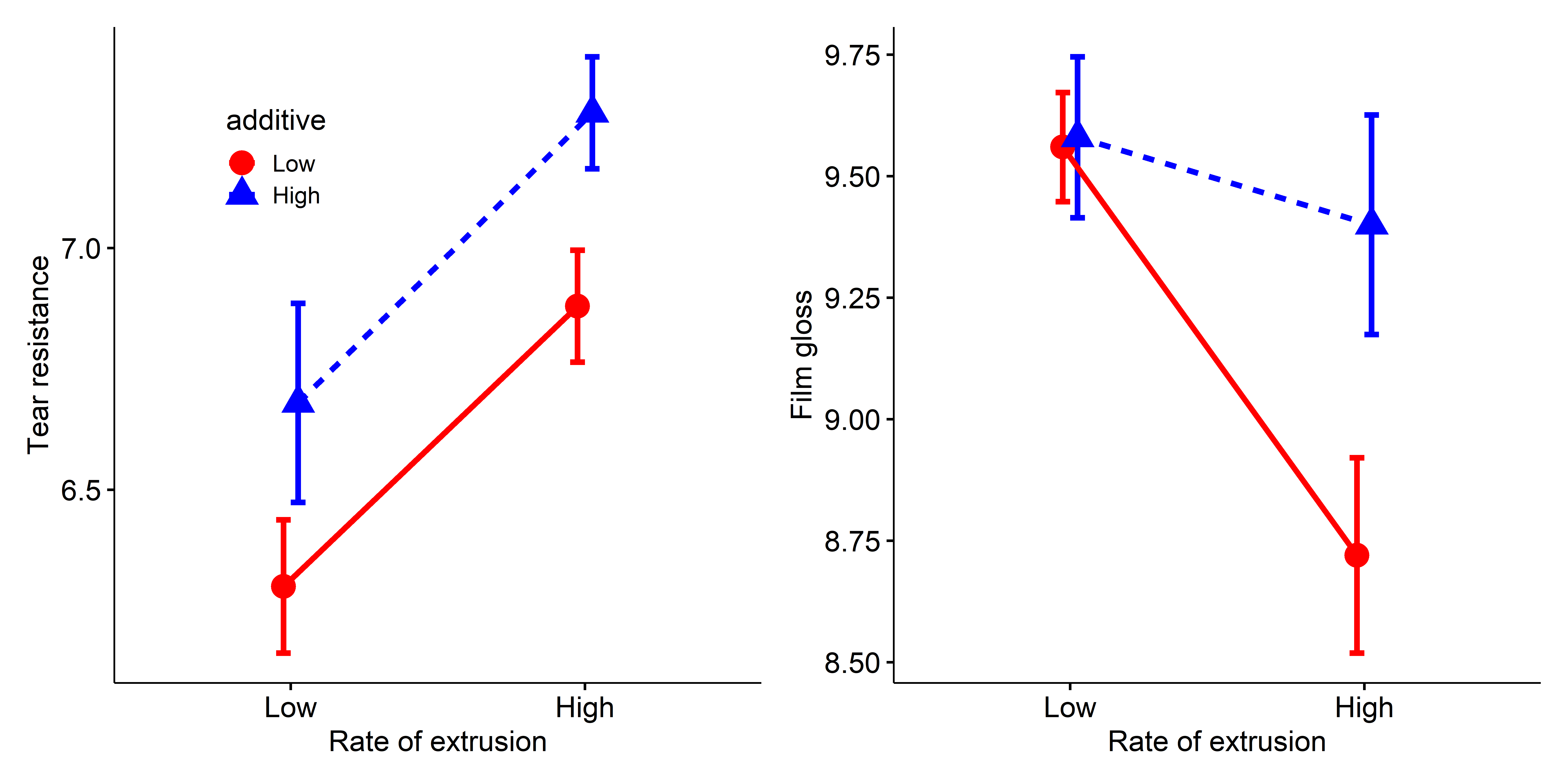
tear (left) and gloss (right) in the plastic film data.
Resistance to tear is greater with the high rate of extrusion and high level of the additive. The lines are parallel, so there is no interaction. In the panel for gloss, the means for additive don’t differ at the high rate, but do so substantially at the low extrusion rate, giving rise to the interaction for this outcome.
Such univariate plots are certainly useful for this simple \(2 \times 2\) design with two response variables, but you can imagine that they get more complicated, both to construct and to understand with larger designs and more response variables. As well, plotting the responses separately give no information on how the outcomes vary jointly. I return to this data in Example exm-plastic2, where I show how HE plots can give greater insight in this situation.
Example 10.2 Does defendant physical attractiveness affect jury decisions?
In a social psychology study of influences on jury decisions by Plaster (1989), male participants (prison inmates) were shown a picture of one of three young women. Pilot work had indicated that one woman’s photo was “beautiful”, another of “average” physical attractiveness, and the third “unattractive”. Participants rated the woman they saw on each of twelve attributes on scales of 1–9. These measures were used to check on the manipulation of “attractiveness” by the photo.
In the main part of the study, other participants were told that the person in the photo had committed a non-violent crime, either burglary or swindling. They were asked to rate the seriousness of the crime and recommend a prison sentence, in Years.
The data are contained in the data frame heplots::MockJury. Only the first four are analyzed here: Attr, Crime, Year and Serious. The remaining twelve, exciting … ownPA relate to validity tests of whether the attractiveness classification Attr of the photo captures the essence of the attribute ratings.
Sample sizes were roughly balanced for the independent variables in the three conditions of the attractiveness of the photo, and the two combinations of this with Crime, which was burglary or swindling, giving a \(3 \times 2\) factorial design.
The main questions of interest were:
- Does attractiveness of the “defendant” influence the sentence or perceived seriousness of the crime?
- Does attractiveness interact with the nature of the crime? That is, does attractiveness have the same pattern of means for both crimes?
So, I carry out a two-way MANOVA of the responses Years and Serious in relation to the independent variables Attr and Crime.
# influence of Attr of photo and nature of crime on Serious and Years
jury.mod <- lm( cbind(Serious, Years) ~ Attr * Crime, data=MockJury)
Anova(jury.mod, test = "Roy")
#
# Type II MANOVA Tests: Roy test statistic
#            Df test stat approx F num Df den Df Pr(>F)
# Attr        2    0.0756     4.08      2    108  0.020 *
# Crime       1    0.0047     0.25      2    107  0.778
# Attr:Crime  2    0.0501     2.71      2    108  0.071 .
# ---
# Signif. codes:  0 '***' 0.001 '**' 0.01 '*' 0.05 '.' 0.1 ' ' 1
We see that there is a strong main effect of Attr, no overall effect of Crime, and a nearly significant interaction between Attr and Crime. To probe these multivariate tests, you can also examine the univariate results for each response.
uniStats(jury.mod)
# Univariate tests for responses in the multivariate linear model jury.mod
#
#            R^2    F df1 df2 Pr(>F)
# Serious 0.0117 0.26   5 108  0.936
# Years   0.0843 1.99   5 108  0.086 .
# ---
# Signif. codes:  0 '***' 0.001 '**' 0.01 '*' 0.05 '.' 0.1 ' ' 1
Again, you can interpret these results more easily from line plots of the means and standard error bars. In Figure fig-jury-ggline, I assign attractiveness to the horizontal axis and plot separate lines for the types of crime.
p1 <- ggline(MockJury,
  x = "Attr", y = "Years",
  color = "Crime", shape = "Crime", linetype = "Crime",
  add = c("mean_se"), position = position_dodge(width = .1),
  point.size = 5, linewidth = 1.5,
  palette = c("blue", "darkorange2"),
  ggtheme = theme_pubr(base_size = 16)
  ) +
  xlab("Physical attractiveness of photo") +
  ylab("Recommended years of sentence") +
  legend_inside(c(.25, .9))

p2 <- ggline(MockJury,
  x = "Attr", y = "Serious",
  color = "Crime", shape = "Crime", linetype = "Crime",
  add = c("mean_se"), position = position_dodge(width = .1),
  point.size = 5,  linewidth = 1.5,
  palette = c("blue", "darkorange2"),
  ggtheme = theme_pubr(base_size = 16)
  ) +
  xlab("Physical attractiveness of photo") +
  ylab("Seriousness of crime") +
  legend_inside(c(.75, .9))

p1 + p2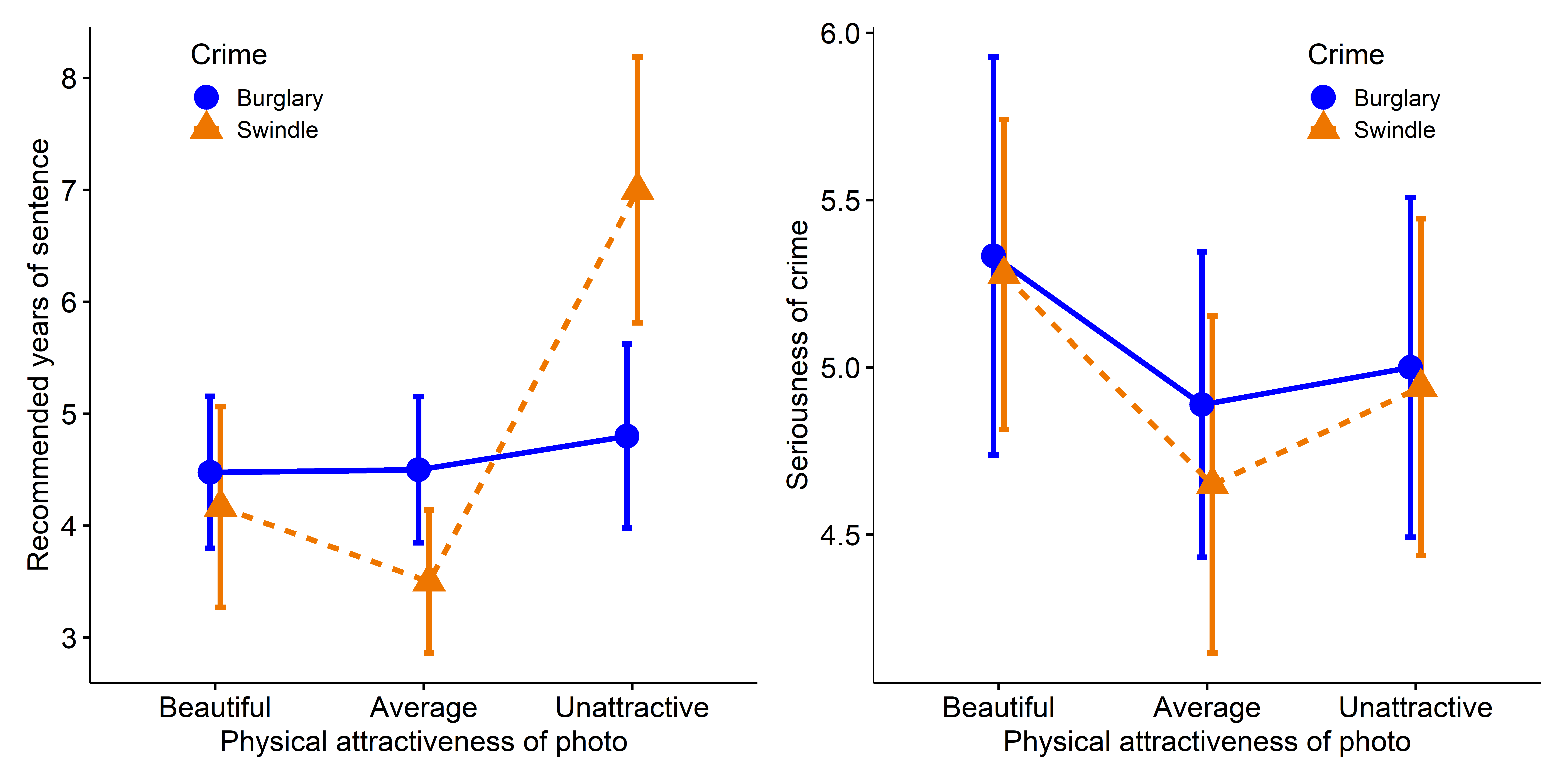
Years (left) and Serious (right) in the Mock Jury data.
10.6 MRA \(\rightarrow\) MMRA
When all predictor variables are quantitative, the MLM Equation eq-mlm becomes the extension of univariate multiple regression analysis (MRA) to the situation where there are \(p\) response variables (MMRA). Just as in univariate models, we might want to test hypotheses about subsets of the predictors, for example when some predictors are meant as controls or things you might want to adjust for in assessing the effects of predictors of main interest.
But first, there are a couple of aspects of statistical practice that should be mentioned.
Model selection is one topic where univariate and multivariate approaches differ. When there are more than a few predictors, approaches like hierarchical regression, LASSO (Tibshirani, 1996) and stepwise selection can be used to eliminate uninformative predictors for each response.7 But this gives a different models for each response, based on the predictors included, each with its own interpretation. In contrast, the multivariate approach considers the outcome variables collectively. You can eliminate predictors that are unimportant, but the mechanics are geared toward removing them from the models for all responses.
Overall tests In a one-way ANOVA, to control for multiple testing, it is common practice to carry out an overall \(F\)-test to see if the group means differ collectively before testing comparison between specific groups. Similarly, in univariate multiple regression, researchers sometimes report an overall \(F\)-test or test of the \(R^2\) so they can reject the hypothesis that all predictors have no effect, before considering them individually.
Similarly, the the case of multivariate linear models, some consider it necessary to reject the multivariate null hypothesis for a predictor term before considering how it contributes to each of the response variables. Some further suggest that the individual univariate models be tested after an overall significant effect. I believe the first of these is wise, but the second might be too much to require when the general goal is to understand the data.
10.6.1 Example: NLSY data
The dataset NLSY comes from a small part of the National Longitudinal Survey of Youth, a series of annual surveys conducted by the U.S. Department of Labor to examine the transition of young people into the labor force. This particular subset gives measures of 243 children on mathematics and reading achievement and also measures of behavioral problems (antisocial, hyperactivity). Also available are the yearly income and education of the child’s father.
In this analysis the math and read scores are taken at the outcome variables.8 Among the remaining predictors, income and educ might be considered as background variables necessary to control for. Interest might then be focused on whether the behavioral variables antisoc and hyperact contribute beyond that.
data(NLSY, package = "heplots")
str(NLSY)
# 'data.frame': 243 obs. of  6 variables:
#  $ math    : num  50 28.6 50 32.1 21.4 ...
#  $ read    : num  45.2 28.6 53.6 34.5 22.6 ...
#  $ antisoc : int  4 0 2 0 0 1 0 1 1 4 ...
#  $ hyperact: int  3 0 2 2 2 0 1 4 3 5 ...
#  $ income  : num  52.52 42.6 50 6.08 7.41 ...
#  $ educ    : int  14 12 12 12 14 12 12 12 12 9 ...
Exploratory plots
To begin, I would examine some scatterplots and univariate displays. I’ll start with density plots for all the variables to see the shapes of their distributions, wikh rug plots at the bottom to show where the observations are located. From Figure fig-NLSY-density we see that math and reading scores are positively skewed, anti-social and hyperactivity have distributions highly concentrated in the lower scores. As we would suspect, father’s income is quite positively skewed. Father’s education is reasonably symmetric, but highly peaked at 12 years of schooling in this sample. The spikes reflect the fact that education is measured in discrete years.
NLSY_long <- NLSY |>
  tidyr::pivot_longer(math:educ, names_to = "variable") |>
  dplyr::mutate(variable = forcats::fct_inorder(variable))

ggplot(NLSY_long, aes(x=value, fill=variable)) +
  geom_density(alpha = 0.5) +
  geom_rug() +
  facet_wrap(~variable, scales="free") +
  theme_bw(base_size = 14) +
theme(legend.position = "none") 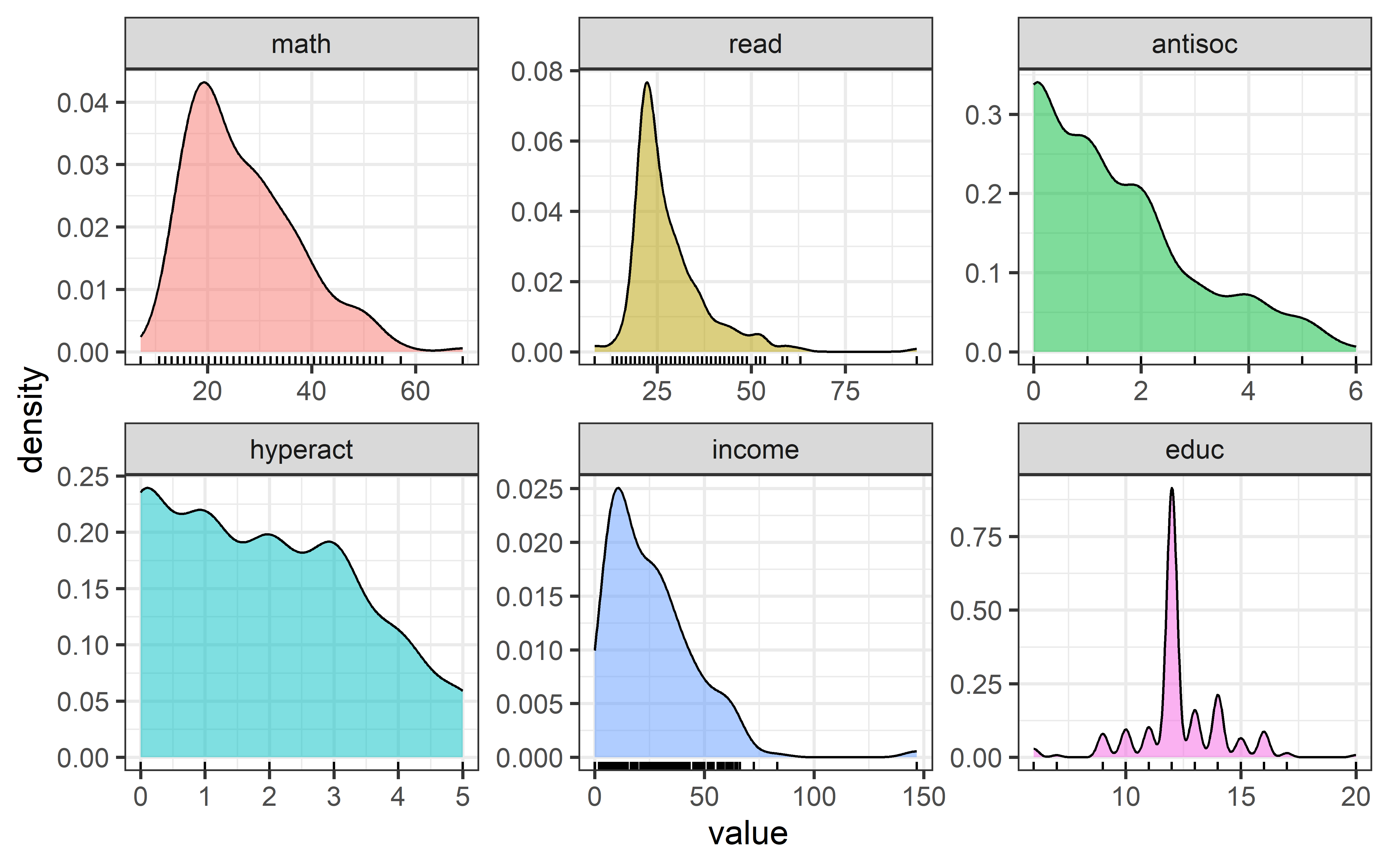
NLSY dataset.
In terms of an analysis focused on math and read as outcomes, a scatterplot of one against the other is useful, as is collection of scatterplots of each against the remaining variables. The second of these is left as an exercise to the reader.
set.seed(47)
ggplot(NLSY, aes(x = read, y = math)) +
  geom_jitter()+
  geom_smooth(method = lm, formula = y~x, fill = "blue", alpha = 0.2) +
  geom_smooth(method = loess, se = FALSE, color = "red", linewidth = 2)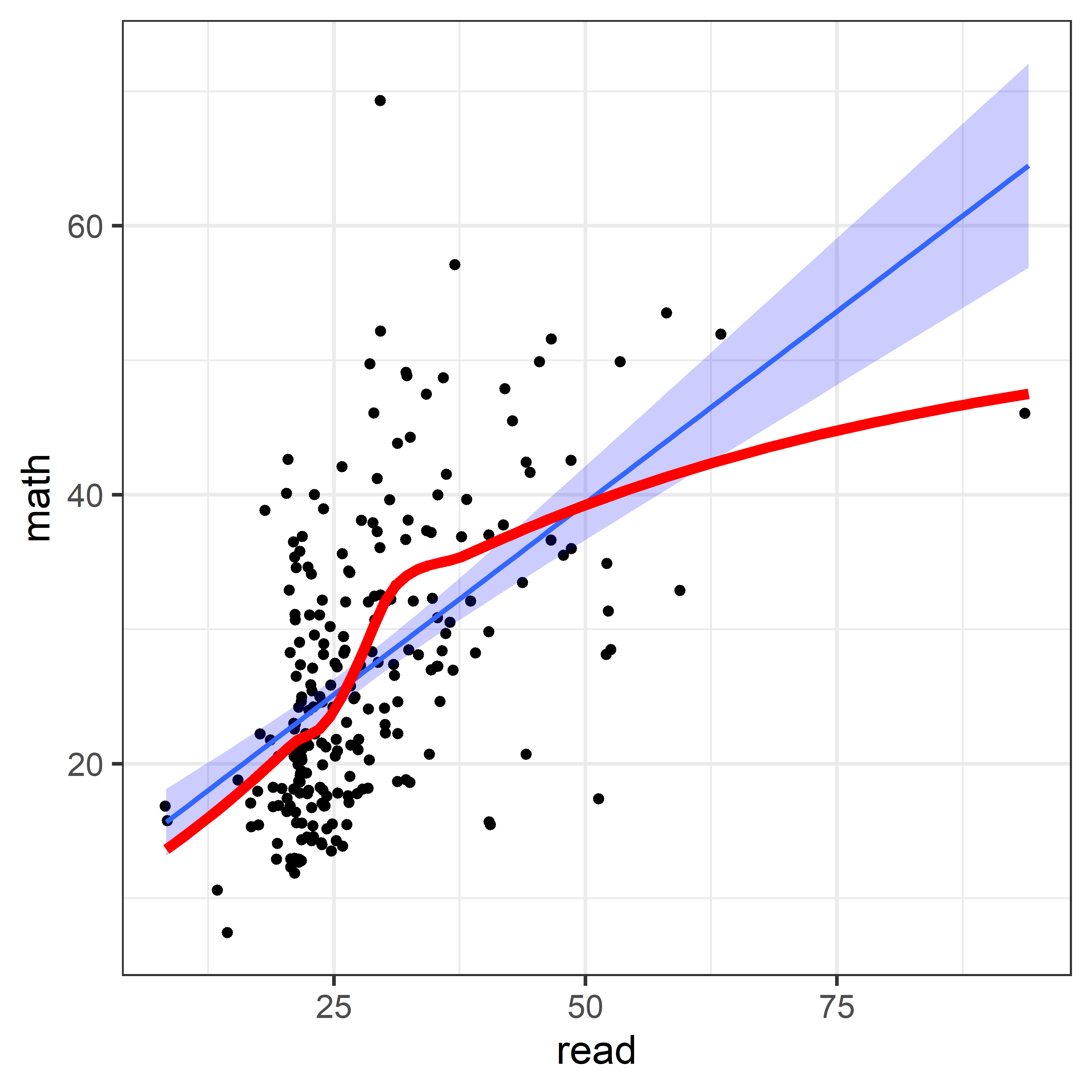
The non-linear trend in Figure fig-NLSY-scat1 may be due to the sparsity of data in the upper range of reading, and there are also a few unusual points shown in this plot. The function heplots::noteworthy() provides a variety of methods to identify such noteworthy points in scatterplots. The default method uses Mahalanobis \(D^2\). The plot below labels the five largest observations.
ids <- heplots::noteworthy(NLSY[, 1:2], method = "mahal", n=5)
ggplot(NLSY, aes(x = read, y = math)) +
  geom_jitter()+
  geom_smooth(method = lm, formula = y~x, fill = "blue", alpha = 0.2) +
geom_text(data = NLSY[ids, ], label = ids, size = 5, nudge_y = 2) 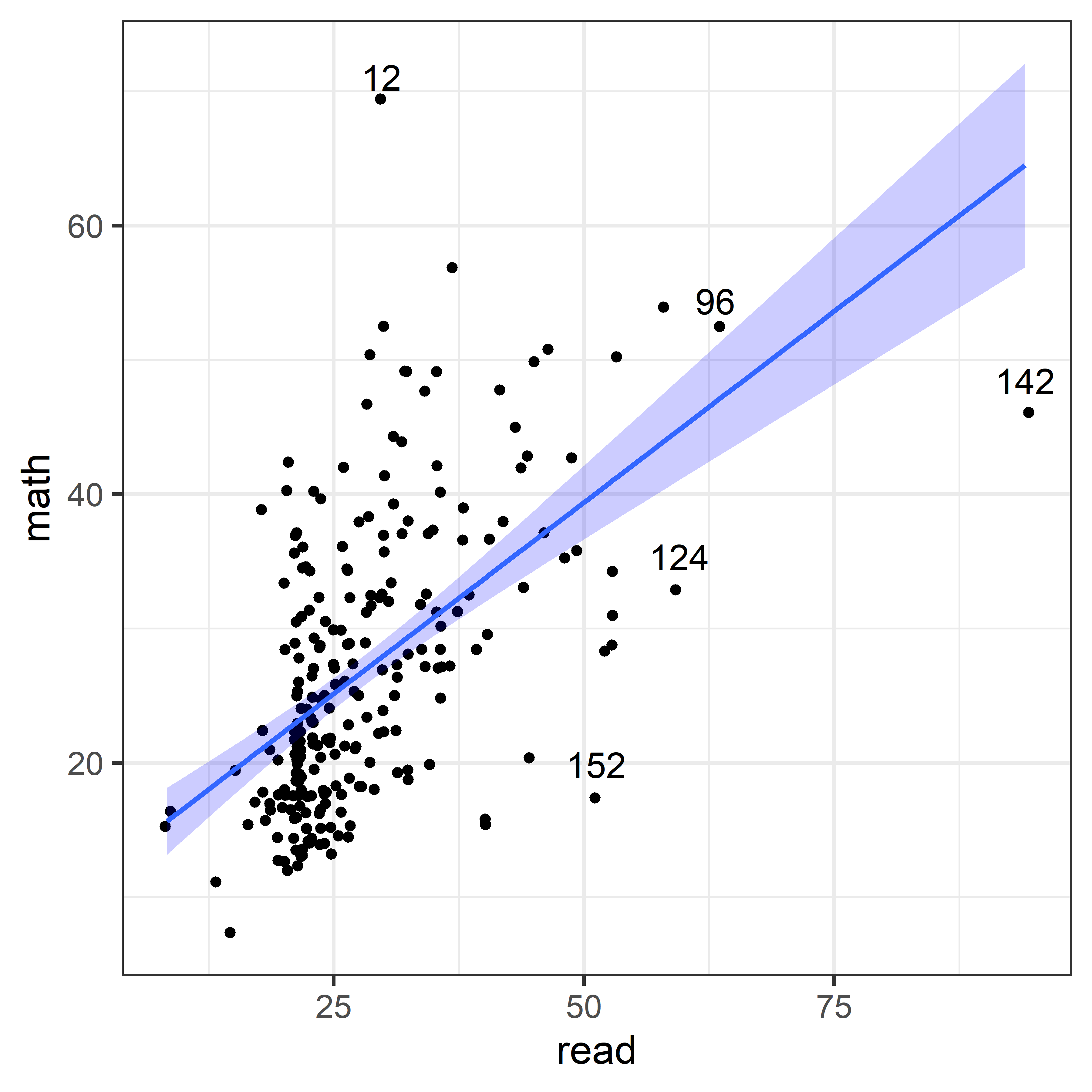
Fitting models
We could of course include all of the predictors in a single model, and perhaps be done with it. To develop some model-thinking, it is more useful to proceed in smaller steps to see what we can learn from each. If we view parents’ income and education as the most obvious predictors of reading and mathematics scores, those are the variables to fit first.
NLSY.mod1 <- lm(cbind(read, math) ~ income + educ,
                data = NLSY)

Anova(NLSY.mod1)  # Type II, partial test
#
# Type II MANOVA Tests: Pillai test statistic
#        Df test stat approx F num Df den Df Pr(>F)
# income  1    0.0345     4.27      2    239 0.0151 *
# educ    1    0.0515     6.49      2    239 0.0018 **
# ---
# Signif. codes:  0 '***' 0.001 '**' 0.01 '*' 0.05 '.' 0.1 ' ' 1
Overall test
The Anova() results above give multivariate tests of the contributions of each predictor separately to explaining reading and math and how they vary together. To get an overall test of the global null hypothesis \(\mathcal{H}_0 : \mathbf{B} =(\boldsymbol{\beta}_{\text{inc}}, \boldsymbol{\beta}_{\text{educ}}) =\mathbf{0}\) for all predictors together, you can use linearHypothesis():
coefs <- rownames(coef(NLSY.mod1))[-1]
linearHypothesis(NLSY.mod1, coefs, title = "income, educ = 0") |>
  print(SSP = FALSE)
#
# Multivariate Tests: income, educ = 0
#                  Df test stat approx F num Df den Df  Pr(>F)
# Pillai            2     0.117     7.44      4    480 8.1e-06 ***
# Wilks             2     0.884     7.59      4    478 6.2e-06 ***
# Hotelling-Lawley  2     0.130     7.75      4    476 4.7e-06 ***
# Roy               2     0.123    14.79      2    240 8.7e-07 ***
# ---
# Signif. codes:  0 '***' 0.001 '**' 0.01 '*' 0.05 '.' 0.1 ' ' 1
This joint multivariate test is more highly significant than either of those for the separate effects of the predictors, again because it pools strength.
Coefficient plots
As usual, you can display the coefficients using coef(). The tidy method for "mlm" objects defined in heplots shows these in a tidy format with \(t\)-tests for each coefficient., arranged by the response variable.
coef(NLSY.mod1)
#                read   math
# (Intercept) 15.8848 8.7829
# income       0.0137 0.0893
# educ         0.9495 1.2755

tidy(NLSY.mod1)
# # A tibble: 6 × 6
#   response term        estimate std.error statistic  p.value
#   <chr>    <chr>          <dbl>     <dbl>     <dbl>    <dbl>
# 1 read     (Intercept)  15.9       4.25       3.74  0.000233
# 2 read     income        0.0137    0.0325     0.420 0.675
# 3 read     educ          0.949     0.360      2.64  0.00894
# 4 math     (Intercept)   8.78      4.33       2.03  0.0437
# 5 math     income        0.0893    0.0331     2.70  0.00749
# 6 math     educ          1.28      0.367      3.47  0.000607
However, a bivariate plot of these coefficients is more useful, because it provides visual tests of multivariate hypotheses. heplots::coefplot.mlm() gives displays of the coefficients for a given pair of response variables. For interpretation, it adds the bivariate confidence ellipse for the coefficients, as well as univariate confidence intervals for each response. The univariate intervals are simply the horizontal and vertical shadows of the ellipses on the response variable axes.
A wrinkle here, as in sec-coefficient-displays, is that the coefficients are measured in different units and so coefficient plots for different predictors are more easily compared for standardized variables. To do this, I first re-fit the model using scale(NLSY) …
NLSY_std <- scale(NLSY) |>
  as.data.frame()

NLSY_std.mod1 <- lm(cbind(read, math) ~ income + educ,
data = NLSY_std)coefplot(NLSY_std.mod1, fill = TRUE,
col = c("darkgreen", "brown"),
lwd = 2,
cex.lab = 1.5,
ylim = c(-0.1, 0.5),
xlab = "read coefficient (std)",
ylab = "math coefficient (std)")
In Figure fig-NLSY-coefplot1, the confidence ellipses for income and educ both exclude the origin, which represents the multivariate hypothesis \(\mathcal{H}_0 : ( \beta_\textrm{read}, \beta_\textrm{math} ) = (0, \, 0)\), so this hypothesis is rejected. Note that if we only examined the univariate tests for each of the four parameters, we would conclude that for reading, income is not a significant predictor. The orientation of the confidence ellipses indicates the positive correlation between reading and mathematics scores.
10.6.1.1 Behavioral measures
Given that the parental background variables are highly predictive of student performance, we might want to know if the behavioral measures antisoc and hyperact add importantly to this. One way to do this is to add these predictors to the model and test for their additional contributions over and above the baseline model.
You can do this using update(). In the model formula, “.” on the left hand side corresponds to the previous \(y\) variables; on the right-hand side it refers to the \(x\)s in the previous model, so I just add the new predictors to that.
NLSY.mod2 <- update(NLSY.mod1, . ~ . + antisoc + hyperact)
Anova(NLSY.mod2)
#
# Type II MANOVA Tests: Pillai test statistic
#          Df test stat approx F num Df den Df Pr(>F)
# income    1    0.0383     4.72      2    237 0.0098 **
# educ      1    0.0532     6.65      2    237 0.0015 **
# antisoc   1    0.0193     2.34      2    237 0.0988 .
# hyperact  1    0.0144     1.74      2    237 0.1784
# ---
# Signif. codes:  0 '***' 0.001 '**' 0.01 '*' 0.05 '.' 0.1 ' ' 1
Each of these new predictors are individually non-significant according to the Type II tests. Using linearHypothesis() you can test them jointly:
coefs <- rownames(coef(NLSY.mod2))[-1] |> print()
# [1] "income"   "educ"     "antisoc"  "hyperact"

linearHypothesis(NLSY.mod2, coefs[3:4],
                 title = "NLSY.mod2 | NLSY.mod1") |>
  print(SSP = FALSE)
#
# Multivariate Tests: NLSY.mod2 | NLSY.mod1
#                  Df test stat approx F num Df den Df Pr(>F)
# Pillai            2     0.024     1.45      4    476  0.218
# Wilks             2     0.976     1.44      4    474  0.218
# Hotelling-Lawley  2     0.024     1.44      4    472  0.218
# Roy               2     0.022     2.64      2    238  0.073 .
# ---
# Signif. codes:  0 '***' 0.001 '**' 0.01 '*' 0.05 '.' 0.1 ' ' 1
10.6.2 Example: School data
Charnes et al. (1981) describe a large scale “social experiment” in public school education. Seventy school sites across the U.S. participated and a number of variables related to attributes of parents and teachers were used to predict aspects of students’ success in academic indicators (reading, mathematics), but also in their self-esteem. It was conceived in the late 1960’s in relation to a federally sponsored program charged with providing remedial assistance to educationally disadvantaged early primary school students.
The study was focused on the management styles used to guide educational planning across schools. In particular, it was primarily designed to compare schools using Program Follow Through (PFT) management methods of taking actions to achieve goals with those of Non Follow Through (NFT).
Here, I simply focus on the relations between outcome scores on tests of reading, mathematics and self-esteem in relation to five explanatory variables related to parents and teachers:
-
educationlevel of mother as measured by the percentage of high school graduates among female parents. -
occupation, highest occupation of a family member on a rating scale. -
visit, an index of the number of parental visits to the school site. -
counseling, a measure calculated from data on time spent with child on school-related topics such as reading together, etc. -
teacher, number of teachers at the given site.
The dataset, given in schooldata contains observations for 70 schools.9
Exploratory plots
There are eight variables in this example, so a scatterplot matrix or even a corrgram might not be sufficiently revealing. As usual, I tried a number of different methods and found a couple that were interesting and useful.
Multivariate normality is not required for all the variables in \(\mathbf{Y}\) and \(\mathbf{X}\)— it is only required for the residuals, \(\boldsymbol{\Large\varepsilon}= \mathbf{Y} - \widehat{\mathbf{Y}}\). Yet, for MMRA problems, sometimes an initial \(\chi^2\) QQ plot provides a handy way to flag possibly unusual values to pay attention to as the analysis proceeds. In Figure fig-schooldata-cqplot we see five cases outside the 95% confidence envelope.
data(schooldata, package = "heplots")
res <- cqplot(schooldata, id.n = 5) |> print()
#     DSQ quantile       p
# 59 44.6     21.0 0.00714
# 44 38.8     18.0 0.02143
# 33 27.9     16.5 0.03571
# 66 24.0     15.5 0.05000
# 35 21.7     14.7 0.06429

# save the case ID numbers
outliers <- rownames(res) |> as.numeric() |> print()
# [1] 59 44 33 66 35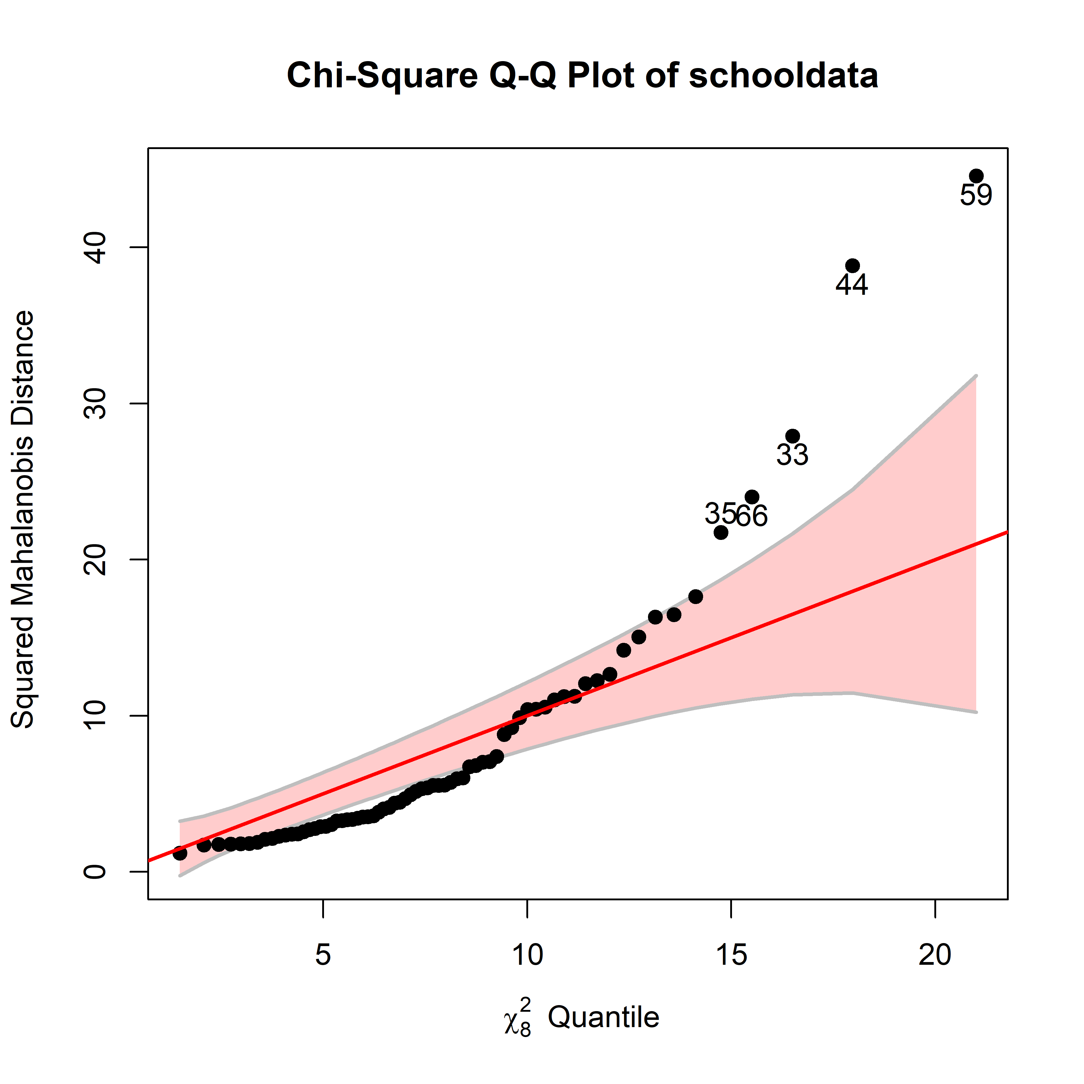
schooldata variables.
Rather than a complete \(8 \times 8\) scatterplot matrix, it is useful here to examine the scatterplots only for each \(y\) variable against each of the predictors in \(\mathbf{X}\).10 I’ll take steps to flag some of these possibly unusual cases to see where they appear in these pairwise relations.
To prepare for this with ggplot2, it is necessary to reshape the data to long format twice—once for the (\(q=5\)) \(x\) variables and again for the (\(p=3\)) \(y\) responses to get all of their \(q \times p\) combinations. That way, we get a data set with variables x and y whose variable names are by xvar and yvar.
# plot predictors vs each response
xvars <- names(schooldata)[1:5]
yvars <- names(schooldata)[6:8]

school_long <- schooldata |>
  tibble::rownames_to_column(var = "site") |>
  pivot_longer(cols = all_of(xvars),
               names_to = "xvar", values_to = "x") |>
  pivot_longer(cols = all_of(yvars),
               names_to = "yvar", values_to = "y") |>
  mutate(xvar = factor(xvar, xvars),
         yvar = factor(yvar, yvars))

car::some(school_long, n=8)
# # A tibble: 8 × 5
#   site  xvar           x yvar            y
#   <chr> <fct>      <dbl> <fct>       <dbl>
# 1 1     teacher     9    reading     54.5
# 2 18    education  28    mathematics 38.2
# 3 26    teacher     7    selfesteem  31.2
# 4 49    occupation  5.29 reading     12.2
# 5 53    counseling 26.3  mathematics 22.0
# 6 61    occupation  2.59 mathematics  7.1
# 7 62    visit       9.89 reading      9.35
# 8 64    occupation  8.91 mathematics 24.5
With this data structure, each scatterplot is a plot of a y against and x, and we can facet this using facet_grid(yvar ~ xvar), giving Figure fig-schooldata-scats.
p1 <- ggplot(school_long, aes(x, y)) +
  geom_point() +
  geom_smooth(method = "lm", se = FALSE, formula = y ~ x) +
  stat_ellipse(geom = "polygon",
               level = 0.95, fill = "blue", alpha = 0.2) +
  facet_grid(yvar ~ xvar, scales = "free") +
  labs(x = "predictor", y = "response") +
  theme_bw(base_size = 16)

# label the 3 most unusual points in each panel
p1 + geom_text_repel(data = school_long |>
                       filter(site %in% outliers[1:3]),
                     aes(label = site))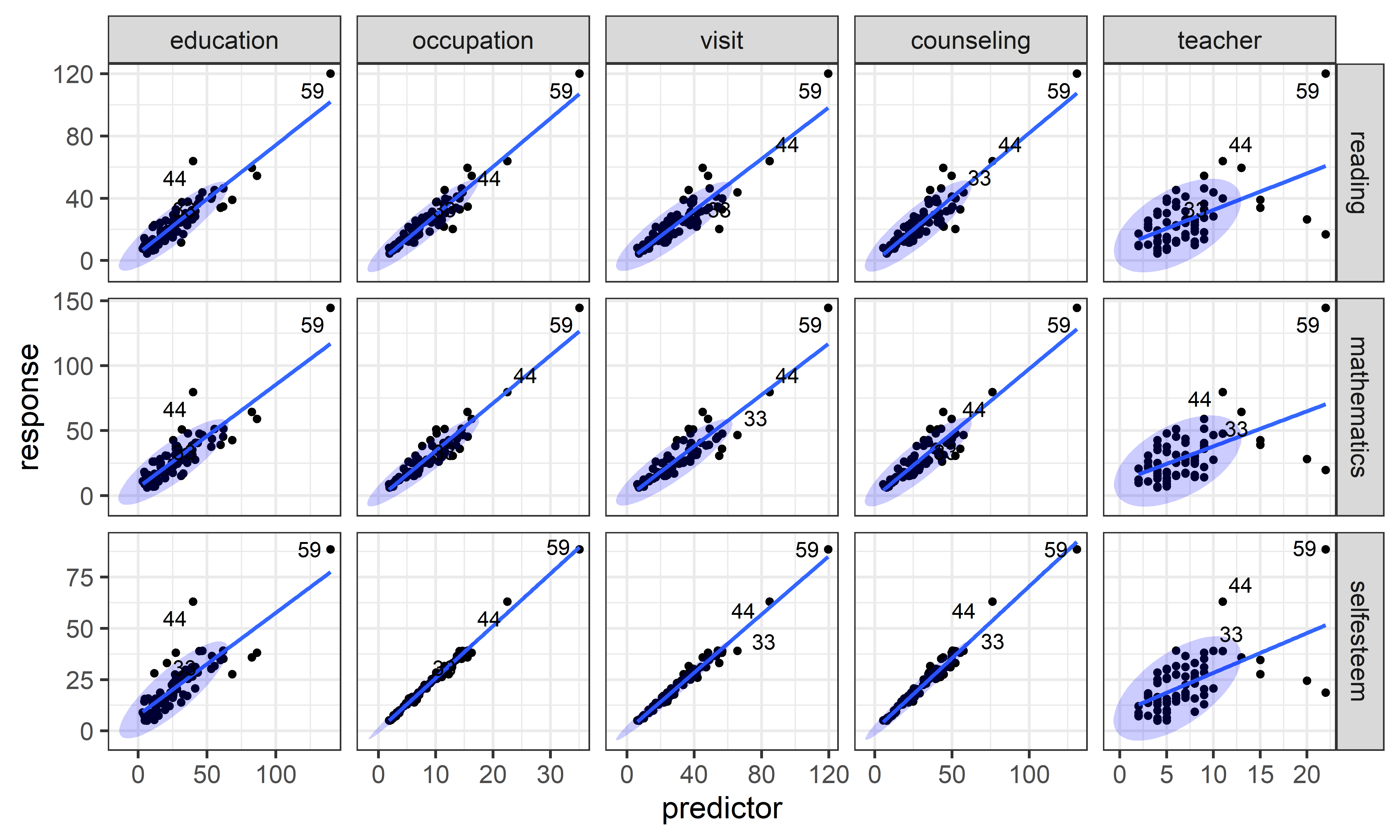
schooldata dataset. Three of the points identified as possible multivariate outliers are labeled.
All of the predictors except for number of teachers show very strong linear relations with the outcome scores. Among the identified points, cases 44 and 59 stand out in all the plots, case 59 being particularly high on all the measures. As well, there is a small cluster of unusual points in the plots for number of teachers.
Fitting models
Let’s proceed to fit the multivariate regression model. Here “.” on the right-hand side of the model formula means all the other variables in the dataset.
school.mod <- lm(cbind(reading, mathematics, selfesteem) ~ .,
                 data=schooldata)
car::Anova(school.mod)
#
# Type II MANOVA Tests: Pillai test statistic
#            Df test stat approx F num Df den Df  Pr(>F)
# education   1     0.376    12.43      3     62 1.8e-06 ***
# occupation  1     0.567    27.02      3     62 2.7e-11 ***
# visit       1     0.260     7.27      3     62 0.00029 ***
# counseling  1     0.065     1.43      3     62 0.24297
# teacher     1     0.049     1.07      3     62 0.37003
# ---
# Signif. codes:  0 '***' 0.001 '**' 0.01 '*' 0.05 '.' 0.1 ' ' 1
These multivariate tests have a seemingly simple interpretation: parent’s education and occupation and their visits to the schools are highly predictive of student’s outcomes; their counseling efforts and the number of teachers in the schools, not so much.
You can get an assessment of the strength of multivariate association from the \(R^2\) for each of the responses using glance() for the MLM. All of these are very high.
glance(school.mod)
# # A tibble: 3 × 8
#   response    r.squared sigma fstatistic numdf dendf  p.value  nobs
#   <chr>           <dbl> <dbl>      <dbl> <dbl> <dbl>    <dbl> <int>
# 1 reading         0.929  4.83       167.     5    64 2.34e-35    70
# 2 mathematics     0.917  6.16       141.     5    64 3.37e-33    70
# 3 selfesteem      0.993  1.17      1852.     5    64 8.47e-68    70
Similarly etasq() for an MLM gives an \(R^2\)-like measure called \(\eta^2\) of the partial association accounted for each of the predictor terms in the model. These are analogous to the Type II tests from Anova(), which test the additional contribution of each term in the model beyond all the others.
In spite of the overwhelming significance of the first three predictors, their variance accounted for is more modest. It is highest for parent’s occupation, followed by education. Parent counseling and teachers contribute very little.
etasq(school.mod)
#             eta^2
# education  0.3756
# occupation 0.5666
# visit      0.2603
# counseling 0.0647
# teacher    0.0491
10.7 Model diagnostics for MLMs
Model building, visualization and interpretation is often an iterative process. You fit a model and calculate some goodness of fit measures (\(R^2\) for responses, \(\eta^2\) for predictors). If these are reasonably strong, you feel happy and proceed to graphical displays to help you understand what you’ve found and explain it to others.
But wait: did you check the assumptions of the MLM? As in univariate models, diagnostic plots can help you spot problems in the data (unusual cases) or in the model (nonlinear relations, omitted predictors or interactions). You sometimes need to go circle back and fit a revised model, starting the process again.
For multivariate regression models, I consider the assumed multivariate normality of residuals and multivariate influence here. For MANOVA models, the question of homogeneity of covariance matrices is deferred until sec-eqcov.
10.7.1 Multivariate normality of residuals
One easy thing to do is to check for multivariate normality of the residuals. Given that we found a few noteworthy points in Figure fig-schooldata-cqplot, a \(\chi^2\) QQ plot of the residuals in the model will tell us if any of these are really problematic. The pattern of points relative to the confidence band gives a rough indication of overall multivariate normality.
cqplot(school.mod, id.n = 5)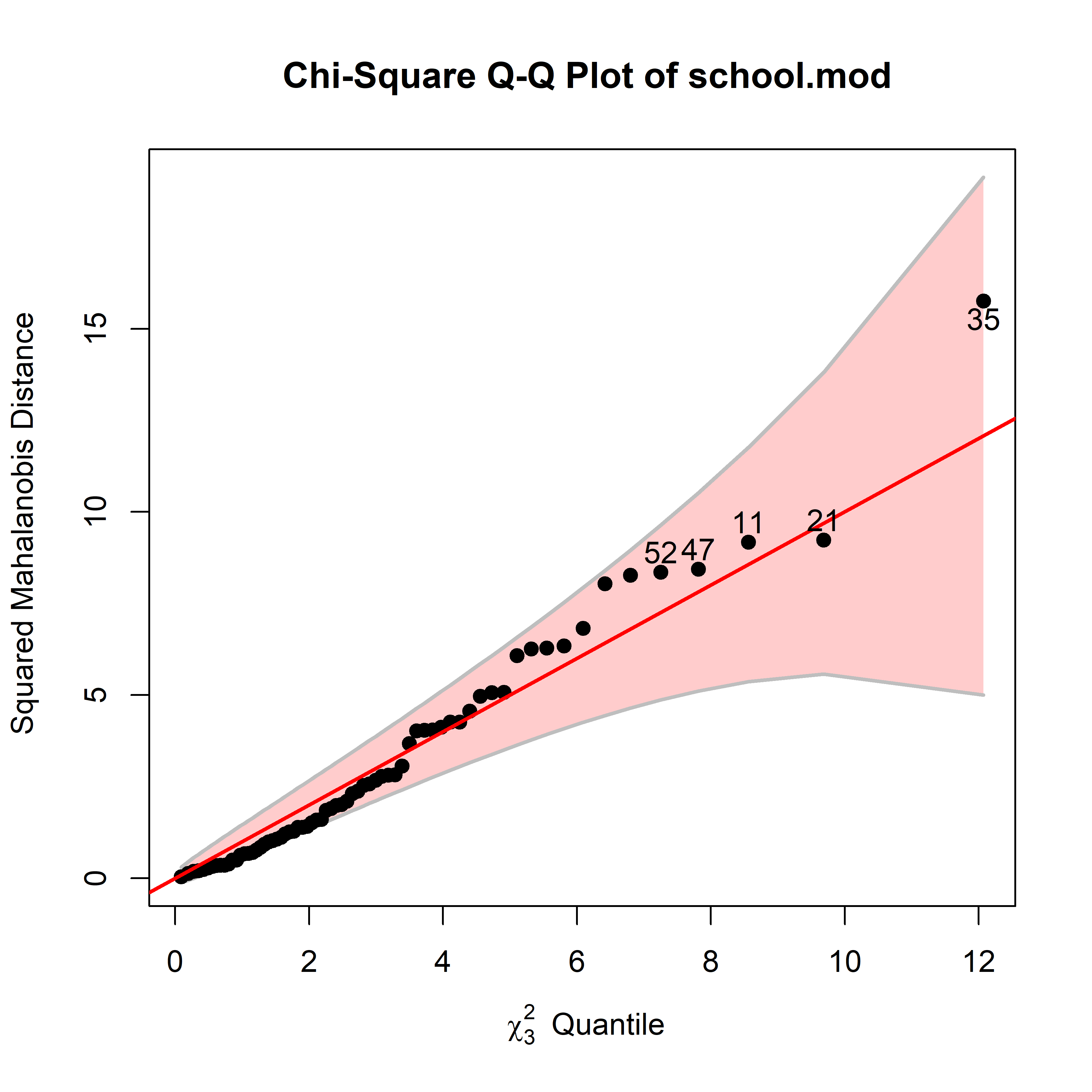
schooldat multivariate regression model.
So, you can see that among the cases that stood out in the cqplot() of the observed variables (Figure fig-schooldata-cqplot), only case 35 attracts attention here, and it is well within the confidence band. Case 59, which was the largest in all the pairwise scatterplots (Figure fig-schooldata-scats) seems not unusual in the fitted model. It is a high-leverage point, but appeared to be well-fitted in all the simple regressions, except in those for teacher.
It is useful to contrast this with what we get from formal tests that the residuals are strictly multivariate normal. The MVN package (Korkmaz et al., 2014) provides mvn() for this, which performs a wide variety of normality tests. The most widely used of these is due to Mardia (1974), which gives multivariate tests of skewness (lack of symmetry) and kurtosis (length of the tails).
Applying this to the residuals from the schools multivariate regression shows that multivariate normality is rejected here. Based on other evidence, this doesn’t seem particularly troubling.
school.mvn <- mvn(residuals, mvn_test = "mardia")
# print multivariate and univariate tests
summary(school.mvn, select = "mvn")
#              Test Statistic p.value     Method      MVN
# 1 Mardia Skewness      1.92   0.750 asymptotic ✓ Normal
# 2 Mardia Kurtosis     -1.16   0.244 asymptotic ✓ Normal
summary(school.mvn, select = "univariate")
#               Test Variable Statistic p.value Normality
# 1 Anderson-Darling    start     0.307   0.524  ✓ Normal
# 2 Anderson-Darling   amount     0.625   0.085  ✓ Normal
mvn() also provides a variety of tests for univariate normality for each of the response variables. These are all OK.
10.7.2 Distance plot
Another useful screening plot (suggested by Rousseeuw et al. (2004)) is a plot of Mahalanobis distances of the predictors against the Mahalanobis distances of the corresponding residuals for a fitted model. This diagnostic plot combines the information on leverage points and regression outliers in an interesting way.
It is much more useful than plotting them individually (against the theoretical values) as in a \(\chi^2\) QQ plot. Moreover, plotting them against each other is visually informative, because it places the leverage points (unusual in \(\mathbf{X}\)}) and the outliers (unusual in \(\mathbf{Y}\)}) in different regions of the plot. To judge notably “large” values, they suggest using cutoffs of \(\sqrt{\chi^2_{p}(0.975)}\) for the predictor distances and \(\sqrt{\chi^2_{q}(0.975)}\) for the residuals.
Such plots are produced by heplots::distPlot(). Running this on the school.mod model gives Figure fig-school-distplot. Points beyond the horizontal and vertical cutoff values are labeled with their case numbers.
distancePlot(school.mod, cex = 1.5, cex.lab = 1.2)
# 0.975 X, Y distance cutoffs: 3.58 3.06
Most of the points identified in the \(\chi^2\) QQ plot Figure fig-schooldata-cqplot are labeled here. Cases 44 and 59 are high leverage points with large \(\mathbf{X}\) distances. Case 35 is the only one beyond the cutoff for residuals. Interestingly, case 66 appeared near 35 in Figure fig-schooldata-cqplot, but is unusual for a different reason as we can see in Figure fig-school-distplot.
Rousseeuw et al. (2004) also suggested methods of robust multivariate regression using robust estimates of location and scatter rather than the classical \(\overline{\mathbf{y}}\) and \(\mathbf{S}\). The minimum covariance determinant (MCD) estimator is a robust estimator with high breakdown value and bounded influence. It looks for the subset of size \(h\), whose covariance matrix has the smallest determinant, where \(h : \lceil n/2 \rceil < h < n\) controls the robustness. The distancePlot() function implements this, as well as a minimum variance ellipse (MVE) method. Some robust methods are illustrated in sec-robust-estimation.
10.7.3 Multivariate influence
TODO Sort out coverage here vs. sec-influence-robust
Again, what we see in simple scatterplots can be misleading because they ignore all the other variables in a model. But looking back after fitting a model and examining diagnostic plots can often be illuminating. Among the ideas we inherit from univariate models, the influence of particular observations on the results of analysis should be high on your list.
The multivariate extension of the diagnostic measures of leverage and influence, and influence plots (sec-leverage) is provided by the mvinfluence package (Friendly, 2025). The theory behind this is due to Barrett & Ling (1992) and better illustrated in Barrett (2003). Mathematical details of this generalization are given in help("mvinfluence-package").
Figure fig-schoolmod-infl shows one form of an influence plot for the school.mod model. Because multiple response variables are involved, this plots a measure of the squared studentized residuals for each observation against a generalized version of hat values, so potentially “bad” observations appear in the upper left corner. The size of the bubble symbol is proportional to a generalization of Cook’s distance, the measure of influence based on the change in all coefficients if each case was deleted from the analysis.
influencePlot(school.mod, id.n=4,
              type="stres",
              cex.lab = 1.5)
#        H      Q  CookD     L      R
# 33 0.328 0.2017 0.7054 0.488 0.3001
# 35 0.101 0.2825 0.3038 0.112 0.3142
# 44 0.503 0.2984 1.6022 1.014 0.6009
# 59 0.568 0.4937 2.9938 1.317 1.1441
# 66 0.355 0.0174 0.0657 0.551 0.0269
schooldat multivariate regression model. Five cases are labeled as “noteworthy” on either axis.
That does not look good! You can see that cases 44 and 59 are actually quite troublesome here, but it turns out for different reasons. Take another look at Figure fig-schooldata-scats. You can see that case 59 is the most extreme on all the predictors, giving it very high leverage and therefore pulling the regression lines toward it in most of the plots, except those for number of teachers, where it also has large residuals. Case 44, on the other hand, stands out as high-leverage on only a few of the predictor–response combinations, but enough to give it a large multivariate hat value. It is also a point that is furthest from the regression lines.
What should be done? An appropriate action would be to re-fit the model, reducing the impact of these cases, in what I call a sensitivity test:
- Do the main conclusions change with those cases removed? That is, do any model terms change in significance tests or do coefficients change sign?
- Do the relative sizes of effects for predictors change enough to affect interpretation? That is, how much do the coefficients change?
The easiest solution is to just omit these troubling cases. You can do this using update(), specifying the data argument to be the subset of rows without the bad boys.
bad <- c(44, 59)
OK <- (1:nrow(schooldata)) |> setdiff(bad)
school.mod2 <- update(school.mod, data = schooldata[OK,])
Anova(school.mod2)
#
# Type II MANOVA Tests: Pillai test statistic
#            Df test stat approx F num Df den Df  Pr(>F)
# education   1     0.211     5.35      3     60  0.0025 **
# occupation  1     0.422    14.62      3     60 2.9e-07 ***
# visit       1     0.191     4.73      3     60  0.0050 **
# counseling  1     0.053     1.13      3     60  0.3459
# teacher     1     0.064     1.37      3     60  0.2618
# ---
# Signif. codes:  0 '***' 0.001 '**' 0.01 '*' 0.05 '.' 0.1 ' ' 1
The results of Anova() on this model tell us that the three significant predictors— occupation, education and visit— are still so, but slightly less so for the last two of these. To compare the coefficients in the new model compared to the old you can calculate the relative difference, \(| \mathbf{B}_1 - \mathbf{B}_2 | / \mathbf{B}_1\), which are
reldiff <- function(x, y, pct=TRUE) {
  res <- abs(x - y) / x
  if (pct) res <- 100 * res
  res
}

reldiff(coef(school.mod)[-1,], coef(school.mod2)[-1,]) |>
  round(1)
#            reading mathematics selfesteem
# education     10.1        19.8      -75.7
# occupation    11.0        10.2       19.4
# visit       -103.6       -76.8        2.8
# counseling  -332.2       305.3     -115.4
# teacher       -7.5        -5.6        7.0
As you can see, the effects on the coefficients for visit and counseling` are dramatic.
10.8 ANCOVA \(\rightarrow\) MANCOVA
TODO: Consider moving this to sec-vis-mlm and use much of the heplots MMRA vignette.
In univariate linear models, analysis of covariance (ANCOVA) is most often used in a situation where we want to compare the mean response, \(\bar{y}_j\) for different groups (defined by one or more factors), but where there are one or more quantitative predictors \(\mathbf{x}_1, \dots\) that should be taken into account for our comparisons to make sense. The simplest case is when \(\mathbf{x}\) is a pre-test score on the same measure, or when it is a background measure like age or level of education that we want to control for, to adjust for differences among the groups.
More generally, ANCOVA and its’ multivariate MANCOVA brother are used for situations where the model matrix \(\mathbf{X}\) contains a mixture of factor variables and quantitative predictors, called “covariates”. In this wider context, there are two flavors of analysis with different emphasis on the factors or the covariates:
true ANCOVA/MANOVA: Attention is centered on the differences among group means, but controlling for any difference in the covariate(s). This requires assuming that the slopes for the groups are all the same.
homogeneity of regression: Here the focus is on the regression relations between the \(\mathbf{y}\)s and the predictor \(\mathbf{x}\)s, but we might also want to determine if the regression slopes are the same for all groups defined by the factors.
In the ANCOVA flavor, the model fits additive effects of the group factor(s) and the covariate(s), while the homogeneity of regression flavor adds interaction terms between groups and the \(\mathbf{x}\)s. The test for homogeneity of regression is the added effect of the interaction terms:
mod1 <- lm(y ~ Group + x)            # ANCOVA model
mod2 <- lm(y ~ Group + x + Group:x)  # allow separate slopes
mod2 <- lm(y ~ Group * x)            # same as above

anova(mod1, mod2)            # test homogeneity of regression
Figure fig-ANCOVA-ex illustrates these cases for a hypothetical two-group design studying the the effect of an exercise program treatment on weight, recorded pre- (\(x\)) and post- (\(y\)) compared to a control group given no treatment. In panel (a) the slopes for the two groups are approximately equal, so the effect of treatment can be estimated by the difference in the fitted values of \(\hat{y}_i\) at the average value of \(x\). In panel (b), the slope for the treated group is considerably greater than that for the control group, so the difference between the groups varies with \(x\).
10.8.1 Example: Paired-associate tasks and academic performance
To what extent can simple tests of paired-associate learning11 predict measures of aptitude and achievement in kindergarten children? This was the question behind an experiment by William Rohwer at the University of California, Berkeley.
There were three outcome measures, one verbal and two visually-based:
- A student achievement test (
SAT), - Peabody Picture Vocabulary test (
PPVT), - Raven Progressive Matrices test (
Raven).
Four paired-associate tasks were used, which differed in the syntactic and semantic relationship between the stimulus and response terms in each pair. These are called named (n), still (s), named still (ns), named action (na), and sentence still (ss).
Rohwer’s data, taken from Timm (1975), is given in Rohwer. But there’s a MANCOVA wrinkle: Performance on the academic tasks is well-known to vary with socioeconomic status of the parents or the school they attend. A simple design was to collect data from children in two schools, one in a low SES neighborhood (\(n=37\)) and the other an upper-class high SES one (\(n=32\)). The data look like this:
data(Rohwer, package = "heplots")
set.seed(42)
Rohwer |> dplyr::sample_n(6)
#    group SES SAT PPVT Raven n  s ns na ss
# 49     2  Hi  88  105    21 2 11 10 26 22
# 65     2  Hi  50   96    13 5  8 20 28 26
# 25     1  Lo   6   57    10 0  1 16 15 17
# 18     1  Lo  45   54    10 0  6  6 14 16
# 69     2  Hi  50   78    19 5 10 18 27 26
# 64     2  Hi  24  102    16 4 17 21 27 31
Following the scheme for reshaping the data used in Figure fig-schooldata-scats, a set of scatterplots of each predictor against each response will give a useful initial look at the data. There’s a lot to see here, so the plot in Figure fig-Rohwer-scats focuses attention on the regression lines for the two groups and their data ellipses.
Code
yvars <- c("SAT", "PPVT", "Raven" )      # outcome variables
xvars <- c("n", "s", "ns", "na", "ss")   # predictors

Rohwer_long <- Rohwer %>%
  dplyr::select(-group) |>
  tidyr::pivot_longer(cols = all_of(xvars),
                      names_to = "xvar", values_to = "x") |>
  tidyr::pivot_longer(cols = all_of(yvars),
                      names_to = "yvar", values_to = "y") |>
  dplyr::mutate(xvar = factor(xvar, levels = xvars),
                yvar = factor(yvar, levels = yvars))

ggplot(Rohwer_long, aes(x, y, color = SES, shape = SES, fill = SES)) +
  geom_jitter(size=0.8) +
  geom_smooth(method = "lm",
              se = FALSE,
              formula = y ~ x,
              linewidth = 1.5) +
  stat_ellipse(geom = "polygon", alpha = 0.1) +
  labs(x = "Predictor (PA task)",
       y = "Response (Academic)") +
  facet_grid(yvar ~ xvar,            # plot matrix of Y by X
             scales = "free") +
  theme_bw(base_size = 16) +
  theme(legend.position = "bottom")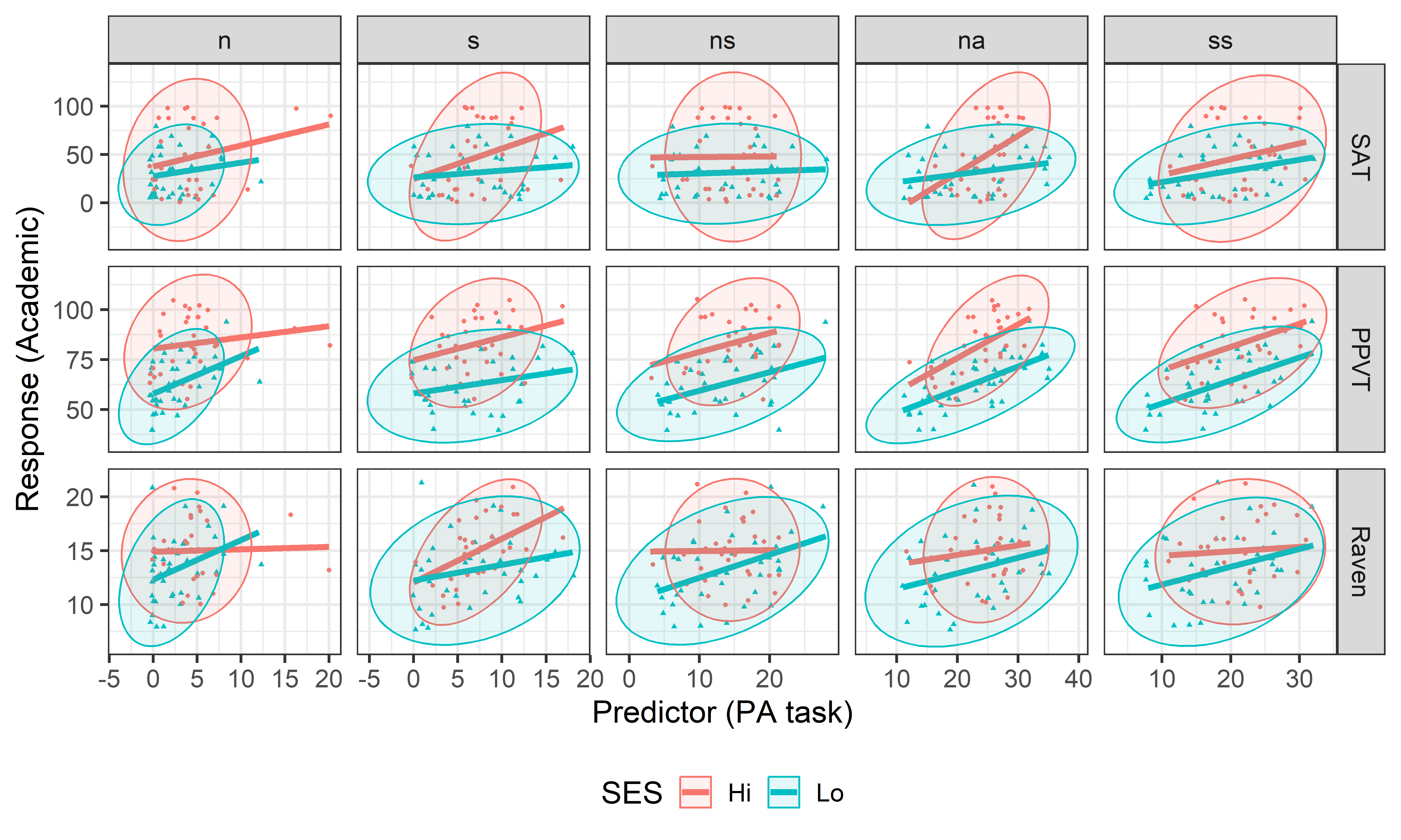
Rohwer dataset.
You can see here that the high-SES group generally performs better than the low group. The regression lines have similar slopes in some of the panels, but not all. The low SES group also appears to have larger variance on most of the PA tasks.
MANCOVA model
Nevertheless, I fit the MANCOVA model that allows a test of different means for the two SES groups on the responses, but constrains the slopes for the PA covariates to be equal. Only two of the PA tasks (na and ns) show individually significant effects in the multivariate tests.
# Make SES == 'Lo' the reference category
Rohwer$SES <- relevel(Rohwer$SES, ref = "Lo")

Rohwer.mod1 <- lm(cbind(SAT, PPVT, Raven) ~ SES + n + s + ns + na + ss,
                  data=Rohwer)
Anova(Rohwer.mod1)
#
# Type II MANOVA Tests: Pillai test statistic
#     Df test stat approx F num Df den Df  Pr(>F)
# SES  1     0.379    12.18      3     60 2.5e-06 ***
# n    1     0.040     0.84      3     60  0.4773
# s    1     0.093     2.04      3     60  0.1173
# ns   1     0.193     4.78      3     60  0.0047 **
# na   1     0.231     6.02      3     60  0.0012 **
# ss   1     0.050     1.05      3     60  0.3770
# ---
# Signif. codes:  0 '***' 0.001 '**' 0.01 '*' 0.05 '.' 0.1 ' ' 1
You can also examine the tests of the univariate ANCOVA models for each of the responses using glance() or heplots::uniStats(). All are significantly related, but the PPVT measure has the largest \(R^2\) by far.
uniStats(Rohwer.mod1)
# Univariate tests for responses in the multivariate linear model Rohwer.mod1
#
#         R^2     F df1 df2 Pr(>F)
# SAT   0.295  4.33   6  62  0.001 **
# PPVT  0.628 17.47   6  62  1e-11 ***
# Raven 0.211  2.76   6  62  0.019 *
# ---
# Signif. codes:  0 '***' 0.001 '**' 0.01 '*' 0.05 '.' 0.1 ' ' 1
To help interpret these effects, bivariate coefficient plots for the paired associate tasks are shown in Figure fig-rohwer-mod1-coef. (The coefficients for the group variable SES are on a different scale and so are omitted here.) From this you can see that the named still and named action tasks have opposite signs: contrary to expectations, ns is negatively associated with the measures of aptitude and achievement (when the other predictors are adjusted for).
coefplot(Rohwer.mod1, parm = 2:6,
         fill = TRUE,
         level = 0.68,
         cex.lab = 1.5)
coefplot(Rohwer.mod1, parm = 2:6, variables = c(1,3),
         fill = TRUE,
         level = 0.68,
         cex.lab = 1.5)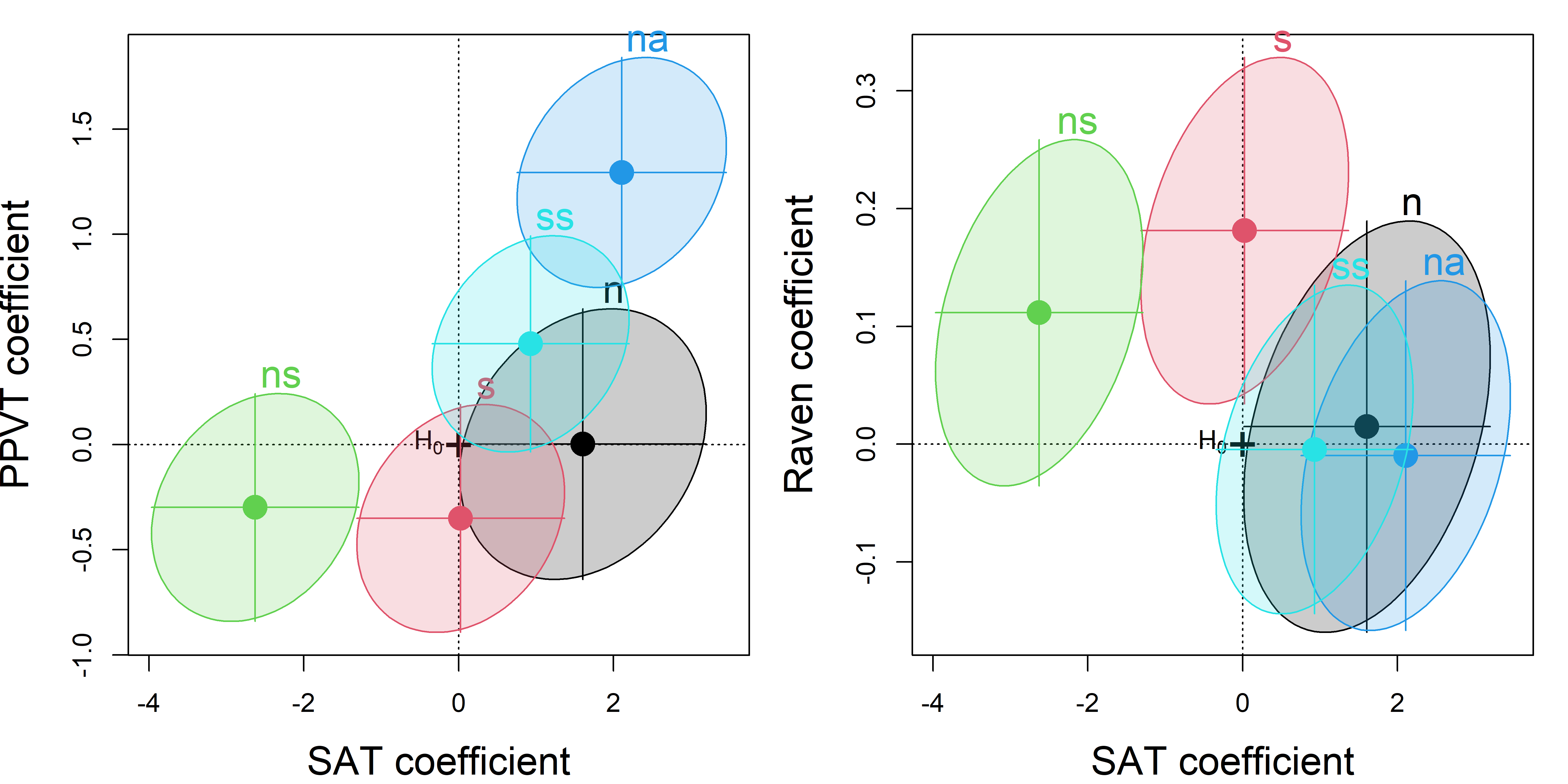
TODO: For interpretation, it would be nice to know how many items were used for each of the PA tasks. The range of na goes up to 35, but others are less.
Adjusted means
From the analysis of covariance perspective, interest is often centered on estimating the differences between the group means, but adjusting or controlling for differences on the covariates. From the table of means below, you can see that the high SES group performs better on all three response variables, but this group also has higher scores on the paired associate tasks.
means <- Rohwer |>
  group_by(SES) |>
  summarise_all(mean) |>
  print()
# # A tibble: 2 × 10
#   SES   group   SAT  PPVT Raven     n     s    ns    na    ss
#   <fct> <dbl> <dbl> <dbl> <dbl> <dbl> <dbl> <dbl> <dbl> <dbl>
# 1 Lo        1  31.3  62.6  13.2  2.54  6.92  13.5  22.4  18.4
# 2 Hi        2  47.7  83.1  15    4.59  7.25  14.5  24.3  21.5
The adjusted mean differences are simply the values estimated by the coefficients for SES in the model. These are smaller than the differences between the observed means.
means[2, 3:5] - means[1, 3:5]
#    SAT PPVT Raven
# 1 16.4 20.4  1.76

# adjusted means
coef(Rohwer.mod1)[2,]
#   SAT  PPVT Raven
# 8.80 16.88 1.59TODO: do this with a CI for the effects
Homogeneity of regression
The MANCOVA model, Rohwer.mod1, has relatively simple interpretations (a large effect of SES, with ns and na as the major predictors) but the test of the SES effect relies on the assumption of homogeneity of slopes for the predictors. We can test this assumption as follows, by adding interactions of SES with each of the covariates:
Rohwer.mod2 <- lm(cbind(SAT, PPVT, Raven) ~ SES * (n + s + ns + na + ss),
                  data=Rohwer)
Anova(Rohwer.mod2)
#
# Type II MANOVA Tests: Pillai test statistic
#        Df test stat approx F num Df den Df  Pr(>F)
# SES     1     0.391    11.78      3     55 4.5e-06 ***
# n       1     0.079     1.57      3     55 0.20638
# s       1     0.125     2.62      3     55 0.05952 .
# ns      1     0.254     6.25      3     55 0.00100 ***
# na      1     0.307     8.11      3     55 0.00015 ***
# ss      1     0.060     1.17      3     55 0.32813
# SES:n   1     0.072     1.43      3     55 0.24417
# SES:s   1     0.099     2.02      3     55 0.12117
# SES:ns  1     0.118     2.44      3     55 0.07383 .
# SES:na  1     0.148     3.18      3     55 0.03081 *
# SES:ss  1     0.057     1.12      3     55 0.35094
# ---
# Signif. codes:  0 '***' 0.001 '**' 0.01 '*' 0.05 '.' 0.1 ' ' 1
It appears from the above that there is only weak evidence of unequal slopes from the separate SES: terms; only that for SES:na is individually significant. The evidence for heterogeneity is stronger, however, when these terms are tested collectively using linearHypothesis(). I use a small grep() trick here to find the interaction terms, which have a “:” in their names.
# test interaction terms jointly
coefs <- rownames(coef(Rohwer.mod2))
interactions <- coefs[grep(":", coefs)]

print(linearHypothesis(Rohwer.mod2, interactions), SSP=FALSE)
#
# Multivariate Tests:
#                  Df test stat approx F num Df den Df Pr(>F)
# Pillai            5     0.418     1.85     15    171 0.0321 *
# Wilks             5     0.624     1.89     15    152 0.0277 *
# Hotelling-Lawley  5     0.539     1.93     15    161 0.0240 *
# Roy               5     0.385     4.38      5     57 0.0019 **
# ---
# Signif. codes:  0 '***' 0.001 '**' 0.01 '*' 0.05 '.' 0.1 ' ' 1
Separate models
Model Rohwer.mod2 with all interaction terms essentially fits a separate slope for each of the low and high SES groups for all responses with each of the predictor PA tasks. This is similar in spirit to what we would get if we fit a separate multivariate regression model for each of the groups, but parameterized differently: The heterogeneous regression model gives, for the interaction terms estimates of the difference in slopes between groups, while the separate-regressions approach gives separate slope estimates for each of the groups. These are equivalent, in the sense that the estimates for each approach can be derived from the other.
They are not equivalent in testing however, because the full model uses a combined pooled within-group error covariance, allows hypotheses about equality of slopes and intercepts to be tested directly and has greater power because it uses the total sample size. Here, I simply illustrate the mechanics of fitting separate models using the subset argument to lm().
Rohwer.sesHi <- lm(cbind(SAT, PPVT, Raven) ~ n + s + ns + na + ss,
                   data=Rohwer, subset = SES=="Hi")
Anova(Rohwer.sesHi)
#
# Type II MANOVA Tests: Pillai test statistic
#    Df test stat approx F num Df den Df Pr(>F)
# n   1     0.202     2.02      3     24 0.1376
# s   1     0.310     3.59      3     24 0.0284 *
# ns  1     0.358     4.46      3     24 0.0126 *
# na  1     0.465     6.96      3     24 0.0016 **
# ss  1     0.089     0.78      3     24 0.5173
# ---
# Signif. codes:  0 '***' 0.001 '**' 0.01 '*' 0.05 '.' 0.1 ' ' 1

Rohwer.sesLo <- lm(cbind(SAT, PPVT, Raven) ~ n + s + ns + na + ss,
                   data=Rohwer, subset = SES=="Lo")
Anova(Rohwer.sesLo)
#
# Type II MANOVA Tests: Pillai test statistic
#    Df test stat approx F num Df den Df Pr(>F)
# n   1    0.0384     0.39      3     29  0.764
# s   1    0.1118     1.22      3     29  0.321
# ns  1    0.2252     2.81      3     29  0.057 .
# na  1    0.2675     3.53      3     29  0.027 *
# ss  1    0.1390     1.56      3     29  0.220
# ---
# Signif. codes:  0 '***' 0.001 '**' 0.01 '*' 0.05 '.' 0.1 ' ' 1
The strength of evidence for the predictors na and ns is weaker here than when tested in the full heterogeneous model.
10.9 What have we learned?
The multivariate linear model is an extension of the (univariate) general linear model. Three major forms of the multivariate linear model are the MANOVA, MMRA and MANCOVA, all of which have their equivalents in ANOVA, MRA and ANCOVA.
What the multivariate linear model offers over the univariate linear model is not just more powerful statistical tests, but also examinations of how the associations amongst the response variables varies with the explanatory variables.
Just as with the general linear model, model diagnostics transfer to the multivariate linear model and are important for identifying potential issues in the validity of the estimated statistical model.
Given that the multivariate linear model can do everything that the general linear model does, there is no reason to not consider the multivariate linear model. Confining discussions of multivariate response models to structural equation modeling may pedagogically create a cognitive blind spot that the association amongst response variables even can vary with the explanatory variables. Rather than something separate, for the purposes of causal inference, it would be better to use structural equation modeling as a more confirmatory statistical model than the multivariate linear model, which is perfectly well suited for exploratory purposes.
Overall, we also see a glimpse of the importance of data visualization in the analysis of data using the multivariate linear model. The following chapter will explore this issue in more depth.
There’s a bit of a puzzle here—a gap in methods—and therefore an opportunity. The classical linear models fit by
lm()extend naturally to non-gaussian data viaglm()which provides for other families (binary: Bernoulli, count data: Poisson). The standardlm()extends quite naturally to a multivariate responses. Yet the combination of these ideas— non-gaussian multivariate models— remains elusive. The VGAM package (Yee (2015), Yee (2025)) handles the bivariate cases of logistic (and probit) regression, but not much more. See Friendly & Meyer (2016), Sec. 10.4 for an example and graphs of odds ratios in these models. There is a lot more to do on this topic.↩︎A slight hiccup in notation is that the uppercase for the Greek Beta (\(\boldsymbol{\beta}\)) is the same as the uppercase Roman \(\mathbf{B}\), so I use \(\mathbf{b}_1 , \mathbf{b}_2 , \dots\) below to refer to its’ columns.↩︎
An class of violation of exogeneity omitted variable bias, which occurs When a relevant variable that influences both the predictor and the outcome is left out of the model. Its effect gets absorbed into the error term, creating a correlation with the predictor. For example, if we model wages as a function of education, but omit the effect of ability, the predictor “education” becomes correlated with the error term because unmodelled ability goes into the error term, and is therefore also correlated with education.↩︎
Among the extensions of the classical OLS framework, errors in variables models attempt to correct for the downward bias of measurement error by adjusting for the known or estimated error variances in the independent variables, providing more accurate and consistent estimations.↩︎
Line plots like this are nearly always more understandable with labels directly on the lines, rather than in a legend. Wrappers for
ggplot2simplify some things but can’t easily accommodate this kind of customization.↩︎Plotting the means plus and minus one standard error of the mean is often the simplest approach to visualizing the uncertainty associated with each estimate. But this practice can create problems of interpretation, such as concluding that means differ if their intervals do not overlap. Some solutions are to encode \(p\)-values for comparisons in a plot, for example using
ggpubr::geom_pwc()for pairwise comparisons, or to use error bars with several widths representing difference confidence levels, as provided by the ggdist package (Kay, 2025).↩︎“Automatic” model selection procedures like stepwise regression, while seemingly attractive are dangerous in that can increase false positives or drop variables that should, on logical grounds, be included in the model. See Stepwise selection of variables in regression is Evil and Harrell (Harrell, 2015).↩︎
Other choices are possible: we could instead try to model the behavioral variables,
antisocialandhyperactfirst, and then determine if the parental variables add appreciably to this. Modeling choices aren’t arbitrary. They should reflect the aims of a study and the story you want to tell about the result.↩︎In this, schools 1–49 were PFT sites and the remaining sites 50–70 were NFT. A separate dataset
schoolsitesprovides other information on the schools, such as the general education style, region of the U.S., size of the city and that of the student population.↩︎GGally has a function
ggduo()that does something similar, plotting each of one set of variables against another. Likeggpairs()it allows for generalizations of a scatterplot where combinations of discrete factors and continuous variables can be displayed with appropriate visualizations for each.↩︎Paired-associate learning are among the simplest tests of memory and learning. The subject is given a list of pairs of words or nonsense syllables, like “banana - house” or “YYZ - Toronto” to learn. On subsequent trials she is given the stimulus term of each pair (“banana”, “YYZ”) and asked to reply with the correct response (“house”, “Toronto”).↩︎