Getting information from a table is like extracting sunlight from a cucumber. —Farquhar & Farquhar (1891)
At the time the Farhquhar brothers wrote this pithy aphorism, graphical methods for understanding data had advanced considerably, but were not universally practiced, prompting their complaint. Most data tables we see are designed for looking something up like the number of measles cases in Ontario compared to other provinces. Tables are not usually designed to reveal patterns, trends or anomalies, although this can be accomplished with modern table generating software such as the tinytable or gt packages.1
The main graphic forms we use today—the pie chart, line graphs and bar—were invented by William Playfair around 1800 (Playfair, 1786, 1801). The scatterplot arrived shortly after (Herschel, 1833) and thematic maps showing the spatial distributions of social variables (crime, suicides, literacy) were used for the first time to reason about important societal questions (Guerry, 1833) such as “is increased education associated with lower rates of crime?”
In the last half of the 18th Century, the idea of correlation was developed (Galton, 1886; Pearson, 1896) and the period, roughly 1860–1890, dubbed the “Golden Age of Graphics” (Friendly, 2008; Funkhouser, 1937) became the richest period of innovation and beauty in the entire history of data visualization. During this time there was an incredible development of visual thinking, represented by the work of Charles Joseph Minard, advances in the role of visualization within scientific discovery, as illustrated through Francis Galton, and graphical excellence, embodied in state statistical atlases produced in France and elsewhere. See Friendly (2008); Friendly & Wainer (2021) for this history. .
2.1 Why plot your data?
This chapter introduces the importance of graphing data through three nearly classic stories with the following themes:
summary statistics are not enough: Anscombe’s Quartet demonstrates datasets that are indistinguishable by numerical summary statistics (mean, standard deviation, correlation), but whose relationships are vastly different.
one lousy point can ruin your day: A researcher is mystified by a difference between a correlation for men and women until she plots the data.
finding the signal in noise: The story of the US 1970 Draft Lottery shows how a weak, but reliable signal, reflecting bias in a process can be revealed by graphical enhancement and summarization.
2.1.1 Anscombe’s Quartet
In 1973, Francis Anscombe (Anscombe, 1973) famously constructed a set of four datasets illustrate the importance of plotting the graphs before analyzing and model building, and the effect of unusual observations on fitted models. Now known as Anscombe’s Quartet, these datasets had identical statistical properties: the same means, standard deviations, correlations and regression lines.
His purpose was to debunk three notions that had been prevalent at the time:
- Numerical calculations are exact, but graphs are coarse and limited by perception and resolution;
- For any particular kind of statistical data there is just one set of calculations constituting a correct statistical analysis;
- Performing intricate calculations is virtuous, whereas actually looking at the data is cheating.
The dataset datasets::anscombe has 11 observations, recorded in wide format, with variables x1:x4 and y1:y4.
The following code transforms this data to long format and calculates some summary statistics for each dataset.
anscombe_long <- anscombe |>
  pivot_longer(everything(),
               names_to = c(".value", "dataset"),
               names_pattern = "(.)(.)"
  ) |>
  arrange(dataset)

anscombe_long |>
  group_by(dataset) |>
  summarise(xbar      = mean(x),
            ybar      = mean(y),
            r         = cor(x, y),
            intercept = coef(lm(y ~ x))[1],
            slope     = coef(lm(y ~ x))[2]
         )
# # A tibble: 4 × 6
#   dataset  xbar  ybar     r intercept slope
#   <chr>   <dbl> <dbl> <dbl>     <dbl> <dbl>
# 1 1           9  7.50 0.816      3.00 0.500
# 2 2           9  7.50 0.816      3.00 0.5
# 3 3           9  7.5  0.816      3.00 0.500
# 4 4           9  7.50 0.817      3.00 0.500
As we can see, all four datasets have nearly identical univariate and bivariate statistical measures. You can only see how they differ in graphs, which show their true natures to be vastly different.
Figure fig-ch02-anscombe1 is an enhanced version of Anscombe’s plot of these data, adding helpful annotations to show visually the underlying statistical summaries.
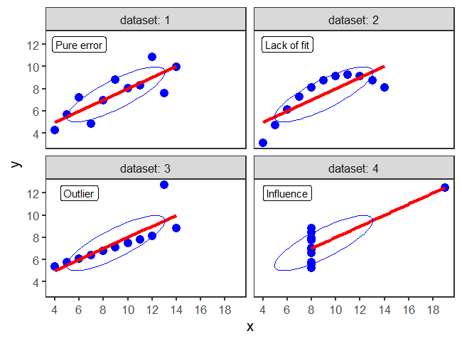
This figure is produced as follows, using a single call to ggplot(), faceted by dataset. As we will see later (sec-data-ellipse), the data ellipse (produced by stat_ellipse()) reflects the correlation between the variables.
desc <- tibble(
  dataset = 1:4,
  label = c("Pure error", "Lack of fit", "Outlier", "Influence")
)

ggplot(anscombe_long, aes(x = x, y = y)) +
  geom_point(color = "blue", size = 4) +
  geom_smooth(method = "lm", formula = y ~ x, se = FALSE,
              color = "red", linewidth = 1.5) +
  scale_x_continuous(breaks = seq(0,20,2)) +
  scale_y_continuous(breaks = seq(0,12,2)) +
  stat_ellipse(level = 0.5, color=col, type="norm") +
  geom_label(data=desc, aes(label = label), x=6, y=12) +
  facet_wrap(~dataset, labeller = label_both)
The subplots are labeled with the statistical idea they reflect:
dataset 1: Pure error. This is the typical case with well-behaved data. Variation of the points around the line reflect only measurement error or unreliability in the response, \(y\).
dataset 2: Lack of fit. The data is clearly curvilinear, and would be very well described by a quadratic,
y ~ poly(x, 2). This violates the assumption of linear regression that the fitted model has the correct form.dataset 3: Outlier. One point, second from the right, has a very large residual. Because this point is near the extreme of \(x\), it pulls the regression line towards it, as you can see by imagining a line through the remaining points.
dataset 4: Influence. All but one of the points have the same \(x\) value. The one unusual point has sufficient influence to force the regression line to fit it exactly.
One moral from this example:
Linear regression only “sees” a line. It does its’ best when the data are really linear. Because the line is fit by least squares, it pulls the line toward discrepant points to minimize the sum of squared residuals.
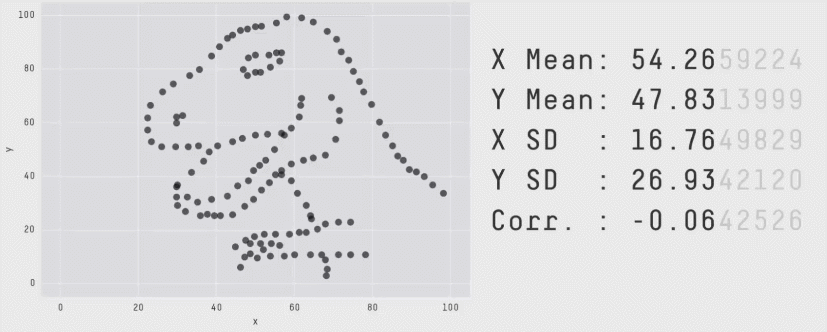
The method Anscombe used to compose his quartet is unknown, but it turns out that that there is a method to construct a wider collection of datasets with identical statistical properties. After all, in a bivariate dataset with \(n\) observations, the correlation has \((n-2)\) degrees of freedom, so it is possible to choose \(n-2\) of the \((x, y)\) pairs to yield any given value. As it happens, it is also possible to create any number of datasets with the same means, standard deviations and correlations with nearly any shape you like — even a dinosaur!
The Datasaurus Dozen was first publicized by Alberto Cairo in a blog post and are available in the datasauRus package (Gillespie et al., 2025). As shown in Figure fig-datasaurus-html the sets include a star, cross, circle, bullseye, horizontal and vertical lines, and, of course the “dino”. The method (Matejka & Fitzmaurice, 2017) uses simulated annealing, an iterative process that perturbs the points in a scatterplot, moving them towards a given shape while keeping the statistical summaries close to the fixed target value.
The datasauRus package just contains the datasets, but a general method, called statistical metamers, for producing such datasets has been described by Elio Campitelli and implemented in the metamer package.
The essential idea of a statistical “quartet” is to illustrate four quite different datasets or circumstances that seem superficially the same, but yet are paradoxically very different when you look behind the scenes.
For example, in the context of causal analysis Gelman et al. (2023), illustrated sets of four graphs, within each of which all four represent the same average (latent) causal effect but with much different patterns of individual effects. McGowan et al. (2023) provide another illustration with four seemingly identical data sets each generated by a different causal mechanism.
As an example of machine learning models, Biecek et al. (2023), introduced the “Rashamon Quartet”, a synthetic dataset for which four models from different classes (linear model, regression tree, random forest, neural network) have practically identical predictive performance. In all cases, the paradox is solved when their visualization reveals the distinct ways of understanding structure in the data. The quartets package (D’Agostino McGowan, 2023) contains these and other variations on this theme.
2.1.2 One lousy point can ruin your day
In the mid 1980s, a consulting client had a strange problem.2 She was conducting a study of the relation between body image and weight preoccupation in exercising and non-exercising people (Davis, 1990). As part of the design, the researcher wanted to know if self-reported weight could be taken as a reliable indicator of true weight measured on a scale. It was expected that the correlations between reported and measured weight should be close to 1.0, and the slope of the regression lines for men and women should also be close to 1.0. The dataset is carData::Davis.
She was therefore very surprised to see the following numerical results: For men, the correlation was nearly perfect, but not so for women.
Similarly, the regression lines showed the expected slope for men, but that for women was only 0.26.
Davis |>
  nest(data = -sex) |>
  mutate(model = map(data, ~ lm(repwt ~ weight, data = .)),
         tidied = map(model, tidy)) |>
  unnest(tidied) |>
  filter(term == "weight") |>
  select(sex, term, estimate, std.error)
# # A tibble: 2 × 4
#   sex   term   estimate std.error
#   <fct> <chr>     <dbl>     <dbl>
# 1 M     weight    0.990    0.0229
# 2 F     weight    0.262    0.0459
“What could be wrong here?”, the client asked. The consultant replied with the obvious question:
Did you plot your data?
The answer turned out to be one discrepant point, a female (case 12), whose measured weight was 166 kg (366 lbs!). This single point exerted so much influence that it pulled the fitted regression line down to a slope of only 0.26.
# shorthand to position legend inside the figure
legend_inside <- function(position) {          # simplify legend placement
  theme(legend.position = "inside",
        legend.position.inside = position)
}

Davis |>
  ggplot(aes(x = weight, y = repwt,
             color = sex, shape = sex, linetype = sex)) +
  geom_point(size = ifelse(Davis$weight==166, 6, 2)) +
  geom_smooth(method = "lm", formula = y~x, se = FALSE) +
  labs(x = "Measured weight (kg)",
       y = "Reported weight (kg)") +
  scale_linetype_manual(values = c(F = "longdash",
                                   M = "solid")) +
  legend_inside(c(.8, .8))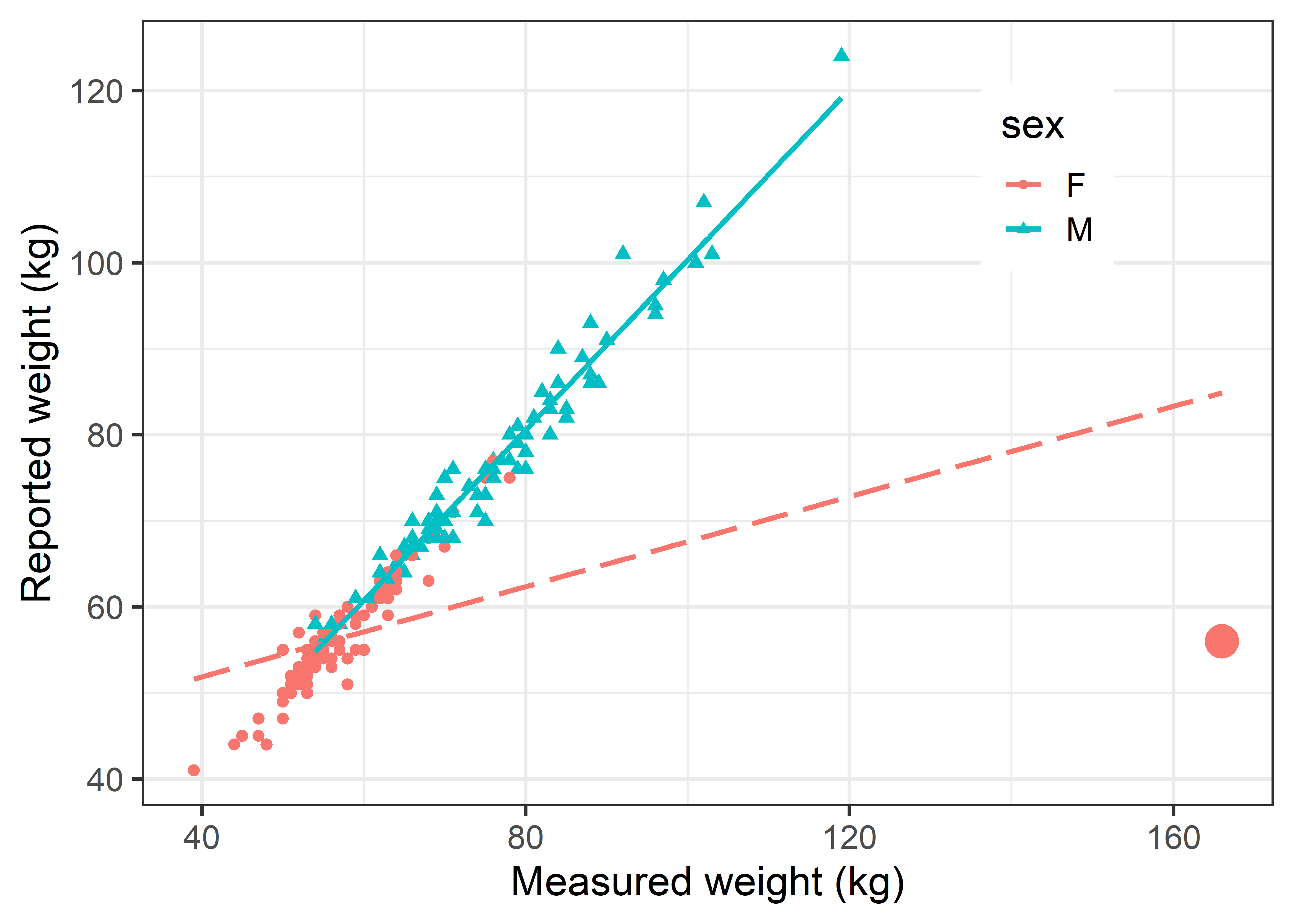
In this example, it was arguable that \(x\) and \(y\) axes should be reversed, to determine how well measured weight can be predicted from reported weight. In ggplot this can easily be done by reversing the x and y aesthetics.
Davis |>
  ggplot(aes(y = weight, x = repwt, color = sex, shape=sex)) +
  geom_point(size = ifelse(Davis$weight==166, 6, 2)) +
  labs(y = "Measured weight (kg)",
       x = "Reported weight (kg)") +
    geom_smooth(method = "lm", formula = y~x, se = FALSE) +
  legend_inside(c(.8, .8))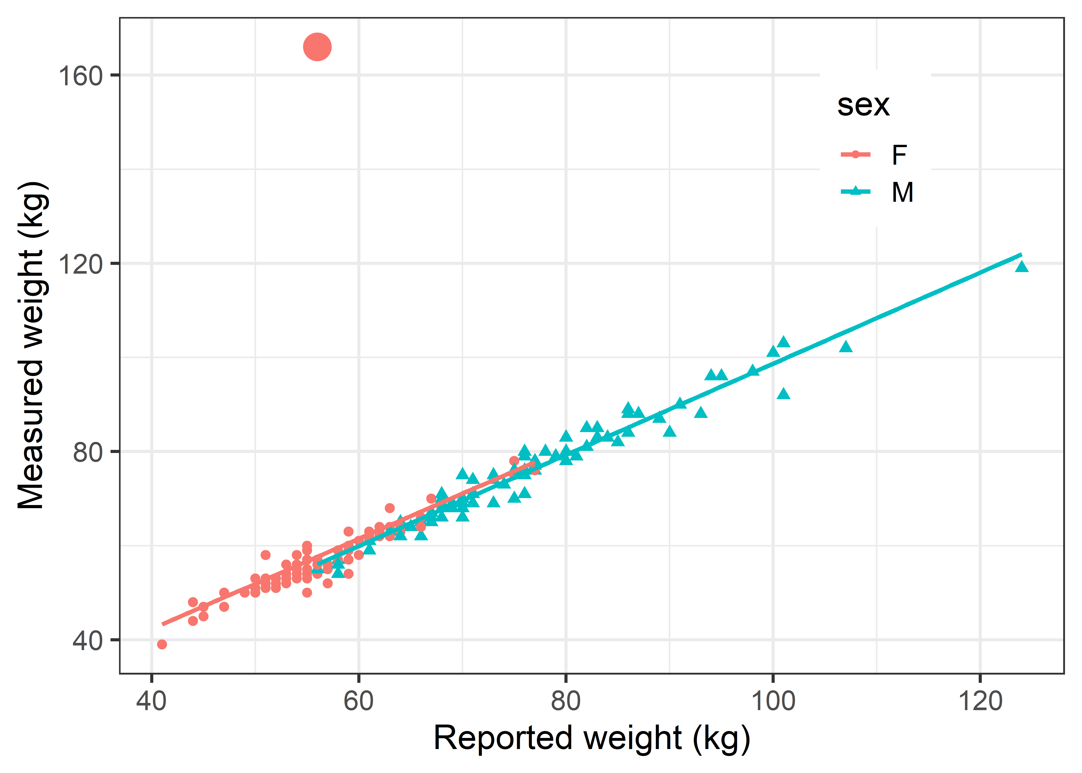
In Figure fig-ch02-davis-reg2, this discrepant observation again stands out like a sore thumb, but it makes very little difference in the fitted line for females. The reason is that this point is well within the range of the \(x\) variable (repwt). To impact the slope of the regression line, an observation must be unusual in both \(x\) and \(y\). We take up the topic of how to detect influential observations and what to do about them in sec-linear-models-plots.
The value of such plots is not only that they can reveal possible problems with an analysis, but also help identify their reasons and suggest corrective action. What went wrong here? Examination of the original data showed that this woman (case 12) mistakenly switched the values, recording her reported weight in the box for measured weight and vice versa.
2.1.3 Shaken, not stirred: The 1970 Draft Lottery
Although we often hear that data speak for themselves, their voices can be soft and sly.—Frederick Mosteller (1983), Beginning Statistics with Data Analysis, p. 234.
The power of graphics is particularly evident when data contains a weak signal embedded in a field of noise. To the casual glance, there may seem to be nothing going on, but the signal can be made apparent in an incisive graph.
A dramatic example of this occurred in 1969 when the U.S. military conducted a lottery, the first since World War II, to determine which young men would be called up to serve in the Vietnam War for 1970. The U.S. Selective Service had devised a system to rank eligible men according to a random drawing of their birthdays. There were 366 blue plastic capsules containing birth dates placed in a transparent glass container and drawn by hand to assign ranked order-of-call numbers to all men within the 18-26 age range.

In an attempt to make the selection process also transparent, the proceeding was covered on radio, TV and film and the dates posted in order on a large display board. The first capsule—drawn by Congressman Alexander Pirnie (R-NY) of the House Armed Services Committee—contained the date September 14, so all men born on September 14 in any year between 1944 and 1950 were assigned lottery number 1, and would be drafted first. April 24 was drawn next, then December 30, February 14, and so on until June 8, selected last. At the time of the drawing, US officials stated that those with birthdays drawn in the first third would almost certainly be drafted, while those in the last third would probably avoid the draft (Fienberg, 1971).
I watched this unfold with considerable interest because I was eligible for the Draft that year. I was dismayed when my birthday, May 7, came up ranked 35. Ugh! Could some data analysis and graphics get me out of my funk?
The data, from the official Selective Service listing are contained in the dataset vcdExtra::Draft1970, ordered by Month and birthdate (Day), with Rank as the order in which the birthdates were drawn.
library(ggplot2)
library(dplyr)
data(Draft1970, package = "vcdExtra")
dplyr::glimpse(Draft1970)
# Rows: 366
# Columns: 3
# $ Day   <int> 1, 2, 3, 4, 5, 6, 7, 8, 9, 10, 11, 12, 13, 14, 15, 1…
# $ Rank  <int> 305, 159, 251, 215, 101, 224, 306, 199, 194, 325, 32…
# $ Month <ord> Jan, Jan, Jan, Jan, Jan, Jan, Jan, Jan, Jan, Jan, Ja…
A basic scatterplot, slightly prettified, is shown in Figure fig-draft-gg1. The points are colored by month, and month labels are shown at the bottom.
Show the code
# make markers for months at their mid points
months <- data.frame(
  month =unique(Draft1970$Month),
  mid = seq(15, 365-15, by = 30))

ggplot2:: theme_set(theme_bw(base_size = 16))
gg <- ggplot(Draft1970, aes(x = Day, y = Rank)) +
  geom_point(size = 2.5, shape = 21,
             alpha = 0.3,
             color = "black",
             aes(fill=Month)
  ) +
  scale_fill_manual(values = rainbow(12)) +
  geom_text(data=months, aes(x=mid, y=0, label=month), nudge_x = 5) +
  geom_smooth(method = "lm", formula = y ~ 1,
              col = "black", fill="grey", linetype = "dashed", alpha=0.6) +
  labs(x = "Day of the year",
       y = "Lottery rank") +
  theme(legend.position = "none")
gg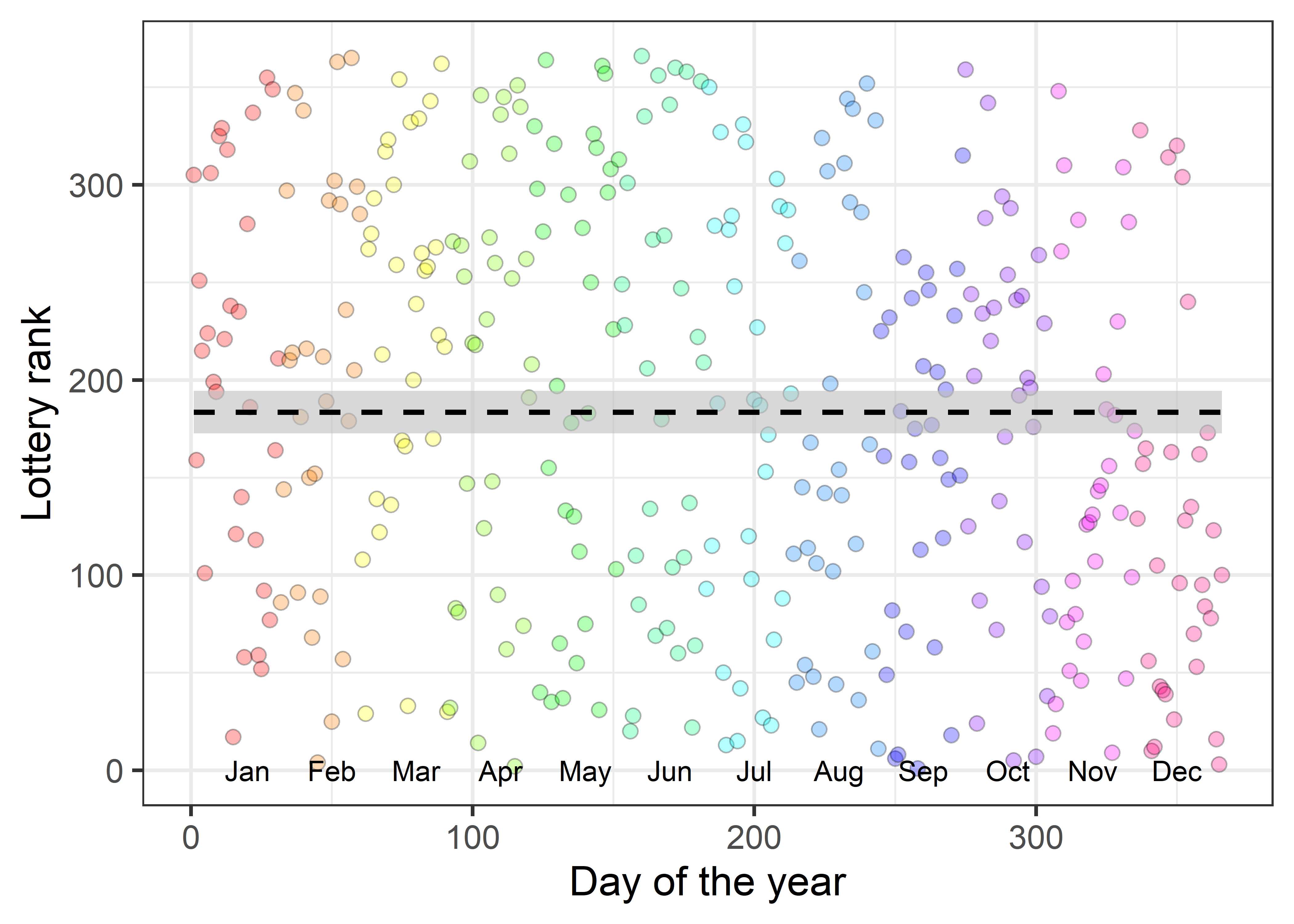
The ranks do seem to be essentially random. Is there any reason to suspect a flaw in the selection process, as I firmly hoped at the time?
If you stare at the graph in Figure fig-draft-gg1 long enough, you just can make out a sparsity of points in the upper right corner and also in the lower left corner compared to the opposite corners. But probably not until I told you where to look.
Visual smoothers
Fitting a linear regression line or a smoothed (loess) curve can bring out the signal lurking in the background of a field of nearly random points. Figure fig-draft-gg2 shows a definite trend to lower ranks for birthdays toward the end of the year. Those born earlier in the year were more likely to be given lower ranks, calling them up sooner for the draft.
Show the code
ggplot(Draft1970, aes(x = Day, y = Rank)) +
  geom_point(size = 2.5, shape = 21,
             alpha = 0.3,
             color = "black",
             aes(fill=Month)) +
  scale_fill_manual(values = rainbow(12)) +
  geom_smooth(method = "lm", formula = y~1,
              se = FALSE,
              col = "black", fill="grey", linetype = "dashed", alpha=0.6) +
  geom_smooth(method = "loess", formula = y~x,
              color = "blue", se = FALSE,
              alpha=0.25) +
  geom_smooth(method = "lm", formula = y~x,
              color = "darkgreen",
              fill = "darkgreen",
              alpha=0.25) +
  geom_text(data=months, aes(x=mid, y=0, label=month), nudge_x = 5) +
  labs(x = "Day of the year",
       y = "Lottery rank") +
theme(legend.position = "none") 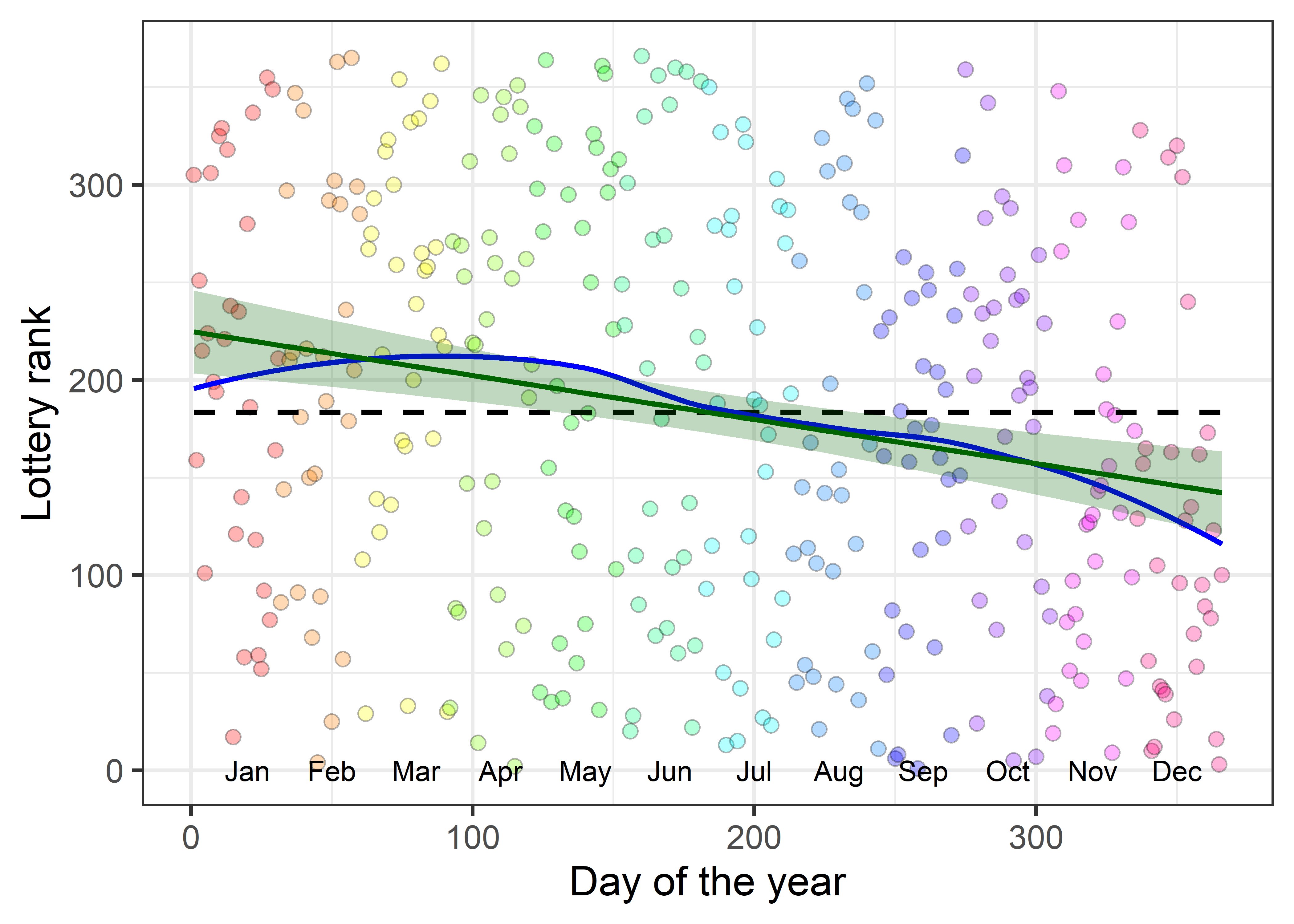
Is this a real effect? Even though the points seem to be random over the year, linear regression of Rank on Day shows a highly significant negative effect even though the correlation3 is small (\(r = -0.226\)). The slope, -0.226, means that for each additional day in the year the lottery rank decreases about 1/4 toward the front of the draft line; that’s nearly 7 ranks per month.
So, smoothing the data, using either the linear regression line or a nonparametric smoother is one important technique for seeing a weak signal in a noisy background.
Visual summaries
Another way to enhance the signal-to-noise ratio of a graph is to plot summaries of the messy data points. For example, you might make boxplots of the ranks by month, or calculate and plot the mean or median rank by month and plot those together with some indication of variability within month.
Figure fig-draft-means plots the average Rank for each month with error bars showing the mean \(\pm 1\) standard errors against the average Day. The message of rank decreasing nearly linearly with month is now more dramatic, partly because I decreased the range of the y-axis.4 The correlation between the means is \(r = -0.867\); the slope is -0.231, similar to what we found for the raw data.
Code
means <- Draft1970 |>
  group_by(Month) |>
  summarize(Day = mean(Day),
            se = sd(Rank/ sqrt(n())),
            Rank = mean(Rank))

ggplot(aes(x = Day, y = Rank), data=means) +
  geom_point(size = 4) +
  geom_smooth(method = "lm", formula = y~x,
              color = "blue", fill = "blue", alpha = 0.1) +
  geom_errorbar(aes(ymin = Rank-se, ymax = Rank+se),
                width = 8, linewidth = 1.3) +
  geom_text(data=months, aes(x=mid, y=100, label=month), nudge_x = 5) +
  ylim(100, 250) +
  labs(x = "Average day of the year",
       y = "Average lottery rank")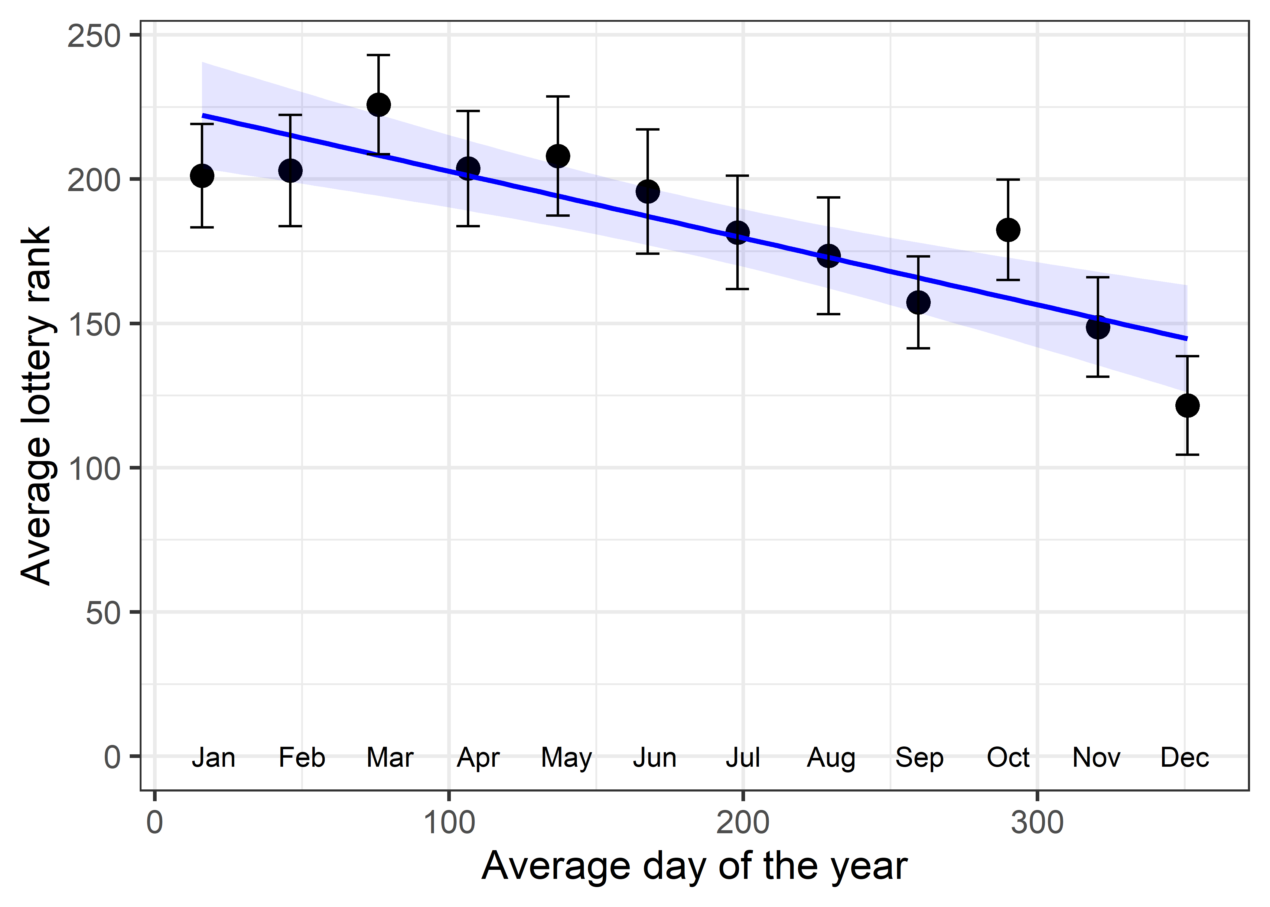
The visual impression of a linearly decreasing trend in lottery rank is much stronger in Figure fig-draft-means than in Figure fig-draft-gg2 for two reasons:
- Replacing the data points with their means strengthens the signal in relation to noise, which is essentially eliminated by plotting means and error bars rather than the raw data. This is an example of visual thinning (sec-visual-thinning), reducing visual complexity to highlight an overall pattern.
- The narrower vertical range (100–250) in the plot of means makes the slope of the line appear steeper. (However, the slope of the means, \(b = -0.231\) is nearly the same as that for the data points.) The narrower range also makes deviations from the regression line more noticeable.
What happened here?
Previous lotteries carried out by drawing capsules from a container had occasionally suffered the embarrassment that an empty capsule was selected because of vigorous mixing (Fienberg, 1971). So for the 1970 lottery, the birthdate capsules were put in cardboard boxes, one for each month and these were carefully emptied into the glass container in order of month: Jan., Feb., through Dec., and gently shaken in atop the pile already there.
All might have been well had the persons drawing the capsules put their hand in truly randomly, but generally they picked from toward the top of the container. Consequently, those born later in the year had a greater chance of being picked earlier.
There was considerable criticism of this procedure once the flaw had been revealed by analyses such as described here. In the following year, the Selective Service called upon the National Bureau of Standards to devise a better procedure. In 1971 they used two drums, one with the dates of the year and another with the rank numbers 1-366. As a date capsule was drawn randomly from the first drum, another from the numbers drum was picked simultaneously, giving a doubly-randomized sequence.
Of course, if they had R, the entire process could have been done using sample():
set.seed(42)
date = seq(as.Date("1971-01-01"),
           as.Date("1971-12-31"), by="+1 day")
rank = sample(seq_along(date))
draft1971 <- data.frame(date, rank)

head(draft1971, 3)
#         date rank
# 1 1971-01-01   49
# 2 1971-01-02  321
# 3 1971-01-03  153
tail(draft1971, 3)
#           date rank
# 363 1971-12-29    8
# 364 1971-12-30  333
# 365 1971-12-31  132
And, what would have happened to me and all others born on a May 7th, if they did it this way? My lottery rank would have 274!5
me <- as.Date("1971-05-07")
draft1971[draft1971$date == me,]
#           date rank
# 127 1971-05-07  274
2.2 Plots for data analysis
Visualization methods take an enormous variety of forms, so it is useful to distinguish several broad categories according to their use in data analysis:
data plots: primarily plot the raw data, often with annotations to aid interpretation. 1D plots include boxplots, violin plots and dot plots, sometimes in combination; univariate distributions can also be portrayed in histograms and density estimates. 2D plots are most often scatterplots, favorably enhanced using regression lines and smooths, data ellipses, rug plots and marginal distributions. A survey of these methods is presented in sec-bivariate_summaries.
reconnaissance plots: with more than a few variables, reconnaissance plots provide a high-level, bird’s-eye overview of the data, allowing you to see patterns that might not be visible in a set of separate plots. Some examples are scatterplot matrices (sec-scatmat) showing all bivariate plots of variables in a dataset; correlation diagrams (sec-corrgram), using visual glyphs to represent the correlations between all pairs of variables and “trellis” or faceted plots that show how a focal relation of one or more variables differs across values of other variables.
model plots: plot the results of a fitted model, such as a regression line or curve to show uncertainty, or a regression surface in 3D, or a plot of coefficients in model together with confidence intervals. Figure fig-draft-means is a simple example.
Other model plots try to take into account that a fitted model may involve more variables than can be shown in a static 2D plot. Some examples of these are added variable plots (sec-avplots), and marginal effect plots (sec-effect-displays), both of which attempt to show the net relation of two focal variables, controlling or adjusting for other variables in a model.
diagnostic plots: indicating potential problems with the fitted model. For linear models, these include residual plots, influence plots, plots for testing homogeneity of variance and so forth, illustrated in sec-diagnostic-plots. Plots for diagnosing problems with multivariate models are discussed in sec-model-diagnostics-MLM.
dimension reduction plots : plot representations of the data in a space of fewer dimensions than the number of variables in the analysis. Simple examples include principal components analysis (PCA) and the related biplots, and multidimensional scaling (MDS) methods. This is the topic of sec-pca-biplot, but this powerful idea runs through the rest of the book. I refer to such plots as multivariate juicers, because they can squeeze the essence of your data into low-D package, enhancing the flavor.
2.2.1 Diagnostic plots
Having fit a model, your next step should usually be to try to criticize it by checking whether the assumptions of the model are met in your data.
For example, the plot of the Davis data in Figure fig-ch02-davis-reg1 effectively fits a separate regression line for males and females, which is expressed by the model formula repwt ~ weight * sex. Having fit the model using lm(), the plot method for a "lm" object produces a set of four diagnostic plots (called the “regression quartet” sec-regression-quartet) designed to highlight problems with the fitted model.
davis.mod <- lm(repwt ~ weight * sex, data=Davis)
plot(davis.mod,
     cex.lab = 1.2, cex = 1.1,
     id.n = 2, cex.id = 1.2, lwd = 2)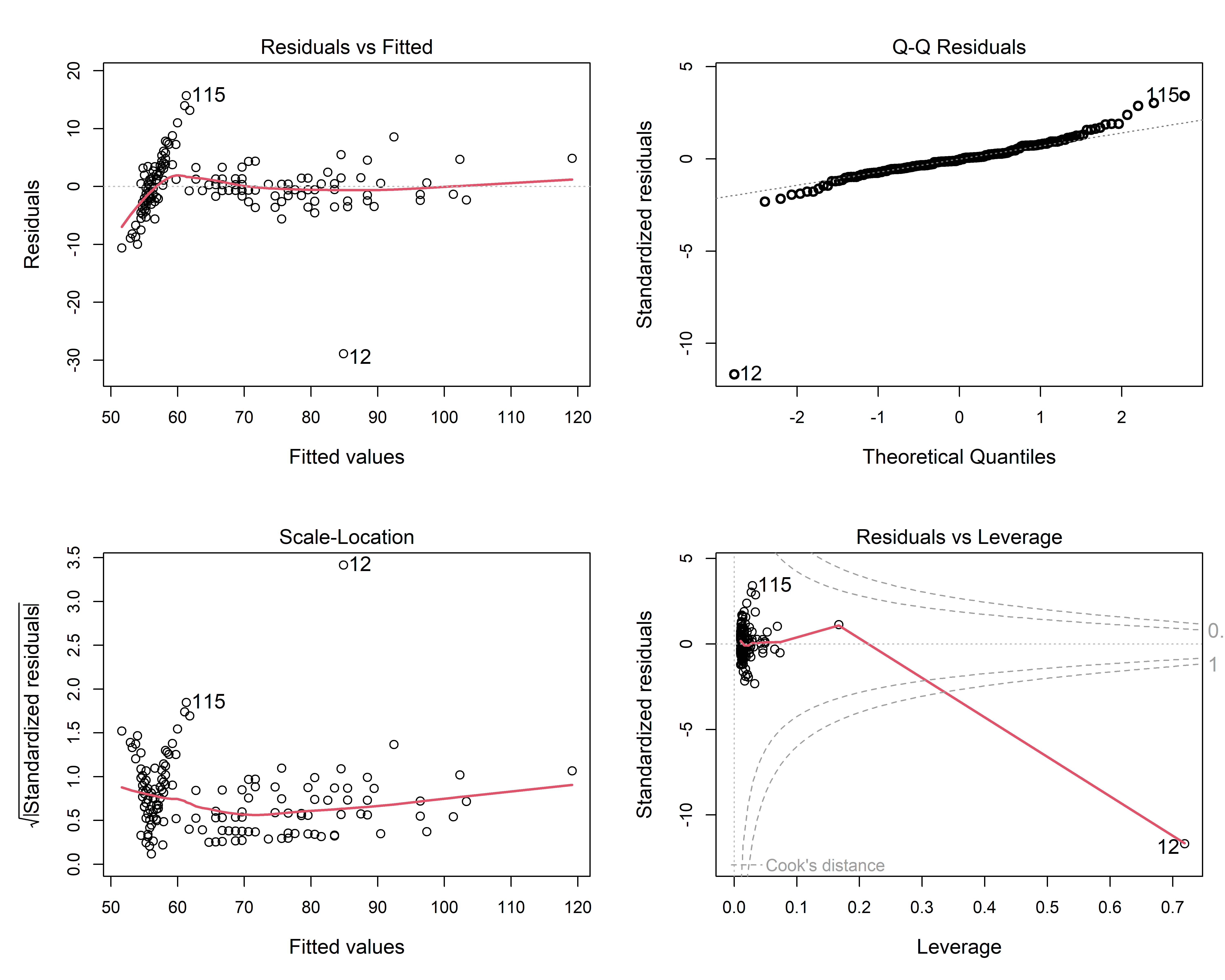
The details of such plots are discussed and illustrated in sec-regression-quartet, so I will just point out one useful feature here: that of point identification: the id.n argument controls the number of most-extreme points to be labeled in each panel. The point for the erroneous case 12 female who mis-recorded her height as her weight sticks out a mile in all four panels.
2.3 Principles of graphical display
TODO: This could be a separate chapter, supplementary materials or excluded here
- Criteria for assessing graphs: communication goals
- Effective data display:
- Make the data stand out
- Make graphical comparison easy
- Effect ordering: For variables and unordered factors, arrange them according to the effects to be seen
- Visual thinning: As the data becomes more complex, focus more on impactful summaries
2.4 What have we learned?
This chapter demonstrates why visualization isn’t just a “nice-to-have” feature in data analysis–—it’s absolutely essential. Through compelling historical examples and modern techniques, we’ve discovered some fundamental idea that every data analyst should embrace:
Summary statistics can conceal the truth: Anscombe’s Quartet reveals that datasets can have identical means, correlations, and regression coefficients yet tell completely different stories. The quartet’s four plots–—pure error, lack of fit, outliers, and influence—–show that numerical summaries without visualization can lead us wildly astray. Modern extensions like the Datasaurus Dozen prove this isn’t just a quirky historical example–—you can literally hide a dinosaur in your data while maintaining identical statistical properties! Talk about the dinosaur in the room!
One rogue data point can hijack your entire analysis: Plotting the raw data facilitates critical engagement with our statistical models. The Davis weight study demonstrates how a single influential observation (one participant who accidentally switched their reported and measured weights) can completely distort relationships between variables. What appeared to be a puzzling gender difference in the reliability of self-reported weight vanished once the data was plotted and the outlier revealed itself as a simple recording error.
Meaning becomes more apparent through thoughtful visualizations of well-considered models: Statistical modeling helps guide your attention in what might otherwise be a chaotic plot of raw data. The 1970 Draft Lottery story shows how graphics can reveal systematic bias hiding in apparently random data. While individual lottery numbers seemed random, smoothing techniques and summary plots exposed a clear pattern–—later birthdays were systematically favored due to poor mixing of the lottery capsules. Sometimes the most important patterns are the ones that whisper rather than shout.
Different plot types serve different purposes: The chapter introduces a taxonomy of visualization goals that helps us choose the right tool for each analytical task. Data plots show raw observations, reconnaissance plots provide bird’s-eye overviews of complex datasets, model plots reveal fitted relationships, diagnostic plots expose model problems, and dimension reduction plots tame high-dimensional complexity. Each serves a distinct role in the analytical process.
Visual enhancement amplifies signal over noise: Whether through smoothing lines, statistical summaries, or careful use of color and annotation, the chapter shows how thoughtful visual design can make weak patterns stand out dramatically. The Draft Lottery analysis becomes far more convincing when we plot monthly averages rather than individual data points, transforming a subtle correlation into an unmistakable trend.
The overarching message is clear: in an era where we can compute any statistic imaginable, the not-so-humble graph remains our most powerful tool for understanding what our data are really trying to tell us. As the Farquhar brothers noted over a century ago, getting information from tables alone is like extracting sunlight from a cucumber—possible in theory, but why make it so hard on yourself?
For example, a cell in a table can be used to show a “sparklines” (Tufte (1983)), tiny versions of a line graph or bar chart. As well, table rows and/or columns can be sorted to show trends or background colors can be used to show unusual values.↩︎
This story is told apocryphally. The consulting client actually did plot the data, but needed help in understanding what went wrong in her analyses and in making better graphs.↩︎
Because both days of the year and rank in the lottery are the integers, 1 to 366, the Pearson correlation and Spearman rank order correlation are identical.↩︎
Restricting the y-axis range in plots can sometimes be a graphical sin. It can distort the visual representation of the data, making differences appear larger than they actually are, and potentially misleading the viewer. But this is not a sin, when it serves a communication goal, which in Figure fig-draft-means is to focus attention on the relative changes in lottery rank over the year. Using a visual cue like a broken axis in the axis is one way to avoid misinterpretation. For
ggplotgraphs, the ggbreak package is useful for this purpose.↩︎A personal note: I escaped being drafted, but I moved to Canada in 1971. Looking back today, it’s one of the best decisions I ever made.↩︎