The methods discussed in sec-mlm-review provide the basis for a rather complete multivariate analysis of traditional univariate methods for the same designs. You can carry out multivariate multiple regression, MANOVA, or indeed, any classical linear model with the standard collection of analysis tools you use for a single outcome variable, but naturally extended in most cases to having several outcomes to analyse together. The key points are:
Everything you know about the usual univariate models– regression coefficients, main effects and contrasts for factors, interactions of model terms, … applies here.
By a rather clever design, called “matrix algebra” the separate univariate models can be combined, by turning vectors of responses, \(\mathbf{y}_1, \mathbf{y}_2, \dots\) into a matrix \(\mathbf{Y}\). Bingo! We get a multivariate extension.
You can treat this as a collection of separate models, one for each response, because the coefficients are the same. But, the benefit of a multivariate approach is that you also get an overall multivariate test for each term in the model.
As nice as these mathematical and statistical ideas might be, the fact that the analysis is conducted for the response variables collectively, means that it may be harder to interpret and explain what this means about the separate responses. Here’s where multivariate model visualization comes to the rescue!
HE plots: The tests of multivariate models, including multivariate analysis of variance (MANOVA) for group differences and multivariate multiple regression (MMRA) can be easily visualized by plots of a hypothesis (“H”) data ellipse for the fitted values, relative to the corresponding plot of the error ellipse (“E”) of the residuals, which I call the HE plot framework.
contrasts: For factors in MANOVA, contrasts and linear hypotheses (sec-contrasts2) provide a way to decompose an overall multivariate test into portions directed at meaningful specific research questions regarding how the groups differ.
CDA: For more than a few response variables, these result can be projected onto a lower-dimensional “canonical” space providing an even simpler description, accounting for most of the “juice”. Vectors for the response variables in this space show how these relate to the canonical dimension, facilitating interpretation.
Huang (2019), in a provocative article titled, “MANOVA: A Procedure Whose Time Has Passed?” criticized these methods as (a) difficult to understand because they are framed in terms of linear combinations of the the responses; (b) more complicated and limited in interpreting MANOVA effects and (c) unwieldy post hoc strategies often employed for interpretation.
But that’s just you should expect to happen if you rely on tables of coefficients or ANOVA summary tables, even with significance stars (* … ***) to help interpret what is important. (You should be looking at effect sizes and practical significance, right?)
These difficulties in understanding multivariate models can, I believe, be cured by accessible graphical methods for visualizing hypothesis tests and for visualizing what these linear combinations reflect in terms of the observed variables. The HE plot framework described below provides powerful graphic methods available in easily used software, the heplots and candisc packages.
This chapter describes this framework and illustrates some concrete examples, first for MANOVA designs which are conceptually and visually simpler, and then for MMRA designs with quantitative predictors and finally for MANCOVA models. Many more worked examples are available in vignettes for the heplots package.1
Packages
In this chapter I use the following packages. Load them now.
11.1 HE plot framework
sec-Hotelling illustrated the basic ideas of the framework for visualizing multivariate linear models in the context of a simple two group design, using Hotelling’s \(T^2\). The main ideas were illustrated in Figure fig-HE-framework.
Having described the statistical ideas behind the MLM in sec-mlm-review, we can proceed to extend this framework to larger designs. Figure fig-dogfood-quartet illustrates these ideas using the simple one-way MANOVA design of the dogfood data from sec-dogfood-data.
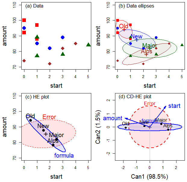
In (a) data space, each group is summarized in (b) by its data ellipse, representing the means and covariances.
Variation against the hypothesis of equal means can be seen by the \(\mathbf{H}\) ellipse in the (c) HE plot, representing the data ellipse of the fitted values. Error variance is shown in the \(\mathbf{E}\) ellipse, representing the pooled within-group covariance matrix, \(\mathbf{S}_p\) and the data ellipse of the residuals from the model. For the dogfood data, the group means have a negative relation: longer time to start eating is associated with a smaller amount eaten.
The MANOVA (or Hotelling’s \(T^2\)) is formally equivalent to a discriminant analysis, predicting group membership from the response variables which can be seen in data space. (The main difference is emphasis and goals: MANOVA seeks to test differences among group means, while discriminant analysis aims at classification of the observations into groups.)
This effectively projects the \(p\)-dimensional space of the predictors into the smaller (d) canonical space that shows the greatest differences among the groups. As in a biplot, vectors show the relations of the response variables with the canonical dimensions.
For more complex models such as MANOVA with multiple factors or multivariate multivariate regression with several predictors, there is one sum of squares and products matrix (SSP), and therefore one \(\mathbf{H}\) ellipse for each term in the model. For example, in a two-way MANOVA design with the model formula (y1, y2) ~ A + B + A*B and equal sample sizes in the groups, the total sum of squares accounted for by the model is the sum of their separate effects,
\[ \begin{aligned} \mathbf{SSP}_{\text{Model}} & = \mathbf{SSP}_{A} + \mathbf{SSP}_{B} + \mathbf{SSP}_{AB} \\ & = \mathbf{H}_A + \mathbf{H}_B + \mathbf{H}_{AB} \:\: . \end{aligned} \tag{11.1}\]
All of these hypotheses can be overlaid in a single HE plot showing their effects together in a comprehensive view.
11.2 HE plot construction
The HE plot is constructed to allow a direct visualization of the “size” of hypothesized terms in a multivariate linear model in relation to unexplained error variation. These can be displayed in 2D or 3D plots, so I use the term “ellipsoid” below to cover all cases.
Error variation is represented by a standard 68% data ellipsoid of the \(\mathbf{E}\) matrix of the residuals in \(\boldsymbol{\Large\varepsilon}\). This is divided by the residual degrees of freedom, so the size of \(\mathbf{E} / \text{df}_e\) is analogous to a mean square error in univariate tests. The choice of 68% coverage allows you to ``read’’ the residual standard deviation as the half-length of the shadow of the \(\mathbf{E}\) ellipsoid on any axis (see Figure fig-galton-ellipse-r).
The \(\mathbf{E}\) ellipsoid is then translated to the overall (grand) means \(\bar{\mathbf{y}}\) of the variables plotted, which allows us to show the means for factor levels on the same scale, facilitating interpretation. In the notation of Equation eq-ellE, the error ellipsoid \(\mathcal{E}_c\) of size \(c\) is given by
\[ \mathcal{E}_c (\bar{\mathbf{y}}, \mathbf{E}) = \bar{\mathbf{y}} \; \oplus \; c\,\mathbf{E}^{1/2} \:\: , \tag{11.2}\] where \(c = \chi^2_2 (0.68)\) for 2D plots and \(c = \chi^2_3 (0.68)\) for 3D plots of standard 68% coverage.2 Ellipses of various coverage were shown in Figure fig-ellipses-coverage.
An ellipsoid representing variation in the means of a factor (or any other term reflected in a general linear hypothesis test, Equation eq-hmat) uses the corresponding \(\mathbf{H}\) matrix is simply the data ellipse of the fitted values for that term. But there is a question of the relative scaling of the \(\mathbf{H}\) and \(\mathbf{E}\) ellipsoids for interpretation.
Dividing the hypothesis matrix by the error degrees of freedom, giving \(\mathbf{H} / \text{df}_e\), puts this on the same scale as the \(\mathbf{E}\) ellipse. I refer to this as effect size scaling, because it is similar to an effect size index used in univariate models, e.g., \(ES = (\bar{y}_1 - \bar{y}_2) / s_e\) in a two-group, univariate design. An alternative, significance scaling (sec-signif-scaling) provides a visual test of significance of a model \(\mathbf{H}\) term.
To illustrate this concretely, consider the HE plot for the dogfood shown in Figure fig-dogfood-quartet (c), reproduced here as Figure fig-dogfood-HE.
Show the code
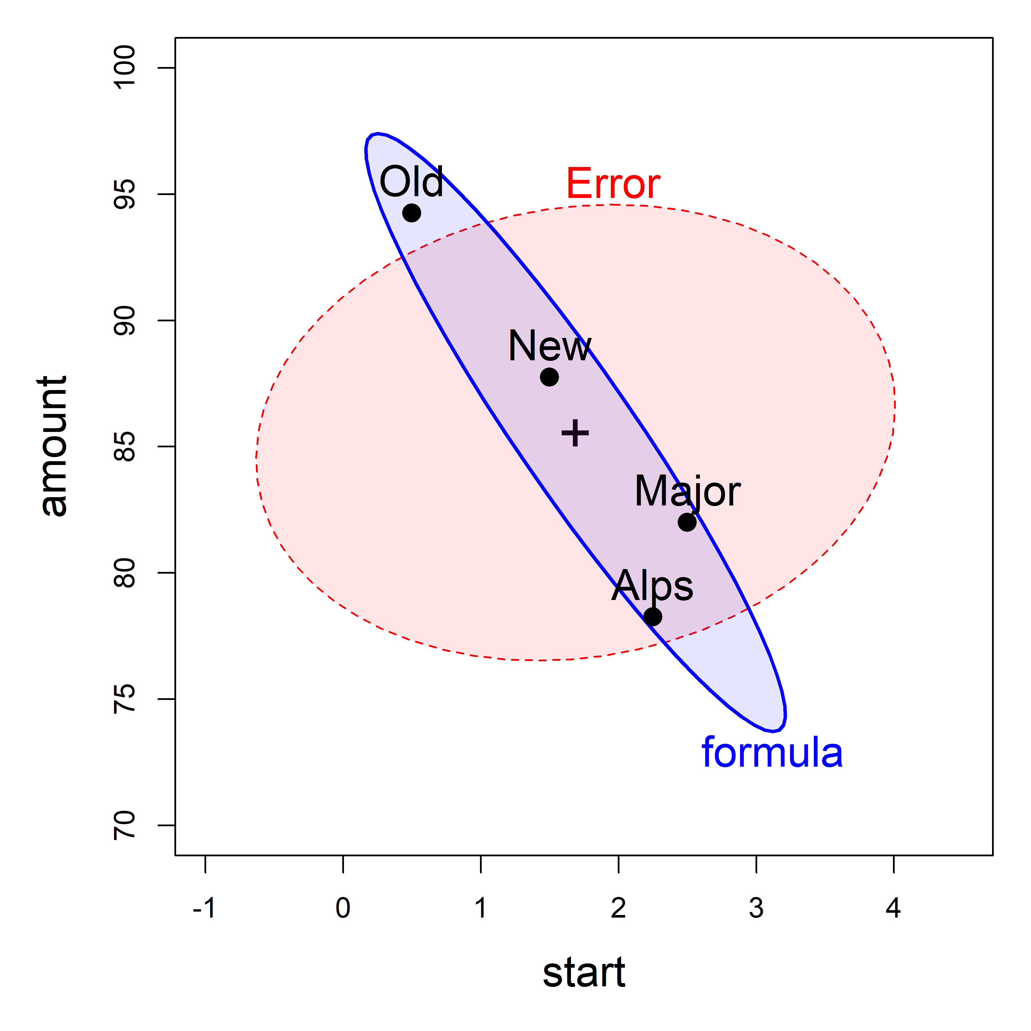
dogfood data, showing the means of the four groups, which generates the \(\mathbf{H}\) ellipse for the effect of formula. The \(\mathbf{E}\) ellipse labeled ‘Error’ shows the within-group variances and covariance.
From the analysis in sec-sums-of-squares, we found the \(\mathbf{H}\) matrix for the formula effect in the dogfood.mod model to be as shown below. The negative covariance, -70.94, reflects a correlation of -0.94 between the means of start time and amount eaten.
Similarly, the \(\mathbf{E}\) matrix, shown below, reflects a slight positive correlation, 0.12, for dogs fed the same formula.
SSP_E <- dogfood.aov$SSPE |> print()
#        start amount
# start   25.8   11.8
# amount  11.8  390.3
Example 11.1 Iris data
Perhaps the most famous (or infamous) dataset in the history of multivariate data analysis is that of measurements on three species of Iris flowers collected by Edgar Anderson (1935) in the Gaspé Peninsula of Québec, Canada. Anderson wanted to quantify the outward appearance (“morphology”: shape, structure, color, pattern, size) of species as a method to study variation within and between such groups. Although Anderson published in the obscure Bulletin of the American Iris Society, R. A. Fisher (1936) saw this as a challenge and opportunity to introduce the method now called discriminant analysis—how to find a weighted composite of variables to best discriminate among existing groups.
I said “infamous” above because Fisher published in the Annals of Eugenics. He was an ardent eugenicist himself, and the work of eugenicists was often pervaded by prejudice against racial, ethnic and disabled groups. Through guilt by association, the Iris data, having mistakenly been called “Fisher’s Iris Data”, has become deprecated, even called “racist data”.3 The voices of the Setosa, Versicolor and Virginica of Gaspé protest: we don’t have a racist bone in our body and nor prejudice against any other species, to no avail.
Bodmer et al. (2021) present a careful account of Fisher’s views on eugenics within the context of his time and his contributions to modern statistical theory and practice. Fisher’s views on race were largely formed by Darwin and Galton, but “nearly all of Fisher’s statements were about populations, groups of populations, or the human species as a whole”. Regardless, the iris data were Anderson’s and should not be blamed. After all, if Anderson had gave his car to Fisher, would the car be tainted by Fisher’s eugenicist leanings?
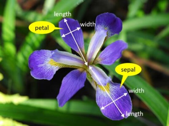
So that we understand what the measurements represent, Figure fig-iris-diagram superposes labels on a typical iris flower, having three sepals which alternate with three petals. Sepals are like ostentatious petals, with attractive decorations in the central section. Length is the distance from the center to the tip and width is the transverse dimension.
As always, it is useful to start with overview displays to see the data. A scatterplot matrix (Figure fig-iris-spm) shows that versicolor and virginica are more similar to each other than either is to setosa, both in their pairwise means (setosa are smaller) and in the slopes of regression lines. Further, the ellipses suggest that the assumption of constant within-group covariance matrices is problematic: While the shapes and sizes of the concentration ellipses for versicolor and virginica are reasonably similar, the shapes and sizes of the ellipses for setosa are different from the other two.
iris_colors <-c("blue", "darkgreen", "brown4")
scatterplotMatrix(~ Sepal.Length + Sepal.Width +
                    Petal.Length + Petal.Width | Species,
  data = iris,
  col = iris_colors,
  pch = 15:17,
  smooth=FALSE,
  regLine = TRUE,
  ellipse=list(levels=0.68, fill.alpha=0.1),
  diagonal = FALSE,
  legend = list(coords = "bottomleft",
                cex = 1.3, pt.cex = 1.2))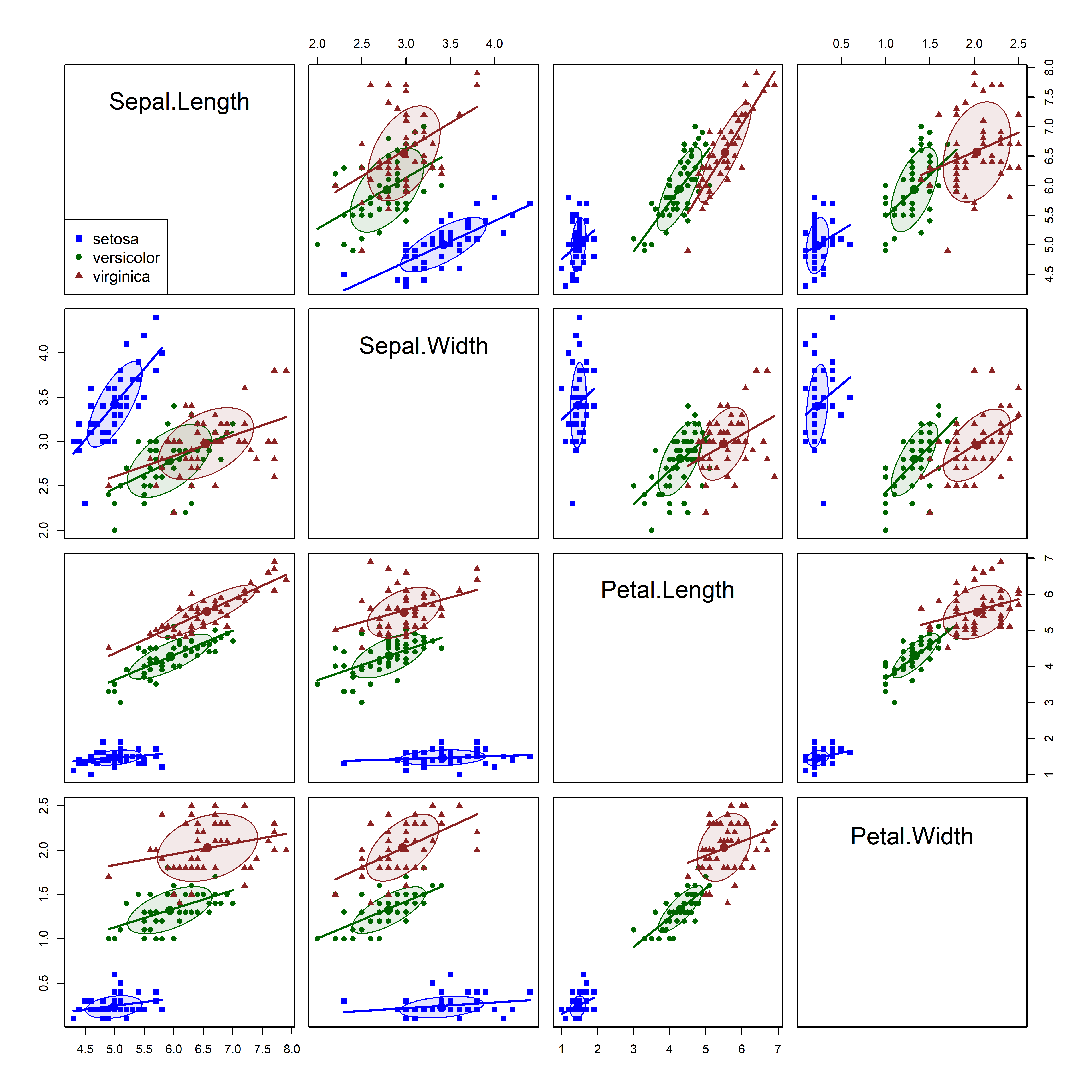
iris dataset. The species are summarized by 68% data ellipses and linear regression lines in each pairwise plot.
11.2.1 MANOVA model
We proceed nevertheless to fit a multivariate one-way ANOVA model to the iris data. The MANOVA model for these data addresses the question: “Do the means of the Species differ significantly for the sepal and petal variables taken together?” \[
\mathcal{H}_0 : \boldsymbol{\mu}_\textrm{setosa} = \boldsymbol{\mu}_\textrm{versicolor} = \boldsymbol{\mu}_\textrm{virginica}
\]
Because there are three species, the test involves \(s = \min(p, g-1) =2\) degrees of freedom, and we are entitled to represent this by two 1-df contrasts, or sub-questions. From the separation among the groups shown in Figure fig-iris-spm (or more botanical knowledge), it makes sense to compare:
- Setosa vs. others: \(\mathbf{c}_1 = (1,\: -\frac12, \: -\frac12)\)
- Versicolor vs. Virginica: : \(\mathbf{c}_1 = (0,\: 1, \: -1)\)
You can do this by putting these vectors as columns in a matrix and assigning this to the contrasts() of Species. It is important to do this before fitting with lm(), because the contrasts in effect determine how the \(\mathbf{X}\) matrix is setup, and hence the names of the coefficients representing Species.
Now let’s fit the model. As you would expect from Figure fig-iris-spm, the differences among groups are highly significant.
iris.mod <- lm(cbind(Sepal.Length, Sepal.Width, Petal.Length, Petal.Width) ~
                 Species, data=iris)
Anova(iris.mod)
#
# Type II MANOVA Tests: Pillai test statistic
#         Df test stat approx F num Df den Df Pr(>F)
# Species  2      1.19     53.5      8    290 <2e-16 ***
# ---
# Signif. codes:  0 '***' 0.001 '**' 0.01 '*' 0.05 '.' 0.1 ' ' 1
As a quick follow-up, it is useful to examine the univariate tests for each of the iris variables, using heplots::glance() or heplots::uniStats(). It is of interest that the univariate \(R^2\) values are much larger for the petal variables than the sepal length and width.4. For comparison, heplots::etasq() gives the overall \(\eta^2\) proportion of variance accounted for in all responses.
glance(iris.mod)
# # A tibble: 4 × 8
#   response     r.squared sigma fstatistic numdf dendf  p.value  nobs
#   <chr>            <dbl> <dbl>      <dbl> <dbl> <dbl>    <dbl> <int>
# 1 Sepal.Length     0.619 0.515      119.      2   147 1.67e-31   150
# 2 Sepal.Width      0.401 0.340       49.2     2   147 4.49e-17   150
# 3 Petal.Length     0.941 0.430     1180.      2   147 2.86e-91   150
# 4 Petal.Width      0.929 0.205      960.      2   147 4.17e-85   150

etasq(iris.mod)
#         eta^2
# Species 0.596
But these statistics don’t help to understand how the species differ. For this, we turn to HE plots.
11.3 HE plots
The heplot() function takes a "mlm" object and produces an HE plot for one pair of variables specified by the variables argument. By default, it plots the first two. Figure fig-iris-HE1 shows the HE plots for the two sepal and the two petal variables.
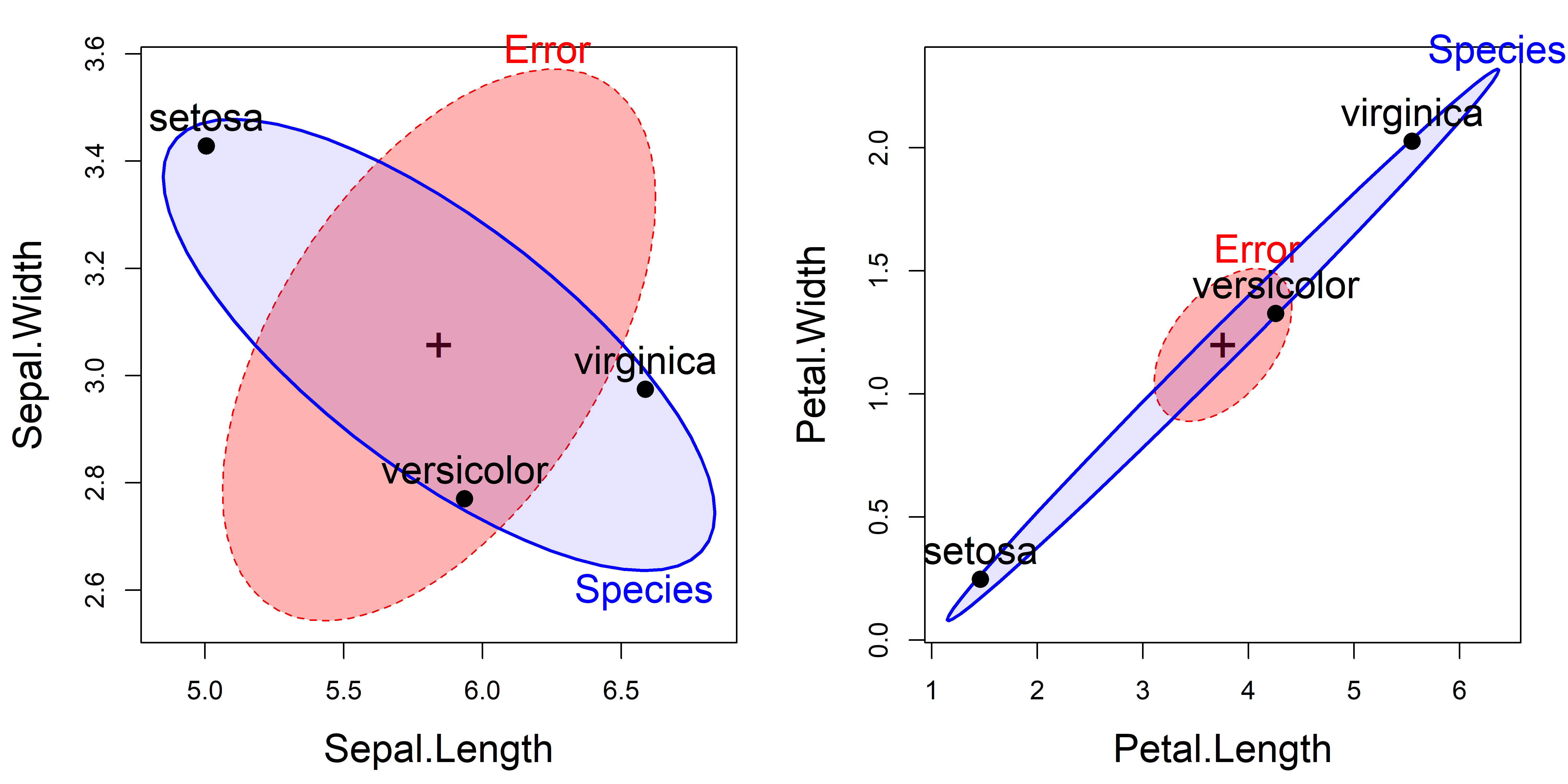
iris.mod. The left panel shows the plot for the Sepal variables; the right panel plots the Petal variables.
The interpretation of the plots in Figure fig-iris-HE1 is as follows:
For the Sepal variables, length and width are positively correlated within species (the \(\mathbf{E}\) = “Error” ellipsoid). The means of the groups (the \(\mathbf{H}\) = “Species” ellipsoid), however, are negatively correlated. This plot is the HE plot representation of the data shown in row 2, column 1 of Figure fig-iris-spm. It reflects the relative shape of the iris sepals: shorter and wider for setosa than the other two species.
For the Petal variables length and width are again positively correlated within species, but now the means of the groups are positively correlated: longer petals go with wider ones across species. This reflects the relative size of the iris petals. The analogous data plot appears in row 4, column 3 of Figure fig-iris-spm.
11.4 Significance scaling
The geometry of ellipsoids and multivariate tests allow us to go further with another re-scaling of the \(\mathbf{H}\) ellipsoid that gives a visual test of significance for any term in a MLM. This is done simply by dividing \(\mathbf{H} / df_e\) further by the \(\alpha\)-critical value of the corresponding test statistic to show the strength of evidence against the null hypothesis.
Among the various multivariate test statistics, Roy’s maximum root test, based on the largest eigenvalue \(\lambda_1\) of \(\mathbf{H} \mathbf{E}^{-1}\), gives \(\mathbf{H} / (\lambda_\alpha df_e)\) which has the visual property that the scaled \(\mathbf{H}\) ellipsoid will protrude somewhere outside the standard \(\mathbf{E}\) ellipsoid if and only if Roy’s test is significant at significance level \(\alpha\). The critical value \(\lambda_\alpha\) for Roy’s test is \[ \lambda_\alpha = \left(\frac{\text{df}_1}{\text{df}_2}\right) \; F_{\text{df}_1, \text{df}_2}^{1-\alpha} \:\: , \] where \(\text{df}_1 = \max(p, \text{df}_h)\) and \(\text{df}_2 = \text{df}_h + \text{df}_e - \text{df}_1\).
For these data, the HE plot using significance scaling is shown in the right panel of Figure fig-iris-HE2. The left panel is the same as that shown for sepal width and length in Figure fig-iris-HE1, but with axis limits to make the two plots directly comparable.
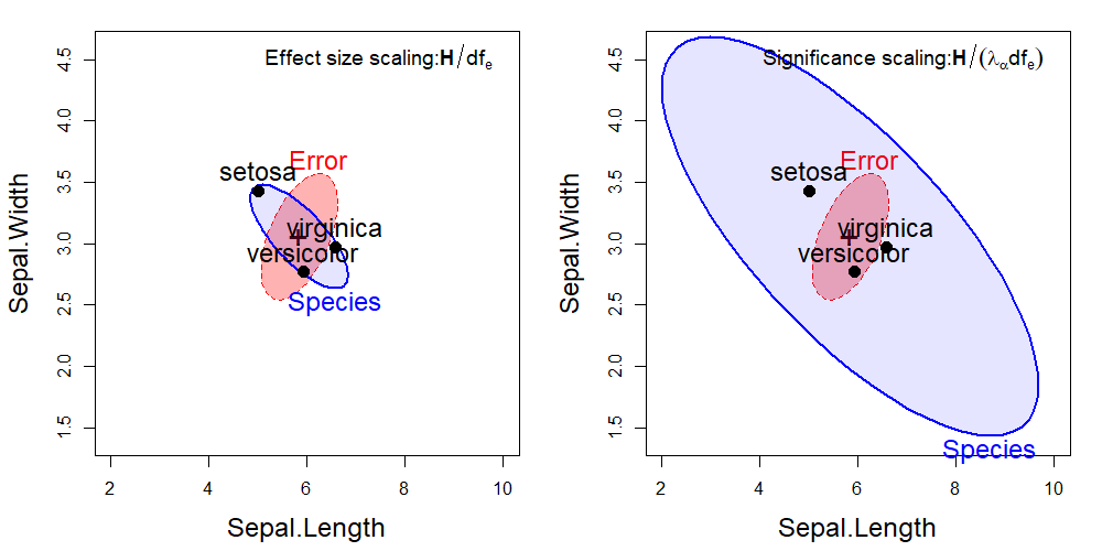
You can interpret the plot using effect scaling to indicate that the overall “size” of variation of the group means is roughly the same as that of within-group variation for the two sepal variables. Significance scaling weights the evidence against the null hypothesis that a given effect is zero. Clearly, the species vary significantly on the sepal variables, and the direction of the \(\mathbf{H}\) ellipse suggests that those whose sepals are longer are also less wide.
11.5 Visualizing contrasts and linear hypotheses
As described in sec-contrasts, tests of linear hypotheses and contrasts represented by the general linear test \(\mathcal{H}_0: \mathbf{C} \;\mathbf{B} = \mathbf{0}\) provide a powerful way to probe the specific effects represented within the global null hypothesis, \(\mathcal{H}_0: \mathbf{B} = \mathbf{0}\), that all effects are zero.
In this example the contrasts \(\mathbf{c}_1\) (Species1) and \(\mathbf{c}_2\) (Species2) among the iris species are orthogonal, i.e., \(\mathbf{c}_1^\top \mathbf{c}_2 = 0\). Therefore, their tests are statistically independent, and their \(\mathbf{H}\) matrices are additive. They fully decompose the general question of differences among the groups into two independent questions regarding the contrasts.
\[ \mathbf{H}_\text{Species} = \mathbf{H}_\text{Species1} + \mathbf{H}_\text{Species2} \tag{11.3}\]
car::linearHypothesis() is the means for testing these statistically, and heplot() provides the way to show these tests visually. Using the contrasts set up in sec-iris-mod, \(\mathbf{c}_1\), representing the difference between setosa and the other species is labeled Species1 and the comparison of versicolor with virginica is Species2. The coefficients for these in \(\mathbf{B}\) give the differences in the means. The line for (Intercept) gives grand means of the variables.
coef(iris.mod)
#             Sepal.Length Sepal.Width Petal.Length Petal.Width
# (Intercept)        5.843       3.057        3.758       1.199
# Species1          -0.837       0.371       -2.296      -0.953
# Species2          -0.326      -0.102       -0.646      -0.350
Numerical tests of hypotheses using linearHypothesis() can be specified in a very general way: A matrix (or vector) \(\mathbf{C}\) giving linear combinations of coefficients by rows, or a character vector giving the hypothesis in symbolic form. A character variable or vector tests whether the named coefficients are different from zero for all responses.
linearHypothesis(iris.mod, "Species1") |> print(SSP=FALSE)
#
# Multivariate Tests:
#                  Df test stat approx F num Df den Df Pr(>F)
# Pillai            1      0.97     1064      4    144 <2e-16 ***
# Wilks             1      0.03     1064      4    144 <2e-16 ***
# Hotelling-Lawley  1     29.55     1064      4    144 <2e-16 ***
# Roy               1     29.55     1064      4    144 <2e-16 ***
# ---
# Signif. codes:  0 '***' 0.001 '**' 0.01 '*' 0.05 '.' 0.1 ' ' 1

linearHypothesis(iris.mod, "Species2") |> print(SSP=FALSE)
#
# Multivariate Tests:
#                  Df test stat approx F num Df den Df Pr(>F)
# Pillai            1     0.745      105      4    144 <2e-16 ***
# Wilks             1     0.255      105      4    144 <2e-16 ***
# Hotelling-Lawley  1     2.925      105      4    144 <2e-16 ***
# Roy               1     2.925      105      4    144 <2e-16 ***
# ---
# Signif. codes:  0 '***' 0.001 '**' 0.01 '*' 0.05 '.' 0.1 ' ' 1
The various test statistics are all equivalent here—they give the same \(F\) statistics— because they they have 1 degree of freedom.
In passing, from Equation eq-H-Species, note that the joint test of these contrasts is exactly equivalent to the overall test of Species (results not shown).
linearHypothesis(iris.mod, c("Species1", "Species2"))We can show these contrasts in an HE plot by supplying a named list for the hypotheses argument. The names are used as labels in the plot. In the case of a 1-df multivariate test, the \(\mathbf{H}\) ellipses plot as a degenerate line.
hyp <- list("S:Vv" = "Species1", "V:v" = "Species2")
heplot(iris.mod, hypotheses=hyp,
       cex = 1.5, cex.lab = 1.5,
       fill = TRUE, fill.alpha = c(0.3, 0.1),
       col = c("red", "blue", "darkgreen", "darkgreen"),
       lty = c(0,0,1,1), label.pos = c(3, 1, 2, 1),
       xlim = c(2, 10), ylim = c(1.4, 4.6))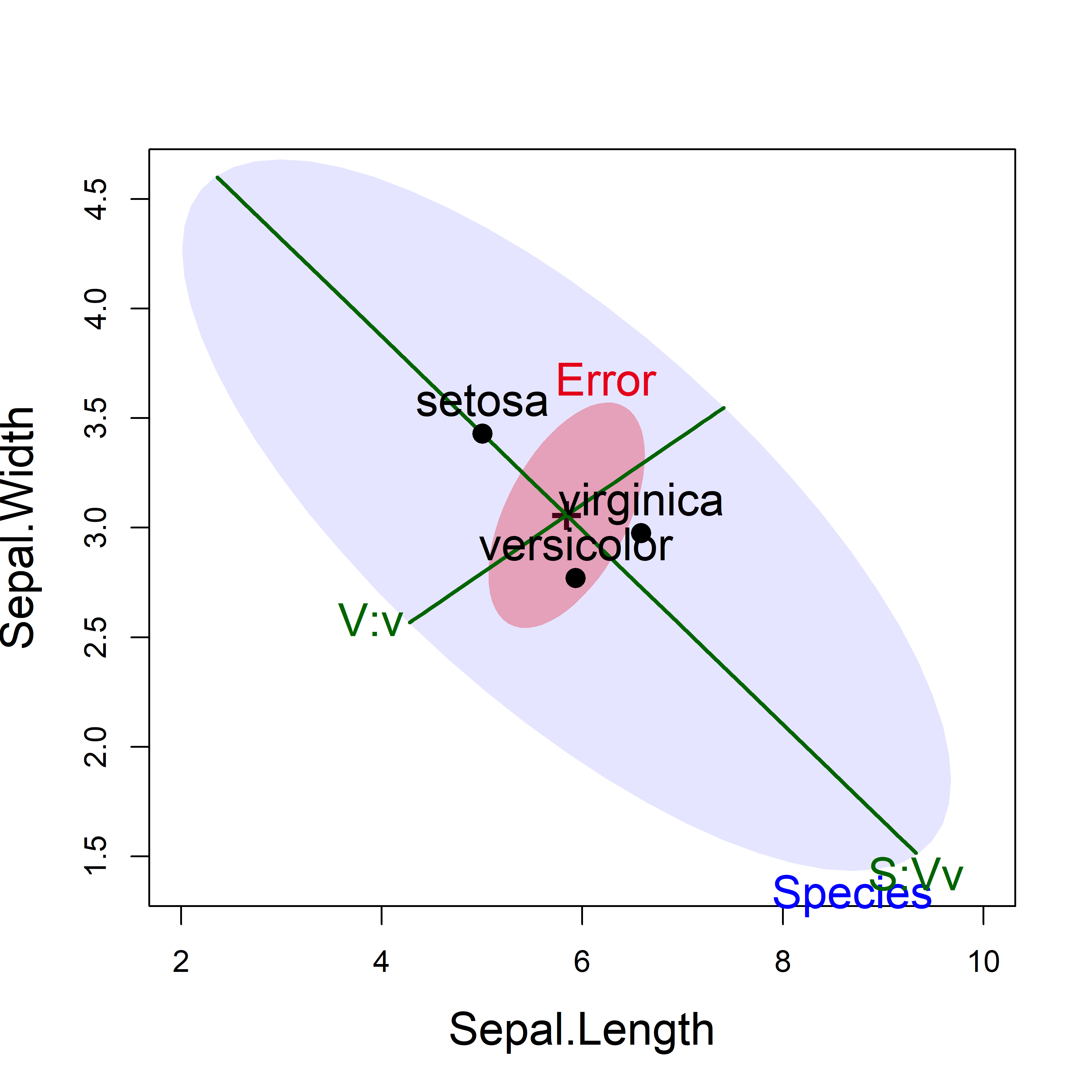
iris data showing the tests of the two contrasts, using significance scaling.
This HE plot shows that, for the two sepal variables, the greatest between-species variation is accounted for by the contrast (S:Vv) between setosa and the others, for which the effect is very large in relation to error variation. The second contrast (V:v), between the versicolor and virginica species is relatively smaller, but still explains significant variation of the sepal variables among the species.
The directions of these hypotheses in a given plot show how the group means differ in terms of a given contrast.5 For example, the contrast S:Vv is the line that separates setosa from the others and indicates that setosa flowers have shorter but wider sepals.
11.6 HE plot matrices
In base R graphics, 2D scatterplots are extended to all pairwise views of multivariate data with a pairs() method. For multivariate linear models, the heplots package defines a pairs.mlm() method to display HE plots for all pairs of the response variables.
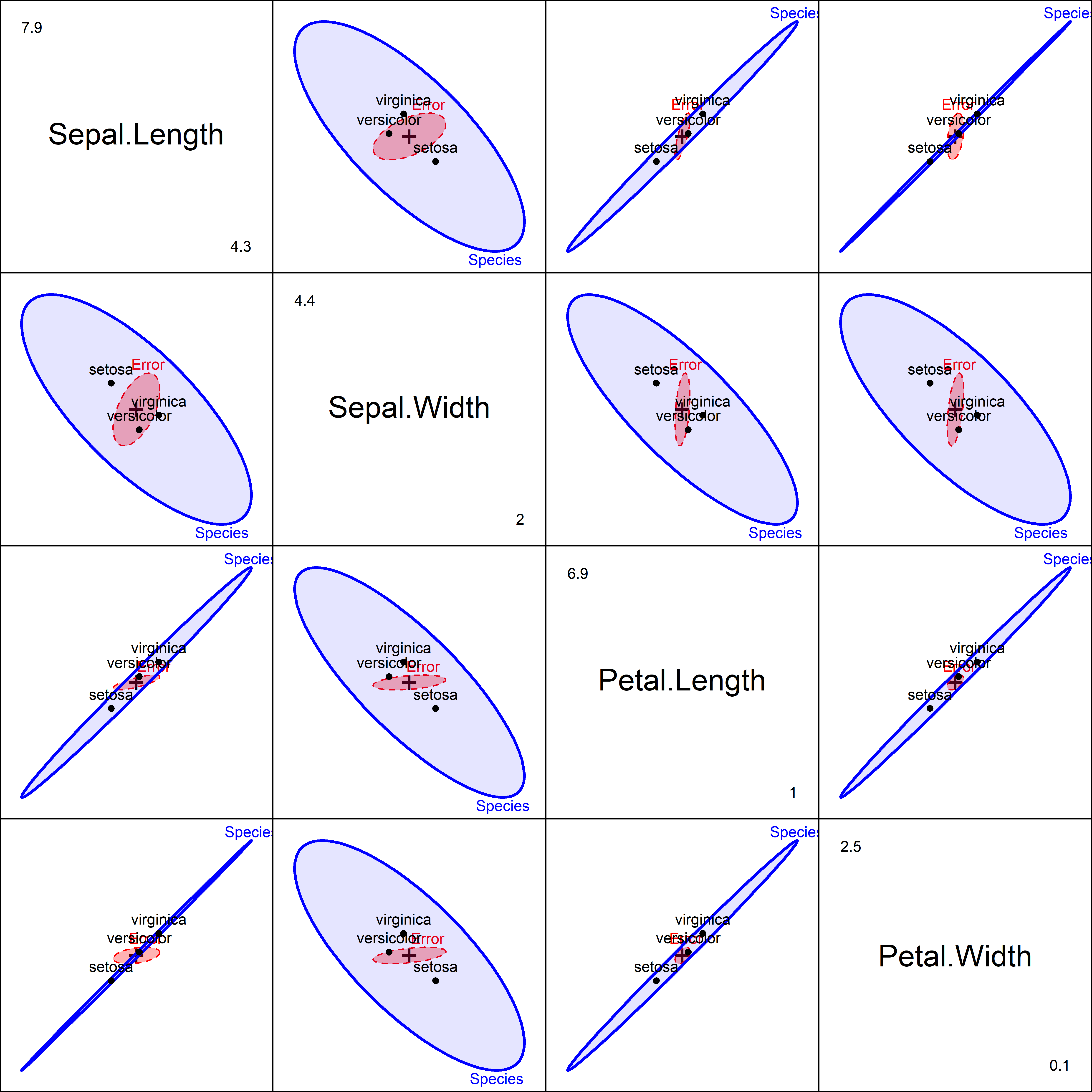
Figure fig-iris-pairs provides a fairly complete visualization of the results of the multivariate tests and answers the question: how do the species differ? Sepal length and the two petal variables have the group means nearly perfectly correlated, in the order setosa < versicolor < virginica. For Sepal width, however, setosa has the largest mean, and so the \(\mathbf{H}\) ellipses show a negative correlation in the second row and column.
11.7 Low-D views: Canonical analysis
The HE plot framework so far provides views of all the effects in a MLM in variable space. We can view this in 2D for selected pairs of response variables, or for all pairwise views in scatterplot matrix format, as in Figure fig-iris-pairs.
There is also an heplot3d() function giving plots for three response variables together. The 3D plots are interactive, in that they can be rotated and zoomed by mouse control, and dynamic, in that they can be made to spin and saved as movies. To save space, these plots are not shown here.
However in a one-way MANOVA design with more than three response variables, it is difficult to visualize how the groups vary on all responses together, and how the different variables contribute to discrimination among groups. In this situation, canonical discriminant analysis (CDA) is often used, to provide a low-D visualization of between-group variation.
When the predictors are also continuous, the analogous term is canonical correlation analysis (CCA), described in sec-cancor. The advantage in both cases is that we can also show the relations of the response variables to these dimensions, similar to a biplot (sec-biplot) for a PCA of purely quantitative variables.
But, to be clear: dimensions and variance accounted for in canonical space describe the relationships between response variables and factors or quantitative predictors, whereas PCA is only striving to account for the total variation in the space of all variables.
The key to CDA is the eigenvalue decomposition of the \(\mathbf{H}\) relative to \(\mathbf{E}\) \(\mathbf{H}\mathbf{E}^{-1} \lambda_i = \lambda_i \mathbf{v}_i\) (Equation eq-he-eigen). The eigenvalues, \(\lambda_i\), give the “size” of each \(s\) orthogonal dimensions on which the multivariate tests are based (sec-H-vs-E). But the corresponding eigenvectors, \(\mathbf{v}_i\), give the weights for the response variables in \(s\) linear combinations that maximally discriminate among the groups or equivalently maximize the (canonical) \(R^2\) of a linear combination of the predictor \(\mathbf{X}\)s with a linear combination of the response \(\mathbf{Y}\)s.
Thus, CDA amounts to a transformation of the \(p\) responses, \(\mathbf{Y}_{n \times p}\) into scores \(\mathbf{Z}\) in the canonical space,
\[ \mathbf{Z}_{n \times s} = \mathbf{Y} \; \mathbf{E}^{-1/2} \; \mathbf{V} \;, \tag{11.4}\]
where \(\mathbf{V}\) contains the eigenvectors of \(\mathbf{H}\mathbf{E}^{-1}\) and \(s=\min ( p, \textbf{df}_h )\) dimensions, the degrees of freedom for the hypothesis. It is well-known (e.g., Gittins (1985)) that canonical discriminant plots of the first two (or three, in 3D) columns of \(\mathbf{Z}\) corresponding to the largest canonical correlations provide an optimal low-D display of the variation between groups relative to variation within groups.
Canonical discriminant analysis is typically carried out in conjunction with a one-way MANOVA design. The candisc package (Friendly & Fox, 2025) generalizes this to multi-factor designs in the candisc() function. For any given term in a "mlm", the generalized canonical discriminant analysis amounts to a standard discriminant analysis based on the \(\mathbf{H}\) matrix for that term in relation to the full-model \(\mathbf{E}\) matrix.6
Tests based on the eigenvalues \(\lambda_i\), initially stated by Bartlett (1938), use Wilks’ \(\Lambda\) likelihood ratio tests of these. This allow you to determine the number of significant canonical dimensions, or the number of different aspects to consider for the relations between the responses and predictors. This is a big win over univariate analyses for each dependent variable separately as follow-ups for a significant MANOVA result.
These take the form of sequential global tests of the hypothesis that the canonical correlation in the current row and all that follow are zero. Thus, if you find that the second dimension is insignificant, there is no need to look at any further down the list. The canonical \(R^2\), CanRsq, gives the R-squared value of fitting the \(i\)th response canonical variate to the corresponding \(i\)th canonical variate for the predictors.
For the iris data, we get the following printed summary:
iris.can <- candisc(iris.mod) |>
  print()
#
# Canonical Discriminant Analysis for Species:
#
#   CanRsq Eigenvalue Difference Percent Cumulative
# 1  0.970     32.192       31.9  99.121       99.1
# 2  0.222      0.285       31.9   0.879      100.0
#
# Test of H0: The canonical correlations in the
# current row and all that follow are zero
#
#   LR test stat approx F numDF denDF Pr(> F)
# 1        0.023    199.1     8   288 < 2e-16 ***
# 2        0.778     13.8     3   145 5.8e-08 ***
# ---
# Signif. codes:  0 '***' 0.001 '**' 0.01 '*' 0.05 '.' 0.1 ' ' 1
This analysis shows a very simple result: The differences among the iris species can be nearly entirely accounted for by the first canonical dimension (99.1%). Interestingly, the second dimension is also highly significant, even though it accounts for only 0.88%.
11.7.1 Coeficients
The coef() method for “candisc” objects returns a matrix of weights for the response variables in the canonical dimensions. By default, these are given for the response variables standardized to \(\bar{y}=0\) and \(s^2_y = 1\).
The type argument also allows for raw score weights (type = "raw") used to compute scores for the observations on the canonical variables Can1, Can2, … . Using type = "structure" gives the canonical structure coefficients, which are the correlations between each response and the canonical scores.
coef(iris.can, type = "std")
#                Can1    Can2
# Sepal.Length  0.427  0.0124
# Sepal.Width   0.521  0.7353
# Petal.Length -0.947 -0.4010
# Petal.Width  -0.575  0.5810
coef(iris.can, type = "structure")
#                Can1  Can2
# Sepal.Length -0.792 0.218
# Sepal.Width   0.531 0.758
# Petal.Length -0.985 0.046
# Petal.Width  -0.973 0.223
The standardized (or raw score) weights are interpreted in terms of their signs and magnitudes, just as in coefficient weights in a multiple regression. From the numbers, Can1 seems to be a contrast between the sepal and petal variables. For Can2, sepal length doesn’t matter and the result contrasts the two width variables against petal length.
I find it easier to interpret the correlations between the observed and canonical variables, given as the canonical structure coefficients. These are easily visualized as vectors in canonical space (similar to biplots for a PCA), as shown below (Figure fig-iris-candisc).
11.7.2 Canonical scores plot
The plot() method for "candisc" objects gives a plot of these observation scores in any two dimensions. The argument ellipse=TRUE overlays this with their standard data ellipses for each species, as shown in Figure fig-iris-candisc.
Analogous to the biplot (sec-biplot), the response variables are shown as vectors, using the structure coefficients. Thus, the relative size of the projection of these vectors on the canonical axes reflects the correlation of the observed response on the canonical dimension. For ease of interpretation I flipped the sign of the first canonical dimension (rev.axes), so that the positive Can1 direction corresponds to larger flowers.
vars <- names(iris)[1:4] |>
  stringr::str_replace("\\.", "\n")
plot(iris.can,
     var.labels = vars,
     var.col = "black",
     var.lwd = 2,
     ellipse=TRUE,
     scale = 9,
     col = iris_colors,
     pch = 15:17,
     cex = 0.7, var.cex = 1.25,
     rev.axes = c(TRUE, FALSE),
     xlim = c(-10, 10),
     cex.lab = 1.5)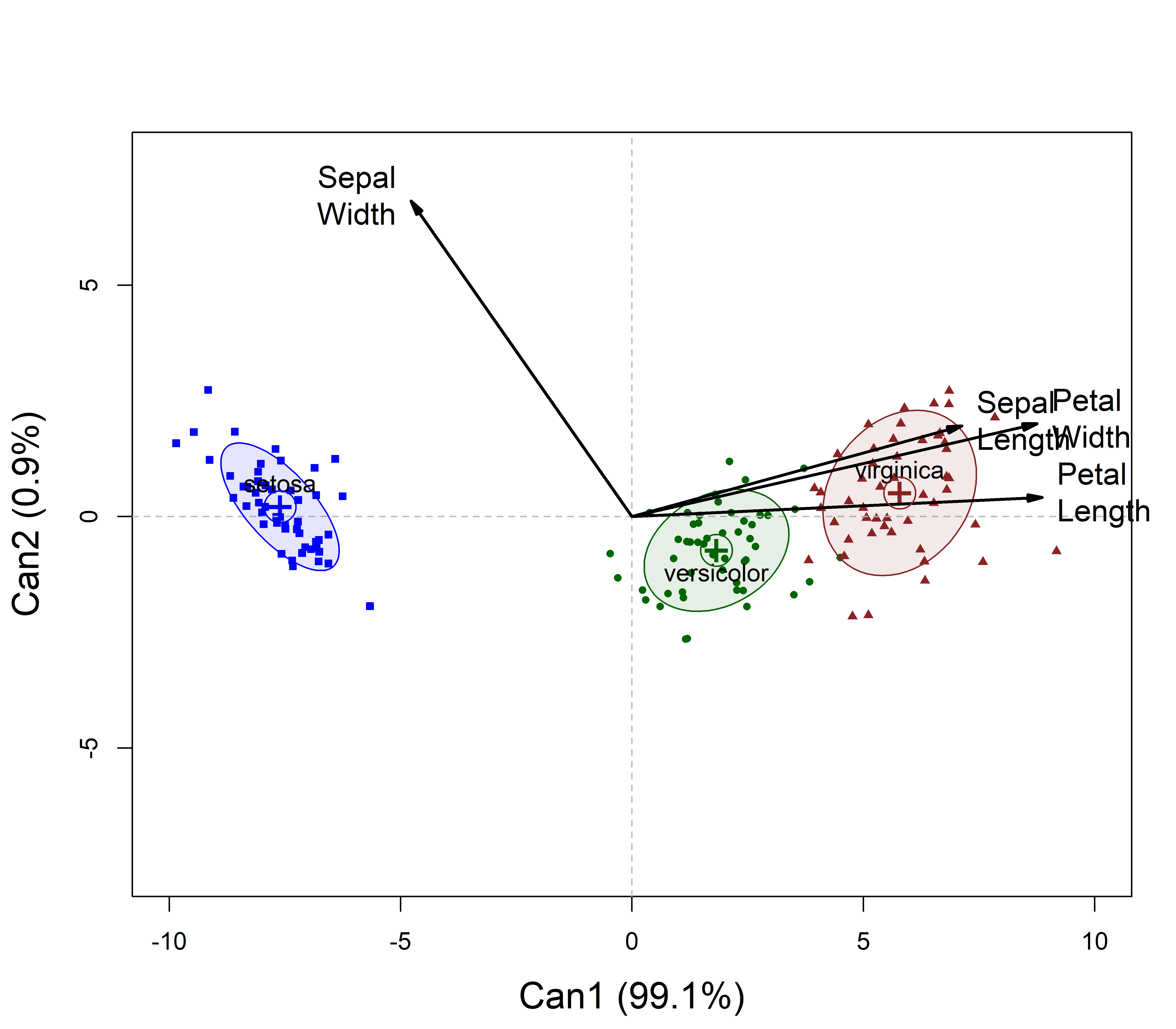
The interpretation of this plot is simple: in canonical space, variation of the means for the iris species is essentially one-dimensional (99.1% of the effect of Species), and this dimension corresponds to overall size of the iris flowers: The Setosas have smaller flowers.
All variables except for Sepal.Width are positively aligned with this axis, but the two petal variables show the greatest discrimination. The negative direction for Sepal.Width reflects the pattern seen in Figure fig-iris-pairs, where setosa have wider sepals.
For the second dimension, look at the projections of the variable vectors on the Can2 axis. All are positive, but this is dominated by Sepal.Width. We could call this a flower shape dimension.
11.7.3 Canonical HE plot
For a one-way design, the canonical HE plot is simply the HE plot of the canonical scores in the analogous MLM model that substitutes \(\mathbf{Z}\) for \(\mathbf{Y}\). In effect, it is a more compact visual summary of the plot shown of canonical scores in Figure fig-iris-candisc.
This is shown in Figure fig-iris-HEcan for the iris data. In canonical space, the residuals are always uncorrelated, so the \(\mathbf{E}\) ellipse plots as a circle. The \(\mathbf{H}\) ellipse for Species here reflects a data ellipse for the fitted values— group means— shown as labeled points in the plot. The differences among Species are so large that this plot uses size = "effect" scaling, making the axes comparable to those in Figure fig-iris-candisc.7
The vectors for each predictor are the same structure coefficients as in the ordinary canonical plot. They can again be reflected for easier interpretation and scaled in length to fill the plot window.
heplot(iris.can,
       size = "effect",
       scale = 8,
       var.labels = vars, var.col = "black",
       var.lwd = 2, var.cex = 1.25,
       fill = TRUE, fill.alpha = 0.2,
       rev.axes = c(TRUE, FALSE),
       xlim = c(-10, 10),
       cex.lab = 1.5)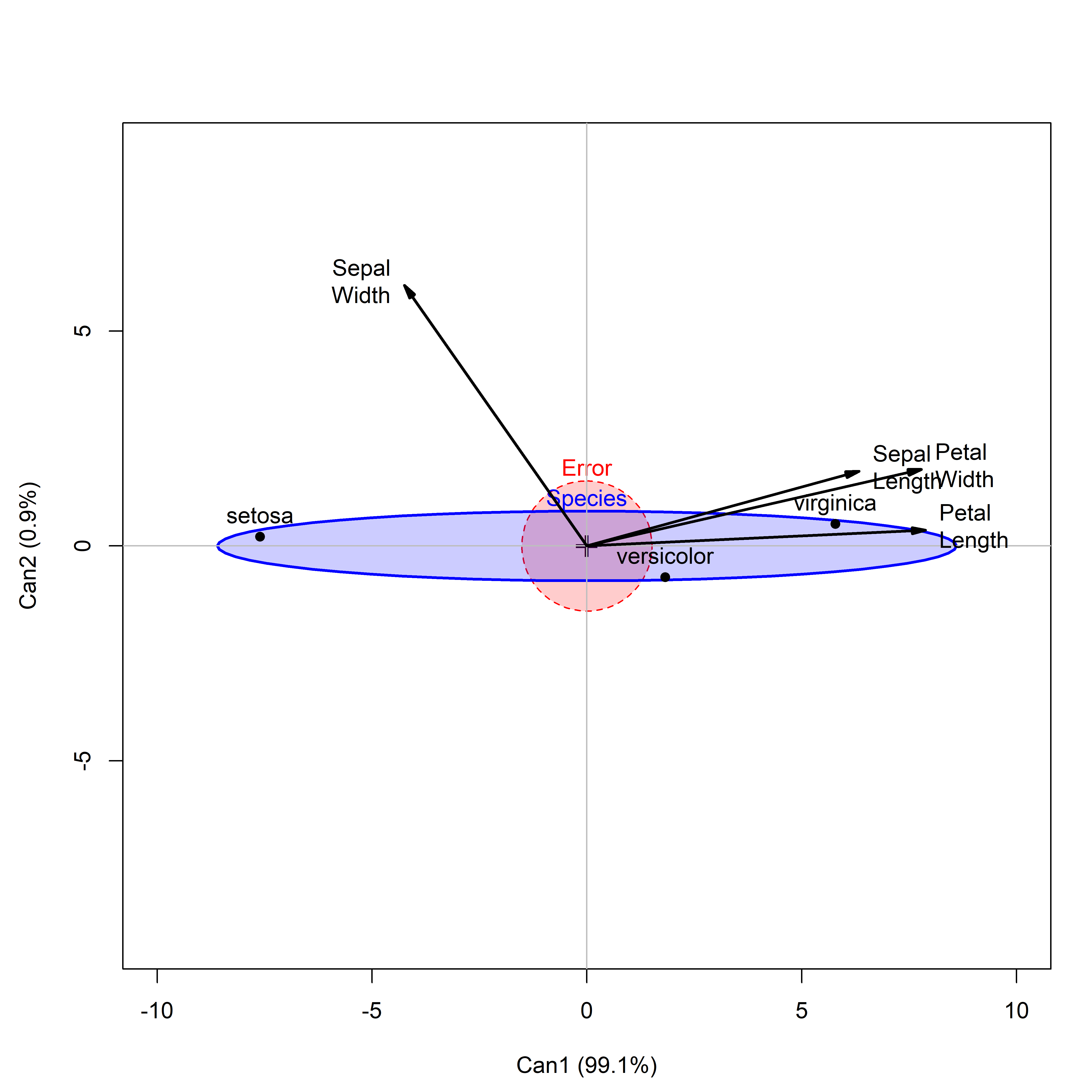
The collection of plots shown for the iris data here can be seen as progressive visual summaries of the data and increased visual understanding of the morphology of Anderson’s Iris flowers:
- The scatterplot matrix in Figure fig-iris-spm shows the iris flowers in the data space of the sepal and petal variables.
- Canonical analysis substitutes for these the two linear combinations reflected in
Can1andCan2. The plot in Figure fig-iris-candisc portrays exactly the same relations among the species, but in the reduced canonical space of only two dimensions. - The HE plot version, shown in Figure fig-iris-HEcan summarizes the separate data ellipses for the species with pooled, within-group variance of the \(\mathbf{E}\) matrix for the canonical variables, which are always uncorrelated. The variation among the group means is reflected in the size and shape of the ellipse for the \(\mathbf{E}\) matrix.
11.8 Factorial MANOVA
When there are two or more factors, the overall model is comprised of main effects and possible interactions as shown in Equation eq-HE-model. A significant advantage of HE plots is that they show how the response variables are related in their effects. Moreover, the main effects and interactions can be overlaid in the same plot showing how each term contributes to assessment of differences among the groups.
Example 11.2 Plastic film data
I illustrate these points below for the Plastic film data analyzed earlier in Example exm-plastic1. The model contemplated there examined how the three response variables, resistance to tear, film gloss and the opacity of the film varied with the two experimental factors, rate of extrusion and amount of some additive, both at two levels, labeled High and Low. Both main effects and the interaction of rate and additive were fit in the model plastic.mod:
We can visualize all these effects for pairs of variables in an HE plot, showing the “size” and orientation of hypothesis variation (\(\mathbf{H}\)) for each model term, in relation to error variation (\(\mathbf{E}\)), as ellipsoids. When, as here, the model terms have 1 degree of freedom, the \(\mathbf{H}\) ellipsoids for rate, additive and rate:additive each degenerate to a line.
Figure fig-plastic-HE1 shows the HE plot for the responses tear and gloss, the strongest by univariate tests. This plot takes advantage of another feature of heplot(): You can overlay plots using add = TRUE, as is done here to show both significance and effect size scaling in a single plot.
colors = c("red", "darkblue", "darkgreen", "brown4")
heplot(plastic.mod, size="significance",
       col=colors, cex=1.5,  cex.lab = 1.5,
       fill=TRUE, fill.alpha=0.1)
heplot(plastic.mod, size="effect",
       col=colors, lwd=6,
       add=TRUE, term.labels=FALSE)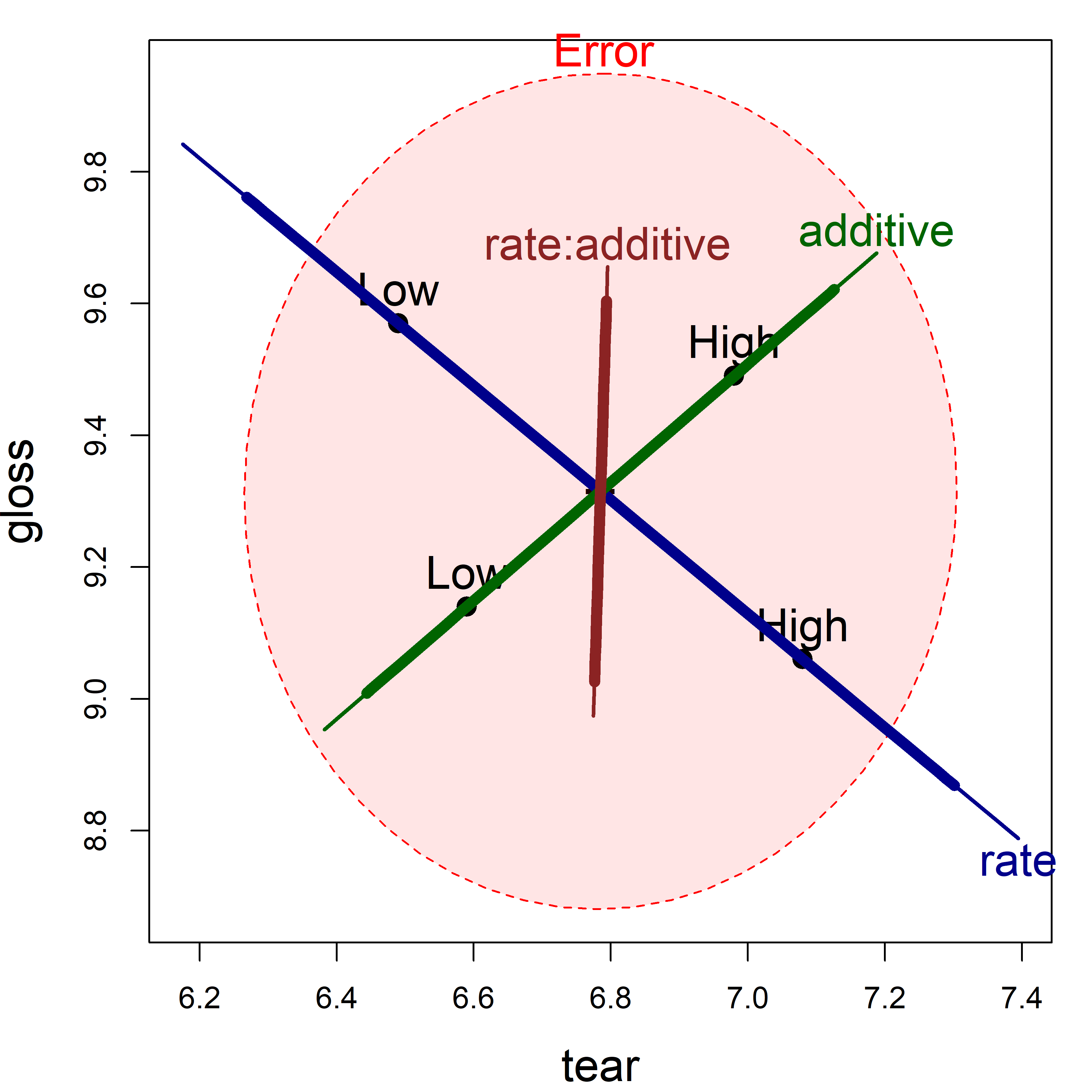
tear and gloss according to the factors rate, additive and their interaction, rate:additive. The thicker lines show effect size scaling; thinner lines show significance scaling.
In this view, the main effect of extrusion rate is highly significant, with the high level giving larger tear resistance and lower gloss on average. High level of additive produces greater tear resistance and higher gloss. The interaction effect, rate:additive, while non-significant, points nearly entirely in the direction of gloss. You can see this more directly in Figure fig-plastic-ggline, where the lines for gloss diverge.
But what if you also wanted to show the means for the combinations of rate and additive in an HE plot? By design, means for the levels of interaction terms are not shown in the HE plot, because doing so in general can lead to messy displays.
We can add them here for the term rate:additive as shown in Figure fig-plastic-HE2. This uses heplots::termMeans() to find the cell means for the combinations of the two factors and then lines() to connect the pairs of points for the low and high levels of additive.
par(mar = c(4,4,1,1)+.1)
heplot(plastic.mod, size="evidence",
       col=colors, cex=1.5, cex.lab = 1.5,
       lwd = c(1, 5),
       fill=TRUE, fill.alpha=0.05)

# add interaction means
intMeans <- termMeans(plastic.mod, 'rate:additive',
                      abbrev.levels=3)
points(intMeans[,1], intMeans[,2], pch=18, cex=1.2, col="brown4")
text(intMeans[,1], intMeans[,2], rownames(intMeans),
     adj=c(0.5, 1), col="brown4")
lines(intMeans[c(1,3),1], intMeans[c(1,3),2],
      col="brown4", lwd = 3)
lines(intMeans[c(2,4),1], intMeans[c(2,4),2],
      col="brown4", lwd = 3)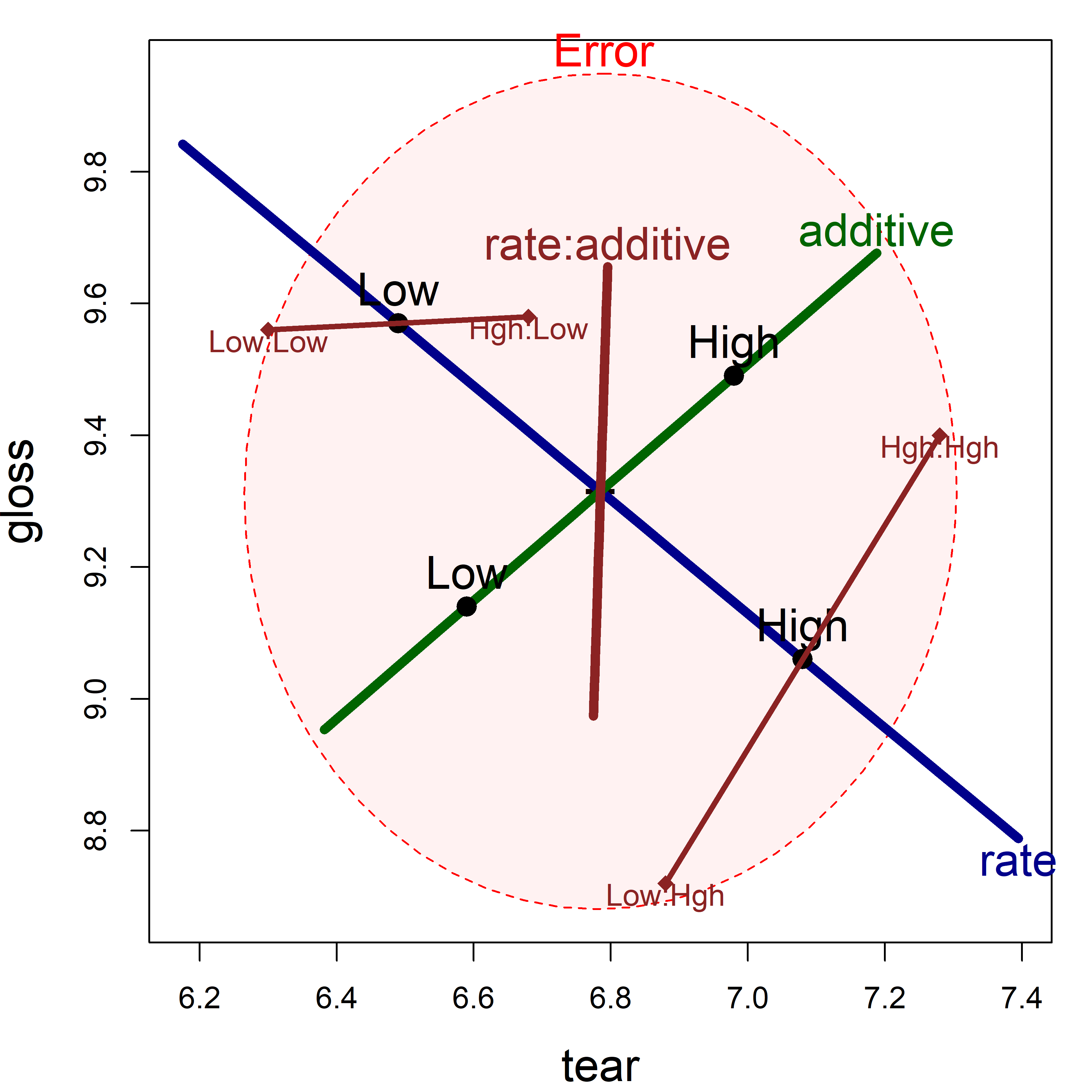
tear and gloss using significance scaling. To this is added points showing the means for the combinations of rate and additive.
Figure fig-plastic-HE2 is somewhat more complicated to interpret than the simple line plots in Figure fig-plastic-ggline, but has the advantage that it shows effects on the two response variables jointly.
Example 11.3 MockJury: Manipulation check
In Example exm-MockJury1, I examined the effects of the attractiveness of photos of hypothetical women defendants and the nature of a crime on the judgments made by members of a mock jury, on the rated seriousness of the crime and the length of a prison sentence participants would give to a guilty defendant. This analysis used the following model, fitting Serious and Years of sentence to the combinations of Attr and Crime:
The photos were classified as “beautiful”, of “average” beauty or “unattractive”, and as a validity check on this experimental manipulation, 1–9 ratings on twelve attributes were also collected. Of these, the direct rating of physical attractiveness, physattr, was most important, but it was also of interest to see how other ratings differentiated the photos. The rating scales are the following:
names(MockJury)[-(1:4)]
#  [1] "exciting"      "calm"          "independent"   "sincere"
#  [5] "warm"          "phyattr"       "sociable"      "kind"
#  [9] "intelligent"   "strong"        "sophisticated" "happy"
# [13] "ownPA"
To keep the graphs below simple, I consider only a subset of the ratings here, and fit the full \(3 \times 2\) MANOVA model for Attr and Crime and their interaction. The main interest is in the attractiveness of the photo, but the other terms are included in the model to control for them.8
jury.mod1 <- lm(cbind(phyattr, exciting, sociable, happy, independent) ~ Attr * Crime,
                  data=MockJury)
uniStats(jury.mod1)
# Univariate tests for responses in the multivariate linear model jury.mod1
#
#               R^2     F df1 df2 Pr(>F)
# phyattr     0.639 38.24   5 108 <2e-16 ***
# exciting    0.139  3.49   5 108 0.0058 **
# sociable    0.134  3.33   5 108 0.0078 **
# happy       0.112  2.73   5 108 0.0233 *
# independent 0.120  2.94   5 108 0.0159 *
# ---
# Signif. codes:  0 '***' 0.001 '**' 0.01 '*' 0.05 '.' 0.1 ' ' 1
The pairs.mlm() plot for this model would be a \(5 \times 5\) display showing all pairwise HE plots for this model. Figure fig-jury-HE selects two of these showing phyattr against exciting and independent. Although the model includes the full factorial of Attr and Crime, I only want to show the effect of Attr here, so I do this using the terms and factor.means arguments. Because the ratings are on the same 1–9 scale, I also use asp = 1 to make response variables visually comparable.
heplot(jury.mod1,
       terms = "Attr", factor.means = "Attr",
       fill = TRUE, fill.alpha = 0.2,
       cex = 1.2, cex.lab = 1.6, asp = 1)

heplot(jury.mod1,
       variables = c(1,5),
       terms = "Attr", factor.means = "Attr",
       fill = TRUE, fill.alpha = 0.2,
       cex = 1.2, cex.lab = 1.6, asp = 1)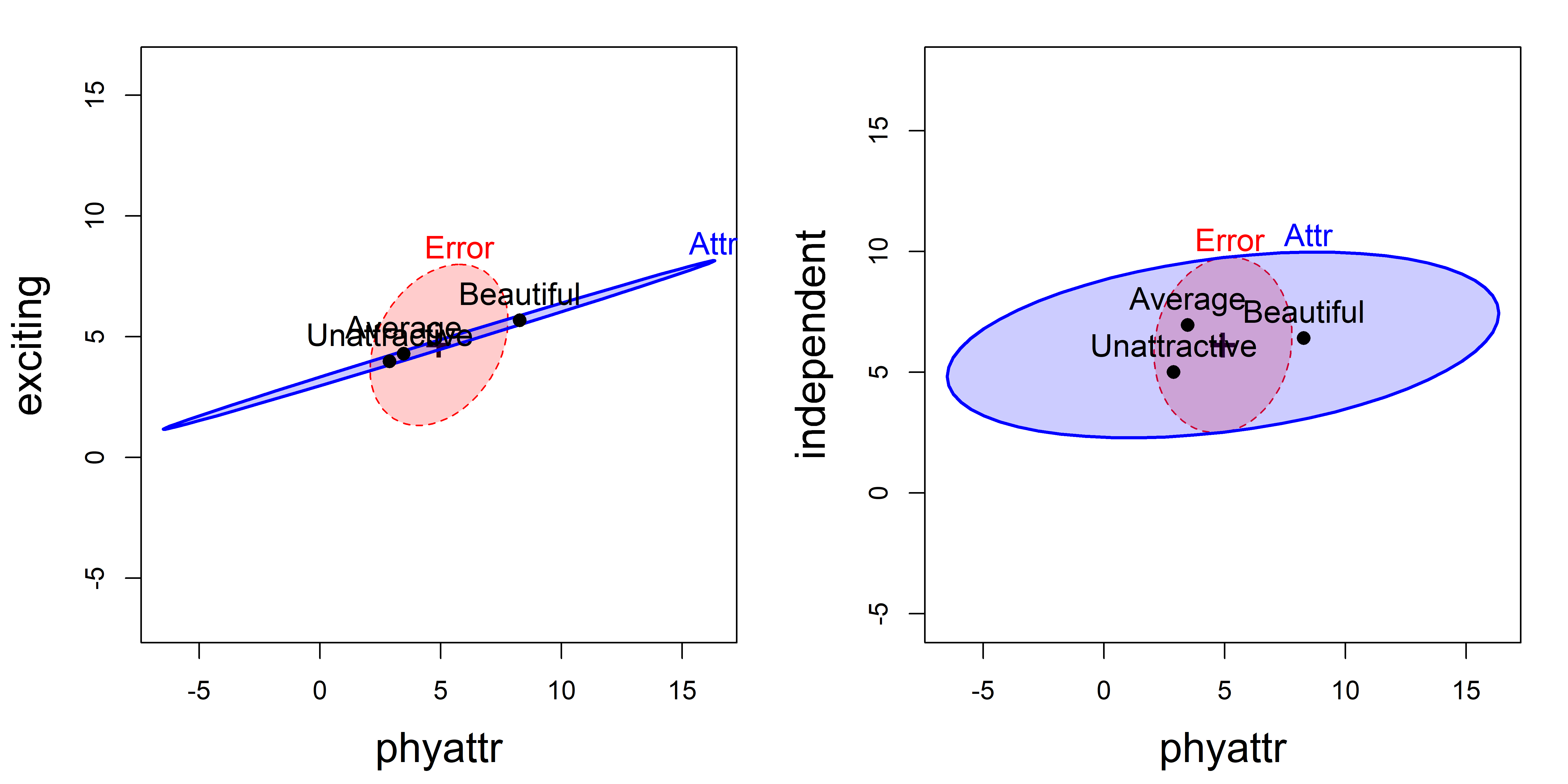
exciting vs. phyattr ratings; right: independent vs. phyattr ratings.
These plots show that the means of the ratings of phyattr of the photos are in the expected order (Beautiful > Average > Unattractive), though the largest difference is between Beautiful and the others in both panels.9
In the left panel of Figure fig-jury-HE, the means for exciting are nearly perfectly correlated with those for phyattr, and there is little difference between the Beautiful photos and the others. The means for independent are slightly positively correlated with those for phyattr, but there is a wider separation between Average and Unattractive photos. The right panel shows the same order of the means for phyattr, but the photos of Average attractiveness are rated as highest on independence.
Canonical analysis
As before, a canonical analysis squeezes the juice in a collection of responses into fewer dimensions, allowing you to see relationships not not apparent in all pairwise views. With 2 degrees of freedom for Attr, the space for all the ratings is 2D. candisc() for this term10 shows that 91% of the variation between photo groups is accounted for in one dimension, but there is still some significant variation associated with the 2\(^\text{nd}\) dimension.
jury.can1 <- candisc(jury.mod1, term = "Attr") |>
  print()
#
# Canonical Discriminant Analysis for Attr:
#
#   CanRsq Eigenvalue Difference Percent Cumulative
# 1  0.642       1.79       1.61   90.87       90.9
# 2  0.153       0.18       1.61    9.13      100.0
#
# Test of H0: The canonical correlations in the
# current row and all that follow are zero
#
#   LR test stat approx F numDF denDF Pr(> F)
# 1        0.303    17.46    10   214  <2e-16 ***
# 2        0.847     4.87     4   108  0.0012 **
# ---
# Signif. codes:  0 '***' 0.001 '**' 0.01 '*' 0.05 '.' 0.1 ' ' 1
The 2D plot of canonical scores in Figure fig-jury-can gives a very simple description for this model. Dimension Can1 widely separates the photo groups, and this dimension is nearly perfectly aligned with the phyattr ratings. Ratings for exciting are also strongly associated with this. This finding is sufficient to claim the validity of the classification used in the experiment.
col <- c("blue", "darkgreen", "red")
plot(jury.can1, rev.axes = c(TRUE, TRUE),
     col = col,
     ellipse = TRUE, ellipse.prob = 0.5,
     lwd = 3,
     var.lwd = 2,
     var.cex = 1.4,
     var.col = "black",
     pch = 15:17,
     cex = 1.4,
     cex.lab = 1.5)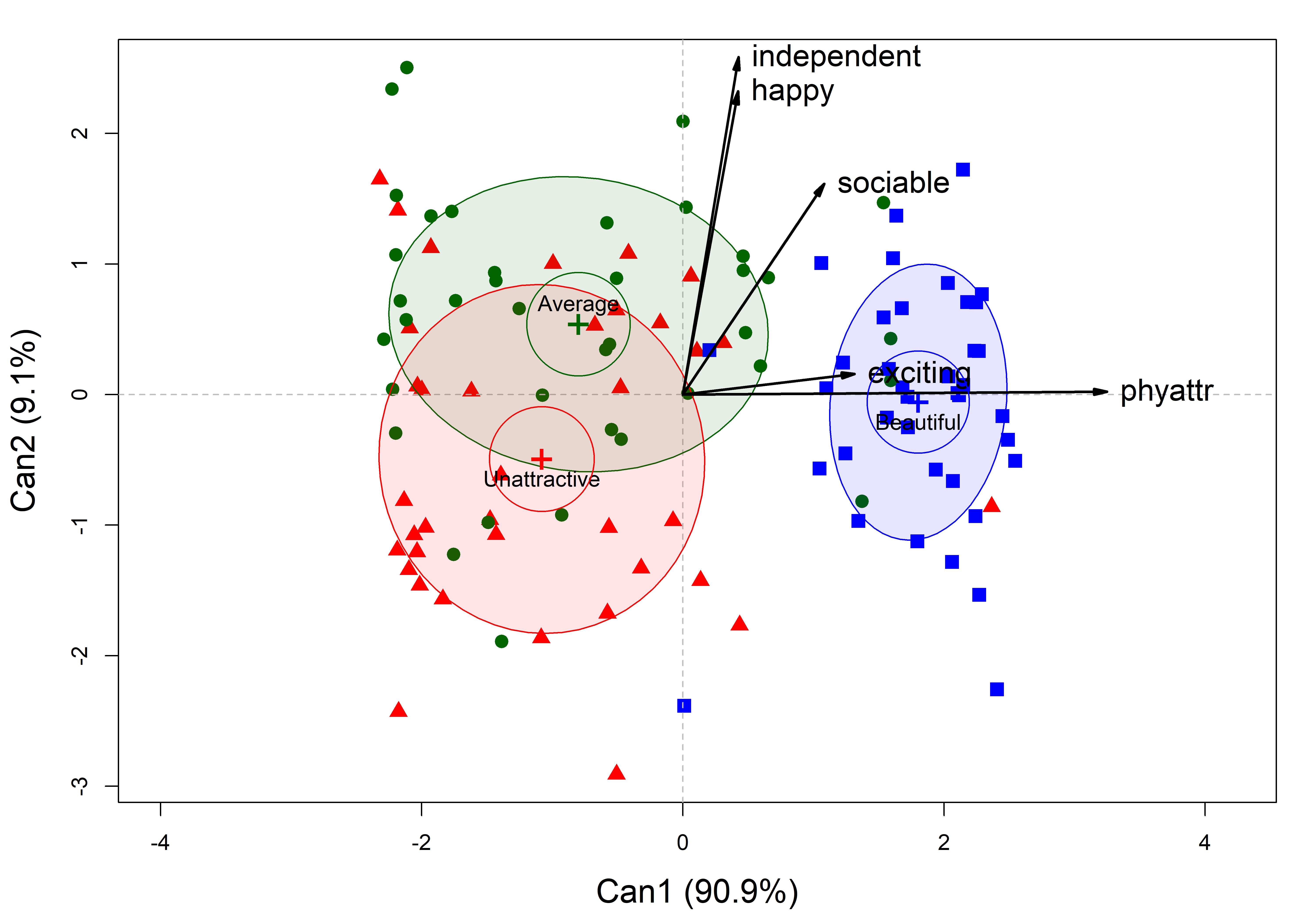
Attr in the model jury.mod1 for the ratings of the photos classified as Beautiful, Average or Unattractive. Ellipses have 50% coverage for the canonical scores. Variable vectors reflect the correlations of the rating scales with the canonical dimensions.
The second canonical dimension, Can2 is also of some interest. The photo means differ here mainly between those considered of Average beauty and those classified as Unattractive. The ratings for independent and happy are most strongly associated with this dimension. Ratings on sociable are related to both dimensions, but more so with Can2.
11.9 Quantitative predictors: MMRA
The ideas behind HE plots extend naturally to multivariate multiple regression (MMRA). A purely visual feature of HE plots in these cases is that the \(\mathbf{H}\) ellipse for a quantitative predictor with 1 df appears as a degenerate line. But consequently, the angles between these for different predictors has a simple interpretation as as the correlation between their predicted effects. Moreover, it is easy to show visual overall tests of joint linear hypotheses for two or more predictors together.
TODO: Use for an exercise heplots::Hernior: Recovery from Elective Herniorrhaphy -> HE_mmra vignette
Example 11.4 NLSY data
Here I’ll continue the analysis of the NLSY data from sec-NLSY-mmra. In the model NLSY.mod1, I used only father’s income and education to predict scores in reading and math, and both of these demographic variables were highly significant. Figure fig-NLSY-heplot1 shows what this looks like in an HE plot.
data(NLSY, package = "heplots")
NLSY.mod1 <- lm(cbind(read, math) ~ income + educ,
                data = NLSY)

heplot(NLSY.mod1,
  fill=TRUE, fill.alpha = 0.2,
  cex = 1.5, cex.lab = 1.5,
  lwd=c(2, 3, 3),
  label.pos = c("bottom", "top", "top")
  )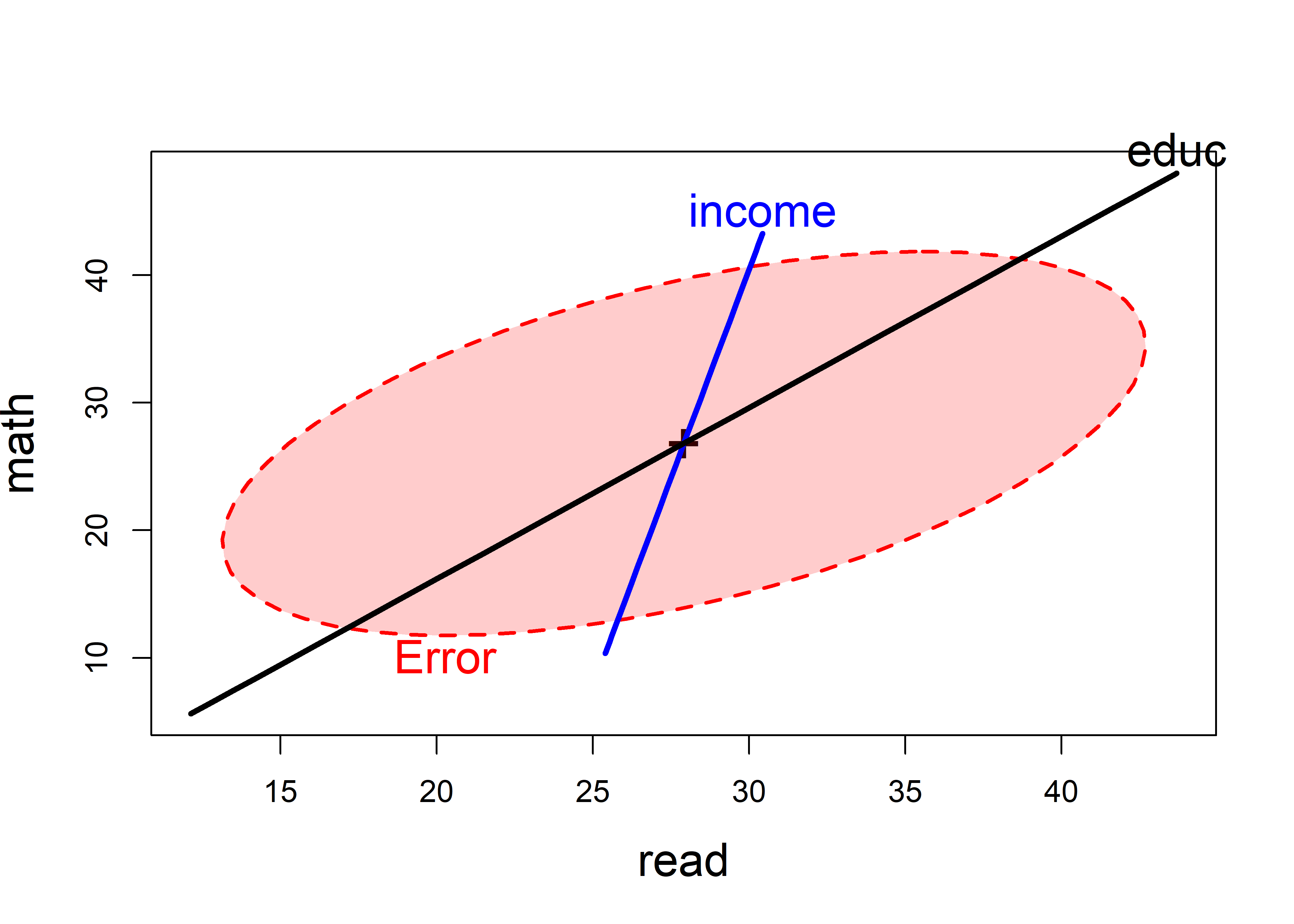
Fathers income and education are positively correlated in their effects on the outcome scores. From the angles in the plot, income is most related to the math score, while education is related to both, but slightly more to the reading score.
The overall joint test for both predictors can then be visualized as the test of the linear hypothesis \(\mathcal{H}_0 : \mathbf{B} = [\boldsymbol{\beta}_\text{income}, \boldsymbol{\beta}_\text{educ}] = \mathbf{0}\). For heplot(), we specify the names of the coefficients to be tested with the hypotheses argument.
coefs <- rownames(coef(NLSY.mod1))[-1] |> print()
# [1] "income" "educ"

heplot(NLSY.mod1,
       hypotheses = list("Overall" = coefs),
       fill=TRUE, fill.alpha = 0.2,
       cex = 1.5, cex.lab = 1.5,
       lwd=c(2, 3, 3, 2),
       label.pos = c("bottom", "top"))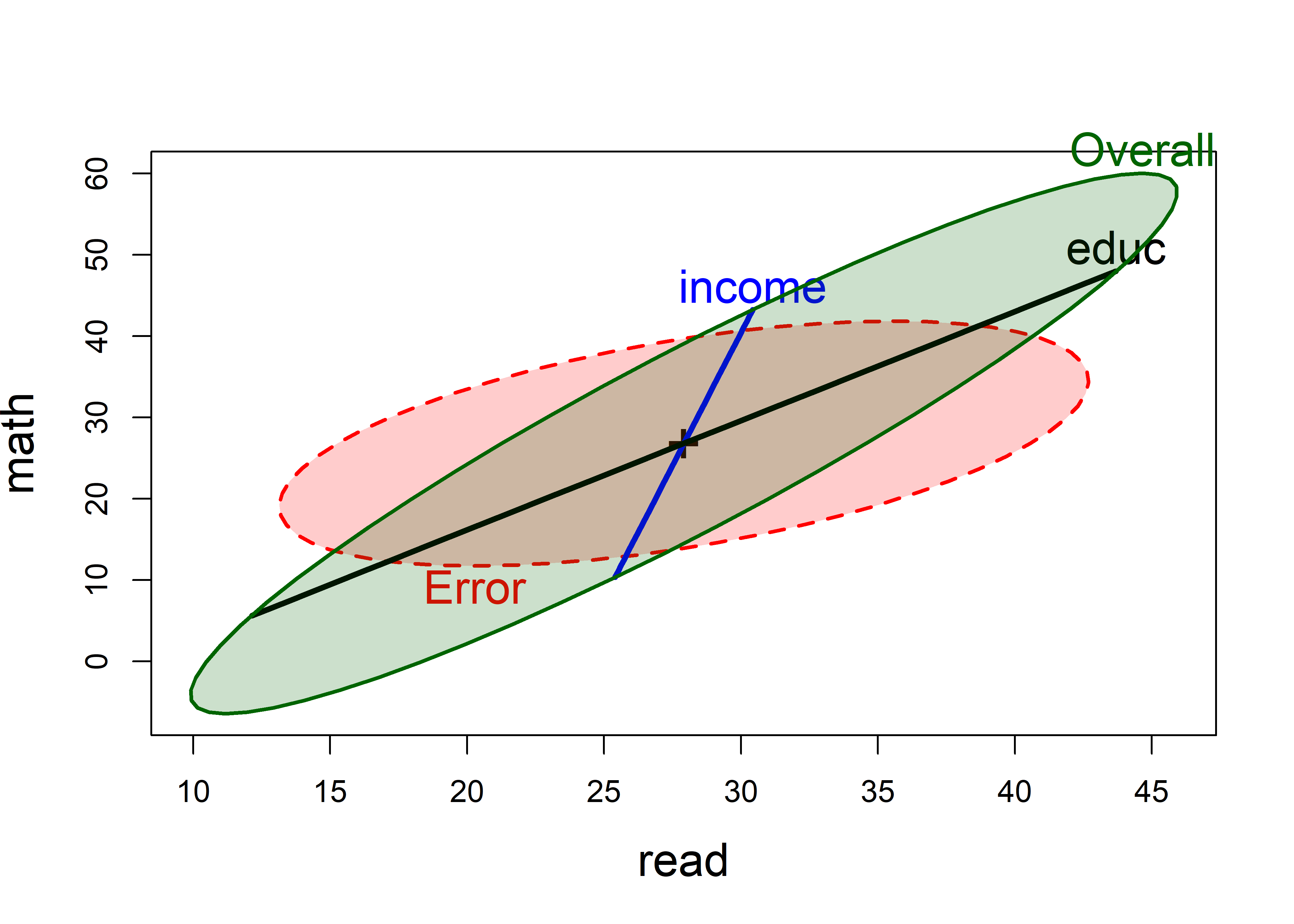
The geometric relations of the \(\mathbf{H}\) ellipses for the overall test and the individual predictors in Figure fig-NLSY-heplot2 are worth noting here. Those for the separate coefficients always lie within the overall ellipse. The contribution for income makes the overall ellipse larger in the direction of the math score, while the contribution of education makes it larger in both directions.
Example 11.5 School data: HE plots
The schooldata dataset analyzed in sec-schooldata-mmra can also be illuminated by the methods of this chapter. There I fit the multivariate regression model predicting students scores on reading, mathematics and a measure of self-esteem using as predictors measures of parents’ education, occupation, school visits, counseling help with school assignments and number of teachers per school.
But I also found two highly influential observations (cases 44, 59; see Figure fig-schoolmod-infl) whose effect on the coefficients is rather large; so, I remove them from the analysis here.11
In this model, parent’s education and occupation and their visits to the schools were highly predictive of student’s outcomes but their counseling efforts and the number of teachers in the schools did not contribute much. However, the nature of these relationships was largely uninterpreted in that analysis.
Here is where HE plots can help. You can think of this as a way to visualize what is entailed in the coefficients for this model by showing the magnitude of the predictor effects by their size and their relations to the outcome variable by their direction. The table of raw score coefficients isn’t very helpful in this regard.
coef(school.mod2)
#             reading mathematics selfesteem
# (Intercept)  2.7096       3.561    0.39751
# education    0.2233       0.132   -0.01088
# occupation   3.3336       4.284    1.79574
# visit        0.0101      -0.123    0.20005
# counseling  -0.3953      -0.293    0.00868
# teacher     -0.1945      -0.360    0.01129
Figure fig-school-heplot1 shows the HE plot for reading and mathematics scores in this model, using the default significance scaling.
heplot(school.mod2,
       fill=TRUE, fill.alpha=0.1,
       cex = 1.5,
       cex.lab = 1.5,
       label.pos = c(rep("top", 4), "bottom", "bottom"))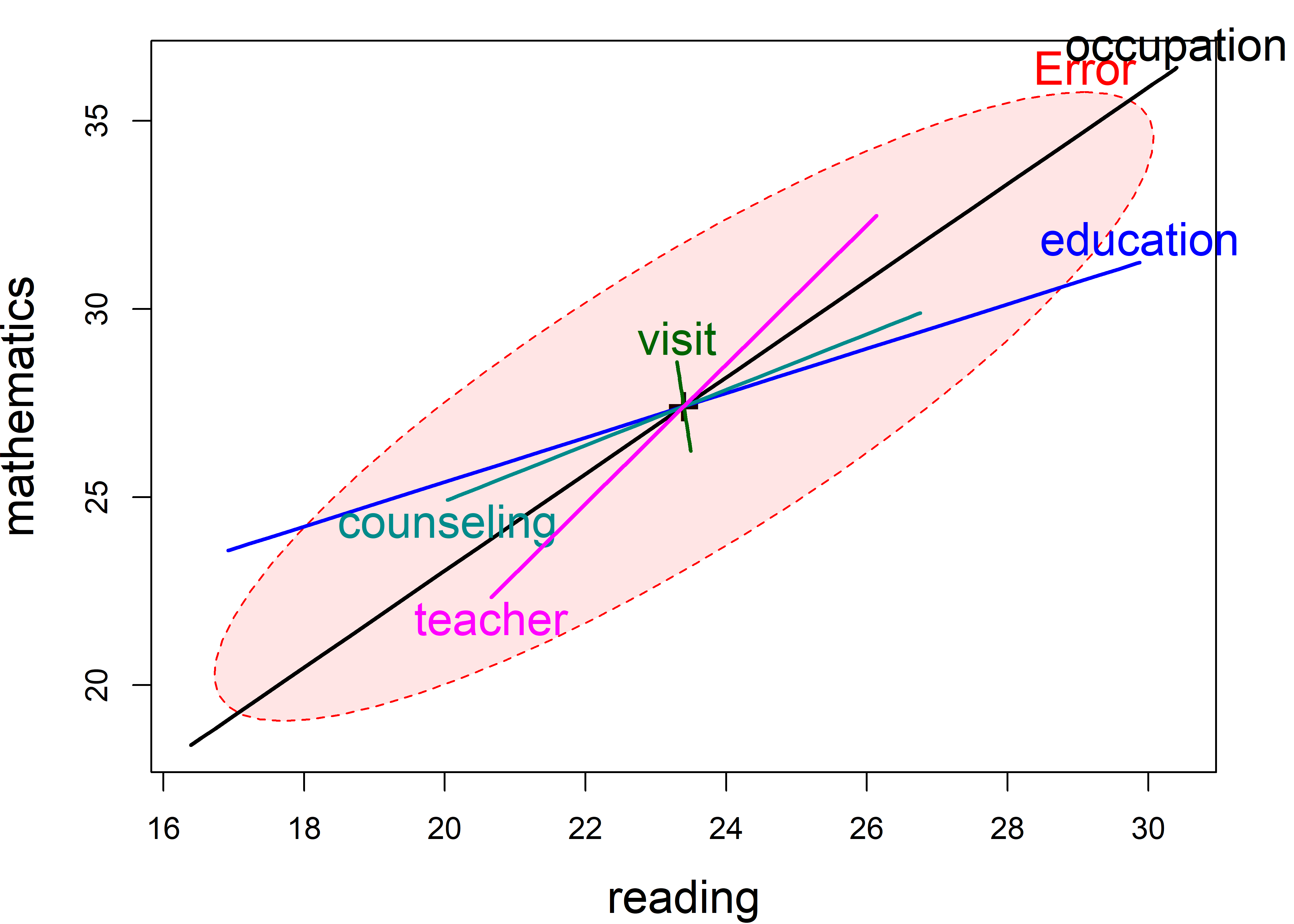
In Figure fig-school-heplot1, you can readily see:
Parent’s occupation and education are both significant in this view, but what is more important is their orientation. Both are positively associated with reading and math scores, but education is somewhat more related to reading than to mathematics.
Number of teachers and degree of parental counseling have a similar orientation, with teachers having a greater relation to mathematics scores.
Visits to school and number of teachers are not significant in this plot, but both are positively correlated with reading and math and are coincident in the plot.
The parent time counseling measure, while also insignificant, tilts in the opposite direction, having different signs for reading and math.
In the pairs() plot for all three responses (Figure fig-school-heplot2), we see something different in the relations for self-esteem. While occupation has a large positive relation in all the plots in the third row and column, education, counseling and teachers have negative relations in these plots, particularly with mathematics scores.
pairs(school.mod2,
      fill=TRUE, fill.alpha=0.1,
      var.cex = 2.5,
      cex = 1.3)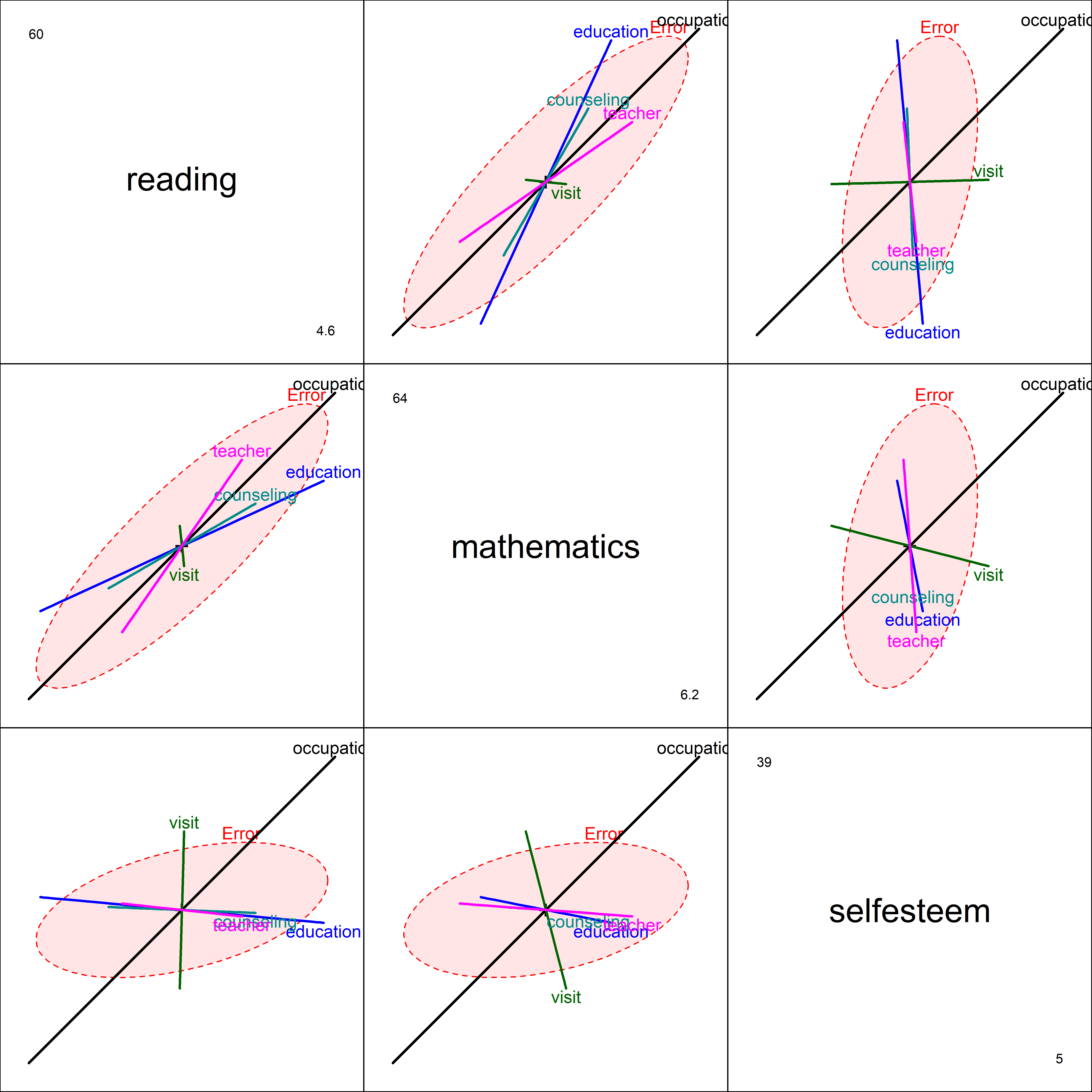
The analysis of this data is continued below in Example exm-schooldata-cancor.
11.10 Canonical correlation analysis
Just as we saw for MANOVA designs, a canonical analysis for multivariate regression involves finding a low-D view of the relations between predictors and outcomes that maximally explains their relations in terms of linear combinations of each. That is, the goal is to find weights for one set of variables, say \(\mathbf{X}\) not to predict each of the other set \(\mathbf{Y} =[\mathbf{y}_1, \mathbf{y}_2, \dots]\) individually, but rather to also find weights for the \(\mathbf{y}\)s which is most highly correlated with the linear combination of the \(\mathbf{x}\)s.
In this sense, canonical correlation analysis (CCA) is symmetric in the \(x\) and \(y\) variables: the \(y\) set is not considered responses. Rather the goal is simply to explain the correlations between the two sets. For a thorough treatment of this topic, see Gittins (1985).
Geometrically, these linear combinations are vectors representing projections in the observation space of the \(x\) and \(y\) variables, and CCA can also be thought of as minimizing the angle between these vectors or maximizing the cosine of this angle. This is illustrated in Figure fig-cancor-diagram.
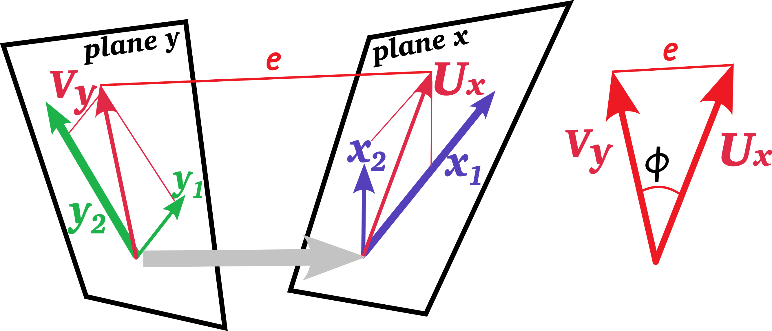
Specifically, we want to find one set of weights \(\mathbf{a}_1\) for the \(x\) variables and another for the \(y\) variables to give the linear combinations \(\mathbf{u}_1\) and \(\mathbf{v}_1\),
\[\begin{aligned} \mathbf{u}_1 & = \mathbf{X} \ \mathbf{a}_1 = a_{11} \mathbf{x}_1 + a_{12} \mathbf{x}_2 + \cdots + a_{11} \mathbf{x}_q \\ \mathbf{v}_1 & = \mathbf{Y} \ \mathbf{b}_1 = b_{11} \mathbf{y}_1 + b_{12} \mathbf{y}_1 + \cdots + b_{11} \mathbf{y}_p \; , \end{aligned}\]
such that the correlation \(\rho_1 = \textrm{corr}(\mathbf{u}_1, \mathbf{v}_1)\) is maximized, or equivalently, minimizing the angle between them.
Using \(\mathbf{S}_{xx}\), \(\mathbf{S}_{yy}\) to represent the covariance matrices of the \(x\) and \(y\) variables, and \(\mathbf{S}_{xy}\) for the cross-covariances between the two sets, the correlation between the linear combinations of each can be expressed as
\[\begin{aligned} \rho_1 & = \textrm{corr}(\mathbf{u}_1, \mathbf{v}_1) = \textrm{corr}(\mathbf{X} \ \mathbf{a}_1, \mathbf{Y} \ \mathbf{b}_1) \\ & = \frac{\mathbf{a}_1^\top \ \mathbf{S}_{xy} \ \mathbf{b}_1 }{\sqrt{\mathbf{a}_1^\top \ \mathbf{S}_{xx} \ \mathbf{a}_1 } \sqrt{\mathbf{b}_1^\top \ \mathbf{S}_{yy} \ \mathbf{b}_1 }} \end{aligned}\]
But, the \(y\) variables lie in a \(p\)-dimensional (observation) space, and the \(x\) in \(q\) dimensions, so what they have common is a space of \(s = \min(p, q)\) dimensions. Therefore, we can find additional pairs of canonical variables,
\[\begin{aligned} \mathbf{u}_2 = \mathbf{X} \ \mathbf{a}_2 & \quad\quad \mathbf{v}_2 = \mathbf{Y} \ \mathbf{b}_2 \\ & \vdots \\ \mathbf{u}_s = \mathbf{X} \ \mathbf{a}_s & \quad\quad \mathbf{v}_s = \mathbf{Y} \ \mathbf{b}_s \\ \end{aligned}\]
such that each pair \((\mathbf{u}_i, \mathbf{v}_i)\) has the maximum possible correlation and all distinct pairs are uncorrelated:
\[\begin{aligned} \rho_i & =\max _{\mathbf{a}_i, \mathbf{b}_i}\left\{\mathbf{u}_i^{\top} \mathbf{v}_i\right\} = \\ \left\|\mathbf{u}_i\right\| & =1, \quad\left\|\mathbf{v}_i\right\|=1, \\ \mathbf{u}_i^{{\top}} \mathbf{u}_j & =0, \quad \mathbf{v}_i^{\top} \mathbf{v}_j=0 \quad\quad \forall j \neq i: i, j \in\{1,2, \ldots, s\} \ . \end{aligned}\]
In words, the correlations among canonical variables are zero except when when they are associated with the same canonical correlation or the weights \((\mathbf{a}_i, \mathbf{b}_i)\) for the same pair. Alternatively, all \(p \times q\) correlations the variables in \(\mathbf{Y}\) and \(\mathbf{X}\) are fully summarized in the \(s = \min(p, q)\) canonical correlations \(\rho_i\) for \(i = 1, 2, \dots, s\).
The solution, developed by Hotelling (1936), is a form of a generalized eigenvalue problem, that can be stated in two equivalent ways,
\[ \begin{aligned} & \left(\mathbf{S}_{y x} \ \mathbf{S}_{x x}^{-1} \ \mathbf{S}_{x y} - \rho^2 \ \mathbf{S}_{y y}\right) \mathbf{b} = \mathbf{0} \\ & \left(\mathbf{S}_{x y} \ \mathbf{S}_{y y}^{-1} \ \mathbf{S}_{y x} - \rho^2 \ \mathbf{S}_{x x}\right) \mathbf{a} = \mathbf{0} \ . \end{aligned} \] Both equations have the same form and have the same eigenvalues. And, given the eigenvectors for one of these equations, we can find the eigenvectors for the other.
Example 11.6 School data: Canonical analysis
For the school data, with \(p = 3\) responses and \(q = 5\) predictors there are three possible sets of canonical variables. Together these account for 100% of the total linear relations between them. heplots::cancor() gives the percentage associated with each of the eigenvalues and the canonical correlations.
For this dataset, the first canonical variates, with Can \(R = 0.995\), accounts for 98.6%, so you might think that that is sufficient. Yet the likelihood ratio tests show that the second set, with Can \(R = 0.774\), is also significant, even though it only accounts for 1.3%.
school.can2 <- cancor(
  cbind(reading, mathematics, selfesteem) ~
        education + occupation + visit + counseling + teacher,
  data=schooldata[OK, ])
school.can2
#
# Canonical correlation analysis of:
#    5   X  variables:  education, occupation, visit, counseling, teacher
#   with   3   Y  variables:  reading, mathematics, selfesteem
#
#     CanR CanRSQ    Eigen  percent    cum
# 1 0.9946 0.9892 91.41999 98.57540  98.58
# 2 0.7444 0.5541  1.24267  1.33994  99.92
# 3 0.2698 0.0728  0.07852  0.08466 100.00
#                          scree
# 1 ****************************
# 2
# 3
#
# Test of H0: The canonical correlations in the
# current row and all that follow are zero
#
#    CanR LR test stat approx F numDF denDF Pr(> F)
# 1 0.995        0.004     67.5    15   166 < 2e-16 ***
# 2 0.744        0.413      8.5     8   122 4.1e-09 ***
# 3 0.270        0.927      1.6     3    62    0.19
# ---
# Signif. codes:  0 '***' 0.001 '**' 0.01 '*' 0.05 '.' 0.1 ' ' 1
The virtue of CCA is that all correlations between the X and Y variables are completely captured in the correlations between the pairs of canonical scores: The \(p \times q\) correlations between the sets are entirely represented by the \(s = \min(p, q)\) canonical ones. Whether the second dimension is useful here depends on whether it adds some interpretable increment to what is going on in these relations. One could be justifiably happy with an explanation based on the first dimension that accounts for nearly all the total association between the sets.
The class "cancor" object returned by cancor() contains the canonical coefficients, for which there is a coef() method as in candisc(), and also a scores() method to return the scores on the canonical variables, called Xcan1, Xcan2, … and Ycan1, Ycan2.
names(school.can2)
#  [1] "cancor"    "names"     "ndim"      "dim"       "coef"
#  [6] "scores"    "X"         "Y"         "weights"   "structure"
# [11] "call"      "terms"
You can use the plot() method or heplot() method to visualize and help interpret the results. The plot() method plots the canonical scores$X against the scores$Y for a given dimension (selected by the which argument). The id.n argument gives a way to flag noteworthy observations.
plot(school.can2,
     pch=16, id.n = 3,
     cex.lab = 1.5, id.cex = 1.5,
     ellipse.args = list(fill = TRUE, fill.alpha = 0.1))
text(-2, 1.5, paste("Can R =", round(school.can2$cancor[1], 3)),
     cex = 1.4, pos = 4)

plot(school.can2, which = 2,
     pch=16, id.n = 3,
     cex.lab = 1.5, id.cex = 1.5,
     ellipse.args = list(fill = TRUE, fill.alpha = 0.1))
text(-3, 3, paste("Can R =", round(school.can2$cancor[2], 3)),
     cex = 1.4, pos = 4)
par(op)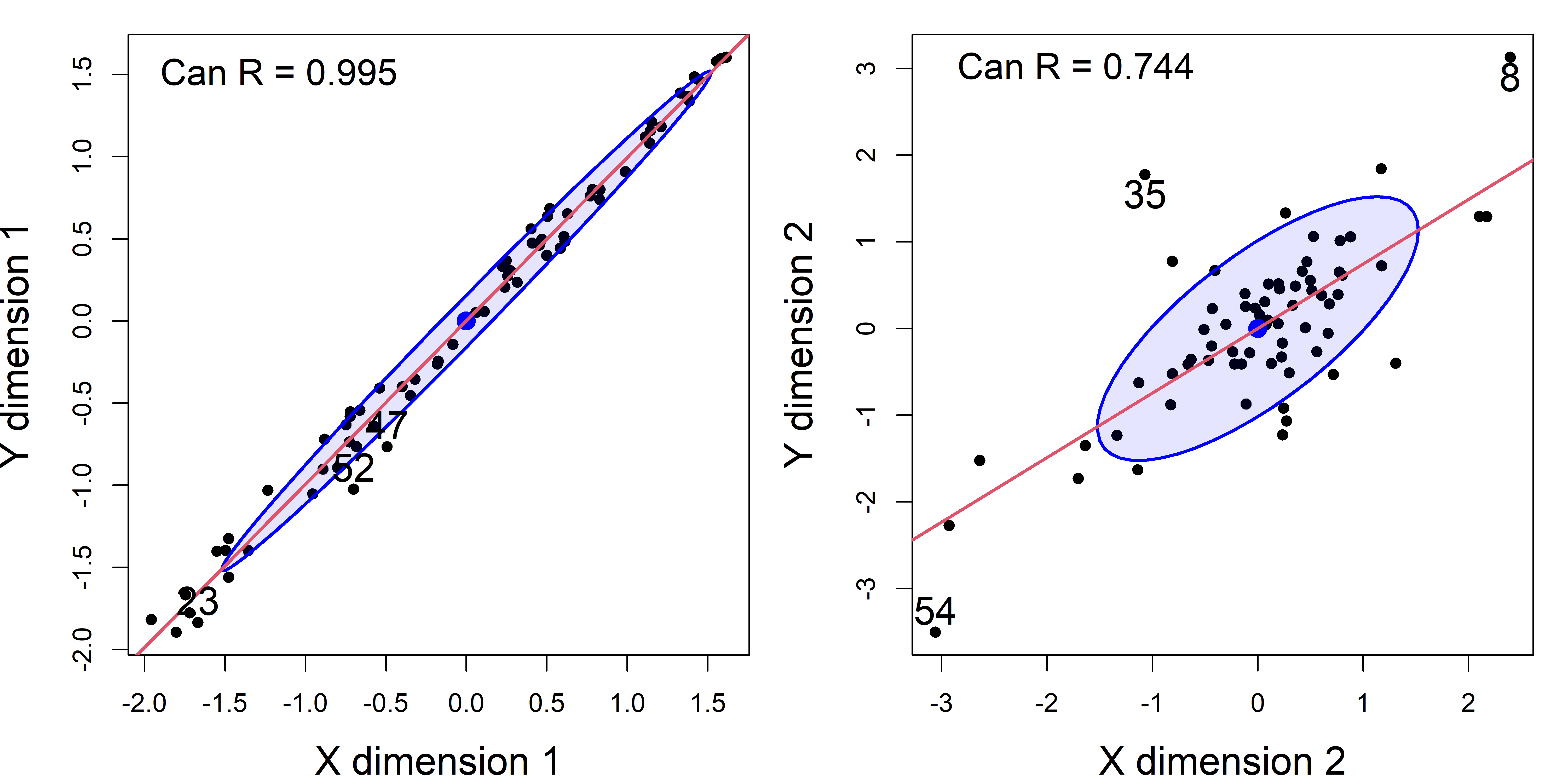
schooldata dataset, omitting the two highly influential cases.
It is worthwhile to look at an analogous plot of canonical scores for the original dataset including the two highly influential cases. As you can see in Figure fig-school-can0, cases 44 and 59 are way outside the range of the rest of the data. Their influence increases the canonical correlation to a near perfect \(\rho = 0.997\).
school.can <- cancor(cbind(reading, mathematics, selfesteem) ~
                       education + occupation + visit + counseling + teacher,
                     data=schooldata)
plot(school.can,
     pch=16, id.n = 3,
     cex.lab = 1.5, id.cex = 1.5,
     ellipse.args = list(fill = TRUE, fill.alpha = 0.1))
text(-5, 1, paste("Can R =", round(school.can$cancor[1], 3)),
     cex = 1.4, pos = 4)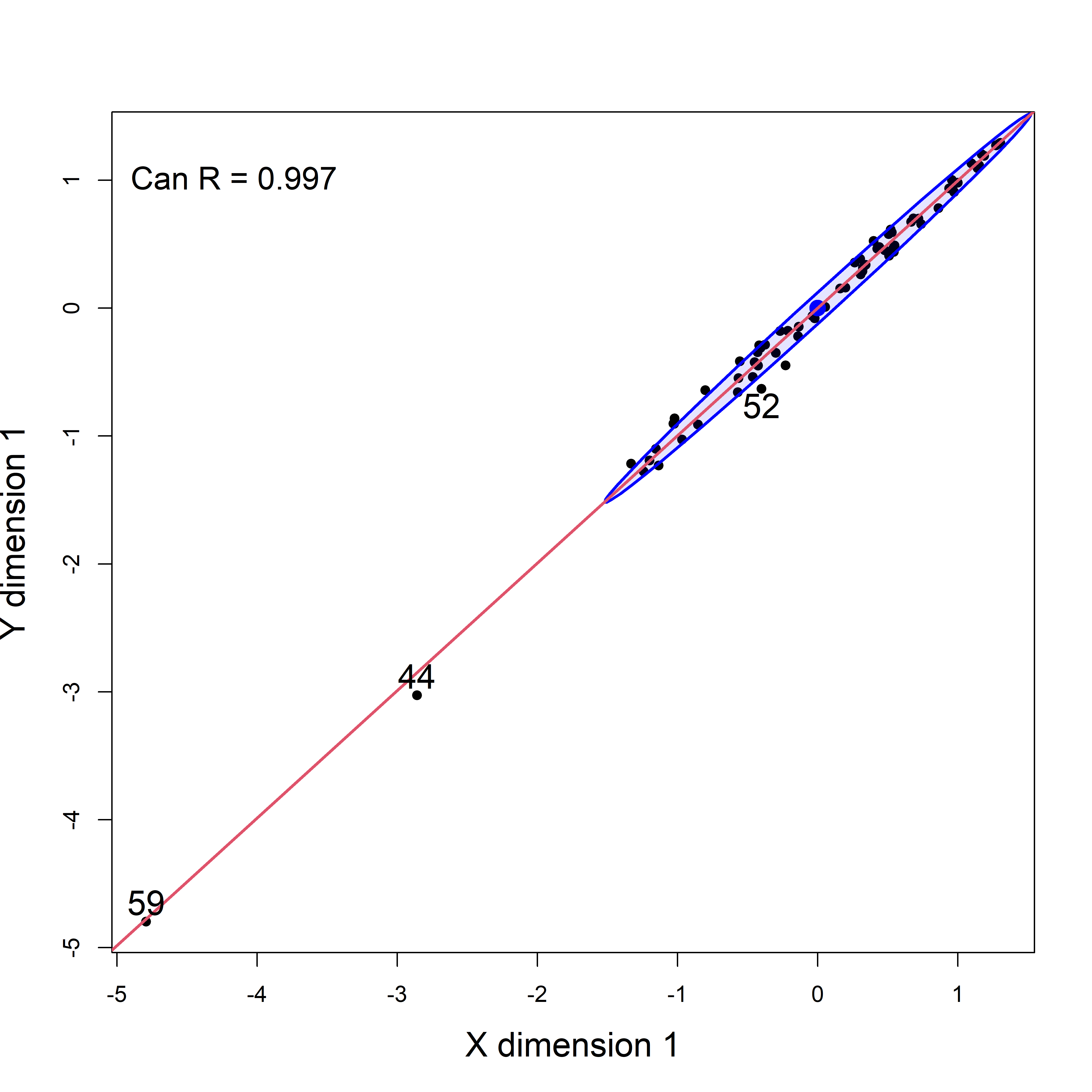
schooldata, including the influential cases, which stand out as so far frome the rest of the observations.
Plots of canonical scores tell us of the strength of the canonical dimensions, but do not help interpreting the analysis in relation to the original variables. The HE plot version for canonical correlation analysis re-fits a multivariate regression model for the Y variables against the Xs, but substitutes the canonical scores for each, essentially projecting the data into canonical space.
TODO: Check out signs of structure coefs from cancor(). Would be better to reflect the vectors for Ycan1.
heplot(school.can2,
       fill = TRUE, fill.alpha = 0.2,
       var.col = "red",
       asp = NA, scale = 0.25,
       cex.lab = 1.5, cex = 1.25,
       prefix="Y canonical dimension ")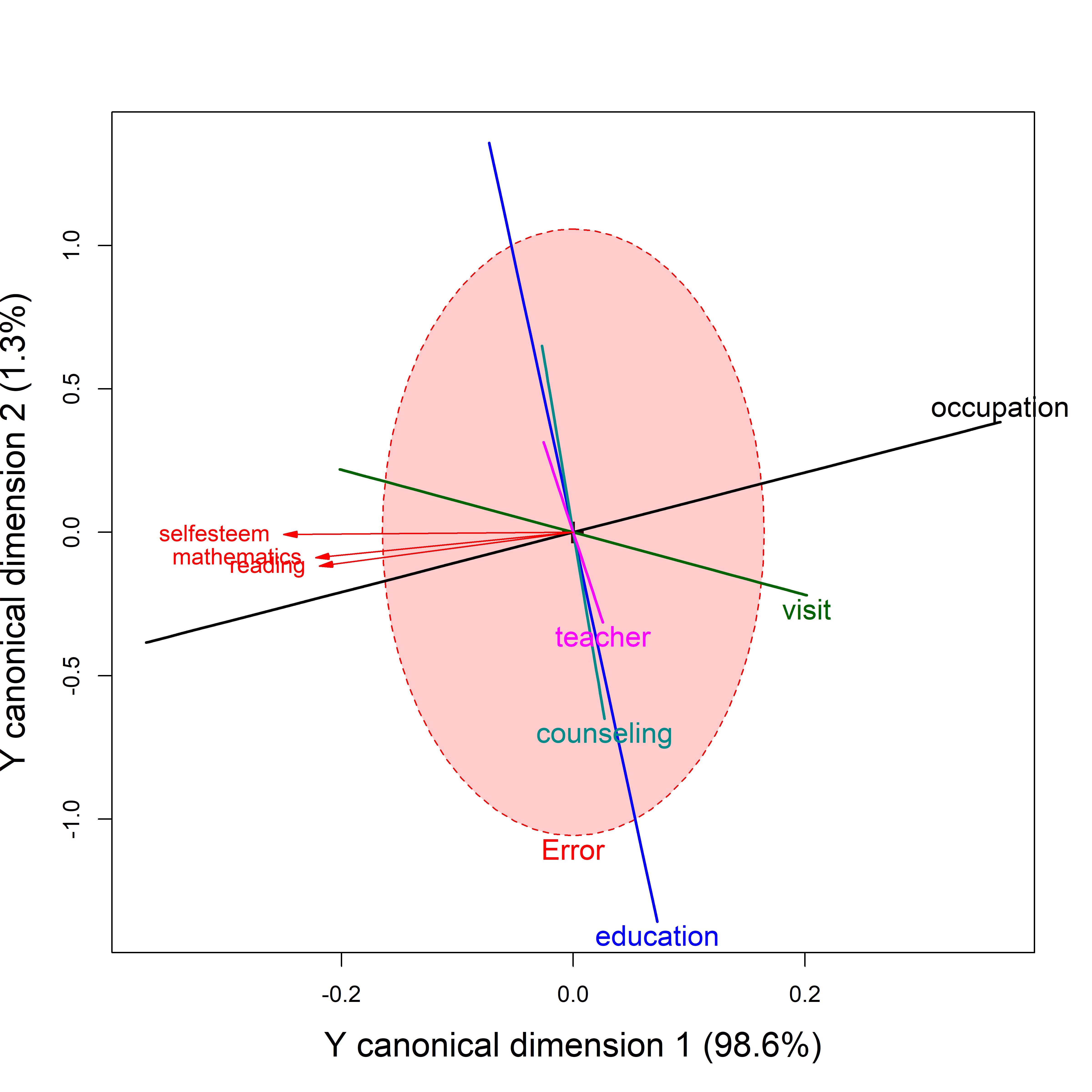
The red variable vectors shown in these plots are intended only to show the correlations of Y variables with the canonical dimensions. The fact that they are so closely aligned reflects the fact that the first dimension accounts for nearly all of their associations with the predictors. The orientation of the \(\mathbf{H}\) ellipses/lines reflects the projection of those from Figure fig-school-heplot2 into canonical space
Only their relative lengths and angles with respect to the Y canonical dimensions have meaning in these plots. Relative lengths correspond to proportions of variance accounted for in the Y canonical dimensions plotted; angles between the variable vectors and the canonical axes correspond to the structure correlations. The absolute lengths of these vectors are arbitrary and are typically manipulated by the scale argument to provide better visual resolution and labeling for the variables.
11.11 MANCOVA models
HE plots for designs containing a collection of quantitative predictors and one or more factors are quite simple in MANCOVA models where the effects are additive, i.e., don’t involve interactions. They are a bit more challenging when you allow separate slopes for groups on all quantitative variables, because there get to be too many terms to usefully display. But these models are more complicated!
If the evidence for heterogeneity of regressions is not very strong, it is still useful to fit the MANCOVA model and display it in an HE plot.
An alternative is to fit separate models for the groups and display these as HE plots. As noted earlier (sec-PA-tasks), this is not ideal for testing hypotheses, but provides a useful and informative display of the relations between the predictors and responses and the groups effect. I illustrate these approaches for the Rohwer data, encountered in sec-PA-tasks, below.
Example 11.7 Rowher data
In sec-PA-tasks I fit several models for Rohwer’s data on the relations between paired-associate tasks and scholastic performance. The first model was the MANCOVA model testing the difference between the high and low SES groups, controlling for, or taking into account differences on the paired-associate task.
HE plots for this model for the pairs (SAT, PPVT) and (SAT, Raven) is shown in Figure fig-rohwer-HE-mod1-pairs. The result of an overall test for all predictors, \(\mathcal{H}_0 : \mathbf{B} = \mathbf{0}\), is added to the basic plot using the hypotheses argument.
colors <- c("red", "blue", rep("black",5), "#969696")
covariates <- rownames(coef(Rohwer.mod1))[-(1:2)]
pairs(Rohwer.mod1,
       col=colors,
       hypotheses=list("Regr" = covariates),
       fill = TRUE, fill.alpha = 0.1,
       cex=1.5, cex.lab = 1.5, var.cex = 3,
       lwd=c(2, rep(3,5), 4))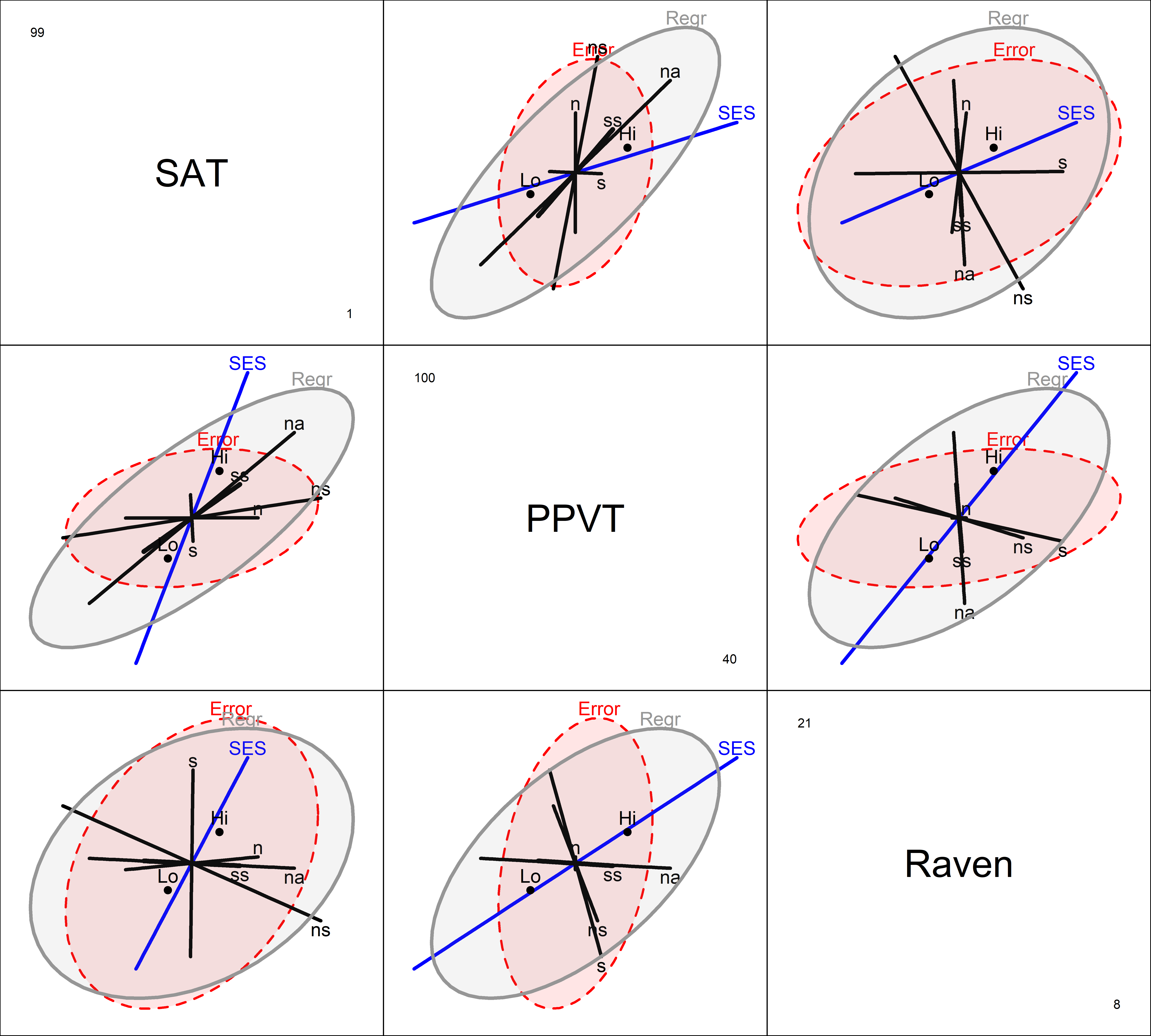
The positive effect of SES on the outcome measures is seen in all pairwise plots: the high SES group is better on all responses. The positive orientation of the Regr ellipses for the covariates shows that the predicted values for all three responses are positively correlated (more so for SAT and PPVT): higher performance on the paired associate tasks, in general, is associated with higher academic performance. The two significant predictors, na and ns are the only ones that extend outside the error ellipses, but their orientations differ.
Homogeneity of regression
A second model tested the assumption of homogeneity of regression by adding interactions of SES with the PA tasks, allowing separate slopes for the two groups on each of the other predictors.
This model has 11 terms, excluding the intercept: SES, plus 5 main effects (\(x\)s) for the predictors and 5 interactions (slope differences), too many for an understandable display. To visualize this in an HE plot (Figure fig-rohwer-HE-mod2), I simplify, by showing the interaction terms collectively by a single ellipse, representing their joint effect, and specified as a linear hypothesis called slopes that picks out the interaction effects.
The argument terms limits the \(\mathbf{H}\) ellipses for the right-hand-side of the model which are shown to just those terms specified. The combined effect of the interaction terms is specified as an hypothesis (slopes) testing the interaction terms (which have a “:” in their name). Because SES is “treatment-coded” in this model, the interaction terms reflect the difference in slopes for the high SES group compared to the low.
(coefs <- rownames(coef(Rohwer.mod2)))
#  [1] "(Intercept)" "SESLo"       "n"           "s"
#  [5] "ns"          "na"          "ss"          "SESLo:n"
#  [9] "SESLo:s"     "SESLo:ns"    "SESLo:na"    "SESLo:ss"

colors <- c("red", "blue", rep("black",5), "#969696")
heplot(Rohwer.mod2, col=c(colors, "darkgreen"),
       terms=c("SES", "n", "s", "ns", "na", "ss"),
       hypotheses=list("Regr" = c("n", "s", "ns", "na", "ss"),
                       "Slopes" = coefs[grep(":", coefs)]),
       fill = TRUE, fill.alpha = 0.2, cex.lab = 1.5)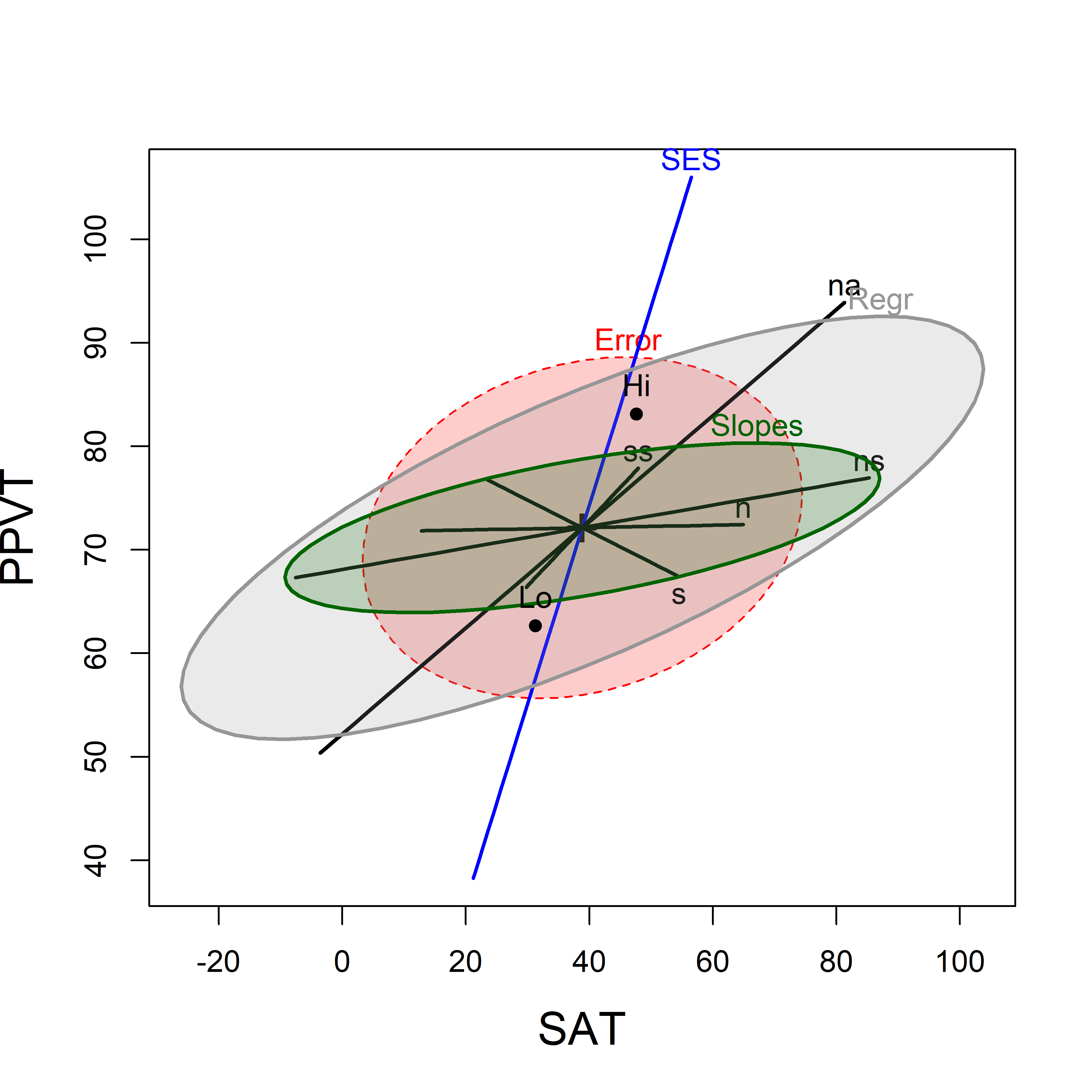
Separate models
When there is heterogeneity of regressions, using submodels for each of the groups has the advantage that you can easily visualize the slopes for the predictors in each of the groups, particularly if you overlay the individual HE plots. In this example, I’m using the models Rohwer.sesLo and Rohwer.sesLo fit to each of the groups.
Here I make use of the fact that several HE plots can be overlaid using the option add=TRUE as shown in Figure fig-rohwer-HE-lohi. The axis limits may need adjustment in the first plot so that the second one will fit.
heplot(Rohwer.sesLo,
       xlim = c(0,100),               # adjust axis limits
       ylim = c(40,110),
       col=c("red", "black"),
       fill = TRUE, fill.alpha = 0.1,
       lwd=2, cex=1.2, cex.lab = 1.5)
heplot(Rohwer.sesHi,
       add=TRUE,
       col=c("brown", "black"),
       grand.mean=TRUE,
       error.ellipse=TRUE,            # not shown by default when add=TRUE
       fill = TRUE, fill.alpha = 0.1,
       lwd=2, cex=1.2)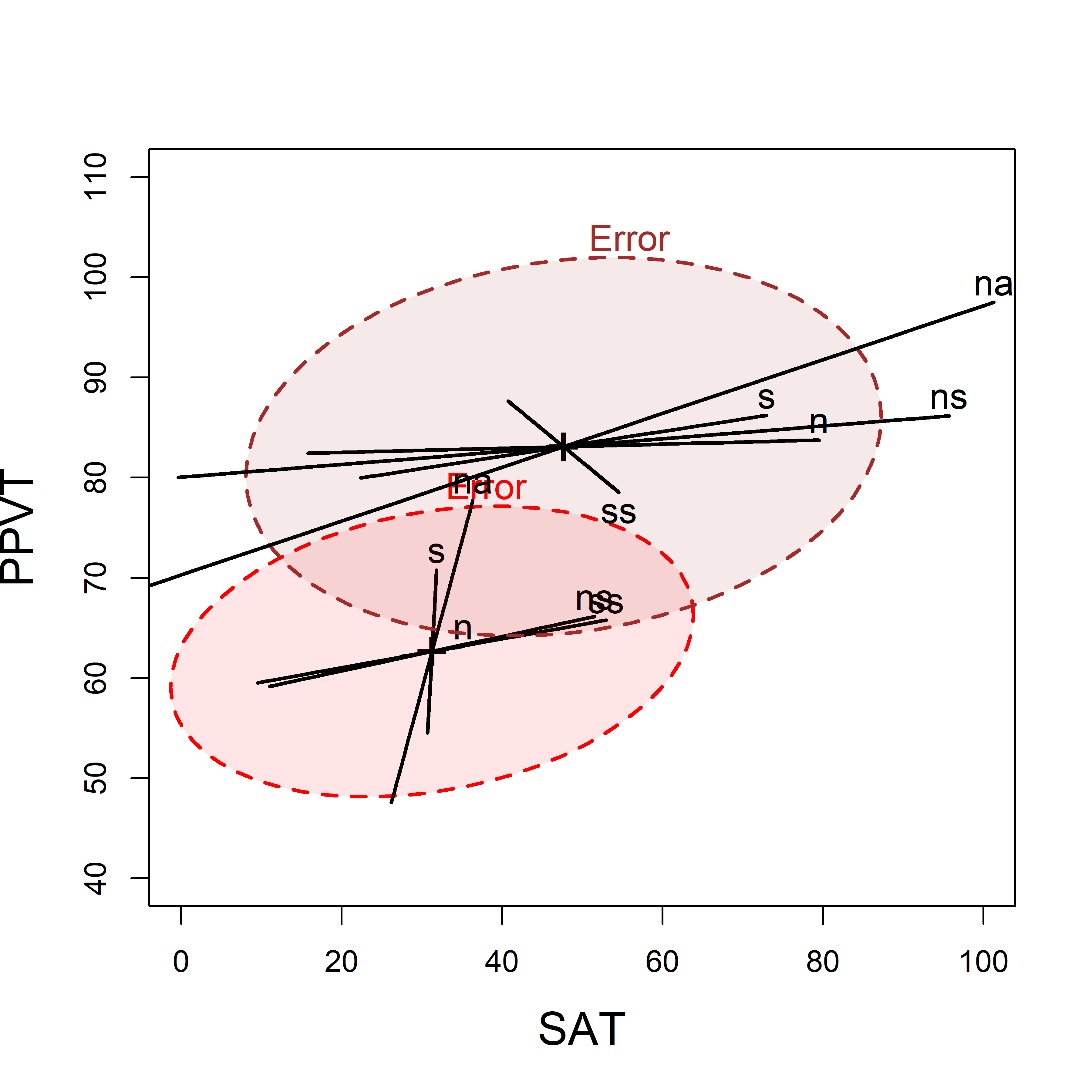
We can readily see the difference in means for the two SES groups (Hi has greater scores on both variables) and it also appears that the slopes of the s and n predictor ellipses are shallower for the High than the Low group, indicating greater relation with the SAT score. As well, the error ellipses show that on these measures, error variation is somewhat smaller in the low SES group.
11.12 What have we learned?
HE plots clarify complex multivariate models through direct visualization - The HE plot framework solves the interpretability problem of multivariate models by visualizing hypothesis (H) ellipses against error (E) ellipses. Rather than navigate a confusing maze of tables of coefficients and test statistics, with HE plots you can see which effects matter, how they relate to each other, and whether they’re statistically significant. All of these benefits are given in a single, intuitive plot that reveals the geometric structure underlying your multivariate analysis.
Visual hypothesis testing beats \(p\)-value hunting - HE plots make hypothesis testing immediate and intuitive: if a hypothesis ellipse extends outside the error ellipse (under significance scaling), the effect is significant. No more scanning tables of p-values or wrestling with multiple comparisons—the geometry tells the story directly. You can even decompose overall effects into meaningful contrasts and see their individual contributions as separate ellipses.
Ellipse orientations reveal the hidden correlational structure of your effects - The angles between hypothesis ellipses in HE plots directly show how different predictors relate to your response variables and to each other. When effect ellipses point in similar directions, those predictors have similar multivariate signatures; when they’re orthogonal, they capture independent aspects of variation. This geometric insight goes far beyond what correlation matrices can reveal.
Canonical space is your secret weapon for high-dimensional visualization - When you have many response variables, canonical discriminant analysis and canonical correlation analysis project the complex multivariate relationships into a lower-dimensional space that captures the essential patterns. This isn’t just dimension reduction—it’s insight amplification, revealing the fundamental directions of variation that matter most while showing how your original variables contribute to these meaningful dimensions.
Multivariate models become tractable through progressive visual summaries - The chapter demonstrates a powerful visualization strategy: start with scatterplot matrices to see the raw data structure, move to HE plots to understand model effects, then project to canonical space for the clearest possible view of multivariate relationships. Each step preserves the essential information while making it more interpretable, turning the complexity of multivariate analysis into a comprehensible visual narrative.
See the heplots vignettes
vignette("HE_manova", package="heplots")andvignette("HE_mmra", package="heplots"). ↩︎In smallish samples (\(n < 30\)) we use the better approximations, \(c = \sqrt{2 F_{2, n-2}^{0.68}}\) for 2D plots and \(c = \sqrt{3 F_{3, n-3}^{0.68}}\) for 3D. The difference between these is usually invisible in plots.↩︎
For example, Megan Stodel in a blog post Stop using iris says, “It is clear to me that knowingly using work that was itself used in pursuit of racist ideals is totally unacceptable.” A Reddit discussion on this topic, Is it socially acceptable to use the Iris dataset? has some interesting replies.↩︎
Recall that \(R^2\) for a linear model is the the proportion of variation in the response that is explained by the model, calculated as \(R^2 = \text{SS}_H / \text{SS}_T = \text{SS}_H / (\text{SS}_H + \text{SS}_E )\). For a multivariate model, these are obtained from the diagonal elements of \(\mathbf{H}\) and \(\mathbf{E}\).↩︎
That the \(\mathbf{H}\) ellipses for the contrasts subtend that for the overall test of
Speciesis no accident. In fact, this is true in \(p\)-dimensional space for any linear hypothesis, and orthogonal contrasts have the additional geometric property that they form conjugate axes for the overall \(\mathbf{H}\) ellipsoid relative to the \(\mathbf{E}\) ellipsoid (Friendly et al., 2013).↩︎The related
candiscList()function performs a generalized canonical discriminant analysis for all terms in a multivariate linear model, returning a list of the results for each factor.↩︎If significance scaling was used the interpretation of the canonical HE plot plot would the same as before: if the hypothesis ellipse extends beyond the error ellipse, then that dimension is significant.↩︎
As in univariate linear models, any factors or covariates ignored in the model formula have their effects pooled with the error term, reducing the sensitivity of their tests.↩︎
You could test this comparison with a more focused 1 df linear hypothesis using the contrast \((1, -\frac12, -\frac12)\) for the levels of
Attr.↩︎For MANOVA designs there is a separate analysis for each term in the model because there are different weights for the response variables.↩︎
An alternative to fitting the model removing specific cases deemed troublesome is to use a robust method, such as
heplots::roblm(). This uses re-weighted least squares to down-weight observations with large residuals or other problems. These methods are illustrated in sec-robust-estimation.↩︎