Generalized Ridge Trace Plots for Ridge Regression
Version 0.7.2
What is ridge regression?
Consider the standard linear model, for predictors in a multiple regression. In this context, high multiple correlations among the predictors lead to well-known problems of collinearity under ordinary least squares (OLS) estimation, which result in unstable estimates of the parameters in β: standard errors are inflated and estimated coefficients tend to be too large in absolute value on average.
Ridge regression is an instance of a class of techniques designed to obtain more favorable predictions at the expense of some increase in bias, compared to ordinary least squares (OLS) estimation. An essential idea behind these methods is that the OLS estimates are constrained in some way, shrinking them, on average, toward zero, to satisfy increased predictive accuracy.
The OLS estimates, which minimize the sum of squared residuals are given by: with .
Ridge regression replaces the standard residual sum of squares criterion with a penalized form,
whose solution is easily seen to be:
where is the shrinkage factor or tuning constant, penalizing larger coefficients. Shrinkage can also be expressed as the equivalent degrees of freedom, the trace of the analog of the “hat” matrix, . In general,
- The bias increases as λ increases,
- The sampling variance decreases as λ increases.
One goal of the genridge package is to provide visualization methods for these models to help understand the tradeoff between bias and variance and choice of a shrinkage value .
Package overview
The genridge package introduces generalizations of the standard univariate ridge trace plot used in ridge regression and related methods (Friendly, 2011, 2013). These graphical methods show both bias (actually, shrinkage) and precision, by plotting the covariance ellipsoids of the estimated coefficients, rather than just the estimates themselves. 2D and 3D plotting methods are provided, both in the space of the predictor variables and in the transformed space of the PCA/SVD of the predictors.
Details
This package provides computational support for the graphical methods described in Friendly (2013). Ridge regression models may be fit using the function ridge, which incorporates features of MASS::lm.ridge() and ElemStatLearn::simple.ridge(). In particular, the shrinkage factors in ridge regression may be specified either in terms of the constant () added to the diagonal of matrix, or the equivalent number of degrees of freedom.
The following computational functions are provided:
-
ridge()Calculates ridge regression estimates; returns an object of class"ridge" -
pca.ridge()Transform coefficients and covariance matrices to PCA/SVD space; returns an object of classc("pcaridge", "ridge") -
vif.ridge()Calculates VIFs for “ridge” objects -
precision()Calculates measures of precision and shrinkage
More importantly, the ridge functions also calculate and returns the associated covariance matrices of each of the ridge estimates, allowing precision to be studied and displayed graphically.
This provides the support for the main plotting functions in the package:
-
traceplot(): Traditional univariate ridge trace plots -
plot.ridge(): Bivariate ridge trace plots, showing the covariance ellipse of the estimated coefficients. -
pairs.ridge(): All pairwise bivariate ridge trace plots -
plot3d.ridge(): 3D ridge trace plots with ellipsoids -
plot.precision(): Plots a measure of precsion vs. one of shrinkage -
plot.vif.ridge(): Plots variance inflation factors
In addition, the pca() method for "ridge" objects transforms the coefficients and covariance matrices of a ridge object from predictor space to the equivalent, but more interesting space of the PCA of or the SVD of . The main plotting functions also work for these objects, of class c("ridge", "pcaridge").
-
biplot.pcaridge(): Adds variable vectors to the bivariate plots of coefficients in PCA space
Finally, the functions precision() and vif.ridge() provide other useful measures and plots.
Installation
| CRAN version | install.packages("genridge") |
| R-universe | install.packages("genridge", repos = c('https://friendly.r-universe.dev') |
| Development version | remotes::install_github("friendly/genridge") |
Examples
The classic example for ridge regression is Longley’s (1967) data, consisting of 7 economic variables, observed yearly from 1947 to 1962 (n=16), in the data frame datasets::longley. The goal is to predict Employed from GNP, Unemployed, Armed.Forces, Population, Year, GNP.deflator.
These data, constructed to illustrate numerical problems in least squares software at the time, are (purposely) perverse, in that:
- each variable is a time series so that there is clearly a lack of independence among predictors.
- worse, there is also some structural collinearity among the variables
GNP,Year,GNP.deflator,Population, e.g.,GNP.deflatoris a multiplicative factor to account for inflation.
data(longley)
str(longley)
#> 'data.frame':    16 obs. of  7 variables:
#>  $ GNP.deflator: num  83 88.5 88.2 89.5 96.2 ...
#>  $ GNP         : num  234 259 258 285 329 ...
#>  $ Unemployed  : num  236 232 368 335 210 ...
#>  $ Armed.Forces: num  159 146 162 165 310 ...
#>  $ Population  : num  108 109 110 111 112 ...
#>  $ Year        : int  1947 1948 1949 1950 1951 1952 1953 1954 1955 1956 ...
#>  $ Employed    : num  60.3 61.1 60.2 61.2 63.2 ...
Shrinkage values, can be specified using either (where corresponds to OLS), or equivalent effective degrees of freedom. This quantifies the tradeoff between bias and variance for predictive modeling, where OLS has low bias, but can have large predictive variance.
ridge() returns a matrix containing the coefficients for each predictor for each shrinkage value and other quantities.
lambda <- c(0, 0.005, 0.01, 0.02, 0.04, 0.08)
lridge <- ridge(Employed ~ GNP + Unemployed + Armed.Forces + Population + Year + GNP.deflator,
        data=longley, lambda=lambda)
lridge
#> Ridge Coefficients:
#>        GNP        Unemployed  Armed.Forces  Population  Year       GNP.deflator
#> 0.000  -3.447192  -1.827886   -0.696210     -0.344197    8.431972   0.157380
#> 0.005  -1.042478  -1.491395   -0.623468     -0.935580    6.566532  -0.041750
#> 0.010  -0.179797  -1.361047   -0.588140     -1.003168    5.656287  -0.026122
#> 0.020   0.499494  -1.245137   -0.547633     -0.867553    4.626116   0.097663
#> 0.040   0.905947  -1.155229   -0.503911     -0.523471    3.576502   0.321240
#> 0.080   1.090705  -1.086421   -0.458252     -0.085963    2.641649   0.570252
Variance Inflation Factors
The effects of collinearity can be measured by a variance inflation factor (VIF), the ratio of the sampling variances of the coefficients, relative to what they would be if all predictors were uncorrelated, given by where “others” represents all other predictors except .
vif() for a "ridge" object calculates variance inflation factors for all values of the ridge constant. You can see that for OLS, nearly all VIF values are dangerously high. With a ridge factor of 0.04 or greater, variance inflation has been considerably reduced for a few of the predictors.
vridge <- vif(lridge)
vridge
#> Variance inflaction factors:
#>            GNP  Unemployed  Armed.Forces  Population    Year  GNP.deflator
#> 0.000  1788.51      33.619         3.589      399.15  758.98        135.53
#> 0.005   540.04      12.118         2.921      193.30  336.15         90.63
#> 0.010   259.00       7.284         2.733      134.42  218.84         74.79
#> 0.020   101.12       4.573         2.578       87.29  128.82         58.94
#> 0.040    34.43       3.422         2.441       52.22   66.31         43.56
#> 0.080    11.28       2.994         2.301       28.59   28.82         29.52
vif() returns a "vif.ridge" object for which there is a plot method:
clr <-  c("black", "red", "darkgreen","blue", "cyan4", "magenta")
pch <- c(15:18, 7, 9)
plot(vridge, X = "df", Y="sqrt",
     col=clr, pch=pch, cex = 1.2,
     xlim = c(4, 6.5))
Univariate trace plots
A standard, univariate, traceplot() simply plots the estimated coefficients for each predictor against the shrinkage factor, .
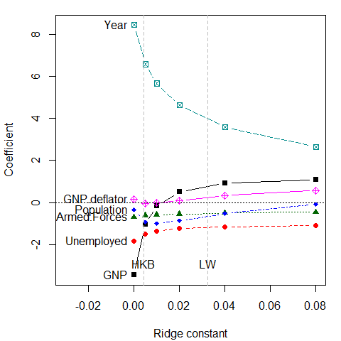
The dotted lines show choices for the ridge constant by two commonly used criteria to balance bias against precision due to HKB: Hoerl, Kennard, and Baldwin (1975) and LW: Lawless and Wang (1976). These values (along with a generalized cross-validation value GCV) are also stored in the "ridge" object,
c(HKB=lridge$kHKB, LW=lridge$kLW, GCV=lridge$kGCV)
#>      HKB       LW      GCV
#> 0.004275 0.032295 0.005000
# these are also stored in 'criteria' for use with plotting methods
criteria <- lridge$criteria
These values seem rather small, but note that the coefficients for Year and GNP are shrunk considerably.
Alternative plot
It is sometimes easier to interpret the plot when coefficients are plotted against the equivalent degrees of freedom, where corresponds to 6 degrees of freedom in the parameter space of six predictors. Note that the values of chosen here were approximately chosen on a log scale. Using the scaling X="df" here makes the points more nearly equally spaced.
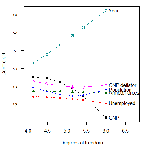
But wait: This is the wrong plot! These plots show the trends in increased bias associated with larger , but they do not show the accompanying decrease in variance (increase in precision). For that, we need to consider the variances and covariances of the estimated coefficients. The univariate trace plot is the wrong graphic form for what is essentially a multivariate problem, where we would like to visualize how both coefficients and their variances change with .
Bivariate trace plots
The bivariate analog of the trace plot suggested by Friendly (2013) plots bivariate confidence ellipses for pairs of coefficients. Their centers, show the estimated coefficients, and their size and shape indicate sampling variance, . Here, we plot those for GNP against four of the other predictors.
op <- par(mfrow=c(2,2), mar=c(4, 4, 1, 1)+ 0.1)
clr <-  c("black", "red", "darkgreen","blue", "cyan4", "magenta")
pch <- c(15:18, 7, 9)
lambdaf <- c(expression(~widehat(beta)^OLS), ".005", ".01", ".02", ".04", ".08")

for (i in 2:5) {
    plot(lridge, variables=c(1,i),
         radius=0.5, cex.lab=1.5, col=clr,
         labels=NULL, fill=TRUE, fill.alpha=0.2)
    text(lridge$coef[1,1], lridge$coef[1,i],
         expression(~widehat(beta)^OLS), cex=1.5, pos=4, offset=.1)
    text(lridge$coef[-1,c(1,i)], lambdaf[-1], pos=3, cex=1.3)
}
par(op)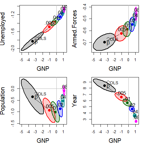
Bivariate ridge trace plots for the coefficients of four predictors against the coefficient for GNP in Longley’s data, with λ = 0, 0.005, 0.01, 0.02, 0.04, 0.08. In most cases, the coefficients are driven toward zero, but the bivariate plot also makes clear the reduction in variance, as well as the bivariate path of shrinkage.
As can be seen, the coefficients for each pair of predictors trace a path generally in toward the origin , and the covariance ellipses get smaller, indicating increased precision.
The pairs() method for "ridge" objects shows all pairwise views in scatterplot matrix form.
pairs(lridge, radius=0.5, diag.cex = 2,
      fill = TRUE, fill.alpha = 0.1)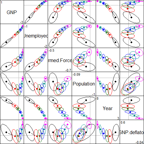
Scatterplot matrix of bivariate ridge trace plots
See Friendly et-al. (2013) for other examples of how elliptical thinking can lead to insights in statistical problems.
Visualizing the bias-variance tradeoff
The function precision() calculates a number of measures of the effect of shrinkage of the coefficients on the estimated sampling variance. Larger shrinkage should lead to smaller , indicating increased precision. See: help(precision) for details.
precision(lridge)
#>       lambda    df    det   trace max.eig norm.beta norm.diff
#> 0.000  0.000 6.000 -12.93 18.1190 15.4191    1.0000     0.000
#> 0.005  0.005 5.415 -14.41  6.8209  4.6065    0.7406     1.276
#> 0.010  0.010 5.135 -15.41  4.0423  2.1807    0.6365     1.783
#> 0.020  0.020 4.818 -16.83  2.2180  1.0255    0.5282     2.262
#> 0.040  0.040 4.478 -18.70  1.1647  0.5808    0.4233     2.679
#> 0.080  0.080 4.128 -21.05  0.5873  0.2599    0.3373     3.027
norm.beta is a measure of shrinkage, and det , is a measure of variance of the coefficients (inverse of precision). Plotting these against each other gives a direct view of the tradeoff between bias and precision.
pridge <- precision(lridge)
op <- par(mar=c(4, 4, 1, 1) + 0.2)
library(splines)
with(pridge, {
    plot(norm.beta, det, type="b",
    cex.lab=1.25, pch=16, cex=1.5, col=clr, lwd=2,
  xlab='shrinkage: ||b|| / max(||b||)',
    ylab='variance: log |Var(b)|')
    text(norm.beta, det, lambdaf, cex=1.25, pos=c(rep(2,length(lambda)-1),4), xpd = TRUE)
    text(min(norm.beta), max(det), "log |Variance| vs. Shrinkage", cex=1.5, pos=4)
    })
mod <- lm(cbind(det, norm.beta) ~ bs(lambda, df=5), data=pridge)
x <- data.frame(lambda=c(lridge$kHKB, lridge$kLW))
fit <- predict(mod, x)
points(fit[,2:1], pch=15, col=gray(.50), cex=1.5)
text(fit[,2:1], c("HKB", "LW"), pos=3, cex=1.5, col=gray(.50))
par(op)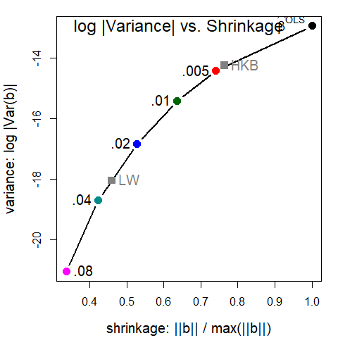
These plots are now provided in the plot() method for (class "precision") objects returned by precision(). This plots the measure norm.beta on the horizontal axis vs. any of the variance measures det, trace, or max.eig, and labels the points with either k or df. See help("precision") for the definitions of these variance measures.
A plot similar to that above can be produced as shown below, but here labeling the points with effective degrees of freedom. The shape of the curve is quite similar.
plot(pridge, labels = "df", label.prefix="df:", criteria = criteria)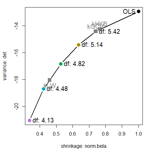
Low-rank views
Just as principal components analysis gives low-dimensional views of a data set, PCA can be useful to understand ridge regression.
The pca method transforms a "ridge" object from parameter space, where the estimated coefficients are with covariance matrices , to the principal component space defined by the right singular vectors, , of the singular value decomposition of the scaled predictor matrix, .
plridge <- pca(lridge)
plridge
#> Ridge Coefficients:
#>        dim1     dim2     dim3     dim4     dim5     dim6
#> 0.000  1.51541  0.37939  1.80131  0.34595  5.97391  6.74225
#> 0.005  1.51531  0.37928  1.79855  0.33886  5.32221  3.68519
#> 0.010  1.51521  0.37918  1.79579  0.33205  4.79871  2.53553
#> 0.020  1.51500  0.37898  1.79031  0.31922  4.00988  1.56135
#> 0.040  1.51459  0.37858  1.77944  0.29633  3.01774  0.88291
#> 0.080  1.51377  0.37778  1.75810  0.25915  2.01876  0.47238
traceplot(plridge)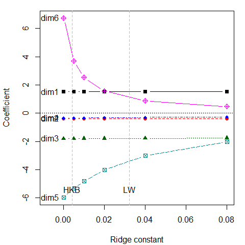
What is perhaps surprising is that the coefficients for the first 4 components are not shrunk at all. Rather, the effect of shrinkage is seen only on the last two dimensions. These are the directions that contribute most to collinearity, for which other visualization methods have been proposed (Friendly & Kwan 2009).
The pairs() plot illustrates the joint effects: the principal components of are uncorrelated, so the ellipses are all aligned with the coordinate axes and the ellipses largely coincide for dimensions 1 to 4:
pairs(plridge)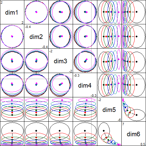
If we focus on the plot of dimensions 5:6, we can see where all the shrinkage action is in this representation. Generally, the predictors that are related to the smallest dimension (6) are shrunk quickly at first.
plot(plridge, variables=5:6, fill = TRUE, fill.alpha=0.2)
text(plridge$coef[, 5:6],
       label = lambdaf,
     cex=1.5, pos=4, offset=.1)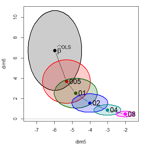
Biplot view
Finally, we can project the predictor variables into the PCA space of the smallest dimensions, where the shrinkage action mostly occurs to see how the predictor variables relate to these dimensions.
biplot.pcaridge() supplements the standard display of the covariance ellipsoids for a ridge regression problem in PCA/SVD space with labeled arrows showing the contributions of the original variables to the dimensions plotted. The length of the arrows reflects proportion of variance that each predictors shares with the components.
The biplot view showing the dimensions corresponding to the two smallest singular values is particularly useful for understanding how the predictors contribute to shrinkage in ridge regression. Here, Year and Population largely contribute to dim 5; a contrast between (Year, Population) and GNP contributes to dim 6.
op <- par(mar=c(4, 4, 1, 1) + 0.2)
biplot(plridge, radius=0.5,
       ref=FALSE, asp=1,
       var.cex=1.15, cex.lab=1.3, col=clr,
       fill=TRUE, fill.alpha=0.2, prefix="Dimension ")
#> Vector scale factor set to  5.247
text(plridge$coef[,5:6], lambdaf, pos=2, cex=1.3)
par(op)
Other examples
The genridge package contains four data sets, each with its own examples; e.g., you can try example(Acetylene).
vcdExtra::datasets(package="genridge")
#>        Item      class    dim                               Title
#> 1 Acetylene data.frame   16x4                      Acetylene Data
#> 2   Detroit data.frame  13x14 Detroit Homicide Data for 1961-1973
#> 3  Manpower data.frame   17x6              Hospital manpower data
#> 4      diab data.frame 442x11                Diabetes Progression
#> 5  prostate data.frame  97x10                Prostate Cancer Data
References
Friendly, M. (2011). Generalized Ridge Trace Plots: Visualizing Bias and Precision with the genridge R package. SCS Seminar, Jan., 2011. Slides: gentalk.pdf; gentalk-2x2.pdf
Friendly, M. (2013). The Generalized Ridge Trace Plot: Visualizing Bias and Precision. Journal of Computational and Graphical Statistics, 22(1), 50-68, DOI link, Online: genridge-jcgs.pdf, Supp. materials: genridge-supp.zip
Friendly, M., and Kwan, E. (2009), Where’s Waldo: Visualizing Collinearity Diagnostics, The American Statistician, 63(1), 56–65, DOI link, Online: viscollin-tast.pdf, Supp. materials: http://datavis.ca/papers/viscollin/.
Friendly, M., Monette, G., & Fox, J. (2013). Elliptical Insights: Understanding Statistical Methods Through Elliptical Geometry. Statistical Science, 28(1), 1–39. https://doi.org/10.1214/12-STS402
Golub G.H., Heath M., Wahba G. (1979) Generalized cross-validation as a method for choosing a good ridge parameter. Technometrics, 21:215–223. https://doi.org/10.2307/1268518.
Hoerl, A. E., Kennard, R. W., and Baldwin, K. F. (1975), Ridge Regression: Some Simulations, Communications in Statistics, 4, 105–123.
Lawless, J. F., and Wang, P. (1976), A Simulation Study of Ridge and Other Regression Estimators, Communications in Statistics, 5, 307–323.
Longley, J. W. (1967) An appraisal of least-squares programs from the point of view of the user. Journal of the American Statistical Association, 62, 819–841.
